
Two screenshots sit side by side in a review thread. One is the Figma frame, the other the staging build, and they line up to the pixel, so the ticket closes.
Three weeks later somebody opens that screen with a keyboard, presses Tab, and watches focus vanish behind the sticky header. The defect was never hidden. It just wasn't a still image.
Nothing in that sequence is dramatic, which is the problem. A modal that forgets to return focus, an error message that renders below the fold, a 24 dp icon asked to do a 48 dp job: each one looks harmless in a screenshot and each one stops a person mid-task. The expensive part isn't the bug. It's the round trip after the sprint closes, when three roles reopen work they already signed off on and the designer who owns the screen has moved on.
Design QA is a handoff problem before it's a visual one. Four roles touch every screen before it ships, and each holds a different piece of the truth about whether it's done. What follows is the checklist by screen area, a repeatable pass, the thresholds that decide pass or fail, and the handoff stages where each defect class is cheapest to kill.
Design QA Checklist by Screen Area
The build matches the frame in a screenshot and fails in a browser. That gap explains most design rework: the side-by-side comparison passes, the sprint closes, and the defect surfaces when a real person tries to finish a task. Screen-by-screen review catches it earlier if the reviewer works in a fixed order instead of reacting to whatever looks off first.
| Area | What to verify | Pass condition | Owner |
|---|---|---|---|
| Layout and spacing | Spacing, grid and alignment against the frame | Values come from spacing tokens, with no hard-coded pixels | Designer |
| Typography | Size, weight and line height per text role | One token per role; long strings wrap without clipping | Designer, Engineer |
| Color | Hex values, semantic roles and dark mode | Only semantic tokens; no off-palette fills | Designer |
| Component states | Default, hover, focus, active, disabled, loading, error | Every state exists in the library and in the build | Designer, Engineer |
| Empty and loading states | First-run view, zero results, skeletons | Shown for every list, table and chart | PM |
| Error and recovery | Validation text, failed save, timeout | Message states the problem and the fix; typed input survives | PM, QA |
| Content variants | Minimum and maximum length, missing images, null values | Layout holds at both edges | QA |
| Responsive behavior | Shipped breakpoints and orientation changes | No overlap or horizontal scroll at target widths | QA |
| Accessibility | Contrast, focus order, labels, alt text | Meets the thresholds in the accessibility reference table | Designer, QA |
Who signs which row
The owner column is the part teams skip, and it's the part that decides whether the checklist survives contact with a sprint. A designer signs layout, typography, color and the state library, because those are decisions made in the file. QA signs content variants and responsive behavior, because those need a running build and real strings. The PM signs empty, loading and error states, because those are product decisions about what the screen says when it has nothing to say.
Owner rule: a row without a name isn't a check, it's a hope.
Notice what the table doesn't do. It doesn't ask the designer to verify everything, and it doesn't ask QA to guess design intent. Who owns the row nobody claimed? Usually the engineer, at 6pm, inventing a loading state.
Copy this table into your review template and attach it to every ticket that touches a screen. When a row comes back empty, that's the finding.
How to Run a Design QA Pass Step by Step
A pass usually ends in an argument because nobody agreed on the reference or the standard before the review began. Two people compare the same screen to two different files and both are right.
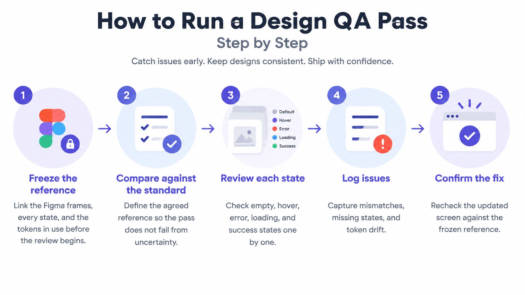
Step 1. Freeze the reference.
Link the Figma frames for every state, the tokens in use, and the version you're comparing against.
The common slip is reviewing a file that's still being edited, so a "mismatch" turns out to be a design change made mid-review.
Step 2. Define the standard.
Pick WCAG 2.2 Level AA and convert each applicable criterion into a binary acceptance test, which is the approach the WCAG 2.2 specification sets out while noting that some criteria need human testers for part or all of the evaluation.
The slip is treating accessibility as a final audit step when it belongs in this second step, before anyone opens the build.
Step 3. Map the states the designs omit.
Empty, loading, error, permission and long-content states rarely make it into a file. Write them down before review starts.
What does the build do when a save fails halfway? If nobody knows, that's a missing state, not a missing test.
Step 4. Test the running build, state by state.
Compare against each state at the viewport sizes the team ships, not against one happy-path screenshot.
The slip is reviewing a polished prototype populated with tidy sample data.
Step 5. Walk the primary journeys with a keyboard and a screen reader.
Tab through sign-up, checkout and settings. Watch where focus goes, whether it stays visible, and whether every control announces a name.
The slip is testing only with a mouse, which is how a keyboard trap ships undetected.
Step 6. Measure what the eye can't judge.
Contrast ratios, hit areas, and the spacing between adjacent targets need a tool or a number, not an opinion.
The slip is eyeballing two grays and calling the darker one fine.
Step 7. Log, retest and sign off.
One defect per ticket, with severity and an expected value. QA retests the changed flow before approval, and anything you fixed gets checked again in the build, not in the file.
A finished pass produces a traceability list that ties each component and state to a criterion, an owner and a retest result. That list is the same evidence QA needs when assessing release readiness through acceptance testing, which is the point where design sign-off stops being a matter of taste.
Accessibility and Touch Thresholds Design QA Must Enforce
Contrast fails more often than any other measurable check, which is why it leads the list. The WebAIM Million study evaluated 1,000,000 home pages in 2022 and found 50,829,406 distinct accessibility errors, an average of 50.8 per page, with 83.9% of home pages carrying low-contrast text, ahead of missing image alt text at 55.4% and empty links at 50.1%. The same run found at least one automatically detectable WCAG 2 failure on 96.8% of pages.
| Measure | Threshold | Reference |
|---|---|---|
| Normal text contrast | 4.5:1 | WCAG 2.2 SC 1.4.3 |
| Large text contrast | 3:1 | WCAG 2.2 SC 1.4.3 |
| UI component and graphical object contrast | 3:1 | WCAG 2.2 SC 1.4.11 |
| Focus indicator | Visible on every interactive element | WCAG 2.2 SC 2.4.7 |
| Minimum target size (AA) | 24 by 24 CSS px | WCAG 2.2 SC 2.5.8 |
| Android touch target | 48 by 48 dp, with 8 dp spacing where possible | Android accessibility guidance |
| iOS touch target | 44 by 44 pt | Apple Human Interface Guidelines |
| Reflow | Content readable at 320 CSS pixels wide without horizontal scrolling | WCAG 2.2 SC 1.4.10 |
| Text spacing | No loss of content or function when spacing increases | WCAG 2.2 SC 1.4.12 |
These are design decisions, not audit findings. A text color, a button's padding, and a label's wording all get chosen in the file, months before a scanner can see them. That's why contrast and focus belong in the token layer, which is where Figr's guide to accessible design systems puts the fix rather than at the end of the pipeline.
Does a clean scan prove conformance? No. Automated tools only detect measurable failures, so a green report tells you the detectable subset passed, nothing more. Form controls are where that gap shows up most: the Shopify form styling guide from Yassine Malti is a useful reference for input, label and error treatment that keeps focus visible and keeps error text attached to the field it describes, which is exactly the part a scanner can't judge.
Any unresolved Level A failure blocks release. A Level AA failure on a primary journey blocks until it's fixed or formally accepted by the product owner in writing.
Design QA Tooling by Layer
Treat tooling as a handoff chain across designer, engineer, QA and product owner. Each layer removes the defects that are cheapest there and passes a smaller set of unknowns downstream.
In the file: designer. A contrast plugin and a token audit confirm every text and background pair clears 4.5:1 before a frame is handed over. Fifteen minutes here deletes a whole class of defects before an engineer prices them as rework.
On every pull request: engineer. axe and Lighthouse run against the running build and catch contrast problems, missing labels, empty links and missing alt text. Keep them in CI on any pull request that touches a changed screen, where a failure can still be fixed inside the same branch.
Against a baseline: QA with product approval. Chromatic and Percy compare each state with an approved snapshot, which is how you catch layout and styling regressions across screens built from a shared component. Baselines defend whatever was approved first, so a stale approval becomes a stale defense.
In the pre-release round: QA plus product owner. A keyboard and a screen reader, NVDA or VoiceOver, with a person who knows the intended flow. This pass is slower, and it is also the last cheap moment to stop a blocker before support finds it.
Side by side: designer and engineer together. Dev-mode inspection in Figma or Storybook shows spacing tokens and component states next to the build, turning "this looks off" into "this is 14px instead of 16."
How much can a scanner see? Only the measurable subset of WCAG violations. Keyboard traps, heading structure and screen-reader behavior still need manual passes. Scanners are fast and partial; people are slower and decisive. Record each tool's version in the reference and write down what it cannot check.
Common Design QA Issues and How to Fix Them
Say a team ships a settings screen on Thursday. On Friday a support agent forwards a screenshot from an Android phone where five icon buttons sit a thumb-width apart and the wrong one keeps firing.
The build matches the frame. That's the symptom that surprises teams, and it's the reason a picture comparison can't be the last word.
| Symptom | Likely cause | Fix |
|---|---|---|
| Button sits a few pixels off on one breakpoint | Hard-coded values instead of spacing tokens | Replace with tokens and add a visual check at that breakpoint |
| Error message exists but is not visible | Error element rendered off screen or after load | Render the error beside the field and test an invalid submit |
| Focus disappears after a modal closes | Focus not returned to the element that opened it | Return focus to the trigger and add a keyboard test to the checklist |
| Empty state missing from the build | Designs covered only the populated view | Add empty and zero-result frames before build starts |
| Icon button is hard to tap on mobile | Hit area equals the icon size | Add padding so the hit area reaches 48 by 48 dp |
| Same defect on many screens | A local copy of the component drifted | Fix the component, then retest every screen that uses it |
| Gray helper text fails contrast | An off-token gray chosen for a lighter look | Switch to a token that passes 4.5:1 on its background |
The tap target that looks fine
Why does a control that looks correct fail a thumb? Because the visible icon and the tappable area are different objects. Android accessibility guidance recommends touch targets of at least 48 by 48 dp, with 8 dp or more of separation where possible, and notes that a 24 by 24 dp icon can sit inside padding that creates the full response area, a physical size of roughly 9 mm. A reviewer comparing pictures checks the icon. A reviewer comparing bounds checks the tap.
Missing states are the most expensive defect in that table, because the fix requires a product decision rather than a padding change. Naming them early is the whole game. Figr asks the questions it needs answered, maps the current flow, identifies friction and lists missing states before design work continues, which turns a vague "the empty state is missing" note into a decision somebody owns.
The fix pattern matters as much as the fix. When a defect repeats across screens, repair the component and retest every screen that uses it. Separating an afternoon of token work from a fix that needs a design decision is what keeps a review from stalling on the cheap items.
Writing Design QA Tickets and Sampling Users
Validating every screen equally is the fastest way to validate none of them well. Rank flows by business impact and interaction complexity first: onboarding, checkout, billing, permissions and irreversible actions carry the risk, and a settings page with two toggles doesn't need a research round.
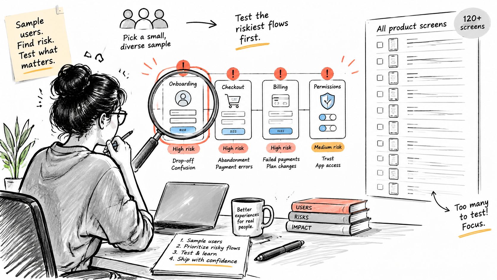
For each ranked flow, write task scenarios that cover the primary path, recoverable errors, boundary values, interrupted sessions and alternate device sizes. Then run a qualitative round with five representative users, fix the highest-severity findings and retest the changed flow. Nielsen Norman Group's guidance on how many test users treats five as a practical baseline for qualitative work, and is explicit that it isn't a conversion estimate: quantitative measures need at least 20 users, with larger samples for tighter confidence.
How many people does that take? Fewer than teams budget for, provided you retest.
Then write the ticket so nobody has to ask you what happened.
- User goal. What the person was trying to finish, in their words, not the screen name.
- State and data. The exact record, permission level or empty condition that produced the defect.
- Reproduction steps. Numbered, starting from a clean session.
- Expected versus observed. The token or value the design specifies next to what the build rendered.
- Severity and evidence. Screenshot, browser, viewport, and whether a primary journey is blocked.
- Type. A design system violation or a one-off implementation defect, because the fixes differ.
Track task-completion rate, critical-error rate, time on task and abandonment, and keep first-attempt success separate from success after help. Four pitfalls eat the value of a round: prototypes with unrealistic data, no returning-user scenario, duplicate symptoms counted as separate problems, and a facilitator who rescues a participant too early.
Every finding should map to a design decision, an acceptance criterion or a regression test. If it maps to none of those, it's an observation, and observations don't get fixed. A test case creation guide is the right home for the ones that graduate.
Handoff Workflow Between Designers, PMs, QA and Engineers
Six stages, one owner each, one artifact leaving each stage.
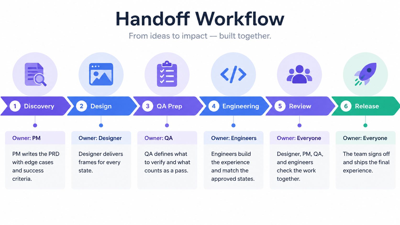
| Stage | Owner | Artifact handed over | Sign-off |
|---|---|---|---|
| Discovery | PM | PRD with edge cases and success criteria | PM and designer agree on scope |
| Design | Designer | Frames for every state, tokens and annotations | Design review with QA attending |
| Pre-build | QA and engineer | Acceptance criteria and test cases per state | Engineer confirms feasibility |
| Build | Engineer | Components with accessible names | Designer spot-checks against frames |
| Pre-release QA | QA | Defect log with severity and reproduction steps | QA lead approves; Level A failures block |
| Release | PM | Go or no-go decision with open issues | PM accepts remaining Medium and Low risk in writing |
The rework mechanism is worth naming plainly. A missing state found during build sends the work back through three roles. The same state found at design review costs one frame edit and a sentence in the PRD. That asymmetry is the whole argument for the gate, and it's why developer handoff best practices keep circling back to completeness at the source rather than speed at the destination.
Who absorbs that rework? Usually the people who didn't make the decision. The engineer invents a hover state at 6pm, QA writes reproduction steps for behavior nobody specified, and the designer reopens a file they closed two weeks ago. The handoff is cheap only when each artifact is complete as it leaves its stage, and the cost of an incomplete artifact is paid by whoever receives it.
The stakes are easier to see at the journey level. Accessibility.com's December 2025 litigation recap records 170 U.S. federal disability-access cases filed across 15 states in that month, with 86% involving users unable to complete a purchase. A screen can match its frame and still lose the order.
This is the same discipline creative teams apply when they turn product photos into ad variants: define the approved version once, then check every produced asset against it rather than judging each one by feel.
Set Up Your First Design QA Gate This Sprint
Pick one live flow, not a whole product. Checkout and onboarding hide the most empty, error and permission states, so a first pass there shows you how many open questions the team has been carrying in its head.
Run the checklist from the first section against the newest screens in that flow before the next handoff. Expect a short list of questions and a longer list of missing states. Both are the output.
The gate, in one sentence: no build moves to pre-release QA until the PM and the designer have signed the states list and every Level A failure is closed.
Designers still review, refine and apply judgment before anything ships, so the gate supports that review rather than replacing it. It just moves the review to the point where a change costs a frame edit. When questions and assumptions surface before design continues, the states list starts from explicit questions instead of memory, which is how Figr works through a flow before committing to screens.
Which flow would you pick? The one with the most states, not the one with the most screens.
Assign an owner to each checklist row and book a 30-minute review before the first design handoff of the next sprint. Thirty minutes now, or three roles reopening the same ticket later.
The checklist, the thresholds and the handoff table are all things Figr can generate for your product rather than borrow from a template: it captures your live app, reads your design system and tokens, then produces the states list, the edge cases and the test cases your team argues about in review. Bring one flow to it this week and compare the output against the list you'd have written from memory. Visit Figr to see how the artifacts hold up before your next handoff.