
Your release dashboard is green, but the checkout button is floating above its label. The team tested the purchase flow, confirmed the payment response, and merged the change.
Customers still encounter clipped prices, overlapping text, and controls that disappear on smaller screens. A product manager ends up asking why a fully tested release needs an emergency CSS fix.
Visual regression testing adds evidence about what users see. Its value depends on a visual approval contract: stable captures, explicit comparison rules, and someone accountable for deciding which changes belong.
How Visual Regression Testing Compares Two Screenshots
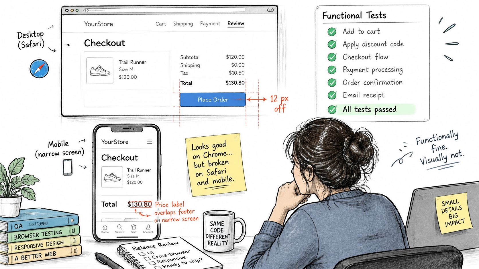
A checkout flow passes its functional tests, but the button appears in a different place in Safari and a price label overlaps the footer on a narrow screen. The purchase assertion still passes because it checks whether the transaction works, not whether the page looks right.
A product manager may confirm that checkout completes while a designer spots the displaced button. Both observations can be correct: functional tests and visual comparisons examine different properties of the interface.
The comparison loop
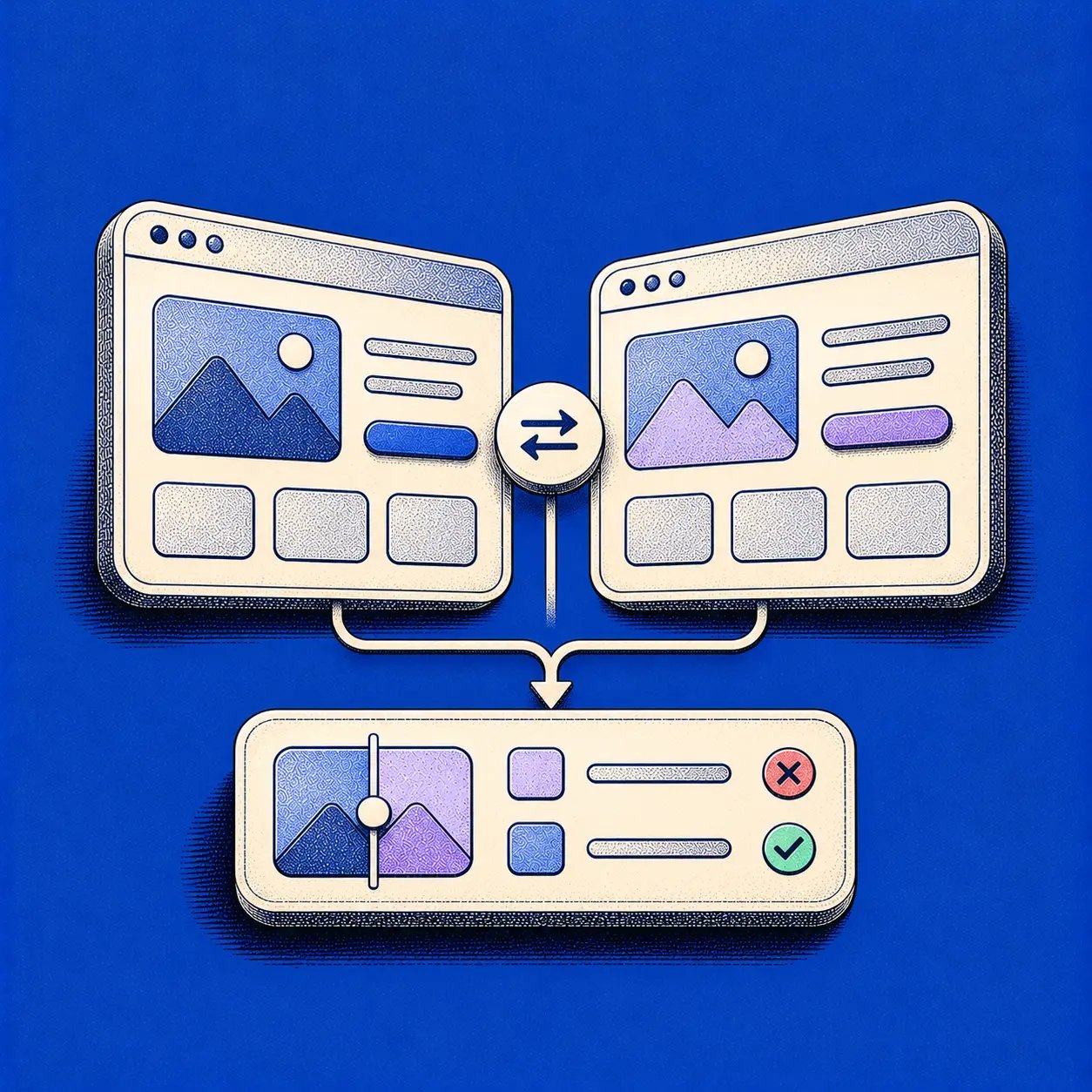
Visual regression testing compares a newly rendered screen with an approved reference. The reference is the baseline; the new capture is the candidate.
- Capture the baseline. Render the expected interface under controlled conditions, then approve the screenshot.
- Capture the candidate. Render the changed build using the same configuration.
- Generate the diff. Compare the images pixel by pixel or with a perceptual method, then inspect the highlighted changes.
Matching HTML or JSX does not guarantee matching appearance. CSS inheritance, font substitution, and responsive rules can shift layout, change color or typography, alter spacing, or hide an element, even when a structural assertion still passes.
The comparison works like proofreading a printed page against an approved master. A changed mark draws attention; a person decides whether it is a mistake or an intended edit. The tool flags differences, while the team governs which changes are accepted into the baseline.
Practical rule: Treat every detected difference as a review decision, not automatic proof of a defect.
Two settings shape the result: how sensitive the comparison is to pixel-level variation, and how much of the image must change to trigger a failure. A small rendering variation across text may be noise, while a small missing checkout control can matter greatly. Thresholds should reflect the page and the risk, rather than being loosened until every test passes.
A 2017 systematic literature review examined 31 studies; screenshot-based visual analysis appeared in 16 studies, or 51.6%.
Ask whether a screenshot of a recently broken page would have exposed the defect before release. A visual check can reveal what changed, but it cannot confirm that interactions work or that the interface is accessible.
When Visual Regression Testing Earns Its Place
Is this worth the baseline upkeep?
Usually, yes, when appearance can deteriorate independently of behavior. The strongest candidates have stable expectations and a meaningful cost when users encounter visual defects.
- Shared components. A navigation, button, or modal change can affect routes its author never opens.
- Frequent style refactors. Teams need evidence that reorganizing CSS hasn't altered approved layouts.
- Responsive workflows. A narrow checkout and a wide dashboard can fail independently.
The connection to product outcomes is straightforward. CIQRA's guide to creating intuitive online shopping experiences provides useful context for treating interface clarity as part of the purchase experience.
Visual evidence also requires careful interpretation. A 2021 ACM study of Android visual GUI testing reported a 30% increase in passing tests using full-screen visual locators, with limited additional computational burden. That finding concerns mobile element identification, not a promised improvement from browser screenshot regression.
Invest where users expect stability and developers routinely change shared presentation code.
Defer broad screenshot coverage for a page undergoing constant redesign. Protect its stable components instead, and reduce release risks with UI test automation across its behavior.
Ask whether recent user-reported visual bugs would survive your current functional assertions. If they would, you've found a coverage gap worth testing.
Tool Types and What Each One Misses
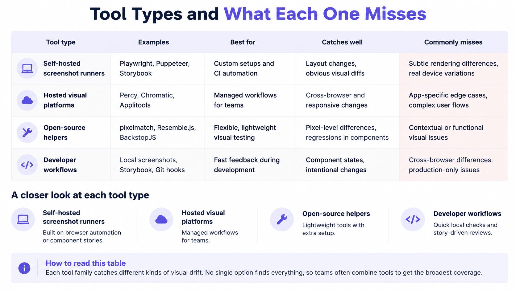
Visual testing tool types compared
| Tool type | What it compares | Catches well | Misses |
|---|---|---|---|
| Self-hosted screenshot runner | Rendered pages or component stories against committed baselines | Full control of the environment and no per-screenshot service fees | Baseline review and noise tuning stay with your team |
| Hosted visual review service | Snapshots from cloud browser grids against approved images | Cross-browser coverage and a reviewer workflow | Recurring cost, and images leave your network |
| Pixel-diff library | Raw image difference between two files | Transparent and cheap to start | Perceptual tolerance, a review interface, and reporting, all of which you build yourself |
| Design-to-build comparison | Design file against the live interface | Spec drift before code ships | Real data states, permissions, and responsive behavior outside the supplied comparison |
Read each row as a division of responsibility. Which work does the tool handle, and which work will your team still own?
Choose the operating model
A self-hosted runner, such as a Playwright screenshot workflow, fits teams that need control over browser images, test data, and artifact storage. There's no screenshot-service charge, but your engineers still maintain the infrastructure and approval experience.
A hosted visual platform can provide browser coverage and an accessible review queue. Inspect its capture architecture before choosing it: determine what screenshots or page assets leave your environment, who can view them, and how reviewers approve changes.
A pixel-diff library is useful when you already have image files and want transparent comparison behavior. The initial integration can be small. Building a usable system around it requires artifact retention, failure reporting, branch-aware baselines, and a place to inspect differences.
Design-to-build comparison answers whether implementation matches intended design. It can expose an incorrect spacing choice already present in the first build, which a historical baseline would preserve. A comparison against a static design still needs explicit coverage for permissions, live content, and responsive states.
Use the same procurement lens you apply to test management and browser automation tools: evaluate maintenance ownership alongside capability.
Keep accessibility evidence separate
Can a matching screenshot prove that a dialog announces its title?
It can't. Screenshots don't establish accessible names, screen-reader announcements, keyboard behavior, or semantic correctness. The ACM paper on accessibility-relevant visual changes supports combining visual evidence with DOM- and behavior-level accessibility checks.
Capture visible focus and zoomed layouts, then test keyboard flows and accessibility rules separately. Functional tests must still verify that controls perform their intended actions.
Match the tool to the surface that breaks most often, rather than the longest feature list.
How to Set Up Your First Visual Test
A team changes a dashboard, and the next pull request shows a screenshot diff. Before anyone can tell whether the change is intentional, the test must capture the same page under repeatable conditions and give reviewers a clear way to approve the result.
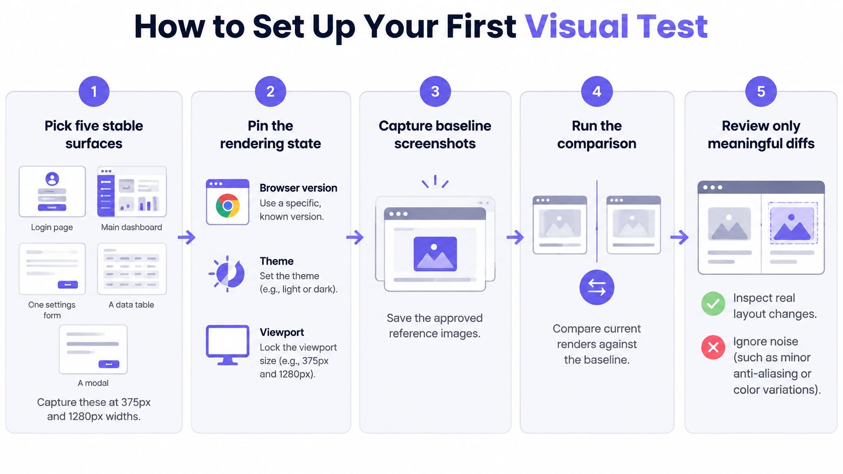
Start with a small pilot: five stable surfaces, each captured at 375px and 1280px. These are useful starting settings, not universal device coverage.
Build a reproducible capture
Step 1. Pick stable surfaces. Start with a login page, main dashboard, settings form, data table, and modal. Name each capture with its route, state, and viewport so a failure points reviewers to the right context.
Step 2. Pin the rendering state. Record the browser version, device-pixel ratio, locale, color scheme, and viewport in the test configuration. Keep separate baselines for configurations that are meant to render differently.
Step 3. Seed the data. Mock API responses and the clock, including account details, counts, dates, and image references. When inputs stay fixed, reviewers can focus on changes caused by the build rather than different customer data.
Step 4. Freeze motion and await assets. Disable animations and wait for fonts and critical images to load. Check that the expected page state is visible instead of relying on an arbitrary sleep.
Chromium's pixel-testing guidance recommends disabling animations, using mock data, and testing the smallest useful surface area. A component capture can be easier to diagnose than a full-page capture of a scrolling application.
Define the decision and review path
Step 5. Capture and commit the baseline. Compare the initial image with the intended experience before saving it alongside the code. Keep the baseline branch-specific so unrelated feature work does not unexpectedly change what the test expects.
Step 6. Set both thresholds. TestingBot's Selenium visual-testing documentation describes a color-difference threshold from 0 to 1, where lower values mean stricter comparison, and a separate limit on differing pixels. Document both settings. Test them with a harmless rendering variation and a deliberately broken layout so the team can see what each threshold allows through.
Step 7. Run on every pull request. Show the expected image, candidate, and diff together. Require a reviewer to approve or investigate every unexplained difference before merging.
A useful test description names the user state, expected appearance, and person responsible for a failure. Apply the same clarity you would when creating test cases for product teams.
For preview captures, make the deployment address and build identity explicit so reviewers know which environment and version produced the screenshots. If you need to deploy your app to Vercel, record that preview target in the capture configuration.
Finally, require identical results across three consecutive unchanged runs, then introduce a deliberate layout change. Confirm that the test flags it and that the reviewer can approve the intended result. Keep the pilot small until both parts work: the comparison detects a real change, and the approval process gives the team a trustworthy way to handle it.
Why Tests Fail When Nothing Changed
When unchanged code repeatedly fails, reviewers start approving screenshots without inspecting them. The next real regression can pass through the same habit.
Who can carefully review a queue dominated by irrelevant changes?
Percy's visual-testing workflow addresses the need to manage rendering variation before meaningful comparison. Typical noise sources include animation, changing content, font loading, and differences between browser environments.
Noise sources and their controls
| Noise source | What the diff shows | Control |
|---|---|---|
| Animations and GIFs | Intermediate frames differ on each run | Freeze motion or wait for it to finish |
| Timestamps and live counters | Text changes on every run | Mask the region and assert its format separately |
| Asynchronous data | Layout jumps as rows load | Wait for network idle and mock responses |
| Font loading | Glyph widths shift before fonts arrive | Wait for document fonts to be ready before capture |
| Anti-aliasing and subpixel positioning | Scattered single-pixel differences | Use perceptual comparison for text-heavy pages |
| Rotating content | A different carousel slide on each run | Pin to the first slide with seeded content |
| Browser or OS differences | Rendering varies from machine to machine | Run every capture in one pinned container |
Diagnose the pattern before changing tolerance
A font-loading failure often affects line wrapping across the page. Increasing the allowed difference might make the test pass while leaving the capture process unreliable.
Likewise, waiting for network idle helps only when the application reaches that condition. Products with polling need a specific readiness assertion, such as the expected table rows appearing.
For cross-browser coverage, pin each browser environment separately. Comparing a Safari candidate with a Chromium baseline confuses intentional environment differences with regressions.
Masking requires restraint. Hiding an entire live-content panel could conceal an overlapping badge or a broken container. Prefer deterministic content; when masking is necessary, keep the excluded area narrow and test its behavior independently.
Every ignored region is a coverage decision. Give it an owner and a reason.
Tune for the asset, then classify the failure
Use exact or low-tolerance comparison for icons and design-system tokens when subtle changes matter. Text-heavy pages may need perceptual or structure-aware comparison to tolerate harmless rasterization differences.
Don't choose sensitivity solely by making existing failures disappear. Introduce representative defects, such as a clipped heading or missing icon, and verify that your chosen settings still catch them.
Classify each reviewed diff as intentional change, environmental noise, or regression. When noise recurs, fix its fixture or environment instead of approving the same distraction again.
The economic issue is reviewer attention. A stricter suite only improves release confidence when people can afford to inspect its failures.
Testing Dynamic SaaS States Without Hiding Defects
A SaaS dashboard looks different for every account. Live counts, localized dates, permission-specific controls, notifications, and experiments can all change its appearance.
What exactly should an approved dashboard screenshot represent?
Define a named scenario with controlled inputs. The browser-QA guidance on visual and accessibility testing highlights deterministic states, explicit checks for excluded regions, and inconclusive results when baselines are missing.
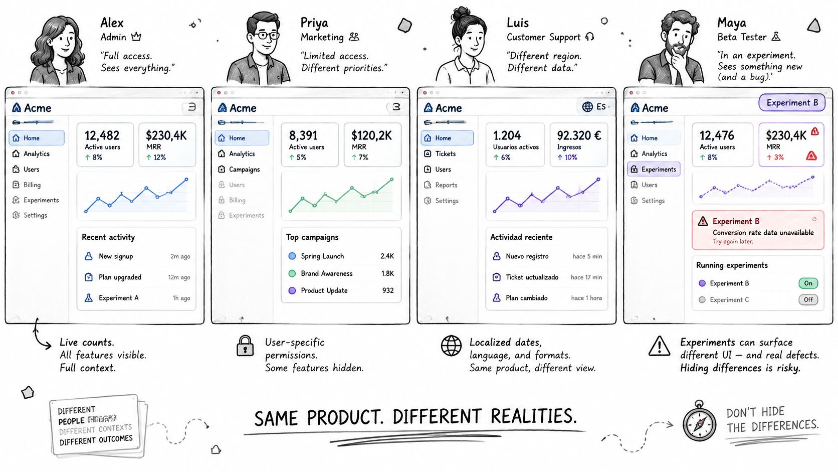
Make each state explainable
Dynamic states and how to test them
| State | How to make it deterministic | Assert separately |
|---|---|---|
| Empty dashboard | Seed zero records | Empty-state copy and call to action are present |
| Loading | Delay the mocked response by a fixed interval | Skeleton shows and no layout jump occurs |
| Error | Return a fixed HTTP 500 fixture | Error message and recovery action render |
| Long content | Seed maximum-length names and values | Text truncates without overflow |
| Permission personas | Log in as admin, editor, viewer, and guest | Restricted controls are absent for each role |
| Dark mode | Set the color scheme explicitly | Contrast tokens hold against the light baseline |
Treat the error response and viewport choices as test fixtures, not assumptions about production behavior. Capture loading deliberately while the mocked response is pending; capture the settled layout after resolution.
For permissions, use an explicit role-to-control expectation. An editor may retain actions a viewer must never see. Checking that every restricted control disappears for every role would encode the wrong product rule.
Dark mode needs its own approved image. Compare its theme-token expectations with the light baseline, then use computed-color checks for contrast rather than inferring accessibility from appearance.
Give exclusions their own evidence
A masked timestamp still needs an assertion that it exists and uses the intended format. A masked counter needs a behavior check showing that it updates correctly.
Explainable failures are the objective. Fewer failures are useful only when they reflect better control, rather than less coverage.
Use Figr's guide to UX edge cases to identify scenarios your happy-path screenshots omit. Include overflowing content and experiment assignments when those states change layout.
If a baseline is missing, mark the result inconclusive and request review. There's no approved reference against which to claim success.
Start with the three states generating the most support tickets as a practical prioritization exercise. They connect coverage to problems users already experience.
Who Approves Baseline Changes and Why It Matters
Baseline approval distributes authority over the product's expected appearance. Once someone accepts an image, future matching captures can pass.
That creates an incentive problem. A developer trying to unblock a merge may approve a difference that a designer would question. Without ownership, the fastest reviewer can become the accidental decision-maker.
Chromium's pixel-test documentation warns that baseline configuration must accompany UI changes; otherwise, a regression introducing a new element can pass against an older tested surface. Its review workflow exposes expected and actual images for acceptance or rejection.
Make the approval contract explicit
- Capture and compare. Attach the candidate, expected image, and diff to the relevant change.
- Inspect the evidence. Review the complete affected component or page, not only highlighted pixels.
- Approve or reject. Link acceptance to a requirement, design decision, or experiment assignment.
- Persist the approved state. Store the accepted baseline with the matching code and test configuration.
An intentional design-system change should update its baseline in the same pull request. An unplanned difference should block merging or enter a documented triage path.
Assign shared-component sign-off to a designer or QA lead. Feature teams can own their pages, with escalation when a local change affects common components. Who resolves disagreement when both groups believe the change is acceptable?
Name that decision-maker before the release is waiting.
Measure whether reviewers still trust the gate
Track false positives per week alongside escaped visual defects found after release. These are operating measures to collect, not industry benchmarks.
If noise rises, inspect capture controls. If escaped defects rise while failures disappear, inspect missing states, permissive thresholds, and approval quality.
Teams also need to communicate design system updates so downstream reviewers understand why a widespread change is intentional.
A baseline nobody can explain becomes an undocumented source of truth.
In short, the tool records differences, while people define acceptable change. Preserve the reason for each acceptance so the next reviewer can distinguish deliberate evolution from accumulated drift.
Confirm Your First Baseline This Week
Use the coming week as a bounded pilot rather than a coverage campaign. The proposed schedule below tests your process before you invest in more screenshots.
A small release rehearsal
Day 1. Capture known trouble spots. Pick three routes that already cause concern, such as checkout, onboarding, and admin settings. Apply pinned rendering rules and inspect the initial images against the intended product experience.
Day 3. Exercise real reviews. Commit the baselines and run the suite on two pull requests. Log every failure in a shared sheet with its route, diff image, classification, and reviewing owner.
Day 7. Audit the noise. Count failures attributable to known environmental causes and examine recurring patterns. If reviewers are repeatedly approving noise, repair those controls before adding another route.
Define the checkpoint
Can the team explain why its baseline is correct, why a candidate failed, and who can accept the change?
Your checkpoint is one stable route, a documented pair of thresholds, and a named baseline approver. Keep its functional assertions and accessibility checks active throughout the pilot.
If the pilot exposes missing product decisions, resolve them before treating the screenshot as authoritative. A clean image can't settle whether the underlying flow makes sense.
Figr lets you review existing UX and test flows before launch, addressing product questions before screenshot regression protects the implemented screens.
Bring the pilot's evidence to the next release review. Ask the named approver to accept the stable baseline, record the decision, and choose the next route based on an actual failure pattern.
Use Figr to review an existing flow, map its missing states, and draft test scenarios before launch. Bring the screens and product requirements for your pilot route, then use those decisions to define what your visual regression baseline should protect.