

Your team can ship a good model and still fail users with a weak AI assistant UI.
That failure usually appears in ordinary moments, a stalled search bar, a draft that sounds confident but feels wrong, a support assistant that forgets what the customer just clarified. People stop trusting the feature long before they stop using the product. They open a ticket, retry the same prompt, or leave the workflow entirely.
A stronger approach starts with states, memory, and product context. When an assistant understands the screens, tokens, docs, and prior decisions around a task, the interface can guide users through loading, uncertainty, correction, and recovery instead of pretending those moments don't exist.
Understanding AI Assistant UI
AI assistant UI is the operating surface for trust, not a chat box pasted into your app.
I watched a Product Manager at a Series C company demo an in-product support assistant that looked polished for exactly ten seconds. A user asked a simple account question, the field froze, no spinner appeared, and the result arrived as a long answer with no source cue, no confidence signal, and no next action. The room got quiet because everyone could feel the same thing: if the interface hesitates without explanation, users assume the system is guessing.
That moment is common now because usage expectations changed fast. Comscore reported that mobile visitation to leading AI assistant destinations reached 54.3 million unique visitors in December 2025, up 107% year over year. People have learned a new interaction habit. They expect to ask, refine, and recover inside a conversational flow.
A lot of teams still treat that expectation like a frontend problem.
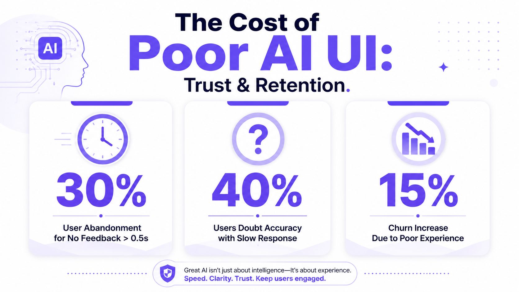
The hidden failure is state debt
The visible UI is only part of the job. The underlying work sits underneath, in how the assistant behaves when it's unsure, when retrieval comes back thin, when the answer needs correction, or when a user changes intent midstream.
I keep seeing the same pattern in support and productivity products:
Loading feels blank: users think the assistant missed the query.
Results feel overconfident: the answer reads cleanly but skips uncertainty.
Correction feels expensive: users must retype context instead of steering the answer.
Recovery feels absent: there's no clear path back from a weak result.
Practical rule: If a user can't tell whether the assistant is working, uncertain, or done, the interface is under-designed.
If you want a broader framing of how visual conventions shape trust, this primer on AI UI is a useful companion.
The stronger pattern is a guided one. That's why I like the framing in Figr's piece on AI UX assistants, which focuses on assistants that move users through a product task instead of acting like detached chat widgets. The basic gist is this: the assistant should feel native to the workflow it serves.
What good looks like inside a product
Good AI assistant UI reduces ambiguity at every turn. It shows what's happening, what the system used, what the user can do next, and how to reverse a bad move. In-product support AI needs source cues and recovery paths. Productivity AI needs draft steering, version visibility, and lightweight corrections.
That's why Gmail-style tone controls are so instructive. The answer isn't “done” when text appears. It's done when the user can shape tone, review changes, and keep momentum without starting over.
Search Functionality in AI Assistant
Search functionality is the backbone of AI assistant UI because every answer depends on retrieval quality, timing, and framing.
When users type into an assistant, they don't care whether your stack splits the job into query parsing, ranking, filters, or synonym expansion. They care whether the result feels relevant, current, and steerable. But product teams do need to understand the machinery, because most trust problems start there.
The search path usually breaks into six interacting components.
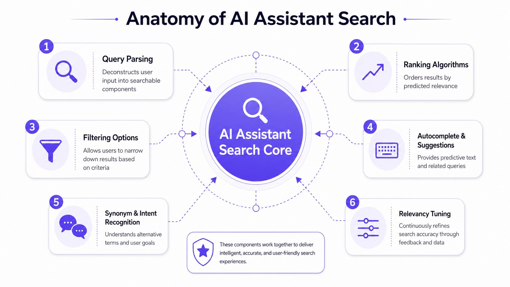
Where search quality actually comes from
Query parsing: turns messy language into usable intent.
Ranking algorithms: decide which results deserve attention first.
Filtering options: help users narrow a broad ask without rephrasing everything.
Autocomplete and suggestions: reduce prompt effort and guide discoverability.
Synonym and intent recognition: catch the words users don't know your product uses.
Relevancy tuning: adjusts the whole system based on observed outcomes.
Those pieces need UI support. A parsed query may still need a visible refinement chip. Ranking logic may still need a freshness tag. Synonym handling may still need a “show results for…” nudge. Search relevance is technical, but confidence is visual.
A useful reference for the product-side setup work is Figr's guide for product managers, especially if you're trying to define what context the assistant should carry before design or implementation starts.
Later in the flow, response behavior matters just as much as retrieval. The open source assistant-ui specifications state that production-ready chat interfaces need native handling of streaming tokens and auto-scrolling to preserve continuity and trust. That matches what teams learn the hard way. Static pauses feel broken. Progressive response feels alive.
Here's a practical walkthrough of how those moving parts come together in interface terms:
The trade-off most teams miss
The trade-off isn't “search versus chat.” It's precision versus cognitive load.
If you expose every filter and retrieval hint at once, the assistant starts to feel like an old search console. If you hide too much, users can't steer weak results. The best pattern I've seen is gradual disclosure. Show one or two high-value controls when confidence is low or result breadth is high. Keep the default interaction light.
A search assistant earns trust when the user can feel the system narrowing the space with them.
Breaking Down Technical Components
A usable assistant search experience comes from shipping the technical pieces in a deliberate order.
Teams often scope AI search as one feature. That's a mistake. The cleaner way is to break it into components that can be designed, tested, and tuned independently. That creates better tickets and fewer surprises in QA.
A phased build that teams can actually ship
Step 1. Start with query parsing.
Define what your assistant should recognize in natural language, including product nouns, synonyms, and common shorthand.
Write examples from real support logs, analytics, and internal docs.
Design visible refinements for ambiguous intent, such as chips or clarification prompts.
Step 2. Add ranking logic that can be explained.
Decide what matters most for the first release: freshness, authority, behavioral popularity, or task completion relevance.
Expose supporting cues in the UI, such as source labels or updated timestamps.
Avoid “magic” answers that can't show why they appeared.
Step 3. Design autocomplete as guidance, not decoration.
Suggest likely intents based on product workflows, not generic language completion.
Use suggestions to teach users how the assistant thinks.
Keep the list short enough that it reduces effort instead of adding noise.
Step 4. Treat filters as rescue tools.
Filters help when retrieval is broad, not as permanent chrome around the assistant.
Surface them when the assistant detects category spread or mixed confidence.
Design them to preserve the query, so users can recover without retyping.
Step 5. Tune synonyms and intent handling continuously.
Review failed searches and awkward follow-ups.
Map product language against customer language.
Update the retrieval layer and the visible helper text together.
Small examples beat broad ambitions
A support assistant might parse “refund status for annual plan” into billing, subscription, and timing. A productivity assistant inside email might parse “make this less harsh” into tone adjustment, not a new draft. Those are different intents, so they need different follow-up states.
For design handoff, I like grounding these behaviors in component systems rather than loose mockups. Figr on auto-generating design system components is useful here because assistant states spread fast across chips, callouts, composer states, source cards, and undo bars. If those elements aren't tied back to the system, every iteration creates new drift.
A short personal vignette here matters because I've seen this go wrong in a very ordinary way. A Designer once showed me a beautiful assistant panel with excellent happy-path responses. Then we walked through a malformed query, a weak retrieval hit, and a user edit after streaming started. The UI didn't collapse because the model failed. It collapsed because the team had never broken the feature into technical and interaction layers.
UX Patterns for Assistant Search
Strong AI assistant UI depends on visible states for loading, empty, low-confidence, correction, and undo.
Most product teams have decent patterns for empty states and errors in standard forms. They have weaker patterns for AI-specific ambiguity. That's where search assistants lose trust. A result can be fluent and still be risky. A user can need revision, not replacement. The interface has to acknowledge that.
The state map that changes outcomes
I'd map assistant search states like this:
Loading: show progress immediately, then stream if possible
Empty result: suggest narrower prompts or adjacent actions
Low confidence: label uncertainty and offer refinement paths
Correction: let users steer the output without restarting
Error: explain what failed and what remains available
Undo: make reversal cheap and obvious
That correction layer matters more than teams assume. The Aydesign pattern for inline diff and undo argues that every agent modification should appear as a visible diff with one-click undo at the line, block, or session level. I agree with that instinct, especially in productivity AI. Reversibility should feel normal, not catastrophic.
A concrete example helps. In this Gmail AI draft with tone control gallery concept, the useful pattern isn't just the draft itself. It's the presence of steering controls around tone, which lowers the cost of saying “closer, but not quite.”
Generative UI raises the bar
The next layer is harder. Some assistants don't just answer. They assemble UI around the answer.
Standard Beagle's write-up on AI-generated interfaces points out that most UX guides neglect generative UI that dynamically renders functional interfaces based on context. That gap is real. Once an assistant starts rendering action cards, forms, or next-step controls, your design system and validation logic can't live outside the assistant experience.
That's where Figr's insights on AI design become useful, especially for turning ambiguous assistant outputs into grounded, product-shaped interface patterns rather than standalone text.
The assistant should reveal uncertainty with the same care that it reveals confidence.
A practical pattern for support and productivity AI
For in-product support AI, I'd show source freshness, article type, and a lightweight “did this answer your question?” path. For productivity AI, I'd show diffs, tone controls, and selective regenerate options. Both need correction loops that preserve user intent.
The zoom-out matters here. At scale, these patterns change operating costs. Every unclear answer creates support work. Every expensive correction adds friction to product adoption. Teams feel this first in tickets and retries, then in churn and roadmap drag.
Performance Accessibility and Security
Performance, accessibility, and security shape whether an assistant feels dependable under real usage.
A flashy prototype hides these trade-offs. Production usage reveals them in minutes. If streaming stutters, users lose the thread. If keyboard focus disappears when cards re-render, the interface becomes fragile. If your model can emit arbitrary UI without controls, you've created a security and trust problem at the same time.
Why rendering architecture matters
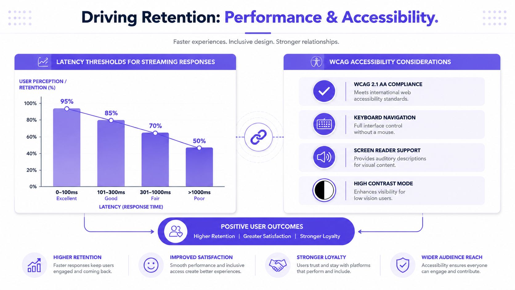
The assistant-ui generative UI documentation makes a practical point: separating UI specification as JSON from rendering logic reduces latency in multi-step tasks by decoupling reasoning from paint cycles, enabling streaming updates without blocking. That architecture matters when the assistant needs to think, render partial results, and continue without freezing the frontend.
The same documentation also calls for an allowlist model when resolving components. That's one of the clearest security patterns for generative UI. The model can suggest a component tree, but the product controls what's allowed to render.
Here's how I compare two common approaches:
Approach: Static chat UI with minimal state handling
What works: Faster to prototype, easier to reason about
What breaks: Feels brittle when tasks become multi-step
Approach: Dynamic generative UI with controlled components
What works: Better for action-oriented flows and contextual forms
What breaks: Requires strict component governance and stronger QA
Minimalism helps people think
The assistant-ui GitHub guidance also emphasizes a clutter-free interface, visible AI identity cues, and CTA buttons in responses, noting that goal-based CTAs can shorten conversation loops by 30-40%. That number lines up with what I've seen in practice. When a user can verify, apply, or refine with one click, the assistant stays inside the task instead of turning into a transcription burden.
For teams thinking about security posture around AI tools, I've found it useful to review examples like Donely's commitment to security, not for a product comparison, but as a reminder that permission boundaries, data handling, and visible operational controls need to be part of the interface conversation early.
Accessibility needs explicit design, not good intentions
Assistants re-render often. That means focus states, screen reader announcements, keyboard order, and contrast choices should be designed as part of the state system. If loading, error, and suggestion panels all look distinct visually but announce poorly, many users lose context.
A minimalist surface usually performs better here because it gives each state room to speak clearly. Fewer decorative elements. More predictable hierarchy. Better labeling. That discipline helps everyone, not only users with accessibility needs.
Measuring Success and Relevancy Tuning
You measure AI assistant UI by how often users reach a useful next step with minimal repair work.
Vanity metrics hide a lot in assistant products. Message count can rise because people are confused. Session length can increase because users are stuck. The signals that matter are the ones that reveal clarity, correction cost, and outcome quality.
The metrics worth instrumenting
I'd track these buckets first:
Time to first useful result: not first token, useful result
Suggestion interaction: whether autocomplete or refinement chips help
Correction rate: how often users need to redirect, edit, or retry
Recovery success: whether a low-confidence answer can be salvaged
Task completion: whether the user finishes the intended job
Satisfaction signal: lightweight feedback tied to the specific turn
Personalization matters when it's grounded in product context. Veza Digital reports that AI-driven adaptation in UX design delivers a verified 10-25% conversion lift, and that AI-assisted prototyping reduces time requirements by over 50%. Those numbers are useful because they push teams past generic “AI is useful” thinking. Better tuning and better prototyping speed only matter when they improve a real workflow.
Relevancy tuning is product work
The assistant learns from retrieval failures, but the product team has to decide what “better” means. Sometimes relevance means the newest source. Sometimes it means the safest answer. Sometimes it means showing three plausible paths instead of one polished guess.
This is what I mean by tuning as product work:
A support assistant may prefer authoritative docs over conversational fluency.
A productivity assistant may prefer editable drafts over perfect-looking drafts.
A recommendation assistant may need source freshness shown up front, like this Perplexity source freshness tags example.
Field note: If users keep correcting the same answer style, that's a UI signal as much as a model signal.
The economics become obvious at scale. A team that measures correction loops well can reduce wasted prompts, support escalations, and design churn. A team that doesn't ends up debating taste instead of observing behavior.
Testing A B Strategies and Prioritization
A B testing for assistant interfaces works when the hypothesis is tied to a specific state, not a vague promise of “better AI.”
The worst assistant experiments bundle too many variables. New prompt copy, new source card layout, new loading animation, and new model settings all launch together. Nobody learns much. The cleaner move is to test one state behavior at a time.
A lot of this starts with memory. Think.Design notes that 78% of users abandon intelligent assistants when they fail to recall prior context or require repetitive input. That's why persistent context needs testing, not just implementation. If the assistant forgets prior choices, your beautifully tested prompt chips won't save it.
A practical experiment workflow
Step 1. Write a narrow hypothesis.
Example: adding a visible low-confidence badge will improve recovery after weak retrieval.
Keep the expected behavior specific and observable.
Tie the test to one assistant state.
Step 2. Create two believable variants.
Vary one interaction pattern, not the whole assistant.
Good candidates include source freshness tags, undo placement, or refinement chips.
Keep the response quality and task scenario consistent.
Step 3. Define the winning metric before launch.
Use recovery success, correction rate, or task completion.
Avoid broad engagement metrics unless they reflect success.
Add qualitative review for confusing edge cases.
Step 4. Prioritize by impact and effort.
High-impact, low-effort state fixes should go first.
Persistent memory and correction loops usually outrank cosmetic polish.
Archive ideas that look clever but don't remove user effort.
A good supporting read here is A/B testing best practices, especially if your product team needs a repeatable way to isolate variables in design experiments.
What to prioritize first
I'd prioritize in this order for most in-product assistants:
Memory continuity
Low-confidence recovery
Undo and correction
Source visibility
Autocomplete polish
Why that order? Because users tolerate imperfect style longer than they tolerate repeated input. When an assistant remembers the task and gives users a way back from a wrong turn, the whole system feels smarter than it is.
Visual Context Graph Five Layers
The Visual Context Graph gives assistant UI design the missing layer of product reality.
A lot of AI design work still starts from prompts and screenshots. That works for inspiration. It fails for product-native assistant behavior because the interface needs more than visual resemblance. It needs the context behind the screen, including what users do, what rules the design system enforces, what the product knows, and what implementation constraints exist.
The last H2 matters because at this point product context stops being abstract.
The five layers that ground decisions
Visual context
This is the on-screen structure, hierarchy, spacing, and component composition. It tells the assistant what users see and where intervention belongs.Behavioral context
This layer captures interaction patterns, historical usage, and the way users move through the flow. It helps distinguish a common detour from a rare edge case.Design system context
Tokens, components, variants, states, and usage rules live here. Through them, consistent assistant UI stops drifting into one-off design.Product knowledge context
PRDs, research, docs, analytics, and product logic sit in this layer. It gives the assistant a factual grounding for what the feature is supposed to do.Implementation context
This includes the practical constraints of the shipped product, what can render, what patterns are supported, and what engineering boundaries apply.
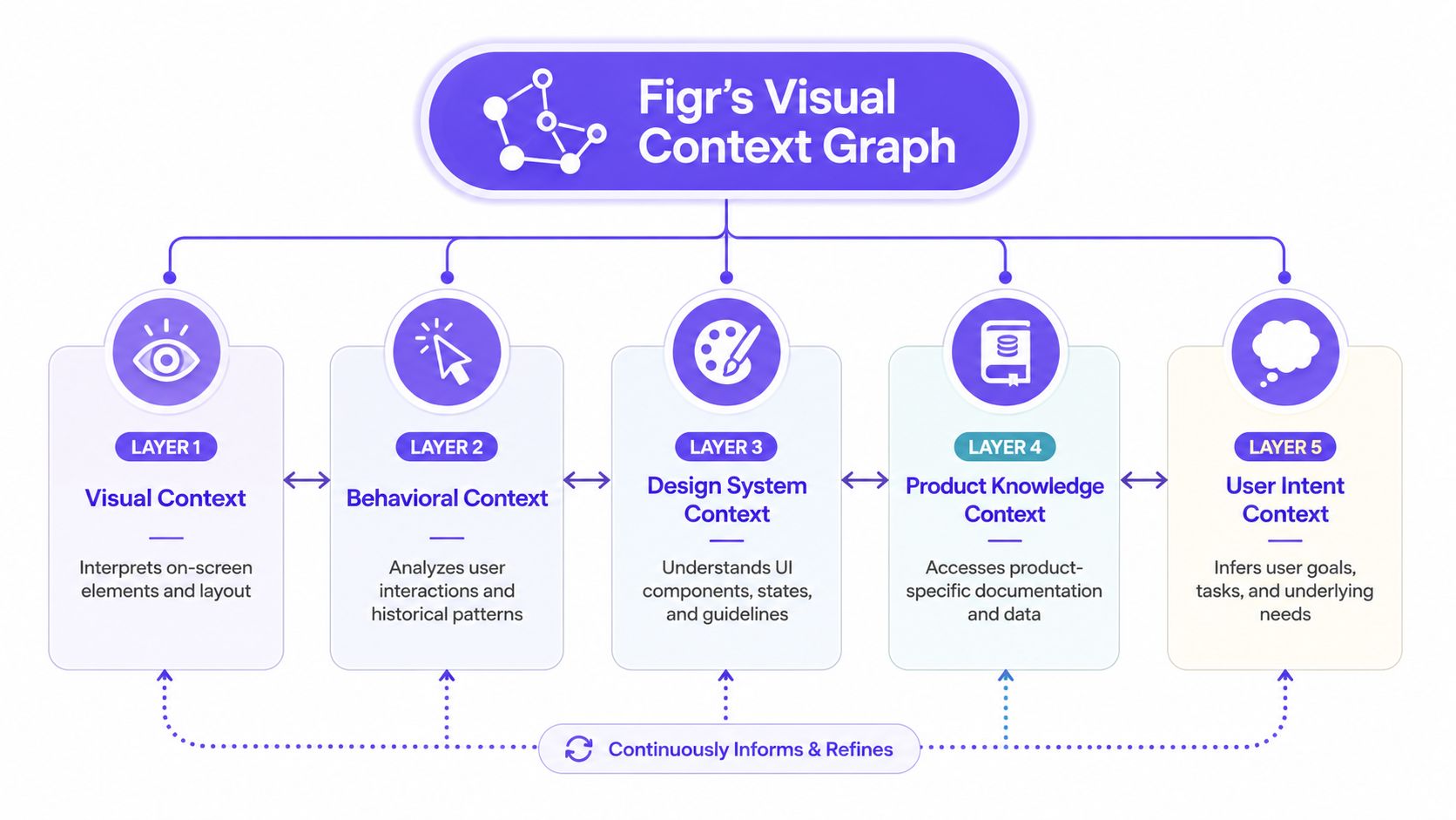
There's a naming mismatch in a lot of AI product discussions. People talk about “context” as if it were one thing. It isn't. Search relevance, correction states, source freshness, and generated controls all improve when those five layers connect.
How this changes assistant search design
In practice, one option teams use is UI design outputs, plus Refine Design for iterating specific states and Memories for cross-session recall. That combination is relevant for assistant UI because loading, low-confidence, and correction states often fail when product context disappears between sessions or artifacts.
A support assistant can use this context to show better recovery routes around policy answers. A productivity assistant can keep draft tone decisions consistent over time. A Designer gets Figma-ready artifacts tied to existing patterns instead of disconnected mockups. A Product Manager gets clearer trade-offs before handoff.
And if you're trying to design AI inside the product rather than around it, this context-first approach is why the assistant can feel native instead of bolted on.
If you're designing assistant states and want to pressure-test loading, uncertainty, correction, and memory against real product context, try Figr.
AI assistant UI fails when teams treat the answer as the product. The product is the full interaction around the answer, including how the system loads, explains itself, accepts correction, and recovers when confidence drops.
The framework I'd keep is simple. Design the states first. Make uncertainty visible. Keep correction cheap. Measure usefulness over novelty. Ground every assistant behavior in product context instead of generic prompt behavior.
That's also why edge cases deserve first-class design time. If you want a practical next step, review your current assistant against the patterns in edge cases for AI product flows. Then audit one real workflow, support search or draft generation works well, and map every state a user can hit after the first prompt.
If the current interface can't explain what it's doing, what it knows, and how to fix a weak result, start there. Then try Figr.
FAQ
What is AI assistant UI in a product?
I think of AI assistant UI as the set of interaction states around an assistant, not just the chat surface. It includes loading, uncertainty, correction, undo, source cues, and next actions.
How do I make an assistant search experience feel trustworthy?
Show progress quickly, label low-confidence moments, preserve prior context, and give users easy ways to refine or undo. Trust grows when recovery is cheap.
Should every AI assistant look like chat?
No. I'd use chat when exploration matters, but many product tasks need action cards, filters, diffs, or embedded controls around the conversation.
What should I test first in an assistant UI?
I'd start with memory continuity, low-confidence recovery, and correction flows. Those break trust faster than visual polish issues.
How do designers and Product Managers work together on this?
I'd align on state coverage, success metrics, and product constraints before styling the interface. The best assistant UI decisions sit between workflow design and interaction design.