It's Tuesday morning. You’re mapping out a user flow for a new AI feature, but the familiar boxes and arrows feel wrong. You’re not just diagramming clicks. You’re choreographing predictions, conversations, and corrections. The old way is like handing someone a paper map with one route drawn in pen. An AI interface is a live GPS, constantly recalculating based on the immediate reality.
Designing software isn't a conveyor belt anymore; it's a switchboard.
Your Interface Is Now A Conversation
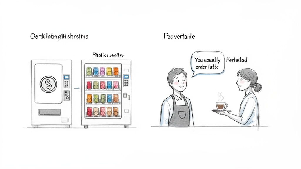
This shift changes the very nature of an interface. We are moving from designing a vending machine to designing a skilled barista.
The vending machine is a simple instrument. You put in a coin, press B4, and a soda comes out. The user gives a direct command, and the machine executes it. It's reliable but completely rigid. It can’t learn you prefer diet soda on Thursdays or that you might want water if it’s hot outside. This is the world of traditional UI.
The barista is a partner. They learn your name, remember your usual order, and might suggest a new blend they think you’ll like. They understand context. If you say, “the usual, but make it stronger today,” they know exactly what to do. This is the heart of AI user interface design.
The Rise of Anticipatory Design
This new model is what I call Anticipatory Design. It’s an approach where the interface serves up what the user needs before they have to ask for it. It infers intent instead of waiting for an explicit click.
A friend at a growing fintech company told me about their new runway forecasting tool. At first, it just showed the data. After integrating AI, the tool started suggesting specific cost-saving measures when it spotted spending patterns that threatened their cash flow. A static dashboard became an active financial advisor. You can see a similar idea in this runway forecasting UI concept.
The basic gist is this: AI design isn't just about adding a chatbot to your app. It’s a fundamental change in how we think about the user’s experience. Nielsen Norman Group’s research on AI-powered features highlights a crucial shift: service metrics must now assess the quality of human-AI collaboration and user trust. For those building these experiences, you can learn more about prototyping conversational UI in our guide.
The question is no longer just "is this button in the right place?"
Instead, we have to ask: Does the interface understand what the user is trying to do? Can it adapt when their goal changes? And most importantly, does it build trust with every single interaction? This guide is your starting point for answering these questions.
Designing For When The AI Is Wrong
Your AI feature just gave a user a confident, completely wrong answer. What happens now?
Do they hit a dead end, close the app in frustration, and lose a tiny piece of trust? Or does the interface give them a clear path forward: a way to correct the mistake and feel in control? How you answer that question is what separates a frustrating AI gimmick from a genuinely helpful partner.
Designing for an AI’s fallibility isn’t about admitting defeat. It’s about building a resilient, trustworthy relationship with your user. The entire system is an instrument to help them achieve a goal. Sometimes, the best help is simply getting out of the way.
The Four Pillars of AI Interaction
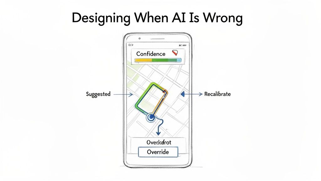
Think about a good GPS navigator. It's the perfect analogy for a well-designed AI interface. It doesn’t just spit out a single, unchangeable route; it partners with you on your journey. Its success is built on four key principles: the pillars of a great AI user interface.
- Transparent Reasoning: The GPS shows you the suggested route on a map. You see the turns and the ETA. It’s showing its work, giving you the context needed to trust its suggestion.
- Explicit Control: You see the route but decide to take a different street. The GPS doesn’t argue or block you. It respects your decision because you're the one driving the car. The user must always have an override.
- Graceful Fallibility: When you take that different street, the GPS instantly recalculates. It doesn't crash or throw a cryptic error. It accepts the new input, adapts, and finds a new path to your destination.
- Progressive Disclosure: Your navigator doesn't show you every single turn for a 500-mile trip on one screen. It gives you the immediate info you need while keeping the broader context available if you zoom out.
These four pillars create a system that feels intelligent not because it’s always right, but because it’s always helpful. Even when it is wrong.
The Iceberg Under The "Simple" Feature
Last quarter, a PM at a fintech company shipped a file upload feature. Engineering estimated two weeks. It took six.
Why?
The PM specified one screen, the "happy path" where a file uploads perfectly. But engineering quickly discovered eleven additional states during development. What happens when the AI's confidence is only 50%? What if the photo is blurry? What if the user uploads a lunch receipt to the "Travel" category?
Suddenly, that one screen became twelve.
The real work in AI user interface design isn't just designing the perfect output. It’s choreographing the dance of uncertainty, user correction, and system recovery.
Each of those states required a design decision. For instance, the team needed a clear flow for when the user rejects the AI’s suggestion, like in this task assignment component where every action has a clear resulting state. This isn’t just error handling; it is a dialogue. If you want to dive deeper, you can see how to use AI tools that create contextual error messages that guide users instead of just flagging problems.
In short, the two-week estimate assumed a perfect AI. The six-week reality was a lesson in designing for an imperfect one.
From Magic to Mechanics
The temptation is to hide the seams and present AI as a flawless oracle. This is a fragile strategy. The moment the magic trick fails, user trust evaporates.
A better approach is to expose the mechanics when it matters. Don't be afraid to show an AI confidence score or ask a clarifying question. This transparency turns the user from a passive recipient of AI magic into an active collaborator. When users can see, guide, and correct the AI, they feel a sense of ownership over the outcome. And that’s how you build an interface people will actually trust.
Translating AI Concepts Into Concrete Designs
It’s 3:15 PM, and you’re staring at a whiteboard. You've sketched out the core idea for a new AI feature: a smart playlist generator. The theory is solid, the principles are clear, but now what? How do you actually get from a concept like “it learns your mood” to an engineering ticket that specifies what happens when the AI is only 60% confident about a song choice?
This is the translation gap.
It's that treacherous space between a high-level requirement and a detailed, buildable specification. This is where most AI features either stall or balloon in scope, buried under a mountain of unforeseen “what if” scenarios. The abstract idea must become a concrete artifact.
The design process for AI isn't a straight line; it's more like sculpting. You start with a rough block of user intent, the raw material. Then, you methodically chip away ambiguity with user flows, prototypes, and edge case analysis until a refined, functional experience emerges. Each pass reveals more detail, moving from the general to the specific.
From Core Flow to Complete Specification
Let’s return to that smart playlist feature. A product manager's first step isn’t to diagram every possible AI response. That’s a recipe for paralysis. Instead, you map the core user flow, the ideal path. For instance, a PM could start by outlining the journey for creating an AI-powered playlist, similar to this PRD for an AI-powered feature developed for a Spotify concept.
This initial map is the skeleton. It defines the primary steps: user provides a prompt, AI suggests a tracklist, user reviews and saves.
But a skeleton isn’t enough.
This is where an AI design agent acts as a force multiplier. Once the core flow is established, the agent can be tasked with fleshing out the rest of the body. It can systematically generate the dozens of necessary edge cases.
- What does the UI show when the AI misinterprets a vague prompt like "chill vibes"?
- How does the user correct a song choice that completely misses the mark?
- What happens if the AI can’t find enough songs to fulfill the request?
These aren't minor details. They are the substance of a resilient AI user interface. Ignoring them is like building a car with an accelerator but no brakes.
The Artifact as the Source of Truth
This entire process culminates in a comprehensive, living document. Last week, I watched a PM use this exact method. They started with a screen recording of an existing feature, mapped the core flow, and then used an AI agent to generate every conceivable test case and error state, like these test cases for a scheduling feature. The output was a complete, buildable specification, ready for design and engineering.
This is what I mean: the goal is to systematically convert ambiguity into clarity. By using AI to explore the problem space, the team wasn't bogged down in manual, repetitive diagramming. Instead, they could focus their energy on the strategic decisions that truly mattered. This is a critical step, as teams often wonder how AI can auto-generate UI components from design systems once these foundational flows are locked.
A great AI feature is defined not by its perfect first guess, but by the quality of its recovery from a bad one. The design artifacts must reflect this reality.
This approach transforms the design process from a reactive chore into a proactive strategy. You anticipate the failures, design the corrections, and build a system that feels intelligent because it handles imperfection with grace. That is how you bridge the gap and turn a clever concept into a product people can actually use.
Navigating The Hidden Complexities Of AI States
It’s 10:00 AM on a Friday, and your team is celebrating. You just shipped a new AI feature. The demo looked incredible, the happy path works like a charm, and leadership is ecstatic.
Two weeks later, the support tickets start piling up.
This happens because an AI interface is an iceberg.
What your users actually see, the slick, intelligent output on the "happy path," is just the tip. Below the surface, unseen and often unplanned for, lies the massive, dangerous bulk of the experience: all the states of failure, loading, ambiguity, and correction. A great AI user experience isn't defined by the 10% that's visible, but by how elegantly it handles the 90% that's hidden.
This isn’t just about showing a loading spinner. It’s about creating a rich, communicative dialogue with the user when things aren't perfect. It’s the difference between a generic "Something went wrong" message and a specific, helpful one like, "Your connection is unstable, so AI suggestions may be delayed."
Mapping The Submerged States
Think about a tool we all use: Zoom. Its core job seems simple, but its resilience is built on a complex foundation of state management. What happens when a user's network connection degrades mid-call? That’s not one single failure state; it's a dozen possibilities.
Last week, a friend at a comms tech company showed me their process. They had mapped out every conceivable network degradation scenario for their video platform, much like this exploration of Zoom's network states. Their diagram included specific UI responses for things like:
- Packet Loss: A subtle indicator that audio quality might get choppy.
- Low Bandwidth: Automatically downgrading video resolution to preserve the audio stream.
- Reconnection Loops: A clear banner explaining the system is trying to reconnect, often with a countdown.
A robust AI product treats failure as a core part of the user experience. Each of these states is a conversation, a moment to build trust by showing that the system is aware and working to recover. Ignoring them is like building a ship without lifeboats.
The Economic Incentive for Deep Work
Why does this deep work matter at scale? There's a powerful economic reason. Skipping the hard work of mapping these edge cases feels faster at first. It shortens the initial design and engineering cycle. You get the feature out the door.
But this speed creates a hidden debt. That debt comes due in the form of increased support tickets, frustrated user churn, and emergency engineering sprints to fix issues that should have been caught from the start. A study from IBM’s Systems Sciences Institute found that fixing an error after a product release can be 4 to 5 times more expensive than during design, and up to 100 times more if it has to be fixed after deployment. You can see our analysis of how these missed edge cases cost more after launch.
The initial time saved by ignoring failure states is paid back, with interest, in the form of lost user trust and expensive rework.
This brings us to a simple framework for auditing these hidden complexities. Before shipping any AI feature, your team should be able to clearly answer three questions.
- The Uncertainty Question: What does the interface show when the AI's confidence is low?
- The Correction Question: How does a user easily and intuitively fix a wrong suggestion?
- The Failure Question: What are the top three ways this feature can fail, and what is the UI for each?
Answering these questions upfront transforms the design process. It forces you to move beyond the demo-friendly happy path and build an interface that is not just intelligent, but resilient.
Building Trust Through Transparency And Control
You’re trying a new AI-powered email client. It surfaces a forgotten conversation and drafts a reply to someone you haven’t spoken to in three years. It’s helpful, but it's also unsettling. Where did it find that? What else does it know? This is the central tension of designing for AI: the fragile line between intelligent assistance and invasive overreach.
Whenever an interface seems to anticipate your needs, the user’s next unspoken question is always the same: how does it know that?
If the answer is a mystery, you breed suspicion. If it’s clear, you build trust. The design of the interface is what delivers that answer. This isn’t about privacy policies buried deep in a settings menu; it’s about providing clear, in-context controls that give users a real sense of agency. This is the heart of what researchers call Algorithmic Accountability, the simple idea that users have a right to understand and influence the automated decisions that affect them.
The visualization below makes it obvious that the visible UI is just a tiny fraction of a user's experience with an AI.
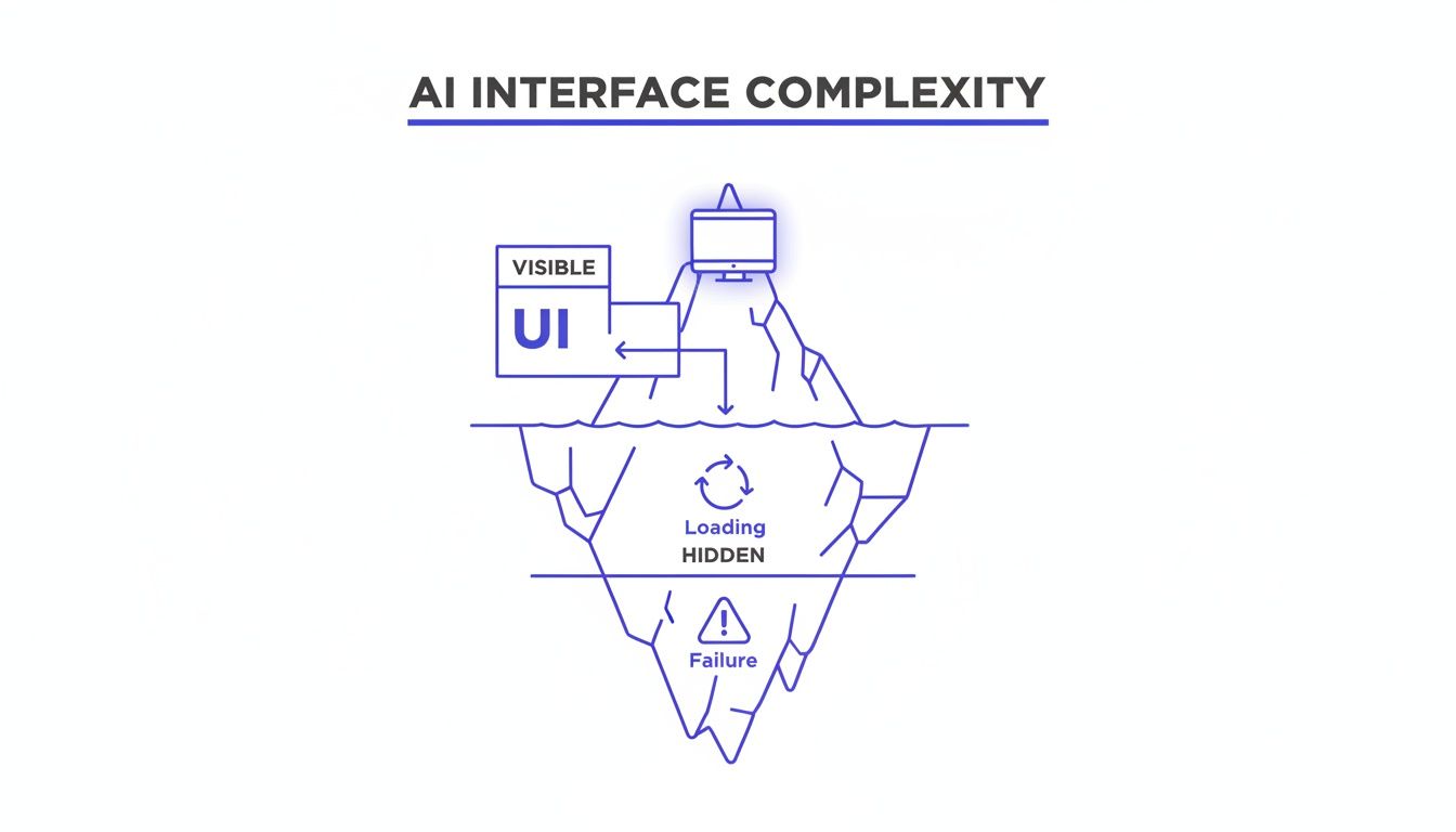
This iceberg model shows that trust is built or broken not by what the user sees, but by how the system handles the complexities hidden just beneath the surface.
Giving Users The Keys
Building this kind of trust isn't an abstract ideal. It’s a series of concrete design decisions. The goal is to make the user feel like the driver, not a passenger just along for the ride.
A friend working on a productivity AI told me their biggest user-retention win wasn’t a flashy new feature, but a new settings page. They built a simple hub showing users exactly what the AI had “learned” about their work habits and gave them toggles to turn certain inferences on or off. Engagement with that one page skyrocketed.
Practical transparency builds confidence. Here are a few essential patterns:
- Opt-In by Default: Personalization and data-driven suggestions should always be a choice the user makes, not a setting they have to hunt down and disable.
- Manageable Memory: Users need a clear way to see what the AI remembers about them and an easy way to delete or edit those memories.
- Explainable Outputs: When the AI makes a recommendation, a simple "Because you often do X..." provides crucial context and makes the system feel less like a mysterious black box.
These patterns fundamentally change the user's relationship with the AI. It’s no longer a mysterious entity making decisions for them, but a transparent tool making suggestions to them.
What User Control Looks Like In Practice
Let's imagine an AI design agent that learns about your product over time to provide better suggestions. This is incredibly powerful, but it demands giving the user absolute control over the AI's "memory."
A great example is this project for a memory management hub in Figr. It doesn't just store learnings; it exposes them in a clear, editable interface. The user can see exactly what the AI remembers about their design system, their user personas, and their product context. They can delete outdated information or correct a misinterpretation on the spot. You can even try an interactive prototype that shows how AI can provide smarter, contextual replies in an email client.
When you give users control over the AI's memory, you are giving them control over the AI itself. This is the foundation of a trustworthy partnership.
This isn’t just a nice-to-have feature. It’s a fundamental requirement for any AI interface that hopes to earn long-term adoption.
Don’t hide how your AI works. Expose its logic, give users control over its inputs, and design for transparency at every single step. This clarity is the single most important asset you have for building a product that people won't just use, but will actually trust.
Your First Step Toward Building Better AI Interfaces
We’ve covered the mindset, the patterns, and the pitfalls. So what do you do with all this tomorrow morning? What's the first tangible step you can take to start building smarter interfaces?
The answer isn't to kick off a massive, product-wide redesign.
That approach almost always gets bogged down and rarely works. A much better way to start is to pick just one high-impact, high-friction user flow. Find a single moment where your users consistently get stuck, feel overwhelmed, or are forced into repetitive tasks.
Your first actionable step is to map that existing flow. A friend at a SaaS company did exactly this. They were seeing a huge drop-off rate in their complex checkout setup. So, they mapped out the entire existing Shopify checkout setup flow to pinpoint exactly where things were going wrong.
Ask Three Simple Questions
Once you have that journey visualized, you can look at it through a new lens. Get your team together and ask these three simple but powerful questions about that single flow:
- Intent: What is the user’s real goal here? Based on their actions, what can we reasonably infer about what they’re trying to do?
- Anticipation: How could an AI use that inferred intent to helpfully predict the user’s next step?
- Recovery: What are three specific ways the AI could get it wrong? More importantly, how would the UI help the user gracefully recover control?
This focused exercise makes the principles of AI user interface design real. It pulls the conversation out of abstract theory and grounds it in a tangible user problem. For instance, if you're working on conversational AI, you have to plan for moments when the AI misunderstands a user's question. Digging into advanced AI chatbot solutions is a great way to see how pros handle these kinds of recovery patterns.
This small-scale audit gives you a concrete plan for introducing intelligence into your product. It delivers immediate value, builds momentum for your team, and gives you a clear win to build on. This is how you start.
Frequently Asked Questions
What Is The Biggest Mistake Product Teams Make With An AI User Interface Design?
The most common mistake? Obsessing over the perfect "happy path."
Teams pour all their energy into designing for that magic moment when the AI gives the perfect answer. They completely underinvest in designing for the moments when the AI is uncertain, flat-out wrong, or needs to ask the user for clarification. This creates a brittle experience that shatters user trust at the first sign of trouble.
A truly intelligent product treats these "graceful fallibility" states as a core part of the design from day one, not as edge cases to patch up later. It's the difference between a product that feels like a reliable partner and one that just feels fragile.
How Do You Measure Success For An AI-Driven Interface?
Your standard metrics like engagement and conversion aren't enough here. With AI, the focus shifts from simple task completion to the quality of the collaboration between the human and the machine.
You'll need to track a new set of vitals:
- Task Success Rate: Did the user actually get their job done, with or without the AI's help?
- Correction Rate: How often do users have to manually override, edit, or completely fix the AI’s suggestions? A high correction rate is a massive red flag.
- Perceived Trust: This one is more qualitative. You have to actually ask users how confident they feel in what the system is telling them.
A low correction rate combined with a high task success rate is a powerful signal that your AI interface is actually working.
Does This New Design Approach Replace UX Designers?
Not at all. In fact, it elevates their role tremendously.
AI is great at automating the repetitive, tactical parts of design, but that just massively amplifies the need for human strategic thinking. The designer’s job shifts from pushing pixels to choreographing a dynamic, two-way conversation.
The designer becomes the architect of the dialogue between the user and the AI, focusing on ethics, trust, and how to handle the inevitable screw-ups.
AI tools can handle the "how," which frees up designers to wrestle with the much harder, more valuable questions of "why" and "what if." They become less like component-builders and more like experience-strategists, ensuring the AI serves the user’s real goals, not just its own. For general questions about platform usage or policies, you can always check Amino's additional FAQs.
Ultimately, AI makes a human designer’s judgment more valuable, not less.
Ready to build better AI interfaces, faster? With Figr, you can turn product thinking into production-ready artifacts. Map complex flows, uncover edge cases before they cost you, and design with confidence. Start your free trial today.