
It’s 3:17 PM on a Tuesday. The big roadmap meeting is tomorrow. Your product backlog has 217 items.
Every single stakeholder is convinced their request is P0. You’re just staring at the list, a jumbled mess of bug fixes, half-baked feature ideas from last year, and a few "urgent" demands from the sales team. Does that sound familiar?
That feeling isn’t just overwhelm. It’s a quiet paralysis that can grind an entire team to a halt. This is the real, hidden cost of a cluttered backlog: a tax on your focus, your momentum, and your team's morale. When everything is a priority, nothing is.
Time isn't a conveyor belt where you just process one task after another. It’s a switchboard for impact. You don’t need more hours in the day, you need a better way to decide which switches to flip.
This is what I mean. The action priority matrix is a simple but potent tool for making these decisions. It helps teams decide what to work on by plotting tasks across two dimensions: effort and impact. It’s a lens that brings clarity to the chaos, forcing you to ask a simple, powerful question for every single item on your list: how much will this move the needle, and what will it actually cost us to do it?
The Evolution from Urgency to Impact
The idea of a four-quadrant matrix isn't new. In his 1989 book The 7 Habits of Highly Effective People, Stephen Covey introduced a model that plotted tasks by urgency and importance. It helped managers separate putting out fires from long-term strategic planning.
But as product development evolved, so did the matrix. The action priority matrix is a modern adaptation that swaps urgency for effort and importance for impact. This simple shift created four distinct, actionable zones: quick wins, major projects, fill-ins, and thankless tasks you should probably just eliminate.
Diagnosing the Problem in Your Own Workflow
Last week, a friend at a Series C company told me she spent two full days prepping for her roadmap meeting. She had all the data: analytics, user interviews, a list of 50 feature requests. Still, she felt completely stuck. Why?
Because every item on her list felt equally important.
Her backlog was a flat, one-dimensional list, not a strategic map. It was missing the crucial dimensions of effort and impact. This is what I call "priority drift," where a team slowly veers off course, one small, low-impact task at a time. The only way to prevent this is with a system, which is exactly what the matrix provides. And if you're looking for a way to track your own work and avoid getting sidetracked, something as simple as a Job Application Tracking Template can make a huge difference.
The whole point is to shift from reactive firefighting to proactive, strategic execution. The action priority matrix is the tool that makes this shift possible.
Defining Your Axes for True Clarity
A map is useless if north is just a vague suggestion. The same goes for the action priority matrix. If you don't have a shared, concrete definition of "Impact" and "Effort," you’re just drawing squares on a whiteboard. You have to translate these fuzzy ideas into your team's specific reality.
"Impact" isn't a universal constant. For a seed-stage startup, it might be weekly active users. For a huge enterprise platform, it could be cutting customer support tickets by 10%. For a team drowning in technical debt, the highest-impact thing they can do might be deleting a legacy service.
What truly matters is getting everyone in the room to agree on what "impact" means for you, right now.
Decoding Impact Beyond Revenue
I know a product manager at a fintech company who first defined impact as "new signups." The team spent an entire quarter shipping features to drive top-of-funnel growth. Signups did inch up. But the company’s real problem wasn't acquisition, it was activation. People were signing up but never making their first transaction.
The real bottleneck was hidden two steps down the funnel.
Once they redefined impact as "time to first transaction," their entire perspective shifted. A tiny, low-effort tweak to the onboarding flow, something that just clarified one confusing step, suddenly became the highest-impact item in their backlog. The right definition of impact points you to the real problem, not just the most obvious one.
The True Cost of Effort
Effort is just as tricky. It’s almost never just about engineering hours. True effort is a composite score, a reflection of a task’s total cost to the business.
A proper effort score has to account for:
- Engineering Complexity: How many systems does this touch? Are we using a new technology or something that requires specialized knowledge?
- Design Resources: Does this need new components, user research, or multiple design iterations?
- Cross-Team Dependencies: Do we need sign-off from legal? Will marketing need to support the launch? The more handoffs, the higher the effort.
Ignoring these hidden costs is how a "two-week" project spirals into a two-month slog. For a deeper look at this, our guide on how to prioritize the product backlog offers more strategies.
A Simple Scoring System to Create Alignment
To make this practical, you don't need some complex formula. A simple 1-10 scoring system for both axes works perfectly, but only if you define what the numbers mean. The goal is to build a rubric that removes as much subjectivity as possible.
The basic gist is this: a scoring rubric isn't about getting a perfect, objective number. It's a tool to facilitate a better conversation. The debate over whether a task is a 7 or an 8 is where real alignment happens.
For instance, your team might define an "Impact" score of 10 as "a feature that will be used by >50% of daily active users and is projected to increase retention by 5%." An "Effort" score of 10 could be "a project requiring >100 engineer-hours and coordination with at least two other departments."
This shared language is the foundation. It ensures that when one person says "high impact," everyone else in the room understands exactly what that means. You're no longer comparing opinions, you're evaluating ideas against a common standard.
From Ideas to Coordinates: Plotting Your Initiatives
You’ve defined your axes. The empty grid is staring back at you, clean and logical. Now comes the hard part, the human part. It's time to translate that jumble of ideas, feature requests, and big ambitions into plotted coordinates on the matrix.
This isn’t a solo exercise. Effective prioritization is a team sport.
The goal here isn't just to fill out a chart, it's to build a shared reality. You need engineering, design, and product in the same room, having a real conversation that surfaces the truth. Without a structured process, the loudest voice or the highest-ranking person always wins. The action priority matrix is your defense against that.
Turning Opinions into Data Points
The session shouldn't start with debate. It should start with evidence.
What does the funnel data show? Where are users dropping off? Which support tickets keep showing up, over and over again? Bringing concrete artifacts to the meeting completely changes the dynamic.
Instead of guessing at the effort for a new feature, you can ground the conversation in something real. A product manager, for instance, could analyze the full user flow for a complex feature, like all the hidden steps in a simple file upload. Pulling up a detailed edge cases map for Dropbox's upload states can transform a vague "Effort" score into a much more accurate number. Suddenly, the hidden complexity is visible to everyone.
This simple diagram breaks down the process of defining your axes and scoring.
The visual makes it clear: scoring is the final step, and it only works if it's built on a solid foundation of well-defined Impact and Effort.
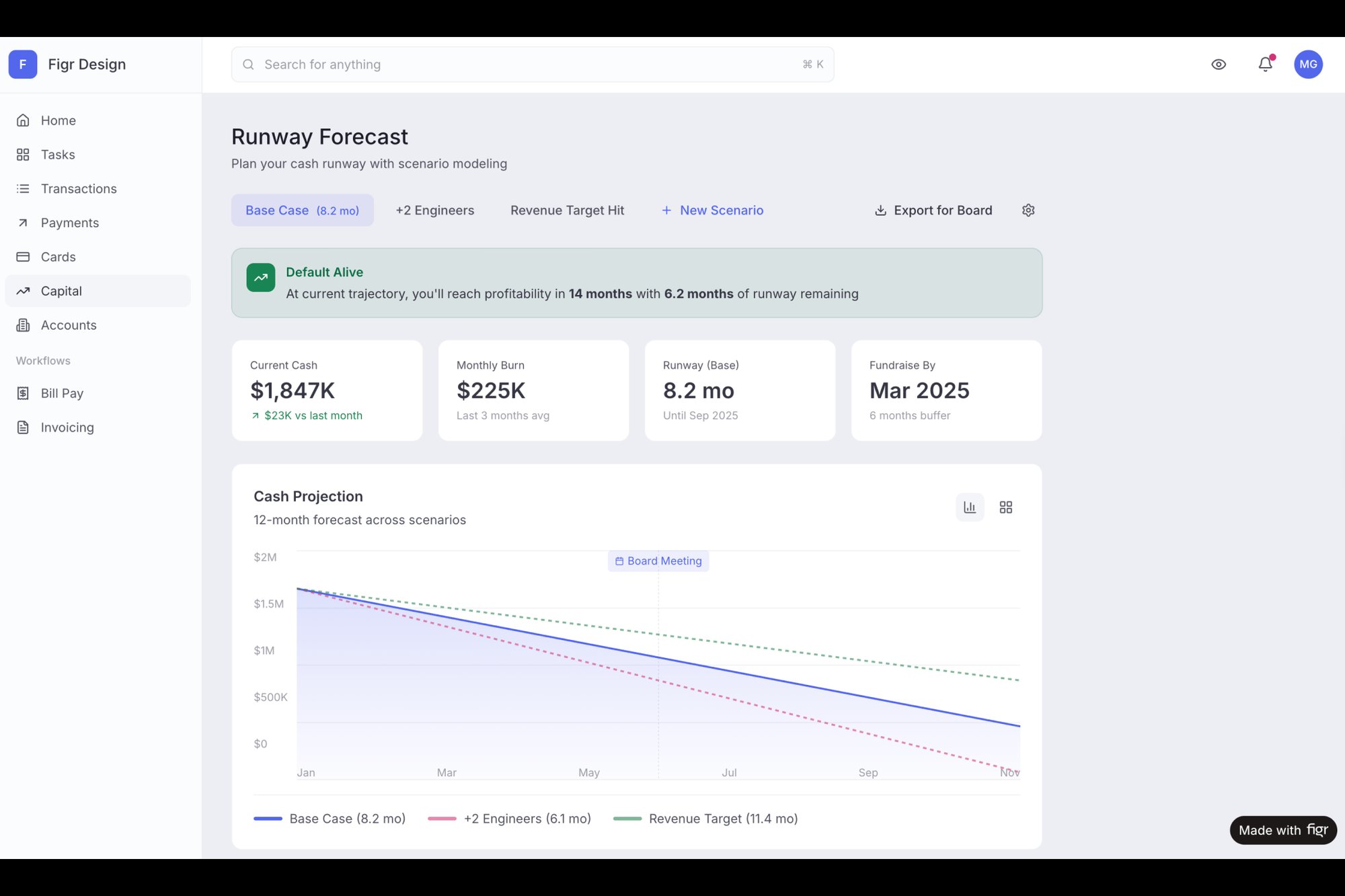
The same goes for "Impact," it can't just be a gut feeling. It has to be tied directly to user needs and business goals. When the team is considering a major feature, like a runway forecasting tool for a banking app, the discussion needs evidence. Using a comprehensive artifact like a detailed PRD for the Mercury forecasting feature ensures the impact score is connected to validated user problems, not just wishful thinking. (If you want to get better at crafting those kinds of guiding documents, check out our guide on how to write a PRD.)
Orchestrating the Prioritization Session
With the data on the table, you can finally start plotting. But how do you run the session itself to make sure every voice is actually heard? One of the most effective techniques is silent plotting.
Give each person digital or physical sticky notes. Have them individually score each initiative on Effort and Impact without talking. Then, everyone places their votes on the matrix at the exact same time.
This small act of a simultaneous reveal is surprisingly powerful.
It short-circuits groupthink and stops the first, most confident person from anchoring everyone else's opinion. You immediately see where there's consensus and, more importantly, where the major disagreements are. A task that one engineer scores a '3' for effort and another scores a '9' isn't a problem. It’s a conversation starter. Why the massive difference?
This is where the magic happens. The point of the action priority matrix isn’t just the final artifact, it’s the conversation that creates it. The arguments over scores are how a team builds a shared understanding of what’s hard, what’s valuable, and why.
The Four Quadrants: Strategic Action in Every Zone
Your map has coordinates. Your initiatives are plotted. But an Action Priority Matrix isn't just a static picture, it's a strategic playbook. Each of its four quadrants represents a distinct zone of activity, demanding a completely different mindset and approach.
Think of yourself as a portfolio manager. You need a mix of reliable, short-term gains and ambitious, long-term bets. At the same time, you have to actively divest from assets that just drain resources without producing returns.
Quick Wins: Building Irresistible Momentum
This is your momentum engine. The top-left quadrant, Quick Wins (low effort, high impact), is where you find tasks that deliver a ton of value for the cost. These are the small UI tweaks that cut support tickets in half or the copy change that doubles a conversion rate. Shipping these builds trust with stakeholders and creates a powerful sense of progress for the team. A team that ships a valuable win, no matter how small, every single week is a team that feels unstoppable.
Major Projects: De-Risking the Big Bets
The top-right quadrant, Major Projects (high effort, high impact), holds your most ambitious goals. These are the game-changing features and new product lines that will define your future. They’re seductive but also dangerous.
You don't just "do" a Major Project. You de-risk it.
The key is to break these monoliths into smaller, phased rollouts. Instead of a six-month "big bang" launch, can you ship a V1 in six weeks to a small beta group? For example, a complex project like a new setup flow can be validated with a prototype before committing to the full build. This approach gets you learning faster and shrinks the blast radius if your initial assumptions are wrong.
Fill-Ins: The Strategic Use of Downtime
The bottom-left quadrant is for Fill-Ins (low effort, low impact). Think minor bug fixes, small visual polish tasks, and quick documentation updates. They aren’t going to change the trajectory of the business, but they aren't worthless, either. The mistake most teams make is letting these tasks clutter the main backlog, creating noise and distraction.
Fill-ins should never be your primary focus. Treat them as opportunistic tasks, perfect for when an engineer is waiting on a code review or a designer has a gap between larger projects. This quadrant is a "nice-to-have" list that keeps the product feeling clean without derailing progress on what truly matters. We have an article that goes deeper into using AI tools that help prioritize product features based on user data, which can further refine this process.
Thankless Tasks: The Power of Saying No
Finally, we arrive at the bottom-right quadrant: the danger zone of Thankless Tasks (high effort, low impact). These are the over-engineered features for a tiny subset of users or the vanity projects requested by a single stakeholder.
The most valuable action you can take here is to decisively say no.
I once watched a team spend an entire quarter building a custom reporting feature for a single large client. They poured hundreds of engineering hours into it. When they finally shipped, the client used it twice. The opportunity cost was immense. These tasks are liabilities, black holes for morale and resources. Identifying them on the matrix gives you the clarity and justification needed to kill them. Once you've identified your high-impact items, organize them into a buildable plan using user story mapping.
Beyond the Matrix: Living with Your Priorities
The chart is done. The sticky notes are perfectly aligned, and for a moment, there's a feeling of perfect, crystalline clarity.
But that feeling is fleeting. This artifact, this action priority matrix, isn't a destination. It's a departure point.
Creating the matrix is the easy part. The real challenge is living with the choices you just made, especially when a new "urgent" request lands in your inbox at 4:00 PM on a Friday. The matrix isn't a shield, it's a compass. You still have to navigate. So how do you turn this visual grid into a sequenced, defensible roadmap that your team and stakeholders can actually follow? The matrix feeds into backlog prioritization, where these ranked items get sequenced into sprints.
From a Picture to a Plan
Your matrix is just a snapshot of your strategic thinking. To make it operational, you have to turn it into a narrative. This means communicating the why behind each item's placement. A task in the "Major Projects" quadrant isn't just a big project, it's a strategic bet on future growth that demands focused investment.
When you present your priorities, don't just show the grid. Tell the story.
Organize your communication around the quadrants themselves:
- Quick Wins: "This quarter, we're targeting these three quick wins to build momentum. We expect to ship them within the next month."
- Major Projects: "Our primary focus is this one major project. It’s a huge effort, which is why we're de-prioritizing other initiatives to give it the resources it needs."
- Fill-Ins: "We have a list of smaller-impact tasks we'll tackle opportunistically when developers have downtime. They won't be part of our core sprint commitments."
- Thankless Tasks: "These items, while requested, require a high level of effort for minimal return. We've made the decision to formally decline them for now."
This approach transforms the matrix from a static image into a dynamic plan. It gives everyone a clear language for talking about what matters and what doesn't.
The Pull of the Unimportant
This is our zoom-out moment. Why, even with a crystal-clear matrix, do teams so often get pulled into the low-impact "Fill-ins" quadrant? The answer lies in a quirk of human psychology: completion bias.
As researchers for the Harvard Business Review noted, making visible progress is a powerful motivator. Checking a small, easy task off a list delivers a satisfying hit of dopamine. It feels productive. This creates a powerful incentive to tackle a dozen low-impact "Fill-ins" rather than the first, messy step of a high-impact "Major Project."
This behavioral pull is the silent killer of big ambitions. A team can feel incredibly busy for an entire quarter, shipping constantly, yet make zero meaningful progress toward their most important goals.
This is exactly why good tooling and process are so critical. They provide the structure to counteract our natural biases. For example, a "Major Project" like redesigning a complex Shopify checkout setup is daunting. But what if a team used a tool to first map the current information architecture and identify specific drop-off points? Suddenly, the huge project has a concrete, manageable starting point. This breaks the spell of completion bias by making the important work feel just as achievable as the unimportant work.
In short, your action priority matrix is a living document. It requires regular check-ins, perhaps quarterly or after a major business shift. It’s your tool to defend your team’s focus, communicate your strategy, and ensure you’re not just busy, but busy with the work that actually matters.
Your Next Actionable Step to Prioritize Smarter
The point of a framework like this was never to create a perfect, unchangeable artifact. The real goal is much simpler: make a better decision tomorrow than you did today. Clarity is a process, not a destination, and the action priority matrix is just a compass for that journey.
So, what now? The gut reaction might be to schedule a three-hour meeting, lock everyone in a room, and try to plot your entire 217-item backlog.
Resist that urge. Please.
That’s a classic case of boiling the ocean. It’s also the fastest way to turn a useful tool into an intimidating chore nobody wants to touch. The real next step is smaller, faster, and infinitely more valuable.
Start with Just Five Items
Your entire mission for this week is to find 30 minutes. That's it. Invite one engineer and one designer to join you. Before you all meet, pick just five items from your current backlog.
Try to make your selection a good mix:
- Three tasks you feel are genuine contenders for the next sprint.
- One item you personally believe is a high-impact "Quick Win."
- One task you secretly suspect is a low-impact "Thankless Task."
That’s the entire agenda. In your meeting, just score those five things together. Use a simple 1-10 scale for both effort and impact. The conversation that erupts when an engineer scores effort at an '8' while you saw it as a '3' will be more insightful than a dozen meetings spent just staring at a massive list.
This tiny action demystifies the whole process. It proves the value of the matrix by giving you an immediate, tangible insight you can act on right away. Of course, to truly put these insights into motion, mastering how to prioritize tasks effectively is the key to making it all stick.
You just need to take that first small step. Start with five.
Action Priority Matrix FAQs
People often get stuck on the same few questions when they first start using an action priority matrix. The tool seems simple, but reality is always messy. Here are the common sticking points I’ve seen teams wrestle with and how to think your way through them.
What if Everything Feels High Impact?
This is a classic. When everything feels like a P0, it’s a huge red flag that your definition of "impact" is way too broad. It usually means the team is trying to serve too many goals at once: increase retention, drive new signups, and pay down technical debt.
The only way out is to force a choice.
For the next quarter, or even just the next month, what is the single most important metric you need to move? Define impact only in relation to that one goal. This deliberate constraint is what creates real clarity.
How Often Should We Update the Matrix?
Think of the matrix as a living document, not a one-time artifact. It's a snapshot of your current understanding of the world, and that world changes. A good cadence is to formally revisit and re-score your initiatives quarterly. But don't be too rigid. You should absolutely trigger an update any time a major new piece of information lands on your desk, like a key competitor launch or surprising user research.
How Do We Handle Scoring Disagreements?
This is my favorite part. Disagreements aren't a bug, they're the main feature of the exercise. When you see a big gap in scoring, especially on the "Effort" axis, it almost always signals a knowledge gap. One person, often an engineer, sees a hidden dependency or a nasty bit of tech debt the other person doesn't. Instead of trying to split the difference and land on a meaningless average, dig into the "why" behind each person's number. The resulting conversation is far more valuable than the final score itself. The action priority matrix is one tool in a larger toolkit. See our product roadmap guide for how it fits into the broader planning process.
Figr helps teams turn these strategic conversations into production-ready artifacts. Go from a prioritized idea to a high-fidelity prototype that mirrors your actual product, grounded in your real design system and user data. Ship UX faster with Figr.