

One major UK government monitoring programme tested 21 public-sector mobile apps, and none was fully compliant at the initial assessment. Testers found between 13 and 76 accessibility issues per app, with an average of 42, exposing the gap between a released interface and a usable one (SASQAG accessibility testing statistics).
When that gap remains open, a user may reach a login screen but can't identify the fields, open a checkout flow but lose focus after an error, or see a control that looks available while its touch target is too small to activate. The underlying function exists. The experience still stops the user.
Effective accessibility testing for mobile apps connects automated checks, manual assistive-technology journeys, representative user testing, and release decisions. The central idea is the invisible affordance audit, a risk-based method that measures whether people can complete important tasks, rather than merely whether a scanner found a violation.
The Scale of the Mobile Accessibility Gap
The audience at risk is not marginal. The World Health Organization estimates that 1.3 billion people, about 16% of the global population, or roughly one in six people, experience significant disability (WHO disability overview). For a mobile product team, that is not a niche segment. It is a large share of the market whose success depends on whether the interface exposes actions, feedback, and state in ways assistive technologies can use.
That distinction matters on mobile because many failures are invisible in standard QA passes. An app can include every planned feature and still block real task completion if labels are vague, focus moves unpredictably, status changes are silent, or a gesture has no accessible alternative. VoiceOver, TalkBack, captions, magnification, voice control, Switch Access, and simplified interaction patterns all rely on those invisible affordances. When they break, the feature exists in code but not in practice.
Accessibility is a product reach question before it's a compliance question.
Teams should treat accessibility coverage the same way they treat functional coverage, performance risk, and security exposure. A release dashboard that only asks whether requirements shipped misses the harder question: which users can complete high-consequence tasks under real conditions?
From compliance check to coverage model
WCAG 2.1 Level A and AA remain a useful base for testing perceivability, operability, understandability, and compatibility with assistive technology. Teams also need to keep pace with newer guidance as mobile interaction patterns change, including WCAG 2.2. On its own, though, a standards checklist does not tell you whether the journeys that matter most are usable on actual devices with actual assistive technology combinations.
A stronger framing is an invisible affordance audit. The question is not whether every screen was scanned. It is, “Which users, journeys, states, and assistive technologies have we covered?”
Start with the flows where failure has the highest user cost:
Authentication: Account creation, sign-in, password recovery, and identity verification.
Core transactions: Search, checkout, payment, booking, or subscription changes.
Recovery paths: Validation errors, expired sessions, permission prompts, loading states, and failed requests.
Account control: Settings, notifications, privacy choices, and cancellation.
That journey map works best when paired with broader product review. To examine adjacent usability signals that often hide accessibility risk, browse the UX audit checklist, then convert those findings into test cases tied to user impact.
This is also a prioritization problem. Product teams often fix what tools can count because counted defects fit sprint planning. Users experience something else entirely: whether they can finish the task without getting lost, blocked, or misled. A risk-based coverage model closes that gap.
Why Automated Scanners Create False Confidence
An automated scanner is valuable because it can identify structural issues quickly. It can flag missing labels, contrast failures, undersized touch targets, and certain semantic problems. It can't decide whether a screen-reader announcement makes sense in context, whether focus order preserves meaning, or whether a custom gesture has an accessible alternative.
That distinction matters because a green scan can coexist with a broken journey. A 2025 assessment of 50 popular apps found that 72% of evaluated user journeys produced a poor or failing experience across four assistive technologies (Auditi mobile accessibility testing guide). A scanner may confirm that a button has a label while missing the fact that the label describes the icon's appearance instead of its action.
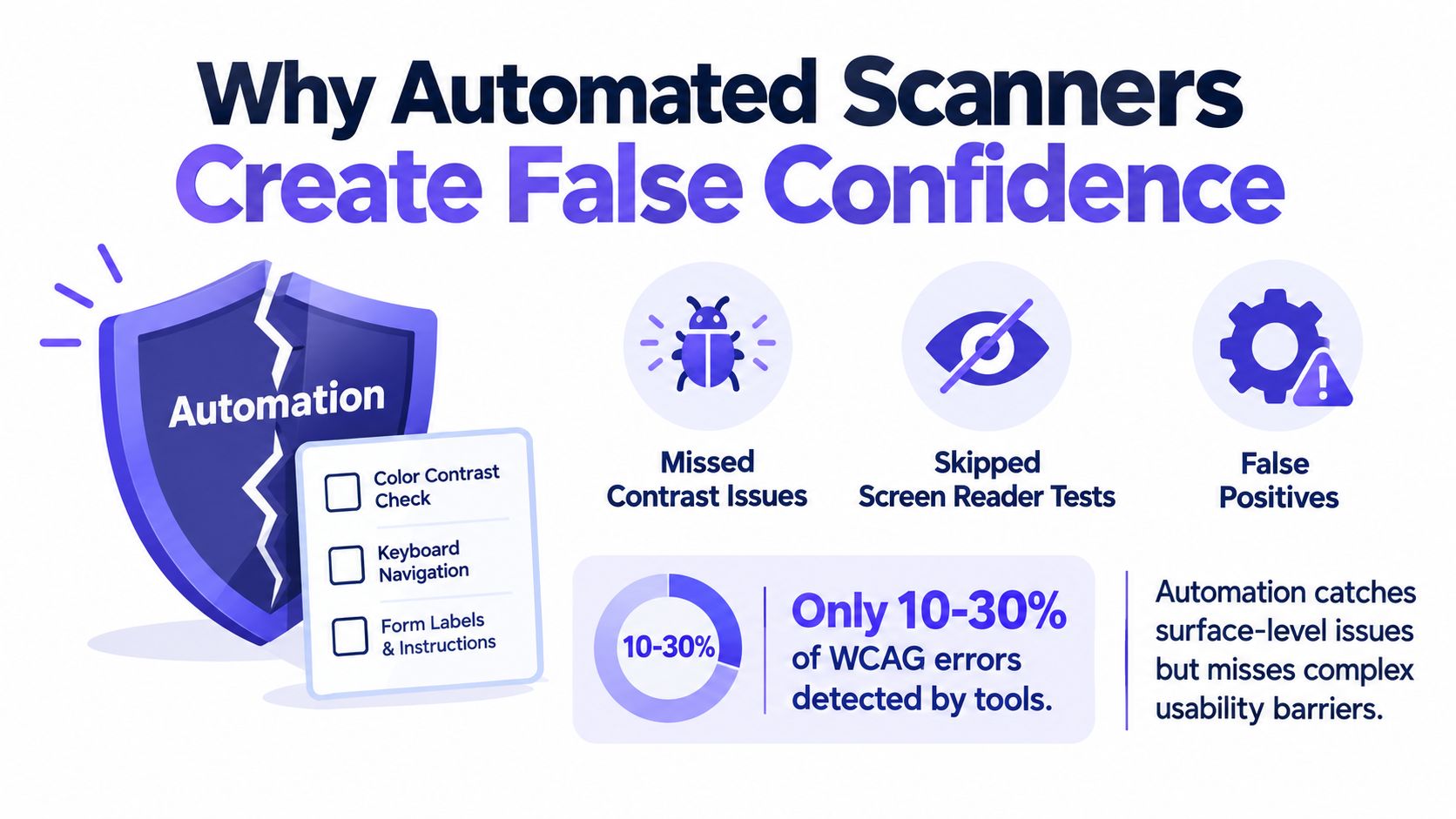
Treat scan output as a structural baseline
The practical role of automation is regression detection and structural triage. It gives teams repeatable evidence during development, especially when checks run inside existing UI interactions. It doesn't provide an end-to-end usability verdict.
Manual verification must test:
Meaning: Does TalkBack or VoiceOver announce the control, role, value, and state clearly?
Sequence: Does focus move in an order that supports the task?
Change: When content updates, does the user receive the right announcement?
Alternatives: Can a gesture-dependent action be completed through another input method?
Completion: Can a person finish the journey without sighted assistance?
This is what I mean by scanner confidence debt. Each automated pass can reassure a team while leaving untested interaction meaning underneath. The debt becomes visible at release, when product changes are expensive and the affected user is the first person to discover the failure.
A product manager I once watched review a mobile release had a familiar reaction: the accessibility report showed a short list, so the release looked safe. Then a manual tester opened a modal with TalkBack and found focus trapped behind it. The report had measured the presence of controls, not the user's ability to proceed.
The right operating model combines tools with human traversal. A guide to accessible UI design tools can help teams compare tool capabilities, but the decision rule remains task-based: automated findings inform priority, while assistive-technology journeys determine whether critical work is complete.
Building a Layered Testing Sequence for iOS and Android
A reliable test sequence moves from cheap structural feedback toward increasingly realistic evidence. Each layer answers a different question, so removing one creates a blind spot rather than a faster process.
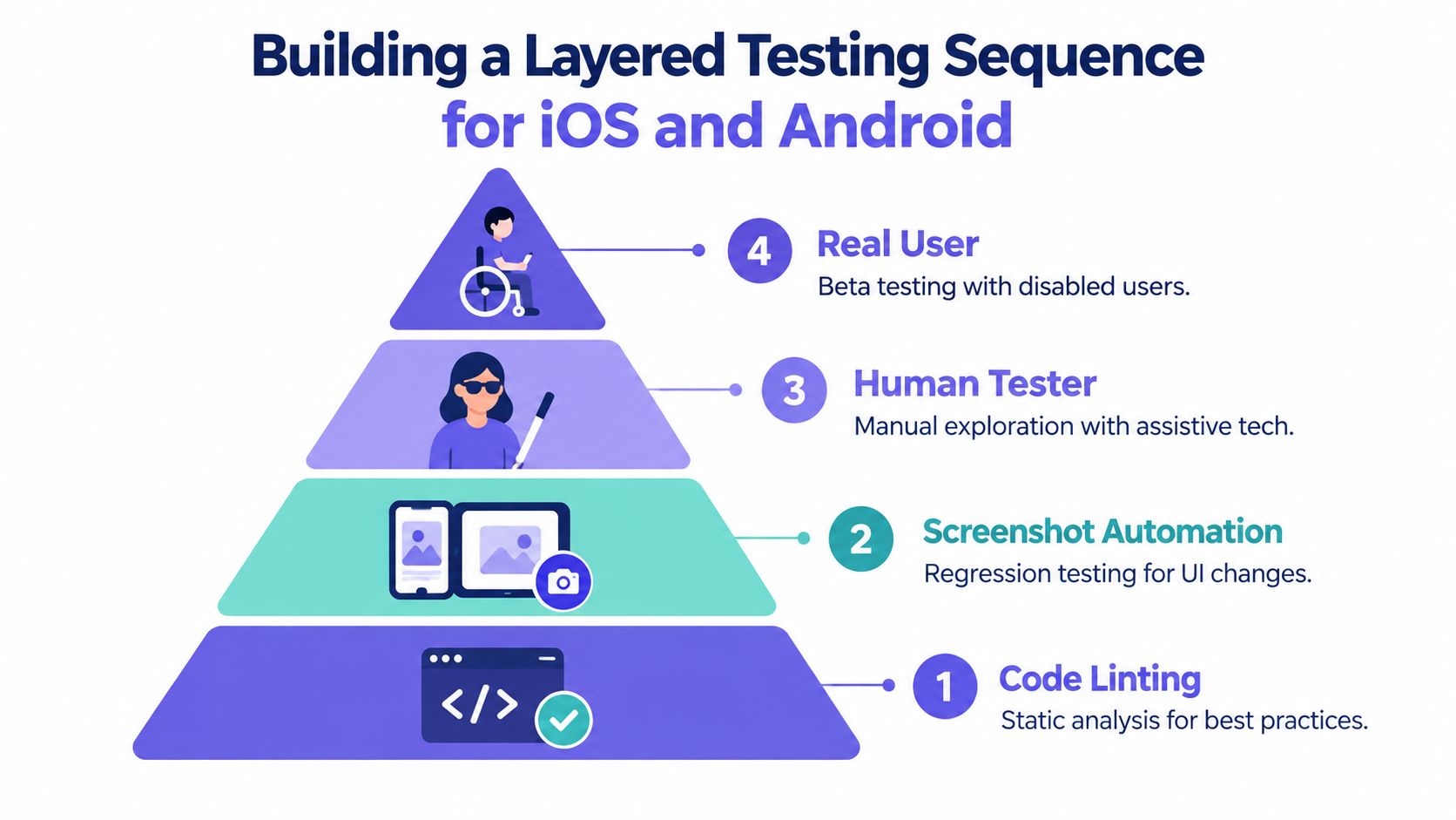
Five layers of evidence
Step 1. Run static checks early.
Use Android Studio, Accessibility Scanner, and platform-specific audits to inspect labels, contrast, clickable elements, touch targets, and UI semantics. On iOS, add accessibility audits to UI tests and inspect the interface with VoiceOver enabled.Step 2. Execute checks during interaction.
Integrate Android Accessibility Test Framework checks into Espresso flows. ATF can run in unit, UI, integration, presubmit, and CI suites, allowing regressions to appear during normal development rather than at final QA.Step 3. Configure the scope deliberately.
Use root-view checks when a test validates a complete screen, not only the views touched by an interaction. Otherwise, a test can pass while an untouched control on the same screen remains inaccessible.Step 4. Traverse critical flows manually.
Use TalkBack and Switch Access on Android, then VoiceOver on iOS. Test launch, navigation, form entry, dialogs, dynamic updates, errors, and completion states across representative devices.Step 5. Include disabled users before release.
People who rely on assistive technologies reveal interaction barriers that scripts and experienced internal testers may miss. Their evidence should influence severity and release decisions, not sit in a separate research document.
Android's guidance recommends combining automated checks with manual verification because semantic order, focus behavior, announcements, gesture compatibility, dynamic updates, and complete task execution may not be captured automatically (Android Espresso accessibility checking).
Make the sequence part of delivery
The key design choice is integration. If accessibility checks live only in a pre-release audit, they compete with schedule pressure. If they run in presubmit and CI, a developer receives feedback near the code change that caused the regression.
Compose teams should apply the same principle. Automated checks can inspect contrast, touch-target size, and traversal order, while manual TalkBack and Switch Access testing verifies meaning and completion. On iOS, VoiceOver testing should follow repeatable flows, and Apple recommends adding accessibility audits to UI tests (Apple accessibility audits).
A practical gate is therefore zero unresolved critical findings plus successful completion of representative tasks through screen-reader and switch-navigation paths. Zero automated findings alone is too narrow to represent product readiness.
Executing the Manual Audit and Invisible Affordances
A control can look generous and still be difficult to activate. The visible icon is only one part of the interaction. The functional hit region, focus behavior, label, state, and available input methods form the invisible affordance.
Android recommends a minimum interactive area of 48 dp by 48 dp, roughly 9 mm on the physical screen, with at least 8 dp of separation between neighboring targets (Android accessibility help). Padding counts toward the hit region, so a small icon can remain visually compact if its responsive area is large enough.
For interfaces supporting touch and pointer input, the W3C Mobile Accessibility extension proposes at least 44 px by 44 px for touch targets and 20 px by 20 px for mouse or pointer targets (W3C touch guidance). Testers should evaluate the default viewport, input method, and responsive state separately. A target that works with a precise pointer may fail under a finger.
Run the audit as a journey
Step 1. Select the task.
Begin with authentication, search, checkout, payment, settings, or recovery. Include loading, error, empty, and confirmation states.Step 2. Set the assistive technology.
Enable TalkBack and Switch Access on Android. Enable VoiceOver through Settings, Accessibility, and VoiceOver on iOS, then move through the interface using its gestures as Apple describes.Step 3. Check sequence integrity.
Move through every control without sighted inspection. Confirm that focus is logical, labels describe purpose, roles are accurate, and state changes are announced.Step 4. Inspect the invisible region.
Identify every clickable element and test its complete responsive hit area. Check neighboring controls, rotation, dynamic content, and smaller screens.Step 5. Attempt completion without touch.
Use Switch Access, VoiceOver gestures, or the available keyboard and pointer path. Record where the journey becomes ambiguous, trapped, or impossible.
VoiceOver testing is especially revealing when a modal opens, a form reports an error, or content updates without changing the visible screen. A visually polished interface can omit a button from the accessibility tree or leave focus behind an overlay.
The audit should produce evidence, not impressions. Record the operating system, device, assistive technology, state, exact steps, expected announcement, actual announcement, and whether the user could complete the task. For broader interaction principles, the practical UX and accessibility playbook offers a useful companion to this evidence-led method.
Expanding the Matrix for Global and Edge-Case Realities
Across studied markets, mobile internet adoption among people with disabilities ranged from 6% to 49%, versus 32% to 85% among nondisabled people (GSMA Mobile Disability Gap Report 2025). That spread has a direct testing implication. A single English-language run on one current device says little about whether the app still exposes the right cues when language, hardware, and network conditions shift.
The main risk is not only visible breakage. It is the loss of invisible affordances: focus order that drifts in right-to-left layouts, status messages that never reach a screen reader during retries, captions missing in the language a market really uses, or hit targets that become unreliable after text expansion. An interface can look compliant in a default build and still fail in the combinations that matter most to completion.
Build a risk-based matrix
Start with consequence, not coverage. Expand the matrix around the combinations most likely to interrupt high-value journeys or exclude a meaningful user segment:
Markets and languages: Prioritize regions tied to usage, regulatory exposure, or support demand. Check translated labels, longer strings, captions, transcripts, and right-to-left rendering.
Device classes: Include lower-end devices, smaller screens, older operating-system versions, and manufacturer variants where product analytics or field research show concentration.
Connectivity states: Test loading, retry, timeout, offline, and partial-response states. Confirm that assistive technologies receive clear progress and error feedback.
Input combinations: Pair each priority market with the assistive technology combinations users are likely to rely on, including screen reader, switch navigation, magnification, voice control, and keyboard or pointer paths.
Journey states: Re-test authentication, payment, recovery, onboarding, and settings under localization and constrained network conditions, not only on the default path.
That matrix should be selective. Teams do not need every possible combination. They need the combinations with the highest probability of concealing a blocker.
This is also where accessibility testing becomes a specialist practice, not just an extension of functional QA. Teams often benefit from people who understand both assistive technology behavior and product delivery constraints, including those looking to start an assistive tech career.
For a practical way to formalize these scenarios, the edge case testing guide for product teams is a useful companion. It helps teams convert market-specific risk into named test cases instead of relying on memory or scanner output alone.
Remediation Workflow and Continuous Release Gates
Accessibility defects become easier to control when teams route them through a defined remediation system instead of treating them as one-off QA findings. A UK government monitoring programme recorded 880 issues across the apps it reviewed, and organisations later resolved 743, or 84% (SASQAG accessibility testing statistics). The same programme also found 0.7 to 5.5 unique issues per evaluated page, averaging 2.5, a useful reminder that a quick check of a launch screen or one happy path does not represent the risk inside a full mobile product.
Four stages from finding to gate
Step 1. Capture evidence.
Record the affected journey, user impact, reproducibility, screenshot, accessibility-tree evidence, operating system, device, assistive technology, and exact reproduction steps.Step 2. Classify by consequence.
Separate critical task blockers from major friction and minor clarity issues. Prioritize failures that stop authentication, payment, recovery, navigation, or task completion.Step 3. Verify the fix.
Re-run the original manual path, then add an automated regression check when the issue is structurally detectable. Confirm that the change did not break another state, platform, or assistive technology combination.Step 4. Enforce the release gate.
Block release for unresolved critical findings. Track remediation commitments and include accessibility status in recurring product quality reporting.
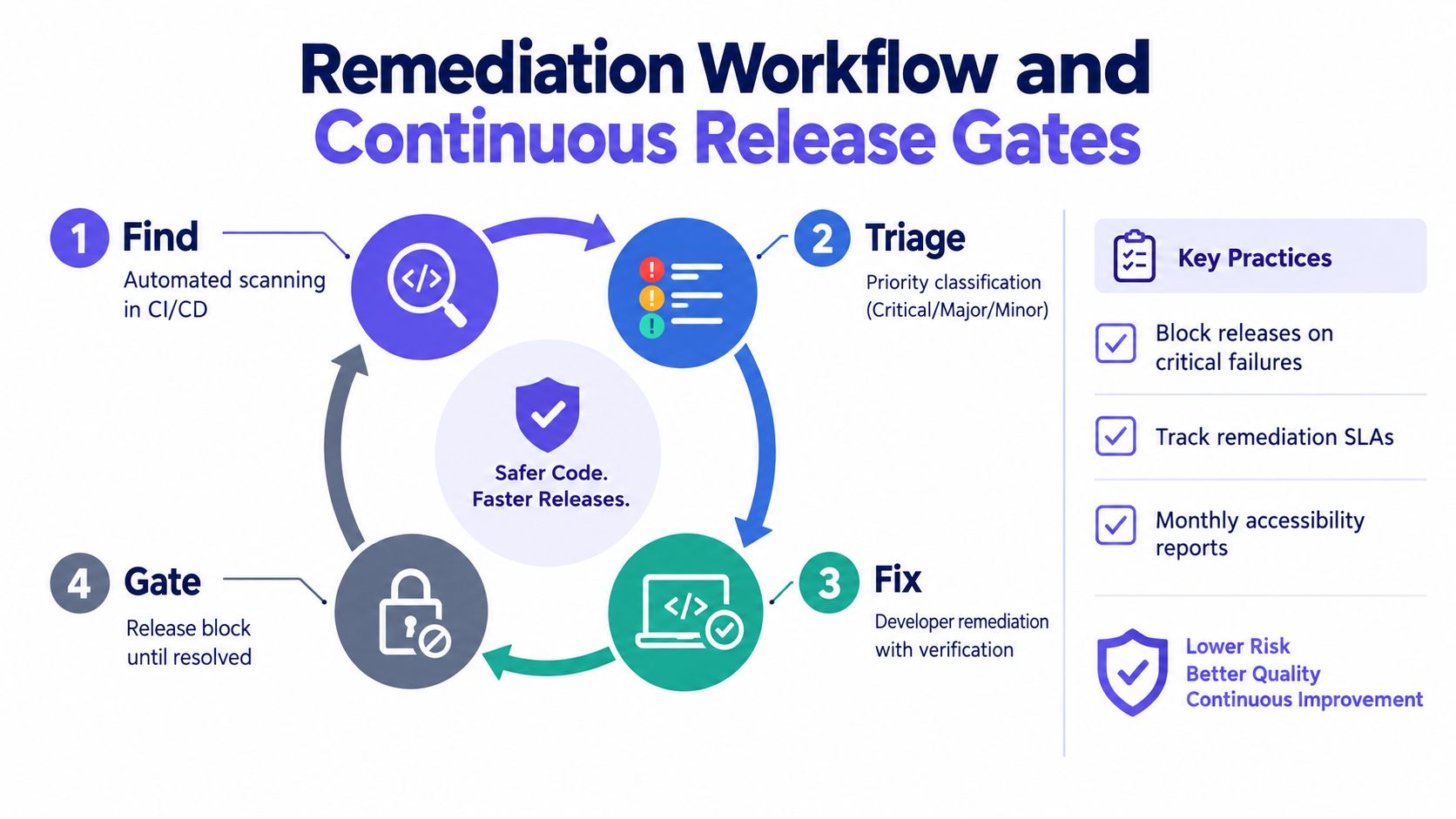
A strong defect record lets another tester reproduce the failure without a meeting. It should show what the user tried to do, what the assistive technology announced, what should have happened, and which release introduced the defect. That standard matters because invisible affordance failures often look fixed in the UI while the spoken label, focus order, gesture path, or state announcement still fails in use.
This workflow also changes prioritization. Teams should not rank issues by scanner count alone. They should rank them by journey risk, user impact, and how often a broken affordance sits inside a high-consequence task. The test case creation guide is useful here because it helps teams define repeatable journey cases, expected outcomes, and retest evidence across design, QA, and engineering.
The strongest release gate combines automated regression checks, manual completion of representative journeys, and zero unresolved critical blockers. Accessibility then becomes part of release control, not a document that appears after product decisions are already locked.