

A product team can spend weeks polishing a screen that still makes users hesitate at the first meaningful action. The interface looks coherent in review, yet people miss the next step, lose their place, trigger avoidable errors, or ask support for help.
Those failures rarely stay inside the design file. They create extra tickets for engineering, more regression paths for QA, higher support volume, weaker funnel performance, and less confidence in the product. A low-contrast label can become a conversion barrier, while an unnecessary field can turn a willing buyer into an abandoned session.
The practical answer is to treat design and interfaces as product infrastructure. Evaluate the work through task success, error recovery, accessibility, visible user effort, and consistency across states. Once teams measure those outcomes, interface quality becomes something they can improve deliberately rather than defend subjectively.
Why Design and Interfaces Shape Product Outcomes
A settings flow can look complete in review and still stop a customer at the next decision. The primary button uses the approved color, the cards align, and legal has signed off on the copy. Then a PM tries to change one account permission and pauses at the same screen that has already generated support tickets. The product has met its visual brief, but the interface has not explained what will happen next.
That gap creates work beyond the screen. A missing status message becomes a support question. A hidden dependency creates another QA branch. An ambiguous label requires localization decisions and can force engineering to revisit shared components. Teams pay for the original shortcut repeatedly, through costs that rarely appear in the first design estimate.
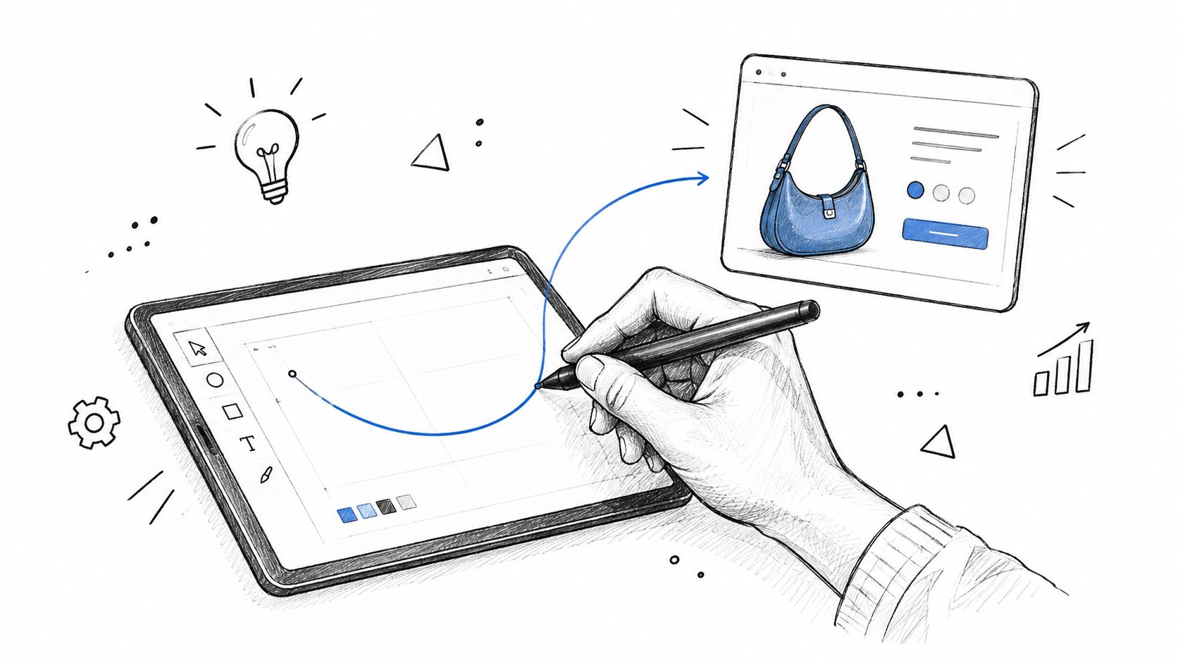
From visual judgment to operational evidence
A useful interface review asks whether people can complete the intended task without unnecessary assistance. Nielsen Norman Group's historical usability comparison found an average task-success rate of 66% across broad testing of unfamiliar websites, rising to 82% when the research was repeated across a larger set of websites in 2016. Its report of an improvement of 1.3 percentage points per year frames usability as a performance outcome rather than a matter of taste. Nielsen Norman Group's usability history provides the underlying comparison.
Those figures are reference points, not universal targets. A frequent expert user may value speed and shortcuts, while a new user may need visible explanations and forgiving recovery. Accessibility changes the commercial outcome as well: an unreadable error, missing focus state, or unclear form instruction can prevent a qualified customer from completing a purchase, yet many teams do not connect those failures to conversion reporting.
The review should therefore identify the user, the task, the failure state, and the evidence that supports the decision. A strong product team connects UX design fundamentals to operational measures, asking which action failed, which state confused the user, and which reusable pattern could prevent the issue from returning.
Practical rule: Review every major interface decision as a future support ticket, QA condition, analytics event, or customer conversation.
Design history shows why these decisions persist. The Xerox Alto introduced visual interaction concepts such as bit-mapped display, mouse input, and overlapping windows in 1973. Apple helped bring the graphical user interface to a mass audience with the Macintosh in 1984. Nielsen Norman Group's account of the GUI's commercial development shows how conventions emerge from research, hardware constraints, learnability, and coherent interaction models.
That history also gives PMs a practical evaluation frame. Ask what users must understand, what the system must communicate, which people may be excluded by the interaction, and what downstream work the choice creates. Design quality becomes a product decision with visible effects across support, QA, localization, analytics, and conversion, rather than a subjective preference settled in a review meeting.
The Core Architecture of Design and Interfaces
A reliable interface has layers, but users experience the layers as one system. They don't separate information architecture from visual design while trying to find a report. They just know whether the product helped them reach the right place and understand what to do there.
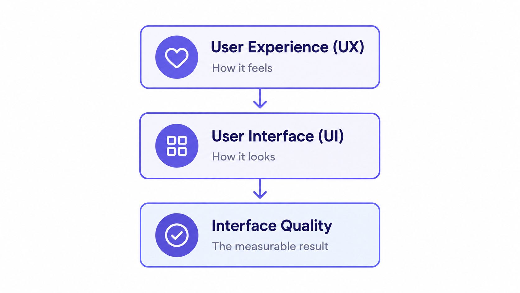
The most useful architecture combines four questions:
Can users find the right object? Information architecture determines naming, grouping, navigation, and the relationship between related tasks.
Can users predict the interaction? Interaction patterns establish what clicking, typing, dragging, saving, and undoing will do.
Can users see the priority? Visual hierarchy directs attention toward the next decision without hiding important context.
Can all intended users operate the interface? Accessibility constraints cover contrast, focus, keyboard movement, content structure, and state changes.
These layers reinforce one another. A well-labeled navigation system cannot rescue a destructive action with an unclear confirmation state. A beautiful dashboard cannot compensate for filters that reset without warning. A keyboard-accessible component still creates friction if its focus order follows the visual layout rather than the user's task.
The interface quality equation
Think of interface quality as the result of clarity multiplied by control and recoverability. This isn't a mathematical score. It's a review lens. If users understand where they are but can't recover from a mistake, the experience remains fragile. If the flow is forgiving but the hierarchy hides the primary action, people still struggle.
A design system makes this architecture repeatable. Shared components reduce the number of novel decisions users must interpret, while shared tokens give teams a controlled way to change color, spacing, type, and state behavior. Consistency lowers cognitive demand because users can transfer what they learned from one part of the product to another.
The trade-off is real. Too much consistency can flatten meaningful distinctions, while too little leaves every team inventing its own grammar. PMs should evaluate patterns by asking whether they preserve the user's mental model, not whether every screen looks identical. A billing warning and a neutral informational note should not have the same visual weight just to satisfy a component rule.
Evaluate layers together
A practical review can compare one successful path with one failure-prone path and inspect the same layers in both. Where does the user enter, what decision comes first, what feedback follows, and what happens after an error? Teams can align your team with UI frameworks when they need shared language for those decisions.
A strong architecture makes the next action obvious, preserves context, and gives the user a safe way back. A weak one forces users to remember hidden rules. The difference is visible in task completion, error patterns, and support conversations long before it appears in a design critique.
Accessibility as a Measurable Product Constraint
Accessibility failures usually begin as small design compromises. A gray label becomes slightly lighter to fit the visual tone. A focus outline disappears because it looks dated. A modal traps keyboard users because the interaction was tested with a mouse. Each choice can pass through review in isolation, then combine into a journey that excludes people and weakens performance for everyone.
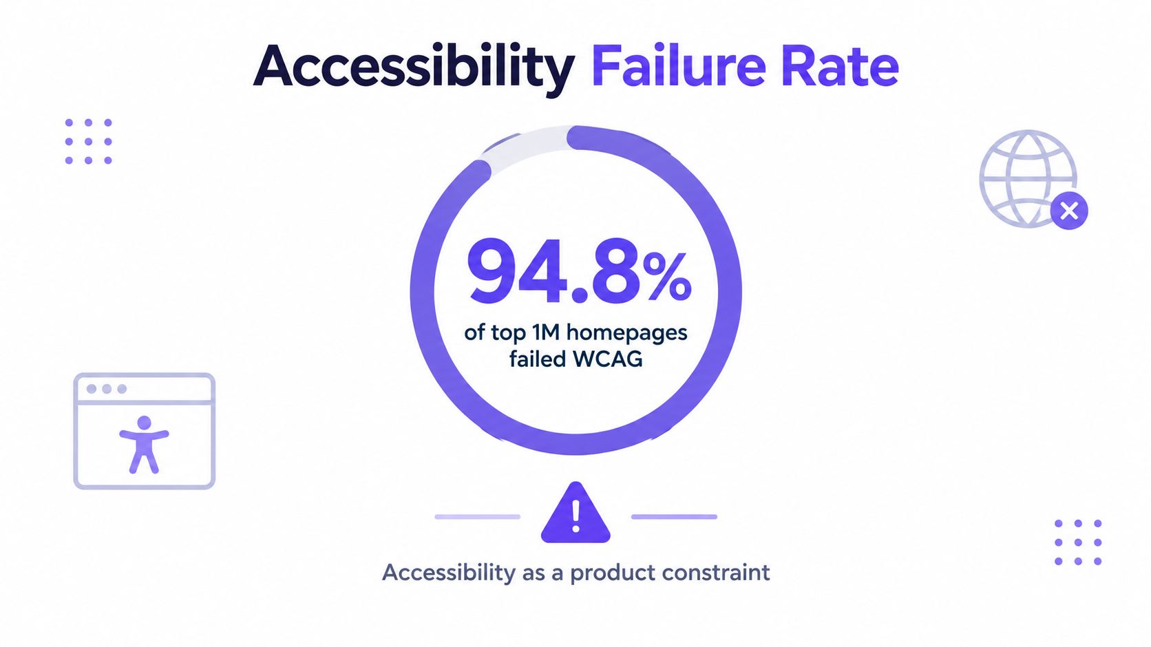
The scale of the problem is clear. In February 2025, 94.8% of the world's top one million homepages failed WCAG standards, and 79.1% had low-contrast text, according to the evidence summarized by Figma's web design statistics resource. The same source reports that only 28% of organizations address accessibility during planning and 27% during design.
That timing creates avoidable risk. Teams discover barriers after content, components, analytics, and engineering behavior have already settled around them. Fixing the issue then means changing more than a color token. It may require new focus behavior, revised copy, altered component APIs, updated tests, and another round of product review.
Prioritize barriers by journey risk
Start with the journeys that matter most to the business and the user. A signup, payment, permission change, or support request deserves review across default and exceptional states. Then rank failures by the work they impose and the number of downstream components they affect.
Journey blockers: A user can't submit, move around, authenticate, or recover. Resolve these before cosmetic improvements.
High-reach component defects: A weak color token, inaccessible dialog, or broken form pattern appears throughout the product. Fix the source component and then inspect its instances.
State-specific failures: Hover, focus, disabled, selected, loading, and error states lose distinction. Treat each as part of the interface contract.
Content and structure failures: Headings, labels, instructions, and announcements don't communicate the task. Improve the information itself, not only its presentation.
WCAG 2.2 gives teams a concrete constraint. Normal text and images of text require a minimum contrast ratio of 4.5:1, while large text can use the applicable 3:1 threshold under the relevant success criterion. The WCAG 2.2 specification turns a visual preference into a testable requirement.
Test the complete state
A resting screen that passes an automated check can still fail during interaction. QA should move through the keyboard sequence, submit invalid input, trigger loading, dismiss a message, and return to the same task after an error. Designers should inspect contrast and focus behavior in every meaningful state.
Recent evidence also shows how little passive improvement can achieve. The cited 2025 Web Almanac result reported only a 1% improvement in median Lighthouse accessibility scores, while 67% of sites removed default focus outlines. Those figures appear in Figma's accessibility evidence, and they point to a governance problem rather than a tooling one.
Use automated checks to catch repeatable defects, then pair them with keyboard review and assistive technology testing. Teams can also check product UI for accessibility during design review, provided the output becomes an actionable issue with an owner, severity, and regression test.
Accessibility improves conversion when it removes barriers at the moment of decision. Measure that connection through task completion, form errors, recoveries, and funnel movement. The business case becomes much stronger when a team can show which interface constraint blocked a real action and how the fix changed the path.
Building and Evaluating Design Systems
A design system earns its place when it prevents teams from solving the same interface problem repeatedly. A collection of polished components isn't enough. The system must preserve decisions from design through implementation, make states explicit, and help PMs, designers, engineers, and QA discuss the same behavior.
Start by separating the system into three operational layers:
Tokens: Define color, spacing, typography, elevation, motion, and state values. Tokens should carry meaning, such as interactive-primary or surface-warning, rather than only visual labels.
Components: Package behavior with appearance. A button needs loading, disabled, focus, hover, and error rules alongside its dimensions.
Patterns: Describe when a component belongs in a journey. A modal, inline message, and full-page error solve different problems even if they share visual elements.
A practical evaluation sequence
Step 1. Trace a live feature. Pick a recently shipped flow and identify every place where the team departed from an existing component or invented a new state. The exceptions reveal whether the system reflects product reality.
Step 2. Inspect the handoff. Compare the design file, implementation, and QA cases. Missing states, ambiguous interaction notes, and one-off values show where the system stops carrying its weight.
Step 3. Test change propagation. Ask what happens when a token changes. If the team can't identify affected components, screens, and regression checks, the system lacks operational visibility.
Step 4. Review adoption quality. Count qualitative signals such as repeated overrides, duplicate components, unexplained variants, and recurring accessibility defects. A smaller system with clear rules often serves teams better than a larger library nobody trusts.
Live product context matters here. A team working from an empty canvas can produce a technically consistent component that conflicts with existing navigation, content density, or user expectations. Tools that capture the current application and import established Figma tokens can help teams preserve those constraints while creating new artifacts. A practical resource on how to build component libraries fast is useful when the bottleneck is library construction, though speed shouldn't replace governance.
The hidden cost is the visibility-work tax. Every unexplained variant forces another person to inspect the source, ask a question, or repeat a decision. Encode the rationale where the component lives, and connect it to usage examples and test expectations.
For teams formalizing their approach, a design system best practices guide can provide a shared baseline. The system is healthy when it makes the right path easier, makes exceptions visible, and gives QA enough information to test behavior rather than screenshots alone.
Checkout and Form Patterns That Drive Decisions
A checkout can lose a customer without one spectacular defect. The damage often comes from accumulation: one unnecessary field, one hidden label, one payment method missing, one validation message arriving too late. Each interaction asks for a little more patience until the user decides the purchase costs too much effort.
Baymard reports that the average US checkout displays 23.48 form elements by default, while an optimized flow can reduce that burden to 12 elements, made up of 7 fields, 2 checkboxes, 2 dropdowns, and 1 radio button. Its research also reports that 17% of US online shoppers abandoned an order during the previous quarter because the checkout was too long or complicated. These figures come from Baymard's checkout usability research.
I once reviewed a form where the team defended every field as necessary for operations. That was true inside the database. It wasn't true at the point of entry. Several values could be derived, requested later, or shown only when a previous answer made them relevant.
Reduce visible user work
Conditional fields, address autofill, sensible defaults, and a clear guest path reduce the work users see without weakening the underlying process. A field should earn its place by changing a decision, preventing a real error, or supplying information the business needs at that moment.
Form mechanics also communicate competence. Persistent labels remain visible after typing. Required and optional fields are explicit. Inline validation appears after the user finishes a field rather than interrupting natural input. Baymard describes these patterns in its checkout flow UX research, alongside the finding that 10% of US online shoppers abandoned checkout because their preferred payment option was unavailable.
Responsive reassurance: Every field should explain what it needs, accept natural input, and respond when feedback becomes useful.
Teams often debate a single-page checkout against a multi-step flow as if step count decides usability. Baymard's 2024 research found an average checkout flow of 5.1 steps and 11.3 form fields, while again reporting 17% abandonment because of checkout complexity. Its analysis concludes that the amount of form work matters more than the number of steps alone, as documented in Baymard's checkout flow field research.
That gives PMs a better acceptance model:
Field necessity: Remove any input that doesn't change the outcome or prevent a meaningful error.
Input behavior: Accept expected formats, preserve labels, and avoid rejecting natural spacing or typing patterns.
Feedback timing: Validate after a useful interaction point, then explain how to recover.
Payment choice: Expose supported payment methods before the user invests heavily in the flow.
Progress visibility: Let users understand where they are and what remains without forcing unnecessary steps.
AI-Generated Interfaces - Evaluation Frameworks
AI can produce a screen before a team has agreed on the problem. That speed helps when the team needs to compare directions, expose missing states, or turn a rough hypothesis into something testable. It increases risk when the generated output receives visual approval before anyone can explain its assumptions.
The central question is traceability. Which user need shaped this component? Which product constraint did the system preserve? What evidence supports the recommendation, and who can override it when context changes?
Compare generation with judgment
A useful human-AI operating model gives automation a bounded role:
Generate within constraints: Provide the existing design tokens, content rules, user role, business limits, and accessibility requirements before requesting a variant.
Require a rationale: Every recommendation should state the problem it addresses, the assumption it makes, and the evidence a team should inspect.
Probe the edges: Test empty, overloaded, invalid, interrupted, permission-limited, and keyboard-only states before accepting the happy path.
Preserve human ownership: A PM or designer approves the interaction model, while engineering and QA verify feasibility and behavior.
Compare behavior: Evaluate variants through task success, error recovery, completion quality, and user comprehension rather than aesthetic preference alone.
Researchers have identified recurring risks in generative interface work, including training-data bias, privacy concerns, opaque decisions, generic outputs, homogenized design, and weak understanding of brand, culture, and user context. They also identify the lack of a common evaluation standard for AI-generated UI elements, which makes governance necessary. The research on generative AI and user interface design supports that caution.
A generated interface may look plausible because it resembles familiar software. Familiarity can hide a poor fit. An enterprise permission screen, a financial workflow, and a creative tool need different explanations, recovery paths, and levels of user control.
Use the principles for choosing doc automation AI as a related governance lens: define the context the system may use, make its output inspectable, and keep a clear human decision point.
The right measure of AI assistance is reduced uncertainty, not the number of screens generated. If the team can't explain why a variant exists or how it was tested, faster production has only moved risk earlier in the process.
Evaluation Checklist and Next Steps
A useful interface audit ends with decisions, not a gallery of observations. Start with one important journey and follow it from entry to completion, including the states that teams usually skip. Record what the user must understand, enter, decide, and recover from at each stage.
Use this compact review sequence:
Define the task outcome. Write the action in the user's language. “Export the report for the finance team” is more useful than “review the reporting screen.”
Observe task success. Watch whether users complete the task, where they pause, and which actions require explanation. The historical usability evidence cited earlier shows why task completion belongs in product reviews.
Map failure recovery. Trigger invalid input, lost connectivity, empty data, expired permissions, and accidental navigation. Record whether the user knows what happened and what to do next.
Inspect accessibility states. Check contrast, focus, keyboard order, labels, announcements, and state changes. Apply WCAG requirements to the interaction, not only the initial screen.
Audit reusable patterns. Identify one-off components, inconsistent terminology, token overrides, and missing variants. Prioritize defects that appear across multiple journeys.
Measure visible work. Count the decisions, fields, confirmations, and context switches users must manage. Remove work that doesn't improve the result.
Create a change backlog. Give each issue an owner, affected journey, severity, evidence, and regression test.
A 30-day improvement cycle can stay focused. In the first week, select one journey and collect recordings, support tickets, analytics events, and existing QA cases. In the second, prototype the highest-risk changes and review them with keyboard and edge-case checks. In the third, test the revised flow with users and compare task behavior against the original. In the fourth, ship the smallest validated improvement and add the new states to the design system.
A grounded takeaway: The best interface roadmap starts with one user task, one observable failure, and one change the team can verify.
Figr can capture a live application, import Figma systems and tokens, generate flows and prototypes grounded in existing product context, surface UX and accessibility issues, and create supporting PRDs or QA cases. Used alongside user research, product analytics, and engineering review, that workflow can help teams turn interface findings into production-ready decisions.
The zoom-out matters. At scale, every ambiguous interaction asks several people to compensate for it. A clear interface reduces that coordination cost, while a documented pattern prevents the same uncertainty from returning in the next release.
If your team wants to evaluate existing screens in product context, Figr can help turn live-app analysis, design-system constraints, prototypes, and QA cases into a more disciplined interface workflow. Start with one high-value journey, inspect its failure states, and use the resulting evidence to decide what to change next.