
A user interface design framework is the formal rulebook everyone follows when building a product. It's less of a suggestion and more of the official building code for your software. This is what moves a team from endless debates and subjective calls to a shared system that scales. Predictably.
Why Your Blueprint Is Not The Building
Imagine a brilliant architect designs a skyscraper. They create incredibly detailed blueprints that specify every single beam, window, and electrical socket. But what happens if the construction crew uses whatever materials they have on hand? Or decides a ‘load-bearing wall’ is just a friendly suggestion? The result is chaos. Structural integrity goes out the window. This is exactly what happens in software when teams don't have a shared set of rules.
A user interface design framework is that building code. It goes way beyond a simple style guide that might just define your brand's colors and fonts. It's the comprehensive system that governs how your entire digital product is actually built.
Defining The Core Structure
At its heart, a framework exists to create a single source of truth. It’s meant to answer the critical questions before they have a chance to derail a sprint. What does a "disabled" state look like? How do we handle error messages consistently across every part of the app? Which animations are okay, and which ones are just distracting?
Without these defined rules, every designer and developer is left to their own devices.
This is what I mean: one team might build a sleek, minimalist dropdown menu for a new feature. At the same time, another team, working on a legacy section of the app, creates a totally different dropdown with its own interactions and styles. Now the user has to learn two different patterns to do the same thing. This friction, multiplied across hundreds of components, creates a disjointed and deeply confusing experience.
Framework vs. System vs. Kit
It's really important to get the language right here. People use these terms interchangeably, but they aren’t the same.
UI Kit: Think of this as a box of parts. You get buttons, icons, and form fields, but there are no rules for how to put them together. It’s a start, but not a system.
Design System: This is the official parts catalog and the assembly instructions. It documents all the components and provides guidelines on how and when to use them.
UI Framework: This is the overarching governance. It includes the design system but also adds the principles, processes, and core rules for how the entire product should look, feel, and behave.
The market for these tools is growing fast. Projections show the global UI Design market is expected to hit $9.83 billion by 2035, mostly because user experience has become the main battlefield for competition. A big part of this trend is the rise of AI-driven tools that help teams actually enforce these frameworks.
The goal is to shift from one-off decisions to relying on a shared system. This isn’t about killing creativity: it’s about channeling it. By taking care of the basics, a good framework frees up your product teams to focus on solving much bigger, more interesting problems. You can see how this works in practice by reading about how streamlined processes impact product delivery in our guide on going from PRD to prototype.
In short, a blueprint is a plan, but a framework is the law that ensures the plan becomes a sound structure. It's the difference between a random collection of features and a cohesive product people can rely on.
The Three Pillars Of A Strong UI Design Framework
A strong UI design framework isn't just a folder full of pretty components. It’s an operating system for your product team, one that brings order to the chaos of building software. This system rests on three pillars.
Without them, your "framework" is just a set of suggestions that people will ignore. With them, you have a real engine for building better products, faster.
Pillar 1: Guiding Principles
The first pillar is Guiding Principles. Think of these as the constitution for your product. They are the high-level truths that settle arguments before they even start.
Are you optimizing for information density over whitespace? Is blazing-fast performance more important than a slick animation? Does accessibility for all users beat out a novel interface pattern that only some can use?
These principles aren't just feel-good platitudes. They're tie-breakers. I know a team at a Series C company that wasted an entire week debating the design of a single data table. The argument only stopped when they remembered their own guiding principle: “Clarity over aesthetics.”
That simple rule gave them the answer.
A principle like "motion for meaning" forces a team to decide if an animation actually helps the user understand something or if it's just decoration. These principles turn subjective fights into objective decisions, saving hundreds of hours. Documenting these rules is step zero. If you're looking for a starting point on what makes a design feel right, our article on the core elements of web design is a good place to start.
Pillar 2: Component Libraries And Patterns
The second pillar is your Component Libraries and Patterns. These are the tangible, LEGO-like building blocks of your interface. But it goes way beyond just a button or a dropdown. It's about creating predictable solutions for complex user problems.
A good framework doesn't just give you a "loading spinner." It defines the entire pattern for how the app behaves during any delay. This includes skeleton screens for the initial page load, spinners for actions in progress, and toast notifications for when the action is complete. Each piece is part of a larger, coherent system. You can see how a simple task creation flow can generate complex states by checking out this task assignment prototype.
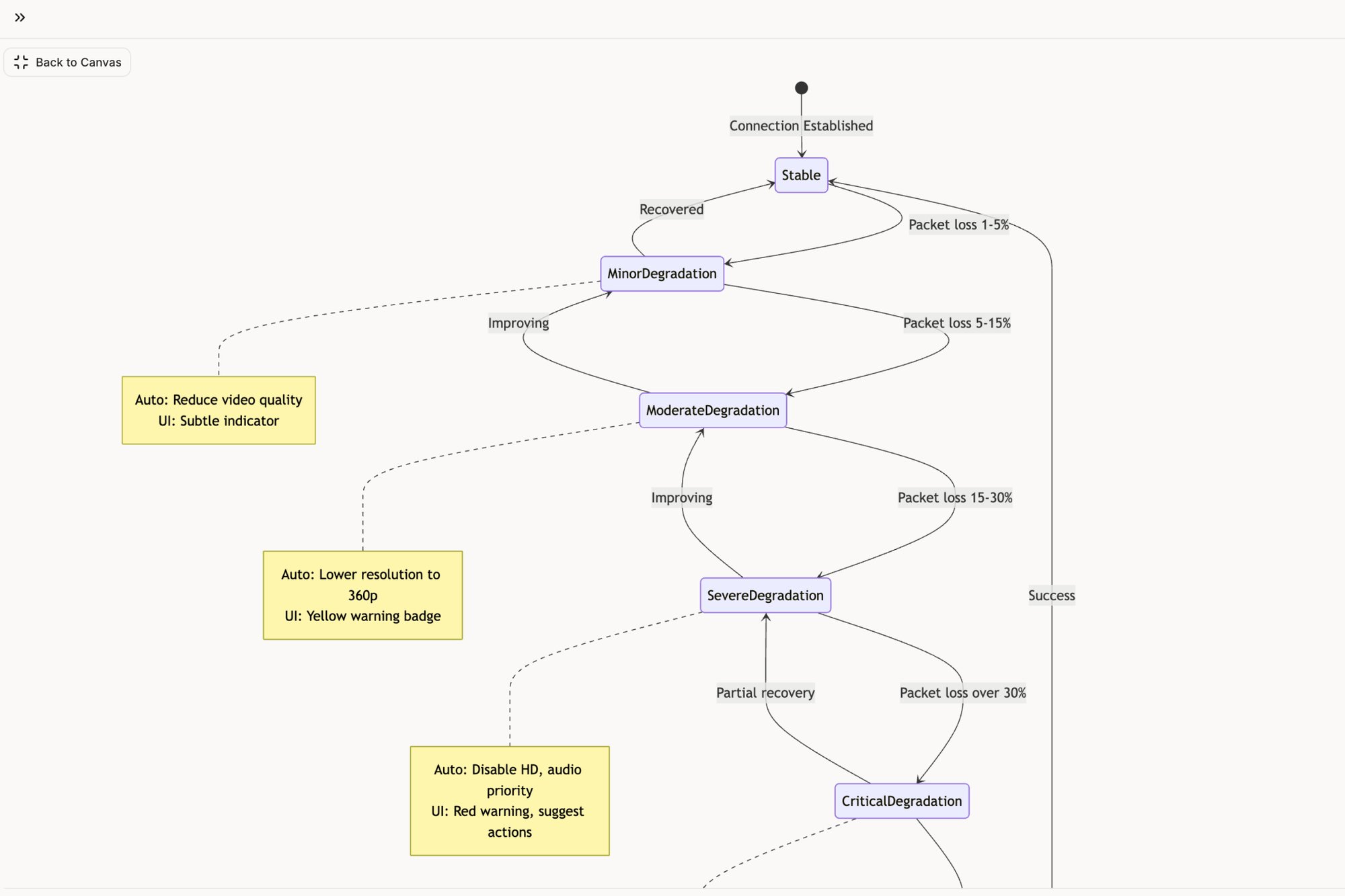
For example, if you look closely at Zoom, you'll see how masterfully it handles dozens of network issues. Those aren't random error messages. They are a carefully designed sequence of patterns meant to inform you without causing panic. Mapping these complex states is what a mature framework does, something we explored in our own analysis of Zoom’s network resilience on the Figr canvas.
Pillar 3: Governance And Contribution
The final, and most overlooked, pillar is Governance and Contribution. How does the framework evolve without either becoming a mess or getting totally outdated? This pillar defines the rules of the game.
This model answers the really hard questions:
Who can propose a new component? Is it a free-for-all, or does it go through a core team?
What's the review process? Does a proposal need sign-off from design, engineering, and product?
How are changes documented and communicated? How do you make sure the whole company knows a pattern has been updated?
A framework is only as good as the people building and maintaining it, and asking effective UX designer interview questions is critical for getting the right talent in the door. Without a clear governance model, your framework will either stagnate or break apart as teams start making their own "fixes" on the side. A living governance process is what keeps the framework a single source of truth that can actually adapt.
Your principles guide what components you build, and your governance model ensures those components stay true to the principles over time. Get all three right, and you've moved from just designing screens to engineering a system.
Mapping Unseen States With A Framework
Last quarter, a PM at a fintech company shipped a file upload feature. Engineering estimated 2 weeks. It took 6. Why? The PM specified one screen. Engineering discovered 11 additional states during development. Each state required design decisions. Each decision required PM input. The 2-week estimate assumed one screen. The 6-week reality was 12 screens plus 4 rounds of 'what should happen when...' conversations.
From Happy Paths To State Machines
This is where a real user interface design framework earns its keep. It forces you to stop designing just the successful outcome and start treating every feature like a complete state machine. You’re not just making a screen; you’re mapping a system. The framework gives you the vocabulary to account for this complexity before it becomes a crisis.
Think about the humble task assignment card in a project tool. It seems simple enough: a card with buttons for "Approve," "Reject," and "Reassign." But what happens after the click? The entire component must change its state. If you’re curious, we mapped this exact scenario so you can view these different component states in an interactive model.
Mapping these states is what stops last-minute engineering blow-ups that destroy your timeline.
The core pillars of a framework guide this entire process, from setting the ground rules to building the actual components and, most importantly, governing how they behave in every possible state.
Principles tell you what to build, components are how you build it, and governance ensures you build it correctly for all the messy, real-world scenarios.
Uncovering The Invisible Work
The best products handle this invisible work so well you never even see it. Think about Dropbox’s file sync. It feels effortless. But behind that simple facade is a system that gracefully handles dozens of failure modes, from duplicate files to a full hard drive.
So how do you start seeing these invisible states in your own work?
A framework gives you a checklist. It’s a systematic way to ask the right questions for every single user action.
Success State: The ideal outcome. Everything worked.
Loading State: The in-between. What happens while the system is thinking?
Error State: Something broke. What does the user see, and what can they do about it?
Empty State: The screen before there’s any data. What does a first-time user see?
Partial State: When only some of the information is ready. How is it shown?
A mature product team doesn't just design features; they design for failure. By mapping these states, you turn invisible complexity into a clear, actionable diagram that leaves nothing to chance. A colleague once told me that 90% of development complexity lives in the 10% of edge cases nobody considers until after launch. A good framework shines a bright light on that 10% from day one. In fact, we wrote a whole piece on how to identify edge cases that inflate costs after launch.
Forcing these conversations early transforms UI design from a purely aesthetic exercise into a discipline as rigorous as engineering. It’s how you ship software that’s not just beautiful, but resilient. It’s the only way to build something that feels simple, even when it’s not.
How To Implement Your UI Design Framework
Putting a new UI design framework in place isn’t like flipping a switch. It’s more like terraforming. You’re deliberately reshaping the environment so that good, consistent design can finally grow on its own. It’s a process that demands a clear strategy and a dose of reality before you start building.
The work breaks down into four steps. Each one builds on the last, turning a vague goal into something tangible that your team can actually get behind.
Step 1: Audit Your Reality
You can’t build a better future until you’re honest about the present. Most teams think they know what their product looks like. The truth is usually a mess, fragmented across dozens of features built by different people at different times. An audit isn't about placing blame. It’s about creating an objective map of your territory.
The basic gist is this: you have to capture your live app, exactly as it is today.
This means documenting every single component, style, and flow. I once saw a team try this with screenshots and a massive spreadsheet. It took them three weeks and was outdated the day they "finished." Don't do that. Modern tools can automate this, giving you a living inventory of your design debt and every last inconsistency.
This audit becomes your "before" picture. It’s the hard evidence that justifies the entire effort.
Step 2: Define Your Core Principles
Once you have a map of your current state, you have to ask: where are we going? Your core principles are the compass. They turn high-level business goals into concrete design directives that your team can actually use.
What’s your product’s north star?
Simplicity: Is the main goal to make a complex task feel effortless?
Power: Are you building for experts who need density and raw efficiency?
Accessibility: Is it a non-negotiable that everyone, regardless of ability, can use your product?
These principles aren't just fluffy words for a slide deck. They are decision-making tools. When a debate breaks out over two different designs, you don't listen to the loudest person in the room. You go back to the principles. They give you the objective logic to move forward with confidence.
Step 3: Start Small and Build Incrementally
The most common way this whole thing fails? Trying to boil the ocean. Teams get excited and try to build a massive, perfect framework for the entire product all at once. This approach almost always collapses under its own weight.
The key is to get an early, tangible win.
Find a single, high-impact area to start. This could be your most-used components (buttons, inputs) or a single, critical user flow. For an e-commerce site, that might be the checkout process. For a project tool, maybe it’s the task creation flow.
For example, a team could focus only on simplifying a complex flow like Shopify’s checkout setup. By first mapping the existing mess and then proposing a clean, streamlined version, like this redesigned Shopify setup flow, they prove the value immediately. This small success builds momentum and gives you the political capital to expand the effort.
Step 4: Establish Clear Governance
A framework without a process for changing it is just a museum exhibit. It's interesting to look at, but useless for daily work. Governance is the living system that lets your framework evolve without falling back into chaos. You need to answer a few critical questions. For a deeper look, check out our guide on the process for creating and implementing a design system, which hits on many of the same points.
Your governance model has to define a few things:
The Contribution Process: How does someone propose a new pattern or a change to an old one?
The Review Committee: Who actually gets to approve those changes? (Hint: it should be a mix of design, engineering, and product.)
The Communication Plan: How are updates shared so that everyone knows about the change and how to use it correctly?
This structure is what keeps your UI design framework a true single source of truth. It allows it to adapt to new problems while protecting the consistency you worked so hard to build in the first place.
The Economic Case For A UI Design Framework
Let's step out of the design studio for a minute and walk down the hall to the CFO’s office. Why should they care about a user interface design framework? It sounds abstract. What’s the actual line item on the budget for that?
The answer is brutally simple: inconsistency is expensive. It's a quiet, creeping tax that gets levied on every single product development cycle.
Every time a designer has to reinvent a dropdown menu, you pay for it. Every time an engineer has to code a new modal from scratch because the last one was a one-off, you pay again. This isn't just about wasted hours, though those add up fast. It’s about the compounding cost of redundant work, duplicated QA efforts, and a fractured user experience that slowly bleeds customer trust.
Introducing Economies Of Scale To Design
A UI design framework is really just a powerful economic lever. It introduces the concept of economies of scale to the messy, creative process of building software.
This isn’t a revolutionary idea. As cognitive scientist Don Norman laid out in his foundational book, The Design of Everyday Things, standardized systems reduce our cognitive load. People learn a pattern once and can apply it everywhere they see it. What’s often missed is that this same principle applies to the people building the product, not just the ones using it.
When your internal teams have a standardized playbook of components and rules, they move faster. A lot faster.
Onboarding a new engineer or designer suddenly takes days, not weeks. Why? Because they aren't learning your company's unique quirks and historical baggage. They're just learning your system.
The Real Cost Is Rework
The biggest financial drain in software isn't the initial build. It’s the endless, soul-crushing cycles of rework that come from late-stage discoveries. It's the bugs that emerge from interactions no one bothered to think through. This is where a framework delivers its biggest return.
By forcing teams to map out complex flows and edge cases before a single line of code is written, a framework eliminates entire categories of preventable rework. It shifts quality control from a reactive, expensive fire-drill to a proactive, cost-effective discipline.
Think about a critical financial feature, like freezing a lost debit card. A simple "freeze" button hides a mountain of complexity. What if the network fails mid-request? What if a transaction is already in progress? What if the user tries to unfreeze it three seconds later?
Mapping these scenarios out before development is the whole game. For instance, exploring an interactive simulation of a Wise card freeze flow shows how every single state can be defined and tested before anyone writes code. This kind of preemptive clarity saves weeks of bug-fixing and panicked meetings down the road. It turns a potential crisis into just another predictable workflow.
Ultimately, a UI design framework isn't an expense. It's a capital asset. It’s a machine you build once, which then pays dividends in velocity, quality, and team morale for years. That’s an economic case any CFO can get behind.
Your Next Step From Theory To Action
Reading about user interface design frameworks is easy. Actually implementing one is hard. The theory always makes sense, but the path from a messy product reality to a clean, systematic future can feel impossibly long.
So, let's make this practical. What’s the first real step?
It’s not what you think. Do not start by trying to build a new framework from scratch.
Start by understanding the one you already have.
Uncovering Your De-Facto Framework
Every product has a framework. Yours is probably just an unwritten, chaotic one that grew organically over years of shipping features. The first step isn’t creation; it’s archaeology. You have to dig up what’s already there.
Here’s how you do it: pick a single, core user flow in your product. It could be the login sequence, the checkout process, or how a user creates their first project. The flow should be important but self-contained.
Now, grab a screen recorder and capture every single click, screen, and modal in that flow. Don’t talk. Don’t narrate. Just perform the task from start to finish. This recording is your raw data: an objective artifact showing your product as it truly is, not as you imagine it to be.
From Recording To Revelation
With that recording in hand, pull together a small, cross-functional team. One designer, one engineer, and one product manager is perfect. Watch the recording together. As you watch, map out every distinct interaction, every unique component, and every state change you see.
I guarantee you’ll find things that surprise you.
Redundant Components: You’ll discover three different styles of date pickers all doing the same job.
Inconsistent States: You’ll notice that error messages are styled differently on two consecutive screens.
Confusing Patterns: You’ll realize two buttons with the exact same label lead to wildly different outcomes.
This isn't an exercise in finding failure. It's about establishing an honest starting point. A friend at a marketing automation company did this for their campaign creation flow and found 17 distinct button variations where they thought they had four. That single discovery became the business case for their entire design system initiative.
This one act makes the need for a UI design framework tangible for everyone in the room. It shifts the conversation from abstract ideas to a concrete, shared understanding of your product's real-world problems. While a deep dive might eventually lead you to work with expert design consultancies, this internal audit is where you must begin. It’s how you turn theory into action.
Frequently Asked Questions
What's The Difference Between A UI Framework, A Design System, and A UI Kit?
Let’s stick to something simple. Think about building with LEGOs.
A UI kit is just a box of random bricks. You get the pieces: buttons, inputs, cards: but no rules on how to put them together. It’s pure potential, and pure chaos.
A design system is a step up. It's the official, organized LEGO catalog. It gives you all the approved bricks, the color palette, and the instruction manuals for building specific, pre-approved models like a car or a house. It ensures consistency for individual things.
A UI design framework is the city planning code for your entire LEGO world. It doesn't just list the bricks; it tells you where roads must go, what kind of buildings are allowed in which zones, and defines the underlying principles that make the entire city feel cohesive and functional. It’s about systemic scale, not just component-level consistency.
How Can Our Team Start A UI Design Framework Without A Dedicated Team?
You don't need a formal committee and a six-month charter. That’s how these initiatives die. The key is to start small and prove the value so fast it becomes undeniable.
Don't try to boil the ocean by building a massive, all-in-one framework from scratch. Instead, pull together a small, cross-functional "guild." You need one designer, one engineer, and one product manager who are genuinely tired of the constant inconsistencies.
Give this tiny team a focused mission: document and standardize one, and only one, critical user flow. Maybe it’s your app's login process. Maybe it’s the primary "create" flow. By tackling a single, high-impact area, you build momentum and create a powerful case study. The goal is to show, not just tell, how a framework stops the bleeding.
How Do AI Tools Accelerate Framework Adoption?
AI tools act as a massive accelerant, plain and simple. They cut out hundreds of hours of mind-numbing manual work. Who wants to spend weeks taking screenshots and logging components in a spreadsheet?
AI tools instantly scan and identify every component, style, and user flow you actually have in production. This gives you a complete, brutally honest inventory of your current state, highlighting every inconsistency and piece of design debt from day one.
From that audit, the AI can generate the foundational assets you need to build from. We see this firsthand when generating complex product maps. For instance, an AI can produce detailed user flow diagrams, automatically uncover hidden edge cases for a feature like Waymo's mid-trip changes, and even write the initial test cases. The key is that these assets are grounded in your real product, not some generic template. That makes them immediately useful and dramatically shortens the path from chaos to a coherent, enforceable framework.
Ready to stop documenting and start building? Figr learns your live app, design system, and analytics to help your team ship consistent, high-quality UX faster. Explore how Figr can accelerate your product workflows.