
The tool
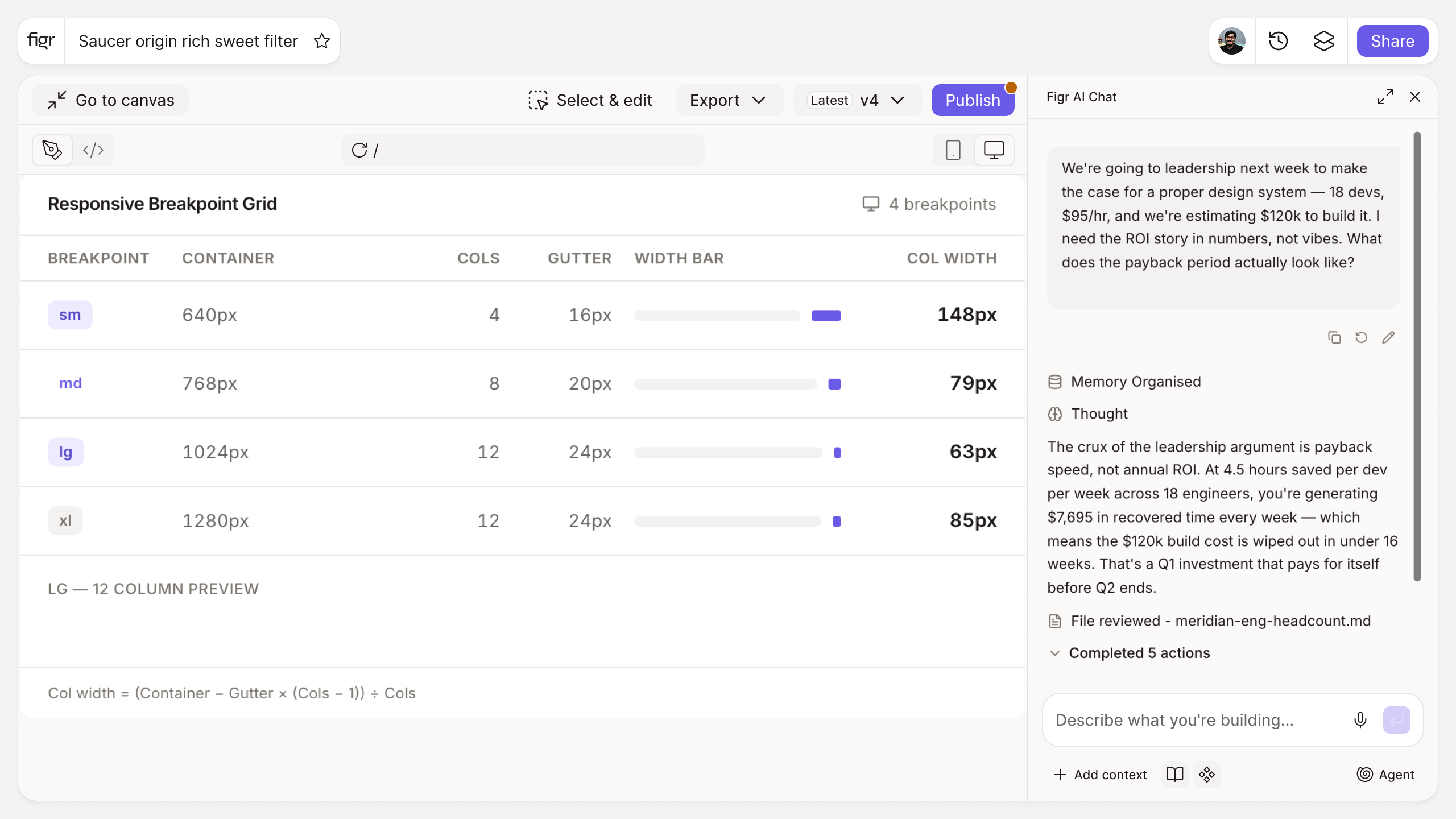
Inputs:
- Column count (number)
- Gutter width (number, px)
- Container max width (number, px)
- Target devices (multi-select): mobile, tablet, desktop, wide
Output: Recommended breakpoint values per device, the resulting content width at each, and copyable CSS media queries.
Behavior: Calculates live in-browser, no login. Exportable.
Copied breakpoints lead to awkward layouts
Most teams paste 768 and 1024 from a framework and move on, then wonder why a layout looks cramped at one size and stretched at another. Breakpoints lifted from someone else's grid have no relationship to yours, so the content reflows at the wrong moments.
Deriving them from your actual columns, gutter, and container keeps line lengths readable and columns aligned across devices. This tool does that math and hands you the media queries. The principles behind it are in responsive design best practices and mobile-first design.
How it works
1. Set your grid. Enter columns, gutter, and container width.
2. Choose target devices. Pick the ranges you support.
3. Read the breakpoints. See values and the content width at each.
4. Copy the media queries. Drop them into your CSS.
A worked example
With a 12-column grid, 24px gutters, and a 1200px container, the calculator works out where columns would get too narrow to hold readable content and places breakpoints there, rather than at arbitrary round numbers. You get a tablet breakpoint that keeps the grid legible and a desktop one tied to your real container, plus the media queries to implement them. Pairing this with a sound grid is what makes responsive behavior feel designed rather than accidental.
From breakpoints to responsive design, with Figr
Breakpoints are the math; designing for each one is the work. Figr is an AI product designer that reasons through responsive behavior from your product context and produces Figma-ready screens across sizes, so responsiveness is designed in, not bolted on after. Pair this with the grid calculator and the spacing system generator.
Who this is for
This is for UX designers and front-end developers who need breakpoints grounded in a real grid.
What this tool is not
It calculates sensible breakpoints from your grid; it does not decide your content strategy at each size, which is still a design judgment. It is also a free, standalone utility, not a Figr product feature.
FAQ
Is the breakpoint calculator free?
Yes, free and no sign-up.
What breakpoints should I use?
It depends on your grid and audience. This tool derives sensible values from your columns and container rather than copying generic defaults.
Does it output media queries?
Yes, copyable CSS media queries for each breakpoint.
Can I target custom devices?
Yes. Select the device ranges you support.
How is this different from Figr the product?
This is a free utility. Figr the product is an AI product designer that turns product context into UX decisions and Figma-ready design.