
A Designer can lose a week arguing about whether a screen is a wireframe, mockup, or prototype, when the underlying question is what decision the team is trying to make. I watched this happen on a settings redesign where everyone used the right artifact name and still talked past each other.
When that confusion lingers, feedback gets distorted. Stakeholders react to color when the team needs structural input, engineering estimates a polished static screen as if the flow is resolved, and usability issues surface after handoff because nobody tested behavior early enough.
Figr changes that by grounding design generation in product context instead of starting from a blank canvas. Its Visual Context Graph pulls together screens, flows, design systems, product knowledge, and implementation constraints so a team can generate the right artifact for the question at hand, whether that means a rough structure, a polished visual, or a high-fidelity interactive prototype.
What Are Wireframes, Mockups, and Prototypes Really For?
Wireframes, mockups, and prototypes are different tools for different decisions, not just different levels of polish.
The standard explanation is still useful. A widely used UX framing puts these three artifacts on a fidelity spectrum: wireframes are low-fidelity and focus on structure, mockups are high-fidelity and focus on visual design, and prototypes are interactive and used for testing. Product guidance from Moqups, Sketch, Aha!, and Figma also places them in that general order, with wireframes first, mockups second, and prototypes last in the workflow, making prototype creation the typical final stage before development in those frameworks, as described in Moqups' overview of the fidelity spectrum.
That's the textbook answer. It's also where many teams stop too early.
The job each artifact is hired to do
A wireframe answers structural questions:
What belongs on this screen
What has priority
How a user moves from one step to the next
A mockup answers visual questions:
Does the interface feel on-brand
Are typography, spacing, and hierarchy working together
Will this visual language support trust and clarity
A prototype answers behavioral questions:
Can someone complete the task
Does the interaction make sense in motion
Where does confusion show up once the interface responds
The basic gist is this: the artifact matters less than the uncertainty you're trying to reduce.
If a Product Manager needs alignment on an onboarding path, a clickable prototype might help more than a gorgeous mockup. If the team is still debating whether billing belongs under settings or workspace admin, a wireframe is usually enough. If the structure is settled but leadership needs confidence that the new account area still feels like the product they know, a mockup earns its place.
Practical rule: Ask “what question are we answering?” before asking “what deliverable do we need?”
That framing also helps newer teams avoid overproducing artifacts. You don't always need all three. You need enough fidelity to move the decision forward without creating fake certainty.
If you want a deeper baseline on understanding wireframes, start there first, then come back to this comparison with a sharper lens. For founders working through early product definition, Refact helps founders build a useful bridge between prototype thinking and MVP decisions, which is often where these terms get blurred.
Why the Linear Wireframe to Prototype Model Is Broken
The linear model breaks when teams treat artifacts like mandatory checkpoints instead of decision tools.
Last week, I watched a Product Manager push for a mockup because leadership wanted “something real.” The Designer needed flow feedback, engineering needed state clarity, and user research still suggested the navigation model might be wrong. They followed the expected sequence and still created rework.
That happens because the sequence can become a script.
Where the friction actually comes from
Most mainstream explainers present a linear path, wireframe first, mockup second, prototype third. What they rarely address is the more useful question: when should a prototype replace a mockup because the primary risk is flow comprehension, not polish? Major design resources define mockups as static representations, while prototypes are the interactive format teams use to test flows and gather usability feedback before development, which is the core nuance highlighted in Miro's discussion of mockups versus wireframes.
In practice, teams get stuck when they assume higher fidelity means better progress. It doesn't. Higher fidelity means narrower feedback.
A rough wireframe invites questions about hierarchy. A polished mockup invites comments about color, spacing, and whether the brand “feels premium.” A prototype invites observations about timing, decision points, and friction. If you use the wrong artifact, people still give feedback. It's just feedback on the wrong layer of the problem.
Why this gets expensive fast
The cost isn't just design churn. It's organizational drift.
Stakeholders anchor on polish: A clean mockup looks settled, so people stop challenging weak logic.
Engineers infer missing behavior: Static screens force development teams to guess what happens in loading, error, or edge states.
Researchers test too late: If interaction questions wait until after visual sign-off, teams learn the most painful truths at the worst moment.
This is why artifact-driven process often creates handoffs instead of shared thinking. The work moves forward on paper, but uncertainty stays hidden.
I've seen teams fix this by changing the meeting input. Instead of “review the mockup,” they review “the assumption that users can recover from a failed invite flow without support.” Suddenly the artifact becomes secondary, and the conversation gets sharper.
If your team keeps shipping with hidden ambiguity, this pattern often shows up alongside broader process debt. A useful companion read is how to resolve product development issues before they keep leaking into design reviews.
How to Start with Goals Before Drawing a Single Box
Good design starts with a question, a user outcome, and a constraint, not a canvas.
Teams often open Figma too early because drawing feels like momentum. Sometimes it is. Often it's a way to avoid the harder work of defining what success looks like.
A better starting point
Before anyone sketches a screen, get crisp on four things:
User outcome: What should the user be able to do after this flow exists?
Business outcome: What changes for the product if this flow works better?
Decision risk: What are you least sure about right now?
Constraint: What can't change because of policy, code reality, or system behavior?
That short exercise changes everything. A settings redesign and an onboarding redesign can both produce “three screens,” but they demand different kinds of evidence. One may need architecture validation. The other may need interaction testing around trust and error recovery.
A simple pre-design workflow
Step 1. Name the user job.
Write the task in plain language.
Example: “A team admin needs to invite a contractor without granting full workspace access.”
Step 2. Define the failure mode.
What usually goes wrong today?
Misunderstood permissions
Hidden prerequisites
No recovery path after an error
Step 3. Decide what must be learned first.
Choose the biggest uncertainty.
That choice tells you whether to start with a wireframe, mockup, or prototype.
Step 4. Gather context before generating options.
Useful inputs include:
PRDs
research notes
support tickets
analytics observations
existing screen captures
Context-heavy tools become useful. Figr's Context Pod can ingest written product context, research, analytics notes, and existing screens so the design exploration starts from the product's actual memory, not a vague prompt. That matters because AI is only helpful when it inherits the actual problem, the actual constraints, and the actual language of the product.
Teams don't usually suffer from a lack of screens. They suffer from a lack of shared intent.
If your team needs a stronger framing before design work begins, this guide on understanding product problems is a good companion because it pushes the conversation upstream, where a lot of design confusion starts.
From User Research to Coherent Information Architecture
Information architecture gets better when teams translate research into decisions about placement, sequence, and mental models.
User research is easy to admire and hard to operationalize. Teams collect interview notes, survey themes, and support pain points, then jump straight into screens without converting those findings into structure. That's why interfaces end up looking clean while still feeling wrong.
Research should change the shape of the product
The shift happens when you stop asking “what did users say?” and start asking “what should move because of what users said?”
A few examples:
If users describe a task in one phrase and your navigation labels use another, your architecture is already drifting from their mental model.
If people repeatedly pause at the same step in a recording, the problem may be sequencing, not visual clarity.
If users keep asking “where does this live?” your hierarchy is the issue, not your styling.
That's why research synthesis should lead to an architecture draft before it leads to polished screens.
A practical translation workflow
Step 1. Cluster by task, not quote.
Group findings around what users are trying to accomplish.
This avoids designing around isolated anecdotes.
Step 2. Draft the object model.
List the core entities users think they're interacting with.
Workspace
Project
Template
Approval
Billing account
Step 3. Map critical paths.
Focus on the paths users repeat or the paths where failure has high cost.
Don't map everything at once.
Step 4. Test the labels in plain language.
If a navigation item needs explanation in a meeting, it probably needs rewriting in the product.
A friend at a Series C company told me their Designer kept fixing “UI issues” in a reporting feature until screen recordings showed users didn't understand the difference between a report, a dashboard, and an export. The problem lived in the information model. Once they changed the architecture and labels, the UI suddenly looked smarter without becoming more complex.
This is what I mean by coherent structure. Design maturity often shows up less in visual novelty and more in whether the product mirrors how users think.
For teams doing this work from scratch, strong methods for user research matter because weak inputs create confident-looking architecture with shaky foundations.
Choosing the Right Fidelity to Answer the Right Question
The right fidelity is the one that reduces the current uncertainty with the least wasted effort.
The phrase wireframe vs mockup vs prototype sounds like a contest. In practice, it's a routing question. Which artifact gets the team to the next good decision fastest?
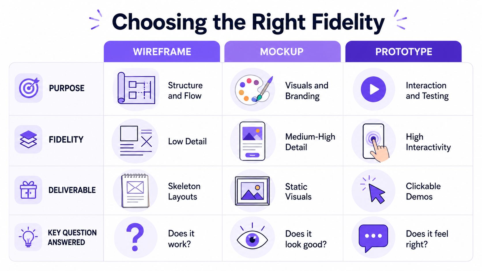
Fidelity follows uncertainty
If you're still unsure about page hierarchy, low fidelity is an advantage. It keeps attention where it belongs. If visual trust matters because the product handles payments, identity, or approvals, higher visual fidelity may be necessary earlier. If the whole risk lives in sequence and interaction, skip the polished static layer and move straight to a prototype.
That's why fidelity should follow uncertainty, not ritual.
Fidelity vs Question choosing your artifact
Does the structure make sense? Best artifact: a wireframe. It's low-fidelity, structural, and intentionally simplified. Use it for early exploration, architecture reviews, and flow alignment.
Does the interface look right for this brand or product? Best artifact: a mockup. It's static, visually detailed, and closer to final UI. Use it for stakeholder reviews, visual sign-off, and design refinement.
Can a user complete the task without friction? Best artifact: a prototype. It's interactive, behavior-focused, and testable. Use it for usability testing, flow validation, and pre-development checks.
Do we need feedback on both structure and behavior quickly? Best artifact: a prototype, sometimes before a mockup. It's clickable enough to test sequence, not necessarily polished. Use it for flow-heavy features, onboarding, and multi-step tasks.
Are we comparing directions rather than polishing one? Best artifact: a wireframe first, then selective mockup. It allows fast variation before deeper visual work. Use it for concept comparison and product strategy exploration.
What works and what usually backfires
What works:
Wireframes for alignment when the model is still changing
Mockups when visual confidence affects buy-in
Prototypes when the team needs evidence about behavior
What backfires:
Mockups used as stand-ins for interaction
Prototypes built after structure is politically frozen
Wireframes treated as a mandatory stage even when the main risk is flow
A modern AI workflow can reduce the friction between these layers by generating multiple fidelity levels from the same product context. Instead of rebuilding the same idea three times, the team can produce a rough structural draft, a visual treatment, and a high-fidelity prototype from one grounded source of truth, then choose the artifact that matches the decision in front of them.
That's a better way to think about fidelity. Less ladder, more lens.
How Usability Testing and Analytics Inform Your Next Move
Validation works best when usability observations and product analytics are read together.
A prototype on its own is a rehearsal. Analytics on their own are a footprint. You need both if you want to understand what users intended, where they hesitated, and whether the design improved the path.
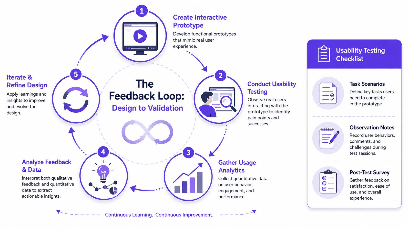
What to look for in a prototype test
When a Designer runs usability sessions, the useful signals usually aren't dramatic. They're subtle.
Hesitation: The user pauses because the next step isn't obvious.
Backtracking: The user reverses direction after making a choice.
Narration mismatch: The user says one thing and clicks another.
Workaround behavior: The user invents a path the product didn't intend.
A short checklist helps:
Task scenarios: Give users a believable goal, not feature instructions.
Observation notes: Record where they pause, ask questions, or recover from mistakes.
Post-test survey: Ask what felt clear, what felt risky, and what they expected next.
Analytics changes what you redesign next
Testing tells you why a person struggled in a controlled setting. Analytics helps you see whether that pattern likely matters in the wild.
Maybe your prototype test shows confusion around invite permissions. Then your analytics review shows drop-off around team setup or repeated visits to role-management docs. That doesn't prove causation, but it sharpens the next design question.
This matters at scale because product teams don't have infinite time for bespoke debates. They need a way to connect what a handful of people said in testing with what the broader user base keeps doing in the product. The teams that do this well aren't just designing screens. They're building decision loops.
When testing and analytics disagree, pause before redesigning. One may be surfacing intent, the other may be surfacing behavior under real constraints.
A context-aware AI workflow helps here by connecting funnel observations, behavior notes, and design artifacts in one place, so the next iteration isn't based on a screenshot alone. That reduces the common pattern where a team “fixes” the screen that got feedback instead of fixing the flow that caused the behavior.
Mapping Every State and Edge Case Before Handoff
Most design debt hides in the states nobody presented during review.
Teams love the happy path because it fits neatly into a deck. Users don't live there. They hit loading delays, expired sessions, empty data, permission conflicts, failed uploads, and ambiguous recovery moments. If those states aren't designed before handoff, engineering fills the gap under pressure.
Static artifacts hide dynamic risk
The historical distinction still matters here. Wireframes are early-stage blueprints or schematics, mockups are static visual renderings, and prototypes are interactive simulations. Figma's guidance, as summarized by Aha!, describes wireframes as early ideas in black-and-white or grayscale with placeholder content, while mockups include near-final copy, color, typography, and fonts, which is useful context in Aha!’s guide to wireframes, mockups, and prototypes.
That distinction explains why edge cases often go missing. A static mockup can look complete while omitting the very moments that define user trust.
A good handoff package should make hidden states visible.
The state inventory I'd expect before development
State 1. Empty state.
What does the product show when there's nothing to display?
This affects comprehension more than is commonly recognized.
State 2. Loading state.
What feedback appears while the system works?
Silence creates doubt.
State 3. Error state.
What failed, what can the user do next, and what remains safe?
Generic errors erode trust quickly.
State 4. Success state.
How does the interface confirm completion?
Subtle feedback is fine if the action feels reversible and clear.
State 5. Permission or policy state.
What happens when the user reaches a legitimate boundary?
At this point, many B2B products feel arbitrary.
A strong example of this kind of thinking appears in the Figr gallery through the task approval card example, which explores a workflow with many product states rather than one idealized screen. That's the right instinct. Designers should treat state coverage as part of the design, not as implementation detail.
If your handoff still relies on engineers inferring behavior from polished screens, these developer handoff best practices will help tighten the gap before it becomes rework.
How AI Redefines Design with a Visual Context Graph
AI changes the workflow most when it understands the product before it generates the artifact.
The usual AI design failure is easy to spot. The output looks plausible, but it doesn't belong to the product. The flows are generic, the states are thin, and the visual choices don't respect the system the team has already built. Speed without context creates decorative certainty.
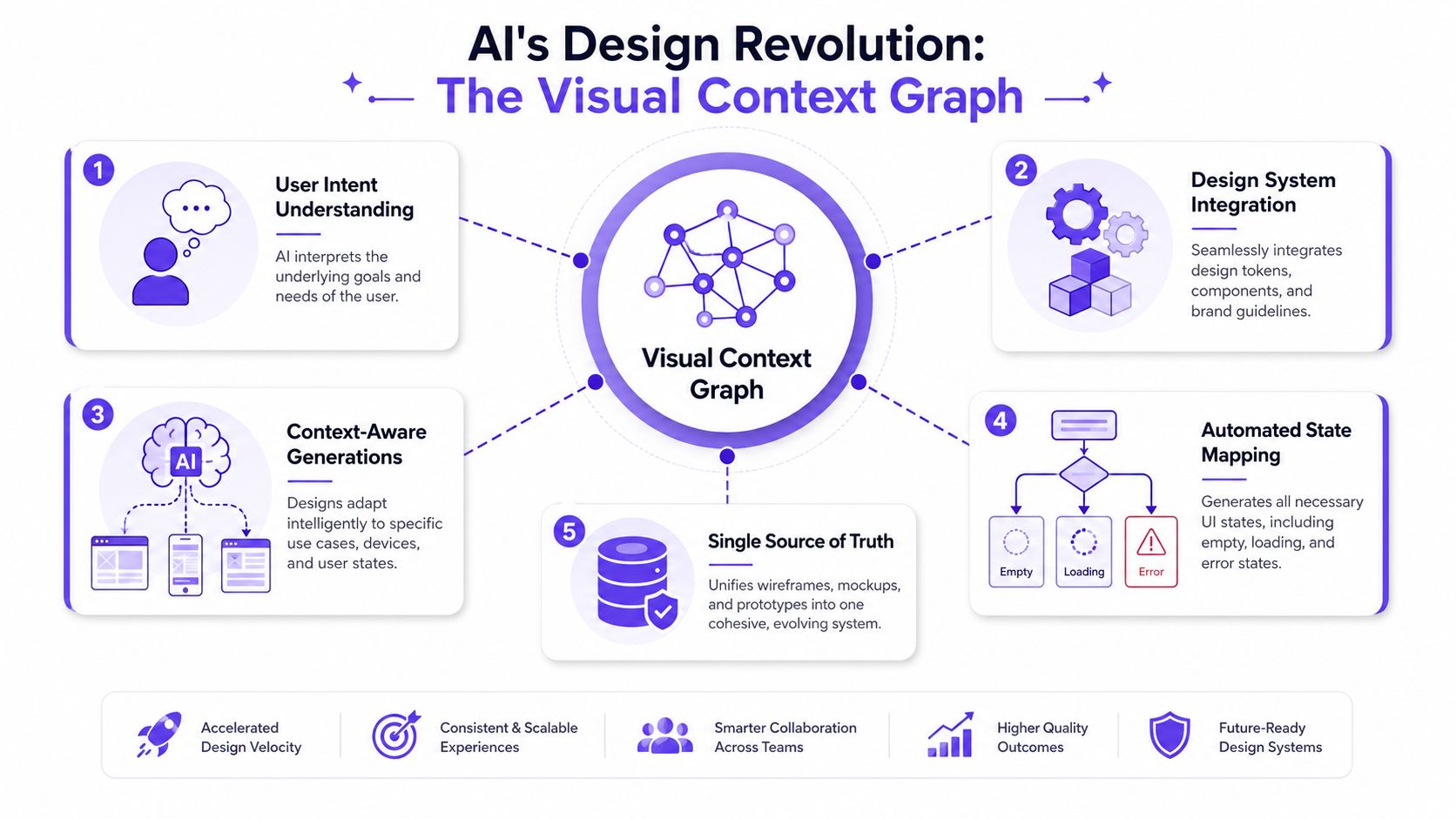
The five layers that change the output
Figr's Visual Context Graph is the model that makes a non-linear design workflow practical. It connects five layers of product memory:
Visual context: Existing screens, frames, and layouts
Behavioral context: Recordings, flows, and observed usage paths
Design System context: Tokens, components, variants, and usage rules
Product Knowledge context: PRDs, research, decisions, and written rationale
Implementation context: Code constraints and build realities
That stack matters because a Designer rarely needs “a prototype” in the abstract. They need a prototype that reflects how their product already behaves, what their users are trying to do, what their design system allows, and what engineering can support.
Why this collapses the old sequence
Once AI has layered context, the sequence becomes less rigid. You can generate a structural artifact to discuss hierarchy, then move directly to a high-fidelity prototype for flow testing, then return to visual refinements without rebuilding from scratch. The artifact changes, but the context stays stable.
That is the deeper shift behind the wireframe vs mockup vs prototype conversation. The old model assumes each artifact is a separate phase. A context-grounded AI workflow treats them as different views of the same product understanding.
People exploring broader ideas around building AI workflows often focus on automation. Design needs a more specific version of that idea. It needs memory, constraints, and reasoning between prompt and output.
Here's a quick look at the workflow in action:
I've found this especially useful in flows that combine policy, state, and visual nuance, such as approvals, onboarding, account recovery, or anything with role-based behavior. Those are the moments where a blank-canvas AI output usually falls apart, and where context-aware generation becomes genuinely practical.
If your current process still rebuilds the same idea three times, once as a wireframe, once as a mockup, and once as a prototype, it's worth trying a context-grounded workflow. You can try Figr and see what changes when the system starts from your product instead of from a prompt.
The practical difference between a wireframe, mockup, and prototype is simple once you stop treating them as labels and start treating them as answers to different questions. Wireframes help with structure. Mockups help with visual confidence. Prototypes help with behavioral truth.
The harder part is choosing the right one at the right moment. That choice gets easier when you anchor the work in goals, research, architecture, testing, analytics, and state coverage instead of defaulting to a linear ritual.
Teams still need judgment. AI doesn't replace that. What it can do is reduce the waste between thinking and making, especially when it carries the full product context forward across each fidelity level.
Your next step is straightforward: pick one active feature, write down the biggest unresolved question, and choose the artifact that answers that question with the least extra work.
FAQ
Do I always need a wireframe, mockup, and prototype for every project?
No. I'd choose based on the uncertainty in the work. If structure is clear and interaction is the risk, I'd move faster to a prototype.
When should I use a prototype before a mockup?
I do that when stakeholders or users need to understand flow, not polish. If the main question is behavior, a static mockup usually slows learning.
Are wireframes still useful now that AI can generate polished screens?
Yes. I still use wireframes when the team needs to discuss hierarchy, scope, and flow without getting distracted by visual detail.
What's the biggest mistake teams make in the wireframe vs mockup vs prototype workflow?
I see teams pick the artifact by habit instead of by question. That creates polished outputs without resolving the core uncertainty.
How does AI fit into this process without replacing the Designer?
I use AI as a context-aware drafting and reasoning layer. It helps generate options and artifacts faster, but I still decide what problem we're solving and what trade-offs are acceptable.