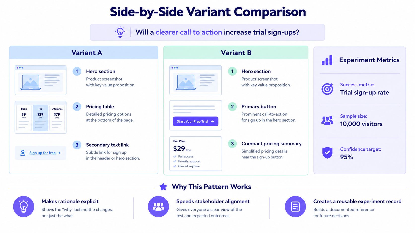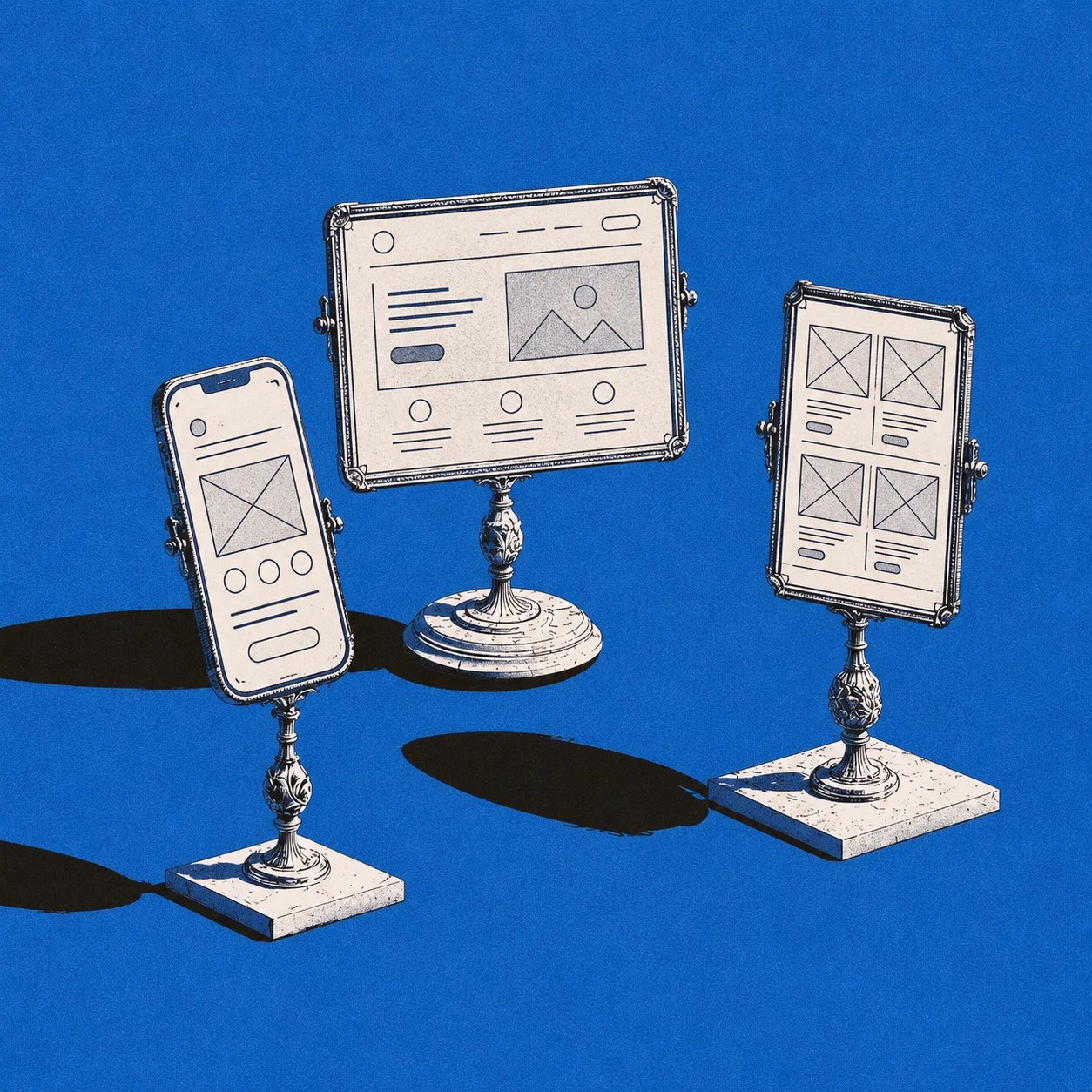
A product team can spend days debating visual polish on a screen that has not yet proved it can support the task. Wireframes prevent that drift by making layout, hierarchy, and flow visible before design and engineering effort compounds around the wrong structure.
A single polished screen also hides the real source of product friction. Users do not experience products as isolated frames. They move through states, edge cases, validation moments, loading delays, and handoffs between screens, which is why wireframes are most useful when they capture flows instead of only surfaces.
In this guide, you will see eight practical wireframe design examples for common product scenarios, what each one should include, the mistakes teams miss, and how Figr helps product teams explore alternatives before moving into high-fidelity work. For a broader sense of good UX references, you can also find top UX websites.
What makes a good wireframe design?
A good wireframe is not just a rough sketch of boxes. It is a decision-making artifact that clarifies what matters on the screen, what the user is trying to do, and what the team still needs to test. Figma describes wireframes as a way to focus on structure, content, and functionality before visual details take over the discussion (Figma wireframing guide). That is why strong wireframes are useful for Product Managers, Product Designers, engineers, and reviewers at the same time.
The best wireframe examples make six things easy to understand:
- Content hierarchy: What should users notice first, second, and third?
- Navigation: How does the user know where they are and where they can go next?
- Primary actions: What is the main task on the page, and is the action obvious?
- User intent: Does the layout reflect what the user came to do, not what the team wants to show?
- Interaction states: What happens when the screen is empty, loading, invalid, complete, or partially configured?
- Appropriate fidelity: Is the wireframe detailed enough to answer the current question, but not so polished that people argue about color and style too early?
Fidelity matters, but not in a simplistic low-fi versus hi-fi way. Figma notes that fidelity can vary across visual detail, content realism, and interactivity (how to wireframe). A grayscale wireframe can still be rich in product thinking if it shows realistic flows, branching logic, and meaningful states.
Nielsen Norman Group has long emphasized that low-fidelity artifacts are especially useful early in design because they keep the team focused on concepts and task support rather than cosmetic adjustments. That principle is one reason UX wireframe examples are so effective during feature planning: they reduce the cost of being wrong before engineering starts building.
Quick wireframe evaluation checklist
Use this short checklist before moving any wireframe into visual design:
- Can a new teammate tell what the screen is for in 10 seconds?
- Is the primary action more obvious than secondary actions?
- Does the wireframe include empty, loading, error, success, and permission-related states where relevant?
- Does navigation stay clear on desktop and mobile?
- Are labels specific enough to support scanning and search?
- Does the layout reflect the user flow before and after this screen?
- Are key assumptions annotated so reviewers debate the right thing?
If the answer is no to two or three of those questions, the wireframe probably needs another round before high-fidelity design begins.
8 wireframe design examples for product teams
Below are eight practical wireframe design examples that product teams use repeatedly across SaaS, ecommerce, mobile apps, internal tools, and AI features. Each example covers the structure to sketch, the states to include, and the mistakes that often create rework later.
1. SaaS dashboard wireframe
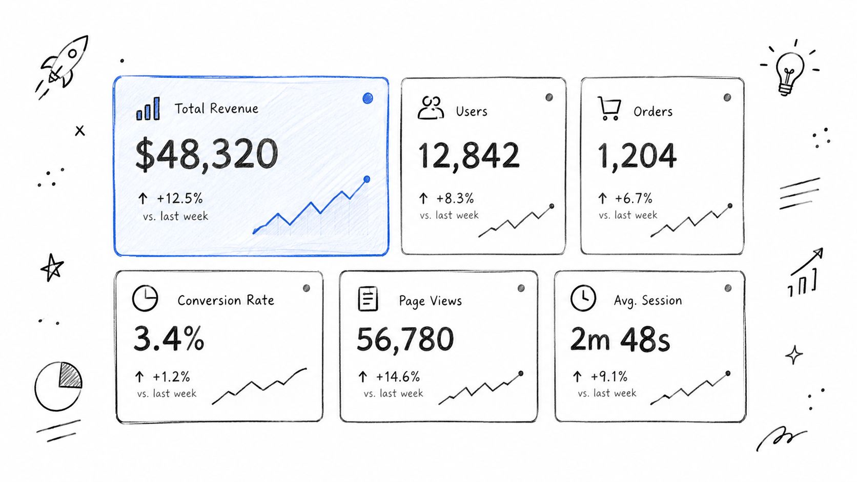
A SaaS dashboard is one of the most common UI wireframe examples because it compresses several UX decisions into one screen. It has to orient the user, summarize important information, expose next steps, and handle incomplete data gracefully.
At the wireframe level, start with five structural areas:
- Global navigation
- Page title and context
- Filters or date controls
- KPI summary cards
- A deeper analysis region, often a table or chart section
The key question is not "What data can we show?" It is "What decision should this dashboard help the user make?" That question determines hierarchy. A dashboard for an operations lead should not look like a dashboard for a founder or a support manager, even if they draw from the same database.
A strong dashboard wireframe usually includes:
- A clear first row of KPIs, limited to the metrics that change action
- Filters placed near the content they affect
- A table or chart area that explains the KPI change
- A visible timestamp or data freshness cue
- Empty states for unconfigured accounts, no recent activity, or disconnected sources
- Helpful next actions, such as "connect source," "create report," or "invite teammate"
This is where many product wireframe examples fail. Teams wireframe the ideal full-data state but skip the empty dashboard state, even though that is often the first experience new users see. The blank version needs as much thought as the populated version. It should explain what belongs here, what the user must do first, and what value they will unlock next.
Another common mistake is equal weighting. If every card is the same size, the same color, and the same importance, nothing guides attention. Use the wireframe to decide which KPI anchors the page and which metrics support it.
For product teams working through dashboard options, Figr can help compare alternative layouts on canvas, grounded in product context from screens, flows, docs, and design systems via its product workflow and Context Pod approach (Figr product). That is especially useful when PMs need to explore whether a dashboard should emphasize trend analysis, operational monitoring, or setup completion before asking a designer to polish one direction.
2. User onboarding wireframe
Onboarding is where product promise meets product reality. A polished landing page can acquire the user, but the onboarding flow determines whether they understand how to reach first value.
A useful onboarding wireframe should map the flow, not just the first screen. That usually means sketching:
- Welcome or setup context
- Account creation or sign-in steps
- Permissions or integration requests
- Progress indicators
- Optional versus required tasks
- Drop-off recovery, such as saved progress or reminder paths
The most effective website wireframe examples for onboarding use progressive disclosure. Users should only see the information they need for the current decision. Figma's guidance on wireframing supports this structure-first approach, keeping attention on sequence and usability before visual treatment (Figma wireframing guide).
For SaaS onboarding, the wireframe should answer several practical questions:
- What must happen before the product can deliver value?
- Which permissions are required now versus later?
- What can be skipped safely?
- How will users recover if they abandon the flow midway?
- Does the system explain why it is asking for data, access, or setup effort?
Good onboarding wireframes also show friction points that often go unmodeled:
- Email already exists
- SSO success but no team assigned
- Integration attempt fails
- User skips setup and lands in a partially functional workspace
- Admin must complete a step another teammate cannot do
That last point matters for product teams. Many onboarding flows fail because the wireframe assumes one actor, but the real product requires admin approval, procurement input, or technical setup from someone else.
Figr is relevant here because onboarding rarely depends on one screen alone. Figr's documented workflow focuses on connecting product screens, design context, documents, and flows so teams can explore multiple design directions and missing states before moving to final UI (Figr gallery, Figr changelog). The Gallery includes workflow examples that are relevant to setup and activation, such as a Cal.com comparison focused on how quickly users can configure availability for research calls (Cal.com vs Calendly setup example). A PM can use this kind of flow-oriented review to compare a checklist-led onboarding path against a wizard-led path, then review where each flow creates drop-off risk.
3. E-commerce checkout wireframe
Checkout is one of the clearest examples of why wireframes should model states, not just content blocks. The screen must support trust, accuracy, speed, and recovery from errors, often under time pressure.
A checkout wireframe should usually include:
- Cart summary
- Shipping information
- Billing and payment section
- Promo or discount handling
- Order review
- Validation and error placement
- Confirmation screen or post-purchase state
Baymard's research continues to show that checkout usability details matter. In its 2024 review, Baymard reported ongoing expansion of its checkout research and found that 31% of ecommerce sites lacked inline validation, while 4% implemented it incorrectly (Baymard 2024 year in review). That is exactly the kind of insight wireframes should surface early.
For checkout, the wireframe must make these decisions visible:
- When does validation appear?
- Where do field-specific errors show up?
- Can users edit cart contents without losing form progress?
- Is guest checkout clearly available if relevant?
- What happens if payment fails after the rest of the form is complete?
- How are address suggestions or tax calculations handled?
This is one of the most practical website wireframe examples because teams often assume detailed visual design will solve abandonment. It usually will not. Structural issues like poor field grouping, confusing totals, hidden shipping costs, and weak error recovery can exist even in a beautiful interface.
A good wireframe also models confirmation. The success state should reassure the user that the order was placed, summarize what happens next, and provide useful follow-up actions like tracking, downloading a receipt, or returning to the store.
If your team is comparing one-page checkout against a multi-step flow, wireframe both. Baymard also noted in benchmark reporting that checkout complexity still varies widely across sites, with many experiences carrying more fields and steps than necessary. That makes alternative wireframes valuable long before engineering commits to one implementation path.
Figr Gallery also has especially relevant checkout workflow examples. One Shopify project maps checkout setup structure and redesign opportunities, while another explores conflicting checkout settings and the value of showing downstream consequences before save (Shopify checkout setup redesign, Shopify checkout dependencies example). There is also a Stripe example that maps the PaymentIntent state machine and designs recovery paths for failed payments across desktop and mobile (Stripe checkout recovery example). These are useful as workflow demonstrations because they show why checkout wireframes need to include validation, dependencies, and failure recovery, not just the happy path.
4. Mobile app wireframe
Mobile product work needs its own category because many desktop assumptions break quickly on a phone. Space is tighter, navigation options are fewer, attention is shorter, and users rely on touch rather than precise cursor interactions.
A mobile app wireframe should focus on:
- Top-level navigation model
- Thumb-friendly primary actions
- Content priority in a constrained viewport
- Keyboard behavior and form entry
- Loading and offline handling
- Responsive adaptation from larger screens if the product is cross-platform
The best app wireframe examples reduce the amount of simultaneous choice on screen. That does not mean less capability. It means sequencing actions so users can move through the task without fighting the interface.
When sketching a mobile app wireframe, ask:
- What absolutely must be visible above the fold?
- Which actions belong in bottom navigation, tabs, or a floating action button?
- Are touch targets large enough and spaced well enough?
- What changes when the keyboard opens?
- Is the most common action reachable with one hand?
A frequent mistake is importing desktop information architecture directly into mobile. For example, a left navigation model with deep nested controls often becomes unusable when compressed into a small menu. Mobile wireframes should make harder choices about hierarchy.
These are also ideal UI wireframe examples for testing state transitions. A mobile screen may need compact loading states, partial content rendering, permissions prompts, native share behavior, and retry patterns for weak connectivity. Those states are easy to skip in high-level planning, but they strongly affect perceived quality.
For teams already working inside existing design systems, Figr's documented design-system-aware workflow and Figma Sync can help translate current product patterns into mobile explorations without starting from a blank canvas every time (Figr product, Figr changelog). The Gallery also includes mobile-relevant workflow examples, including Stripe payment recovery flows designed across desktop and mobile, plus a Skyscanner review that surfaces issues like small tap targets, weak contrast, and overwhelming choice density for older users (Stripe checkout recovery example, Skyscanner accessibility review). That can help PMs and Designers pressure-test whether a new mobile flow fits current product conventions before full production design begins.
5. Search and filtering wireframe
Search and filtering are deceptively complex. On the surface, they seem like a search box plus some controls. In practice, they define how users narrow a large information space without losing orientation.
A search and filtering wireframe should cover:
- Search field placement and default behavior
- Filter categories and hierarchy
- Result count visibility
- Sort controls
- Applied-filter chips or summaries
- Zero-results state
- Clear-filter or reset action
This is one of the most valuable wireframe design examples for B2B SaaS products because power users often depend on search to complete high-frequency tasks. If labels are vague or filters are buried, task time expands quickly.
A strong wireframe shows not only the ideal results state, but also the system behavior around search:
- What appears before the user types?
- Are suggestions, recent searches, or saved filters shown?
- What happens with misspellings?
- Can users combine filters across categories?
- Does the interface explain why no results appeared?
Zero-results states matter as much as positive results. A useful zero-results wireframe should tell users whether the issue is spelling, permissions, incompatible filters, or simply no matching data. It should also offer a recovery path, such as removing a filter, broadening the query, or creating a new item.
Search wireframes are also strong candidates for annotated logic. Rather than only drawing boxes, add notes such as:
- "Search matches item name first, then description"
- "Recent filters persist per user"
- "Permission-restricted results are hidden, not disabled"
Those annotations help engineers and PMs align on behavior before implementation. Figr Gallery also shows adjacent workflow examples that reinforce this point, including a Skyscanner flight-search review and a LinkedIn Recruiter concept that consolidates candidate review into a single evidence-rich screening flow (Skyscanner accessibility review, LinkedIn Recruiter screening example). For teams exploring AI-assisted product ideation, this is another area where comparing multiple wireframe directions can be useful, especially when ranking rules, filters, and result density may vary by user type.
6. Account settings wireframe
Settings pages rarely win design awards, but they are core product wireframe examples because they expose how carefully a team organizes information and risk. Poor settings design creates support load, security confusion, and accidental changes.
An account settings wireframe should usually group information into clear sections such as:
- Profile information
- Team or workspace settings
- Billing and plan details
- Notifications
- Security controls
- Connected apps or integrations
- Destructive actions, such as deactivate or delete
The wireframe should clarify whether settings live in tabs, a left-side navigation, an accordion, or separate pages. The right answer depends on scope, but the grouping logic should reflect user mental models rather than backend categories.
Key behaviors to wireframe include:
- Inline editing versus edit screens
- Save confirmation behavior
- Unsaved changes warning
- Password or 2FA setup states
- Admin-only restrictions
- Confirmation modals for destructive actions
This is where isolated screens are especially dangerous. A settings wireframe may look clean in the default state, then break down once error messages, disabled controls, role-based restrictions, or verification flows are added.
For example, changing an email address might require:
- Current password confirmation
- Verification sent state
- Pending email change message
- Ability to resend verification
- Error handling if the link expires
If those states are missing from the wireframe, implementation choices will drift. Strong UX wireframe examples prevent that by treating settings as a sequence of state transitions, not a static form.
Figr's workflow is relevant for these cases because settings often need to stay aligned with an existing product language and design system. According to Figr's product documentation and changelog, it supports design-system-aware generation, direct editing on prototypes, and Figma Sync, which can help teams iterate settings structures while staying grounded in current UI conventions (Figr product, Figr changelog). The Gallery also includes examples that are useful for settings-style thinking, such as Shopify checkout dependency mapping and Cal.com timezone handling across setup, confirmation, and calendar invites (Shopify checkout dependencies example, Cal.com dual timezone example). These are useful as workflow demonstrations because they show how configuration choices ripple into later states and downstream communication.
7. Team invitation wireframe
The team invitation flow is a compact but high-impact pattern. It looks simple on the surface, but it often combines form input, permissions, role logic, duplication checks, and multi-user outcomes.
A team invitation wireframe should include:
- Email input or multi-email entry
- Role selection
- Permission explanation
- Invite message or context if relevant
- Validation for format and domain rules
- Duplicate invitation handling
- Success and failure states
This is one of the most practical wireframe examples for SaaS products because collaboration features often depend on it, and small flaws create immediate confusion. A weak invitation flow can lead to wrong permissions, user distrust, and support tickets that should have been preventable.
Important wireframe questions include:
- Can users invite multiple teammates at once?
- Are all roles selectable by every inviter?
- What if the invitee already belongs to the workspace?
- What if the invite is pending already?
- Is domain-based auto-join available, and how is it explained?
- What happens if an inviter lacks permission to assign a specific role?
A complete wireframe should show both the initiating screen and the downstream feedback states. For example:
- Success toast or confirmation panel
- "Invitation already sent" state
- "User already in workspace" message
- Permission error state
- Expired invitation acceptance state
These details make a difference because invitation flows connect product UX with account administration. They are excellent candidates for annotation, especially around permissions. Write the rules directly into the wireframe when needed, so product and engineering do not interpret the same control differently.
If PMs need to compare a modal-based invite flow against a dedicated invite page, or test whether role education belongs inline or behind helper text, wireframing both versions usually resolves the debate faster than discussing the pattern abstractly.
8. AI feature wireframe
An AI feature wireframe deserves its own category because AI interfaces introduce a new set of expectations and failure modes. Users need input clarity, output trust, transparency, and control when the generated result is imperfect.
A strong AI feature wireframe should cover:
- Input area or prompt entry
- Scope or context selection
- Loading state
- Generated result area
- Failure and retry behavior
- Editing or refinement controls
- User control over acceptance, regeneration, or dismissal
- History or comparison if multiple outputs matter
This is one of the most important UI wireframe examples in 2026 because teams are adding AI features into mature products, not building greenfield interfaces from scratch. That means the wireframe has to answer how the AI interaction fits within existing navigation, permissions, and workflows.
For example, if the feature generates a dashboard summary, a support reply, or a wireframe direction, the product should make several things obvious:
- What context is the AI using?
- How long might generation take?
- What should users do while waiting?
- How do they retry if the request fails?
- Can they edit the result directly?
- What happens if the output is incomplete or unsuitable?
The loading state is especially important. AI features often feel unreliable not because the output is poor, but because the system does not explain what it is doing. The wireframe should consider whether to show progress text, staged status messages, partial output, or a cancel action.
Failure states also need real product thinking. A useful AI wireframe may include:
- "Could not generate" with retry
- Rate limit reached
- Missing permissions or missing data sources
- Unsafe or unsupported prompt guidance
- Ability to fall back to manual workflow
This is an area where Figr is directly relevant. Figr positions itself as an AI product design agent that uses product screens, Figma files, PRDs, research, analytics, recordings, and design-system context to generate contextually appropriate UX, rather than generic UI output (Figr product). Its documented capabilities include Context Pod, UX Reasoning, wireframes on canvas, multiple design directions, multi-state prototypes, Direct Editing, Design System Intelligence, and Figma Sync (Figr changelog). In practice, that makes Figr useful when a PM or Designer wants to explore several AI feature flows, identify missing states, and compare solutions before taking one direction into detailed design.
The gallery also shows workflow-oriented examples where teams map edge cases, failure conditions, and UX reasoning during review, which is a better fit for AI feature design than treating the output panel as a simple content block (Figr gallery).
Common wireframing mistakes product teams make
Across all eight examples, the same issues tend to create rework:
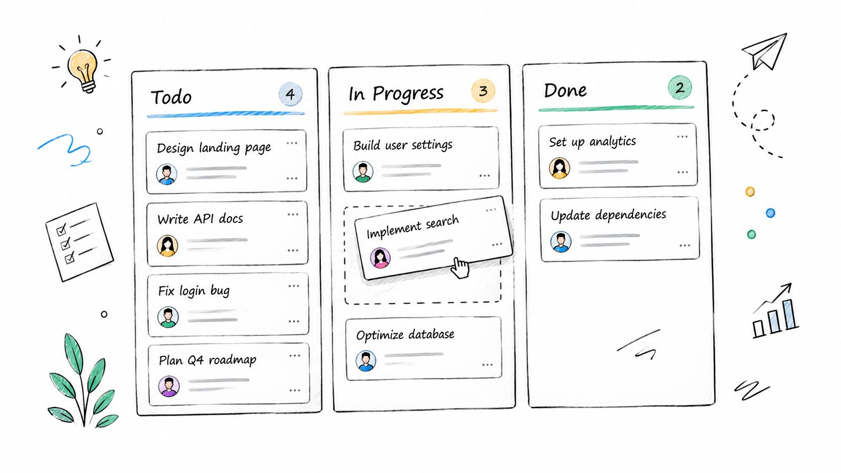
Designing one happy path only
The default state is rarely the only state that matters. Empty, loading, invalid, permission-restricted, and success states often determine whether the feature feels usable.
Debating visuals too early
When a wireframe becomes too polished too soon, stakeholders comment on typography and colors instead of structure. Keep fidelity matched to the question you are trying to answer.
Ignoring adjacent screens
A dashboard without setup, a checkout without confirmation, or settings without verification is not a complete design decision. Wireframes should connect to the surrounding flow.
Treating labels as placeholder copy
Labels are part of the UX. Search, navigation, settings, and role names all depend on precise language. Vague naming weakens even a strong layout.
Skipping annotations
Many of the best wireframe examples are strong not because they look impressive, but because they explain behavior. Notes about ranking logic, permission rules, validation timing, or role restrictions save time later.
How Figr helps teams move from wireframe idea to review-ready direction
For product teams with an existing product, wireframing is rarely a blank-page exercise. New features need to fit current screens, design-system rules, user flows, documentation, and implementation constraints.
That is where Figr is differentiated. Figr describes its workflow as grounded in existing product and design-system context, using sources like product screens, Figma files, PRDs, research, analytics, recordings, and code constraints to generate contextually appropriate UX (Figr product).
For MOFU readers evaluating how to speed up product exploration, several documented Figr capabilities are especially relevant:
- Context Pod to store reusable product memory and design context
- UX Reasoning to explain why a flow or layout direction makes sense
- Wireframes on canvas for exploration before pixel-perfect UI
- Multiple design directions for comparing alternatives
- Multi-state prototypes for flows, edge cases, and review scenarios
- Design System Intelligence to stay closer to existing components and patterns
- Direct Editing to refine content and UI details on the canvas
- Figma Sync to pull in richer context from a full Figma file
According to the official changelog, recent updates also expanded prototype editing and deeper Figma Sync behavior, which matters when teams want to iterate from real product artifacts instead of recreating context manually (Figr changelog).
That does not mean Figr automatically validates usability or guarantees perfect adherence to every system rule. It means teams can explore, compare, and refine wireframe directions faster with more product context in view.
If you want to see how these workflows look in practice, the Figr Gallery shows examples of design reviews, UX exploration, and flow-oriented outputs. Those examples are useful as demonstrations of workflow and reasoning, not as proof of customer outcomes.
FAQ about wireframe design examples
What is the difference between a wireframe and a mockup?
A wireframe focuses on structure, hierarchy, flow, and core interactions. A mockup adds visual design details such as color, typography, spacing polish, and branded UI treatment. In practice, product teams use wireframe design examples to make layout and workflow decisions before investing in detailed visuals.
When should product teams use low-fidelity wireframes?
Low-fidelity wireframes are most useful early in the design process, when the team still needs to compare ideas, test flows, and align on requirements. They help Product Managers and Designers discuss the right questions before high-fidelity screens make weak structure look finished.
What should a good wireframe include?
A good wireframe should make the main user task obvious. It should show content hierarchy, navigation, primary actions, labels, and relevant states such as empty, loading, error, success, and permission-related conditions. The strongest UX wireframe examples also include annotations when system behavior is important.
Are wireframes still useful if a team already has a design system?
Yes. A design system helps teams stay consistent, but it does not decide the right workflow, screen hierarchy, or state handling for a new feature. Product wireframe examples are still valuable because they help teams test whether the structure itself makes sense before applying production-ready components.
How detailed should a wireframe be?
The right level of detail depends on the decision being made. If the team is deciding between two flows, simple boxes and annotations may be enough. If the team needs feedback on a complex setup path, the wireframe may need realistic content, branching states, and clickable transitions. Strong UI wireframe examples are detailed enough to answer current product questions, but not so polished that reviews drift into visual preference debates.
What are the most common wireframing mistakes?
The most common mistakes are designing only the happy path, skipping empty or error states, copying desktop layouts directly into mobile, using vague labels, and debating visual polish too early. Many weak website wireframe examples look fine at first glance, but break down once edge cases and adjacent screens are considered.
Can AI help create wireframes for existing products?
AI can help teams explore alternatives faster, especially when it is grounded in real product context instead of generic prompts. For example, Figr is designed to use screens, flows, PRDs, research, analytics, recordings, and design-system context to help teams generate and refine wireframe directions that fit an existing product environment (Figr product).
FAQ about wireframe design examples
What is the difference between a wireframe and a mockup?
A wireframe focuses on structure, hierarchy, flow, and core interactions. A mockup adds visual design details such as color, typography, spacing polish, and branded UI treatment. In practice, product teams use wireframe design examples to make layout and workflow decisions before investing in detailed visuals.
When should product teams use low-fidelity wireframes?
Low-fidelity wireframes are most useful early in the design process, when the team still needs to compare ideas, test flows, and align on requirements. They help Product Managers and Designers discuss the right questions before high-fidelity screens make weak structure look finished.
What should a good wireframe include?
A good wireframe should make the main user task obvious. It should show content hierarchy, navigation, primary actions, labels, and relevant states such as empty, loading, error, success, and permission-related conditions. The strongest UX wireframe examples also include annotations when system behavior is important.
Are wireframes still useful if a team already has a design system?
Yes. A design system helps teams stay consistent, but it does not decide the right workflow, screen hierarchy, or state handling for a new feature. Product wireframe examples are still valuable because they help teams test whether the structure itself makes sense before applying production-ready components.
How detailed should a wireframe be?
The right level of detail depends on the decision being made. If the team is deciding between two flows, simple boxes and annotations may be enough. If the team needs feedback on a complex setup path, the wireframe may need realistic content, branching states, and clickable transitions. Strong UI wireframe examples are detailed enough to answer current product questions, but not so polished that reviews drift into visual preference debates.
What are the most common wireframing mistakes?
The most common mistakes are designing only the happy path, skipping empty or error states, copying desktop layouts directly into mobile, using vague labels, and debating visual polish too early. Many weak website wireframe examples look fine at first glance, but break down once edge cases and adjacent screens are considered.
Can AI help create wireframes for existing products?
AI can help teams explore alternatives faster, especially when it is grounded in real product context instead of generic prompts. For example, Figr is designed to use screens, flows, PRDs, research, analytics, recordings, and design-system context to help teams generate and refine wireframe directions that fit an existing product environment (Figr product).
Final takeaway
The value of wireframe design examples is not that they give you a template to copy. It is that they show what product teams must think through before high-fidelity design makes the wrong decisions feel expensive.
Whether you are designing a dashboard, onboarding sequence, checkout, mobile app, search flow, settings area, invitation system, or AI feature, the best wireframes make structure, intent, and state behavior explicit. They help teams evaluate features before committing to polished visuals or engineering implementation.
If your team wants to move from idea to review-ready wireframes with stronger product context, Figr can help you explore flows, compare options, identify missing states, and refine directions grounded in your existing product. Visit Figr to see how it supports wireframing and product design exploration.