
A product team can ship a beautiful internal tool and still make the workday worse, because they solved for the wrong kind of user experience.
You've probably seen the pattern. The new interface looks clean, the navigation feels modern, and the first demo lands well in a conference room. Then the people who live in the product all day start stumbling. The finance analyst can't compare records fast enough. The operations manager loses context across multi-step flows. The support queue starts filling with “where did this go?” tickets.
The fix isn't more polish. It's a different discipline. Enterprise UX design and consumer UX design serve different economic realities, different user motivations, and different kinds of risk. If you understand that split, and build from it, you can design software that supports real business operations instead of fighting them. A solid grounding in user experience design principles helps, but enterprise work demands a sharper lens.
Introduction
The Core Divide Efficiency vs Engagement
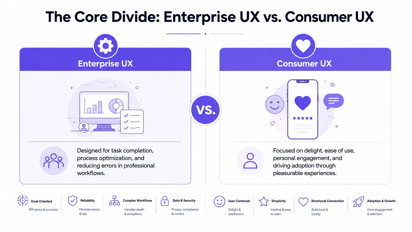
Consumer and enterprise UX are often discussed as if they sit on the same spectrum, with one “more complex” than the other. That framing misses the structural divide. These are two different strategic disciplines.
Two products, two risks
Consumer UX mainly manages market risk. Will someone choose this product, understand it quickly, and come back? The design has to earn attention in a crowded market. It has to reduce friction to adoption and support the emotional layer that keeps a product memorable.
Enterprise UX manages operational risk. Will people complete critical tasks accurately, repeatedly, and under pressure? Will the workflow hold when a role changes, data volume spikes, or an edge case appears at the worst possible time?
A sports car and a commercial airliner can both be well designed. Nobody confuses their purpose.
That's the basic gist: consumer UX tries to win a choice, enterprise UX tries to protect performance.
Why “delight” can become expensive
Last week I watched a PM walk through a redesign of an internal operations tool. The new version looked calmer. Fewer controls were visible. More actions were tucked behind menus. The room liked it, until an experienced user asked how to batch-review exceptions without leaving the table. Nobody had a fast answer.
That moment happens because teams import the wrong success criteria.
For broad UX work, Forrester reported via Adobe that strategic UX investment can increase conversion rates by up to 400% and return about $100 for every $1 invested. In enterprise settings, organizations translate that logic into operational metrics such as 20–40% reductions in task completion time and 30–50% lower error rates after a redesign, because efficiency and accuracy are primary business outcomes.
Practical rule: If a workflow is performed all day, speed and error tolerance usually matter more than novelty.
That's why enterprise UX often feels less theatrical. It doesn't need to charm the user into trying the product. It needs to help an expert stay in flow for hours without accumulating mistakes, fatigue, or rework.
The pressure product teams feel
A lot of teams still borrow from consumer playbooks because the language is attractive. Simplicity. delight. frictionless onboarding. Those ideas matter, but they need translation before they enter a business tool. A useful companion is this guide for product teams on emotional design, especially if your team tends to equate emotional quality with visual softness.
Enterprise users do want good experiences. They just define “good” differently. They want confidence, legibility, continuity, and control. They want the interface to behave like a reliable coworker, not a clever campaign.
Why Enterprise Users Are Not Customers
The biggest mistake in enterprise UX is treating the user like a buyer.
A consumer decides whether your app belongs in their life. An enterprise user is usually assigned a tool because their role depends on it. That changes everything, from motivation to tolerance for friction to what “time to value” means.
Captive users create a different design brief
When someone chooses Spotify, Notion, or Duolingo, the product has to prove itself immediately. It has to reduce confusion fast because abandonment is easy. In a company system, abandonment often isn't an option. Work still has to get done.
That doesn't mean enterprise users will tolerate poor design. It means they optimize differently. They'll accept a steeper learning curve if the product repays that effort with speed, precision, and fewer mistakes over time.
A friend at a Series C company told me their “ugliest” internal screen was also the one expert users defended most fiercely. Why? Because every field was exactly where they expected it, and every shortcut respected the rhythm of the task.
Simplicity changes meaning in enterprise software
In consumer apps, simplicity often means reduction. Fewer choices. Shorter paths. Cleaner first-run experiences.
In enterprise products, simplicity usually means organized complexity. The work itself is complex, so the interface has to expose enough of that reality for users to act without losing context.
According to Modern, enterprise systems typically display 50 to 200 data fields per screen, which is why clarity matters more than visual minimalism. Hierarchy, grouping, and consistent information architecture help expert users scan, compare, and prioritize information without getting buried by it.
Enterprise UX rewards recognition under pressure, not just ease on first glance.
This is what I mean when I say enterprise users aren't customers. They're operators inside a system. Their success depends on memory, repetition, confidence, and context carried across long sessions.
What teams need to design for instead
If you're modernizing a legacy platform, this is where the work gets real. Surface polish helps, but role logic, data structures, and workflow continuity matter more. Teams doing that work often benefit from patterns like those in Figr's guide to AI modernization, especially when old interfaces contain hidden task logic nobody documented.
A useful way to think about enterprise users:
They accumulate mastery: Repeated use changes what counts as intuitive.
They work across interruptions: The interface must preserve context when calls, approvals, or escalations break focus.
They carry role-specific responsibility: An admin, analyst, and manager don't need the same visibility or actions.
They pay for errors differently: A mistake can trigger downstream cleanup, audit pain, or customer impact.
Here's a useful primer before you redesign a dense workflow:
The Different Toolkits for Complex Work
Once you accept that enterprise UX is about operational performance, the interface toolkit changes too.
The components tell the story
Consumer products lean hard on onboarding, lightweight navigation, persuasive calls to action, and moments of emotional reinforcement. Enterprise products live elsewhere. They need components that can carry complicated work without collapsing into confusion.
The recurring enterprise patterns are familiar to anyone who's built for operations, finance, compliance, or admin systems:
Configurable tables: Dense views that support sorting, filtering, comparison, and status scanning.
High-consequence forms: Validation, conditional logic, recovery states, and error handling that assume imperfect inputs.
Bulk actions: Because no serious operations team wants to repeat the same action row by row.
Permissions-aware interfaces: What the user can see and change depends on role, policy, and organizational structure.
Search plus filters: Not decorative search bars, but retrieval systems that help people narrow large datasets quickly.
These aren't secondary details. They are the grammar of enterprise software.
Why design systems matter more here
In consumer work, a design system improves consistency and speed. In enterprise work, it also protects the product from entropy.
Coherent Solutions notes that consistent UI components and reusable patterns can cut development time by 30–50% in enterprise settings. That matters because large product suites rarely fail from one dramatic design error. They erode through local inconsistencies, duplicated patterns, and one-off exceptions that confuse users and slow engineering.
If your team is trying to tighten that loop between design and implementation, practical discussions around streamlining development with Claude AI are worth reviewing, especially when the challenge is turning repeatable product logic into working output without adding more handoff friction.
Field note: In enterprise products, inconsistency is a tax. Users pay it in hesitation, engineers pay it in rework, and support pays it in explanations.
A mature enterprise toolkit is partly operational governance
That's why token discipline, component governance, and shared interaction rules matter so much. They aren't branding chores. They are a way to keep a multi-team product legible as it grows. If your team is still debating spacing, states, and naming conventions inside every sprint, it helps to learn design token best practices before the product suite gets any wider.
The deeper pattern is easy to miss. Consumer interfaces often optimize for choice under abundance. Enterprise interfaces optimize for judgment under constraint. One tries to win attention. The other tries to reduce waste inside expensive systems.
How to Measure Success and Predict Failure
A lot of design debates disappear once the metrics get honest.
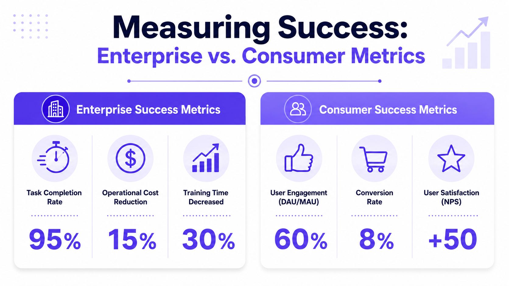
Enterprise UX uses operational KPIs
Consumer teams often watch activation, engagement, conversion, retention, and satisfaction. Those measures make sense when a product's primary challenge is earning repeated voluntary use.
Enterprise teams need different instruments. The useful signals are closer to operations management than growth marketing:
Task completion time: How long does critical work take?
Error rate: Where do mistakes cluster, and how costly are they?
Time to mastery: How quickly can a new hire become competent?
Support volume tied to workflows: Which parts of the interface create repeated confusion?
Cycle-time friction: Where does work stall across handoffs?
A clean dashboard can hide a broken operation. A slightly dense interface can subtly save thousands of decisions from going wrong. Which one would you rather ship?
Failure leaves a pattern before it leaves a crater
According to UX Pilot, 60–70% of enterprise UX failures trace back to poor data handling at scale, inconsistent interaction patterns, and lack of role-based personalization. That finding matters because it shifts the conversation away from taste.
Bad enterprise UX usually isn't a color problem. It's a structural alignment problem.
Here's a quick decision lens:
Longer session time. Consumer: often healthy engagement. Enterprise: often workflow friction.
More feature discovery. Consumer: positive exploration. Enterprise: possible overload.
Fewer visible controls. Consumer: cleaner first impression. Enterprise: possible loss of expert speed.
Support requests. Consumer: an onboarding issue. Enterprise: a workflow or role mismatch.
That table sounds obvious once you see it. Before you see it, teams misread the data all the time.
How to build a business case people will fund
The economics get clearer when you zoom out. Enterprise software often serves large organizations across many roles, and even modest workflow friction gets multiplied by headcount, repetition, and time. That's why design in business software starts sounding less like “experience” and more like asset maintenance.
If you want better instrumentation, avoiding common UX measurement mistakes is a useful reference point. The trap is relying on generic UX signals when the actual business question is operational reliability.
When a workflow runs every day, every extra click becomes labor cost.
That's also why enterprise UX can be a risk discussion, not only an efficiency discussion. The background issue many teams still understate is that internal design flaws can contribute to exposure, mistakes, and downstream compliance trouble. Product leaders who can connect UX choices to risk language tend to get heard faster by finance, legal, and security stakeholders.
The Enterprise Design Process in Practice
The enterprise design process starts where consumer teams often arrive too late: in the actual work, with the actual constraints visible.
A four-step operating model
Step 1. Watch the work where it happens.
Use contextual inquiry, shadowing, and role-based interviews.
Don't ask what users prefer first. Ask what they do, where they pause, and what they workaround.Step 2. Map workflows, not screens.
Capture the full path across people, systems, approvals, and exceptions.
The flow usually matters more than any single page, especially when tasks branch or loop back.Step 3. Prototype for role logic and edge cases.
Build around permissions, bulk actions, data states, and failure recovery.
A tidy happy path won't survive contact with real operations.Step 4. Pilot before broad rollout.
Release with a limited group, compare old and new flows, and watch adoption behavior closely.
Preserve continuity where muscle memory matters, then expand.
Why this process works
Lyssna points to contextual inquiry and workflow mapping as core enterprise methods, and reports that these approaches can yield 20–30% reductions in task time and error rates when teams translate the findings into role-specific flows and prioritized feature maps.
That result makes intuitive sense. Enterprise software fails when teams design abstractions of work instead of work itself.
I've seen this firsthand in redesign programs where the early mockups looked promising, but the first workflow map revealed approval loops, exception handling, and role overlaps nobody had represented. Once those were visible, the interface choices changed quickly. Fewer debates about aesthetics. Better debates about control, sequence, and failure recovery.
The design system layer belongs inside the process
A lot of teams still treat the design system as a library they consult after the hard thinking is done. In enterprise products, the system belongs much earlier. Shared components shape what kinds of workflows stay coherent as the product grows, and they reduce the drift that causes users to relearn the same action in slightly different contexts.
For teams tightening that foundation, these Querio insights on design systems are useful because they connect system thinking to repeatability, not just visual consistency.
Working rule: If the workflow can't be described clearly across roles, the interface probably can't be designed clearly either.
The grounded takeaway is simple. Pick one high-frequency workflow this week. Sit with the people who use it. Map the actual sequence, including handoffs, edge cases, and recovery paths. Then measure where time, uncertainty, and errors cluster. That single exercise will tell you more about what enterprise UX design is, and how it differs from consumer UX, than a month of abstract design debate.
If your team needs a faster way to turn that workflow understanding into artifacts you can ship, Figr is worth a close look. It helps product teams capture live product context, generate flows, PRDs, edge cases, prototypes, and UX reviews grounded in the product they already have, so enterprise design work starts from reality instead of a blank canvas.