
A prototype can look finished while remaining almost unusable to the team that must ship it. That's the central tension in UX Pilot vs Uizard: both can turn an idea into screens, but the decision changes once those screens meet your design system, interaction states, and Figma workflow.
When that gap stays hidden, a Product Manager reviews a convincing flow, then watches Designers rebuild layers, restore tokens, recreate component variants, and clarify missing states before engineering can work. A visually plausible screen becomes a second design project, and the cost appears as cleanup, ambiguity, and delayed decisions rather than on the pricing page.
The practical answer is to evaluate the entire path from context to editable handoff. Figr approaches that path through a Visual Context Graph, connecting product screens, behavior, design-system rules, product knowledge, and implementation constraints before generating UX artifacts.
The Prototype Handoff Illusion
A Product Manager can approve a polished checkout concept in a review, then hand the file to a Designer who must rebuild its foundations. The layout appears credible, the primary action sits where expected, and stakeholders agree on the direction. The implementation path tells a different story: the button uses an unfamiliar radius, text styles diverge from the library, loading behavior is absent, and the error state has no clear relationship to the success path.
This pattern recurs in evaluation scenarios because the failure is structural, not dramatic. A screen can pass visual review while failing the operational test. Engineers still need component mapping, Designers still need editable layers, and the Product Manager still needs confidence that the flow reflects the actual product.
Practical rule: Treat generated screens as evidence of a direction, not evidence of production readiness.
Existing products make the distinction sharper. A new concept may temporarily ignore legacy constraints during exploration. A feature approaching implementation must account for tokens, variants, navigation rules, analytics assumptions, and known edge cases. As product maturity increases, disconnected output creates more cleanup and more opportunities for interpretation.
A useful evaluation therefore measures the work left after generation:
- Context: Did the tool understand the existing product or only the prompt?
- States: Can the team inspect empty, loading, error, success, and permission conditions?
- Editability: Are layers, components, and styles usable after export?
- Handoff: How much remediation remains before a Designer can brief engineering?
- Iteration: Can the team revise one decision without destabilizing the surrounding flow?
The difference between a visual artifact and a shippable design is central to design-to-dev handoff best practices. It also changes how Uizard and UX Pilot should be compared. Uizard favors accessible concept creation and editable workshop output. UX Pilot emphasizes prompt-driven production work, connected flows, and design-system mechanisms. Those orientations affect Figma cleanup, state coverage, and the number of unresolved decisions passed to engineering.
The deciding question is which product leaves your team with fewer unknowns after the first review. Prototype generation speed matters only when the resulting artifact preserves product logic and reduces handoff friction.
Divergent Paths to AI Design
Uizard and UX Pilot reflect different product histories, and those histories help explain their different operating assumptions.
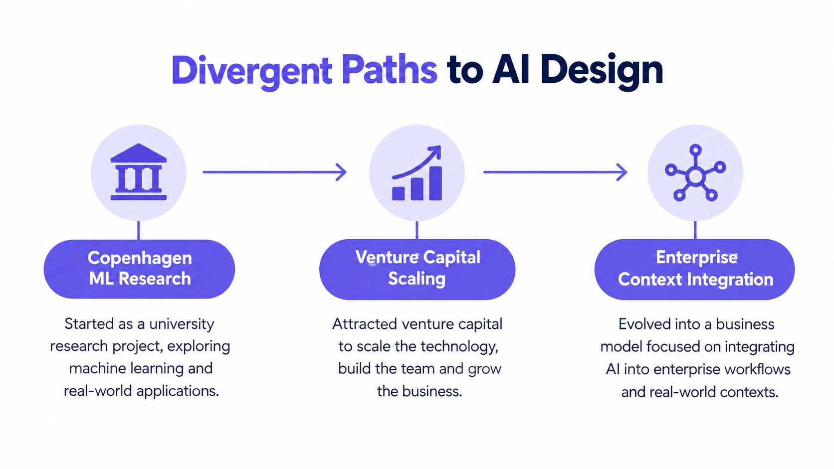
Uizard began in Copenhagen in 2017 as a machine-learning research project and was formally incorporated in 2018. Its private beta launched in September 2018, initially converting hand-drawn interface sketches into digital prototypes. The product later launched publicly beyond beta in February 2021, broadening its audience beyond Designers and Developers to include founders, Product Managers, consultants, analysts, engineers, marketers, and UX professionals. By the time of its $15 million Series A in August 2021, Uizard reported more than 192,000 registered accounts and over 14,900 monthly active users, according to VentureBeat's account of the funding round.
UX Pilot came through a different route. It emerged from a Figma-plugin side project, officially launched at the beginning of 2024, and was reportedly built without venture-capital funding. A founder interview reported $10,000 in monthly recurring revenue within roughly six to seven months of the initial product question, growth from $3 million to $5.3 million in annual recurring revenue over five months, approximately $5.3 million ARR in under two years, 15,000 paying subscribers, and a 30-person team. Those figures are founder-reported or third-party estimates, rather than audited financial statements, as described in the UX Pilot founder interview.
The strategic contrast is useful. Uizard's early market entry and institutional financing supported broad adoption around sketch-to-interface automation. UX Pilot's bootstrapped model concentrated attention on paid conversion, prompt-led generation, and production-oriented workflows.
The business model shows up in the workflow
Uizard's broader positioning makes sense for workshops where participants need to move quickly from rough thinking to something discussable. Hand-drawn sketches, screenshots, and text can become editable interfaces, while collaboration, comments, stakeholder sharing, and prototyping support group decision-making.
UX Pilot's workflow reflects a narrower production loop. Its published materials describe prompt, PRD, sketch, screenshot, and reference-based generation, connected multi-screen flows, AI-chat refinement, clickable prototypes, design-system configuration, and Figma connectivity. The product behaves more like an AI-first design workspace than a general-purpose canvas.
That difference doesn't make one history superior. It gives each tool a natural center of gravity:
- Uizard fits early exploration: Teams can lower the barrier for non-Designers and turn workshop material into presentable concepts.
- UX Pilot fits structured generation: Product teams can start with more explicit requirements and explore connected screens through prompts.
- Figr fits context-led evaluation: Teams can combine live product capture, Figma files, written requirements, analytics context, and behavioral evidence before generating a direction.
The same pattern appears across AI products. As AI design agent insights on agentic vs generative systems show, the difference isn't only output quality. It's where the product stores context, how it reasons about the task, and whether later artifacts retain that context.
Generation Fidelity and Flow Logic
UX Pilot is the stronger candidate when prompt adherence and connected flow exploration are the immediate bottlenecks, while Uizard is better suited to rapid, editable concept creation from sketches and screenshots.
Available comparison data reports UX Pilot at 9.0/10 versus Uizard at 8.2/10 in an editor rubric. The same comparison describes UX Pilot's support for prompt, PRD, sketch, screenshot, and reference-based generation, connected multi-screen flows, AI-chat refinement, and clickable prototypes. Uizard's strengths are editable interfaces from text, screenshots, and hand-drawn sketches, together with real-time collaboration, comments, stakeholder sharing, and prototyping. See the UX Pilot and Uizard editor comparison for the stated rubric and capability summary.
That score shouldn't be treated as a controlled benchmark. The available comparison doesn't provide reproducible generation-speed, usability, or output-quality testing. A higher editor score can guide a shortlist, but it can't tell you whether your own account settings, product vocabulary, component library, and flow complexity will produce a usable handoff.
One task exposes the difference
Use a realistic feature brief instead of testing isolated landing pages. Consider a hypothetical account recovery flow for an existing SaaS product. The brief includes identity verification, an expired link, rate limiting, a successful reset, and a route back to the sign-in screen.
With Uizard, begin with a rough journey, a hand-drawn flow, or a screenshot of the current product. The evaluation should ask whether the resulting screens remain easy to edit and discuss with stakeholders. Uizard's advantage appears when the team needs a shared visual object quickly, especially when workshop participants have uneven design experience.
With UX Pilot, express the same brief as a structured prompt or PRD. Ask for connected screens and explicit transitions. Then test whether an instruction such as “preserve the current navigation and show an expired-link recovery state” changes only the intended part of the flow. The important observation isn't how attractive the first output looks. It's whether the tool maintains the relationship between screens during refinement.
A Product Manager should inspect:
- Intent coverage: Does the flow represent the actual user goal?
- Transition logic: Do actions lead to states that make sense?
- State visibility: Are failure and recovery paths represented?
- Revision stability: Does a local prompt preserve approved decisions elsewhere?
- Reviewability: Can a Designer explain what is generated, assumed, or unresolved?
A prototype with fewer screens can be more useful if it makes the unresolved states visible. Conversely, a larger flow can create false confidence when it only fills the happy path.
The useful output isn't the most polished screen. It's the clearest record of what the team still needs to decide.
Teams comparing early and late-stage artifacts can use this framework to compare prototype fidelity levels. Figr becomes relevant when the task requires UX reasoning between a prompt and a prototype, including user intent, flow logic, states, edge cases, constraints, and tradeoffs. That doesn't remove Designer judgment. It gives the team more context to apply it.
The Figma Interoperability Reality
A generated screen enters the product workflow only after it survives Figma cleanup. The relevant questions are whether the team can edit its structure, apply the existing design system, preserve interactions, and hand it to engineering without rebuilding core decisions.
Published comparisons describe UX Pilot as supporting direct Figma export, custom components, design-system configuration, layer preservation, and brand alignment. The same comparison describes Uizard as using SVG export and import workflows that may reduce fidelity during handoff. These remain vendor or published comparison claims rather than audited interoperability benchmarks. Public G2 reviews of UX Pilot report user friction with Figma uploads and file management, so the workflow deserves testing beyond the export label. The capability distinction is documented in UX Pilot's comparison with Uizard.

Editable does not mean production-aligned
An exported file may contain editable objects while still creating substantial operational work. A Designer may need to:
- Rebuild hierarchy: Turn visual groups into meaningful layers.
- Restore layout behavior: Reapply Auto Layout, constraints, and responsive relationships.
- Reconnect components: Replace detached objects with approved variants.
- Reapply tokens: Correct color, spacing, typography, radius, and elevation styles.
- Repair interactions: Reconstruct prototype links and state transitions.
- Document exceptions: Explain intentional departures from the system.
The operational measure is hours of remediation per flow, which export availability alone does not capture. A visually close screen that loses token relationships can cost more than a rougher concept that preserves editable structure.
Design-system fidelity also extends beyond colors and buttons. A mature library encodes naming, variants, usage rules, density, responsive behavior, content patterns, and exceptions. A generated design can match the visual surface while violating those rules, forcing review and correction before implementation.
How to test the handoff claim
Use a representative Figma file containing:
- Tokens for typography, spacing, color, and radius
- Nested components and variants
- Existing usage examples
- Multi-screen flows
- Responsive frames
- A deliberately complex interaction state
Record defects instead of relying on visual impressions. Measure token retention, layer editability, component replacement effort, interaction preservation, visual deviation, and time to production-ready handoff. Neither available source provides a reproducible benchmark for these measures, so a neutral pilot offers stronger evidence than feature-count comparisons.
The guide for product teams syncing Figma designs helps distinguish a file that merely opens in Figma from one that remains maintainable there.
Designing a Neutral Evaluation Workflow
A fair UX Pilot versus Uizard evaluation should use the same feature brief, the same product context, and measurable handoff checks for both tools.
The test should resemble the work your team does. A generic prompt rewards prompt fluency, while a representative feature exposes assumptions about existing screens, states, components, and implementation constraints.
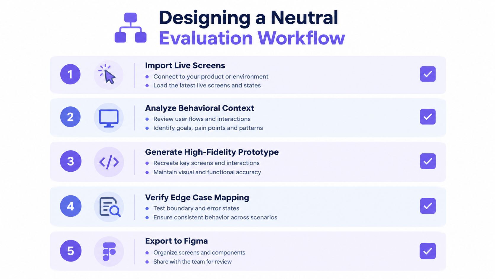
Step 1. Load the same feature brief.
Give each product identical requirements, including the primary user goal, known constraints, acceptance criteria, and required states. Avoid adding hidden guidance to one tool.
Step 2. Use representative product inputs.
Select a small but meaningful set of existing material:
- Live screens: Include the current entry point and adjacent workflow.
- Figma context: Use components, variants, tokens, and usage examples.
- Written context: Add the PRD, research notes, and product decisions.
- Behavioral context: Include a flow description or screen recording where available.
- Analytics context: Use relevant funnel observations or exported product notes.
Figr's inputs are designed around this kind of context assembly. Its product description includes live product capture through a Chrome extension, Figma file import, screen recording analysis, analytics context, and ingestion of PRDs and research.
Step 3. Generate the same flow.
Ask each tool to produce the same screens and transitions. Preserve the first output, then run a controlled revision such as changing the recovery rule or adding a permission state.
Record whether the revision affects only the requested area. This reveals whether iteration is local and predictable or whether the team must repair neighboring screens.
Step 4. Map unresolved states.
Create an explicit state inventory:
- Entry: What conditions bring the user into the flow?
- Progress: What does the user see while work is processing?
- Failure: What happens when a request fails or expires?
- Recovery: Can the user retry, change direction, or contact support?
- Completion: What confirms the task is complete?
- Permission: What changes for restricted users or roles?
A tool can generate a polished happy path while leaving these questions unanswered. Mark assumptions separately from requirements.
Step 5. Inspect the Figma handoff.
Export or sync the result, then assess:
- Token retention: Are approved styles preserved?
- Layer structure: Can Designers edit the result without flattening or reconstruction?
- Component reuse: Do objects map to the existing library?
- Flow integrity: Do interactions survive transfer?
- Remediation time: How long does the file take to reach a reviewable standard?
This workflow also applies when teams evaluate adjacent categories, including products covered by resources that compare AI commerce solutions. The principle is consistent: test the artifact inside the operating environment where decisions and implementation occur.
The final score should combine generation usefulness with handoff friction. A fast first draft doesn't win if the team spends the rest of the evaluation repairing it.
Pricing Models and Iteration Ceilings
AI design pricing is part of the workflow because credits, scans, screens, and project limits determine how much exploration a team can afford.
UX Pilot uses a credit-based model. Its free plan provides 45 one-time credits and supports up to 7 screens. Standard lists 420 credits per month for up to 70 screens, Pro lists 1,200 credits per month for up to 200 screens, and Teams lists 1,600 credits per user per month for up to 266 screens per user. Annual billing lists $14 per month for Standard, $22 for Pro, and $31 per user for Teams, according to the published UX Pilot plan details.
Uizard's subscription structure meters the workflow differently. Its free tier permits up to 2 projects, with a maximum of 5 screens per project. Pro raises the project allowance to 100 and removes the screen limit. The free tier includes 3 screenshot scans per month, while the next listed tiers provide 500 and 5,000 scans per month, with the highest tier offering unlimited scans, as shown in Uizard's pricing comparison and its subscription documentation.
Credits change design behavior
A Product Manager rarely consumes capacity in a single clean pass. The team explores alternatives, revises copy, adds an edge case, and returns to a rejected direction after a stakeholder changes the requirement. Credit-based plans make those decisions visible as usage.
Uizard's screenshot-scan allowance creates a different constraint. If the team is recreating existing interfaces or studying reference screens, the scan allowance shapes how much source material can enter the workflow. A simple concept can therefore hit a practical ceiling when the flow becomes screen-heavy.
The economic question is not “Which plan is cheaper?” It's “Which decisions will the plan discourage?”
- Broad exploration: A limited allowance may push the team toward fewer directions.
- State coverage: Edge cases can feel expensive when each added screen consumes capacity.
- Stakeholder variation: Multiple alternatives can compete with implementation-oriented refinement.
- Design-system testing: Repeated imports and exports may consume time even when generation capacity remains.
A pricing model becomes a product constraint when it changes which questions the team is willing to ask.
The broader AI-powered design tools category includes many different meters, but Product Managers should compare the cost of iteration with the cost of cleanup. A plan that supports many screens may still create handoff friction. A smaller plan may be sufficient for a focused concept if the exported structure remains usable.
The Case for Context-Aware Generation
Context-aware generation reduces disconnected output by giving the design agent access to the product conditions that a prompt alone can't express.
A prompt can describe a desired screen. It usually doesn't contain the full relationship between that screen, the existing component library, user behavior, product decisions, and implementation limits. Figr is relevant as a third option when the team wants to evaluate those relationships before generating Figma-ready artifacts.
The Visual Context Graph
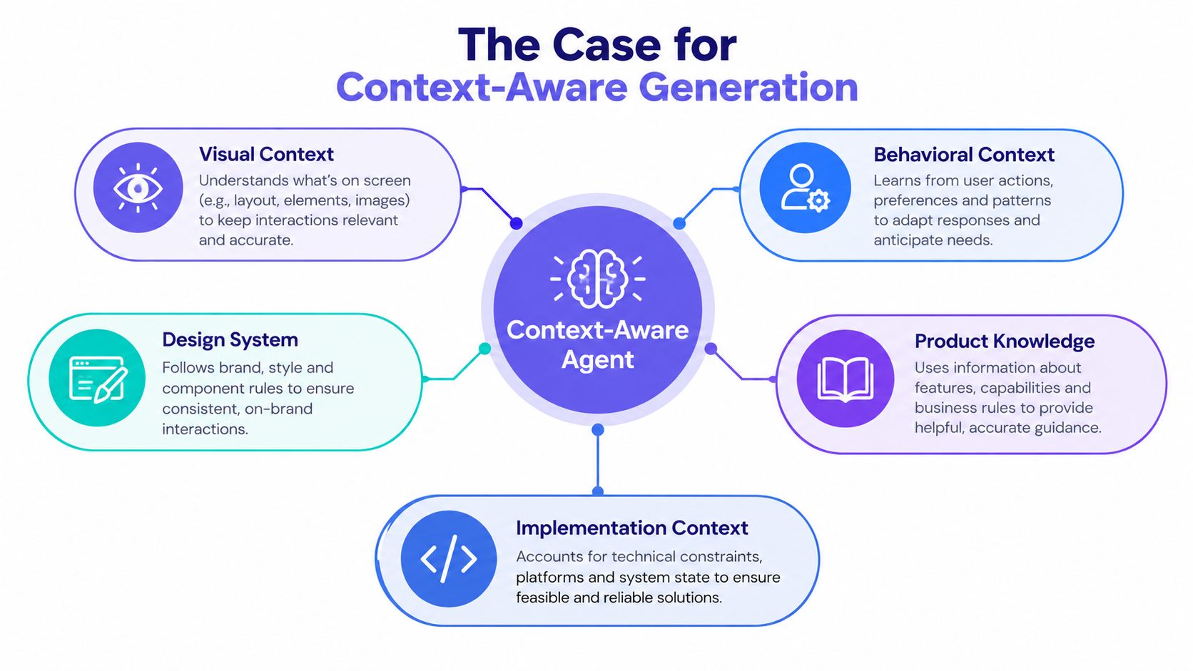
Figr's Visual Context Graph connects five layers:
- Visual context: Existing screens, frames, layout patterns, navigation, and component density.
- Behavioral context: Recordings, flows, cursor movement, interaction patterns, and observed behavior.
- Design System context: Tokens, components, variants, usage rules, and brand alignment.
- Product Knowledge context: PRDs, research, analytics notes, decisions, requirements, and unresolved questions.
- Implementation context: Code constraints, technical boundaries, supported patterns, and conditions that affect delivery.
The value comes from the connection between layers. A screenshot can show what a user sees, but a recording can reveal how the user reaches it. A Figma file can show a component, but usage examples can clarify when that component is appropriate. A PRD can specify a requirement, while analytics can indicate where the current flow creates friction.
Figr describes a Context Pod for product memory across sessions. That memory can include PRDs, research, walkthroughs, analytics, screens, and decisions. The practical implication is continuity: the Product Manager doesn't need to restate the entire product every time the team explores another direction.
From prompt to reasoning
The missing middle between a prompt and a prototype is UX reasoning. Teams need to make choices about intent, flow logic, states, edge cases, constraints, and tradeoffs before they can judge whether a screen is useful.
Figr's stated capabilities include user flows, wireframes, edge-case maps, UX reviews, test scenarios, acceptance criteria, prototype directions, and Figma-ready screens. It also describes an AI high-fidelity prototype generator and Figma Sync that moves output into Figma as editable screens with Auto Layout, components, and tokens. Those claims should still be tested against your own library during a pilot.
The distinction is systemic. Generic generation optimizes the visible artifact. Context-aware generation can organize the evidence around the artifact, so the team can ask why a state exists, which product rule created it, and what implementation constraint shaped the design.
That doesn't make the generated result final. It gives Designers and Product Managers a better basis for review.
Making the Final Selection
Choose Uizard for fast, low-commitment concept exploration, choose UX Pilot for prompt-driven higher-fidelity flow work, and consider Figr when existing product context and design-system fidelity govern the decision.
Uizard is a strong fit for workshops, founder-led exploration, and teams that need to turn sketches or screenshots into editable concepts without requiring deep design expertise. Its collaboration and sharing features support discussion before implementation commitments harden.
UX Pilot is a stronger fit when the team has a structured brief and needs connected multi-screen exploration, AI-chat refinement, design-system configuration, and a Figma-oriented workflow. The team should validate upload behavior, layer structure, token retention, and cleanup effort with a representative file before treating its interoperability claims as operational fact.
Figr belongs in the evaluation when the product itself is the main source of truth. Its Visual Context Graph combines visual, behavioral, design-system, product knowledge, and implementation context. That makes it relevant for teams that need to map states, explain tradeoffs, generate UX artifacts, and produce Figma-ready directions grounded in an existing product.
A decision rule for Product Managers
Run the same feature brief through each shortlisted tool. Use the result to answer four questions:
- Can the team explain the flow? If the artifact hides assumptions, it creates review risk.
- Can the Designer edit the result? If the file loses structure, visual similarity is misleading.
- Can the system support the feature? If generated patterns diverge from approved components, implementation inherits rework.
- Can engineering act on the handoff? If states and constraints remain unclear, the prototype hasn't completed its job.
In short, select the tool that minimizes uncertainty across the full path from product context to implementation. Uizard may win the first workshop. UX Pilot may win a prompt-led exploration. Figr may be the relevant third option when the team's real challenge is preserving context across decisions, states, design-system rules, and handoff.
Run a neutral pilot before committing. Import the same product evidence, generate the same flow, revise the same state, inspect the same Figma library, and record remediation effort. That test will tell you more than a feature matrix because it measures the work your team pays for.
Figr connects live product capture, Figma files, written requirements, behavioral evidence, and product memory before generating UX artifacts. Try the same feature brief you use for this comparison in Figr, then inspect its flows, edge cases, UX reviews, and Figma-ready output against your existing system.