
Your Figma file can look polished and still be wrong, because most product teams design from snapshots while the product keeps moving.
When that gap stays open, the damage shows up in familiar places: onboarding flows that ignore current drop-off behavior, handoff screens that miss new edge cases, prototypes that look convincing but don't reflect how the live product behaves. A Product Manager ends up reconciling Slack decisions, dashboard notes, bug fixes, and design reviews by hand. The file says one thing, the shipped product says another.
A better workflow connects the canvas to the product's memory. In a practical Figr Figma workflow guide, that means bringing live screens, analytics, PRDs, user feedback, recordings, and design-system rules into the same loop, then syncing editable output back into Figma so design stays connected to reality instead of drifting away from it.
What Is a Data-Grounded Figma Workflow
A data-grounded workflow keeps design decisions tied to live product context, not just to a tidy Figma file.
Teams often already know how to clean layers, organize pages, and standardize components. That's useful, but it solves the wrong problem first. The harder issue is operational: how do you keep design artifacts aligned with the actual product, the analytics behind user behavior, and the rules inside your design system as the product changes?
That gap shows up in almost every mature team I've seen. The file is neat. The thinking around it is fragmented.
File hygiene is not workflow integrity
A lot of Figma advice still treats workflow as a file-management discipline. Rename layers. Fix Auto Layout. publish components. Archive old pages. Those habits matter, but they don't tell you whether the screen in front of you reflects the latest funnel behavior, a recently changed requirement, or a workaround Engineering shipped last week.
Figr's own documentation pushes on a more useful question: start from live product capture, analytics CSVs, user feedback, and screen sharing so the system can understand constraints and edge cases that static screenshots miss, as outlined in this product-to-design walkthrough. That's the center of gravity a modern workflow needs.
This is what I mean by data-grounded: the design file becomes a working surface for product reality, not a shrine to yesterday's assumptions.
A clean file helps people edit faster. A grounded file helps teams make fewer wrong decisions.
If you're trying to boost business efficiency, this distinction matters. Workflow automation only pays off when the process carries the right inputs forward. Automating disconnected artifacts just helps teams move faster in the wrong direction.
The new unit of work is context
The most useful way to think about a Figr Figma workflow guide is as a bi-directional context loop.
The loop usually includes:
Live product evidence: current screens, real states, recent behavior
Product intent: PRDs, research notes, decision logs
Performance signals: analytics exports, funnel observations, drop-off clues
System constraints: components, tokens, variants, usage rules
That is why an AI design tool that thinks through UX feels different from a prompt box that only generates screens. It has something to reason from.
A design workflow becomes more trustworthy when every new screen can answer a simple question: what product reality is this based on?
Why Do Figma Files Drift from Reality
Figma files drift because product decisions happen everywhere except inside the file.
Last week I watched a Product Manager explain a signup flow to a new engineer using a design page that looked current at first glance. It wasn't. The error state had changed, a permissions branch had been added in code, and the analytics team had already flagged a confusing drop-off point that never made it back into the design. Nobody was careless. Everyone was busy.
That kind of drift is systemic, not personal.
The drift usually starts in the gaps between tools
A product changes through dozens of small decisions. A support issue triggers a copy tweak. An engineer patches a state that never existed in the prototype. A researcher shares a painful user quote in a doc. A Product Manager updates the PRD after a review. Each step makes sense locally, but the design file becomes a lagging artifact.
Common causes show up fast:
Decision sprawl: product rationale lives in docs, chats, tickets, and calls
Implementation shortcuts: shipped behavior diverges from the idealized flow
Analytics isolation: evidence sits in dashboards, not in the design conversation
Human lag: someone meant to update the file, then the sprint moved on
That is why teams need systems to prevent design system drift, not just lectures about staying organized.
This is a scale problem across the industry
The reason this matters so much is simple: Figma isn't a niche workspace. By March 2025, it had more than 13 million monthly active users across free and paid tiers, and by 2024 it reported more than 4 million users. Contrary Research also noted that surveys found about three-quarters of product designers saw Figma as their primary UI design software, according to Contrary's Figma analysis.
So when a Figma file drifts, it isn't a quirky local process issue. It's a widespread coordination problem in modern product development.
The zoomed-out view matters here. As design became the shared surface for Product, Design, and Engineering, the file took on more responsibility than it was designed to carry by itself. Teams now expect it to reflect user behavior, technical constraints, design rules, and current strategy. Without a context layer around it, that's too much to ask from a canvas alone.
How to Import Real Product Context into Figma
The first half of a strong Figr Figma workflow guide is getting reality into the design process before anyone starts generating new screens.
That sounds obvious, but teams often do the opposite. They start with a prompt, a blank frame, or a rough mockup, then try to add truth later. By then, most of the structural decisions are already baked in.
Start with the product as it exists
A practical workflow starts by collecting enough context to represent the product accurately. The basic gist is this: import what users truly experience, what the team already knows, and what the system must respect.
If you want a good mental model for that, Figr's design archaeology approach is useful. It treats existing product surfaces as evidence, not as something to ignore while making fresh screens.
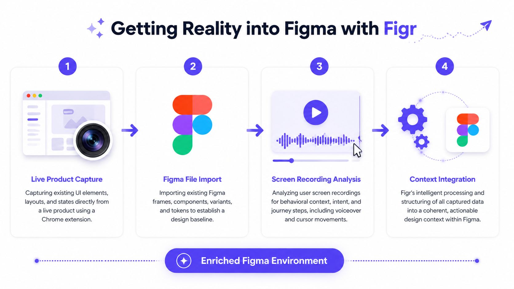
A four-step import workflow
Step 1. Capture the live product.
Use live product capture to pull in current screens, layout patterns, navigation structure, and visible states.
Look for state variation: empty, loading, error, success, disabled, partially completed
Note interaction density: where users click, hesitate, or branch
Preserve product reality: don't simplify away awkward but real constraints
Step 2. Import the existing Figma baseline.
Bring in current frames, components, variants, and tokens so the work starts from the actual design system.
Use the file as structure: page hierarchy and components often reveal product assumptions
Check for stale patterns: imported files may contain old conventions that need review
Keep the baseline editable: this matters later when syncing outputs back
Step 3. Load behavioral evidence.
Add screen recordings, walkthroughs, and usage observations so the workflow reflects how people move through the product.
Cursor movement helps: it often reveals hesitation and hidden complexity
Voiceover adds intent: why the user is doing something matters as much as what they click
Sequence matters: isolated screens rarely explain the whole journey
Step 4. Add product knowledge into the same memory.
Bring in PRDs, research notes, analytics exports, and decision context.
PRDs define intent: what problem the flow is supposed to solve
Research reveals friction: where expectations and interface behavior diverge
Analytics CSVs add pressure: they show where the product is underperforming, even if the screen looks fine
Practical rule: If a designer or Product Manager would need to search three tools to explain a flow, the design context is still incomplete.
What good import discipline looks like
I wouldn't import everything blindly. The point isn't volume. The point is fidelity.
Use this filter before bringing context in:
Live product. Import current flows, real states, and navigation patterns. Avoid old staging captures with known mismatches.
Figma files. Import active components, current tokens, and relevant flows. Avoid archived explorations with no decision value.
Analytics. Import funnel observations, CSV exports, and notable behavior trends. Avoid raw dumps with no link to the flow in question.
Docs. Import PRDs, research notes, and decision logs. Avoid unscoped docs that mix unrelated initiatives.
Teams get better outputs when the imported context reflects the actual product conversation, not when the system is fed a pile of loosely related artifacts.
Evaluating User Flows Beyond the Happy Path
User flows become trustworthy when teams model branches, failure states, and recoveries, not just the ideal route.
Happy-path design is seductive because it presents order. The user arrives, understands everything, completes the task, and leaves satisfied. Real products don't behave like that. Payment methods fail. Permissions collide. Uploads stall. Drafts expire. A user returns halfway through a setup flow and the product has to remember what happened.
A prototype is an interaction graph
Figma's own prototyping model is a helpful grounding point here. A solid prototype starts by treating frames as part of an interaction graph, where you connect a hotspot to a destination frame and define interactions or animations in the Prototype tab, as described in Figma's prototyping guide. The practical takeaway is clear: define the primary path first, then add secondary branches, overlays, and motion after the starting frame and navigation map are stable.
That sounds technical, but it changes how a Product Manager and designer think together. You stop asking, "Do we have the screens?" and start asking, "Can a user realistically move through this system?"
Edge cases are where product quality shows
Gallery-style examples make this easier to grasp. A Dropbox-style upload failure flow isn't one screen. It's a family of states with different user implications. A Wise-like card freeze experience includes timing, confirmation, reversal, and reassurance patterns. Even something as simple as a task approval card can split into many product states depending on role, timing, permission, and prior action.
When teams use imported product context well, they can map:
Failure branches: upload interrupted, save conflict, expired session
Recovery options: retry, dismiss, save draft, contact support
Role-based differences: admin, contributor, reviewer
State memory: resumed progress, partial completion, conflicting actions
If you want a deeper method for this kind of review, this guide on how to find missing UX issues is a strong companion.
Static screens are easy to approve. Branching behavior is what actually gets shipped.
The products people trust usually aren't the ones with the prettiest happy path. They're the ones that handle reality without making the user do the cleanup.
How Do You Ensure Design System Consistency
Design system consistency holds when the workflow understands rules, not just visuals.
Many AI-assisted design workflows often falter. A generated screen can look close enough in a demo, then fall apart in review because spacing is off, component usage is inconsistent, or states don't match how the system behaves. Teams end up spending the saved time on cleanup.
Consistency lives in semantics
A mature workflow has to recognize more than pixels. It needs to understand:
Tokens: color, spacing, type, radius, elevation
Components: what exists, when to use it, when not to
Variants: state, size, emphasis, platform differences
Usage rules: patterns the system expects across flows
That is why design system governance can't rely on visual similarity alone. The workflow has to preserve intent inside structure.
A lot of teams only discover this after the third or fourth generated concept. The first screen looks passable. The second introduces a new card pattern for no reason. The third invents button spacing the system has never used. Review gets slower because everyone is scanning for drift instead of discussing product choices.
What to inspect before accepting output
I usually tell teams to review generated work in three passes:
Component pass. Are approved components being used correctly? Failure mode: new ad hoc UI sneaks in.
Token pass. Are spacing, type, and color tied to system rules? Failure mode: visual inconsistency accumulates.
State pass. Do variants reflect actual behavior and permissions? Failure mode: flows look complete but break in use.
Design teams that want a stronger foundation here should spend time mastering design system best practices. The payoff isn't only visual consistency. It is decision speed. When the system is legible, review conversations move from "fix this button" to "is this the right product choice?"
That shift saves more time than people expect, because senior reviewers stop policing avoidable UI mistakes and return to higher-value questions.
Generating Accurate Editable Designs with Figr
Accurate editable output depends on structured context, not on clever prompting alone.
A lot of AI design frustration comes from a mismatch in expectations. Teams ask for a polished flow from sparse input, get something visually plausible, then discover that it doesn't fit the product, the system, or the handoff process. The output isn't wrong in a stylistic sense. It's wrong in a product sense.
That is where Figr is useful as one workflow option. It ingests live product context, Figma files, design systems, PRDs, research, analytics, and recordings, then produces Figma-ready output that remains editable instead of flattened. The value isn't that it draws quickly. The value is that it reasons from the product's own materials before drawing.
Structured input changes output quality
Figma's own guidance for AI-assisted workflows points in the same direction. Higher-fidelity output comes from attaching existing assets directly to prompts, naming layers well, setting proper frame constraints, and applying Auto Layout, as covered in this Figma Make guidance video. It also recommends including audience, device type, core features, technical requirements, and style preferences, then breaking complex work into smaller follow-up prompts.
That lines up with what works in practice. Better structure means less ambiguity. Less ambiguity means less cleanup.
Useful inputs include:
Well-labeled frames: current screens with meaningful layer names
Tokenized components: reusable system elements with consistent behavior
Behavioral context: recordings and flow steps, not only static references
Written intent: PRDs, acceptance logic, and research cues
What editable really means in practice
Editable output matters because design doesn't end at generation. A team still needs to review, revise, annotate, prototype, and hand off.
Here is the kind of artifact teams need:
Frames a designer can inspect
Layers that make sense during review
Components that align with the existing system
Layout behavior that survives content changes
A Product Manager at a growth-stage company told me something I hear often in different words: the fastest AI output is useless if the designer has to rebuild it by hand before the meeting.
That is why layer names, constraints, and Auto Layout aren't cosmetic details. They determine whether generated work becomes part of the team's operating system or just a screenshot with extra steps.
A short walkthrough helps make that concrete:
Closing the Loop with Figma Sync
A bi-directional workflow only works when the output returns to Figma as editable design, ready for real team use.
Many workflows often break down. Teams do the hard work of grounding context, reasoning through states, and generating candidate flows, then hit a dead end at export. What lands in Figma is hard to edit, detached from the file structure, or separated from the components the team works with.
That creates a second cleanup project nobody asked for.
What to sync back into the file
A useful sync step should return artifacts that a designer and Product Manager can use immediately in the existing workflow.
That usually means:
Structured frames: not flat images
Understandable layers: so review doesn't start with reconstruction
Reusable components: where the system already defines them
Layout behavior: constraints and Auto Layout preserved where relevant
If the synced output arrives as something the team can duplicate, critique, connect, and refine, then the tool has joined the workflow. If it arrives as a visual approximation that needs rebuilding, the tool has created another handoff boundary.
A practical sync routine
Step 1. Push only scoped outputs.
Send the flow or screen set tied to a defined product question.
Avoid bulk dumping: too many loosely related artifacts bury the main decision
Name the branch clearly: reviewers should know what changed and why
Step 2. Place the work in the live project structure.
Sync into the team's active Figma environment, not into an isolated sandbox nobody revisits.
Use existing page logic: concept, review, handoff, archive
Keep review discoverable: comments and iteration history matter
Step 3. Review editability before review quality.
Check whether a designer can work with the artifact naturally.
Can layers be understood quickly?
Do components behave as expected?
Do text and layout changes hold together?
Step 4. Reconnect comments to product context.
When the team reviews the synced designs, carry forward the analytics, PRD logic, and edge-case notes that shaped them.
Tie objections to evidence: not preference alone
Capture decisions: the next cycle should start smarter than the last one
The handoff isn't finished when pixels land in Figma. It's finished when the team can keep thinking inside the artifact.
That is the operational difference between export and sync. Export ends a task. Sync preserves a workflow.
The Visual Context Graph That Powers This Workflow
The reason this workflow holds together is the Visual Context Graph, a five-layer model that gives design work enough product memory to stay grounded.
Most broken AI design workflows fail for the same reason: they treat input as a loose pile of references. A screenshot here, a prompt there, maybe a file import if you're lucky. That creates visual imitation, not product understanding.
The Visual Context Graph organizes the work differently.
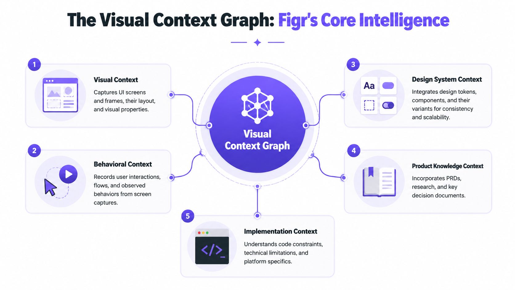
The five layers that matter
Each layer answers a different product question.
Visual context. Contains screens, frames, layout patterns, and visible states. Gives the system a concrete view of the interface.
Behavioral context. Contains recordings, flows, cursor movement, and observed actions. Shows how people move, hesitate, and branch.
Design System context. Contains tokens, components, variants, and usage rules. Keeps generated work aligned with the system.
Product Knowledge context. Contains PRDs, research, decisions, and feedback. Connects design choices to product intent.
Implementation context. Contains code constraints, platform limitations, and technical realities. Prevents concepts from drifting away from what can be built.
Why this model changes the workflow
Once these layers are connected, the design process stops depending on heroic memory. The Product Manager doesn't have to remember every caveat from the analytics review. The designer doesn't have to reconstruct a missing state from a support screenshot. The engineer doesn't have to guess whether a branch was intentional or forgotten.
I like this model because it reflects how product teams work. Product quality is rarely blocked by a lack of screen-making ability. It is blocked by missing context between decisions.
There's a useful management lesson here too. Harvard Business Review has long argued that knowledge work suffers when information stays trapped in silos and handoffs degrade understanding. The same pattern shows up in product design every day. When context is fragmented, teams debate artifacts instead of solving user problems.
Why bi-directional matters more than generation alone
A real Figr Figma workflow guide isn't about importing a file and calling it integration. It's about creating a living loop:
Context comes in from the live product
Reasoning happens against system rules and product intent
Design artifacts go back into Figma as editable work
Decisions feed the next cycle instead of disappearing
That is the piece that has often been missing.
If your current workflow still depends on screenshots, stale files, and memory, start smaller than you think. Pick one flow, load the current product context, generate a Figma-ready version, and review whether the output reflects the product you ship. Then make that your new baseline and try Figr.
Design gets calmer when the file stops pretending to be the source of truth and starts connecting to it.
The practical framework is simple. Bring in live product evidence, evaluate branches, preserve design-system rules, generate editable artifacts, and sync them back into the place your team already works. That's how a bi-directional workflow earns trust.
You don't need a perfect process to start. You need one flow where the context, the design, and the decision trail stay together. That's the next move.
FAQ
Can I use this workflow if my team already has an established Figma process
Yes. I'd keep your existing Figma review and handoff habits, then add context ingestion and editable sync around them. The goal is to reduce drift, not replace the team's working file.
Do I need analytics data for every flow
No. I use analytics where behavior matters or where the team suspects friction. For simpler flows, live capture, PRDs, and current Figma components are often enough to ground the work.
Will this replace designer judgment
No. I treat it as a way to improve inputs, expose missing states, and speed up structured design work. A designer still decides what trade-offs make sense.
What should I import first
I'd start with one active flow, the current Figma baseline, the live product capture, and the latest written product context. That gives you enough signal without creating review noise.
What's the biggest mistake teams make with a Figr Figma workflow guide
I see teams jump straight to generation before they load product reality. When that happens, the output may look polished, but it won't carry the constraints, states, and intent that make the design usable.