

Your launch looks right in Figma, but the production flow leaves users guessing. Say you're a product manager watching a customer configure a new workspace: they open settings, hesitate over an unfamiliar label, and press Save again because nothing seems to happen. The screens passed review. The interaction didn't.
By the afternoon, support has screenshots of duplicate invitations and an onboarding form that erased someone's work. Engineering needs decisions about states nobody designed. Your team can patch the symptoms, but every rushed fix competes with the next release. What looked like a small interface problem has become a coordination problem across product, design, engineering, and QA.
UX best practices earn their place by preventing specific failures at specific delivery moments. Start with evidence about users' tasks, translate that evidence into interaction decisions, build accessibility into the components, then test the difficult branches before handoff. The practices below follow that delivery logic, with validation woven throughout. Each comes with a trade-off and a practical application, because a rule without rationale won't help when your product refuses to fit the textbook.
1. Reduce Cognitive Load With Progressive Disclosure
A workspace settings page can look beautifully organized and still ask users to make decisions they aren't ready to make. Notification preferences belong near the surface. Webhook retries probably don't.
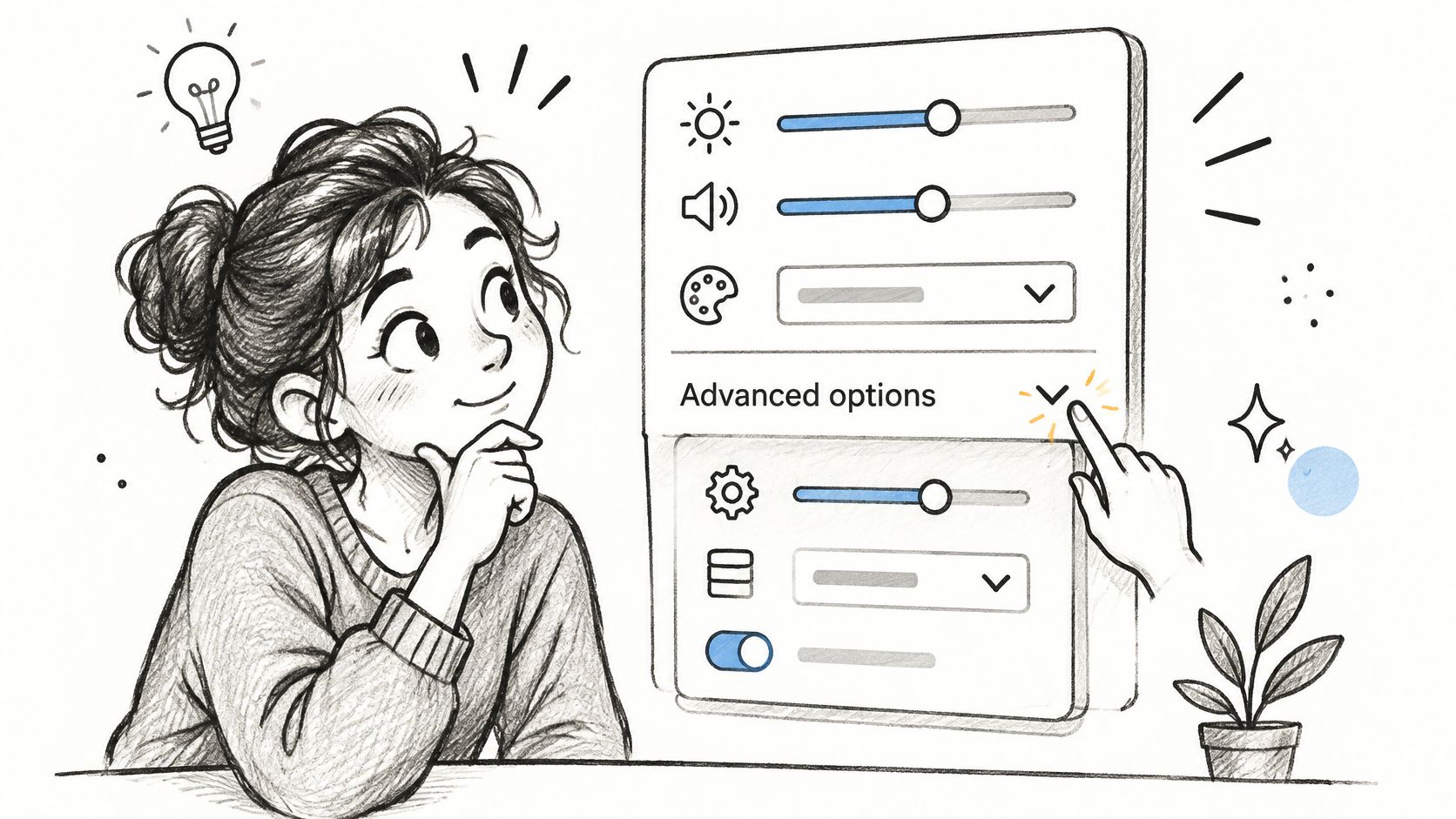
Progressive disclosure means revealing information when it becomes relevant to the task. Before drawing the screen, learn which decisions users must make to proceed and which belong to occasional specialist work. Otherwise, you're organizing the interface around your database rather than their attention.
Hide complexity without hiding consequences
Say you're designing a workout logger. Someone following Strive Workout Log's 5x5 workout guide needs a clear route to recording their workout. Detailed configuration can sit behind an Advanced options control, provided the default behavior remains understandable.
The trade-off is discoverability. If an advanced setting changes billing, privacy, or data deletion, hiding its consequences creates a different usability problem. Keep a visible summary of consequential choices.
- Classify the controls. Mark each element as essential to the current task, useful later, or rarely needed.
- Expose the next decision. Show dependent fields after users select the option that makes them relevant.
- Test retrieval. Ask someone to find an advanced setting without naming its location.
Could users explain what will happen before they continue? That's a stronger test than whether the screen looks uncluttered.
2. Design for Existing Mental Models and Familiar Conventions
A customer looking for invoices usually starts near billing, not inside a creatively named command center. Your navigation vocabulary should help them transfer knowledge from tools they already use.
Mental models are working expectations. People arrive with assumptions about where information lives, what a button does, and whether Back preserves their progress. Familiar conventions reduce the amount they must learn before doing useful work.
Consider a SaaS permissions editor. An administrator might understand roles such as owner, member, and viewer, yet struggle with an internal term such as collaborator class. The underlying permission system can remain advanced while the interface uses recognizable language.
Spend your originality on the product's value, not on making users decode its navigation.
Make deviations earn their place
Use these core UX principles to review whether your interaction choices support expectations or merely reflect team preferences.
- Collect vocabulary. Pull terms from interviews, support tickets, and the tools your customers already use.
- Test placement. Use card sorting for grouping questions and first-click testing for navigation expectations.
- Document exceptions. Explain why an unfamiliar pattern improves a real task and what evidence supports it.
Familiarity still needs context. A banking transfer and a casual collaboration invite shouldn't share identical confirmation behavior just because both move something somewhere. Match the convention to the user's risk, vocabulary, and environment.
Would a new customer know what to try without your onboarding tour? If not, investigate the model before adding more instructions.
3. Make System Status Visible at Every Moment
The customer presses Save. The button remains unchanged, the page stays still, and the network request continues somewhere out of sight. Should they wait, retry, or leave?
Every consequential action needs an understandable state. Google Docs' saving status is a useful product reference: it addresses the uncertainty around whether work has persisted. In your own product, distinguish work saved locally from work confirmed by the server.
The basic gist is this: describe what the system knows, rather than offering reassurance it can't support. A spinner communicates activity, but it doesn't explain whether an upload is progressing or stuck.
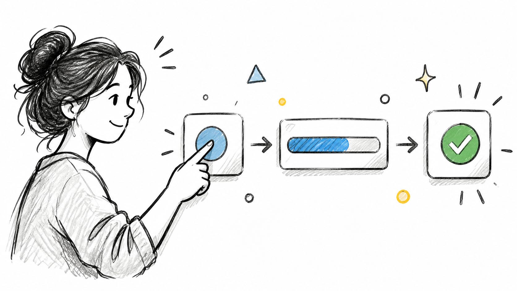
For a report export, define the transition from request accepted to processing, ready, or failed. Let people leave safely when processing can continue in the background.
- Name the operation. Tell users whether you're uploading, validating, saving, or generating.
- Prevent duplicate actions. Change the submit state while preserving an understandable recovery path.
- Announce meaningful changes. Use appropriate ARIA live regions so critical updates don't depend on sight.
Use skeleton screens when the content structure is predictable. Avoid fabricated progress percentages when completion can't be measured. Optimistic updates can make reversible actions feel responsive, but payments and permission changes deserve confirmed outcomes.
The failure to prevent is uncertain commitment: users shouldn't have to guess whether their action took effect.
4. Build Accessibility Into the Design Process From Day One
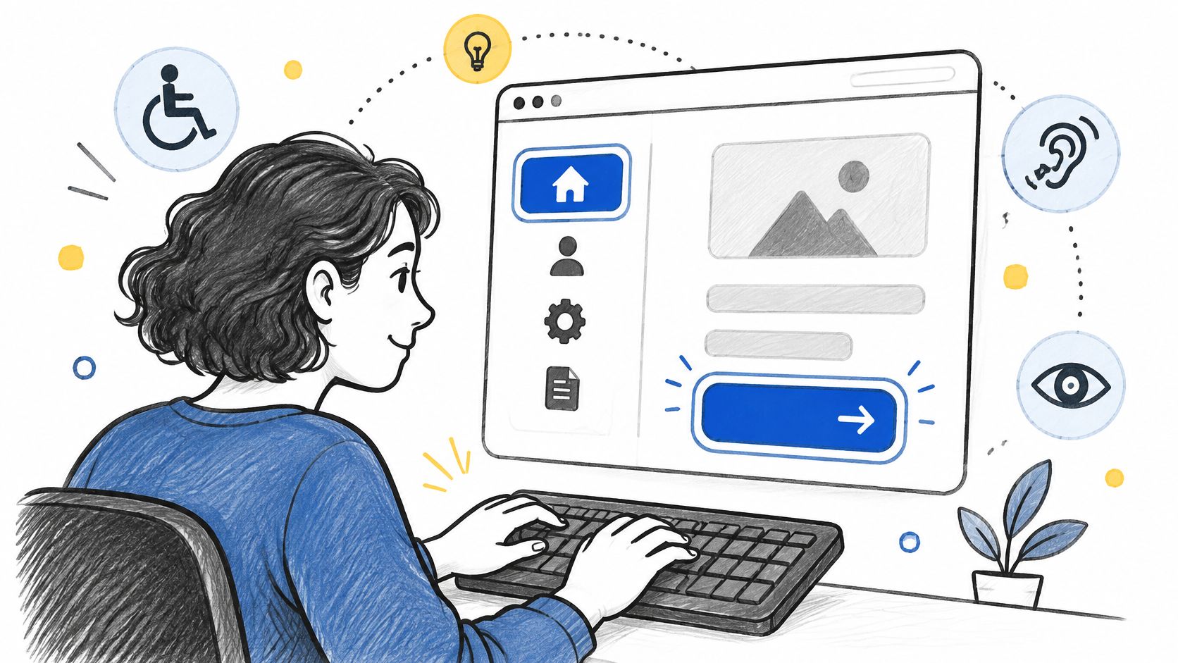
Accessibility decisions start when you choose components, interaction patterns, and content structure. A final audit can identify barriers, but it can't make late architectural changes painless.
The W3C's accessibility overview cites World Health Organization figures that approximately 1.3 billion people, about 16% of the global population, experience significant disability. Treat keyboard operation, meaningful labels, readable contrast, and clear recovery as product requirements.
Specify behavior alongside appearance
For a permissions dialog, define where focus enters, how users move through controls, and where focus returns after closing. Put those decisions beside the visual design, using the UI design guide to connect interface structure with implementation details.
The WCAG 2.2 guidance sets a 24 by 24 CSS pixel minimum for pointer-input targets, subject to spacing and other specified exceptions. Audit the actual hit area, not just the visible icon.
- Review components early. Check contrast, accessible names, focus visibility, and keyboard behavior before reuse.
- Test real tasks. Complete authentication, billing, and support journeys with keyboard and screen-reader testing.
- Assign defects to owners. Fix shared components rather than repeatedly patching individual screens.
Why keep testing after design approval? WebAIM's 2025 analysis found detectable WCAG 2 failures on 94.8% of the million home pages analyzed. Automated checks provide a baseline, while manual testing evaluates the interaction.
5. Simplify Forms and Remove Unnecessary Input Friction
Before changing a form's layout, ask who uses each answer. If nobody can name the decision a field supports, remove it or defer it.
Form friction includes more than typing. Users must interpret requirements, locate information, understand formatting, and recover from mistakes. A shorter form can still be difficult if its rules remain invisible.
Baymard's mobile checkout research found that 94% of tested sites didn't consistently identify both required and optional fields, while 60% lacked formatting examples or input masks for fields accepting multiple formats.
Make the rules visible before submission
Say you're improving event registration. A player should understand which information reserves their place and which details can follow later. The same reasoning applies when you build better golf tournament registration forms: distinguish essential entry information from administrative convenience.
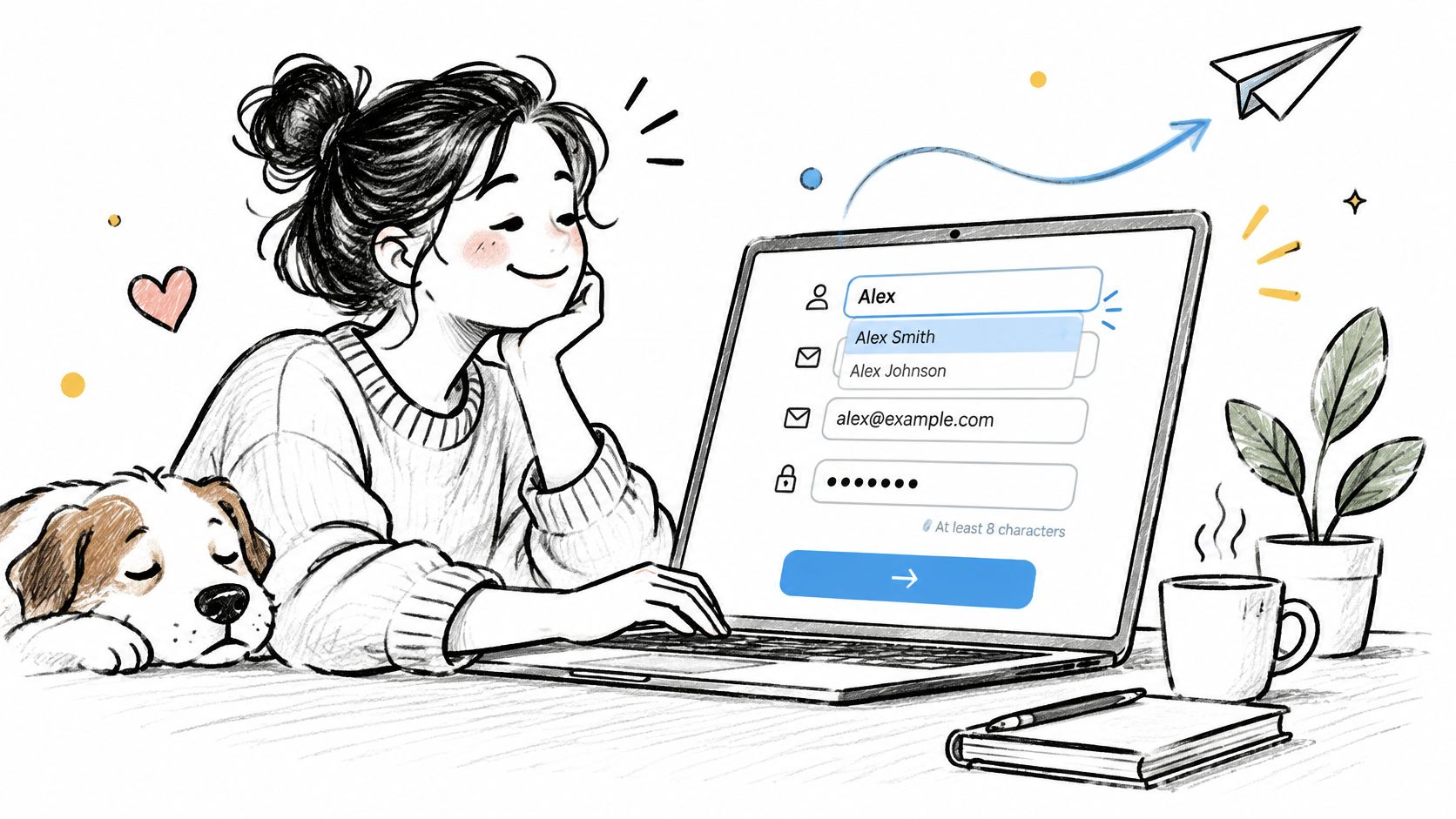
- Explain requirements. Label required and optional fields consistently, with examples near unfamiliar inputs.
- Accept harmless variation. Normalize spacing or formatting when it doesn't change meaning.
- Validate thoughtfully. Check completed fields on blur, avoiding warnings while someone is still typing.
- Investigate abandonment. Pair field-level events with sessions that explain the behavior.
Don't infer sensitive or consequential information without user awareness. A prefilled billing country should remain visible and editable.
The useful optimization is less effort to understand and recover, rather than fewer screens at any cost. Would combining everything onto a crowded page make the task easier?
6. Create a Consistent Design System With Shared Tokens
When Save behaves differently across settings, billing, and account management, users can't confidently reuse what they've learned. Engineers also inherit competing implementations of the same interaction.
A design system should define behavior as well as appearance. Shared tokens cover choices such as color, spacing, and typography. Components need contracts for loading, disabled, error, focus, and success states.
Shopify's Polaris and IBM's Carbon are useful references for examining how component guidance sits alongside reusable interface parts. Copying their visual language won't resolve your product's own state inconsistencies, however.
Practical rule: A component isn't ready for reuse until its difficult states are specified.
Start with recurring decisions
Begin with the components that repeatedly cause disagreement or rework. A dependable form field may be more valuable than an elaborate illustration library.
- Use semantic tokens. Name values by purpose, such as text-danger or surface-selected, rather than appearance alone.
- Connect design and code. Map Figma variables to implemented tokens and document intentional differences.
- Define ownership. Give proposed changes a reviewer, migration approach, and release history.
Say a destructive button changes from red to neutral in a redesign. The token update is straightforward; reviewing its meaning across deletion, cancellation, and revocation flows takes judgment.
Consistency has limits. A specialized workflow may require a new pattern, but the team should explain why an existing component fails. Otherwise, local convenience becomes a permanent exception that everyone else must maintain.
7. Validate Decisions Through Usability Testing Early and Often
A confident design review tells you that colleagues understand the proposal. It doesn't establish that customers can complete the task.
Usability testing makes that distinction observable. Give representative participants a realistic goal, let them work, and record where the interface fails to support them.
The Nielsen and Landauer model summarized by Koji estimates that five participants can reveal approximately 85% of usability problems when each problem has an average 31% discovery probability per participant. That assumption matters: uncommon workflows and distinct user segments need broader coverage.
Test goals, not obedience
For an expense tool, ask a participant to submit a reimbursable trip using realistic receipts. Don't tell them which menu to open. You need to learn whether the product supports the goal without your navigation instructions.
Use a repeatable UX design process guide to connect findings with revisions and retesting.
- Recruit for the task. Match participants to relevant experience, permissions, devices, and access needs.
- Observe outcomes. Capture completion, errors, hesitation, recovery, and confidence.
- Fix the consequential failures. Prioritize barriers to completing or safely understanding the task.
- Retest the change. Confirm that the revision solves the problem without relocating it.
Accessibility research also requires deliberate skill-building: User Interviews' 2024 report found that 44% of surveyed researchers and UX professionals felt comfortable conducting it. Allocate preparation and appropriate recruitment rather than assuming an ordinary session covers every access need.
8. Design Error Messages That Explain and Enable Recovery
A failed invoice import leaves the finance manager with an urgent question: what can they do next? An internal error identifier won't answer it.
Useful error messages connect cause, consequence, and recovery. Explain what failed in language the user understands, preserve valid work, and offer an action they can perform.
Baymard's checkout optimization guidance recommends preserving entered data, providing specific inline feedback after a field is completed, and directing attention to the first error. Apply that recovery-without-reset pattern to onboarding and configuration workflows too.
Write the recovery before the message
Suppose an import contains an unsupported date format. Show the expected format, identify affected rows, and offer a downloadable correction file when appropriate. Keep successfully parsed information available.
- Separate causes. Distinguish invalid input from expired access, network failure, and unavailable services.
- Preserve progress. Retain safe inputs and disclose anything that couldn't be saved.
- Route the next action. Offer correction, retry, access requests, or support according to the failure.
- Protect sensitive details. Keep diagnostic information available to support without exposing secrets.
Should users confirm every deletion? Repeated prompts can become background noise. Prefer undo for reversible actions, and reserve deliberate confirmation for consequential operations that can't be safely reversed.
A recovery path is complete only when the user can continue without reconstructing valid work.
Include these states in prototypes and acceptance criteria. If engineering first encounters the error during implementation, the team is designing recovery under deadline pressure.
9. Map Edge Cases and Complex Flows Before Handoff
A payment succeeds after the browser times out. A trial expires while an administrator edits permissions. A collaborator updates the record someone else has open.
These are ordinary operating conditions for connected software. State mapping makes the required behavior explicit before engineering fills the gaps.
For a subscription upgrade, distinguish pending payment, confirmed entitlement, failed payment, and uncertain confirmation. Who can retry? What remains available? Which system holds the authoritative result?
Turn branches into acceptance criteria
- Map the trigger. Describe the event that changes the state, including background events.
- Define the response. Specify visible feedback, available actions, and retained data.
- Assign authority. Identify which service confirms the outcome and how conflicts resolve.
- Give QA evidence. Turn each branch into a test scenario with observable expectations.
AI-generated flows need the same scrutiny. A Design Research Society paper on generated interfaces found low competence in visually accessible implementation despite useful responses to structured prompts. Treat generated artifacts as drafts requiring accountable human review.
For dynamic interfaces, test generated states, focus order, labels, localization, and failure recovery. Preserve user control through approval before consequential actions and a usable fallback when generation fails.
The handoff should identify unresolved questions rather than disguising them as polished screens. A clearly documented uncertainty is actionable. An invisible assumption becomes a production incident.
10. Prioritize UX Changes With Funnel Data and Industry Benchmarks
A drop-off tells you where to investigate. It doesn't explain whether someone failed, postponed the task, or successfully decided the feature wasn't relevant.
Pair behavioral signals with task evidence and perceived ease. More engagement can mean more value, but it can also mean users are struggling through unnecessary work.
Nielsen Norman Group's UX Metrics and ROI report draws on quantitative analysis from 99 case studies collected over 14 years. Its measurement approach supports defining a baseline, a consistent task, and explicit outcomes before changing an interface.
Diagnose before ranking solutions
Say activation falls at workspace invitations. Sessions reveal that administrators don't yet know whom to invite. Making the button brighter won't resolve that uncertainty; allowing a meaningful solo setup might.
- Segment the signal. Compare device, locale, user maturity, and relevant access needs.
- Check qualitative causes. Use interviews, task sessions, and support evidence to explain the pattern.
- Define guardrails. Monitor errors, support demand, and later task success alongside conversion.
- Compare carefully. Use industry benchmarks only when task definitions and populations are meaningfully comparable.
Use A/B testing best practices to turn a diagnosis into a testable hypothesis. Decide what would count as improvement before inspecting the result.
Method adoption alone doesn't guarantee sound decisions: Userlytics' 2025 industry survey reported that 79% of organizations used surveys and 71% used usability testing. The practical challenge is connecting that evidence to a release decision, including a decision to leave the interface unchanged.
The 10 UX Best Practices at a Glance
| Practice | Design Phase | Primary Benefit | Main Risk if Skipped |
|---|---|---|---|
| Reduce Cognitive Load With Progressive Disclosure | Information architecture and interface design | Lowers complexity while keeping advanced features accessible | Users may face overwhelming screens and hesitate or abandon tasks |
| Design for Existing Mental Models and Familiar Conventions | Research and interaction design | Reduces learning time and builds confidence | Users must relearn familiar patterns, increasing confusion |
| Make System Status Visible at Every Moment | Interaction design and implementation | Reassures users and prevents repeated actions | Users may assume the product failed, causing anxiety or duplicate submissions |
| Build Accessibility Into the Design Process From Day One | From wireframes through implementation | Makes experiences more inclusive and reduces compliance risk | Accessibility issues become costly to fix and can exclude users |
| Simplify Forms and Remove Unnecessary Input Friction | Form and checkout design | Improves completion rates and mobile usability | Users may abandon forms because of unnecessary effort or unclear requirements |
| Create a Consistent Design System With Shared Tokens | Product foundations and ongoing development | Improves consistency and speeds up design and development | Inconsistencies reduce trust and create duplicated work |
| Validate Decisions Through Usability Testing Early and Often | Prototyping and iterative design | Reveals usability problems before they become costly | Teams may build around assumptions and face expensive rework |
| Design Error Messages That Explain and Enable Recovery | Interaction design and prototyping | Helps users understand problems and continue their tasks | Users may become stranded, frustrated, or abandon tasks |
| Map Edge Cases and Complex Flows Before Handoff | Flow design and pre-handoff | Prevents surprises and gives QA clear test cases | Unhandled states can cause late changes and broken experiences |
| Prioritize UX Changes With Funnel Data and Industry Benchmarks | Research and prioritization | Directs effort toward measurable opportunities | Teams may prioritize by opinion and miss important drop-offs |
Pick One Practice and Ship It This Week
Choose the practice closest to the decision your team is making now. If you're defining requirements, investigate the task and its vocabulary. If engineering starts soon, map states and recovery. If the feature is live, examine a struggling funnel step and establish what users are trying to accomplish.
Keep the scope small enough to finish and measure. Improving a real billing-address change flow teaches more than announcing a company-wide commitment to better UX. You can observe the current task, change the interaction, and evaluate whether customers complete it with less confusion.
Accessibility deserves particular attention because planning and lived experience can diverge. Applause's 2024 global survey of more than 3,500 professionals found that 79% of organizations reported building accessibility into design plans at the earliest stages. Separately, Acquia's ResearchScape survey of 1,265 consumers across the United States, Canada, the United Kingdom, and Australia found that 89% encountered accessibility issues that made digital experiences difficult to use. Those surveys cover different populations, but they underline a useful management distinction: planned activity and usable outcomes require separate evidence.
Make the change traceable
- Select a task. Choose a flow with a clear user goal, an accountable owner, and accessible evidence.
- Record the baseline. Capture task completion, observed errors, and users' explanations of difficult moments.
- Change a defined behavior. Remove an unnecessary field, clarify a status, or provide a missing recovery path.
- Review the outcome. Check the intended improvement and any effects on support, accessibility, or later work.
Zoom out and the economics become clearer. Teams pay for an unresolved decision somewhere: during discovery, implementation, QA, or customer support. Earlier investigation doesn't eliminate uncertainty, but it gives the team more options before dependencies harden.
Sequencing helps the practices reinforce each other. Research informs disclosure. Shared components preserve interaction decisions. State maps make testing more precise, and measurement helps prioritize the next revision.
In short, make the next UX decision explicit, testable, and owned. Start by opening a live flow your team already knows is awkward. Write down the user's goal, the moment of uncertainty, and the evidence you'd need to call a change successful.
Figr analyzes UX before designing, using your product context to map flows, identify edge cases, review accessibility, and produce handoff artifacts. Bring a difficult flow and its supporting evidence to Figr, then use the resulting UX questions and test scenarios to shape a focused improvement.