

SaaS UX design loses its connection to renewal when teams approve screens without testing the work people return to do. Your dashboard may look finished while an admin still can't explain why an invitation failed.
Leave that gap unresolved, and customers spend their working day interpreting your interface. A new teammate waits for access, an account owner hunts for billing details, and a trial user mistakes an empty workspace for an empty product.
A better approach starts with recurring task outcomes: what each person needs to accomplish, what can prevent completion, and how the team will measure success. That gives onboarding, permissions, analytics, and accessibility a shared purpose: helping customers get value they can recognize again at renewal.
Why SaaS UX Is a Recurring Experience, Not a Single Screen
An operations manager opens the same reporting dashboard every Monday, as she has for three years. Before she can export her report, she reopens a filter, reselects her team, and dismisses a setup prompt that stopped being relevant long ago. Multiply that interruption across fifty weeks a year and it stops looking small.
That accumulated effort is a recurring workflow tax: the price users pay again each time they repeat a task. Every buried setting, ambiguous label, and unnecessary confirmation adds another payment. Familiarity lets people route around the obstacle; it never removes it.
Practical rule: Evaluate friction by how often people encounter it and what it prevents them from completing.
The subscription changes the design boundary
According to CloudNuro's history of SaaS, the market grew from approximately $10 billion around 2009 to an estimated $317 billion in 2024. Continuously delivered software carries a matching responsibility: teams must support customers who return continuously.
The experience stretches across acquisition, trial conversion, onboarding, activation, collaboration, retention, billing, support, and renewal. A polished daily workspace cannot compensate for an upgrade flow that obscures the charge. An effective product tour cannot rescue invitations that leave teammates waiting for access.
A weak first session carries commercial weight too: customers who never discover value arrive at renewal with nothing to weigh. That is a design risk, and it will not resolve itself through user persistence.
Follow the work beyond the feature
Self-service setup, contextual guidance, integrations, searchable navigation, and visible usage information answer one underlying need: customers keep moving without repeatedly asking someone else for help.
That reframes prioritization. A modest improvement to a task performed weekly can outweigh a conspicuous feature used once, because the comparison that matters is the customer's recurring effort against the commercial weight of the outcome. Teams that price both sides of that equation tend to find their worst problems in the least glamorous screens.
Count the steps your longest-tenured user still performs out of habit rather than necessity.
The Lifecycle Patterns Every SaaS Team Should Map
Use this working map to connect customer questions with design decisions and observable outcomes. The patterns are starting hypotheses, not guarantees of better conversion.
SaaS lifecycle stages, user questions, patterns and metrics
| Lifecycle stage | Question the user is asking | Pattern to ship | Metric to watch |
|---|---|---|---|
| Signup and trial | Can I see what this does in two minutes? | Value-first start with sample data | Signup to first value |
| Onboarding | What do I set up first? | Skippable checklist with saved progress | Time to first value |
| Activation | Has my team gotten value yet? | Guided task completion with clear success states | Activation rate |
| Daily use | Where is my work? | Searchable navigation, saved views, keyboard shortcuts | Task success rate |
| Collaboration | Who can see or change this? | Role-aware invitations and visible permissions | Invite completion rate, permission errors |
| Billing and upgrade | What am I paying and when? | Usage shown before limits, plain-language plan changes | Upgrade conversion, billing support contacts |
| Renewal and churn | Is this still worth paying for? | Usage summaries and value reports before renewal | Renewal rate, churn |
For signup and trial, sample data gives users something concrete to inspect before they supply their own records. Label it clearly and provide a clean removal path. Otherwise, a demonstration can create uncertainty about which information belongs to the customer.
For onboarding, test a skippable checklist with saved progress against a forced wizard. Someone who already understands the setup shouldn't have to repeat explanations. Someone interrupted by another task should return to a recognizable place, with required dependencies still visible.
Renewal requires a different kind of evidence. A usage summary should help the buyer connect activity to useful outcomes before deciding whether to continue. Login counts alone don't establish that connection. Show completed work, relevant adoption, and unresolved limits without implying value you can't substantiate.
Turn the map into an owned inventory
Your screens, specs, and analytics are better starting inputs than a blank workshop board. Use the user journey mapping guide to connect those artifacts around the customer's actual path.
- List the screens behind each stage. Include emails, external authentication, integration handoffs, and support-assisted detours.
- Mark missing ownership. Assign responsibility for transitions as well as destinations, especially where teams divide the work.
- Attach an existing metric. Start with something the team already tracks, then document what it fails to explain.
A context-aware tool can help assemble that inventory from existing product material. The judgment still matters: an inventory tells you what exists; your team must establish whether it supports the customer's goal.
Look especially for mismatches between the question and the metric. An invitation sent isn't an invitation accepted. A billing page viewed isn't a plan change understood.
Which stage has your team never measured?
Measuring Task Success Before and After Release
A design review can approve a flow that users can't finish. Reviewers know the terminology, understand the permissions model, and recognize success states that a new customer may miss. Agreement in the room is useful, but it isn't behavioral evidence.
The Nielsen Norman Group's UX Metrics and ROI report documents 44 real-life case studies of organizations using numerical UX metrics to evaluate products and services. The practical implication is straightforward: define what improvement should look like before deciding whether the redesign delivered it.
Use benchmarks as orientation
Human Standards' metrics benchmarks reports an average task success rate of 78% across more than 1,100 usability tasks, classifies 80–90% as good and above 90% as excellent, and places average System Usability Scale performance at 68 on a 0–100 scale, with scores above 80 generally indicating excellent perceived usability.
Task success benchmark bands for SaaS workflows
| Band | Task success rate | What it signals | Next action |
|---|---|---|---|
| Below average | Under 78% | The flow is likely blocking users | Redesign the flow before adding features |
| Average | 78% | Matches the cross-study mean | Find the step where the drop happens |
| Good | 80–90% | Target for high-frequency tasks | Set as a release gate |
| Excellent | Above 90% | Rarely needed on every task | Keep and monitor by segment |
These bands describe a reference point, not permission to accept failure on a consequential task. A recoverable filter mistake and an incorrect billing change deserve different risk decisions. Don't let an aggregate score erase that distinction.
Define success before collecting events
Use onboarding, teammate invitations, integration configuration, and plan upgrades as explicit tasks. For an invitation, success might mean that the intended person joins the correct workspace with the intended role. Clicking Send is only an intermediate event.
- Establish the baseline and target. Keep the task definition and participant segment consistent across versions.
- Instrument the funnel. Record unassisted completion, abandonment, errors, and time on task, including dependency failures.
- Test the intervention. Observe where people hesitate and ask what they expected to happen.
- Monitor after release. Compare outcomes by role, plan, device, and acquisition source before declaring a win.
For a broader measurement framework, use how to measure user experience to connect behavioral evidence with users' assessments.
SUS can supplement task observations, but satisfaction doesn't prove completion. A user may like the interface while misunderstanding the result.
Set a release gate for high-frequency, high-value tasks, with explicit investigation of permission failures, empty states, integration dependencies, and recovery. What would make your team delay release, rather than merely document the problem?
Onboarding That Users Can Reverse
Suppose you're a product manager at a Series B company testing a setup assistant. It guesses the wrong team role, applies restrictive permissions across the account, and offers no obvious correction. The assistant finishes successfully; your team can't begin working.
That scenario illustrates adaptive but reversible onboarding. Personalize the path, expose consequential assumptions, and keep a conventional workflow reachable. The relevant question is whether the product can recover safely when its inference is wrong.
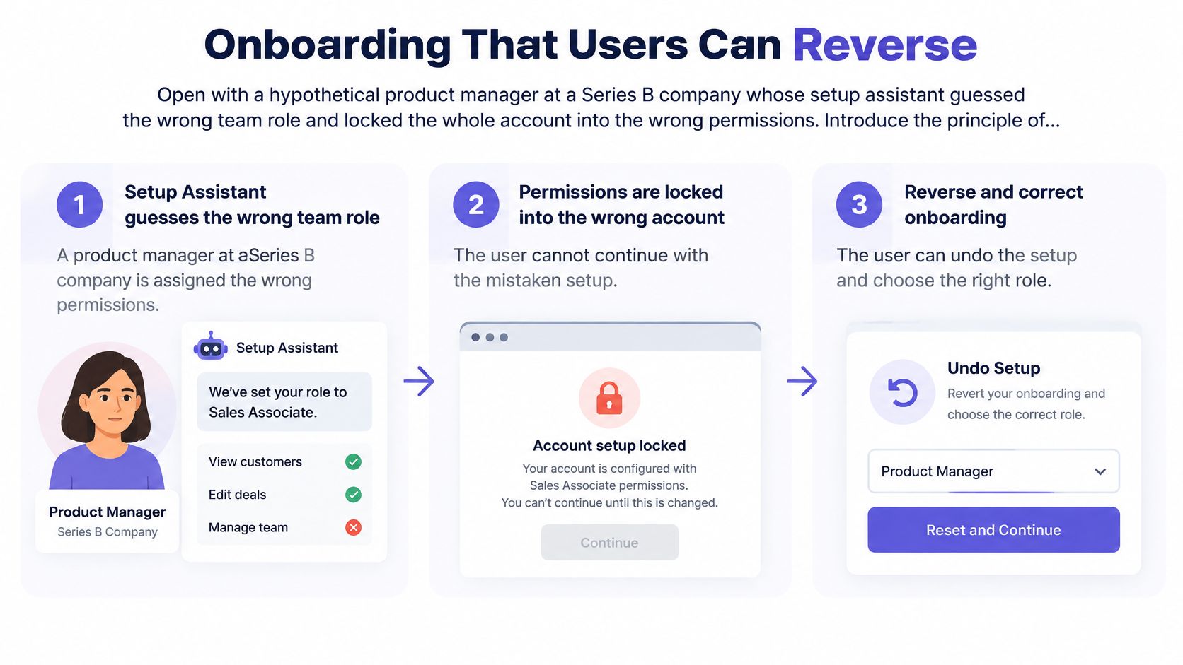
Onboarding decisions by reversibility and risk
| Onboarding decision | Reversibility | Risk | Default handling |
|---|---|---|---|
| Dashboard layout and sample data | Easy to change later | Low | Apply automatically and label it as automatic |
| Team name and invite list | Editable later | Medium | Pre-fill and ask for one confirmation |
| Role and permission assignment | Silent changes are hard to notice | High | Require explicit confirmation |
| Plan and billing details | Costly to reverse once charged | High | Require explicit confirmation with the price shown |
| Data structure and imports | Hard to undo after records load | High | Show a preview and confirm before writing |
Make automation proportional to consequence
- Step 1. List every onboarding decision made for the user. Include inferred roles, suggested invitees, imported fields, and recommended plans. Hidden defaults belong in the inventory.
- Step 2. Classify each decision by reversibility and risk. Use the table to distinguish cosmetic preferences from changes that affect access, money, or stored information.
- Step 3. Automate low-risk defaults and label them automatic. Let people inspect and change the choice without restarting setup.
- Step 4. Confirm consequential changes explicitly. Explain who receives access, what will be charged, or which records will be written before committing.
- Step 5. Keep a plain workflow one click away. Preserve entered information when someone switches from conversation to form.
- Step 6. Compare outcomes beyond completion. Assess activation, time to value, support contacts, task success, and trust. Apply the task benchmark bands to the actual setup goal.
A reported conversational onboarding experiment in Sanjay Dey's account of AI in UX design reduced setup time to 4.2 minutes and increased trial-to-paid conversion from 12% to 21%, while 8% of users disliked the conversational flow and requested a traditional form. That result supports keeping a fallback; it doesn't establish that every product should adopt conversational setup.
Use Fundl to compare meaningful SaaS onboarding signals, alongside a first-use UX guide for product teams, when defining what successful setup means for your product.
A completed conversation isn't evidence of a correctly configured account.
Before designing a feature, we at Figr can ask the UX questions that shape it. Our process asks clarifying questions, maps the current flow, identifies friction and missing states, explains tradeoffs, and gives teams a way to review the logic before committing to screens.
Look for fewer setup-related support contacts and no silent reversals. If users must secretly repair the assistant's choices afterward, the apparent efficiency hasn't survived contact with real work.
Multi-Tenant Roles, Permissions and Empty States
A viewer clicks a disabled Create Project button for the third time, then emails support to ask whether creating projects is even part of her plan. The button worked exactly as the permission model intended. The screen never explained the model, so a missing sentence became another person's job.
In a multi-tenant product, customers share one interface architecture while their data and access stay scoped to separate accounts. An owner, admin, team member, and viewer need different answers from the same screen. A useful audit checks those answers explicitly, role by role, before anyone files a ticket to discover them.

Role-specific states and failure points in a multi-tenant SaaS product
| Role | Primary tasks | States to design | Common failure |
|---|---|---|---|
| Account owner | Billing, plan changes, tenant settings | Plan limit reached, failed payment | Upgrade path buried in settings |
| Admin | Invite users, assign roles, review access | No users yet, conflicting roles | Permissions shown without explanation |
| Team member | Daily work in shared data | Empty workspace, read-only items | Actions hidden instead of explained |
| Viewer or guest | Read reports, leave comments | Restricted object, expired access | Dead end with no next step |
| Support agent acting inside a tenant | Diagnose issues in a customer account | Scoped view, visible audit banner | Customer data shown without scope |
Explain the boundary without exposing protected information
When users can know an action exists, explain why it is unavailable and how to request access. Security policy determines what may be disclosed; UX determines whether the permitted explanation is understandable. Revealing a confidential object name to justify a restriction leaks the very thing the permission was designed to protect.
The same care applies to empty states. An admin with no teammates needs an invitation path. A viewer with no shared reports needs a request-access route, and instructions to create something the role cannot create only confirm the gap.
For assignment flows, designing role assignment interfaces helps frame the relationship between the selected role and its consequences. Show the resulting capabilities before saving, so people learn the permission model from the interface rather than from blocked actions.
Keep tenant scope visible
Display the active organization and workspace wherever a mistaken context could cause harm. Support access deserves an especially clear banner and a visible way to leave the customer account. Domains where access itself is audited treat this as core infrastructure, and the thinking behind investor data controls for PE funds reflects how account boundaries get documented when the underlying data is financial.
The economics follow directly. When an unexplained block generates a support request, someone must reconstruct context the interface could have stated. Multiplied across tenants, that diagnostic work becomes a recurring operating cost, and it tends to surface again at renewal when customers tally the friction they absorbed.
A review pass in Figr can map each role's flow and list its missing states before handoff, which turns the table from a discussion into an artifact the team can check. Treat the rows as an audit hypothesis to test against your own support tickets. Which role does your product design for by accident?
Accessibility as an Operating System, Not a Launch Checklist
Suppose an admin table includes a focus ring in code, but its muted outline blends into the surrounding row. A keyboard user loses their place after each Tab press. The component exists; the interaction still fails.
Accessibility needs to survive changing permissions, dynamic content, and new component states. A launch audit can't establish that every future version remains usable.
Make the requirements testable
The WCAG focus appearance criterion, a Level AAA requirement, specifies an indicator area at least equivalent to a 2 CSS-pixel-thick perimeter and 3:1 contrast between focused and unfocused states. Use it as an explicit design target, while distinguishing it from the requirements of your chosen conformance level.
For Level AA, WCAG 2.2 requires at least 4.5:1 contrast for ordinary text and 3:1 for large text, subject to its stated exemptions. Separately, the non-text contrast criterion requires 3:1 for visual information necessary to identify controls and their states, with specified exceptions.
The keyboard criterion, Success Criterion 2.1.1, requires functionality to be operable through a keyboard interface, except where the underlying function depends on the path of movement. Test menus, dialogs, filters, date pickers, and complete workflows, rather than assuming focusable buttons establish keyboard access.
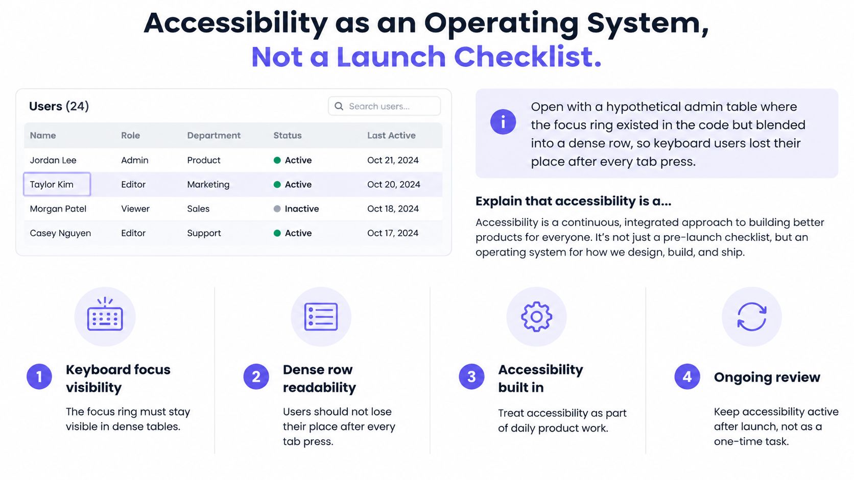
Build checks into delivery
- Specify tokens. Define focus appearance and text, border, icon, and status colors in the design system.
- Automate repeatable checks. Run accessibility checks in continuous integration, then investigate failures before merging.
- Complete keyboard-only journeys. Cover signup, authentication, billing, invitations, and data entry, including recovery.
- Maintain a state matrix. Review default, hover, focus, selected, error, and success states independently.
Automated tools won't establish whether focus order makes sense or whether someone can recover from an error. Manual task testing must cover those questions. A design system accessibility strategy from Figr provides a component-level starting point, but workflow behavior still needs validation.
Release question: Can the customer complete the task after something goes wrong?
The business case extends beyond defect prevention. FuseLab's SaaS design guide notes that the European Accessibility Act began applying in June 2025 for covered products and services, and cites global disability prevalence of roughly 1.3 billion people. Scope matters: don't assume every SaaS product has identical legal obligations.
A controlled study published by Springer involving 60 participants found significant satisfaction gains for a WCAG 2.2-conforming website, with Cohen's d effect sizes of 0.75 for content satisfaction, 0.87 for ease of use, and 0.94 for homepage evaluation. Those are website-study findings, not a promised SaaS conversion lift.
The operational conclusion is narrower and more useful: specify accessibility, test it during real tasks, and retain evidence as the product changes.
Pick One Workflow to Audit This Sprint
Choose a revenue-critical workflow, such as inviting a teammate, rather than attempting a product-wide audit. Keep the task bounded enough that the team can observe failure, agree on a change, and test the result.
In short, audit an outcome your customer needs and your team can own.
Follow a bounded audit sequence
- Step 1. Write the task with a measurable end state. For invitations, require the intended teammate to enter the correct workspace with the intended access.
- Step 2. Complete it using only a keyboard. Record each point where focus, status, or the next action becomes unclear.
- Step 3. Check text and component states. Apply the relevant contrast requirements to the complete interaction, including validation and recovery.
- Step 4. Observe contrasting user segments. Compare an experienced admin with a newly assigned admin. Record unassisted completion, errors, and time on task using the same task definition.
- Step 5. Assign the benchmark band and decide. Document whether to redesign or ship, alongside unresolved risks, an owner, and the next validation task.
Figr suits this audit because it's designed for complex SaaS workflows, admin panels and dashboards, role-based permissions, mature design systems, multi-step setup, and research-heavy decisions. It can generate edge cases and QA cases from the same design. The team still reviews and makes the final UX decision.
Don't close the audit with a screenshot of the improved screen. Close it with evidence that the intended person can complete the intended task, plus an explicit decision about remaining failures.
Which workflow has your team been avoiding because nobody owns it?
Figr helps teams examine existing flows, identify missing states, and turn UX reasoning into designs and handoff artifacts grounded in their product. Visit Figr with a revenue-critical workflow and its screens or specifications, then review the permissions, recovery paths, and QA scenarios before committing to the next version.