
A feature can ship on time and still arrive unfinished, because nobody owned the decisions hiding between the screens.
You feel that gap in the first week. Support asks what should happen offline, QA finds an error state nobody designed, and engineering reopens work everyone thought was approved. Did the team move fast, or did it just postpone the expensive questions?
A product design process built around named owners and exit gates answers those questions while they're still cheap to change. You'll get phases you can run, templates you can copy, and measures that tell you whether the work helped users.
What the Product Design Process Covers and Why Timing Matters
A feature shipped Tuesday. On Thursday, a bug report revealed that nobody had decided what happens when a user uploads a file without an internet connection. The issue was not a missing screen. It was an unresolved product decision that crossed from PM to UX to engineering without an owner.
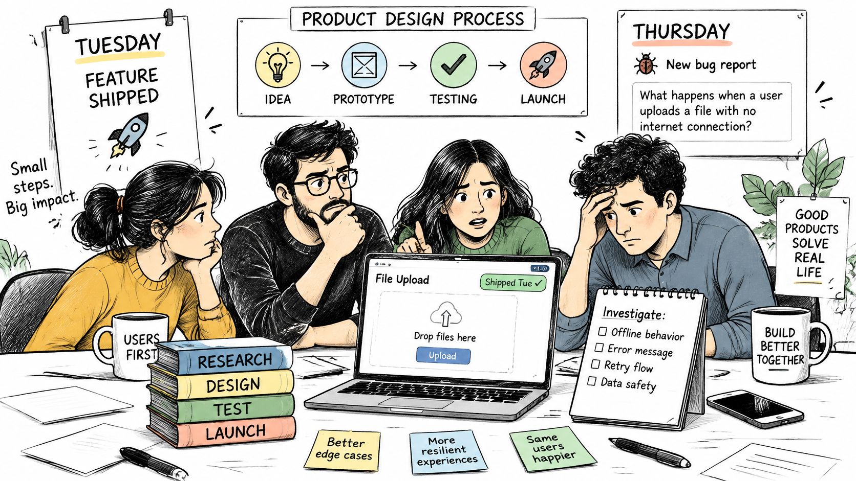
A product design process is a chain of decisions that turns a user problem into a shipped feature. PM defines the problem and constraints, UX shapes the flow and interaction, and QA checks whether the implementation meets agreed requirements. Screens record some of those decisions, but the process also needs clear owners and testable outcomes.
Why late learning costs more
An ACM-published industry summary reported that each dollar spent on user studies during product design could save approximately 10 dollars in fixes during development and 100 dollars or more in rework after release. It also estimated that 80% of software maintenance costs resulted from unforeseen user requirements, compared with 20% attributable to bugs.
The practical distinction is between a defect and a wrong assumption. A defect breaks code; an unresolved requirement can leave working code unable to support what users need. The later the team discovers that gap, the more likely it is to affect implementation, QA, support, and release timing.
Delivery pressure can make teams defer decisions, but extra capacity alone will not resolve them. Even hiring support for nearshore tech teams won't help if engineers receive work with unresolved product behavior.
Practical rule: A decision needs an owner, a written outcome, and a way to test it. Without those, it is still open.
The Six Phases and What Each One Produces
Phases matter because they force different questions in the right order, before answers get expensive to reverse. In practice they overlap. A validation finding can send you back to Define, and that's healthy if the artifact changes with it.
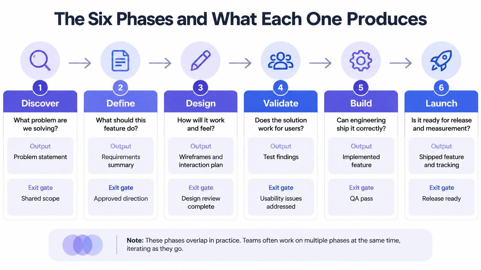
| Phase | Core question | Main output | Exit gate |
|---|---|---|---|
| Discover | Which problem is worth solving? | Research notes and opportunity brief | Problem agreed by PM and UX lead |
| Define | Who is the user and what must they achieve? | PRD, user journeys and success metrics | PRD signed with measurable targets |
| Design | Which flow and screens solve it? | User flows, edge case map and low-fidelity screens | Edge cases mapped and design system tokens applied |
| Validate | Can users complete the task? | Prototype test results | Task success and error thresholds met |
| Build | Does the build match the design? | Implemented screens, QA cases and acceptance criteria | QA passes every acceptance criterion |
| Measure | Did the feature change the outcome? | Adoption, task success and support volume dashboard | Results reviewed against Define targets |
How the gates actually bite
Discover ends when the PM and UX lead can state the same problem in one sentence and point to evidence for it. If they can't, what exactly would Design be solving? Define then turns that agreement into a PRD with user journeys and targets you can measure later.
Design produces flows first and screens second. Your edge case register belongs here, while empty, loading, error and offline states are still lines on a map rather than surprises in a build. Validate checks whether real users can complete the task within thresholds you set before testing starts.
Say a checkout redesign passes Design review because it looks clean. In Validate, users repeatedly miss the delivery-date field because it sits below a summary block they treat as the end of the page. Does the feature move forward because stakeholders like it? No. The gate sends it back, the field moves, and you retest.
Build compares implemented screens against acceptance criteria, not against someone's memory of a review meeting. Measure then compares adoption, task success and support volume against the targets written during Define. That's the loop closing.
Every phase ends in a written artifact. When a project stalls, you can point to the missing brief, unsigned PRD or absent test result instead of debating whose recollection is correct.
Who Owns Each Phase Across PM, UX and QA
A PM can discover two weeks before launch that no one planned tests for offline states. The PRD may be signed and the happy path designed, yet QA has no agreed behavior to verify. By then, adding the missing state can mean revising designs, implementation and test coverage.
Ownership makes those decisions explicit. Responsible means doing the work. Accountable means one person signs off. Consulted means asked for input before a decision; Informed means told afterward. Each decision needs one accountable owner, even when several roles contribute.
| Activity | Product Manager | UX Designer | QA Lead |
|---|---|---|---|
| Problem statement and success metrics | A/R | C | I |
| User research and interviews | C | A/R | I |
| User flows and edge case map | C | A/R | C |
| PRD and acceptance criteria | A | C | C |
| Prototype usability testing | I | A/R | C |
| Accessibility checks | I | R | A |
| Test cases drawn from designs | I | C | A/R |
| Launch go or no-go | A | C | C |
What each role protects
The product manager owns the problem definition, success metrics and launch decision. Coordination is part of the job, but it needs clear decision rights; teams defining that remit can compare it with skills for full lifecycle project managers.
The UX designer owns research synthesis, flows and usability evidence. The QA lead owns test cases and verification against acceptance criteria, including accessibility checks. For teams clarifying role boundaries as they hire, design hiring guidance for SaaS teams can help distinguish product design accountability from narrower UX execution.
Handoffs fail when engineers receive screens without empty, error or offline states. Under deadline pressure, they fill in the gaps themselves, and QA may then test behavior nobody deliberately chose. Involve QA during flow review so those states become decisions before implementation.
Tools can draft artifacts, but they do not take accountability. Designers still review, refine and apply judgment before anything ships; the named owner remains responsible for the decision.
Before kickoff, put names beside the roles in the table. Each person should be able to state which decision they own and what evidence or artifact they need to sign off.
Templates for the Brief, PRD and Edge Case Register
Good templates shorten the distance between a conversation and a testable decision. Keep them in the team wiki, keep them short, and review them quarterly. A template nobody updates becomes the reason a handoff fails.
- Problem brief: One page naming the user, the job to be done, the research evidence and the success metric. Link it to the opportunity notes from Discover so claims stay traceable.
- PRD: Sections for problem, users, scope, out of scope, success metrics and open questions. Write every assumption as a statement you can test, and use a product requirements document guide to keep the structure consistent.
- Edge case register: One row per screen and state, covering empty, loading, error, offline, permission-denied and first-time use. Add an owner and test status column, or rows will age without anyone noticing.
- Acceptance criteria: Given, when, then statements, one for each register row. QA should verify each state without guessing what the designer intended.
- Sign-off record: Names of the PM, UX and QA owners, approval date, and alternatives rejected with reasons. Why relitigate a decision next quarter if the reasoning is already written down?
Keep each template usable
Could a designer complete the brief between screens without hunting through five documents? If not, cut fields until the answer is yes. Even teams outside software face the same discipline, which is why a structured example like the fashion requirements template guide from Sprello is useful for seeing how explicit fields prevent vague requirements from drifting downstream.
A template earns its place when it makes a missing decision visible in under a minute.
Don't add a field unless someone will act on it. Don't keep a field nobody reads. Which of your current templates would survive that test?
Run One Feature From Brief to Handoff in Five Days
Pick a feature that's already moving. A pilot attached to real work exposes process gaps faster than a workshop about process. Five days won't finish every feature, but it will produce the artifacts and gates a sound handoff needs.
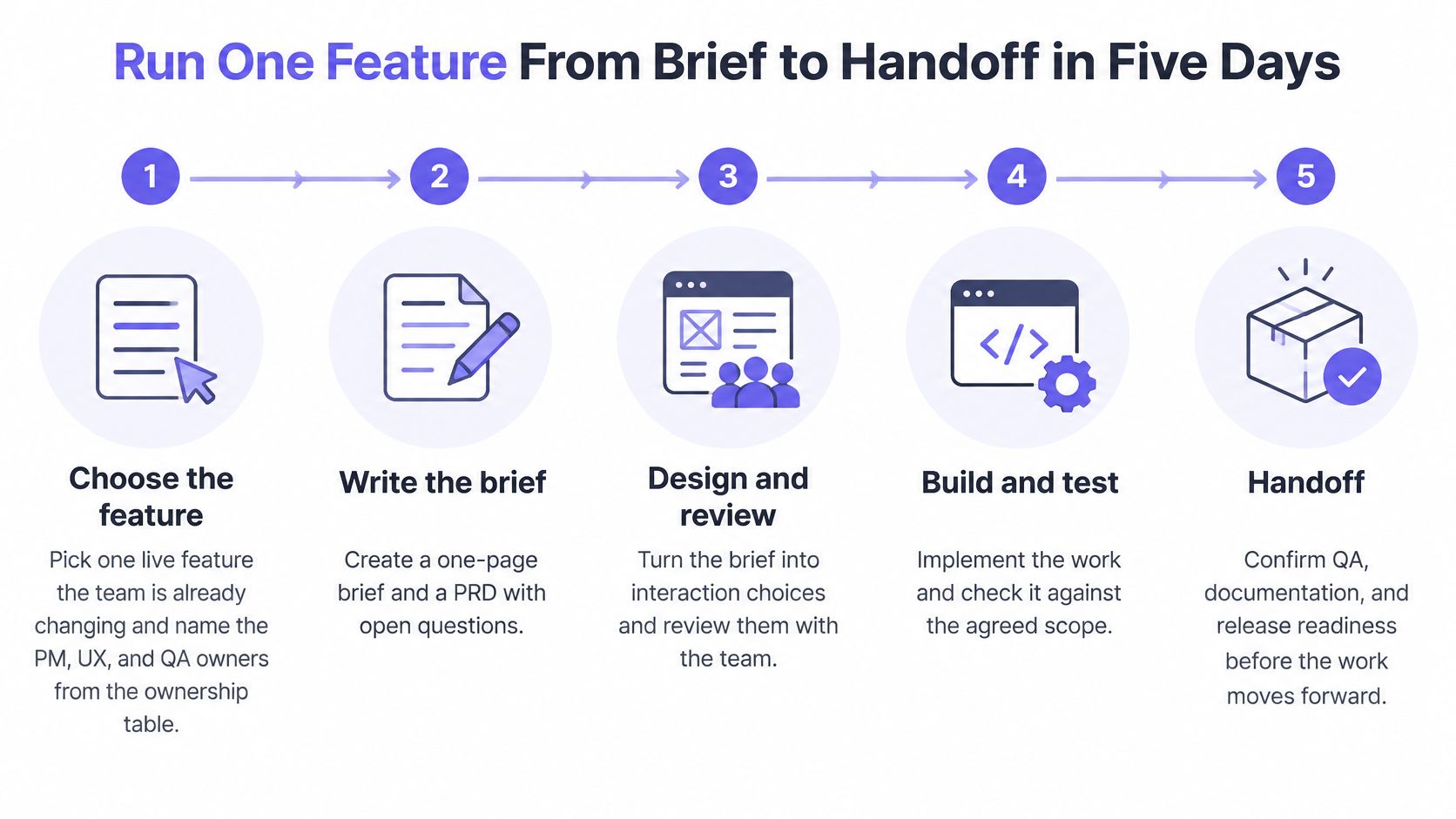
Step 1. Choose the feature and name the owners.
- Select one live feature the team is already changing.
- Assign the PM, UX and QA owners from the ownership table.
- Agree what decision this week must produce.
Step 2. Write the brief and PRD.
- Complete the one-page brief with user, job, evidence and metric.
- Draft the PRD with scope, out of scope and open questions.
- List each assumption as something you can test.
Step 3. Map the flow and edge cases.
- Convert requirements into screens, decisions and exits.
- Build the register for empty, loading, error, offline, permission-denied and first-time states.
- Run accessibility checks on the main flow before polishing screens.
Context matters most here. The workflow starts when you bring a PRD, screen, recording, live product capture, or design file to Figr. It learns the product from its screens, specs, docs, analytics, and design system, then helps with UX reviews, flows, edge cases, prototypes, and designs that fit the product. It also surfaces the questions it needs answered and the assumptions it is making before design work continues. Would you rather discover those assumptions on day three or after release?
Step 4. Prototype and test the riskiest path.
- Choose the path where failure would cost users the most.
- Test with representative users, not convenient colleagues.
- Record completion, errors and time-on-task against thresholds set in advance.
Step 5. Agree handoff and sign off.
- Write acceptance criteria as given, when, then statements.
- Set go or no-go criteria and one success metric for post-launch review.
- Have all three owners sign while recording rejected alternatives and reasons.
What good handoff looks like
Engineers should receive screens, states, acceptance criteria and open questions in one linked package. If they must search chat threads to learn how an error behaves, the handoff isn't done. Teams formalising this moment can compare their package against developer handoff best practices and remove any artifact that doesn't help someone build or test.
What happens if day four fails its threshold? You don't compress day five and hope. You loop back to the flow, change the design, and retest the risky path.
In short, speed comes from deciding once, in writing, with evidence. The five days create that record. Which live feature on your roadmap could carry this run next week?
Accessibility and Contrast Gates Before Handoff
A polished screen can fail before a user reads a word. Light grey text on a soft background looks calm in a design review and disappears for someone with low vision, glare on a phone, or an ageing monitor. Would your team catch that in the component, or wait for an audit?
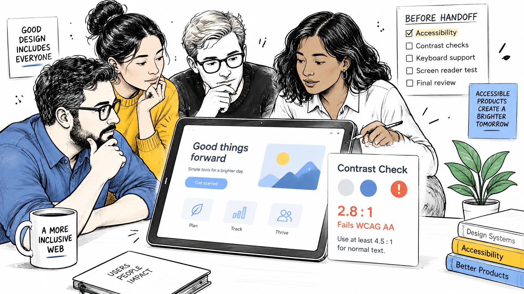
The WCAG 2.2 guidelines set the Level AA minimum for standard text and images of text at a contrast ratio of at least 4.5:1. Large text requires 3:1, with large generally defined as at least 18-point text, or 14-point bold text.
| Text type | Minimum contrast ratio | Size threshold |
|---|---|---|
| Standard text and images of text | 4.5:1 | Below 18-point, or below 14-point bold |
| Large text | 3:1 | At least 18-point, or at least 14-point bold |
| Incidental text such as inactive controls, decoration and logos | Not required | Not applicable |
Turn thresholds into component rules
Define contrast tokens for default, hover, focus, disabled and error states. Check each pair before it enters a reusable component, then verify the shipped interface because rendering and backgrounds can change the result. Teams encoding this discipline can use accessible design systems for product teams to connect tokens, components and review habits.
Automated scans catch some failures. They don't tell you whether focus disappears behind a sticky header, whether a screen reader announces an error clearly, or whether a multi-step form overwhelms working memory. Many criteria need human testing with people who understand how users with different disabilities interact with the web.
- Keyboard path: Complete the flow without a mouse and keep focus visible.
- Screen reader pass: Check forms, errors and confirmation messages.
- Zoom and reflow: Inspect large sizes for clipped or overlapping content.
- Error recovery: Test failed submissions and empty states from the register.
Use one hard gate. A component cannot move from design to build until its contrast pairs pass and its keyboard path is recorded in the flow. Which screen in your current product would fail that check first?
Measuring Whether the Process Works
The release shipped on schedule. The dashboard is green, the launch post is published, and adoption stays flat. Did the process work? Delivery says yes. Users are saying something else.
NIST guidance on usability testing defines usability under ISO 9241-11 through effectiveness, efficiency, and satisfaction for specified users pursuing specified goals in a defined context. That gives you three distinct signals instead of one vague verdict about whether a design feels good.
- Effectiveness: Task-completion rate and error count.
- Efficiency: Time-on-task.
- Satisfaction: Structured feedback after the task.
Read the pattern, then choose the fix
| Result pattern | What it usually means | Where to look next |
|---|---|---|
| Low completion with frequent errors | Interaction or comprehension failure | Labels, field order and error messages |
| High completion with long time-on-task | Avoidable friction | Step count and repeated confirmations |
| Strong performance with low satisfaction | Trust, clarity or expectation problem | Copy, feedback and what the interface promises |
| Fast delivery with flat adoption | Value not felt by users | Task success and price-for-value measures |
Say you test a settings redesign. Completion is strong, so the team relaxes, until time-on-task shows users pausing at a confirmation step that repeats a question they already answered. The fix isn't more visual polish. You remove the duplicate confirmation and retest the same task.
What if users finish quickly but rate the experience poorly? Look at trust and expectation. Perhaps the interface promises instant saving while showing a delayed success message, or uses confident copy around a destructive action. Performance alone would hide that problem.
Set the test before you run it
Each prototype needs task hypotheses, representative tasks, baseline metrics and acceptance thresholds before iteration. Compare variants using the same task script, or you'll mistake an easier script for a better design. Segment results by user type because an acceptable average can hide a segment that's failing every time.
Collect quantitative and qualitative evidence together. Numbers locate the failure, while user language explains what people thought the interface was asking. When you're choosing what belongs on the dashboard, choosing meaningful UX metrics helps separate outcome measures from activity counts.
A useful test for any metric: If this number moved tomorrow, would we know what decision to change?
Review the last metric your team discussed. Did it measure value experienced by users, or only output produced by the team? Start your next feature by copying the ownership table, naming three owners, and writing the thresholds before the first prototype test.
Frequently Asked Questions
What are the six phases of the product design process?
The six phases are Discover, Define, Design, Validate, Build and Measure. Each ends with an artifact or exit gate, but the work is iterative: a failed usability test can send the team back to the flow or problem definition.
Who owns the product design process?
Ownership is shared, but each decision needs one accountable person. The PM owns the problem, success metrics and launch decision. UX owns research synthesis, flows and usability evidence. QA owns test cases and verification against acceptance criteria.
What should a product design handoff include?
Give engineering a linked package of screens, empty and error states, an edge case register, acceptance criteria and unresolved questions. Include the sign-off record so the team can see who approved the decisions and why.
How do you know whether the process worked?
Compare post-launch adoption, task success and support volume with the targets set during Define. For usability, track task completion and errors, time-on-task, and satisfaction. Shipping on schedule is not enough if users still cannot achieve their goal.
Bring your next PRD, screen, recording or design file to Figr and turn the open questions, assumptions and edge cases into flows, prototypes and acceptance criteria your PM, UX and QA owners can sign off together. You'll leave with artifacts grounded in your existing product and design system, ready for a cleaner handoff and a clearer post-launch review.