
A Product Manager building zero-to-one without a full-time designer faces the same trap in almost every startup, the product has to look coherent before the team has the people to make it coherent. I've seen this most often in early product teams where the roadmap is clear, the engineering talent is strong, and the design ownership is blurry.
When that gap stays unresolved, the interface turns into a meeting artifact. One button reflects engineering convenience, another reflects a growth request, and a third reflects something someone liked in another app. The result is familiar: slow reviews, repeated handoffs, UI rework, and a product that feels less trustworthy than the underlying idea deserves.
An AI design tool for product teams can help, but only if it behaves like a system rather than a mood board. That's the useful frame for Figr without full-time designer: use product context, reusable rules, and explicit review loops to replace missing day-to-day design capacity without letting quality collapse.
Introduction
Why Design by Committee Is the Default Failure Mode
Design by committee happens when nobody owns the standard for what “good” means.
Last week I watched a Product Manager try to close a simple checkout change. Engineering wanted fewer steps. Marketing wanted more copy. A founder wanted it to “feel cleaner.” Nobody was wrong, and that was the problem. Without a dedicated designer, every opinion arrived with equal force and no shared rubric.
That pattern has a name in operations terms: fragmented decision-making. When requirements, approvals, and quality checks are not centralized, teams repeat work they already did. Independent design guidance recommends a task schedule, clear marking of major project events, fewer decision-makers, and explicit quality-control checks so work can move through review without constant rework, as outlined in this design workflow guidance from Markzware.
Why smart teams still fall into it
This isn't a talent issue. It's an incentives issue.
A Product Manager wants momentum. Engineers want clarity. Stakeholders want their concern represented before launch. In the absence of a design owner, the team creates a substitute mechanism: everyone comments earlier, more often, and with less structure. The review process starts to behave like governance instead of craft.
One person changes spacing. Another changes labels. Someone else asks for another state after QA already started.
That's where velocity goes to die.
Practical rule: If more than a small group can approve a screen, nobody is really accountable for the screen.
What actually works instead
A no-designer team needs a decision spine. That means one Product Manager owns the brief, one engineering lead owns feasibility, and the team agrees upfront on review checkpoints. Everything else becomes input, not governance.
The useful shift is from ad hoc feedback to structured context:
Define the problem first: Write the user task, business constraint, and shipping deadline before anyone discusses pixels.
Limit reviewers deliberately: Ask for input broadly, but assign approval narrowly.
Create a QC gate: Check consistency, states, and handoff readiness before engineering starts implementation.
Product-context tooling earns its keep. If a team loads PRDs, research, flow notes, and previous decisions into a persistent memory layer, the first draft is grounded in what the product is trying to do. That short-circuits a surprising amount of opinion theater.
The deeper point is economic. Design work doesn't vanish when there's no full-time designer. Someone still makes the decisions. The team either pays for that work in a visible way, or it pays for it later through confusion, rework, and drift.
How to Define Your Good Enough Design Bar
Your quality bar should come from patterns you can explain, not taste you can't defend.
Teams often get stuck because “good enough” feels vague. Is it polished visuals? Is it conversion? Is it consistency with your existing app? Usually it's some blend of all three, but a Product Manager without a designer needs a more usable standard. The basic gist is this: start from what already works, then make your constraints explicit.
Borrow the bar before you invent one
If you already have product surfaces users trust, use them as your baseline. If you don't, study a direct reference point with strong product habits, such as the interaction discipline many teams admire in Linear or the clarity often seen in Perplexity. The goal isn't imitation. The goal is to identify visible rules.
Look for:
Component density: How much is on screen before it feels crowded?
Action hierarchy: What is visually primary, and what is deliberately secondary?
Copy posture: Is the product terse, explanatory, or guided?
State handling: What happens when data is empty, delayed, or partially complete?
That gives you a bar the team can discuss in plain language.
Standardize the path, not just the output
A practical model for non-design teams is to turn design into reusable stages and templates. Guidance for designers emphasizes mapping the customer journey from beginning to delivery, keeping documentation and files ready, and using templates so future work can be copied and adapted instead of rebuilt, as discussed in this process-focused design workflow video.
That matters more than is often realized.
If every new feature starts from a blank canvas, quality becomes a fresh debate every time. If every new feature starts from a reusable brief, a state checklist, and a known screen pattern, quality becomes easier to repeat.
A simple bar a Product Manager can use
I'd define “good enough” with a short scorecard:
Can a new user tell what to do next? Checks clarity of hierarchy and copy.
Does it look like the rest of the product? Checks consistency of components and spacing.
Have you covered the obvious states? Checks empty, loading, success, failure, and permission issues.
Can engineering implement it without guessing? Checks specificity of behavior and acceptance criteria.
If you can't answer those cleanly, the screen is not ready.
That's why Figr without full-time designer works best when the Product Manager treats AI as a calibration layer. You capture screens, patterns, and product rules first. Then you ask the system to generate from a known bar, not from a clever prompt.
Can AI Really Capture Your Product's Nuance
AI can capture product nuance only when you teach it your product, not when you ask it for a generic screen.
That's the dividing line. Most skepticism about AI design is healthy. A Product Manager should ask whether a model can understand the trade-offs behind a billing flow, a risky settings change, or a workflow with historical baggage. On its own, it can't. With persistent product context, it can help surprisingly well.
Generic prompts miss the middle
The weak version of AI-assisted design starts with a sentence like “make me a clean onboarding flow.” You'll get something plausible. You probably won't get something usable. It won't know the conventions your users already learned, the constraints your engineers care about, or the old decisions your team made for good reasons and then forgot to document.
This is what I mean: you are not prompting, you are teaching.
A durable setup usually includes a product memory layer with inputs such as:
PRDs and feature briefs
User research notes
Analytics observations
Existing screens or Figma files
Voice-narrated walkthroughs from the team
Recorded flows that reveal intent and friction
Once that context persists across sessions, the tool can reason from prior decisions instead of redrawing the product from scratch each time.
What a useful AI output looks like
A useful output is not a pretty frame. It's a proposal with logic.
I want the system to reflect the user goal, note likely states, preserve existing interaction patterns, and surface trade-offs the team should review. If it produces only visuals, the Product Manager still has to do the hidden design work alone. If it produces rationale with the prototype, the review starts to resemble a real design critique.
The strongest AI-assisted workflows reduce blank-page work. They do not remove the need for judgment.
That distinction matters. Figr without full-time designer is viable when the system stores product memory across sessions, pulls in docs, research, screens, and decisions, and then generates work that remains attached to that context. The Product Manager is still making decisions, but with a much better first draft and a much tighter audit trail.
Where I'd still be skeptical
I wouldn't trust any AI setup that can't answer basic questions such as:
Why is this the primary action here?
What states did you assume?
Which existing product patterns did this follow?
What constraints from the brief shaped this flow?
If the tool can't carry that conversation, you're getting decoration, not product design support.
A Practical Playbook for Generating Your First Prototype
A first prototype gets useful fast when you structure the work before you generate the screens.
The common mistake is opening the tool too early. A Product Manager has a feature idea, types a prompt, and starts reacting to UI before the team has agreed on user intent, scope, or edge conditions. That's backwards. Start with context, then generate.
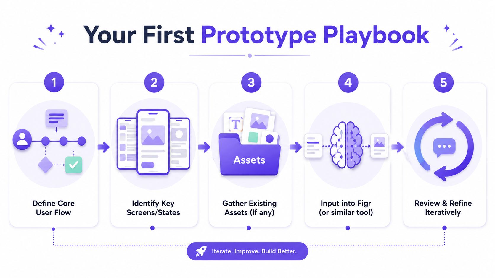
The zero-to-one workflow I'd use
Step 1. Define the core user flow.
Write the job the user is trying to complete. Keep it specific.
Include the trigger, the desired outcome, and the business constraint that matters most.
User trigger: What starts the flow?
Completion point: What counts as success?
Constraint: Time, trust, compliance, engineering scope, or data availability
Step 2. Identify the key screens and states.
Map the happy path first, then list the states that can break it.
Don't wait until QA to discover them.
Primary screens: Entry, action, confirmation, fallback
Critical states: Empty, loading, error, permission, partial completion
Decision points: Anything that changes what the user sees next
Step 3. Gather existing assets and context.
Pull in whatever the product already knows.
Even thin context is better than none.
Written inputs: PRDs, support notes, research summaries
Visual inputs: Current screens, old mocks, component references
Behavioral inputs: Screen recordings, walkthroughs, observed friction
A lot of Product Managers hit this stage and realize the process itself is the bottleneck, not the idea. If that's where you are, it's worth seeing how teams find remote AI product design roles that increasingly expect this hybrid product-plus-AI workflow. The skill isn't “be a designer.” It's “turn product context into shippable artifacts.”
Step 4. Generate a high-fidelity direction from the context.
Now you can use Figr.
Feed the system the flow, the states, the product references, and the rules you already captured.
Ask for:
A prototype direction: Core screens with interaction logic
State coverage: Variants for non-happy paths
Supporting artifacts: Acceptance criteria, edge case notes, QA scenarios
Step 5. Review and refine with a narrow group.
Do one product review before broad sharing.
Too many eyes too early will reintroduce committee dynamics.
Check:
User clarity: Can someone understand the next action quickly?
Pattern fit: Does it feel native to your existing product?
Implementation readiness: Can engineering build it without guessing?
Here's a walkthrough worth keeping nearby if you want a companion process for rapid prototyping for product teams.
What to do after the first draft
The first prototype should move into a tool your team already works with. Editable, Figma-ready output matters because engineering and stakeholders need to inspect details, not stare at a flattened image.
Later in the workflow, a live demo helps expose hidden confusion better than a static review.
What usually breaks this workflow
I've seen three recurring failures:
Prompting without context: The prototype looks polished but disconnected.
Skipping states: The team approves the happy path and discovers problems in QA.
Reviewing too broadly: Stakeholder noise drowns out user logic.
A first prototype isn't supposed to prove visual genius. It's supposed to collapse ambiguity. If it makes requirements clearer, exposes edge cases earlier, and gives engineering a Figma-ready direction, it has done the job.
Design Systems Are for Teams with Designers, Right
A design system matters more when you don't have a full-time designer.
Teams often treat systems as a maturity project for later. I think that's backwards. If you have a dedicated designer, that person can absorb some inconsistency through judgment. If you don't, every unlabeled rule becomes a future argument about buttons, spacing, states, and copy hierarchy.
Why systems become survival mechanisms
Without a system, a Product Manager and an engineer are forced to make design decisions one screen at a time. That feels efficient in the moment. It compounds badly. A secondary button looks different in two places. Form validation behaves differently across flows. Empty states start sounding like they were written by different companies.
Consistency is not cosmetic. Nielsen Norman Group has long argued that consistency supports usability because people learn patterns and rely on them. In practice, that means your team should spend less time inventing and more time reusing.
AI makes systems more useful, not less
Independent industry reporting says 75% of designers use AI tools, up from 35% in 2023, while more than 500,000 designers work in the U.S. and the global graphic design market is valued at $45.8 billion, with a projection to $78.3 billion by 2032, according to this design industry roundup. The pattern underneath those numbers is the useful part: design work is being augmented through hybrid workflows, not disappearing.
That should change how Product Managers think about systems.
If AI is involved in prototype generation, review support, and artifact creation, then system inputs become even more important. Tokens, components, variants, and usage rules give the machine a constraint set. They also give the team a shared language.
What a lightweight system should include
You do not need a giant design ops project.
You need enough structure that repeated product work stops producing repeated visual drift.
Core tokens: Color, type, spacing, radius
Shared components: Buttons, inputs, modals, tables, alerts
State rules: Disabled, loading, error, success
Usage notes: When to use which pattern, and when not to
If you want a practical starting point, Figr's complete guide is a solid reference for how to think about system rules as operating constraints rather than a library cleanup exercise.
A no-designer team cannot afford to decide the same UI rule five times.
That's why I see system work as debt prevention. It removes tiny decisions from the sprint so the team can focus on product decisions that matter.
Mapping the Unseen World of Edge Cases and States
Product quality usually collapses in the states nobody designed on purpose.
The happy path gets all the attention because it is easy to demo. Real product trust is built in the awkward moments: the loading delay, the partial failure, the empty dashboard, the revoked permission, the item that disappears mid-flow. A Product Manager working without a designer will almost always undercount these states at first. That's normal. It's also dangerous.
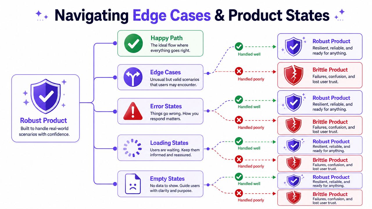
The hidden complexity in simple features
Take something as small as a task approval card. It sounds like one object. In practice, it can contain many real product states: pending, approved, rejected, revoked, reassigned, expired, loading, failed, partially synced, blocked by permission, or waiting on another dependency. Figr's gallery uses a task approval card with 11 product states to make this exact point.
That's the difference between a mockup and production-ready thinking.
A major gap in public advice is operational guidance for preserving quality when teams don't have a full-time designer. Much of the existing coverage treats the issue as cost reduction or career commentary, while the harder question is how to preserve quality, consistency, and decision speed. That gap matters because low-cost, non-specialist design options can create a poor experience and lower-quality outcomes, as discussed in this creator commentary on the freelance design market.
A state map beats a prettier screen
When I review flows, I ask the team for a state map before I ask for visual polish.
List the conditions that alter user experience:
System states: Loading, timeout, stale data, sync conflict
User states: New user, invited user, restricted user, returning user
Business states: Trial expired, approval pending, plan limit reached
Outcome states: Success, partial success, failure, recoverable failure
That exercise usually changes the design more than any visual pass.
Good product design shows what happens when things go slightly wrong, not only when they go right.
How to make this manageable
You don't need to model every theoretical branch. You need to identify the states that change user trust, engineering logic, or support burden.
Four questions to ask, each pointing at what you're really checking:
Can a new user tell what to do next? Checks clarity of hierarchy and copy.
Does it look like the rest of the product? Checks consistency of components and spacing.
Have you covered the obvious states? Checks empty, loading, success, failure, and permission issues.
Can engineering implement it without guessing? Checks specificity of behavior and acceptance criteria.
If you want a sharper checklist, this piece on understanding critical product development pitfalls is useful for spotting the branches teams routinely miss.
How to Measure Quality When You Have No Designer
You measure no-designer quality by tracking rework, defects, review friction, and shipping confidence.
Many teams stay vague. They'll say the process feels faster or that the screens look better. That's not enough. A crucial question is whether operating without dedicated design capacity is a temporary efficiency win or a hidden product risk. Public discussion rarely addresses ROI, defect rates, rework, or time-to-ship tradeoffs, even though that's the actual decision product leaders have to make. Broader labor context also suggests the work doesn't disappear when no designer is present, it gets redistributed, as noted in this labor-market context on design work redistribution.
The dashboard I'd build
I wouldn't start with vanity metrics. I'd track operational signals:
UI-related bug volume: Issues tied to states, labels, hierarchy, or inconsistency
Engineering rework time: Hours spent revisiting shipped UI because behavior was underdefined
Review cycle count: How many approval loops a feature needs before build
Spec completeness: Whether states, edge cases, and acceptance criteria were defined before implementation
Consistency drift: How often new UI introduces nonstandard components or behavior
These metrics tell you whether design debt is accumulating unnoticed.
What improvement should look like
You want fewer ambiguous handoffs, fewer late-stage questions, and fewer bugs caused by missing state logic. You also want engineering reviews to shift from “what should happen here?” to “can we build this within the sprint?”
A simple measurement table helps:
UI bugs after release. Healthy trend: fewer surprises tied to behavior and state handling.
Engineering clarification requests. Healthy trend: more answers exist before build starts.
Time spent in approval. Healthy trend: less debate about basic direction.
QA scenario coverage. Healthy trend: more expected behavior is documented upfront.
The key is consistency over time, not one sprint's anecdote.
What supports this model
Artifact generation matters more than people think. If your workflow can produce test scenarios, state notes, and acceptance criteria from the same design context, QA and engineering catch issues earlier. That is how a Product Manager turns a risky no-designer setup into a managed operating model.
If your team wants a broader operating lens on improving product development, this is the frame I'd use: measure the work that got redistributed, then decide whether the system is containing that cost or just hiding it.
The Engine of Consistency Figr's Visual Context Graph
Figr's Visual Context Graph is the reason context-aware design support can stay consistent across sessions.
Most AI design outputs drift because the inputs sit in separate buckets. Screens live in one place, docs in another, analytics somewhere else, and implementation constraints mostly inside engineers' heads. A Product Manager trying to run design without a full-time designer needs those layers connected. Otherwise every new screen reopens old decisions.
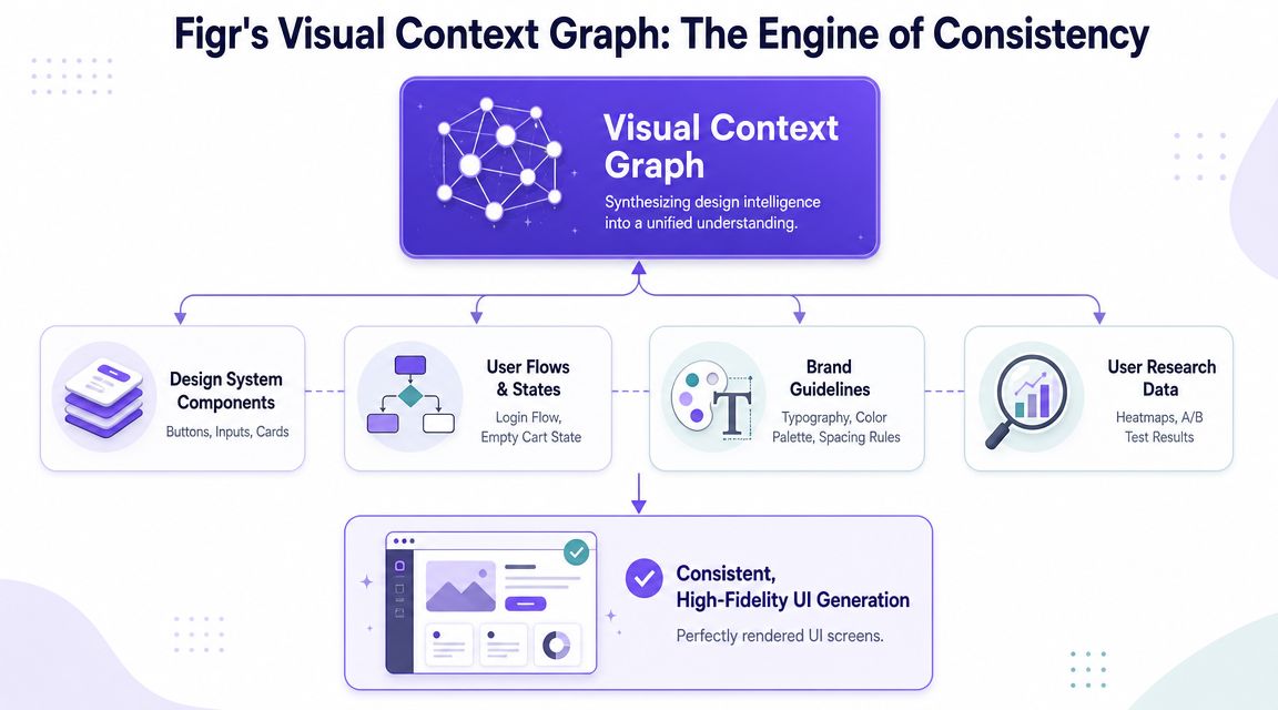
The five layers that matter
The Visual Context Graph connects five layers:
Visual context: Screens, frames, layouts, and existing UI patterns
Behavioral context: Recordings, flows, cursor paths, and user movement through the product
Design System context: Tokens, components, variants, and usage rules
Product Knowledge context: PRDs, research, decisions, and historical trade-offs
Implementation context: Code constraints, technical realities, and build considerations
That set of layers is the useful model.
A screen without behavior is decoration. A flow without system rules turns inconsistent fast. A spec without implementation context creates handoff friction. The graph works because it treats product design as an interconnected memory problem rather than a one-shot generation problem.
Why this matters for zero-to-one work
Zero-to-one teams often think they lack design capacity. What they usually lack is design memory.
A dedicated designer often carries that memory informally. They remember why a previous onboarding experiment failed, why a settings flow uses a particular disclosure pattern, or why engineering asked to avoid a certain interaction. If that person is absent, the team needs a substitute mechanism that keeps decisions attached to the work.
That's the operational value here. The Product Manager doesn't need to become a perfect designer. The Product Manager needs a system that can retain and apply product context with enough fidelity that quality doesn't decay every sprint.
The practical outcome
When these layers stay connected, generated output becomes more useful:
Prototypes align to existing product behavior
System rules carry through into new screens
Edge cases emerge earlier
Engineering receives more buildable artifacts
Review conversations shift from style opinions to trade-offs
This is the promise behind Figr without full-time designer. You are replacing missing day-to-day design bandwidth with an explicit context engine, not asking AI to improvise your product from scratch.
Conclusion
Operating without a full-time designer can work, but only when you replace ad hoc judgment with a repeatable system. The risk is not that the team can't produce screens. The risk is that nobody notices the slow drift into inconsistency, rework, and fragile user experience until it is already expensive.
The pattern that holds up is straightforward. Set a clear quality bar. Limit decision-makers. build from reusable templates and system rules. Map states before polish. Measure whether work is getting clearer or getting redistributed.
In short, Figr without full-time designer is viable when the team uses AI as product memory plus design guardrails, not as a shortcut to generic UI. That is what keeps velocity from turning into design debt.
If you're in that stage right now, pick one real feature, load the actual context, generate the first Figma-ready direction, and review it with a narrow group. Then try Figr.
Frequently Asked Questions
As a PM, will using Figr mean I've become the designer?
I'd think of it differently. You're still the Product Manager, but you're taking on more design orchestration. The system helps with drafts, states, and consistency, while your job stays centered on priorities, trade-offs, and outcomes.
How long does it take to get a useful prototype from Figr?
In my experience, it depends on the quality of the context more than the tool itself. If your flow, constraints, and references are clear, you can get to a useful first prototype quickly. If the brief is fuzzy, the prototype will be fuzzy too.
What if my product has a very unique, non-standard UI?
That's exactly where product context matters most. A generic prompt will miss the nuance. A workflow built from your screens, rules, docs, and decisions has a much better shot at reflecting what makes your product different.
Does this mean my company will never need to hire a designer?
No. I'd treat this as an operating model, not a permanent ideology. Some teams can go far without a full-time designer for a period, but there are moments when dedicated design judgment becomes the right investment.
How does Figr ensure the privacy and security of my product data?
I'd verify the current security posture directly with the vendor before rollout. For any tool in this category, I want clear answers on data handling, access controls, retention, and workspace permissions before I load sensitive product context.
If you want to stop rebuilding product design from scratch every sprint, start with one live workflow and let the system carry the context forward. Figr is built for that exact job.