Your product already disagrees with your design system, and the gap usually stays invisible until a release review, a bug bash, or a customer complaint forces everyone to look closely. One team ships a new billing page, another updates onboarding, and somewhere along the way the “same” button, form field, or empty state becomes three different things.
When that gap goes unmanaged, designers turn into pattern police, engineers keep rebuilding near-duplicates, and Product Managers lose confidence that the system reflects the product they're shipping. Small inconsistencies pile up into real UX costs: harder scanning, more hesitation, more exceptions, more debate. You can see it in comparison-heavy screens, dense tables, and multi-step flows where users need consistency most.
A better approach starts with a deliberate audit, then turns that audit into governance. Figr supports that workflow by grounding analysis in product context, pulling from live screens, design systems, and related product inputs through its Visual Context Graph so teams can compare what exists, spot drift earlier, and decide what to fix with more confidence. If you need the broader foundation first, Figr's design systems guide is a useful companion.
Coverage. Manual review usually stops at obvious screens. A structured audit includes live workflows, repeated patterns, and hidden states.
Evidence. Manual review is opinion-heavy. A structured audit ties findings to task behavior, error patterns, and component use.
Output. Manual review produces screenshots and comments. A structured audit produces prioritized fixes, exceptions, and governance decisions.
Team impact. With manual review, designers carry the burden. A structured audit creates a shared view across product, design, and engineering.
Long-term value. Manual review is a one-time cleanup. A structured audit runs ongoing drift detection and system maintenance.
What Is Design System Drift and Why Does It Happen
Design system drift is the measurable gap between the UI your team ships and the system meant to standardize it.
A review starts with a simple question: why do two settings screens in the same product use different primary buttons? One has tighter spacing, a different hover state, and a lower-contrast fill. The other matches the library. Nobody set out to fragment the experience. Those differences slipped in through normal delivery pressure, and now the team has to decide whether the product changed on purpose or the system lost control.
That is design drift.
I treat drift as an operational problem, not a design purity debate. If a component appears in six variants across production but the system defines two, the team has a gap it can count, inspect, and fix. Once drift has a name and a way to measure it, governance gets easier.
Drift begins as a side effect of speed
Teams rarely create drift through negligence. They create it while trying to ship. A squad needs a state that does not exist in the system yet. A migration brings in legacy patterns. A feature flag creates a branch that survives longer than planned. An engineer patches production during an incident and the change never returns to the component library.
Over time, the product becomes a record of local decisions. The system remains a record of approved decisions. The mismatch grows.
Practical rule: If your shipped UI changes faster than your contribution process, drift is already happening.
Drift comes from broken feedback loops
The first symptom is often visual, but the underlying cause is structural. Design updates Figma without a coded component change. Engineering adjusts the coded component without updating system guidance. Product approves an exception for delivery speed, then no one reviews whether it should become a standard or be removed.
That is why drift spreads. Production patterns carry more weight than documentation in day-to-day work. Once a team sees an exception in the live product, they copy it.
The distinction matters because a design system is more than a style reference. It is shared operating logic for components, states, accessibility behavior, and implementation rules. When that operating logic stops matching what ships, the issue is governance, ownership, and process. For a deeper breakdown of the causes and prevention of design drift, this guide is a useful reference.
The common sources of drift
The same failure modes show up across teams:
Local optimization: A product team solves the immediate problem and skips the upstream update.
Missing states: The system covers default states, but not loading, empty, error, permission, or edge cases.
Design and code divergence: Figma and the coded library evolve on different timelines.
Weak ownership: No one owns parity across design, code, and shipped product.
Exception creep: A short-term deviation survives release after release.
This is normal product entropy. The mistake is treating it as random. Drift can be audited, scored, and reduced if the team compares live product patterns against the system with enough context to separate justified exceptions from unmanaged inconsistency.
Why a Manual Comparison Is a Losing Battle
A manual design system vs live product comparison fails because design drift shows up across too many states, too many breakpoints, and too many implementation layers for a page-by-page review to catch.
A familiar scenario plays out in mature product teams. A designer opens the system file. A PM opens production. An engineer pulls up the component library. Everyone starts matching screenshots and calling out differences. Two hours later, the group has a long comment thread, a short bug list, and very little confidence that they found the actual problem.
That happens because drift is not a screenshot problem. It is a coverage problem.
The review surface is always larger than it looks at the start. The obvious screen might match the system, while the loading state, empty state, permission state, mobile variant, and legacy account path do not. Add feature flags, A/B tests, and partial migrations, and the audit stops being a visual exercise. It becomes a hunt through product behavior.
Manual review breaks first at the edges.
Those edges matter because they are where teams make exceptions under deadline pressure. A button variant gets copied into a one-off flow. A modal inherits old spacing tokens. A table uses the new header treatment but old row actions. None of these choices look catastrophic in isolation. Together, they create measurable drift: more unique patterns than the system defines, more component variants than engineering wants to support, and more places where teams debate what the standard even is.
That is why manual comparison produces weak governance. The findings depend on who reviewed, which screens they opened, and how well they know the product history. One reviewer marks a mismatch as acceptable because it shipped last quarter. Another flags the same pattern as a system violation. Engineering asks whether the issue is visual, functional, or accessibility-related. Product asks what slips if the team fixes it now. A concrete inconsistency turns into a meeting about opinion and timing.
The cost is not just incomplete coverage. It is loss of trust in the audit itself.
I have seen strong teams spend days on visual spot-checks and still miss the patterns creating the most downstream work. They were not underperforming. They were using human review to solve a problem that needs traceability. If you want to reduce drift, you need a repeatable way to compare what shipped, what the system defines, and where the two diverge across states and contexts.
Manual audits create a false sense of control. They produce artifacts, but not a reliable map of drift.
That burden lands unevenly across the organization. Designers become approval checkpoints for decisions that should have been governed upstream. Engineers inherit cleanup tickets with vague rationale and unclear scope. PMs struggle to separate real UX debt from preference disputes. The result is slower decisions and weaker standards, even when everyone agrees consistency matters.
A better audit uses tooling to inspect live product patterns in context, then groups mismatches into something the team can review and act on. That is the difference between noticing drift and managing it. If your team is evaluating context-aware tooling for that kind of workflow, Figr helps build better UX faster.
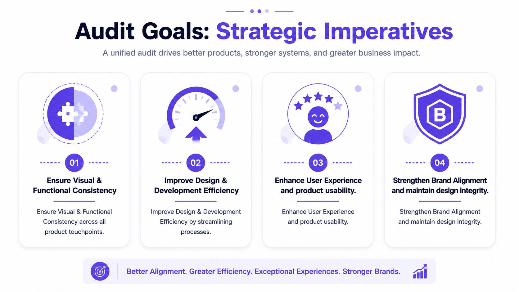
How to Define the Goals of Your Product-to-System Audit
A useful audit starts when a team can point to a specific kind of drift and say, “this is hurting this workflow, for these users, at this cost.”
That is the standard. Without it, the audit becomes a consistency exercise with no clear owner once roadmap pressure picks up.
Design drift is measurable, so the goals for auditing it should be measurable too. The job is to define what you are trying to reduce, where it matters, and how you will know the fix was worth the effort.
Start with workflows, not pages
Page-by-page parity is a weak goal because products are not used page by page. They are used through flows. A sign-up sequence, a checkout path, a reporting task, an approval flow. Drift matters when it changes behavior inside those moments.
NN/g recommends benchmarking product UX at the task level in its article on product UX benchmarks. That gives the audit a practical unit of analysis. Instead of asking whether the UI matches the system in the abstract, ask whether drift in a priority workflow is slowing people down, creating errors, or weakening confidence.
Use goals like these:
Task completion: Are people finishing the workflow after system-aligned fixes?
Time and effort: Are key tasks taking less time or fewer steps?
Error patterns: Are inconsistent components causing avoidable mistakes?
Confidence: Do users hesitate less when states and behaviors become predictable?
Abandonment: Do drop-offs cluster where drift is highest?
This framing keeps the conversation tied to product performance, not visual preference.
Add internal goals that expose system health
A product-to-system audit should also measure whether the system is doing its operational job. I look for signals that show whether the team is reusing shared patterns or rebuilding them under delivery pressure.
Useful internal goals usually include:
Design efficiency: Fewer duplicate components, fewer local variants, fewer revision rounds
Engineering efficiency: Less one-off implementation work, clearer acceptance criteria, lower UI rework
Governance quality: Fewer undocumented exceptions, better coverage for edge cases, cleaner ownership
Adoption: More shipped screens using approved patterns in the way the system defines them
These are not vanity metrics. They show whether drift is a coverage problem, an adoption problem, or a workflow problem between design and engineering. Each one leads to a different fix.
If the team needs a simple starting point for framing those checks, Figr's UX audit checklist is a useful reference.
Write goals in decision language
Good audit goals make prioritization easier. Weak goals create debate.
“Improve consistency” is too broad to guide action. “Reduce input-field variation across account creation, password reset, and billing update flows” gives the team something testable. “Align status badge behavior in reporting views so users can scan state changes faster” does the same.
I usually pressure-test audit goals with three questions:
Which workflow does this affect?
What form of drift are we measuring?
What decision will this help us make?
If no one can answer those questions, the goal is still too vague.
Set scope around real planning constraints
Audit goals also need to survive delivery reality. A team may find drift across fifty screens and still only have capacity to fix six in the next quarter. That is normal. The point is to define goals that can feed roadmap choices, staffing, and release planning without turning the audit into a side project.
That is why I prefer goal statements that connect drift to one of three outcomes: protect a critical workflow, reduce recurring delivery waste, or close a governance gap that keeps reproducing the same inconsistency. Teams already working through release sequencing can tie the audit to existing planning work through resources on mastering project planning.
An audit becomes useful when it helps the team choose what to fix first, what to leave alone, and what the system itself must change to prevent the same drift from returning.
The 5-Step Workflow for Auditing Design Drift
A quarter starts with a familiar complaint. The product feels inconsistent, support tickets mention confusing screens, and design reviews keep surfacing one-off fixes that never quite stick. That is design drift. If the audit process is loose, the team ends up with a folder of screenshots and no shared view of what changed, why it changed, or what to do next.
The workflow below treats drift as a measurable operating problem. It gives teams a way to compare the shipped product against the current system, classify the gaps, and turn findings into decisions that survive engineering constraints.
Prepare the audit around product reality
Start with one contained slice of the product. Teams that begin with the whole surface area usually produce a messy inventory instead of a usable audit.
A good starting point is one area where drift has a real cost:
A revenue-critical flow: checkout, upgrade, onboarding, activation
A dense operational surface: dashboards, tables, admin settings
A drift-prone area: features with many flags, acquisitions, older code paths
A repeated pattern family: forms, cards, navigation, modals
If your product work is already tied to delivery planning, a practical resource on mastering project planning can help structure the sequencing so the audit feeds roadmap decisions rather than becoming a side exercise.
Run the audit in five steps
Step 1. Capture the live product as it ships.
Use real screens, real navigation paths, and real states. Include desktop and responsive views where relevant.
Audit the experience of customers and internal users, not the happy path shown in mocks.Step 2. Import the current design system source of truth.
Pull in components, variants, tokens, and usage rules from the system the team says it follows.
If the source of truth is split across Figma libraries, Storybook, and production code, document that before comparison starts. Split ownership is one of the fastest ways drift gets mislabeled as team error.Step 3. Compare by pattern, state, and workflow.
Run the review in three passes so the audit does not collapse into subjective comments.Pattern pass: buttons, inputs, cards, tabs, tables, alerts
State pass: empty, loading, error, success, disabled
Workflow pass: the top tasks users complete
Step 4. Flag drift by severity, not by annoyance.
Record the type of drift and the cost it creates. A spacing mismatch may be low priority. Conflicting action hierarchy in checkout, inaccessible error handling, or inconsistent status labels usually deserve immediate attention.
Step 5. Turn findings into an action report.
Every issue should end with one of three labels:
Fix the product
Fix the system
Allow a temporary exception with an owner and review date
Check how hard the interface is to scan
Teams often overfocus on token parity and miss a more expensive failure mode. Users cannot quickly compare options, states, or records because the interface makes scanning harder than it should be.
Baymard's research on user-friendly comparison tools found that comparison views work better when repeated attributes are removed, related attributes are grouped, column headings remain visible during scrolling, and row styling helps users track information across the table. That is directly relevant to design drift audits, especially in pricing, reporting, settings, and catalog interfaces.
Use that lens during review:
Attribute repetition: Are users forced to re-read the same information across cards or rows?
Grouping logic: Are related details clustered in a way that matches the task?
Persistent orientation: Do users lose their place while scrolling dense content?
Row definition: Can people track line items without extra effort?
These are measurable drift signals, not abstract design preferences. They show up in support volume, slower task completion, and recurring debates about whether a screen is "good enough."
A useful reference point for what to inspect during review is Figr's UX audit checklist, especially if you need a tighter rubric for states and flow-level friction.
After the first comparison pass, it helps to see the workflow mindset in motion:
Use one source of structured context
Manual audits break down for a predictable reason. The evidence gets fragmented. Screenshots live in one folder, component rules live somewhere else, and the team spends review time arguing about whether a difference is intentional, legacy debt, or system failure.
Tool support helps if it preserves structure instead of collecting flat images. Figr, for example, can capture shipped screens and bring in components, variants, tokens, and usage rules so teams can review drift against actual product context. That matters when inconsistency shows up in state coverage, hierarchy, or component behavior rather than color alone.
The goal is not to automate judgment. The goal is to give the team a reliable record of drift, a consistent comparison method, and a faster path from audit to fix.
How to Prioritize What to Fix After Your Audit
A team finishes a design drift audit and ends up with 70 findings. The instinct is predictable. Fix everything, declare a cleanup sprint, and try to get back to a clean baseline.
That usually fails.
The audit has already done the hard part. It turned vague inconsistency into a measurable list of drift issues. The next job is governance. Decide which drift creates real product risk, which points to a stale system rule, and which can stay in place for a defined period without confusing users or slowing delivery.
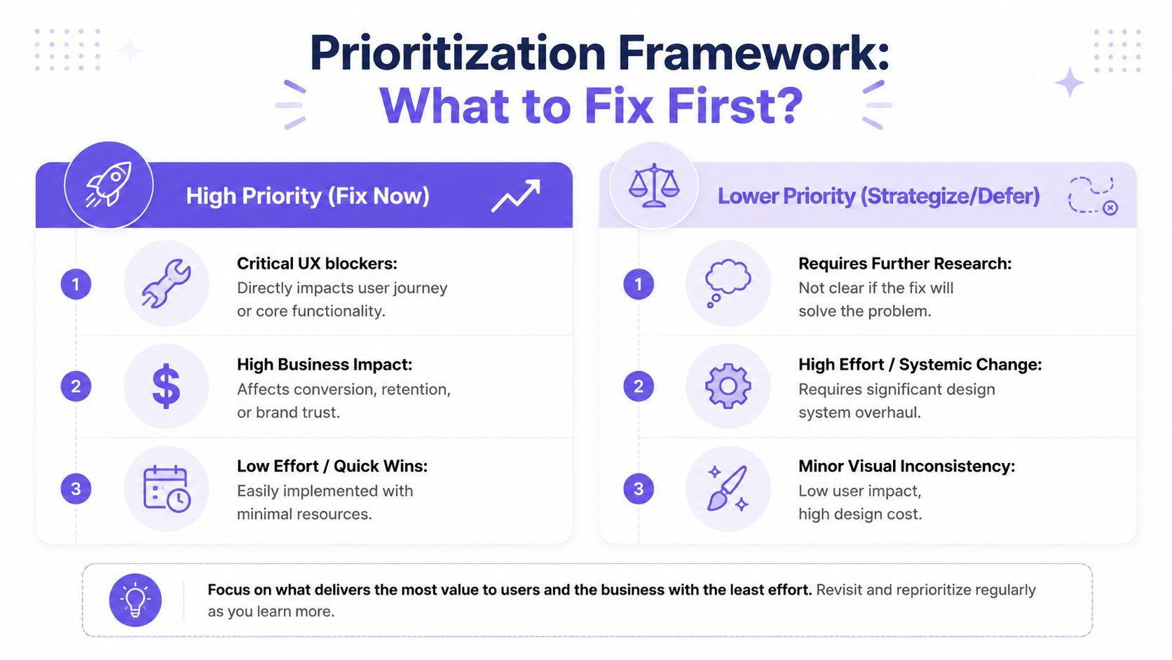
Sort every finding into an action, not just a severity score
Severity alone is not enough. A small visual mismatch in a low-traffic admin screen does not deserve the same response as inconsistent validation states in checkout.
Use three action buckets:
Fix the live product now: Reserve this for drift in top workflows, high-visibility surfaces, or patterns that increase hesitation, error risk, or support load.
Update the design system: Choose this when shipped product decisions are better than the current standard, repeated across teams, and worth formalizing.
Allow a temporary exception: Use this when the constraint is real, but attach an owner, rationale, expiry date, and review trigger.
The third bucket keeps teams honest. Exceptions are manageable when they are visible, time-bound, and revisited. Untracked exceptions are how design systems lose authority.
Governance guidance from UXPin makes the same tension clear. Design systems succeed or fail in production, where teams have to decide whether to correct the product, revise the system, or permit divergence with rules. Their overview of design system examples and governance considerations is useful context for that call.
Use a four-question filter
For each drift issue, ask:
Does it affect a core workflow or high-frequency screen?
Does it change user behavior, increase interpretation effort, or create avoidable mistakes?
Is there a system-approved pattern that already solves it?
Will fixing it reduce future drift instead of creating another one-off pattern?
Issues that score high on the first two questions move up fast. Issues that matter more for maintainability than user experience usually belong in a scheduled cleanup stream tied to roadmap work.
I also separate single-instance drift from repeatable drift. One odd button style matters less than a broken component pattern copied across six teams. Repeated drift is a stronger signal because it points to a governance gap, weak component coverage, or unclear implementation guidance.
Tie design drift to backlog and debt decisions
Design drift behaves like product debt with a visual interface. It spreads through reuse, adds friction to new work, and gets more expensive once teams build on top of it. That is why I prefer to route audit findings into the same triage process used for defects, product debt, and platform work.
Engineering teams usually understand this framing quickly when the conversation is grounded in maintenance cost and rework. If you need a shared reference for that discussion, this piece on managing software technical debt helps connect interface inconsistency to debt management.
The operating model is straightforward. Keep one queue. Tag findings by workflow, component, risk level, and whether the fix belongs in product code, the design system, or both. If your team needs structure for that queue, this practical backlog prioritization system is a solid pattern.
What usually works in practice
Teams make better decisions when prioritization is specific.
What works:
Exceptions with named owners and review dates
Triage shared by Product, Design, and Engineering
Fixes attached to active feature or platform work
System changes triggered by repeated evidence from shipped product
Priority based on workflow risk, not visual annoyance
What fails:
A general push to “clean everything up”
A large consistency epic with no link to user outcomes
A side spreadsheet that never reaches engineering planning
A rule that treats every mismatch as equally important
Strong design systems do not come from purity. They come from repeated, disciplined decisions about which drift to remove, which drift to absorb, and which drift proves the system itself needs to change.
What Design Drift Looks Like in Real Products
Drift is easiest to spot when you stop looking for broken pixels and start looking for broken expectations.
A checkout flow is a good example. In one step, the selected payment method appears in a strong card pattern with clear hierarchy. In the next, a different team shipped a softer container, different spacing, and a new edit interaction. Nothing is technically unusable. But users now have to re-learn the interface halfway through a money decision. That extra interpretation cost shows up as hesitation.
Drift often hides inside repeated decisions
I've seen this in forecasting and analytics surfaces too. A dense table starts out disciplined, then slowly accumulates local fixes. One column uses tighter cell padding. Another uses different typography weight. Inline actions appear in one row style but move into overflow menus elsewhere. The system still “exists,” but the screen has stopped teaching the user one stable grammar.
That matters because comparison-heavy interfaces depend on predictable scanning behavior.
When the rules change from row to row, users work harder than they should.
States are where the product tells on itself
The default state usually looks fine. Drift becomes obvious when the edge cases arrive.
A task approval card might have a clean happy path, then splinter across pending, rejected, partially approved, expired, edited, and retried states. A file upload flow might handle success elegantly but use a completely different visual language for failure and recovery. A messaging surface might align draft composition with the system while suggestion states, warnings, and retry actions borrow patterns from older parts of the product.
Those are the moments where the live product reveals whether the design system governs behavior or just decorates default screens.
Drift loves states that nobody reviewed together.
Product examples feel different when you know what to inspect
Look at a redesign gallery and you'll start noticing the fault lines. A checkout experience can drift across payment branches. A runway forecasting surface can drift in data density and scannability. A complex approval workflow can drift because every state arrived in a different sprint with different constraints.
Once you've seen that pattern, the design system vs live product comparison becomes less abstract. You're no longer asking, “Do these screens match?” You're asking, “Does this product still teach the user one coherent set of rules?”
That question is much harder to ignore.
Go Beyond Audits With a Visual Context Graph
A quarterly audit finds 47 mismatches. Two sprints later, half are back.
That pattern shows up when teams treat drift as a screenshot problem instead of an operating problem. The product changes in code, the system changes in Figma, requirements shift in tickets, and nobody has one place to trace how those decisions connect. The result is predictable. Design drift keeps returning because the context behind each exception is scattered across tools and people.
A visual context graph addresses that failure mode by making drift traceable, not just visible.
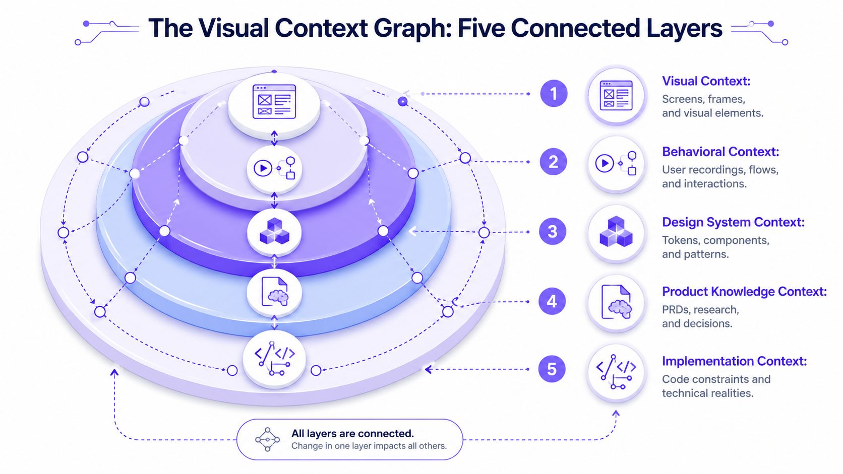
The five layers that change the comparison
Figr calls this model the Visual Context Graph. The idea is practical because it matches how product decisions get made across five connected layers:
Visual Context: screens, frames, and visible UI structure
Behavioral Context: recordings, flows, and interaction patterns
Design System Context: tokens, components, variants, and rules
Product Knowledge Context: PRDs, research, and recorded decisions
Implementation Context: code constraints and technical realities
That structure changes the audit conversation. A button mismatch is no longer just a red mark on a screen. It can be tied to a missing component variant, a temporary engineering workaround, a user-tested exception, or an outdated local pattern that kept spreading because nobody retired it.
That is what makes drift measurable. You stop logging isolated defects and start mapping repeated failure paths.
Context cuts rework
Figma published a controlled study showing that designers completed work faster when they had access to a design system, as detailed in measuring the value of design systems. The useful takeaway is not the headline number. It is the operating implication. When teams can trust the system and see how it relates to live product behavior, they spend less time rebuilding solved patterns and less time debating exceptions from scratch.
I have seen the opposite play out many times. A team ships around a missing state, another team copies it from production, and six months later everyone is arguing over whether the drift is intentional. The expensive part is not the visual inconsistency. The expensive part is the repeated decision-making.
Why the graph matters after the audit
The graph becomes more valuable after findings are logged.
Use it to connect each drift issue to an owner, a source, and a disposition. Fix in product. Add to system. Accept as an exception. Retire after migration. Those choices sound simple, but teams make them poorly when they cannot see the surrounding context.
This also changes incentives at scale. Delivery teams usually choose the shortest reliable path. If the easiest path is copying what already exists in production, old debt spreads. If the easiest path is starting from connected context, with the system, rationale, and implementation constraints in one chain, consistency holds up better under pressure.
For teams reviewing their workflow and stack, this overview of essential design system tools pairs well with Figr's take on context-driven UI.
The strongest design systems do not win because the component library is bigger. They win because teams can see why a pattern exists, where it breaks, who owns the fix, and whether the exception should survive.
Conclusion
Design drift is normal, but unmanaged drift becomes expensive.
The practical move is simple: stop treating a design system vs live product comparison as a visual cleanup task and start treating it as a product audit. Focus on real workflows. Compare patterns and states, not just pages. Score findings by user impact and governance value. Decide whether to fix the product, fix the system, or allow a temporary exception with clear ownership.
That shift changes the work. Instead of relying on screenshots and memory, you create a repeatable way to see where the system no longer reflects the product you ship. Instead of chasing perfect parity, you protect the places where inconsistency hurts task success, trust, and delivery speed.
Drift doesn't disappear because a team cares about quality. It stays manageable when the feedback loop is strong enough to catch it early.
If you want to build that loop into your workflow, the next step is straightforward: try Figr.
FAQ
How often should I run a drift audit
I'd run a lightweight audit continuously on active flows and a deeper audit at major release points. High-change surfaces need more frequent review than stable back-office areas.
What if our design system is incomplete
That's common. I'd still audit the live product, then label findings carefully so you can separate product drift from missing system coverage.
Should we aim for total consistency
No. I'd aim for consistency where users need stable rules and where teams benefit from reuse. Some exceptions are justified if they're documented and reviewed.
Who should own the audit
I'd make it a shared responsibility. Design should guide the comparison, Product Managers should help define priority workflows, and Engineering should validate implementation reality.
Can I start without changing our whole process
Yes. I'd begin with one critical workflow, compare the shipped states against the system, and turn the findings into a small, owned fix list.
If your team keeps discovering inconsistencies late, start from the product you already have. Figr helps teams pull in live screens, design systems, and surrounding product context so drift is easier to spot, discuss, and act on before it spreads.