

I watched a Product Manager spend an entire review meeting debating whether a single button should say “Approve” or “Approve and record.” The underlying argument wasn't copy, it was accountability, and that's why design for regulated industries feels heavier than ordinary product work.
When teams treat compliance as a final checkpoint, the cost shows up everywhere: stalled launches, brittle reviewer workflows, hidden audit gaps, consent screens nobody trusts, and interfaces that force users to guess what the system just did. In healthcare, fintech, and defense, those misses don't stay cosmetic for long. They turn into operational risk, rework, and slower decisions when the product most needs clarity.
The way through is to treat compliance as a design material from day one, then build around real context instead of generic templates. That means grounding flows in the product's actual states, controls, documentation, and review paths so the interface can carry trust, traceability, and safety without collapsing under its own weight.
Why Is Design for Regulated Industries So Hard?
Design for regulated industries is hard because the actual job isn't making flows simple, it's making them trustworthy under scrutiny.
Many teams describe the pain as red tape. I think that misses the point. The harder force is hesitation. Designers, Product Managers, engineers, compliance leads, and reviewers all know one bad decision can echo across audit prep, customer support, and release approvals, so every screen starts carrying invisible weight.
That's why ordinary design instincts often fail here.
A clean interface that hides complexity can become dangerous if it also hides accountability. A fast workflow can create risk if it masks who acted, what data changed, or why a recommendation appeared. A smart automation layer can erode trust if users can't inspect it when something looks off. The work becomes less about reducing friction at all costs, and more about placing the right friction in the right places.
The deeper constraint is fear
I've seen this pattern in both fintech and healthcare. Teams don't freeze because they lack talent. They freeze because they don't know which constraints are flexible and which ones are structural. So they overcorrect. They add approvals everywhere, bury decisions in tickets, and turn the interface into a legal artifact instead of a usable product.
That instinct is understandable, but expensive.
The Mercatus Center at George Mason University found that from 1997 to 2010, the most heavily regulated industries saw productivity growth that was nearly half that of the least regulated industries, with labor costs rising 20% compared to a 4% decline in less regulated sectors, according to this Mercatus Center summary on regulation and productivity.
That matters beyond economics. It explains the mood inside these teams. People are operating inside systems where friction compounds and every extra review loop feels rational, even when it slows the product down.
The pain many teams feel isn't personal failure. It's what product work looks like when uncertainty gets priced into every decision.
If you work with a specialized HealthTech engineering partner, you'll notice the strong teams don't talk about compliance as a side lane. They fold it into architecture, workflow design, and release habits early enough that it stops feeling like a surprise.
Enterprise behavior shows up in the interface
Regulated products are also significantly shaped by the unique goals of enterprise UX. The buyer isn't the only user. The user isn't the only stakeholder. A reviewer, an auditor, a security lead, or a supervisor may interact with the same workflow from a different angle, each needing visibility into risk, provenance, and responsibility.
That's what makes the design challenge feel so dense. You aren't designing one path. You're designing a chain of evidence.
The teams that get good at this stop asking, “How do we hide the complexity?” They ask, “Which complexity must be visible for trust to hold?”
That shift changes everything.
How to De-Risk Your Design Process Early
You de-risk regulated product design by turning rules into interface decisions before anyone starts polishing screens.
That sounds obvious, but it's rarely how teams behave. In practice, many products still move from idea to mockup to legal review, then absorb a late wave of constraints that should have shaped the flow from the start. In regulated work, that sequence creates expensive confusion because the regulatory surface area is massive.
The U.S. Code of Federal Regulations contains over 180,000 pages and more than one million restrictions, which is why visible audit trails and decision documentation have become mandatory UX components instead of backend afterthoughts, as described in this guide to AI design in regulated industries.
Start with a compliance-aware journey map
The basic gist is this: every important user action should have a paired compliance question.
If a clinician edits patient data, what needs to be logged, masked, or approved? If a fintech analyst clears a KYC review, what rationale must be visible later? If a defense workflow surfaces export-controlled material, who can view it, copy it, or route it onward? These aren't edge details. They shape navigation, form logic, empty states, and review patterns.
A useful early artifact is a simple mapping:
Upload document → sensitive data handling → mask previews, restrict roles, log access
Approve workflow step → accountability → capture actor, timestamp, rationale
Trigger automated decision → explainability → show source, confidence context, override path
Share record → access control → enforce role gating, consent, export warnings
That kind of map gives the team a common language before anyone debates visual polish.
A practical workflow that actually helps
Here's the sequence I'd use when starting design for regulated industries.
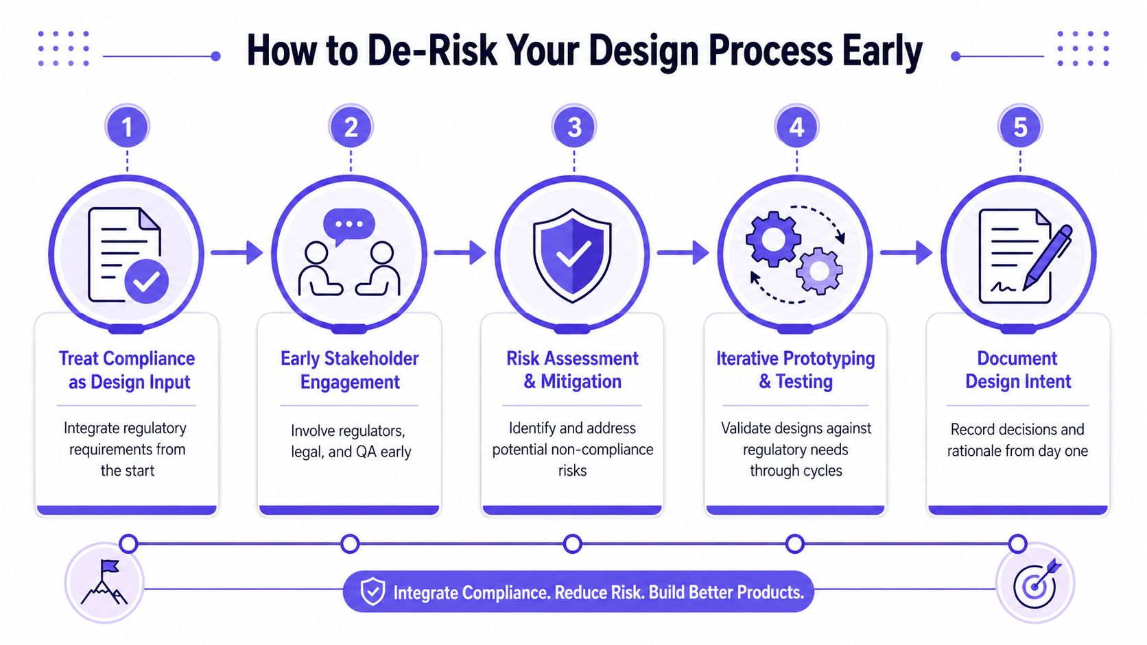
Step 1. Treat compliance as a product input.
Pull requirements into discovery, not just review.
Capture the rules that change user behavior, visibility, permissions, and documentation.Step 2. Bring reviewers in before wireframes harden.
Legal, QA, security, and operations should react to flows while they're still cheap to change.
You want disagreement early, while the work is still made of boxes and notes.Step 3. Map risk to moments in the journey.
Mark where users enter sensitive data, approve actions, hand work to another role, or rely on automation.
Those moments usually need stronger UI signals and clearer accountability.Step 4. Prototype the risky paths first.
Don't begin with the happy path alone.
Use the same discipline you'd apply in rapid prototyping for product teams, but point it at approvals, exceptions, masking, and reversals.Step 5. Document intent while decisions are fresh.
Record why a field exists, why an override is limited, and why a warning appears at a specific moment.
That reasoning becomes valuable later when teams revisit the flow under pressure.
Practical rule: If a rule changes who can see, do, approve, or explain something, it belongs in the design process from day one.
Teams that work this way move faster later because they're not rediscovering the same constraint in design review, QA, and release prep. They've already built it into the product's memory.
What Are Common UX Patterns in Regulated Products?
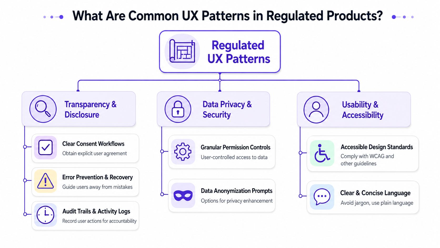
Regulated products rely on a small set of UX patterns that carry far more weight than they do in ordinary software.
The pattern names may sound familiar, but their purpose changes in regulated environments. Here, they aren't just usability choices. They are control surfaces. They help users act safely, help reviewers inspect decisions, and help organizations prove what happened after the fact.
A short pattern library can save teams a lot of thrash.
Patterns that make accountability visible
Some patterns show up almost everywhere in healthcare, fintech, and defense workflows:
Audit trails in the interface
Users need to see more than “updated recently.”
Show who changed what, when it changed, and what state the record moved from and to.Reviewer and approver checkpoints
Sensitive actions often need separation of duties.
The interface should make pending review, returned review, delegated review, and final approval easy to understand.Explicit consent surfaces
Consent can't hide inside a generic checkbox if the action carries legal or ethical consequence.
People need context on what they're agreeing to, what data is involved, and what happens next.Role gating
A user should only see actions they're permitted to take, but they should also understand why other actions are unavailable.
Silent disappearance creates confusion. Contextual explanation creates trust.
Patterns that reduce data risk
Data handling patterns matter just as much as workflow structure.
Data masking
Show only what a user needs at that moment.
In healthcare, that may mean limiting PHI visibility. In fintech, it may mean partial account data until a user expands a secured view.Progressive disclosure for sensitive detail
Let users confirm intent before exposing more.
This is especially useful in KYC, AML review, claims review, and export-controlled documentation.Structured exception handling
If a document fails validation, if identity evidence is incomplete, or if a transaction gets flagged, the next action should be obvious.
This is where strong error state design patterns really matter.
One Product Manager I worked with kept saying, “The risky path is the true path.” She was right. The default flow got all the early design love, but the exception flow was where trust broke or held.
This walkthrough is a useful companion if you want to see how regulated UX thinking starts to show up in interaction design and product structure:
Patterns people forget until it's too late
The most overlooked pattern is accessible clarity.
Many teams know accessibility matters, but they treat it as a downstream review instead of part of decision quality. In regulated contexts, that's risky. If users misunderstand status, permission, consent, or exception handling because the interface is visually or cognitively hard to parse, the product creates preventable errors.
Clear language, visible status, and recoverable actions do more than improve usability. They reduce operational ambiguity.
That's the heart of design for regulated industries. The interface isn't just helping a user finish a task. It's helping the whole system stay legible.
The Critical Role of Documentation and Traceability
Documentation in regulated product work is part of the product, not evidence you assemble after the product is done.
That distinction matters because teams often document too late. They save decisions in scattered comments, tickets, meeting notes, screenshots, and handoff files, then try to reconstruct intent when a reviewer asks why a workflow behaves a certain way. By then, memory is fuzzy and the rationale is half gone.
In regulated environments, that gap is dangerous.
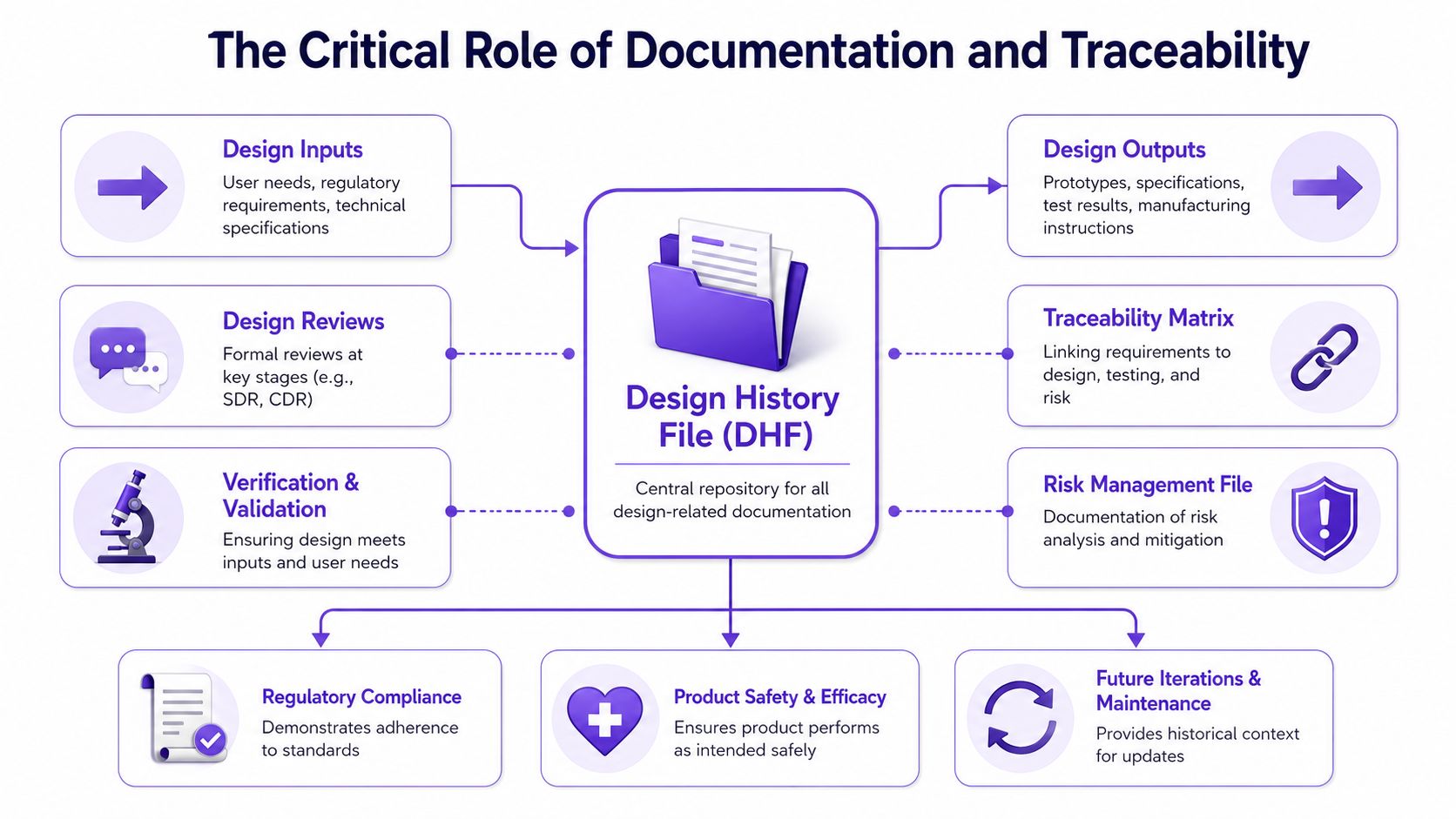
In sectors governed by standards like IEC 62304 for medical devices, every design input must be traceable to a verified output within a Design History File to achieve compliance, and failure to maintain this link between requirements and implementation is a primary cause of regulatory rejection, as outlined in this overview of standards for highly regulated industries.
Think in chains, not files
A Design History File sounds like a medical device term, but the concept is useful far beyond medical devices. It gives teams a practical model for traceability: user need to requirement, requirement to design output, design output to test evidence, and test evidence to release confidence.
If that chain breaks, the team loses more than compliance posture. It loses the ability to explain itself.
This is what I mean by documentation as an immune system. Good traceability helps the organization detect contradictions early. A consent step appears without a matching rationale. A role-restricted action exists without a clear requirement. An override path ships without test evidence. Those are product problems before they are audit problems.
What should be documented in practice
A lightweight traceability discipline usually includes:
Decision rationale
Why a warning exists, why a role can override a recommendation, why a reviewer must add comments before approval.State logic
What statuses exist, what causes a transition, and which states are user-visible.Review history
Who reviewed the flow, what changed, and what objections were resolved.Validation linkage
Which tests, scenarios, or acceptance checks prove the design intent holds under real conditions.
Teams working on laboratory or quality-heavy systems often already appreciate this mindset because data integrity is foundational to ensuring GxP compliance. Product teams can borrow that rigor without turning every project into a paperwork ritual.
Documentation should explain a decision well enough that a new teammate can understand both the user need and the risk behind it.
If your product knowledge is fragmented, it helps to centralize decisions, design artifacts, and requirement context the way Figr on organizing product knowledge discusses. The tooling matters less than the habit: capture intent while the decision is still alive.
Documentation creates design leverage
Here's the strategic upside people miss. Traceability reduces re-litigation.
When a security reviewer, compliance lead, or product leader questions a workflow later, the team doesn't need to restart the argument from scratch. The evidence chain already exists. That saves time, but it also improves quality because decisions become easier to refine without becoming easier to erase.
In regulated work, that's a real advantage.
How Do You Test and Validate in a Regulated Space?
Testing in regulated products has to prove safe behavior, not just catch defects.
That shifts the center of gravity. A conventional team can design a flow, hand it to QA, and expect testing to focus on correctness after implementation. In healthcare, fintech, and defense systems, that sequence is too late for the highest-risk issues because many of them begin in workflow logic, access rules, or missing transparency.
Validation has to start earlier.
Design control frameworks require acceptance criteria to be stated upfront, not retrospectively, which forces teams to bake rules for data segregation and user action transparency into the architecture early and validate them through methods like canary deployments and feature flags, as described in this designing with constraints guide.
Predictive validation changes what teams design
When acceptance criteria are defined early, the interface gets sharper. You stop drawing generic states and start defining testable behavior.
A reviewer can only approve if required documentation is present. Sensitive fields remain masked unless role and context allow expansion. Automated actions create visible records. Users can reverse or escalate certain decisions, but only with logged rationale. Those aren't implementation details. They are core design behaviors.
That's why strong validation work often begins with scenario design.
Normal path scenarios
The user completes the intended action with valid data and appropriate permissions.Boundary scenarios
The user has partial data, limited permissions, or timing conflicts.Failure scenarios
The external service fails, the evidence is incomplete, or the workflow enters a review hold.Abuse and misuse scenarios
The user attempts an action they shouldn't take, accesses restricted material, or tries to move data across a controlled boundary.
Release safely, not broadly
One of the most useful habits in regulated teams is small-scope release logic. Sensitive changes benefit from limited exposure first, with enough observability to inspect behavior before wider rollout.
That's why methods like canary deployments and feature flags matter so much. They create room to validate in realistic conditions without pushing every change to every user immediately.
I'd pair design review with legal review here more tightly than is typically done. If your reviewers are dealing with policy-heavy flows, tools used for AI document review for legal teams can help them move through requirement language and contractual nuance faster, but the product team still has to translate that insight into testable user behavior.
A regulated release should answer one question clearly: if this fails in production, what protects the user and what proves it happened?
A practical next move is to turn workflow states into explicit test assets. This test case creation guide is useful if your current handoff stops at screens and leaves QA to infer the rest.
Safe defaults matter more than clever recovery
Many teams obsess over recovery paths and forget defaults. In regulated spaces, the default state should already lean toward safety. Restricted data stays hidden. Approval requires the required evidence. Sensitive exports stay gated. Automated recommendations stay inspectable.
Recovery still matters, of course.
But the strongest products don't depend on users noticing danger at the last second. They shape the system so the risky move is harder to make by accident.
Designing for Observable Automation
Observable automation is the design principle that makes AI usable in regulated environments.
The phrase matters because many teams still confuse automation with invisibility. They assume the smartest interface is the one that removes human attention entirely, then leaves an audit log somewhere in the backend for later. That model doesn't hold up in finance, healthcare, or any workflow where decisions need to be understood while they're happening and after they've happened.
Black-box automation creates operational anxiety.
Regulators now require not just backend logs but interfaces that present visible audit trails and accountability, and observability, meaning understanding system behavior in real time, is becoming a core design requirement because organizations must trace data origin, transformation, and consumption to comply with laws like GDPR and HIPAA, according to this analysis of transparent integration in regulated industries.
What observable automation looks like in the interface
An observable automated system answers basic human questions clearly:
Why did this happen?
Show the trigger, source data, or rule category behind the action.What changed?
Make the resulting state visible, including what the system updated, flagged, recommended, or blocked.Who can review it?
Surface the owner, reviewer path, or override option when a human needs to step in.What data was involved?
Give enough lineage context for trust without oversharing sensitive information.
This doesn't require exposing every model detail or every backend event. It requires enough visible reasoning for users and reviewers to act with confidence.
The automation paradox
The more consequential the automation, the more explanation the interface needs.
That sounds counterintuitive to teams chasing efficiency, but it reflects how real organizations work. A nurse, fraud analyst, underwriter, compliance reviewer, or defense operator won't trust an automated judgment merely because it arrived quickly. They trust it when the product makes its reasoning inspectable at the moment of use.
Last week I watched a Designer walk through an AI-assisted review flow that looked polished in Figma but collapsed in discussion the second legal asked, “Where would an auditor see why the system recommended this?” The screen had confidence styling and status badges. It had no visible explanation path. Everyone in the room felt the gap immediately.
A practical design lens for AI features
When evaluating an AI feature in a regulated workflow, I'd ask:
| Question | What to look for in the UI |
|---|---|
| Can the user inspect the decision? | Explanation panel, rationale snippet, linked evidence |
| Can the user challenge it? | Override, escalate, request review, annotate |
| Can the organization trace it later? | User-visible history, timestamps, actor trail |
| Can the system fail safely? | Clear fallback state, restricted action, human review path |
Observable automation turns compliance pressure into product clarity. It forces teams to design with causality in mind. Users stop seeing the system as magic and start seeing it as accountable.
That's a better user experience, and in regulated work, it's often the only credible one.
Unlocking Speed with a Visual Context Graph
Speed in regulated design comes from context that stays connected.
Most slowdowns happen because the team's knowledge is fragmented. Screens live in one place, design system rules in another, user research somewhere else, and implementation constraints in a pile of tickets or Slack threads. Every decision becomes a scavenger hunt, and regulated work punishes that fragmentation faster than ordinary software does.
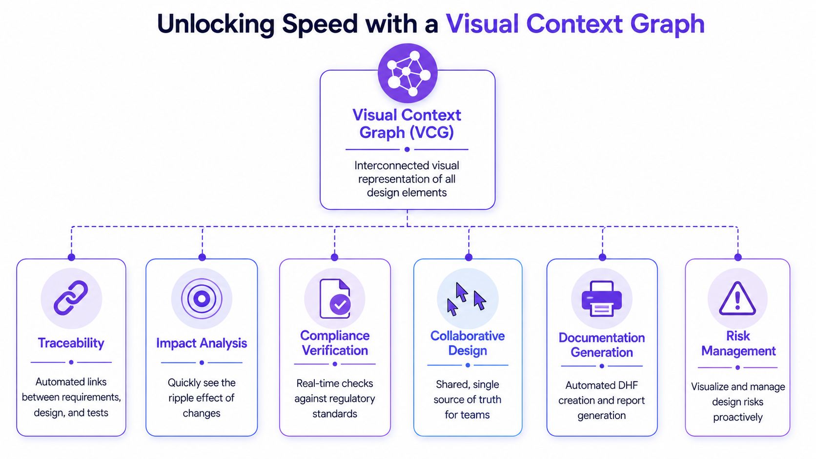
A Visual Context Graph solves that by connecting the product's actual evidence, not just its latest mockups.
The five layers that matter
The model only works if all five layers are present and linked:
Visual context
Live screens, frames, layouts, and component arrangements.
This anchors design decisions in what the product looks like today.Behavioral context
Recordings, flows, interaction paths, and usage patterns.
This shows how users move, hesitate, retry, and recover.Design System context
Tokens, components, variants, and usage rules.
This keeps regulated patterns consistent across states and teams.Product Knowledge context
PRDs, research, decision logs, analytics notes, and requirement history.
This preserves the why behind the interface.Implementation context
Code constraints, technical boundaries, and system realities.
This prevents elegant concepts from drifting away from shippable behavior.
Why this creates speed instead of overhead
A lot of teams hear “more context” and worry about more process. The opposite is usually true. Connected context cuts down on repeated interpretation.
A Product Manager doesn't need to restate the same requirement in every review. A Designer doesn't need to guess whether a state already exists. An engineer doesn't need to infer edge cases from a polished happy-path prototype. A reviewer can trace a decision without reconstructing it from memory.
When context stays connected, compliance stops acting like a surprise and starts acting like an input.
This is the advantage in design for regulated industries. Constraint becomes navigable because the system remembers. It can carry reviewer logic, state complexity, documentation intent, and implementation boundaries together instead of forcing the team to stitch them back together every sprint.
Why teams stall without it
Without a shared context model, teams default to local decisions. One flow gets detailed masking. Another forgets it. One reviewer screen captures rationale. Another relies on comments. One team defines approval states clearly. Another leaves the edge cases to engineering.
That inconsistency is where delay creeps in.
A connected context model doesn't replace judgment. It gives judgment something stable to work with. For regulated software, that stability is often the difference between careful speed and expensive churn.
FAQ About Design for Regulated Industries
What's the biggest mistake teams make?
I see teams wait too long to translate rules into product behavior. If compliance stays abstract, it lands late and forces redesign when the flow is already politically expensive to change.
How should I start if my team feels overwhelmed?
I'd begin with one high-risk workflow, then map permissions, approvals, sensitive data moments, and exceptions. You don't need a perfect operating model first. You need one auditable flow you can learn from.
Does AI help with regulated product design?
Yes, if it's grounded in real product context and used to support judgment. I wouldn't trust generic output for sensitive workflows without clear human review, traceability, and validation.
Do healthcare, fintech, and defense need totally different UX methods?
They need different domain knowledge, but the core design habits overlap. Accountability, visible system behavior, role clarity, documentation, and safe defaults matter in all three.
How do I know a flow is ready to ship?
I'd ask whether the team can explain the user need, the risk controls, the state logic, the reviewer path, and the validation evidence without improvising. If those answers are fuzzy, the design still has hidden risk.
Figr helps teams do this work without starting from a blank canvas. It grounds design in real product context, from live screens and Figma files to PRDs, research, analytics, edge cases, and implementation constraints, so regulated workflows can be explored with more clarity and less rework. If you want a practical way to turn product memory into Figma-ready design artifacts, try Figr.