
A list of best practices can feel like a chore list. Sterile. Abstract. But the most resilient products aren’t built from checklists; they are built from a deep understanding of cause and effect. They see user experience not as a coat of paint, but as the core architecture of value. It’s the difference between a feature that technically works and a feature that feels inevitable.
This is what I mean: many teams talk about being user-centric, but few have a system for translating that intention into tangible, repeatable outcomes. This guide isn't a list of suggestions. It's a system for separating the teams that ship features from the teams that ship value.
A friend at a Series C company told me their biggest drag on velocity wasn't engineering, it was design-dev-QA alignment. They were losing weeks to clarifying states and fixing mismatches. They had all the right roles, but the connections between them were frayed. What does this reveal about how people actually work? That without a system, smart people running fast will inevitably collide.
Mastering best practice UX is not about following rules; it's about building a machine that reliably produces excellence. Let's explore the systems that prevent these common breakdowns.
1. Design System Consistency: The Zoning Code for Your Product
Imagine your product is a city. Without zoning laws, you get chaos: a skyscraper next to a single-family home, a factory beside a park. This is what building a product without a design system feels like. Every feature adds a new, slightly different button, creating a cacophony of user experiences.
Is this just a visual problem?
A design system, governed by design tokens, acts as your city's zoning code. Tokens are the single source of truth for design attributes: a specific hex code for color-brand-primary, a pixel value for spacing-md, or a font stack for typography-heading-h1. As Nathan Curtis, a leader in the field, emphasizes, tokens codify design choices so they can be distributed and enforced automatically. They aren't just variables; they are decisions.
This is what I mean: instead of a designer telling a developer "use our main blue," the system provides a token like $blue-500. This token is used in the Figma file and the React component. When $blue-500 is updated, it updates everywhere. This is the difference between instruction and infrastructure.
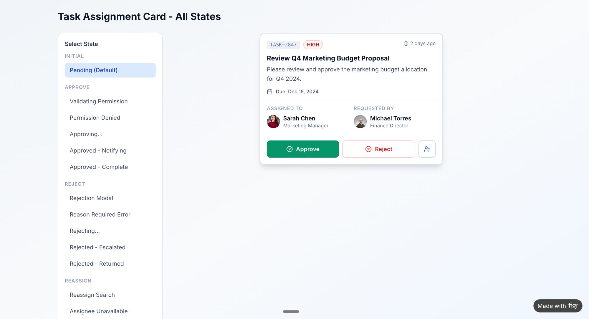
A design system is a force multiplier. It stops the endless, low-value debates about which shade of gray to use. For product managers, it means faster iteration cycles because the building blocks are already defined. Consider the detailed component states mapped out for this task assignment card; a design system ensures each state is consistent across the application.
2. User Flow Mapping: The Journey's Detours
A feature without a map is a guess. You define a "happy path" where everything works perfectly, but users live in a world of dropped connections, invalid inputs, and unexpected choices. Last quarter, a PM at a fintech company shipped a file upload feature. Engineering estimated 2 weeks. It took 6. Why? The PM specified one screen. Engineering discovered 11 additional states during development. Each state required design decisions. Each decision required PM input.
The 2-week estimate assumed one screen. The 6-week reality was 12 screens plus 4 rounds of 'what should happen when...' conversations.
User flow mapping is the antidote. It’s not about drawing lines between screens; it’s about anticipating the journey's detours. It transforms development from a process of discovery into a process of execution. This is a foundational best practice UX approach because it front-loads the difficult questions. You can see how this works by exploring a complex flow for a Shopify checkout redesign.
Clarity is speed. A well-documented flow is a shared understanding that prevents the most common source of friction: ambiguity. When you map out scenarios like Slack’s offline mode or Dropbox’s payment failure states, you are making decisions proactively. This allows QA to write test cases directly from the flow, as seen in this analysis of Waymo's mid-trip changes, and it empowers engineers to build with full context. Catching these problems early is critical, as research shows missing edge cases can cost 50-100x more to fix after launch.
3. Data-Driven Funnel Analysis: Finding the Stuck Door
Your user journey is a series of doorways. People arrive at the first door (your landing page), walk through to the next (sign-up), then the next (onboarding), and finally reach the main room (core product value). What if one of those doors is locked, hidden, or just too heavy to push?
People don't wait. They turn around and leave.
This is a funnel bottleneck, and without data, you're just guessing which door is the problem. Funnel analysis is the practice of mapping these critical user pathways and measuring the conversion rate between each step. It moves the conversation from "I think users are confused here" to "We are losing 47% of users between step 3 and step 4." This approach, popularized by analytics leaders and detailed in books like Lean Analytics, turns subjective opinion into a quantifiable problem statement.
The basic gist is this: instead of guessing why sign-ups are low, you instrument every field and button in the flow. The data might reveal that 90% of drop-offs happen on the "confirm password" field on mobile devices. That's not an opinion, it's a treasure map pointing directly to the problem. Funnel analysis provides a direct line between user behavior and business outcomes. This structured approach, as seen in this Shopify checkout redesign analysis, turns design into a scientific process.
4. Accessibility-First Design: Pouring the Foundation Correctly
Imagine accessibility is the foundation of a house. You can either pour it correctly from the start or try to jack up the entire structure later to fix it. Retrofitting accessibility is like that: expensive, disruptive, and never as solid as building it in from day one. An accessibility-first approach treats universal access not as a feature or a compliance checkbox, but as a fundamental requirement.
It is a best practice UX approach that expands your market and sharpens your design.
This means designing for users with disabilities is not an edge case; it's a core design constraint that leads to better solutions for everyone. As Kat Holmes outlines in Mismatch: How Inclusion Shapes Design, designing for the margins often creates innovations that benefit the mainstream. Think of curb cuts, originally for wheelchair users, now used by parents with strollers and travelers with luggage. Accessible products simply work better, for everyone. An accessibility audit report can serve as a blueprint for both new designs and remediation efforts.
5. Rapid Prototyping with Real Context: No Ghost Ships
A wireframe filled with "Lorem ipsum" is a ghost ship. It looks like a vessel, but it has no crew, no cargo, and no destination. You can admire its structure, but you can’t know if it’s seaworthy until it faces a real storm. This is the danger of low-fidelity, context-free prototyping; it validates an abstract idea, not a real-world solution.
Rapid prototyping with real product context is the antidote.
Instead of a blank canvas, you start with your actual product, using existing components and real data. A prototype for a new feature in your app should look and feel exactly like the rest of the app, populated with names, dates, and images that users would actually encounter. It trades the fantasy of a perfect-path scenario for the messy truth of a real user journey. A great prototype, like this one exploring task assignment states, must include loading indicators, error messages, and empty states. This isn’t just about speed, it's about de-risking development.
6. A/B Testing: The Scientific Method for Product
Decisions based on gut feelings are like navigating by starlight: romantic, but prone to catastrophic error. Too many product changes are pushed live based on an executive's preference or a designer's conviction. The alternative is to treat every significant change as a question and let your users’ behavior provide the answer.
A/B testing is your scientific method.
It pits one version of your product (A) against another (B) to see which one performs better against a specific goal. This isn't just about picking a winner. As Ron Kohavi outlines in his book, Trustworthy Online Controlled Experiments, it's a rigorous discipline for building institutional knowledge. Instead of arguing whether a green or a blue button converts better, you run an experiment. 50% of users see green, 50% see blue. You measure the clicks. The data, not the loudest voice, decides. A disciplined experimentation culture replaces "I think" with "we know," and can be applied to nearly anything, from comparing usability in tools like Linear vs. Jira to testing copy. For more, review A/B testing best practices.
From Practice to Performance
The journey through these practices reveals a fundamental truth: a list of good ideas is not a strategy. True performance doesn't come from a checklist, but from a connected system. Think of it like a car engine. You can have the best pistons, spark plugs, and fuel injectors in the world, but if they aren't timed correctly, if they don’t work together in a precise sequence, you have a pile of expensive parts, not a vehicle.
This is what I mean: a well-documented edge case for a file upload failure isn't just a design artifact. It’s a direct input for generating QA test cases. It’s a justification for a specific component state in your design system. It’s a preventative measure against a panicked 11 PM Slack message from an engineer asking, "What happens if the user's connection drops mid-upload?" Each practice feeds the next, creating a current of clarity that flows through the entire product development cycle. The goal is to move from a series of disconnected tasks to an integrated workflow.
Ultimately, these aren't just 'best practices'. They are systems for building trust. Trust between your product and its users. Trust between design, engineering, and product. This system-level thinking is what separates good teams from great ones. It acknowledges that incentives shape behavior; as organizational dynamics researcher Shreyas Doshi notes, without strong systems, local optimizations often undermine global goals. A designer fixing a one-off inconsistency is a local optimization. A team implementing design tokens that prevent the inconsistency from ever happening is a global, systemic improvement.
In short, a well-implemented best practice UX system isn't a cost center; it is a powerful economic engine that reduces rework, accelerates delivery, and increases customer loyalty.
So, where do you begin? The next step isn't to boil the ocean.
Look at your team’s last retro. What was the most painful, recurring bottleneck? Was it endless back-and-forth over edge cases, inconsistent UI, or features that missed the mark?
Choose one system. Implement it rigorously for one feature. Measure the difference not just in analytics, but in team friction. Did it reduce the number of meetings? Did it cut down on Slack clarification threads? Don't aim for perfection. Aim for a tangible reduction in friction that your team can feel. The momentum from that small win is what will power the adoption of the next practice, and the next, until you're not just practicing UX, you're performing.
Many of the artifacts shown in this article, from mapping edge cases to generating test cases, were created to solve these exact problems. If you want to stop documenting and start doing, check out Figr. It's the platform built to connect these practices, turning product context and design artifacts into the fuel for your team's engine. Find out more at Figr.