
Enterprise Android apps often feel like stretched web dashboards wearing a mobile skin, and you can see the mismatch the moment a field technician opens a dense approval flow on a Samsung phone with gesture navigation turned on.
When that mismatch stays unresolved, teams pay for it in quiet, expensive ways. The back gesture exits a task halfway through. A work profile changes notification behavior. A tablet layout collapses into awkward whitespace, while a compact phone forces six priorities into one screen. Users don't forgive this drift for long. DesignRush reports that 73% of users uninstall apps for poor UI, and 90% check privacy and security before or during use, which raises the bar for clarity and trust from the first interaction (app development statistics from DesignRush).
Figr helps because it starts with product reality, not a blank prompt. Its Visual Context Graph connects live screens, flows, design systems, written decisions, and implementation constraints, so Android-specific patterns can be designed in context instead of patched in later. That changes the work. Designers can adapt the same enterprise flow for phones, tablets, foldables, and work-profile scenarios without rebuilding the system every sprint.
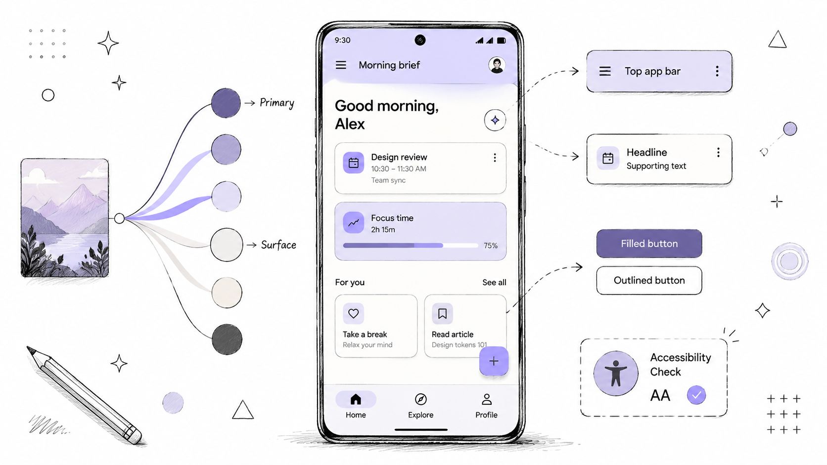
Material Design 3 gives enterprise Android apps a shared grammar
A warehouse supervisor approves a rush order on a Zebra handheld, then reopens the same task later on a Samsung tablet in a work profile. If the buttons shift shape, priority colors mean different things, or a bottom sheet behaves like a desktop modal, the app stops feeling dependable. In enterprise Android, Material Design 3 matters because it gives distributed teams and stressed users a consistent interaction language across devices, OEM skins, and security contexts.
Android has always rewarded products that respect platform conventions. Material 3 is the current baseline for components, typography, color roles, motion, and hierarchy in Android guidance (Material Design 3 guidance from Google). For enterprise apps, the benefit is less about visual polish than operational clarity. Users already spend their day moving between system UI, Google apps, OEM utilities, and your software. Shared patterns reduce the amount of relearning each workflow demands.
I've seen teams spend weeks refining branded screens that still fail basic Android expectations. Dialogs block too much context. Selection controls look custom but behave inconsistently. System bars and insets get treated as edge cases until QA finds them on three device families the week before release. The result is familiar. The app looks finished in mocks and unreliable in the field.
Start with tokens, not screenshots
Material 3 pays off when teams implement it as a decision system. Define tokens for color, type, spacing, elevation, and shape. Define behavior too. Error states need a stable semantic color, even if dynamic theming is available. Snackbar usage should be deliberate. Toasts usually have no place in auditable, task-heavy flows where missed feedback creates support tickets.
That discipline matters even more in B2B apps with dense screens and long-lived workflows. A procurement dashboard, service checklist, or compliance review tool cannot afford every squad inventing its own card style and action pattern. Teams that care about responsive UI performance and accessibility usually get better results by pairing Material tokens with explicit enterprise rules for density, hierarchy, and state behavior.
For teams using Figr, that context is useful. If the design system already encodes component variants and token rules, Figr can generate Figma-ready explorations that stay tied to product constraints instead of drifting toward generic mobile concepts. If you need a practical setup path, Figr's guide to using design tokens is a useful starting point.
Practical rule: In enterprise Android, brand expression should live inside a stable Material framework. The more critical the workflow, the less novelty you want in component behavior.
Where Material 3 needs judgment
Material You theming can improve cohesion, but enterprise products should treat dynamic color as optional input, not as the source of truth. Risk states, approval states, offline indicators, and compliance warnings need fixed semantic meaning across devices and sessions. Personalization is helpful. Semantic drift is expensive.
The same caution applies to flagship Material patterns. A floating action button works for a single, persistent action. Many enterprise apps do not have one. Primary actions change by role, record status, permissions, and work profile, so a FAB often introduces ambiguity instead of speed. In those cases, a clear top app bar action, a persistent action row, or an in-flow primary button usually holds up better over time.
Material 3 gives enterprise Android apps a shared grammar. Judgment is what makes that grammar usable in the messy reality of OEM fragmentation, dense data, and mission-critical work.
Adaptive layouts break first on Android, so design them first
A dispatcher opens the same field-service app on three devices in one shift. A compact Samsung phone in the truck. A Zebra handheld in a warehouse. A tablet on a supervisor's desk. The workflow is the same. The layout failure is not. On Android, adaptive design gets exposed early because enterprise apps live across OEM skins, rugged hardware, work profiles, split-screen use, and screens that carry far more operational detail than a consumer app ever would.
Google's Android design guidance makes the principle clear: adapt layouts, components, and behavior to the device instead of stretching one mobile screen until it technically fits. Enterprise teams still miss this. They approve a polished phone mockup, leave the rest to implementation, and end up with tablets that waste space, foldables that lose hierarchy, and work-critical actions that drift below the fold.
Density is a product choice
In B2B Android apps, density affects task speed, error rate, and trust. A sparse layout can look clean and still slow an experienced user. An overloaded one can bury the only action that matters.
A field operations flow on a compact phone usually needs:
Single-column priority: Surface status, next action, and blocker first
Progressive disclosure: Tuck secondary metadata behind expansion, tabs, or drill-in
Persistent action access: Keep the primary task action visible during long records and audit-heavy screens
The tablet version should support different behavior because the context is different:
Split view: Keep the queue visible beside the selected record
Persistent controls: Leave filters, sort, and scope selectors in view
Parallel context: Show attachments, comments, or history without forcing a screen change
That is adaptive hierarchy. The goal is preserving decision quality across form factors, not preserving pixel relationships.
Start with the smallest stable layout
The smallest supported layout deserves real design attention because it reveals the assumptions that will fail elsewhere. If a workflow only works once every panel is expanded and every label is visible, it is already fragile. Android makes that fragility expensive.
Design in dp. Test compact widths early. Decide what stays visible, what collapses, and what gets deferred. Teams that need a sharper framework for these choices can use this practical guide for product teams to map interactions before variant work starts.
Figr is useful here because it can ingest live screens and design system rules, then generate variants anchored to the product's actual structure. For teams working through responsive UI performance and accessibility, that cuts the usual ambiguity between a layout that responds and one that still supports fast, accurate work.
Gesture navigation changes what back means
Back behavior is one of the easiest ways to make an Android app feel careless, especially in enterprise flows where users move through nested tasks, drafts, and review states.
Designers who come from web-heavy products often treat back as a routing detail. On Android, it is interaction architecture. Gesture navigation, predictive back behavior, modal surfaces, and nested stacks all shape whether a user feels oriented or trapped. In a mission-critical flow, that difference is everything.
Last week I watched a Product Manager walk through a multi-step service workflow on an Android phone. They used the back gesture expecting to move one level up inside the task. Instead, the app dumped them onto the home screen. The reaction was immediate: “I don't trust this flow anymore.” That's the cost of getting back wrong.
Predictive back needs state awareness
Predictive back behavior forces clarity. If the system previews a transition, your app needs a meaningful destination behind that gesture. That means designers should map back outcomes for all major states, especially when screens contain unsaved edits, temporary filters, or work-in-progress approvals.
Useful checkpoints include:
Draft state: Decide whether back saves, warns, or discards
Bottom sheet open: Close the sheet before leaving the screen
Search active: Clear the search mode before navigating away
Nested task detail: Return to the task list, not the app root
A lot of Android app design tips stay shallow here. They mention gestures, but they don't help you resolve state conflicts. The basic gist is this: back is never one action. It is a stack of user expectations.
For teams documenting interactions, this practical guide for product teams is useful because it helps frame behavior, not just visuals.
Here's a visual refresher on how Android gesture patterns evolved in practice:
Snackbars beat toasts for actionable feedback
Toasts are easy to trigger and easy to miss. In enterprise flows, that's a bad combination. If an action matters, users need feedback they can read, revisit briefly, and sometimes undo.
Snackbars usually outperform toasts when:
An action can be reversed: “Task archived” with Undo
A background event completes: “Report synced”
A transient issue appears: “Offline, changes saved locally”
Toasts still fit low-stakes acknowledgment, but even then I'd use them sparingly. If feedback affects trust or recovery, make it visible and anchored.
Dark mode needs semantic discipline, not inverted colors
Dark mode in Android enterprise products works when semantic meaning survives the palette shift.
Teams often treat dark mode as a last-mile visual pass. That's why warning states turn muddy, secondary text loses hierarchy, and data-heavy tables collapse into low-contrast haze. In internal tools, the damage is worse because users spend long stretches in dense screens where they need sustained readability, not novelty.
Build dark mode from semantic roles
The best dark mode systems start with semantic color roles, then test them across real states. A badge for “at risk,” a banner for “policy violation,” and a disabled action all need stable meaning in both light and dark themes. If your color system only works on a marketing page, it won't survive an operations console.
Material 3 helps because it encourages role-based theming, and Figr can support that workflow when your design tokens and component rules are already defined in context. For teams refining palette decisions, these practices for consistent design system color are worth reviewing before you create dark variants.
Dark mode failures usually begin in state design, not in theme files.
OEM variation makes testing less optional
Android Enterprise deployments often include Samsung, Zebra, Pixel, and other OEM devices in the same company. That means your dark surfaces, overlays, and system bar treatments won't always render with the same emotional weight. A subtle divider on one device can disappear on another. A status color can feel louder than intended.
I'd test dark mode in the flows people use under pressure:
Approvals
Alerts
Inventory or logistics scanning
Long-form data entry
Dashboard triage
Those are the moments where contrast debt becomes user friction.
Performance is a design constraint, not a cleanup task
At 7:12 a.m., a field technician opens a work-order app in a warehouse aisle, taps into the next job, and waits half a second for the screen to settle. Then another half second for the parts panel to expand. Nothing crashed. Nothing is technically broken. Trust still drops. In enterprise Android apps, small delays feel like operational risk because people are using the product while they scan inventory, verify compliance steps, or close revenue-critical tasks.
Performance starts in design.
Teams that ship internal tools often push speed concerns to engineering after handoff. That choice usually shows up later as cluttered screens, overloaded state changes, and motion that competes with the task instead of supporting it. On Android, the design decisions that look harmless in Figma can become expensive on real devices, especially across mixed OEM fleets where lower-end Zebra hardware, older Samsung deployments, and locked-down work profile configurations all add friction you cannot wish away.
Design the interaction budget early
Enterprise workflows need a clear interaction budget. Every animation, panel expansion, live filter, sticky element, and background refresh spends from it. Dense products burn through that budget fast.
I use a simple filter in reviews:
Motion that clarifies a state change stays
Motion that adds brand flavor to repeated tasks gets cut
UI layers that hide latency instead of reducing it get redesigned
That standard changes design outcomes. A loading skeleton may be better than a spinner for a dashboard refresh. A static confirmation state may outperform an animated success flourish in a dispatch flow used 200 times a day. A split view with persistent context may beat a stack of drill-down screens if it reduces reloads and backtracking.
Android punishes decorative complexity
Performance problems in enterprise apps rarely come from one dramatic mistake. They come from accumulation. Deep component nesting. Heavy shadows on dense tables. Charts, badges, and live counts all updating together. Three surfaces animating at once while a work profile policy also injects delay into app startup or authentication.
Users do not experience those as technical details. They experience them as hesitation.
That matters more in B2B than in consumer apps because the workflows are longer and the cost of interruption is higher. If a rep loses confidence in a CRM form, they slow down. If a warehouse picker loses confidence in a scanner flow, they retry actions and create downstream errors. Good Android design accounts for frame budget the same way it accounts for hierarchy and spacing.
Measure the moments that feel slow
Instrumentation should follow the workflow, not vanity metrics. Track where people wait, retry, cancel, or abandon a task after a delayed response. In an enterprise app, that usually means timing events around search, sync, save, scan, approve, and account or profile switching.
Useful metrics often include:
Time to interactive for key screens
Delay between tap and visible response
Frequency of retries on the same action
Drop-off after loading, syncing, or validation states
Those signals help product and design teams separate perceived slowness from backend latency, and they make trade-offs easier to discuss. If one version of a screen reduces taps but adds rendering cost on common devices, that is a real design trade-off, not an implementation footnote.
Figr can support that review process when design system decisions, workflow context, and analytics notes live in the same place. That makes it easier for designers and product managers to compare lighter and heavier interaction patterns before engineering commits to them.
Navigation architecture in enterprise apps is mostly about restraint
Android navigation works when users can predict where major actions live and what the back path will do.
Enterprise teams often overcomplicate navigation because every stakeholder wants permanent visibility for their feature. The result is familiar: bottom navigation plus tabs plus a drawer plus overflow menus, all trying to prove importance at once. Users stop exploring and start memorizing survival paths.
Choose the pattern by frequency and scope
Bottom navigation is strong when users switch frequently among a small set of top-level destinations. A navigation drawer works better for larger, less-frequent destination sets, especially when those destinations vary by role. Tabs help inside a section when the user is comparing sibling views, not crossing the whole product.
A rough enterprise heuristic:
Bottom navigation: High-frequency core destinations
Navigation drawer: Broad product areas, admin sections, lower-frequency tools
Tabs: Peer views within one domain
Top app bar actions: Contextual actions, not destinations
Gmail is a useful mental model here. It separates top-level movement from contextual actions cleanly, even when the product has substantial depth.
Work profiles add another layer
Android Enterprise work profiles complicate navigation because notifications, account switching, and data boundaries can alter what users expect from the same screen. If a person uses both personal and managed profiles, your app should make profile state legible without turning the UI into a security lecture.
A practical pattern is to signal profile context subtly yet consistently:
Label managed context clearly
Avoid mixing profile-specific actions in one ambiguous menu
Keep critical state changes visible when profile restrictions apply
Field note: When users are handling company data, ambiguity feels unsafe even when the action is technically allowed.
Accessibility gets harder when workflows get denser
A field technician is standing in a warehouse aisle with one hand on a scanner, one eye on a damaged shipment, and ten required fields on screen. An accessibility failure in that moment does not look academic. It looks like the wrong item approved, the wrong note saved, or the task abandoned until someone gets back to a desktop.
Enterprise Android teams feel this pressure faster than consumer teams because their screens carry more weight. Work profiles add restrictions. OEM skins change spacing and text rendering. Dense tables, approvals, and exception flows push against touch, readability, and focus order all at once. Accessibility has to survive real operating conditions, not a tidy design file.
Start with minimums, then reduce interaction load
Touch target size, readable type, and contrast are baseline requirements. They are not enough for enterprise apps with packed workflows. On a crowded Android screen, shrinking controls to fit one more action usually creates the failure you were trying to avoid.
The better move is structural.
Use patterns that lower decision density without hiding critical work:
Break long forms into staged sections with visible progress
Use progressive disclosure for rare options and advanced settings
Turn tiny icon clusters into labeled actions or overflow menus
Separate destructive actions from high-frequency inline controls
Group related fields so TalkBack users hear meaningful chunks, not a flat wall of labels
I have seen teams spend weeks debating whether a control could be 4 dp smaller. The stronger fix was almost always reducing how many choices appeared at once.
Dense workflows expose focus and reading-order problems
Accessibility problems in enterprise Android apps often come from sequence, not styling. A dashboard can pass contrast checks and still fail a user who relies on TalkBack if status, owner, due date, and action buttons are announced in a confusing order. A tablet layout can look clean in portrait and become awkward in split screen when focus jumps across columns.
This gets harder in B2B products because the content is dense by necessity. Audit trails, permissions, exceptions, and validation messages all compete for priority. Design has to declare what gets read first, what can wait, and what must stay persistent while the user completes a task.
A practical review pass helps:
Test screen-reader order on the busiest screens first
Check keyboard and switch access on managed devices, not only emulators
Verify error messages stay tied to the field that caused them
Make status, restrictions, and compliance warnings readable without color alone
Accessibility also shapes trust
In enterprise software, accessibility and trust are closely tied. If permission state is unclear, if managed-profile restrictions appear without explanation, or if a confirmation message vanishes before it can be read, users stop trusting the interface. They slow down. They escalate simple work. They create shadow processes outside the app.
NN/g has made this connection for years in its usability research, and it holds up in mobile operations work. The interface has to explain itself under pressure.
Teams that want to verify these decisions with real behavior should use A/B testing best practices on high-risk moments such as validation errors, approval confirmations, and restricted-action messaging. For adjacent thinking on how clarity affects action rates, these CRO strategies for 2026 are also useful, especially when task completion depends on trust as much as speed.
Data-driven validation beats design debates
A field technician signs in on a Zebra device inside a managed work profile, loses signal between rooms, then returns to a half-finished task queue with one restricted action and two possible next steps. The team reviewing that flow can argue about labels for an hour and still miss the core question: did the screen help the user recover, choose correctly, and finish the job under enterprise conditions?
Strong Android teams test behavior early. They instrument the moments where OEM variance, policy controls, and dense workflows create real risk, then use that evidence to decide what ships.
For enterprise apps, the event model should reflect operational work, not consumer funnels. Track actions such as managed-profile enrollment, task handoff, failed approval, offline retry, restricted-action tap, and bulk-completion confirmation. Those signals show where users hesitate, where device context changes the outcome, and which design choice reduces error.
What to test in enterprise Android flows
Start with the points where platform behavior and business rules collide:
Enrollment into a managed environment
Task flows with role-based permissions
Labels for rare but high-risk destinations
Guidance shown inside restricted work-profile contexts
Confirmation patterns after bulk actions
Recovery paths after offline interruption or partial sync
This kind of testing works best when each variation has a stated hypothesis. A shorter label should reduce hesitation. A different confirmation pattern should lower accidental bulk actions. A revised empty state should increase successful recovery after policy restrictions appear.
Teams that want a disciplined process can use A/B testing best practices. For adjacent ideas on structuring experiments around user action, these CRO strategies for 2026 are useful if you adapt them to operational workflows rather than marketing funnels.
I have seen review cycles stall because every mockup looked reasonable in isolation. The fix was not more opinion, and not more screens. It was a tighter loop between hypothesis, instrumentation, and result.
Figr is useful here in a practical way. If it holds analytics notes, flow context, and state logic next to the design work, designers can compare alternatives with clear rationale attached. That changes the conversation from preference to evidence, which is usually what enterprise Android products need most.
Designing Android states is where most systems quietly fail
Enterprise Android products break in the states between the happy path.
A login screen may look fine. A dashboard may look fine. Then the user loses connectivity in a warehouse, reopens the app in a work profile, lands on a tablet in split-screen, and tries to retry a failed approval while a snackbar is already showing. Most design systems were never asked to answer that stack of conditions.
State coverage needs explicit structure
For effective Android-specific product design, you need component variants and flow variants that account for:
Empty
Loading
Partial sync
Offline
Permission blocked
Managed device restriction
Error with retry
Success with undo
Large-screen expanded view
Fold posture change
The more operational the product, the more these states shape trust. Users don't judge your app only by how it looks when everything goes right. They judge it by how calmly it behaves when the environment gets messy.
Why a context-aware system helps
Figr is most useful in this part of the workflow because it doesn't have to start from generic mobile assumptions. It can ingest product artifacts, current screens, tokens, behavior notes, and implementation constraints, then help generate Figma-ready states that align with the product's logic. That reduces one of the most expensive forms of mobile design debt, which is discovering missing states only after engineering has already modeled the simpler version.
You can see this pattern in several Figr gallery workflow examples, especially the ones that deal with state-heavy task cards, upload failures, and decision flows.
The Visual Context Graph is what makes Android design work at scale
Enterprise Android design gets easier when your tool understands the product as a connected system rather than a set of disconnected screens.
Most AI design workflows still break at the exact point where Android complexity begins. They can generate a plausible view, but they don't understand the managed environment, the navigation stack, the component rules, the edge states, or the code constraints that determine whether the view should exist in the first place.
The five layers that matter
Figr's Visual Context Graph matters here because it connects five layers of product context:
Visual context, screens and frames
Behavioral context, recordings and flows
Design System context, tokens, components, and variants
Product Knowledge context, PRDs, research, and decisions
Implementation context, code constraints
That structure is unusually relevant for Android work. Why? Because Android apps rarely fail from one isolated visual mistake. They fail when a design choice in one layer ignores a dependency in another. A navigation pattern that looks elegant may break back behavior. A component variant that works on a phone may collapse on a foldable. A dense work-profile flow may need implementation constraints the design never captured.
The outcome is better judgment, faster
I wouldn't use AI to replace a Designer's judgment. I would use it to hold more context than any human can keep active across a long enterprise mobile project. That's the gain. Better recall, faster variation, fewer blind spots.
When Figr ingests live product capture, Figma files, research notes, and analytics context, it can help teams reason through Android-specific trade-offs with more continuity. That's especially valuable when one flow has to survive OEM fragmentation, role-based complexity, and multiple form factors without becoming a patchwork app.
8-Point Android App Design Comparison
Material Design 3 System Implementation. Complexity is medium to high, with a learning curve for tokens and system updates. Needs design system expertise, token setup, Figma/Figr integration, and ongoing maintenance. Delivers consistent, accessible UI across screens and reduced rework. Ideal for apps targeting the Google ecosystem or needing scalable, tokenized systems. Key advantages: dynamic color, built-in accessibility, comprehensive docs, and Figr token enforcement.
Responsive Layout Design and Adaptive UI Patterns. Complexity is high, handling fragmentation and many breakpoints. Needs extensive QA across devices, layout engineering, and design time for variants. Delivers reliable UX across devices and fewer layout-related support issues. Ideal for multi-form-factor apps across phones, tablets, and foldables. Key advantages: maximizes reach, reusable patterns, and data-driven layout exploration.
Gesture Navigation and User Interaction Patterns. Complexity is medium, needing careful edge-case handling and prototyping. Needs device testing, prototyping tools, and cross-team design and engineering collaboration. Delivers more intuitive interactions and higher task completion rates. Ideal for content-browsing and interaction-heavy apps using modern gestures. Key advantages: natural UX, reduced cognitive load, and Figr prototyping for conflicts.
Dark Mode Implementation and Color Contrast Optimization. Complexity is medium, requiring theming and extensive contrast testing. Needs color token management, accessibility checks, and image and asset adjustments. Delivers improved retention, accessibility compliance, and lower OLED battery use. Ideal for apps with long sessions or strong visual branding. Key advantages: WCAG contrast enforcement, OLED optimizations, and consistent theming.
Performance-Conscious UI Design (Jank Prevention). Complexity is high, requiring performance budgets and engineering buy-in. Needs profiling tools, cross-device performance testing, and coordinated design constraints. Delivers smooth animations, lower abandonment, and better app ratings. Ideal for animation-rich apps, maps, editors, and high-interaction experiences. Key advantages: higher perceived quality, battery efficiency, and scalable animations.
Navigation Architecture and Information Hierarchy. Complexity is medium to high, with complex flow mapping and state management. Needs UX flow mapping, analytics integration, and dev implementation for deep links. Delivers improved discoverability, better task completion, and fewer navigation drop-offs. Ideal for feature-rich apps with many destinations and modular content. Key advantages: clear hierarchy, deep linking, and analytics-driven optimizations.
Accessibility-First Design (WCAG 2.1 Compliance). Complexity is medium, with ongoing testing and team training required. Needs accessibility audits, tooling, semantic labeling, and token enforcement. Delivers inclusive UX, legal compliance, and a larger addressable market. Ideal for public-facing, regulated, or broadly targeted apps. Key advantages: WCAG AA compliance, better UX for all users, and reduced liability.
Data-Driven A/B Testing and Design Validation. Complexity is medium to high, needing statistical rigor and experiment setup. Needs analytics infrastructure, sample size planning, and testing time and tooling. Delivers evidence-based improvements, higher ROI, and validated design decisions. Ideal for conversion funnels, onboarding flows, and feature launches and optimizations. Key advantages: removes bias, benchmarks against industry, and enables continuous iteration.
From Afterthought to Asset
Great Android enterprise design comes from respecting the platform where it matters and bending it only when the workflow demands it. Material Design 3, adaptive layouts, predictive back, semantic dark mode, accessible density, and state coverage all point to the same principle: your app should feel native to Android and specific to the job your user is trying to do.
The mistake I see most often is treating Android as a final formatting pass after the web or iOS design is already “done.” That approach creates brittle navigation, confused hierarchy, and interaction debt that surfaces in the exact moments users are already under pressure. A better process starts with Android constraints early, especially form factor variation, work profiles, system behavior, and back-stack logic.
If you only take one action after reading this, audit one critical flow through an Android-native lens. Pick a high-stakes task, such as approval, dispatch, incident review, or field update. Then review it across a compact phone, a larger device, and a managed-profile scenario. Check back behavior, component density, touch target sizing, system bars, transient feedback, and failure states. You'll usually find design gaps in under an hour.
Figr can help with that kind of audit because it works from existing product context, not just prompts. If your team needs a way to connect screens, flows, tokens, decisions, and constraints while generating Figma-ready explorations, it's a relevant option to try. The goal isn't more output. The goal is fewer Android surprises, less rework, and decisions that hold up when the product meets the device ecosystem.
If you're rethinking your Android workflow, try Figr to explore context-aware, Figma-ready design variations grounded in your actual product.
FAQ
How do I adapt Android app design tips for enterprise products?
I start with the workflow, not the screen. Enterprise Android design needs platform patterns, role complexity, work-profile awareness, and state coverage to be designed together.
Should I always use Material Design 3 in a B2B Android app?
I would use Material 3 as the base system almost every time. It gives you familiar behavior and a stable grammar, then you can customize where the product needs distinction.
What navigation pattern works best for enterprise Android apps?
It depends on destination frequency and scope. I use bottom navigation for a small set of high-frequency destinations, drawers for broader product areas, and tabs only within a clearly bounded section.
How do I handle Android fragmentation without exploding the design system?
I define density variants, adaptive breakpoints, and component rules early. A token-driven system with explicit state coverage scales better than resizing one canonical screen over and over.
Where can AI actually help with Android app design tips?
I've found AI most useful when it has product context. It can help explore variants, edge states, and handoff artifacts faster, but the Designer still has to make the trade-offs.