It's 4:47 PM on Thursday. Your VP just asked for something visual to anchor tomorrow's board discussion. You have a folder of user interview transcripts, a dozen support tickets, and a hundred rows of survey feedback. You have sixteen hours and no designer availability.
The insights are in there, somewhere. Buried. This is the moment most teams get stuck. Raw data isn't insight. A folder full of transcripts isn't a strategy. The bridge between the two is missing.
That bridge has a name: affinity diagramming. It’s a method for finding the hidden architecture in your research. It’s not a conveyor belt processing data; it’s a switchboard connecting disparate points into a coherent network. It turns the chaos of individual voices into a map of user needs, pain points, and opportunities.
But theory is cheap. Seeing it in practice is what matters. This article is not another abstract definition. It is a curated collection of real-world examples, each a case study in converting raw data into decisive action.
You will see exactly how product managers and UX researchers use this method to solve specific problems. For each affinity diagram example, we'll break down the goal, the data, the grouping logic, and the outcome. Forget generic templates. This is a tactical deep dive. Let’s begin.
1. Customer Pain Point Clustering for Product Discovery
Your desk is a digital landscape of user sentiment. A hundred support tickets here, fifty post-interview notes there, a few thousand rows of feedback from an in-app survey. Each one is a single voice, a signal. But together, they are just noise. The challenge isn't a lack of data, it's the overwhelming, disorganized volume of it.
This is what I mean. Customer Pain Point Clustering is a method for transforming that qualitative chaos into a clear hierarchy of problems to solve. This particular affinity diagram example is less about finding a single brilliant idea and more about finding the gravitational center of your users' frustrations. It's like finding constellations in a starfield. By grouping individual complaints and friction points, you build a map of where your product is failing your users most often.
How it Works: From Noise to Signal
The process is straightforward but requires rigor. A product team at a SaaS company might gather data from three sources: user interviews, support tickets tagged "UX issue," and screen recordings from a tool like Figr showing rage clicks or session quits.
Each discrete data point gets its own virtual sticky note.
- "I couldn't find the export button."
- "The page timed out before my report finished generating."
- A screen recording showing a user repeatedly trying to click an un-clickable element.
The team then collaboratively groups these notes. "I couldn't find the export button" goes with "Where do I download my invoice?" and "The reporting dashboard is confusing." This forms a cluster that might be named "Poor Information Architecture in Reporting." Another cluster might form around slow performance, and another around authentication errors.
The power of this method isn't just in the final group names. It's in the discussion that happens during sorting. A support agent might see "page timed out" as a performance bug, while a designer sees it as a failure to set user expectations with a progress bar. These cross-functional conversations are where true understanding is forged.
Actionable Takeaways for Your Team
To make this process effective, consider these tactics:
- Aim for Volume: Start with a minimum of 50 data points. Reliable patterns rarely emerge from a handful of comments. For a deeper analysis, like one conducted by a Figr customer analyzing Shopify's checkout setup, you might synthesize insights from analytics data and user flows, as seen in this new setup flow.
- Involve Everyone: The session must include representatives from product, design, engineering, and customer support. Each person brings a unique lens that prevents groupthink and uncovers richer insights.
- Visualize the Impact: Combine the qualitative clusters with quantitative data. If the "Poor Information Architecture" cluster aligns with a 40% drop-off in your analytics funnel, you have a clear, data-validated priority. This moves the conversation from "users are complaining" to "this issue is costing us X% of conversions."
- Connect to the Journey: These pain points do not exist in a vacuum. They are moments within a larger narrative. Once clustered, map them to specific stages of the user experience. You can learn more about user journey mapping to contextualize these friction points and see their downstream effects.
2. Feature Request Prioritization & Roadmap Planning
Your roadmap is less a map and more a battlefield. Sales needs feature X to close a big deal. Your largest customer is threatening to churn without feature Y. The CEO just returned from a conference with a brilliant idea for feature Z. Every request feels urgent, every stakeholder is convinced their need is the most critical. This isn't planning, it's firefighting.
Here, an affinity diagram becomes your strategic command center. It takes that firehose of requests and organizes it into a coherent framework. This affinity diagram example shifts the conversation from "who shouts loudest" to "what moves the needle most." By clustering disparate requests into thematic groups, you can evaluate entire capability areas instead of one-off features. This is the difference between building a collection of parts and designing an engine.
How it Works: From Wishlist to Will-Do List
The process is about creating structure where none exists. A product manager at a B2B SaaS company might pull requests from a dozen sources: Slack channels, CRM notes, support tickets, and direct customer emails. What was once a messy backlog becomes a clear field of opportunities.
Each request gets a note.
- "Enterprise client wants SAML SSO."
- "The sales team needs a better way to demo reporting features."
- "A user complained that the mobile dashboard is hard to read."
The team then gathers these notes, looking for natural affinities. "SAML SSO" clusters with "audit logs" and "role-based access controls" under a new theme: "Enterprise Security & Compliance." The demo request groups with "shareable report links" under "Sales Enablement Tools." Mobile usability issues form a "Mobile Experience Debt" cluster. Last week I watched a PM at a growing fintech do this with over 200 requests from 50+ customers, turning a chaotic spreadsheet into eight clear, actionable capability clusters.
The goal is not just to group similar items. It is to create a new, higher-level vocabulary for discussing the product's future. Instead of debating one feature, you are now debating the strategic importance of "Enterprise Security." This reframes the entire roadmap discussion and aligns it with business goals.
Actionable Takeaways for Your Team
To turn this clustering into a real roadmap, focus on these tactics:
- Standardize the Input: Create a simple, mandatory feature request template for all teams to use. It should capture the "who," "what," and "why," ensuring you have consistent data for every idea you need to sort.
- Score Everything: Once items are clustered, use a prioritization framework like RICE (Reach, Impact, Confidence, Effort) to apply objective scores. This moves the decision from opinion to a data-informed comparison of value versus complexity.
- Visualize Value vs. Effort: Plot your themed clusters on a 2x2 matrix with "User Value/Business Impact" on the y-axis and "Implementation Effort" on the x-axis. Your top priorities become instantly visible in the top-left quadrant (high value, low effort).
- Connect to a Backlog: The roadmap is a strategic document, not a project plan. Once a theme is prioritized, you can break it down into epics and user stories. For a deep dive into turning priorities into an actionable plan, you can explore how to prioritize your product backlog effectively.
3. UX Issues & Design System Violation Mapping
Your design system was supposed to be the single source of truth. A pristine library of components and patterns. Yet, your product looks like a patchwork quilt. One button has a 4px radius, another has 6px. Three different shades of "primary blue" are live in production. Why? Because a system is only as good as its adherence.
This is where the design system audit, visualized as an affinity diagram, becomes a tool for restoration. It systematically captures every inconsistency, UX bug, and accessibility violation, then clusters them to reveal the root cause of the system's decay. This specific affinity diagram example is less about discovering new ideas and more about enforcing standards and paying down design debt at scale. Think of it as mapping cracks in a foundation to find the source of the structural stress.
How it Works: From Entropy to Order
The process begins by gathering evidence from multiple fronts: automated accessibility scans, manual design reviews, and user testing sessions where inconsistencies cause friction. For instance, a team at an enterprise SaaS company might identify that 60% of their UI issues stem from misuse of a single "button" component.
Each violation becomes a data point on a virtual sticky note:
- "Login button on mobile web uses a non-standard hex code (#0052CC)."
- "Modal dialog close icon fails WCAG AA contrast ratio."
- "Tooltip component on the dashboard doesn't match the one on the settings page."
The team then groups these issues. All button-related problems are clustered together, revealing that developers are overriding styles or creating local one-offs. All accessibility violations might be grouped by their WCAG level (A, AA, AAA) or by the type of issue. This creates emergent themes like "Component Detachment," "Accessibility Debt," or "Token Non-compliance."
The most powerful outcome of this exercise is identifying the why behind the violations. Is a component too rigid, forcing developers to detach and customize? Are design tokens poorly documented? Answering these questions allows you to fix the system, not just the symptoms. A fix for one button is a band-aid; a fix for the button component is leverage.
Actionable Takeaways for Your Team
To turn this audit into lasting change, apply these tactics:
- Create a Severity Matrix: Not all violations are equal. Combine the impact (how many users are affected) with the effort to fix it. This creates a clear prioritization framework.
- Automate and Augment: Use automated tools to do the heavy lifting. Run accessibility scans in your CI/CD pipeline and integrate design token checks. This frees up human auditors to focus on nuanced UX issues that machines can't catch. For a deeper dive, explore how to select the best AI tools for design system management.
- Batch Fixes by Component: Grouping issues by component allows for compounding returns. Fixing the core button component in your library can resolve dozens of individual violations in a single deployment. This is far more efficient than playing whack-a-mole with individual bug tickets.
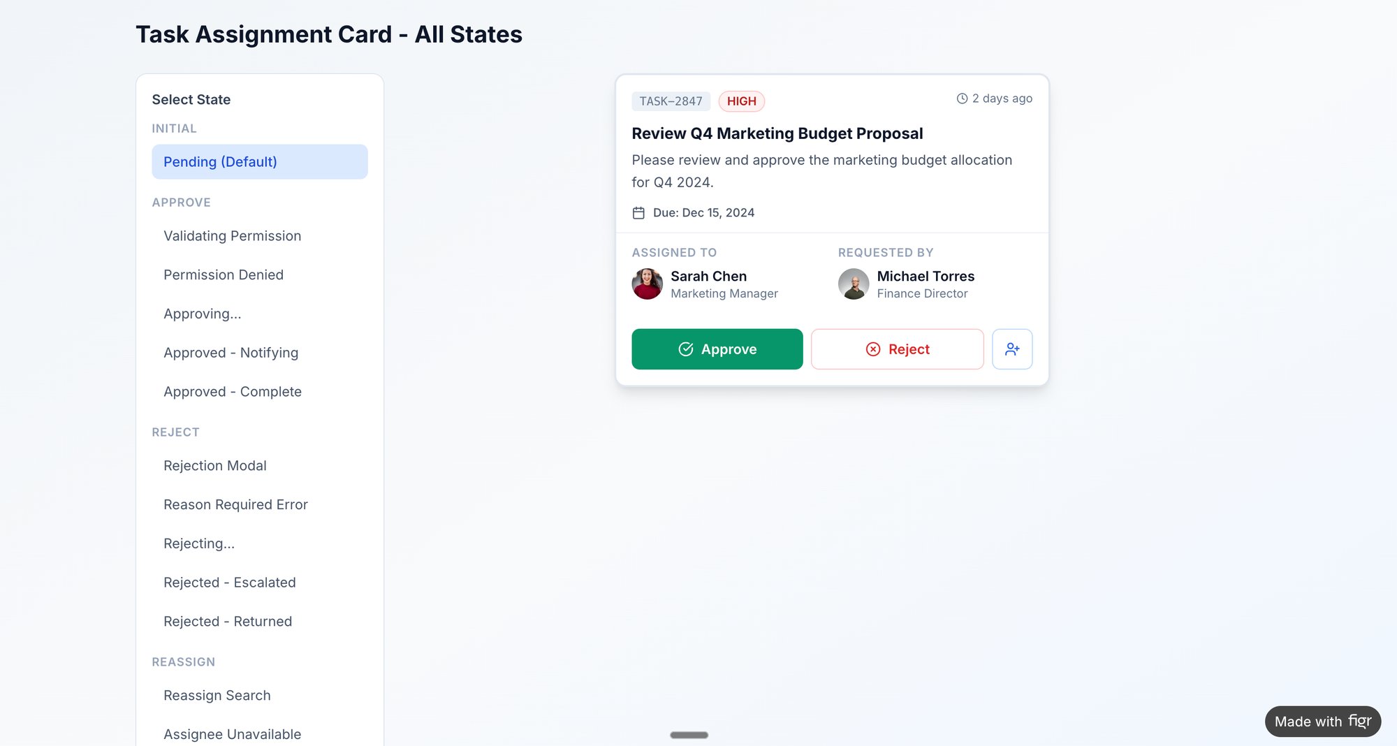
- Visualize the Remediation: Export the clustered issues directly from your affinity map into your workflow tool. A great example of this in action is mapping the various states and potential failures for a task card component, which helps prevent future inconsistencies. You can view component states here.
4. User Research Synthesis & Persona Development
Your research folder is full of voices. Fifteen interview transcripts, a hundred survey responses, notes from a contextual inquiry session. But who are these people, really? Without a clear model, your team builds for a faceless, average user who doesn't actually exist. The product becomes a mirror of the team's own biases, not the market's reality.
This is why User Research Synthesis is a foundational step, and the affinity diagram is its primary tool. It converts raw, qualitative data into coherent user archetypes, or personas. This affinity diagram example is not about finding a single problem, but about discovering the distinct constellations of behaviors, goals, and motivations that define your user base. The process is like sculpting: you start with a block of raw material and chip away until distinct forms emerge.
How it Works: From Observations to Archetypes
The basic gist is this: you transform scattered insights into strategic assets. A UX researcher might start with twenty interview transcripts. When conducting user research, converting spoken insights into text is a crucial first step. To do this efficiently, teams often learn how to transcribe audio to text to create a clean, searchable dataset.
Each key observation becomes a virtual sticky note.
- "I need to generate a compliance report for my manager every Friday."
- "I don't have time to learn all the features; I just use the dashboard."
- "My main job is to set up new user accounts and manage permissions."
The team then begins sorting. The quote about compliance reports clusters with "I need to see historical data for audits." This group might be named "Accountability & Reporting Needs." Another cluster forms around quotes like "I'm the only one who knows how to configure this part of the system," which points to an "Admin/Power User" segment. Soon, patterns emerge, revealing 3 or 4 distinct types of users.
Personas are not just demographic profiles with stock photos. They are behavioral archetypes built from clustered research data. A persona is powerful because it forces the team to ask, "Would Susan, the busy compliance manager, understand this feature?" instead of "Will a user understand this?" It makes the abstract specific.
Actionable Takeaways for Your Team
To build personas that drive decisions, not just decorate slides, consider these tactics:
- Go Beyond Demographics: Focus on clustering behaviors, motivations, and goals first. Demographics are secondary details that add color, not the core structure. The goal is to understand why people act, not just who they are.
- Quote Directly: Support each persona's key traits with direct quotes from your research notes. This grounds the archetype in real data and prevents it from becoming a fictional character. When challenged, you can point to the source.
- Involve the Whole Team: Synthesis is a team sport. Bringing product, engineering, and design into the affinity mapping session ensures everyone sees the data and buys into the resulting personas. This shared context is invaluable.
- Validate with Analytics: Are your qualitative personas reflected in quantitative data? If your "Casual User" persona is defined by brief, infrequent sessions, you should be able to see a corresponding segment in your analytics. You can learn more about creating and using UX personas to ensure your product strategy is deeply rooted in user reality.
5. Edge Cases & Exception Scenario Mapping
A happy user glides through your product, a seamless journey from A to B. But software isn't built for a single, perfect path. It’s a network of possibilities, and many of them lead to dead ends: network timeouts, empty carts, permission errors. These aren't just technical glitches, they are user experiences. Ignoring them is like building a beautiful house but forgetting to install fire escapes.
This is where Edge Cases & Exception Scenario Mapping becomes a critical practice. It’s a systematic way to find, document, and plan for everything that can go wrong. This specific affinity diagram example shifts the focus from the ideal user journey to the inevitable moments of failure. By clustering these unusual situations and boundary conditions, you transform potential chaos into a structured plan for resilience.
How it Works: From What-If to What-To-Do
The process involves proactively hunting for the system's breaking points. A team building an e-commerce checkout flow might start with a list of known scenarios. Then they expand it by asking "what happens if?" at every step. What happens if the network times out during payment? What if the inventory changes mid-transaction?
Each of these "what-if" scenarios becomes a virtual sticky note.
- "User tries to apply an expired promo code."
- "User's session times out with items in the cart."
- "Inventory for a selected item drops to zero after it's in the cart."
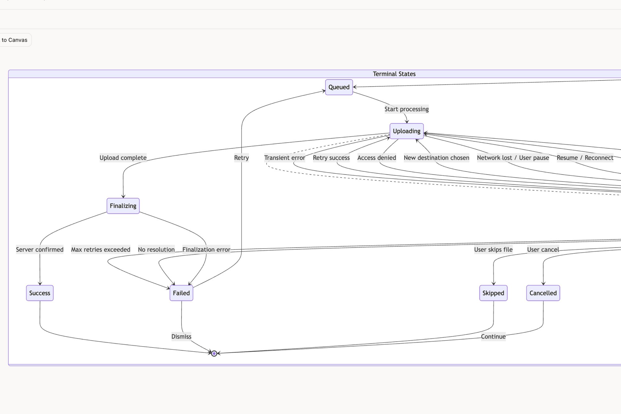
The team then clusters these notes by theme. "Expired promo code" joins "Invalid coupon format" and "Promo code not applicable to cart items" to form a cluster named "Coupon & Discount Errors." This transforms a frightening list of potential bugs into a manageable set of problem categories. You can see how an edge cases map for a tool like Dropbox can turn a simple feature into a web of interconnected states.
The goal isn't just to list errors but to design graceful failures. Mapping these scenarios forces a crucial conversation: what does a user need to see, know, and do when something breaks? This proactive approach turns a potential support ticket into a moment of clear guidance. It’s the difference between a product that feels fragile and one that feels dependable.
Actionable Takeaways for Your Team
To make this process effective, consider these tactics:
- Involve QA Early: Your Quality Assurance team lives and breathes edge cases. Involve them in the affinity mapping session. They bring a dose of realism and can identify failure scenarios that product and design might miss.
- Prioritize Ruthlessly: You cannot build a perfect solution for every edge case. Prioritize clusters using a simple formula: Likelihood × Impact. A rare but catastrophic failure is a higher priority than a common but minor inconvenience.
- Design for Recovery: For each high-priority cluster, design the complete recovery flow. This includes the error message, the user guidance, and the path back to a successful state. For inspiration, explore the edge case simulations generated for the Wise card freeze feature.
- Create Test Plans from Clusters: The final affinity map is a powerful asset for your QA team. Each cluster and the notes within it can be directly exported or transcribed to form the basis of a comprehensive test plan, as seen in these test cases for Waymo.
6. A/B Test Variation Hypotheses & Outcome Organization
Your team's experimentation dashboard is a graveyard of single-use insights. Test A beat Test B by 7% on signups. A different test showed that a green button outperformed a blue one. Each result is a fact, an isolated point of light. But disconnected, they don't form a constellation. They don't guide future decisions or compound into real knowledge.
This is where organizing A/B test hypotheses and outcomes with an affinity diagram provides its strategic value. It's a method for converting a stream of individual test results into a library of reusable patterns. This affinity diagram example is about moving beyond "what won" to "why it wins, and where else that learning applies." The work is to find the story that connects the data points.
How it Works: From Isolated Wins to Compounding Knowledge
The process requires a disciplined approach to both experimentation and analysis. A growth marketing team might be running dozens of tests on their pricing and product pages. They gather their data from their analytics and experimentation tools.
Each discrete test hypothesis and its outcome gets its own virtual note.
- Hypothesis: "Making the CTA 'Start Your Free Trial' will increase clicks by emphasizing value." Result: +12% CVR.
- Hypothesis: "Adding customer logos above the fold will increase trust and drive signups." Result: -3% CVR.
- Hypothesis: "Changing the headline from 'Features' to 'Everything Included' will clarify the offering." Result: +5% CVR.
The team then groups these notes. The "Start Your Free Trial" test goes with the "Everything Included" headline test. This forms a cluster that might be named "Clarity & Value Proposition." The losing test with customer logos might group with other tests about social proof, forming a cluster named "Trust Elements (Mixed Results)." This synthesis reveals that for their audience, explicit value-based copy consistently outperforms social proof at the top of the funnel.
The real breakthrough happens when you stop seeing tests as one-off bets and start seeing them as inquiries into a specific theme. By grouping them, you're not just finding winning variations; you're identifying winning principles. A single copy test is a tactic. A pattern of five winning copy tests all related to "loss aversion" is a strategy.
Actionable Takeaways for Your Team
To make this process effective, consider these tactics:
- Establish a Hypothesis Framework: Mandate a consistent structure for every test: We believe that [change] for [audience] will result in [outcome] because [rationale]. This rigor makes grouping and analysis possible later.
- Document the Losers: The most valuable learnings often come from failed tests. A losing variation invalidates a belief. Grouping these "invalidation" notes is crucial for understanding what your users don't want.
- Group by Stage and Theme: Use your funnel stages (Awareness, Consideration, Conversion) as primary columns. Within each column, create thematic clusters like "CTA Copy," "Visual Hierarchy," or "Social Proof." This helps you see which levers are most effective at different points in the user journey.
- Create a Pattern Library: In short, the end goal is a library of validated patterns. For example: "Across 10 tests, CTA button copy emphasizing immediacy provides a 4% average lift in the checkout funnel." This becomes a documented asset for the entire team.
7. Competitive Analysis & Feature Gap Mapping
The market isn't a vacuum; it’s a crowded room where your product is constantly being compared. Your roadmap is filled with feature requests, but which ones will close a critical gap, and which are just chasing a competitor’s tail lights? Without a clear picture of the landscape, strategic decisions feel like guesswork.
This is where competitive analysis using an affinity diagram provides clarity. It’s a method to deconstruct the competitive landscape, transforming a long list of features into a visual map of strengths, weaknesses, and opportunities. This particular affinity diagram example helps you move from reactive "they have X, we need X" thinking to proactive "they all neglect Y, we will own Y" strategy. The analysis is not a mirror reflecting the competition, but a lens to find the open space.
How it Works: From Feature Lists to Strategic Gaps
The process is a systematic audit. A project management software company, for example, wants to understand its position against tools like Linear and Jira. Instead of just listing features, the team captures screenshots and notes on specific capabilities.
Each data point gets a virtual sticky note.
- "Linear's command bar for task creation is lightning fast."
- "Jira offers complex, customizable reporting dashboards."
- "Competitor Z has no native time-tracking."
- "Our app requires 6 clicks to assign a task."
The team then groups these notes. The note about Linear’s command bar joins others related to speed and efficiency, forming a cluster named "Task Creation Velocity." The Jira note goes into a "Advanced Reporting & Customization" group. This surfaces themes beyond just features: one competitor might be optimized for individual developer speed, while another is built for enterprise-level process control. A great example of this in action is a detailed comparison of Linear vs Jira, which you can see in this UX audit report.
The value isn't a checklist of who has what. It’s understanding the philosophy behind their choices. Why did they prioritize speed over flexibility? What user segment are they implicitly serving with that decision? Answering these questions reveals the strategic positions no one has claimed yet.
Actionable Takeaways for Your Team
To make your competitive analysis truly strategic, use these tactics:
- Audit Both "What" and "How": Don’t just list features. Document the user experience of those features. A competitor may have "collaboration tools," but if the implementation is clunky, that's a weakness, not a strength.
- Focus on Differentiation: Avoid the temptation to achieve feature parity everywhere. As detailed in product strategy frameworks like Melissa Perri’s Escaping the Build Trap, your goal is not to be a perfect mirror. Identify 2-3 areas where you can create a meaningfully better experience.
- Use a 2x2 Matrix: Once clusters are formed, plot them on a simple matrix: one axis for "Feature Importance (to our target user)" and another for "Competitive Parity." Features in the "High Importance, Low Parity" quadrant are your immediate opportunities.
- Avoid Analysis Paralysis: A competitive analysis should be a catalyst for decisions, not a reason to delay them. Set a clear deadline and a specific goal. The map is not the destination.
Final Thoughts
We've journeyed through a landscape of data, from scattered customer complaints to granular UX feedback and competitive intelligence. We’ve seen how a well-executed affinity diagram acts not as a simple container, but as a crucible. It takes the raw, often chaotic, material of research and forges it into structured insight. The process is less about sorting digital sticky notes and more about revealing the hidden architecture of a problem.
The examples we explored share a common thread: they translate ambiguity into action. They move teams from a state of "we have a lot of data" to "we know what matters most right now." An affinity diagram example isn't just a static artifact; it's a dynamic tool for alignment. It's the visual evidence that transforms a lone researcher's observation into a team's shared conviction.
From Clusters to Conviction
The core value proposition of this method is its ability to build understanding from the ground up. Instead of imposing a pre-existing framework onto the data, you allow the data to reveal its own inherent structure.
This is a critical distinction.
It’s the difference between validating your own biases and discovering what you didn't know you were looking for. This matters at scale because organizations that only validate existing beliefs are brittle; they can’t adapt. Organizations that discover new patterns can evolve. The economic incentive is survival.
The power of a great affinity diagram is that it makes the implicit, explicit. It surfaces the silent consensus buried within a mountain of individual data points.
Your Next Step: From Theory to Practice
The transition from understanding the what to mastering the how requires practice. The strategic value doesn't come from a single, perfect diagram. It comes from making this a regular, reflexive part of your process. As Nilofer Merchant outlines in The Power of Onlyness, great ideas often come from the "seams" of an organization. An affinity diagram is a tool built specifically to mine those seams.
So, what is the single most important takeaway?
That an affinity diagram is a decision-making engine. It takes qualitative noise and produces a prioritized signal. The most effective product managers and UX leaders don't just use this technique for big, formal research projects. They use it constantly, almost invisibly, to make sense of meeting notes, to triage a messy bug report, or to plan their week. They've internalized the habit of clustering chaos into clarity.
Your actionable next step is simple. Don't wait for the next major research initiative.
Find a small, messy data set you already have. It could be a dozen user reviews, a Slack channel with customer feedback, or the notes from your last three team meetings. Take thirty minutes. Write each distinct point on a separate "card" and start grouping. Don't overthink it. Just start moving the pieces until patterns emerge. This small, repeated practice is what builds the muscle for strategic synthesis. You'll move from merely looking at an affinity diagram example to creating one that drives real product outcomes.
The examples in this article show the power of turning raw data into visual artifacts. If you want to accelerate this process from hours to minutes, Figr is designed to do exactly that. Figr helps you ingest research, screen recordings, and documentation to automatically generate the user flows, edge case maps, and prototypes you need to build conviction and align your team.