Designers often learn UX laws as tidy slogans, then hit a real product review and discover the laws don't line up neatly on the screen in front of them.
When that gap stays unresolved, teams start arguing in abstractions. Someone says to reduce choices, someone else says to expose power-user controls, and the interface slowly turns into a negotiation between competing instincts. Settings panels get bloated, primary actions shrink to make room for edge cases, and onboarding flows ask people to think harder than they should.
A better approach is to treat laws of UX as working constraints, then apply them against real product context. That's also where tools that understand screens, flows, design systems, and product decisions can help. Figr's model of product context is useful here because it starts from what already exists, not from a blank canvas, so UX laws design becomes easier to apply with judgment instead of guesswork.
The Laws of Time and User Perception
A user opens your product to do one quick task. They click into settings, face a wall of options, choose one, then wait through a blank pause after hitting Save. Nothing is technically broken, but the experience already feels slower than it needed to.
That reaction sits at the intersection of two laws. Hick's Law explains why too many choices slow decision-making. The Doherty Threshold explains why delayed feedback breaks a user's sense of flow. In real products, these laws often collide. Reducing choices can speed decisions, but hiding too much can make people hunt. Showing rich feedback can reassure users, but too much motion or status detail can distract from the task itself.
Hick's Law says decision time increases as choices become more numerous or more complex. That is why grouped options, guided steps, and progressive disclosure often outperform a single flat list, especially in onboarding, settings, and checkout flows, as described in this overview of Hick's Law in interaction design.
Hick's Law in a settings panel
An overloaded SaaS settings page is a good stress test for this law. Billing, domains, permissions, notifications, integrations, audit logs, retention, branding, API keys, and role rules all appear at once. The team may call that efficient because everything is visible. The user experiences it differently. They have to sort, compare, and discard options before taking a single action.
A better pattern usually looks like this:
Group by user goal. Put account controls, workspace controls, and security controls into distinct buckets.
Reveal detail progressively. Show the high-level category first, then let the user go deeper.
Protect frequent actions. Keep common tasks visible, and place rare or risky tasks on a narrower path.
The trade-off matters here. A shorter menu is not automatically better. If a user needs to open three layers just to change a common setting, you reduced visible complexity but increased interaction cost. Good judgment means hiding what is rarely needed without burying what is used every day.
Practical rule: If a user has to scan the whole menu before acting, the interface is asking them to do unnecessary mental sorting.
The Doherty Threshold and the feeling of flow
The same screen can fail even after the user makes a choice. A click with no response creates a small moment of doubt. Did the system register the action? Is it loading? Should they click again?
The Doherty Threshold is useful here because it focuses attention on responsiveness and momentum. People stay engaged when the interface acknowledges input quickly and keeps them oriented while work happens in the background. The lesson is not merely "make it faster." The lesson is to make progress legible.
That is why pressed states, inline validation, skeleton screens, row placeholders, and clear save confirmations matter. They work like a cashier making eye contact and saying, "Got it," before the receipt prints. The transaction may still take a moment, but the user no longer feels ignored.
I'd apply that lens in three common places:
Search and filters. Reflect input immediately, even if results take a moment to update.
Save actions. Confirm receipt of the action right away with a state change or status message.
Longer loads. Replace empty space with placeholders that show structure and expected content.
Figr's view on right-time AI uses a framing that fits well here. Timing in product design is not only about faster output. It is about giving the right feedback at the right moment.
The useful design question is usually not "Which law should I follow?" It is "Which delay hurts more here?" In a checkout flow, you may reduce visible options aggressively because hesitation costs conversion. In an admin console, you may keep more controls visible because expert users value direct access. In both cases, fast acknowledgment still matters.
When Hick's Law and the Doherty Threshold are applied together, the interface feels easier to trust. Users choose with less hesitation, act with more confidence, and spend less time wondering what the product is doing.
How Users Physically Interact with Your UI
Fitts's Law explains why some interfaces feel effortless and others feel annoyingly precise.
Last week I watched someone try to close a mobile overlay by tapping a tiny icon in the top corner. They missed it, hit the background instead, reopened the panel, and tried again. Nothing dramatic happened. Still, the irritation was instant. You could feel the product asking for more motor accuracy than the moment deserved.
That frustration has a name. Fitts's Law gives a measurable relationship between target size, distance, and movement time: larger targets closer to the pointer are faster to acquire, while smaller or farther targets take longer and increase error risk. The principle comes from Paul Fitts's 1954 work and remains a foundational HCI model, as NN/g explains in its article on Fitts's Law.
Where this shows up in product UI
The law becomes obvious once you start noticing target acquisition in real screens.
A few examples:
Primary call-to-action buttons. A large “Continue” button near the end of a form works better than a small text link tucked away in the corner.
Mobile bottom actions. Thumb-reachable controls near the lower portion of the screen reduce stretch and mis-taps.
Dense tables. Tiny row actions hidden behind slim icons increase slip-ups, especially when users are moving quickly.
The basic gist is this: every extra pixel of distance and every reduction in target size asks the user for more effort.
The tradeoff designers miss
Designers sometimes hear Fitts's Law and respond by making everything bigger. That's where trouble starts. A larger target may improve acquisition, but it can also crowd the screen, weaken hierarchy, and create the very clutter that slows decision-making elsewhere.
So how do I apply it in practice?
Enlarge the action that matters most. Don't scale every button equally.
Reduce travel after the likely next step. Place the next action near the user's current focus.
Use forgiving hit areas. The visible icon can stay small if the tappable area is generous.
Small controls aren't always wrong. Small controls for frequent or high-stakes actions usually are.
If you want a stronger mental model for how motion, feedback, and control fit together, this guide on mastering interaction design for UX success is a useful companion.
A good UI doesn't merely look organized. It cooperates with the hand.
Managing Cognitive Load and Complexity
A product manager opens a settings page to change one billing rule and runs into twelve toggles, three dropdowns, two warnings, and labels that only make sense if they remember what happened on the previous screen. Nothing is physically hard to click. The hard part is keeping the whole model in their head long enough to act with confidence.
That is the kind of problem Miller's Law and Tesler's Law help you diagnose. They matter most in dashboards, admin tools, onboarding flows, and any UI where the user has to compare options, remember prior choices, and predict consequences before committing.
Miller's Law is often summarized as a limit on working memory. Designers usually hear the famous number and turn it into a menu rule. That shortcut causes trouble.
The better use of Miller's Law is as a warning about mental juggling.
If a person has to compare plan tiers, remember what they selected two steps ago, keep permission rules straight, and anticipate what “Save” will change, your interface is spending attention too fast. The screen may look organized and still feel heavy because the user is carrying too many open loops at once.
A good way to reduce that burden is to design for recognition instead of recall.
Chunk related information. Group permissions by job or function, not as one long flat list.
Keep context visible. Show selected options, summaries, and consequences near the decision point.
Break large tasks into smaller commitments. A guided setup can reduce mental load more effectively than one giant control panel.
Use progressive disclosure carefully. Hide advanced detail until it is needed, but do not hide so much that users lose the logic of the system.
That last point is where trade-offs start.
Designers often apply Miller's Law by hiding more. Designers often apply Tesler's Law by automating more. Both moves can help. Both can also backfire.
Tesler's Law says every system has some irreducible complexity. You do not delete that complexity. You choose where it lives.
In practice, you have three common options:
Raw settings exposed at once. The user carries the complexity. Typical feeling: "I need to decode this first."
Defaults with editable detail. The system carries it first, the user second. Typical feeling: "I can start, then refine."
Hidden logic with no explanation. The system carries the complexity. Typical feeling: "I don't trust what happened."
This is a key design judgment call. If you expose everything, the user has control but pays in effort. If you automate aggressively, the screen gets calmer but the product can start to feel opaque. Good design usually sits in the middle: sensible defaults, clear labels, visible consequences, and an obvious path to inspect or change the decision.
A permissions screen is a useful example. Listing every rule individually gives expert admins precision, but it forces everyone else to read and compare too much. Bundling those rules into role-based presets reduces mental load, yet presets alone can feel risky if users cannot see what each role includes. The stronger solution is preset first, detail on demand. The product carries more of the complexity, while the user can still verify the outcome.
I saw this pattern on a team that kept “improving” a complex setup screen by adding explanatory microcopy. The screen became clearer sentence by sentence and harder to use as a whole. The fix was structural, not editorial. They grouped decisions into stages, surfaced a running summary, and saved the detailed explanations for moments of uncertainty. Users needed fewer things to hold in mind, not more text to read.
That connection also shows up in a product manager's guide to calm tech, because calm products reduce the amount of thinking users must do in the moment.
Good UX laws design does not erase complexity. It assigns complexity deliberately, then makes sure the user can still understand what the system is doing and why.
Why Users Expect Your Site to Be Familiar
People arrive at your interface with habits formed somewhere else, and your design has to account for that.
That's the everyday force behind Jakob's Law. Users spend most of their time in other products, so they expect your product to work in ways that feel recognizable. Familiarity reduces interpretation work. It lowers the number of small “how does this work here?” moments that pile up across a session.
You can see this in standard patterns. Cart icons sit where people expect them. Search behaves like search. A settings gear signals configuration. A profile menu in the top corner reads immediately because users have practiced that pattern many times elsewhere.
Familiar doesn't mean lazy
Some Designers worry that leaning on familiar patterns makes the work generic. I think the opposite is often true. Familiar structure buys you the right to innovate where it matters.
If your checkout flow invents a new way to apply a coupon, or your editor hides formatting controls behind an unfamiliar gesture, users don't experience that as originality. They experience it as friction.
This is also why UX design fundamentals matter so much. The basics aren't beneath advanced work. They are what make advanced work legible.
Postel's Law in product forms
Postel's Law adds a second layer to this idea. If users expect conventional form behavior, the product should also be forgiving when inputs vary.
A classic example is phone numbers. One user types spaces, another uses dashes, another pastes a number with a country code. A rigid field says “invalid” until the format matches exactly. A forgiving field accepts variation, normalizes it, and only asks for correction when it is essential.
The same principle helps with:
Name fields that accept natural variation
Search bars that tolerate partial matches or imperfect wording
Date inputs that guide correction instead of rejecting the user too early
Interfaces feel intuitive when they meet user expectations, and resilient when they don't punish ordinary variation.
At scale, this matters for support load too. Every brittle form pattern teaches users that the product cares more about formatting than progress.
The Unspoken Rules of Visual Organization
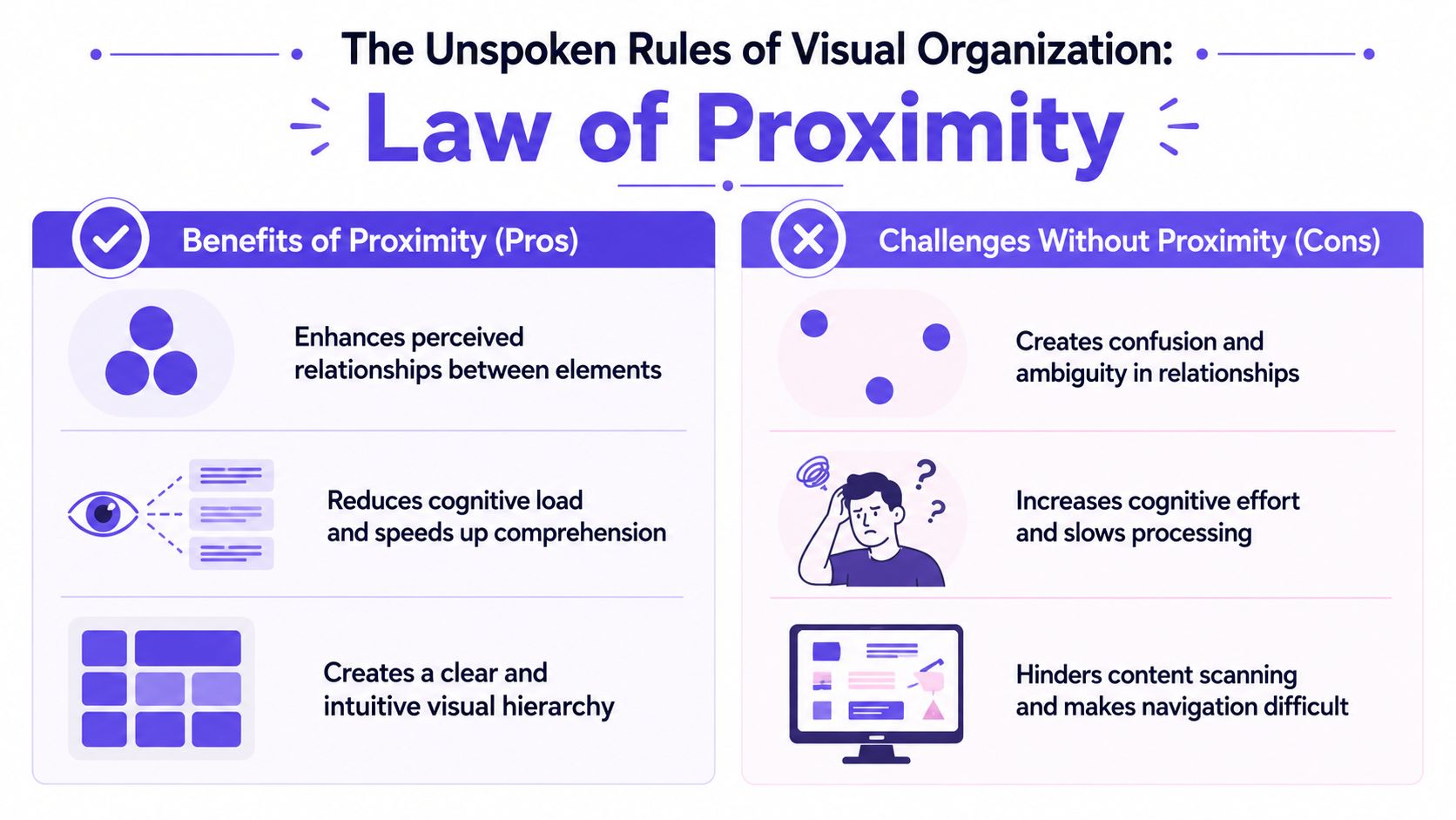
The Law of Proximity is one of the quietest UX laws, and one of the easiest to notice once you know what to look for.
People assume elements placed near each other belong together. That means spacing isn't decorative polish. It's structure. It tells the eye what belongs to what before the user reads a word.
You can test this on a simple form. Put labels, help text, and fields with clear spacing and the form feels obvious. Push the gaps around carelessly and users hesitate. They start checking whether the label applies to the field above or below. They reread. They slow down.
A fast way to audit proximity
When I review a screen, I don't start by asking whether it looks modern. I start by asking whether spacing is teaching the right relationships.
Use this quick check:
Tighten within a group. Label, field, helper text, and validation should feel like one unit.
Open space between groups. Separate billing details from shipping details, or profile info from security info.
Align repeated structures. A ragged grid makes grouping harder to scan.
Real examples in product screens
Proximity does a lot of invisible work in:
Analytics dashboards, where metric cards need clear grouping by theme or time frame
Permission panels, where each role and its controls need a visible boundary
Checkout summaries, where totals, discounts, and payment actions must read as one coherent block
Here's where readers often get confused: they think hierarchy comes mostly from color, type size, or borders. Those help, but spacing often does more with less. If spacing already signals the right structure, the interface needs fewer visual crutches.
A lot of messy enterprise UI isn't messy because it contains too much information. It's messy because related things don't sit together, and unrelated things sit too close.
Design note: If users keep reading the wrong thing together, check spacing before you add another divider or icon.
That's why the Law of Proximity belongs in any serious conversation about UX laws design. It governs comprehension before interaction even begins.
Navigating the Subjective Side of UX
Some UX laws describe measurable behavior, and others help you manage perception, prioritization, and tradeoffs.
Many articles get thin by defining a law, showing a tidy example, and moving on. Real products aren't tidy. A dashboard may need density. A workflow may need exception handling. A clean visual treatment may improve perceived usability, yet hide controls that a power user needs constantly.
The first principle here is the Aesthetic-Usability Effect. People often perceive attractive interfaces as easier to use. That doesn't mean beauty can rescue bad workflows. It means visual refinement changes trust, tolerance, and first-read clarity.
Aesthetic quality affects judgment
A polished interface often gets more benefit of the doubt. Users are more willing to explore it. They assume there's order behind the screen. That's useful, but dangerous if teams overlearn the lesson and start polishing surfaces while leaving rough task flows untouched.
The second principle is the Pareto Principle. In product terms, a smaller subset of features often drives most user value, so design energy should focus there first. You don't need a numeric formula to use the idea well. You need discipline about what deserves the most attention.
I'd apply it like this:
Protect the core path. Make the frequent task easy, fast, and trustworthy.
Defer edge controls. Keep advanced options available without letting them dominate.
Use evidence to prioritize. Look at behavior, support friction, and repeat workflows before polishing low-use surfaces.
Where UX laws conflict
This is the part mid-level Designers need most. UX laws often collide.
Laws of UX frames many of these as best practices rather than absolutes, and that framing matters because product decisions are often tradeoffs, especially in enterprise and B2B software. Making a target larger can increase visual clutter, while reducing visible choices can hide important functionality in complex workflows, as noted on Laws of UX.
A few common collisions -
Fitts's Law. Competing pressure: visual simplicity. Tension: bigger targets can crowd dense screens.
Hick's Law. Competing pressure: discoverability. Tension: fewer visible choices can bury needed actions.
Jakob's Law. Competing pressure: product differentiation. Tension: familiarity can constrain novel workflows.
Aesthetic-Usability Effect. Competing pressure: functional clarity. Tension: minimal styling can under-communicate capability.
That's the zoom-out moment. At scale, product teams aren't rewarded for obeying abstract laws. They're rewarded for reducing friction in the flows users repeat, while still supporting complexity the business needs. Economics shows up here through support costs, onboarding drag, and slower decision-making inside the product itself.
So when should you break the neat version of a UX law?
When the task, audience, and environment demand it, and when you're doing it consciously.
How to Operationalize UX Laws with AI
Knowing the laws is useful, but applying them consistently across a living product is the harder problem.
A designer can spot an obvious Hick's Law issue in a mocked-up menu. It gets trickier when the same product has live edge cases, legacy components, variant-heavy buttons, analytics data, and implementation constraints spread across several teams. That's where operationalizing UX laws design becomes less about memory and more about system support.
One useful way to think about this is as an operational layer that connects principles to product context. If you're comparing tooling categories more broadly, Armox Labs has a curated list of AI automation solutions that helps map where design-adjacent workflow systems fit.
The five layers that matter
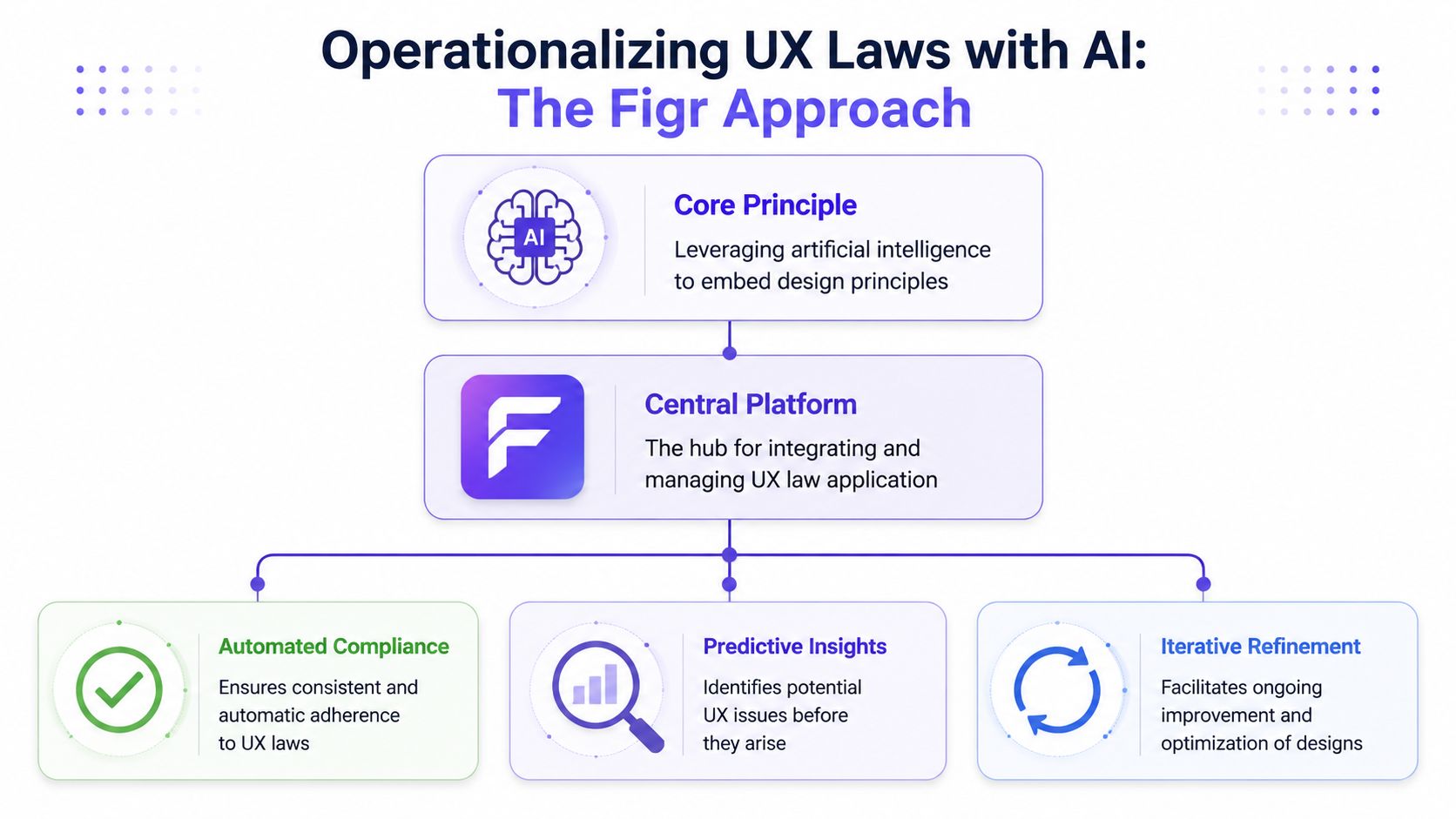
Figr approaches this through its Visual Context Graph, a model that connects five layers of product understanding:
Visual context. Screens, frames, and interface structure
Behavioral context. Recordings, flows, cursor paths, and interaction patterns
Design System context. Tokens, components, variants, and usage rules
Product Knowledge context. PRDs, research, decisions, and written intent
Implementation context. Code constraints and technical realities
That matters because most UX laws don't live in one file. Fitts's Law shows up in hit areas and button placement. Jakob's Law shows up in repeated conventions across flows. Tesler's Law shows up in where complexity lands after a product decision.
For a deeper look at this shift, I'd point to how AI transforms product design, especially the idea that context matters more than raw generation.
Here's the video walkthrough:
A practical workflow for applying laws consistently
If I were setting this up on a team, I'd make it operational in steps:
Step 1. Load product context.
Use live screens, design files, recordings, research notes, and flow history.
The goal is to review actual product behavior, not isolated artboards.Step 2. Audit recurring interaction patterns.
Look for overloaded menus, weak hierarchy, small targets, inconsistent forms, and hidden states.
Tie each issue to the relevant law.Step 3. Review conflicts, not only violations.
Ask where one law is harming another.
A dense B2B workflow may need different tradeoffs than a consumer signup.Step 4. Turn principles into repeatable checks.
Build review habits around target size, grouping, visibility, progressive disclosure, and state clarity.
Keep the laws close to the design system and flow logic.
The benefit isn't that AI replaces judgment. It's that judgment gets more grounded when context is already assembled.
Your First Step Toward Principled Design
The fastest way to use UX laws design well is to stop trying to memorize all ten laws at once.
Pick one law and take it into your next review. That's enough. You don't need a giant checklist to start changing the quality of your decisions.
In my experience, teams get more value from one sharp diagnostic question than from a wall of design doctrine. Ask whether the settings page is forcing too many decisions at once. Ask whether the primary action is physically easy to reach. Ask whether a user has to remember too much across steps. Those questions create traction because they point to something visible.
A simple way to use these laws this week
Use this workflow in your next critique or product meeting:
Step 1. Choose one law before the review starts.
Hick's Law works well for cluttered navigation.
Fitts's Law works well for mobile actions and dense controls.Step 2. Inspect one screen, not the whole product.
Pick a setup flow, dashboard, modal, or table.
Narrow scope makes better judgment possible.Step 3. Name the tension out loud.
Say what the law suggests, then say what might conflict with it.
That's how better tradeoffs enter the room.Step 4. Propose one change only.
Group options differently.
Enlarge one target.
Re-space one form section.
Questions worth bringing into critique
A few prompts I'd keep handy:
For Hick's Law: Are we exposing too many choices at once?
For Fitts's Law: Is the action easy to hit when the user is moving quickly?
For Miller's Law: What does the user have to remember across this flow?
For Jakob's Law: Are we fighting familiar behavior without a strong reason?
For Tesler's Law: Did we simplify the task, or only move complexity somewhere less visible?
You don't need a law for every pixel. You need a law that clarifies the next design decision.
That's why I teach these as lenses, not commandments. They help you see where friction is coming from. They also help you explain design decisions in language that Product Managers and engineers can act on.
The grounded takeaway is simple. Open one active screen today, pick one law, and write down one improvement you'd test first. That habit compounds quickly because it trains your eye to connect user behavior with design structure.
If you want help applying these ideas against real screens, flows, and design system constraints, you can try Figr.
FAQ
How do I start learning laws of UX without getting overwhelmed?
I start with three: Hick's Law, Fitts's Law, and Jakob's Law. They cover decision-making, physical interaction, and familiarity, which gives you a strong base fast.
Are UX laws design rules or guidelines?
I treat them as heuristics. They're strong guiding principles, but real products often force tradeoffs between them.
Which UX law helps most with onboarding flows?
Hick's Law is usually my first lens for onboarding because too many visible choices slow people down. Tesler's Law is a close second when setup complexity is unavoidable.
Does Miller's Law mean I should never show more than seven items?
No. I use it as a reminder to reduce memory burden, not as a rigid screen limit. Visible, well-grouped information works differently from information users must recall.
How do I bring UX laws into team reviews?
I'd choose one law before the review and use it to frame feedback on one screen. That keeps the conversation concrete and makes tradeoffs easier to discuss.