
This guide is your Rosetta Stone. It covers the essential UML diagram types that product and engineering teams use to build software. We will move beyond abstract definitions to show you exactly which diagram to grab for which task. From mapping complex interactions in a feature like Dropbox's file upload to defining test cases for a critical flow, like freezing a card in a fintech app.
You will learn not just what each diagram is, but how to use it as a tool for thinking.
This is your blueprint before the build, a way to make sure everyone is looking at the same plan before the first line of code is written.
1. Class Diagram
Think of your product's code as a city. A Class Diagram is the blueprint for its buildings. It doesn't show people moving inside, the behavior, but it shows the static structure: the buildings themselves (classes), their rooms (attributes), and what you can do in them (methods). It is the architectural drawing.
Among all UML diagram types, this one is the bedrock of object-oriented system design. A Class Diagram represents the static structure, detailing classes, their properties, their functions, and the relationships between them. For product and engineering teams, this diagram is the common language for defining the system's data model.
When to Use a Class Diagram
When do you need to establish a shared understanding of the core concepts in your system? This is the tool. It's most effective during the early design phase of a new feature to map out the data structures required.
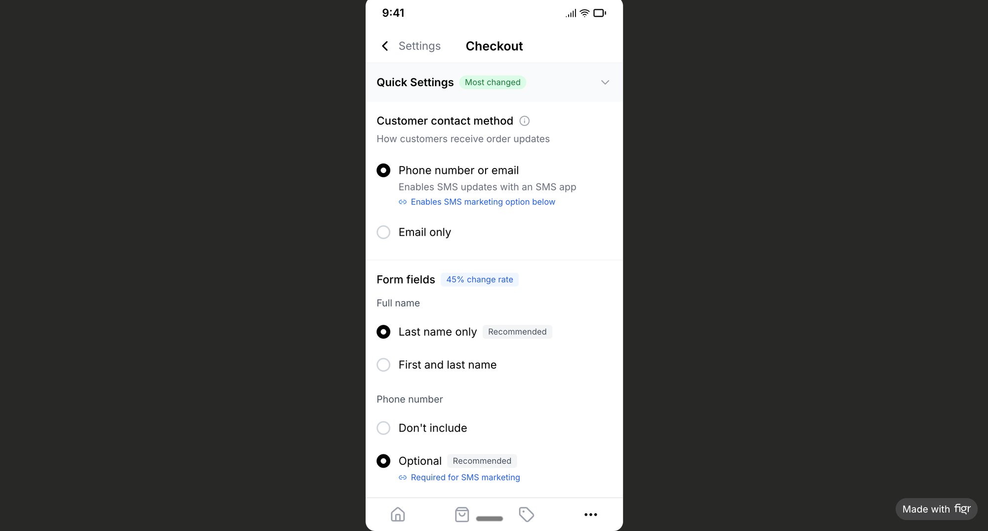
For instance, before building a new checkout flow, a product manager can use a Class Diagram to align with engineering on the definitions of a Product, an Order, and a Customer. This prevents costly architectural misunderstandings. As an example, a well-defined information architecture for a Shopify checkout setup, like in this redesigned flow, is often backed by clear class relationships.
Actionable Tips for Product Teams
- Focus on the Core: Don't map the entire system. Focus on the 3-5 classes most critical to the feature.
- Clarify Relationships: Use composition for "has-a" relationships (an
Orderhas aCustomer) and inheritance for "is-a" relationships (aPremiumUseris aUser). - Inform UI Components: The structure in your Class Diagram can directly inform your design system. If a
Userclass has aprofilePictureattribute, your component for a user avatar should reflect that.
2. Use Case Diagram
If a Class Diagram is the city's blueprint, a Use Case Diagram is the map of its public transportation system. It shows who uses the system (actors) and what they can do with it (use cases). It’s the user’s perspective of the city, showing all possible journeys. It answers the fundamental question: what can people actually do here?
A Use Case Diagram captures the functional requirements of a system by showing how actors, like users or other systems, interact with it. For product teams, this is the bridge between user needs and technical implementation. It visualizes the "what" before engineering dives into the "how." Among the various UML diagram types, this one is a direct link to the user's experience.
When to Use a Use Case Diagram
Use a Use Case Diagram during product discovery to define the scope of what you’re building. It forces clarity on who the users are and what functionality they require.
For example, when designing a project management tool, you'd map out the interactions for different actors. A Team Member might have use cases like "Create Task" and "Comment on Task," while a Project Admin would have "Manage User Permissions" and "Generate Report." This visual scope helps teams prioritize. For instance, creating effective user experience flows often begins with a clear understanding of these core use cases.
Actionable Tips for Product Teams
- Map to User Stories: Each use case bubble should correspond directly to one or more user stories. The "Create Task" use case becomes the epic for stories like "As a user, I want to add a title" and "As a user, I want to set a due date."
- Identify All Actors: Go beyond the primary end-user. Consider
Support Staff,Administrators, or even externalAPI Servicesthat interact with your system. - Use Clear Language: Name your use cases with simple, action-oriented verbs that match the language your team and users already use, like "Withdraw Funds" or "Update Profile," not "Execute Transactional Debit."
3. Sequence Diagram
If a system’s code is a city, a Sequence Diagram is a GPS tracker following a delivery truck on its route. It's not about the buildings or the city map, but about the specific, time-ordered journey: stop one at the warehouse, stop two at the customer, stop three at the bank. It captures the 'what happens next' of your system.
A Sequence Diagram visualizes how objects or components interact over time. It shows the order of messages exchanged between actors and systems, making it essential for understanding complex workflows. Among the UML diagram types, this one excels at making complex interactions understandable.
When to Use a Sequence Diagram
Use a Sequence Diagram when the timing and order of operations are critical. It's perfect for mapping out real-time processes, API calls, or any user flow where multiple systems must coordinate.
Last week I watched a PM use one to debug a login flow. She pinpointed exactly where a token validation was failing between their service and a third-party authenticator. A friend at a fintech company told me they map every payment flow this way. It visualizes the entire process from "Pay Now" to "Payment Confirmed," identifying potential points of failure before development starts.
Actionable Tips for Product Teams
- Separate Paths: Create one diagram for the ideal "happy path" and separate diagrams for key error scenarios, like a failed payment. This keeps each diagram clean. Mapping out these edge cases for a Dropbox upload failure is a perfect use case.
- Number Your Messages: Clearly number each message sequentially (1, 1.1, 1.2, 2) to show the precise execution order and which messages are responses to others.
- Use
altFrames for Logic: Use "alternative" frames to show conditional logic. Analtframe can represent an "if-then-else" choice, like showing different paths for a successful vs. declined credit card charge.
4. Activity Diagram
If your product is a theatrical play, an Activity Diagram is the script for a single scene. It shows an actor's movements (activities), their choices (decisions), and what happens when two actors interact (concurrent flows). It is the director's guide for mapping a dynamic sequence of events.
An Activity Diagram models the dynamic flow of activities, decisions, and workflows within a system. For product teams, it’s a crucial tool for untangling complex processes. Among UML diagram types, it is the best for visualizing process flow.
When to Use an Activity Diagram
Use an Activity Diagram when you need to document a process with multiple steps or decision points. It's perfect for mapping an onboarding sequence, an approval workflow, or an order fulfillment system.
This is what I mean: mapping the flow for a new user signing up, verifying their email, and setting up their account helps identify drop-off points before development starts. The visual nature is far more intuitive than text. Beyond traditional UML, understanding how to build a better product with a user flow diagram offers a complementary view. Many powerful diagramming tools, which are solid Microsoft Visio alternatives, can help create these quickly.
Actionable Tips for Product Teams
- Use Swimlanes: Assign lanes to different actors (
User,System,Admin) to show who is responsible for each action. - Isolate Decisions: Clearly mark every decision node (a diamond shape). Ask: what happens at this fork? This is where user friction and edge cases, like those in this Dropbox upload failure map, are born.
- Model All Paths: Don't just chart the ideal course. Map what happens when a payment fails, an email link expires, or a user wants to go back.
- Cross-Reference with Analytics: If you're modeling an existing flow, overlay your diagram with real user data. Where are users actually dropping off? Your assumptions might be wrong.
5. State Machine Diagram
Time is not a conveyor belt; it is a switchboard. A State Machine Diagram maps this switchboard for a single object. It shows every possible state it can be in (pending, shipped, delivered) and the specific events that flip a switch, triggering a change from one state to the next.
A State Machine Diagram, a key part of the UML diagram types, models the dynamic behavior of an object through its lifecycle. It shows the transitions between states and the events that cause them. For product and engineering, it’s the definitive guide for implementing predictable logic.
When to Use a State Machine Diagram
Use a State Machine Diagram when an object's behavior changes significantly based on its current state. It's invaluable for modeling user-facing features with multiple stages, like a form workflow (draft, submitted, approved) or a subscription status (active, paused, cancelled).
For instance, a PM working on a file upload needs to define what happens if the network drops. Mapping failure modes as states (uploading, paused, failed, retrying) ensures a robust experience, as seen in this analysis of Dropbox's upload failure states. This diagram prevents ambiguity.
Actionable Tips for Product Teams
- Map the Full Lifecycle: Start by listing every possible state an object can be in, from creation to deletion.
- Define Guard Conditions: For each transition, specify the exact rule that must be true for it to occur. For example, a transition from
pendingtoconfirmedmight requirepayment.isSuccessful(). - Plan for the Unexpected: Actively brainstorm and include error states (
failed,timeout,invalid) and the recovery paths from them. This turns a diagram into a resilience plan.
6. Component Diagram
Think of your software as a high-end stereo system. A Component Diagram is the back panel, showing the various boxes: the amplifier, the streamer, the turntable. It shows which cables connect where and how they rely on each other. It shows the physical, modular parts and how they are wired together.
A Component Diagram visualizes the organization of a system's deployable parts and their dependencies. It offers a high-level architectural view. Among the different UML diagram types, this one is crucial for planning microservice architectures and managing large-scale system integrations.
When to Use a Component Diagram
Use a Component Diagram when making architectural decisions affecting multiple teams. It’s perfect for visualizing a move to microservices, planning a major third-party integration, or explaining the existing architecture to new team members. It acts as a higher-level map, much like how a system context diagram provides a bird's-eye view.
When breaking a monolith into microservices, a Component Diagram can show the proposed UserService, OrderService, and PaymentService. This helps everyone see the new boundaries and dependencies, preventing surprises.
Actionable Tips for Product Teams
- Map to Teams: For large organizations, align components with the teams that own them. This clarifies responsibility.
- Show External Dependencies: Clearly illustrate all third-party services like Stripe for payments or SendGrid for emails. This highlights external risks.
- Identify Bottlenecks: Use the diagram to trace dependencies. A single component required by many others could be a potential bottleneck.
- Keep it High-Level: Avoid showing individual classes. Focus on major architectural blocks like "Web Frontend," "API Gateway," or "Database."
7. Deployment Diagram
If your code is a city, a Deployment Diagram is the utility and zoning map. It shows where the power plants (servers), water towers (databases), and cell towers (edge devices) are physically located. It answers the crucial question: where does our software actually live and run?
A Deployment Diagram visualizes the physical deployment of software artifacts on hardware nodes. It illustrates how components are distributed across servers and devices, which directly impacts availability and performance. For product and engineering teams, it is the master plan for infrastructure.
When to Use a Deployment Diagram
Use a Deployment Diagram when planning for performance, scalability, or redundancy. It is essential when launching in new geographic regions, migrating cloud providers, or understanding the physical constraints your software operates within.
For instance, when designing a SaaS platform for global scale, a Deployment Diagram can map how European traffic is routed to a Frankfurt server cluster while North American traffic hits a Virginia data center. This visual planning helps foresee latency issues and data residency compliance (like GDPR) before a single server is provisioned.
Actionable Tips for Product Teams
- Map to Reality: Your diagram should mirror your actual cloud infrastructure. Label nodes with names from your AWS, Azure, or Google Cloud setup.
- Show Redundancy: Explicitly draw fallback connections and backup servers. This clarifies your resilience strategy.
- Inform Rollout Strategy: Use the diagram to plan canary deployments. Which servers get the new feature first? The diagram makes this conversation specific.
- Document Compliance: If certain nodes must comply with specific regulations (like HIPAA), annotate them directly on the diagram.
8. Object Diagram
If a Class Diagram is the blueprint of a building, an Object Diagram is a photograph of one specific apartment at 3:15 PM on a Tuesday. It captures a moment in time, showing concrete instances of your classes and the data they hold. It's the system's runtime state frozen for inspection.
An Object Diagram represents specific instances of classes and their relationships at a particular point. Unlike Class Diagrams which show abstract definitions, Object Diagrams show concrete examples, making them invaluable for understanding complex scenarios and testing assumptions.
When to Use an Object Diagram
Use an Object Diagram to clarify a complex interaction or visualize a specific system state. It’s perfect for exploring "what-if" scenarios or for documenting critical test cases.
For instance, designing a "card freeze" feature requires certainty about the state of the card, user, and account objects before and after the freeze. An Object Diagram can model this specific state change, which can then be used to generate clear test cases, like in this Wise card freeze flow analysis. This makes abstract class relationships tangible.
Actionable Tips for Product Teams
- Model Critical Scenarios: Create Object Diagrams for key test cases, especially for complex state transitions like a user upgrading their subscription mid-cycle.
- Show Real Data: Use plausible data values. Instead of
userName: string, useuserName: "JaneDoe". This grounds the diagram in reality. - Document API Payloads: Use Object Diagrams to provide a crystal-clear example of what an API response should look like for a specific request.
9. Communication Diagram
If a Sequence Diagram is a movie script, a Communication Diagram is the cast and crew contact list. It tells you who talks to whom. It focuses on the network of relationships between objects, showing the pathways of interaction rather than the chronological timing.
A Communication Diagram (formerly a collaboration diagram) maps the interactions between objects, emphasizing the links between them. It uses numbers to show the sequence of messages, making it one of the essential UML diagram types for visualizing the structural organization of communicating objects.
When to Use a Communication Diagram
Use a Communication Diagram when the architecture of connections is more critical than the strict sequence of events. Is your AuthenticationService a bottleneck talking to five other services? This diagram makes that obvious.
For example, when designing a restaurant ordering system, a product manager can use this to show how a CustomerApp talks to an OrderProcessor, which in turn messages the Kitchen and Payment services. This map of interactions helps validate communication paths before a single API is built.
Actionable Tips for Product Teams
- Number Your Messages: Use sequential numbering (1, 2, 3) to show the order of messages.
- Group Related Messages: Use nested numbering (e.g., 1, 1.1, 1.2) for messages that are part of the same parent interaction.
- Focus on Relationships: Use this diagram type when your main goal is to understand which components need to be connected, not the exact timing of their calls.
- Validate Performance Paths: When optimizing a feature, use this diagram to trace the message paths. Are there too many hops between the user action and the database call?
10. Interaction Overview Diagram
If a Sequence Diagram is a single scene, an Interaction Overview Diagram is the storyboard for the entire film. It shows how different scenes connect to tell a complete story. It is the high-level map that reveals the branching paths a user might take.
An Interaction Overview Diagram provides a big-picture view of the control flow between different interactions. It's a hybrid, blending the high-level flow of an Activity Diagram with the detail of Sequence Diagrams. It’s invaluable for visualizing complex user journeys with multiple scenarios.
When to Use an Interaction Overview Diagram
Use this diagram when a single user journey involves multiple, distinct interaction sequences. It's perfect for mapping complex features where you need to see both the forest and the trees.
The basic gist is this: when designing a mobile app's onboarding, you have different paths for a new user versus a returning one. An Interaction Overview Diagram can show the initial "Is User New?" decision point. The "Yes" path leads to a "Create Account" sequence, while the "No" path triggers a "Login" sequence. This approach helps manage complexity, much like mapping out all possible user flows, including edge cases for a feature like Zoom's network degradation states.
Actionable Tips for Product Teams
- Start with Major Decisions: Identify the key decision points in the user journey that cause the flow to branch. This is your diagram's skeleton.
- Reference Detailed Diagrams: Instead of cluttering the overview, use frames to reference specific Sequence Diagrams for the detailed steps. Label them clearly (e.g., "ref: Successful Payment").
- Label Your Paths: Clearly annotate the conditions that lead down each path.
- Map All Endpoints: Ensure every path resolves. Explicitly show success, failure, and recovery flows. A journey that hits a dead end on paper will create a frustrated user in production.
11. Package Diagram
Think of your growing software as a massive library. A Package Diagram is your library's floor plan, showing how you group books into sections: "Billing," "User Management," "Search." It shows the high-level organization and which sections depend on others, preventing your architecture from becoming a tangled mess.
A Package Diagram illustrates how a system is organized into logical groupings, called packages, and shows the dependencies between them. For product leaders, it is the primary tool for visualizing architectural boundaries. Among the various UML diagram types, this one provides the bird's-eye view needed to manage complexity.
When to Use a Package Diagram
Use a Package Diagram during high-level architectural planning or when refactoring a large monolith. It's essential for aligning multiple teams on ownership.
For example, when planning a large SaaS application, you can map out packages for auth, user-management, billing, and reporting. This helps define clear API boundaries and prevents the billing team from creating a brittle dependency on an internal component of the user-management package.
Actionable Tips for Product Teams
- Organize by Domain: Group classes into packages based on business function (
Payments,Inventory) rather than technical type (Controllers,Models). - Enforce One-Way Dependencies: Aim for a clear, directed flow of dependencies. A
UIpackage might depend on aServicespackage, but theServicespackage should never depend on theUI. - Map to Team Structure: Whenever possible, align package ownership with team structure. If you have a "Search" team, they should own the
searchpackage.
12. Timing Diagram
If most diagrams show what happens, a Timing Diagram shows precisely when it happens. Think of it as a musical score for your software. It tracks the state of objects along a timeline, marking the exact moments a state changes in response to an event.
A Timing Diagram is an interaction diagram that details how objects behave over a specific period. For product teams working on real-time applications, this diagram translates abstract requirements like "fast" into concrete, measurable constraints. It is one of the most specialized UML diagram types, invaluable for systems where milliseconds matter.
When to Use a Timing Diagram
Use a Timing Diagram when the sequence and duration of events are critical. It’s essential for designing real-time systems, complex animations, or any interaction where timing affects usability.
Consider a video conferencing app like Zoom. A PM can use a Timing Diagram to define the exact sequence for a user joining a call: audio stream enables, video stream starts 100ms later, and the "participant joined" notification appears within 50ms. Mapping these network-dependent scenarios, as seen in this analysis of Zoom’s resilience, requires a focus on timing that this diagram provides.
Actionable Tips for Product Teams
- Set Performance Budgets: Use the diagram to allocate time. If the total page load must be under 1 second, define how many milliseconds each component gets.
- Show Constraints Visibly: Don't just show what happens; show the time limits. Add a constraint like
{ response < 200ms }to make performance requirements explicit. - Validate Your Assumptions: A Timing Diagram is a hypothesis. Use performance monitoring tools to measure if the live system actually meets the timing constraints you defined.
From Blueprint to Conversation
We've journeyed through the landscape of UML. It's easy to look at these UML diagram types and feel overwhelmed. A new language with its own grammar and vocabulary.
But thinking of them as rules to be memorized is the wrong frame.
A better way to see it is as a set of lenses. Each diagram is a specialized lens you can attach to your mind's eye to bring a different aspect of your product into focus. Need to see the system from the user's perspective? Use Case Diagram. Need to follow a request as it bounces between services? Sequence Diagram. Need to understand how the system physically exists on servers? Deployment Diagram.
Mastery isn't in knowing every symbol. Mastery is in diagnosing your team's confusion and knowing which lens will provide the most clarity, right now.
This is the critical shift: diagrams are not just artifacts to be delivered. They are tools for focusing a conversation. They are instruments for achieving shared understanding, which, as Grady Booch, one of UML’s original architects, noted in his book The Unified Modeling Language User Guide, is the true purpose of modeling. The goal is not the diagram itself, but the clarity the diagram produces. Why does this matter at scale? Because misaligned teams build misaligned products. The economic cost of rework dwarfs the initial cost of alignment every single time.
In short, your next step isn’t to master all twelve types.
Instead, pick one.
Identify the most common point of ambiguity in your current sprint.
- Are you re-explaining what a "user" is? Start with a simple Class Diagram.
- Do engineers keep asking "what happens after the user clicks this?" Grab an Activity Diagram.
- Are you struggling to explain failure states? A State Machine Diagram is your best friend. A great example is mapping all failure states for a file upload, as seen in this Dropbox analysis of edge cases.
Start small. Find one recurring problem and apply one specific diagram. Use it to facilitate one meeting. Watch how it changes the quality of the questions asked. You stop talking past each other and start building together.
That is the real work.
Tired of watching good ideas get lost in translation? What if you could generate user flows, state diagrams, and even test cases directly from your product requirements? Figr is an AI-powered toolkit that helps product teams visualize complexity and move faster. Turn your product specs into clear visual artifacts and ensure everyone is building from the same blueprint by visiting Figr.