
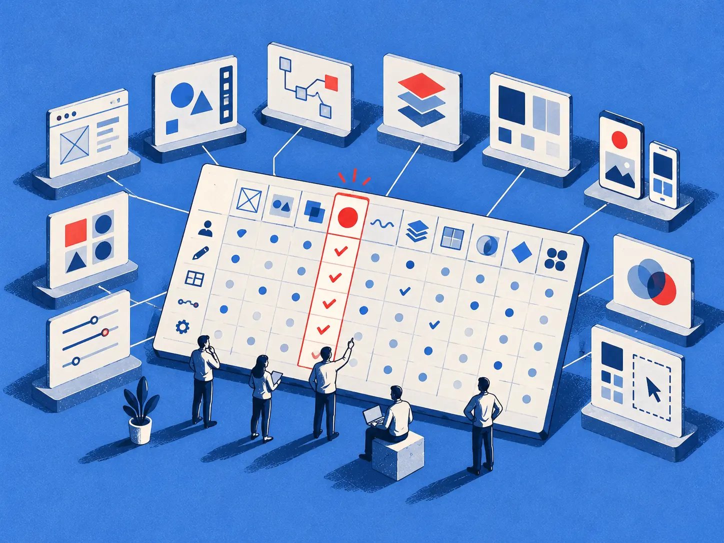
A product team has a polished prototype, a stalled handoff, and three people opening different UI design tools to explain what went wrong. The screens look convincing, yet the components don't match production, edge cases remain untested, and nobody can say which decisions the developers should trust.
When teams choose by screenshots or feature volume alone, the cost appears later. Designers rebuild mismatched components, product managers repeat validation, engineers interpret incomplete states, and the team changes its workflow just to accommodate a tool that solved the wrong bottleneck.
The better approach is to compare tools by the work they help a product team complete, the constraints they introduce, the pricing information they disclose, and the point at which each becomes the sensible choice. The strongest option may be a collaborative canvas, a logic-heavy prototyping environment, a live publishing system, or an AI design agent grounded in the existing product.
The best UI design tool is the one that fits your team's next bottleneck.
1. Figr
Context arrives too late in many redesigns. Existing tokens, analytics signals, forgotten edge cases, and production constraints often surface only after the visual direction has been approved.
Figr targets that gap with an AI design agent. A one-click Chrome capture can bring in a live product, while Figma design systems and tokens provide the surrounding structure. Figr retains decisions across sessions and turns that context into product artifacts, including PRDs, mapped user flows, accessibility reviews, test cases, edge-case discoveries, and high-fidelity prototypes that can export back to Figma.
The resulting unit of work is broader than a screen. The assistant reasons over the product a team already operates, rather than decorating an empty canvas without its constraints.
Where Figr earns its place
Figr analyzes 200,000+ screens and can connect to analytics to benchmark funnels, identify drop-offs, and recommend changes grounded in product data, as described by Figr's product overview. It can also flag decisions that drift from an imported component system, run accessibility checks, and retain the rationale behind UX trade-offs.
That workflow changes review responsibilities. Designers can test alternatives, product managers can examine likely user consequences, and QA can receive test cases tied more closely to design intent. The value is strongest when a team is improving existing software and needs context to travel with each decision.
- Best fit: Product managers, product leaders, UX researchers, designers, and QA teams working on existing software.
- Strongest advantage: It connects product context, design systems, analytics, UX reasoning, and handoff artifacts.
- Main constraint: Setup requires access to the live product, design system, integrations, and permissions.
- Commercial consideration: Public pricing is not listed, so teams need a demo or trial conversation to assess fit.
Figr is also designed for organizations with stricter controls, including SOC 2 Type II, SSO, and zero data retention. Those controls matter when a capture contains sensitive product information, but they do not remove the need for review. A senior designer or product lead still has to judge whether an AI recommendation fits the user, business objective, and technical reality.
2. Figma
A product team reviewing a new flow can open one browser file, inspect the interface, leave comments, and test a prototype without passing exports between tools. That shared workspace explains why Figma became a default for interface work: it reduced coordination overhead as much as it improved design execution.
Figma's browser-based multiplayer model became its defining advantage after launch in 2016. Sketch had launched in 2010 and become the industry standard for UI and UX design by 2015, while Figma made real-time browser collaboration central to the workflow, according to Spyglass Intelligence's history of design tools.
Its strongest job is distributed product design. Teams can move from wireframes to high-fidelity screens, prototypes, variables, tokens, shared libraries, and developer inspection in one environment. Dev Mode and integrations such as VS Code connections reduce the translation between a selected design property and the developer's working context.
The trade-off behind the default
That breadth creates setup and governance work. A small team that needs quick structure may find libraries, permissions, variables, Dev Mode, and AI credits harder to justify than a focused editor. Paid seats and usage-based concepts also mean finance teams should model who edits, reviews, inspects, and uses AI before comparing headline prices.
Figma's market position provides context, not proof of fit. One industry summary describes design tools as a $10B+ market and reports 10M+ Figma users, according to Spyglass Intelligence's history of design tools. Those figures indicate adoption and ecosystem reach, but they do not resolve the collaboration-versus-lightweight trade-off for an individual team.
Choose Figma when shared editing, component governance, and developer alignment are the main constraints. Test alternatives when the job is early structure, AI-assisted context, or a smaller workflow with less configuration. Teams comparing that AI dimension can review best AI design tools, particularly when product context matters more than generic screen generation.
3. Sketch
Sketch still makes a compelling argument for teams that value a focused, native Mac experience. Its editor is designed for macOS, supports offline work, and offers the precision many interface designers want when building vector assets, symbols, libraries, color variables, and prototypes.
A Mac-centric team can benefit from that deliberate constraint. The editor feels closer to a traditional professional application than a broad collaboration suite, which can make daily production work easier to handle. Sketch also provides a web app for review and commenting, plus real-time collaboration in the Mac application, version history, and developer inspection.
When focus beats universality
The decision turns on who needs to edit. If designers work on Macs and reviewers mainly comment through the web, Sketch can provide a clean operating model. If developers, product managers, or designers on other platforms need equal editing access, the platform's macOS-only editor becomes a structural limitation.
Sketch's pricing is comparatively easy to understand, with a subscription option and a perpetual Mac-only license option described on its official product site. That transparency can matter to a small design organization comparing recurring software commitments.
The genuine question is whether collaboration is a primary production activity or mostly a review activity. Figma treats the shared file as the center of team work. Sketch keeps the native editor at the center and extends collaboration around it.
That distinction affects onboarding, meeting habits, and handoff ownership. Teams should test a real library update and a real developer review, then compare how much work happens inside the editor versus around it. A practical evaluation should also include core UX principles, because a polished interface can still encode a weak interaction model.
4. Framer
Framer shortens the distance between a designed web interface and a published web experience. Its strongest use case isn't a complex authenticated application. It's the marketing site, campaign page, landing page, or product narrative that needs to move from responsive layout to live deployment without crossing several systems.
Designers and product managers can work on a visual canvas, build responsive layouts and components, connect a CMS, and publish with hosting included. Analytics integrations, an analytics and A/B testing add-on, and AI Agents with monthly credits support a workflow where the page itself becomes the experiment surface.
That makes Framer valuable when the next bottleneck is release speed for web content. The team can iterate on the actual page rather than treating the prototype as a separate artifact that someone else must rebuild.
The deployment trade-off
Framer's strength also defines its boundary. It is more website-centric than product-app UX, and its export flexibility is more limited than a workflow centered on code repositories. A SaaS product team building complex application behavior may find the visual publishing model attractive for its public site but insufficient for core product interfaces.
The commercial model exposes page, bandwidth, and CMS item limits, with scalable add-ons described on Framer's platform page. Those limits should be evaluated against publishing patterns, not only design-team size.
Ask one operational question: who owns the live result after approval? If designers can publish independently, Framer can reduce handoff overhead. If engineering must own every deployment, its central advantage becomes less important.
5. Axure RP
Some prototypes need to behave like systems before engineers build them. Axure RP is designed for that situation, with advanced interactions, conditional logic, variables, repeaters, realistic form states, and detailed documentation.
It's a strong choice for enterprise applications, business analysis, and workflows where the difficult question is not “does this screen look right?” but “what happens after this decision, input, error, permission, or state change?” A high-fidelity visual canvas alone won't answer that.
The logic-first choice
Axure Cloud hosts prototypes, documentation, and whiteboards, while team plans add co-authoring and revision history. Subscription plans include unlimited prototype hosting and reviewers, according to Axure's product information.
That hosting model supports broad review without requiring every stakeholder to become an editor. It also helps teams preserve behavior and specification together, which is useful when requirements need scrutiny before implementation.
The cost is cognitive load. Axure has a heavier learning curve than a quick wireframing tool, and its depth is excessive for an early workshop where the team only needs to agree on structure. Use it when logic is the uncertainty. Don't introduce it merely because high fidelity sounds more professional.
Practical rule: Choose Axure when an unresolved state or conditional path could change the product decision.
6. UXPin
UXPin addresses a familiar handoff failure: the design uses one set of components, while production uses another. Its Merge capability lets teams design with coded components from Storybook or Git, bringing production-oriented elements into the design canvas.
That creates a different kind of fidelity. The question isn't only whether the prototype resembles the final product. The question is whether the prototype is assembled from the same component logic developers maintain.
UXPin supports HTML, CSS, and JavaScript rendering, along with logic, states, and variables. AI-assisted prototyping and editor updates sit alongside collaboration features, but the core value remains the connection to an established React and design-system pipeline.
The governance prerequisite
UXPin works best when the organization already invests in component libraries. Integration takes time, and the team must maintain the relationship between the coded source and the design workflow. Without that discipline, Merge can become another system requiring ownership.
The benefit is reduced discrepancy at implementation. A designer can test a component closer to its production behavior, while a developer can review a more credible representation of the code-backed system. That can reduce arguments about whether a variation is feasible, because the constraint is visible earlier.
The platform's official UXPin information is the right place to verify available plans and integration details. Pricing transparency should be considered alongside setup effort, because a lower subscription cost would not compensate for a library that nobody maintains.
Choose UXPin when developer alignment is the bottleneck and your team is ready to treat the design system as shared infrastructure.
7. Penpot
Penpot appeals to teams that want the design file to speak more directly to the browser. It's open source, browser-based, and built around developer-friendly concepts such as native SVG and CSS-like layout models.
That matters for organizations concerned about vendor lock-in, open standards, or self-hosting. Penpot supports flex and grid-style layouts, design systems, tokens, and inspect functionality for handoff. Teams can use cloud hosting, a free tier, enterprise governance, or a self-hosted option.
The control argument
Penpot's strongest advantage is strategic rather than cosmetic. A team gains more control over where the tool runs and how its output relates to web implementation. That can be meaningful for organizations with infrastructure requirements or a preference for open formats.
The trade-off is ecosystem maturity. Penpot's plugin breadth is smaller than that of the largest incumbents, and some advanced workflows are still developing. A team that depends on a large catalog of integrations should validate its specific workflow before migrating.
The Penpot platform makes the case for a developer-aligned model, but the right evaluation involves more than inspecting a sample file. Import a real component, inspect its output, and ask an engineer to recreate the intended layout without interpretation.
Penpot is a sensible finalist when cost control, self-hosting, and CSS-like thinking carry more weight than ecosystem familiarity. It can also suit teams that want designers and developers to share a more literal language for layout.
8. ProtoPie
ProtoPie is for the moment when a static design stops answering the research question. Its variables, formulas, timelines, sensors, and cross-device interactions let teams model behavior that depends on movement, sound, timing, or device context.
That makes it especially useful for mobile, automotive, and IoT work, where realism changes what participants notice. A transition, sensor response, or multi-device interaction may affect comprehension in ways a standard click-through prototype won't reveal.
ProtoPie Cloud supports sharing, team libraries, and user testing add-ons. Its security and compliance materials include ISO 27001 and ISO 27701 information on the ProtoPie website, which regulated teams should verify against their own requirements.
A specialist layer, not always a replacement
ProtoPie commonly sits beside a visual design tool. A team might create the visual system in Figma or Sketch, then move the critical interaction into ProtoPie for research. That separation adds another tool and another handoff, but it can be justified when interaction realism is the uncertainty.
The learning curve rises with logic complexity. A simple tap-through may not justify the overhead, while a device-level prototype can. rapid prototyping for product teams becomes a question of learning value, not production speed.
Choose ProtoPie when you need participants to experience behavior, not merely inspect screens.
9. Balsamiq
Balsamiq protects early product conversations from visual polish. Its deliberately sketchy components and rapid click-through prototypes keep stakeholders focused on structure, flow, and content rather than debating color or spacing before the underlying idea is clear.
That makes it a natural fit for PM-led workshops. A product manager can create a rough flow, bring stakeholders into the conversation, and revise the structure without pretending that the interface has already reached design maturity.
Balsamiq Cloud adds AI-assisted wireframing, while exports and integrations with Jira and Confluence help connect early decisions to planning and documentation. The Balsamiq website provides the current product and plan details.
The deliberate stopping point
Balsamiq isn't intended for high-fidelity visual systems, detailed motion, or production handoff. That limitation is useful if the team needs to prevent premature approval. It becomes a problem when the same file is expected to carry the project through component governance and implementation.
The tool belongs at the structure stage. It helps answer whether users can move through the concept before the team spends effort making the concept attractive.
A useful workshop can move from Balsamiq into a more detailed environment once the flow survives scrutiny. Read what is a wireframe for the underlying distinction between structural exploration and visual specification.
10. Uizard
Uizard is designed for speed from idea to clickable mockup. Its Autodesigner can generate multi-screen concepts from text, while screenshot-to-UI and sketch-to-UI features help teams turn existing references or rough drawings into editable directions.
That makes Uizard useful when a PM, founder, or mixed-discipline group needs to compare concepts before a designer commits to a detailed system. Predictive heatmaps, AI image and review helpers, team libraries, private projects, and higher-tier CSS and React handoff broaden the workflow beyond a single generated screen.
Speed with a review obligation
Uizard's advantage is the short path from verbal idea to visual discussion. Its weakness is control. A professional designer working on a precise, token-heavy system may find the output less controllable than a mature vector editor, especially when AI quality varies by prompt and context.
The right scenario is early validation. Generate several directions, identify which flow deserves deeper work, then rebuild or refine it within the team's production system. Don't confuse a fast mockup with a governed interface.
Uizard's current capabilities and plan boundaries are available on its official product page. Teams comparing it with context-grounded systems should also consider design from your real product, particularly when the existing application matters more than a blank starting point.
Top 10 UI Design Tools Comparison
| Tool | Core focus | Key capabilities | Target users | Strengths & USP | Pricing & security |
|---|---|---|---|---|---|
| Figr (Recommended) | AI design agent grounded in live product context | One‑click Chrome capture, Figma tokens sync, Visual Context Graph, PRDs, flows, prototypes, analytics & accessibility checks, Figma export | PMs, product leaders, UX researchers, designers, QA teams | Data‑backed recommendations, enforces design system tokens, remembers decisions, 200k+ screen patterns, reduces rework | Demo / free trial, enterprise pricing on request; SOC 2, SSO, zero data retention |
| Figma | Collaborative cloud-first UI/UX platform | Real‑time multiplayer, Dev Mode (inspect/variables), libraries, plugins, AI credits | Cross‑discipline product & design teams, developers | Best‑in‑class collaboration, strong dev handoff, large ecosystem | Seat-based pricing, paid AI/Dev Mode usage, SSO/SCIM & org controls |
| Sketch | Mac-native UI design app | Native macOS editor, vector tools, Symbols, libraries, web review | Mac-centric designers & small design teams | Fast, polished macOS experience, clear licensing options | Paid licenses (Mac-only); web review + team plans available |
| Framer | Design-to-publish web & landing page platform | Responsive canvas, components, built‑in CMS & hosting, A/B testing, analytics | Designers, PMs, marketing teams building sites & experiments | Fast path from design to live site, good for experiments & marketing pages | Tiered plans with page/CMS limits, hosted service |
| Axure RP | High‑fidelity interaction prototyping & specs | Advanced interactions, conditional logic, variables, Axure Cloud, team co‑authoring | Enterprises, UX professionals, business analysts | Deep interaction modeling and edge‑case specs, robust documentation | Subscription plans, enterprise features (SSO, hosting) |
| UXPin | Code‑based design with production components | Merge with Storybook/Git, HTML/CSS rendering, logic & states | Teams with established React/design system pipelines | Tight design↔dev alignment using real production components | Paid plans; best value with invested component libraries |
| Penpot | Open‑source, browser-based design & prototyping | Native SVG, CSS‑like layouts, design tokens, cloud or self‑host | Teams seeking open standards, self‑host & cost control | No vendor lock‑in, developer-friendly output, self‑hosting option | Free tier, paid cloud/enterprise, self‑host available |
| ProtoPie | Device & sensor‑level interaction prototyping | Variables, timelines, sensors (tilt/sound), cross‑device testing, cloud sharing | Researchers, usability testers, mobile/IoT product teams | High realism for testing device interactions and complex animations | Subscription pricing, enterprise security (ISO certifications) |
| Balsamiq | Rapid low‑fidelity wireframing | Sketchy components, quick click‑through prototypes, Jira/Confluence exports | PMs, early‑stage teams, stakeholder workshops | Very low learning curve; focuses conversations on structure not polish | Affordable plans, Cloud & desktop options |
| Uizard | AI‑first rapid ideation & mockup generator | Text/screenshot/sketch → multi‑screen UI, predictive heatmaps, CSS/React handoff | Non‑designers, PMs validating concepts quickly | Extremely fast idea → clickable mockup flow | Tiered pricing with AI quotas; paid handoff tiers |
Choose the Bottleneck, Then Test the Fit
The market gives teams plenty of choice, but the decision is narrower than the category suggests. Interface design tools hold 82.3% market share and an average satisfaction score of 4.57/5 in the 2026 UX Tools Survey. That concentration signals a practical reality: many teams start with the dominant general-purpose tool, then discover that their actual constraint is logic, governance, deployment, accessibility, or context.
The broader economics point in the same direction. One market report estimates the design software market at USD 38.2 billion in 2024, with a projection of USD 75 billion by 2035 and a long-run CAGR of 6.4%. Another estimates the design, editing, and rendering software market at USD 68.65 billion in 2025, projecting USD 90.43 billion by 2030 at a 5.9% CAGR, as summarized in the design software market report. Different definitions produce different totals, but both point to a large category that continues to expand.
Mordor Intelligence estimates the UX design market at USD 13.06 billion in 2026, growing to USD 25.69 billion by 2031 at a 14.49% CAGR. Its analysis assigns tools 68.05% of market share and cloud deployment 65.10%, reinforcing the importance of tool-led, cloud-first workflows for enterprise and team-based UX work, as detailed in Mordor Intelligence's UX design market analysis.
The zoom-out matters. Teams aren't only buying drawing surfaces. They're choosing where decisions live, who can challenge them, how developers interpret them, and whether governance happens before or after code.
Accessibility changes the evaluation. Recent guidance frames accessibility as something that increasingly lives in the design system, where contrast, focus, typography, spacing, motion, and input flexibility can be encoded as tokens and rules. But tokens don't catch every real-world trap. Build-time linting, reading order, focus handling, and handoff annotations still need attention, as explained in guidance on tools for UI and UX work.
A design token system can become a repeatable control point rather than a naming convention. One study reported 100% WCAG 2.1 Level AA contrast compliance across all 40 tested color pairings, showing how token-level rules can enforce accessible color relationships, as documented in this design token accessibility thesis. A separate accessibility project also reported that all tested color token pairings passed WCAG 2.1 Level AA contrast requirements, reinforcing the value of repeatable token controls in its accessibility-focused design-token research.
That still doesn't make a single tool sufficient. A 2026 UX tooling guide identifies Figma-native Stark for WCAG checks, axe DevTools for browser-layer testing, and manual screen-reader passes for critical flows, reflecting a layered validation model in UXCam's UX tools guide.
Use this decision workflow before committing:
- Identify the next workflow bottleneck. Decide whether the unresolved issue is collaboration, structure, complex logic, component fidelity, accessibility governance, realism, or live publishing.
- Select two plausible tools. Keep the finalists close to the actual bottleneck, not to the largest feature list.
- Recreate one representative flow. Use a real product journey with its existing states, content, components, and edge cases.
- Test handoff and review effort. Ask a designer, developer, product manager, and QA partner to complete the work they normally perform.
- Check governance and total workflow fit. Review permissions, hosting, integrations, accessibility validation, setup ownership, and pricing directly with each vendor.
Figr deserves a close look when the team needs live product context, analytics-informed UX decisions, design-system enforcement, edge-case discovery, and production-ready artifacts. Its AI design agent is relevant precisely because it addresses the space between product understanding and interface production.
Run the same small product scenario through two finalists before committing. The tool that wins should reduce the next bottleneck in your real workflow, not merely produce the most attractive first screen.
Figr helps product teams turn live product context, analytics signals, design tokens, and existing patterns into UX reviews, flows, test cases, and high-fidelity artifacts. If your team wants a UI design tool that supports the reasoning behind the interface as well as the interface itself, visit Figr and test it against one representative product flow.