
The expert review UX method is a structured inspection of an interface by trained evaluators who check it against established usability principles, usually before user testing and without recruiting a single participant. It's the fastest way to find obvious violations, and the evidence on how much one reviewer catches is less flattering: a single evaluator finds an average of about 35% of the usability problems present. Three days before a release, a product manager asks in a channel whether anyone has walked the new onboarding flow since the redesign. Nobody has.
The gap turns into specific costs. An empty-state screen ships because the only person who saw it was on a happy-path demo. The failed-payment path ships unread. Then come the support tickets, the funnel drop nobody can attribute to a cause, and a meeting where three people argue about whether the problem is copy, layout, or data. Reviewing the interface earlier, against a named standard, settles some of that for the price of a few senior hours.
A better framing is to treat an expert review as a risk-screening pass. It produces a triaged, evidence-linked list of candidate problems, ranked and ready for validation, not a finished verdict on whether the interface works. That reframing changes what you do with the output, and it's the difference between a review that changes the product and a slide deck that gets filed. By the end you'll be able to scope a review to one flow, staff it with three independent reviewers, and route every finding either to a fix or to a test without arguing about taste.
What an Expert Review of UX Actually Covers
A product manager opens a checkout flow for the first time in months and finds a button that looks clickable and does nothing. It has looked that way since the redesign, and nobody flagged it, because nobody was reading the interface with a checklist in hand. That's the gap an expert review fills, and it fills it before you spend a single participant's time.
An expert review is a structured inspection of an interface by trained evaluators who check it against named usability principles, called heuristics, and report the violations they find. Evaluators work alone, on their own schedules, without a lab or a recruited audience.
What a review has to produce: every finding needs the principle it violates, the place in the interface where it happens, and a suggested fix. Observations without those three are design opinions with extra steps.
If you want the field list a review should be filling in, Figr's UX audit checklist covers the categories worth inspecting and the evidence to attach to each finding.
The closest analogue is a building inspection. An inspector doesn't live in the house, but knows where problems hide: the seal around a window, the slope of a drain, the breaker panel wired by someone in a hurry. A UX reviewer doesn't use your product daily, but knows the failure patterns that repeat across interfaces. Daily familiarity can make a reviewer worse at this, because you stop seeing the workaround you've internalized.
Heuristic evaluation became a foundational expert-review method when Nielsen and Mack published Usability Inspection Methods in April 1994, as NN/g's account of how heuristic evaluation works sets out. The efficiency comes from small-scale expert participation, and so does the limit: across six projects, a single evaluator found an average of only 35% of the usability problems present. The same account describes an early case study in which a heuristic-evaluation project cost about $10,500 against roughly $500,000 in expected benefits. Treat that as one projected estimate from a single historic project, not a ratio you can plan against.
In short, three questions decide whether the method earns a slot in your schedule:
- What it tells you that user testing can't. Mostly the violations you'd be embarrassed to spend participant time discovering.
- Who should hold the clipboard. Usually not the person who designed the screens.
- How to run it so the output gets acted on. Findings become tickets, tests, or documented declines, never a folder.
Expert Review Versus User Testing
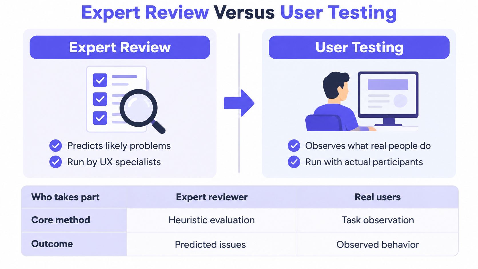
An expert review predicts likely problems. User testing observes what real people do. Teams get into trouble when they treat the first as a cheaper version of the second, because the evidence the two produce isn't interchangeable.
| Factor | Expert review | User testing |
|---|---|---|
| Who takes part | Trained evaluators inspect the interface alone | Representative users complete tasks while observed |
| Core question | Which usability principles does the interface violate? | Where do real users struggle, stall, or fail? |
| Setup effort | No recruited participants or lab needed | Recruit participants, script tasks, run sessions |
| Time to first findings | Often days, depending on reviewer availability | Set by recruiting and scheduling, not by the sessions themselves |
| Strength of evidence | Predicts likely problems; unconfirmed until tested | Observes actual behavior; results are limited to the sample |
| Best use | Early design review and pre-test triage | Validating high-impact tasks with real users |
| Blind spots | Cannot confirm real completion, errors, or abandonment | Cannot cover every screen or state in limited sessions |
Practitioners have paired the two methods for a long time. In a 1995 technology-transfer study of people who had taken a usability-inspection course, 50% of respondents reported using heuristic evaluation against 55% for user testing, and they rated average benefit at 4.5 and 4.8 respectively, from 42 completed responses (NN/g's summary of that technology-transfer study). In 2024, 50% of 444 UX professionals across 37 countries said they used heuristic or expert review (MeasuringU's 2024 survey of UX methods).
The sequence I'd recommend is fixed: run the review first, on the flow you're about to test, and use it to clear the violations that would waste participant time. Then spend user testing on tasks where behavior is uncertain, the ones where you can't predict from a principle whether people will finish.
What an expert review can't do is tell you whether users complete a task, where they abandon, or how long they hesitate. It has no observations to point at, only predictions with a rationale attached.
Scope is the other variable. A UX review evaluates an existing flow, while UX reasoning helps shape new flows, requirements, edge cases, and design decisions before or during creation. Figr's UX reasoning works on that second half, which makes it a pre-test tool rather than a substitute for research with users. If you're deciding which method fits a specific question, this comparison of methods for user research is a faster starting point than another debate in the design channel.
Who Should Run an Expert Review
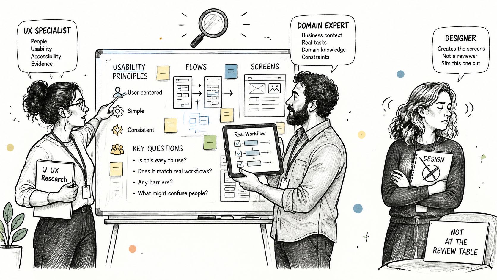
The best reviewers know usability principles and your product domain, and they did not design the screens in front of them. That last condition isn't a formality. Designers defend their own work, and a reviewer who sat through the design review inherits its assumptions.
Three profiles cover the work well:
- A UX specialist who knows the heuristics. This person runs the interface against the checklist and writes findings the way an editor marks a manuscript, specific and reproducible. They carry the standard.
- A product manager who knows the user goal and the business stakes. This reviewer catches the finding that is technically a violation and commercially irrelevant, and the one that costs revenue while breaking no rule. They carry the priority.
- An engineer or QA lead who can reach the states nobody demos. Empty data, permission errors, timeouts, retries after a failed request. They carry the conditions under which the interface runs.
Coverage is the argument for several people rather than one. Nielsen's case studies found detection probability averaged 42% for major problems and 32% for minor ones, and across six interfaces the method surfaced 59 major and 152 minor problems, far more than any single pass will list (NN/g's analysis of usability problems found by heuristic evaluation).
So the working rule: at least three independent reviewers for a high-stakes flow, each working alone before anyone compares notes. Independence is the entire mechanism. Put three reviewers in one room with one confident voice and the other two converge on that person's list.
Staffing cost: three people for one to two hours each, plus one consolidation meeting. That's the whole budget for most flows.
The design owner shouldn't run the review. They should receive every finding, answer each one with a decision, and own the follow-through, because a review whose findings get no response teaches the team that reviewing is optional.
Heuristic Checks and Severity Scale
A review is only as good as the lens the reviewer carries. Without a named standard you get preference dressed as analysis: the button feels heavy, the spacing feels tight, the empty state feels sad. Most expert review UX advice stops at naming the heuristics. The harder questions are what counts as a finding and how bad it is.
Ten Heuristics as the Inspection Lens
Nielsen's ten general heuristics are the usual starting set, and they're deliberately broad rules of thumb rather than product-specific requirements, as the heuristic set reproduced in a USPTO petition record shows. Breadth is the point: a heuristic gives the reviewer a defensible category, which is what separates a usability problem from a stylistic disagreement. If your team doesn't share that vocabulary yet, start with UX design fundamentals before the review, not during the argument.
| Heuristic | What the reviewer checks | Example failure |
|---|---|---|
| Visibility of system status | Feedback after each action and progress during waits | Upload stalls with no progress indicator |
| Match between system and real world | Labels and language familiar to the user | Field labeled with an internal database term |
| User control and freedom | Clear exits, undo, and cancel options | No way to stop a bulk action once it starts |
| Consistency and standards | Same action uses the same control and wording everywhere | Delete button is red on one screen and grey on another |
| Error prevention | Design blocks predictable mistakes before they happen | Form accepts a past date for a future booking |
| Recognition rather than recall | Options and context visible without memorization | Multi-step form hides required values from earlier screens |
| Flexibility and efficiency of use | Shortcuts for frequent users without burdening new ones | No keyboard path for repeated data entry |
| Aesthetic and minimalist design | Only relevant information competes for attention | Confirmation message buried under decorative banners |
| Recognition and recovery from errors | Error text names the problem and a way forward | Error reads only "Invalid input" |
| Help and documentation | Brief, task-focused help is available when needed | Help link leads to a general home page |
Accessibility Checks That Belong in Every Review
Accessibility is where a general review most often stops short, and the size of the gap is measurable. In 2024, 95.9% of the world's top one million home pages had detected WCAG 2 failures, with an average of 56.8 errors per page (WebAIM's million-page accessibility survey).
- Contrast on normal text. A minimum ratio of 4.5:1, which catches the grey-on-grey helper text that ships in a lot of design system defaults.
- Text spacing. Content has to stay usable when line height reaches 1.5 times the font size, paragraph spacing twice the font size, letter spacing 0.12 times the font size, and word spacing 0.16 times the font size, per the WCAG 2.2 success criteria.
- Gesture alternatives. Multipoint or path-based gestures need a single-pointer alternative unless the gesture is essential, which is the check that catches swipe-only carousels.
Automated tools catch the objective failures: missing programmatic names, hard contrast failures, obvious keyboard traps. What they can't tell you is whether a task can be completed with a screen reader, and W3C's guidance is explicit that testing may require automated tools, human judgment, or both, while Level AA requires satisfying every Level A and Level AA criterion (W3C's guidance on WCAG conformance). Record the criterion, the component and its state, the input method, the browser or assistive technology, and the conformance level for every defect. "Improve readability" is not a ticket.
Scoring Severity on Impact, Frequency, and Persistence
Rating is where a review becomes a prioritization tool or a pile of noise. Score impact first, frequency second, persistence third, and rate on user effect rather than on how annoying the fix looks.
| Rating | Meaning | What happens to it |
|---|---|---|
| 0 | Not a usability problem | Close it and note the disagreement |
| 1 | Cosmetic breach with no observed effect | Batch into the backlog |
| 2 | Minor friction users can work around | Backlog, grouped by screen |
| 3 | Major, blocks or seriously slows a task | Validate before building a fix |
| 4 | Catastrophic, prevents completion on a key path | Validate this week and consider a stopgap |
Route 3 and 4 findings on conversion-critical paths to validation before anyone builds a fix, because a severity score is a prediction and the expensive ones deserve evidence. Send 1 and 2 to the backlog and batch them by screen so the fixes don't arrive one at a time. Include the boundary case: a clear guideline violation with no observed effect on behavior can still rate a 1, and saying so out loud buys credibility for the ratings you do defend.
The triage question a product manager needs answered is what evidence would confirm this finding and what it costs to wait. A useful framework links each finding to its confidence, the affected task or segment, expected behavioral impact, the evidence required for confirmation, and the cost of delay, which is exactly the handoff Clay's guide to heuristic evaluations leaves under-specified.
How to Run an Expert Review Step by Step
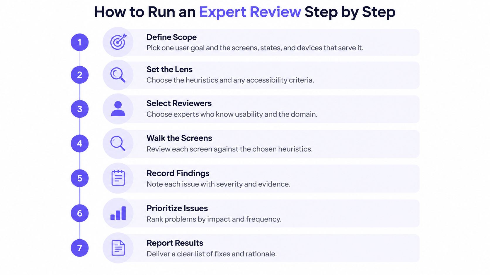
The steps below assume three reviewers and one flow. They still work with one reviewer, as long as you write that limitation into the report.
Scoping to one high-value flow isn't arbitrary. Baymard's benchmark of 344 leading US and European ecommerce sites scored checkout flows against more than 110 guidelines and found 65% performing at a mediocre level or worse, only 2% rated good, and an average of 32 distinct checkout improvements available per site, with an estimated average potential conversion increase of 35% from better checkout UX (Baymard's checkout usability research). Those figures describe ecommerce checkout in that sample. The habit they support travels: weight the rubric, inspect the highest-value steps first, tie fixes to a measurable outcome.
Step 1. Define the scope.
Pick one user goal and the screens, states, and devices that serve it.
Before polished screens get reviewed, walk the user journey, its branches, and the decisions nobody has made yet. A whole-app sweep degrades into a skim by screen twelve.Step 2. Set the lens.
Choose the heuristics and any accessibility target, such as WCAG 2.2 AA, in writing.
A shared lens is what lets two reviewers' lists merge later without a fight about definitions.Step 3. Brief the reviewers and keep them apart.
Give each person the same checklist, the same task, and the same deadline.
Independence before consolidation is the mechanism that produces coverage. Cross-contamination is the most common way a three-person review performs like a one-person review.Step 4. Walk the task as a first-time user, then against the heuristics.
First pass: complete the flow without shortcuts and note every hesitation.
Second pass: go heuristic by heuristic, including the ones you don't expect to find anything under.Step 5. Record every finding with its evidence.
Location, interface state, violated principle, reproduction path, severity guess, suggested fix, screenshot.
A finding without a reproduction path gets argued about instead of fixed.Step 6. Consolidate, then rate severity.
Merge duplicates, count how many reviewers saw each issue, and discuss disagreements before scoring.
Issues that two or more reviewers found independently are the reliable ones, and their severity is usually the one that holds.Step 7. Hand off to tickets and validation.
Convert findings into tickets, test cases, and regression checks, each with the metric that will show the fix worked.
Findings that never become test cases come back in the next release, in the same state.
Worked example, hypothetical. Three reviewers walk an invoice upload flow and return 9, 7, and 6 findings. Merged, they produce 14 unique issues. Four of those appear in two or more reviewers' lists and move to the top of the queue, ahead of the five that only one reviewer saw and couldn't corroborate. The team fixes the four, tests two of them in the next round of usability sessions, and logs the rest with a note on who reported them and what evidence would settle the question.
Where Expert Reviews Mislead and How to Guard Against Them
A checkout flow can look clear in a screenshot and still fail when a payment is declined. Expert reviews are risk-screening passes: they surface likely problems and produce findings to validate, not a final verdict on the interface.
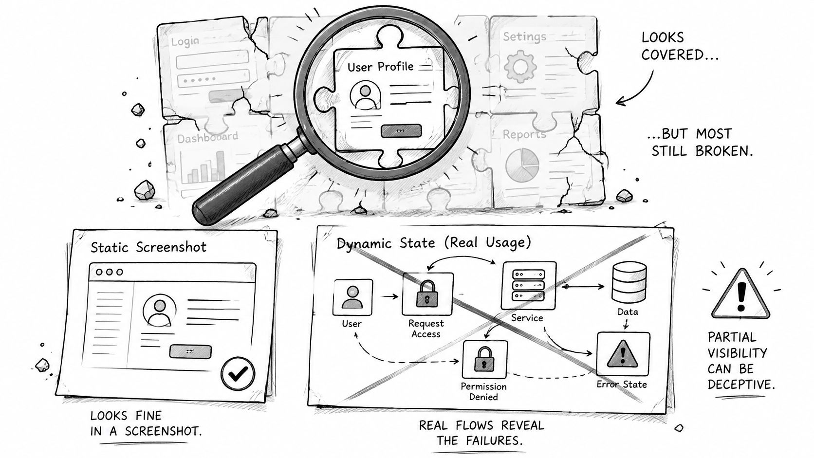
A polished report can make partial coverage look complete. Watch for four limits:
- One reviewer, incomplete coverage. A list of 12 findings says what one person noticed, not what the interface contains.
- Static screens, hidden states. Permissions, empty data, latency, and repeated use can expose problems a screenshot cannot. A declined payment needs to be triggered before that path can be assessed.
- Guideline breach, uncertain impact. A reviewer may flag a usability principle that has little effect on users, while missing friction specific to the product or its real-world use.
- AI-generated findings, uncertain validity. A model can produce many plausible issues quickly, but each still needs evidence and human review.
One comparative study found that GPT-4o identified only 21.2% of the issues found by human experts, surfaced 27 additional issues, performed better on aesthetic and real-world-match heuristics than on flexibility, user control, and efficiency, and produced false positives (the 2025 comparative study of GPT-4o against expert review). Treat automated findings as candidates. Check each against the live interface, record which ones a person confirms, and keep unverified suggestions out of the team's decision log.
The same discipline applies to human reviews. Prioritize findings by likely user impact, link each to the state and evidence that prompted it, and identify what would confirm or disprove it. Set the success measure before filing tickets. Choosing the right UX metrics helps connect a proposed fix to an outcome the team can assess.
Figr can ask UX questions before a feature is designed, helping teams consider missing states while shaping the feature. Its findings can inform the review, but the team still needs to verify them and make the final UX decisions.
Frequently Asked Questions
How does an expert review differ from user testing?
An expert review predicts likely problems by inspecting the interface against usability principles. User testing observes real people attempting tasks and records what they do. The first needs no participants and produces a ranked list of candidates; the second needs recruited users and produces evidence of behavior. Use the review to decide what to test, not to replace the test.
How many reviewers does an expert review need?
Three independent reviewers is the practical minimum for a high-stakes flow. Each walks the interface alone with the same checklist, then the group consolidates and counts how many reviewers saw each issue. A single reviewer beats nothing if the report states the limitation, but one person's list will miss most of what's there.
How long does an expert review take?
Plan one to two hours per reviewer for a single flow, plus a consolidation session of about an hour. That's a planning estimate, not a measured benchmark. The consolidation is where most of the value gets created, because comparing independent lists separates reliable findings from one person's hobbyhorse.
Can AI run an expert review?
AI can widen a first pass, but it can't close the loop. In published comparisons against human experts, a general-purpose model found far fewer of the same issues and added some that didn't exist. Use AI to generate candidate findings and systematic coverage, require evidence for each one, and have a person confirm before anything enters the tracker.
What does an expert review cost?
Budget senior hours and one consolidation meeting. A three-reviewer pass on one flow is a handful of hours plus the write-up, which is small next to recruiting and running a moderated study. Treat historical cost-benefit figures from the method's early case studies as projections, not rates you can build a budget on.
Who owns the findings?
The design owner receives and answers every finding. Reviewers inform the decision; they don't make it, and they shouldn't be the ones deciding what ships. The design owner responds to each item with a fix, a test, or a documented reason to decline, and that response log is what makes the next review taken seriously.
Schedule Your First Expert Review This Sprint
Imagine a product manager reviewing a new onboarding flow the week before release. She assumes the design is finished, then notices nobody has checked what a brand-new workspace looks like before any data exists, or what the screen shows when a card payment fails.
The practical move is smaller than it feels. Choose one user goal, one flow, and three reviewers. Book a 90-minute session for each person, share the same checklist, and collect findings in one sheet with fields for severity, interface state, and evidence. Consolidate within two days, while the interface is still fresh, and send the top five to the design owner with a screenshot and a reproduction path attached to each one.
The rule that keeps it honest: if a finding can't be reproduced, it's a hypothesis. Label it that way and give it an owner and a deadline, or drop it.
The reason this compounds is structural. Every flow you add, every role you introduce, every integration you wire up multiplies the states an interface can be in. Three reviewers can hold one flow in their heads; nobody can hold forty. The review becomes a coordination tool, a shared record of what the team believes the interface does under pressure, which is why the artifacts matter as much as the fixes.
The reviewers' job is to inform the decision, not to make it. The team still decides what gets fixed, and designers still review, refine, and apply judgment to every proposed change before anything ships. If the work has to fit an existing cadence, treat the review as an input to agile sprint planning rather than a separate ceremony with its own kickoff.
Start with the one flow that has the highest drop-off or generates the most support tickets. Write its user goal in a single sentence, name three reviewers, and book the sessions this week.
Figr is built to run the first pass of exactly this work: capture your live product, then let the agent flag usability issues, missing states, accessibility risks, and product-logic gaps, with prioritized fixes tied to specific locations so your reviewers start from a marked-up interface instead of a blank sheet. It doesn't make the final call. Your team still reviews, refines, and decides what changes. Point it at the flow you just named and see what the first pass turns up at Figr.