
FIGR / UI TEMPLATE
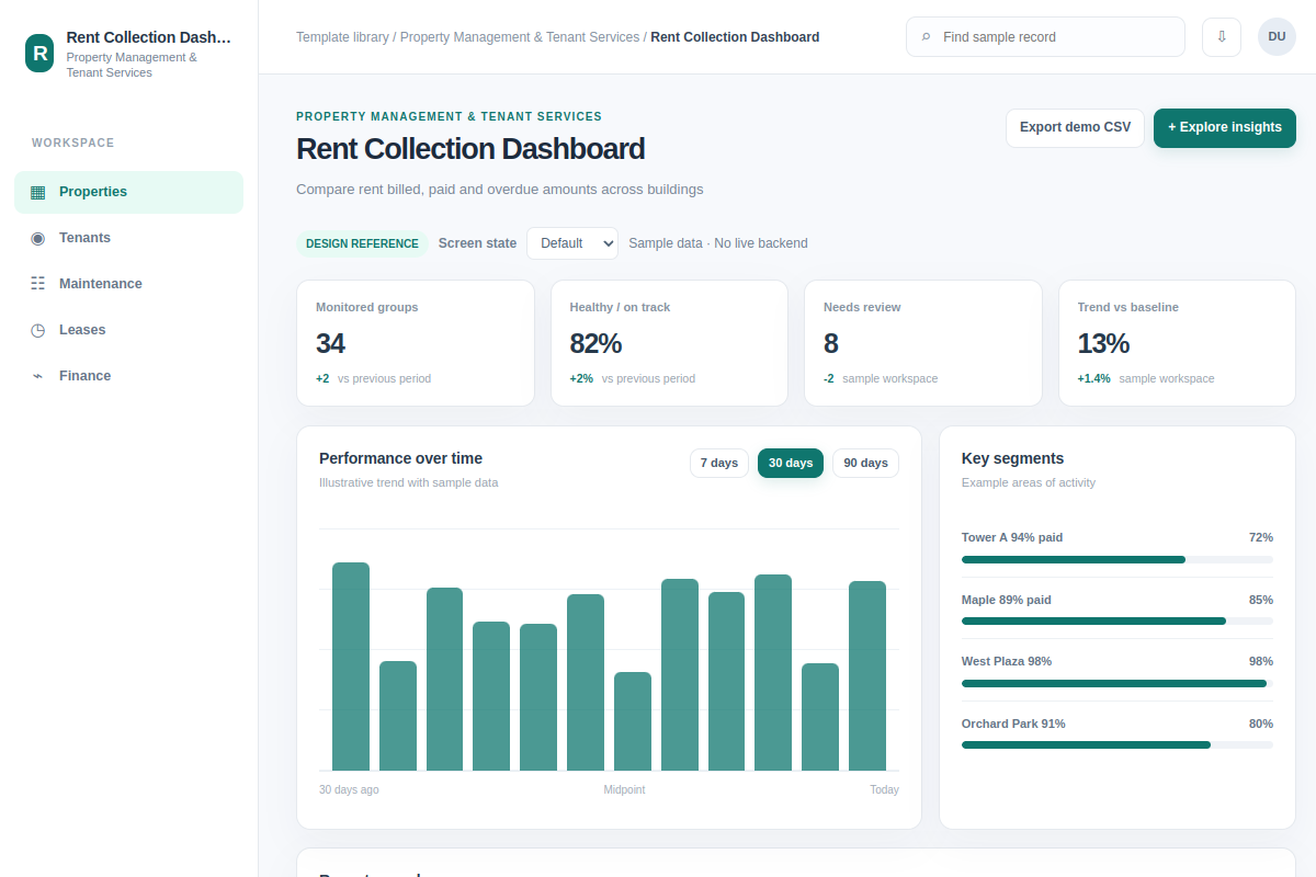
Compare rent billed, paid and overdue amounts across buildings.
Explore how to explore insights in Property Management & Tenant Services software. This analytics includes Tower A 94% paid and Maple 89% paid. Adapt the sample workflow to your product and design system. Records and metrics are fictional.
BUILD ON THIS
Explore this screen, then bring in your own product and design system to shape the next version.
Analytics
Explore insights
analytics with status, filters and selected-record details
Default, Selected, Filtered, Empty, Loading, Warning, Error, Success
Independent product UI reference; no 1mg assets
Review Tower A 94% paid and Maple 89% paid, identify blockers and explore insights with the correct owner and status in view.
Properties → Tenants → Explore insights
analytics, record search, selection, status chips, filtering, action feedback
Show metric units and time periods; never confuse zero with missing data.
Adapt Rent Collection Dashboard to our existing product and design system. Inspect our current layouts, components, flows and permissions before changing anything. We need to explore insights for records such as Tower A 94% paid and Maple 89% paid. Explore two useful approaches, then design default, selected, filtered, empty, loading, warning, error and success states that our designers can keep editing. Example records are fictional.
KEEP EXPLORING
Browse other product UI examples, compare patterns, and pick the direction that suits your product.