
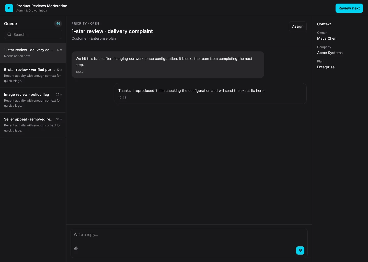
Moderate product reviews with rating, text, images, policy flags, purchase verification, seller context, and approve or remove decisions. This example brings Queue and Flagged together so administrators and growth teams can find the next task without losing context.
It includes representative records such as 1-star review · delivery complaint and 5-star review · verified purchase. Use the screenshot to study the layout, then adapt its components and product states to your own design system.
Inbox
Review next
Inbox
Default, loading, empty, error, permission, success
Configurable product UI theme
Product and growth teams need to review next while keeping waiting, flagged and exceptions visible. The interface should show what changed and who should act next.
Queue → Flagged → Review next → Review outcome
Inbox, Queue, Flagged, contextual actions, error recovery
Keep the current item close to its history, owner and urgency. Put the next action on the record rather than making people open several panels.
Pay attention to queue and flagged. People need to distinguish 1-star review · delivery complaint from 5-star review · verified purchase. Keep waiting visible, especially when a record changes owner or status.
Before this screen reaches handoff, verify keyboard focus, empty and permission states, and what happens after someone chooses “Review next”. Make error recovery as clear as the happy path.
Related screen examples to explore next: Seller Onboarding, Marketplace Search, Loyalty Program.
Design a product reviews moderation screen inside our existing product. Use our current components, tokens and content language. Include Queue and Flagged views, credible records like 1-star review · delivery complaint, and a clear “Review next” action. Use our product permissions and show loading, empty, error and success states. Keep the output editable in Figma.