
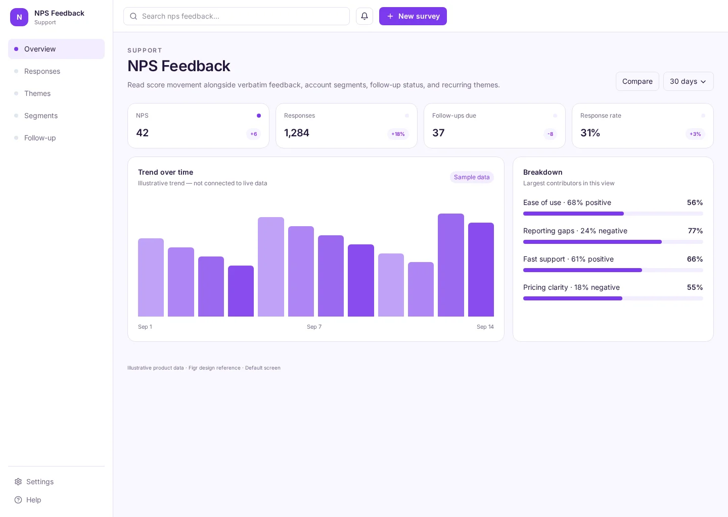
Read score movement alongside verbatim feedback, account segments, follow-up status, and recurring themes. The screen connects Overview and Responses so support agents can find the “New survey” action while checking nps and responses.
Use this reference when you need to design this workflow inside an existing product. The example includes practical records such as Ease of use · 68% positive and Reporting gaps · 24% negative, rather than an empty visual shell.
Analytics
New survey
Analytics
Default, loading, empty, error, permission, success
Adaptable product UI theme
Support agents need a clear “New survey” action without losing sight of nps, responses and the affected records. Keep the decision and its outcome clear before moving to the next task.
Overview → Responses → New survey → Review outcome
Analytics, Overview, Responses, Themes, accessible states, contextual actions
Make time ranges, filters and metric units clear. Show the data behind each trend so readers can test what changed.
In this design, people should be able to compare Ease of use · 68% positive with Reporting gaps · 24% negative. Make nps clear, then use responses to explain whether the next step needs attention.
Before handing this to a designer or engineer, check keyboard focus, error copy, permissions and what happens after they choose the “New survey” action. The happy path alone is not enough.
Related UI examples: Customer Health, Knowledge Base, Help Center Admin.
Design a nps feedback screen for our existing software product. Use our real design-system tokens, components and product language. Show Overview and Responses, include believable records such as Ease of use · 68% positive, and make new survey easy to find. Map loading, empty, failure, permission and success states before you create editable high-fidelity screens.