
FIGR / UI TEMPLATE
Report nonprofit impact across beneficiaries, outputs, outcomes, geography, targets, cost per outcome, program performance, and funder metrics.
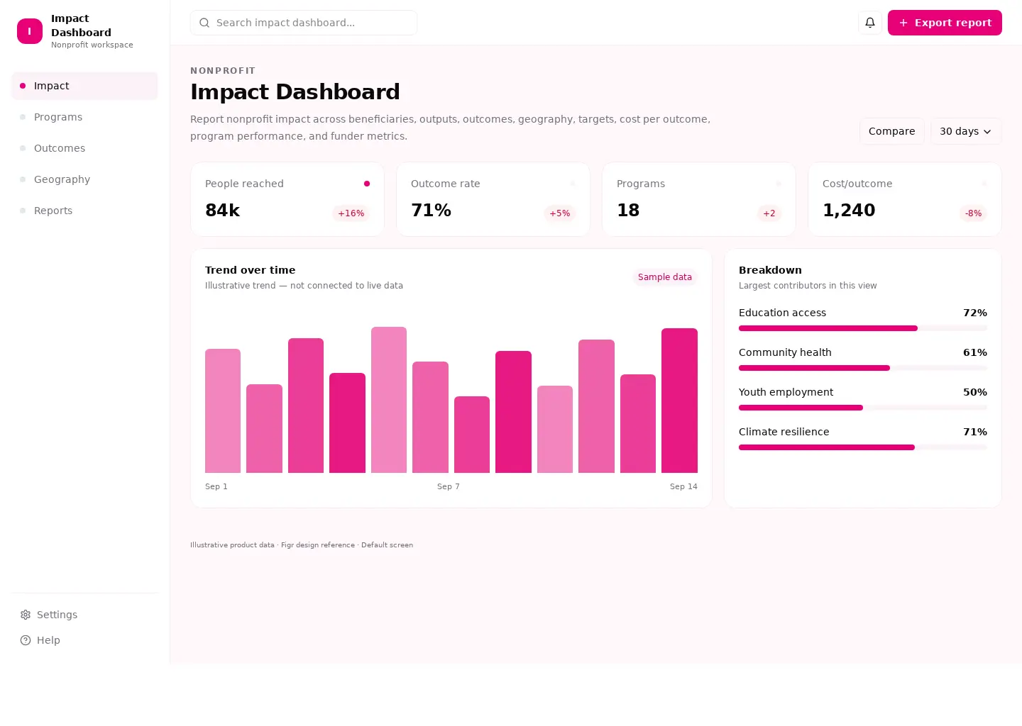
This analytics reference covers nonprofit & fundraising. Its sample screen includes Education access and Community health and the Export report action. Adapt its workflow to your product and design system.
BUILD ON THIS
Explore this screen, then bring in your own product and design system to shape the next version.
Analytics
Export report
Impact Dashboard analytics
Default, loading, empty, error, permission, success
Adaptable product UI theme
The impact dashboard screen supports “Export report” while keeping impact and programs in view. It should show the current state even when data is missing or access is restricted.
Impact → Programs → Export report → Review result
Impact Dashboard analytics, Impact, Programs, permission handling, error recovery
Keep metric definitions, chart periods, and filter context visible together
In this example, Education access is one of the records worth checking. Keep the sample data clearly separate from a live system.
Show why numbers changed; distinguish delayed data from genuine zero values
Make a useful drill-down available before teams export or share findings
Design a impact dashboard screen for an existing nonprofit & fundraising product. Use our actual design system, components, and content rules. Cover Impact and Programs, include believable records such as Education access, and make "Export report" easy to find. Map empty, loading, error, permission, and success states. Keep the result editable in Figma.
KEEP EXPLORING
Browse other product UI examples, compare patterns, and pick the direction that suits your product.