
FIGR / UI TEMPLATE
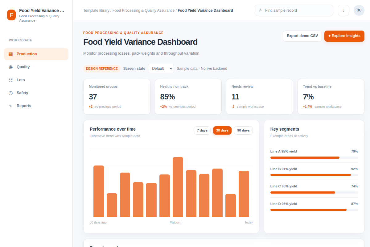
Monitor processing losses, pack weights and throughput variation.
Explore how teams explore insights in Food Processing & Quality Assurance software. This analytics shows records such as Line A 95% yield and Line B 91% yield. Adapt the flow to your own product and design system. All data is fictional.
BUILD ON THIS
Explore this screen, then bring in your own product and design system to shape the next version.
Analytics
Explore insights
analytics with searchable sample records and selected-record details
Default, Selected, Filtered, Empty, Loading, Warning, Error, Success
Independent product UI reference; no 1mg design-system assets
Review Line A 95% yield and Line B 91% yield, spot issues and explore insights while retaining the current owner and status.
Production → Quality → Explore insights
analytics, record selection, search, filters, status chips, task feedback
Label the metric period and units; distinguish missing values from zero.
Adapt Food Yield Variance Dashboard inside our existing product. First inspect our screens, flows, permissions, components and design tokens. Help us explore insights using examples like Line A 95% yield and Line B 91% yield. Compare two layouts, cover default, selected, filtered, empty, loading, warning, error and success states, then create an editable UI our designers can keep working on. Treat the example records as fictional.
KEEP EXPLORING
Browse other product UI examples, compare patterns, and pick the direction that suits your product.