
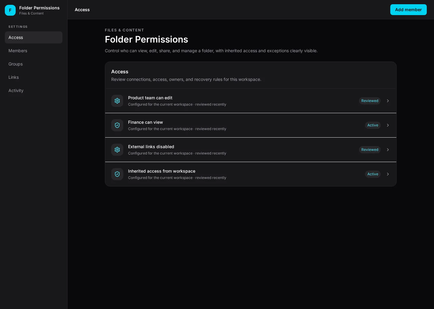
Control who can view, edit, share, and manage a folder, with inherited access and exceptions clearly visible. This example brings Access and Members together so content and product teams can find the next task without losing context.
It includes representative records such as Product team can edit and Finance can view. Use the screenshot to study the layout, then adapt its components and product states to your own design system.
Settings
Add member
Settings
Default, loading, empty, error, permission, success
Configurable product UI theme
Product teams need to add member while keeping members, editors and exceptions visible. The interface should show what changed and who should act next.
Access → Members → Add member → Review outcome
Settings, Access, Members, contextual actions, error recovery
Separate safe everyday choices from risky changes, show who can edit them, and confirm irreversible actions.
Pay attention to access and members. People need to distinguish Product team can edit from Finance can view. Keep members visible, especially when a record changes owner or status.
Before this screen reaches handoff, verify keyboard focus, empty and permission states, and what happens after someone chooses “Add member”. Make error recovery as clear as the happy path.
Related screen examples to explore next: Template Gallery, Archive & Restore, Editorial Review.
Design a folder permissions screen inside our existing product. Use our current components, tokens and content language. Include Access and Members views, credible records like Product team can edit, and a clear “Add member” action. Use our product permissions and show loading, empty, error and success states. Keep the output editable in Figma.