
FIGR / UI TEMPLATE
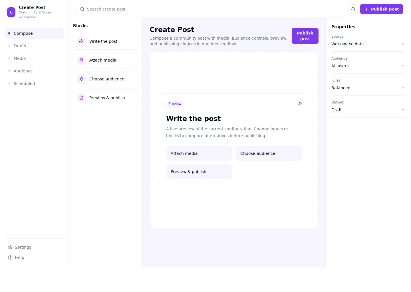
Compose a community post with media, audience controls, preview, and publishing choices in one focused flow.
This builder reference covers community & social. Its sample screen includes Write the post and Attach media and the Publish post action. Adapt its workflow to your product and design system.
BUILD ON THIS
Explore this screen, then bring in your own product and design system to shape the next version.
Builder
Publish post
Create post
Default, loading, empty, error, permission, success
Adaptable product UI theme
The create post screen supports “Publish post” while keeping compose and drafts in view. It should show the current state even when data is missing or access is restricted.
Compose → Drafts → Publish post → Review result
Create post, Compose, Drafts, permission handling, error recovery
State input requirements before the user submits the form
In this example, Write the post is one of the records worth checking. Keep the sample data clearly separate from a live system.
Keep progress and entered values when people move between steps
Show clear permission, validation, and recovery states near the affected control
Design a create post screen for an existing community & social product. Use our actual design system, components, and content rules. Cover Compose and Drafts, include believable records such as Write the post, and make "Publish post" easy to find. Map empty, loading, error, permission, and success states. Keep the result editable in Figma.
KEEP EXPLORING
Browse other product UI examples, compare patterns, and pick the direction that suits your product.