

Your shipped interface drifts from the design system faster than many realize, and the drift usually hides in plain sight.
I've seen the moment up close: a designer opens a live screen next to its Figma source and spots six divergences in under a minute, wrong spacing token, a hardcoded color, a button variant that doesn't exist, missing focus styling, an inconsistent empty state, and copy that no longer fits the component. Left alone, those small breaks turn into support friction, slower implementation, duplicate components, accessibility issues, and redesign debates built on opinion instead of evidence.
A good UI audit turns that fog into a diagnosis. It gives the team a point-in-time read on what shipped, what drifted, what matters most, and how to feed those findings back into the system so the next release starts cleaner.
What Exactly Is a UI Audit?
A UI audit is a point-in-time diagnostic that compares the shipped product against the design system and source designs.
That definition matters because teams often blur audits with ongoing quality checks. Design QA happens throughout delivery. A UI audit happens after drift already exists and you need a clear read on the gap. It answers a tighter question: where does the live product no longer match the system it claims to follow?
I call that gap Design System Drift. Most designers know the feeling before they have language for it. A modal looks mostly right, but the spacing is off. A destructive action uses the wrong color token. A dropdown behaves differently in two nearby flows. Nobody made one catastrophic decision. The product just slid away from its own rules.
The audit is a corrective event
When teams say, “the UI feels inconsistent,” they're usually talking about several categories of mismatch at once:
Token drift: spacing, color, radius, elevation, typography values no longer map to the system
Component drift: engineers improvised a variant, or design created one-off patterns outside the library
State drift: loading, empty, error, hover, focus, disabled, and success states don't line up
Behavior drift: interactions differ across screens even when the components look related
That's why a UI audit is more than a visual tidy-up. In one audit write-up, a team found 47 dead features still occupying product space, even though users described the product as confusing while analytics showed no obvious errors, as described in this UI audit case study. That's a familiar pattern. Teams keep adding, very little gets removed, and the interface starts carrying old decisions that no longer earn their place.
Practical rule: If your team keeps discussing a visual refresh before it can explain where the product drifted from the system, you probably need an audit before a redesign.
A UI audit also gives stakeholders a better frame than “the Designer wants polish.” It ties visible inconsistencies to task completion, maintainability, and product clarity. If you need a broader foundation on user interface design, that primer helps, but the audit itself starts where theory stops and shipped reality begins.
I've also found it useful to show teams examples from firms that work extensively in implementation-heavy environments, such as NiKa Consulting Group, because they remind people that design quality lives or dies in the handoff between intent and execution.
Why Does Shipped UI Drift from the Design System?
Shipped UI drifts because product delivery rewards motion long before it rewards consistency.
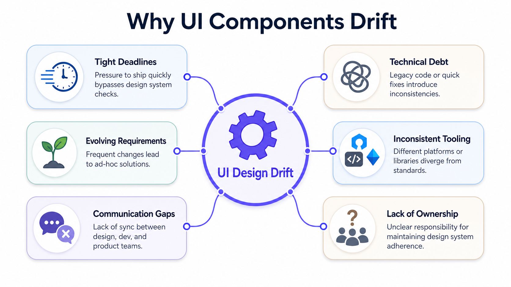
Teams generally don't deliberately choose to violate the system. Drift arrives through normal work. A release gets squeezed. A component almost fits, so somebody patches it. Requirements shift after engineering starts. Documentation lags behind code. The design file gets updated, but staging still runs an older pattern. You've lived this, haven't you?
Drift is usually a systems problem
The basic gist is this: drift compounds when no one owns the relationship between the system and the shipped interface.
A team can have an excellent component library and still ship inconsistent screens if:
Delivery pressure wins daily: the shortest path to release beats the correct path to consistency
Source-of-truth confusion persists: Figma, docs, Storybook, and code don't all say the same thing
Legacy constraints distort decisions: technical limitations show up as visual compromise
Ownership is fuzzy: nobody is explicitly responsible for correcting drift after release
That last point matters more than is often acknowledged. If the system has owners but the shipped product does not, the gap expands every sprint.
Most audits stop too early
There's another issue that makes drift harder to fix. Many audits identify visual problems but never connect them to business movement. Maze's UX audit analysis notes that only 12% of enterprise teams systematically track whether identified UI issues caused quantifiable drops in retention or conversion before the audit. So teams generate a backlog, feel productive, then struggle to prove why those fixes matter.
That's why I push people to think beyond “consistency.” Consistency is useful, but consistency alone won't win headcount or sprint capacity. A better question is: where is drift creating confusion, slowing tasks, or obscuring value?
For a stronger foundation on this pattern, the Figr guide to understanding Figma design inconsistencies captures the day-to-day ways those mismatches appear, and the broader design systems guide helps frame the operational side.
Teams rarely suffer from a lack of standards. They suffer from a lack of active alignment between standards and shipping.
If you want an external read on why interfaces become harder to use when consistency breaks down, NN/g's writing on interaction design and consistency remains worth revisiting through Nielsen Norman Group.
How to Prepare for Your First UI Audit
Your first UI audit goes better when you treat it like an investigation, not a cleanup session.
Preparation is where most avoidable friction shows up. People start reviewing screens before they agree on scope. Someone is missing access to staging. The design file is outdated. The engineering team points to a different component definition than the one the design team is reviewing. Then the audit slows down before it has even produced a useful finding.
Set the scope before you open a single screen
A small scope beats a vague one. Start with a product area that has real user traffic or obvious inconsistency. Good audit scope usually looks like a flow, a feature family, or a platform slice.
Use this framing:
Choose a surface: onboarding, checkout, settings, dashboards, approvals
Choose an environment: production first when possible, staging if production access is constrained
Choose a reference set: design system library, current Figma files, coded component docs, recent release notes
A friend at a growth-stage software company told me their first audit stalled for a week because half the team was comparing production to an old branch of the design library. That's common. Audits don't fail from lack of effort. They fail from mixed references.
Gather the right people and artifacts
You don't need a giant working group. You need the few people who can answer the awkward questions fast.
Bring in:
A Designer: to interpret component intent and system usage
An engineer: to explain implementation constraints and reused patterns
A Product Manager: to tie the work to priority and product risk
Collect:
Live screens: desktop and mobile where relevant
Figma source files: current, not archived
Design system docs: tokens, variants, states, usage notes
Analytics views: enough to understand critical flows and drop-off areas
Accessibility tools: at minimum, one automated checker plus manual review setup
For teams that need browser automation help when collecting states and flows, this breakdown that helps compare Playwright, Selenium, and Apify is a useful companion resource. It won't run the audit for you, but it does help you choose a practical capture approach.
Decide how you'll store findings
Before the audit starts, agree on one report format. That can be a spreadsheet, a project board, or a structured Figma page. What matters is consistency.
Working rule: Every finding should answer four things, where it appears, what the system expects, how severe it is, and what should happen next.
If those fields aren't defined up front, the audit turns into a pile of screenshots with opinions attached.
The Core Audit Workflow A Step-by-Step Guide
A repeatable workflow turns the UI audit from pixel-policing into a reliable operating habit.
I still do parts of this manually, because some problems only become obvious when you click through the product like a real user. But I'm candid about the trade-off. Manual screenshot collection is slow, boring, and easy to do inconsistently. If you've ever named files “final-screen-check-v3-actual-final,” you know the pain.
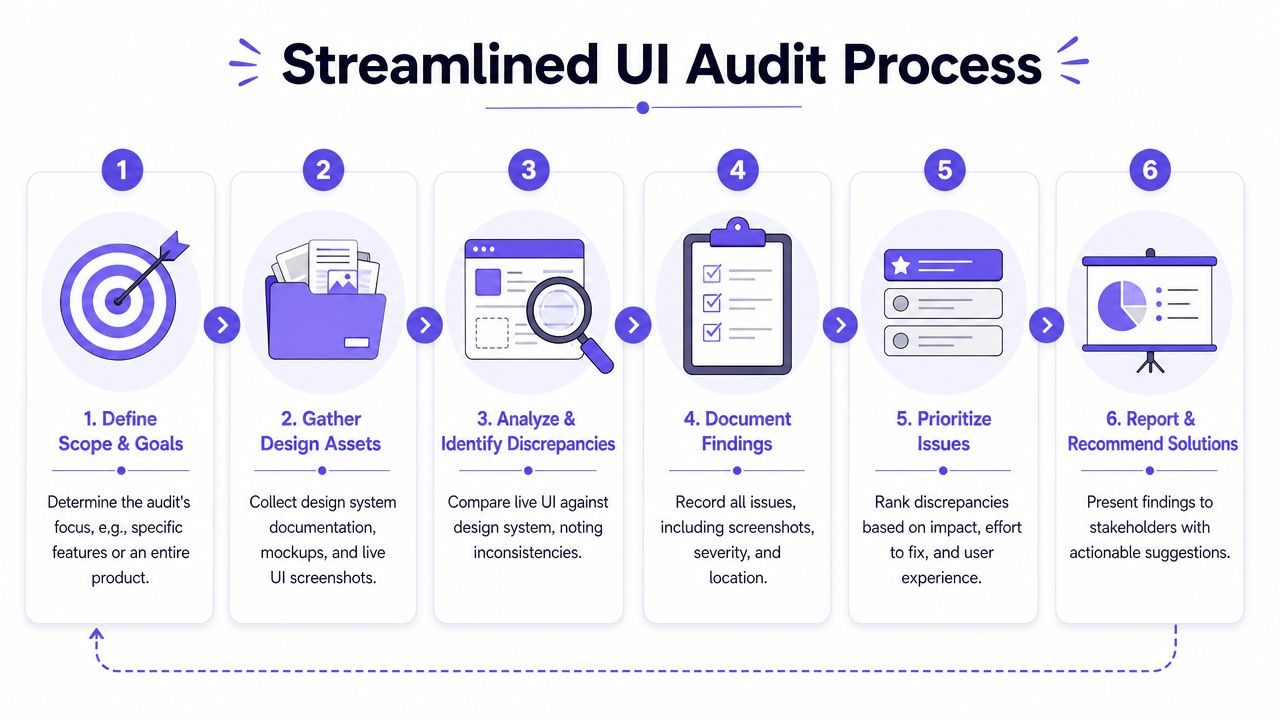
The workflow I'd use
Step 1. Define the audit slice.
Pick one feature area, platform, and release window.
State the source of truth for design and code.
Decide whether you're reviewing visuals only, or visuals plus behavior and states.
Step 2. Capture the shipped UI.
Move through the live product systematically.
Save screens, states, and transitions, not just happy-path pages.
If manual capture is slowing you down, use Live Product Capture to ingest live screens directly instead of building a screenshot graveyard.
Step 3. Pull the design reference set.
Open the current design system library.
Verify the latest variants, tokens, and interaction notes.
Cross-check edge cases against the latest workflow maps, using a guide for product workflow visualization if the flow has become hard to follow.
A lot of teams skip this verification step and compare against a stale design file. That produces fake findings. The audit becomes noise instead of signal.
Step 4. Compare screen by screen.
Review typography, spacing, color usage, components, and interaction states.
Flag custom implementations that don't map back to a system pattern.
Note behavioral differences, especially in forms, overlays, and navigation.
Here's a short walkthrough worth watching if you want to see audit thinking in action:
Step 5. Document findings in one format.
Include screenshot evidence and the matching design reference.
Assign a severity score using the 1–5 scale described in this website UI/UX audit framework, where 1 is minor and 5 is business-critical.
Add an effort-versus-impact note so the team can prioritize intelligently.
Step 6. Separate drift from justified deviation.
Ask engineering whether the difference was intentional.
Ask product whether the flow changed for a real reason.
Keep approved deviations in a decision log so the system can learn from them.
What works and what usually fails
A good audit keeps a narrow lane. It is not a redesign review, a brand critique, or a brainstorm on future features.
What works well:
Consistent evidence: every issue tied to a real screen and a real reference
State coverage: loading, empty, error, and disabled states included
Decision logging: intentional divergence recorded, not rediscovered later
What fails:
Screenshot dumping: lots of images, no structure
Purely visual review: interaction and accessibility left for “later”
No handoff path: findings end in a deck nobody uses
If your current process feels fragile, Smashing Magazine's design systems writing at Smashing Magazine is useful because it tends to stay close to implementation reality rather than abstract ideals.
What Are You Actually Looking For? A UI Audit Checklist
A UI audit gets sharper when you know exactly what counts as drift and what counts as a valid exception.
A common starting point is the feeling that “something feels off.” That's a weak audit lens. You need categories. Once you review against categories, patterns become obvious fast.
Check the visual system first
These checks usually surface the highest volume of inconsistencies:
Typography: font family, size, weight, line height, truncation behavior, heading hierarchy
Color usage: token-backed values versus hardcoded colors, semantic color misuse, contrast problems
Spacing: internal padding, stack spacing, grid alignment, container margins, inconsistent whitespace density
Iconography: wrong size, mismatched stroke style, inconsistent placement in buttons and inputs
I usually review these in batches. Looking at spacing across many screens at once makes drift easier to see than reviewing one page in isolation.
Then inspect components and states
Seemingly “small” implementation choices create larger product inconsistency.
Look for:
Variant misuse: a secondary button behaving like a primary action
State omissions: missing disabled, hover, focus, loading, empty, or error states
Improvised components: patterns that exist in code but nowhere in the system
Copy fit problems: labels or helper text that break the intended layout
A strong gallery reference helps here. The Dropbox upload failure states gallery example is useful because it shows how much product quality lives in edge and failure states, not just polished happy paths.
Accessibility is part of the audit, not an add-on
Accessibility failures should be treated as blockers when they exclude real users. Astra Lab's UX auditing guidance describes contrast, keyboard operability, and labeling errors as automatic blockers, and notes that targeted WCAG checks capture a large share of real-world defects. That matches what I've seen. A screen can look tidy and still be unusable.
The measurable baseline matters. This WCAG-focused audit checklist states that text contrast must be ≥4.5:1, UI control contrast ≥3:1, and clickable target sizes ≥24×24 pixels, and ties those standards to WCAG 2.2 Level AA and the European Accessibility Act timeline starting June 28, 2025.
If a tap target is too small or focus isn't visible, that isn't a style issue. It's a task-completion issue.
Use automated tools, but don't stop there. One accessibility audit checklist notes that scanners like Axe, WAVE, and Lighthouse detect only approximately 30% of all accessibility issues, which is why manual testing remains necessary.
If you want a broader operating checklist beyond the visual layer, this guide to find and fix UX flaws complements the UI audit well.
A practical review
Typography → verify size, weight, line height, hierarchy → drift: one-off text styles in shipped screens
Color → verify token usage, semantic meaning, contrast → drift: hardcoded values, weak contrast
Spacing → verify padding, margins, layout rhythm → drift: near matches that break visual cadence
Components → verify approved variants and usage rules → drift: custom buttons, fields, or cards
States → verify loading, empty, error, focus, disabled → drift: happy path polished, edge cases ignored
Accessibility → verify keyboard use, labels, target size → drift: looks fine with mouse, fails in real use
Mind the Product also has useful writing on how product quality gets shaped in execution, not just planning, and their broader archive at Mind the Product is a good external read for teams trying to connect design debt to product outcomes.
How Do You Prioritize and Report Audit Findings?
A UI audit becomes useful when you reduce a long issue list into a short shipping plan.
One of the fastest ways to lose credibility is to deliver an audit with dozens of findings and no argument about where to start. Teams don't need a bigger pile. They need a narrower next move.
Use the Critical Five
One audit source I often reference makes this point clearly: a typical UX/UI audit can surface 30 or more distinct issues, but the top five findings usually represent the highest immediate impact, according to Timurtek's auditing guidance. That rings true in practice. There's almost always a small cluster of issues doing most of the damage.
Why only five? Because attention is finite. Engineering capacity is finite. Product patience is finite.
I usually rank findings against three questions:
User impact: does this block, confuse, or slow key tasks?
Business impact: does this affect conversion, retention, trust, or support load?
Fix effort: can the team ship the correction without major architectural work?
Report for action, not admiration
Your report should make triage easier in a few minutes, not require a meeting to decode. I'd structure each finding like this:
Finding title: plain language, short, specific
Where it appears: screen, flow, route, platform
Expected pattern: component or token reference
What shipped instead: the actual divergence
Severity: minor, moderate, major, blocker
Recommendation: fix in code, update component, or revise system guidance
Here's the trade-off. A polished slide deck can create false confidence. A plain audit sheet can feel less impressive, but it tends to get used.
Decision test: If a Product Manager can't tell what to schedule after reading the finding, the finding isn't written clearly enough.
Distinguish one-off defects from system issues
This is what I mean when I say the audit should improve the system, not just the screen. Some findings belong in bug tickets. Others belong in the design system backlog.
Use this split:
Screen-level fix: isolated implementation error
System-level fix: component definition is incomplete, ambiguous, or outdated
Decision-level fix: team needs a rule where none exists today
That distinction keeps the audit from becoming a patch list for symptoms.
From Audit to Action Closing the Loop with Engineering
Audit findings only matter when engineers can act on them without translating designer language.
I've watched strong audits die in review because the report read like an internal design critique. Engineers shouldn't have to decode “visual hierarchy tension” or “inconsistent affordance language.” If the issue is a wrong button variant, say that. If the spacing token is wrong, identify the expected token. Clarity is collaboration.
Write tickets in plain language
A useful reporting principle comes from this article on auditing before redesign: reports should avoid jargon, use simple language, group findings by concrete topics, and use visual severity indicators. That advice is practical because audits often need buy-in from Product Managers and developers who weren't in the review.
A good ticket usually includes:
What is wrong: “Primary button uses an unapproved size on account settings”
Where it happens: route, platform, condition
What should replace it: named component or token
Why it matters: consistency, accessibility, or task completion
How to verify: screenshot pair or acceptance note
Make handoff collaborative
The best audit reviews don't sound accusatory. They sound operational. You're not saying, “engineering broke the design.” You're saying, “the shipped product and the intended system are out of sync, here's the shortest path back.”
I'd also keep a running list of approved deviations. Otherwise the same debates repeat every quarter.
If your team needs a stronger execution model after the audit, these design-to-dev handoff best practices help turn findings into work that survives sprint planning.
Close the loop after release
Teams often stop after filing issues. That's too early.
Go back and verify:
Was the fix shipped as specified
Did the system documentation change if needed
Did any nearby screens still carry the old pattern
That last check matters because drift is rarely isolated. One wrong variant usually exists in a family.
What a Good Audit Report Actually Looks Like
A good UI audit report is boring in the best possible way.
It doesn't try to impress. It tries to reduce ambiguity. The more glamorous the report, the more likely it is to hide the actual decision work behind a layer of presentation.
The report should be easy to scan
I prefer grouping findings by concrete categories rather than by abstract heuristics. That means sections like typography, color, forms, navigation, overlays, and accessibility. People can locate their part of the work quickly.
A simple report structure works well:
Executive summary → evidence: Critical Five, scope, major risks → audience: Product Manager, design lead
Detailed findings → evidence: screenshot pair, expected pattern, severity → audience: designer, engineer
System feedback → evidence: missing variants, unclear rules, docs gaps → audience: design system owners
Decision log → evidence: approved deviations and rationale → audience: cross-functional team
Include evidence that reduces debate
I want every finding to include a side-by-side comparison whenever possible:
Live state
Source design or component reference
Notes on mismatch
Recommended action
Last week I watched a Product Manager skim an audit doc and immediately lock onto one issue because the evidence was visual and the recommendation was plain: “Replace hardcoded spacing with approved token on billing confirmation.” No one argued. The problem was concrete.
Better reports shorten meetings because they answer the first objection before anyone raises it.
Keep the system in the frame
A report that only points at broken screens encourages local fixes. A report that also captures pattern debt helps the product improve.
That means adding a short section like:
Patterns to retire
Variants the system should formalize
Documentation gaps causing repeat drift
Areas that need another audit cycle
I'd also keep a small appendix of “confirmed intentional differences.” Without it, teams relitigate every oddity and the audit slowly loses trust.
The Future of Audits How AI Understands Product Context
A typical audit breaks down the moment the product stops behaving like a static set of screens.
You capture a clean checkout flow on Monday. By Wednesday, the pricing block changes for annual plans, a feature flag swaps the upsell card, and the empty state now pulls different copy for accounts with no billing history. The screenshots are still useful, but they no longer describe one stable interface. They describe a moving target.
That is why the next phase of UI audits is less about faster screenshot matching and more about product context. If the goal is to measure design system drift, the audit has to account for the conditions that create drift in the first place. Variant logic, permissions, experiment branches, content rules, and engineering constraints all shape what ships.
Static comparison still has value. I use it all the time. But it misses the cases that matter most: components that look correct in one state and fail in another, approved patterns used in the wrong context, or product exceptions that implicitly become unofficial standards because they were never documented.
Context is what turns comparison into diagnosis
A useful audit system needs to understand more than pixels. It needs to connect what is on screen to why it exists, which rule set it belongs to, and whether the difference is intentional, accidental, or a sign that the design system itself is behind the product.
That is the role of a Visual Context Graph.
Its five layers are:
Visual context
Behavioral context
Design system context
Product knowledge context
Implementation context
Drift rarely appears in a single layer. A modal can match the Figma file and still break keyboard flow. A button can use the right token values and still violate the system's usage rules for destructive actions. A layout can differ from the library for a good product reason, which means the fix is not "make it match." The fix might be to formalize a new variant and update the system.
That shift is important. A mature audit should not only find mismatches. It should help teams separate bug debt from system debt.
Where AI actually helps
AI is useful when it handles the repetitive parts that consume audit time without adding much judgment. In practice, that usually means:
Capturing live product states across routes, breakpoints, and account conditions
Comparing screens to system rules such as tokens, components, variants, and usage constraints
Preserving product memory so prior exceptions and approved deviations do not disappear between audit cycles
Generating working design outputs that reflect existing product structure instead of generic mockups
That last point matters more than people expect. Generic image generation can produce polished UI. It cannot reliably tell you whether a shipped pattern is drifting from the system, whether the system is missing a necessary variant, or whether a local fix will create more inconsistency elsewhere.
Tools that reason about real product inputs are far more useful for audit work. Live Product Capture helps with the painful part nobody enjoys, which is collecting accurate live states at scale. Design System Intelligence is more relevant than a plain vision model because it can evaluate drift against components, tokens, and structure. UI design output becomes much more credible when the output is grounded in the product's actual constraints. The broader gallery of product UI examples is also a practical reference for teams trying to judge whether a suggested pattern feels like a real extension of the product or just a nice-looking detour.
What AI still does poorly
AI still struggles with intent.
It can flag a mismatch. It is less reliable at deciding whether the mismatch should be fixed, accepted, or promoted into the system. That decision still depends on product strategy, engineering trade-offs, accessibility impact, and the history behind earlier exceptions.
I would not hand over audit conclusions to automation. I would use AI to reduce capture time, cluster similar drift, surface likely causes, and keep context attached to the finding so the team spends less time reconstructing what happened. That is where the time savings are real.
The manual work does not disappear. Someone still needs to review ugly edge states, inspect conditional behavior, and judge whether a one-off is the first sign of a broader pattern. But the job changes. Less scavenger hunt. More diagnosis.
If your team is spending too much time comparing live screens to design sources by hand, and too little time deciding what to fix, try Figr.
A strong UI audit measures the gap between the intended system and the shipped product. The next generation of audit tools will be useful when they help teams measure that gap with context, quantify recurring drift, and feed the learning back into the design system itself.
That is the core promise here. Faster audits matter. Closing design system drift matters more.
FAQ
How is a UI audit different from design QA?
I treat a UI audit as a point-in-time diagnostic after drift already exists. Design QA is ongoing and aims to catch issues before they ship.
How often should I run a UI audit?
I'd run one after major releases, design system migrations, or when a product area starts feeling inconsistent. High-change surfaces usually need more frequent review.
What tools do I need for a UI audit?
At minimum, I want access to the live product, current Figma files, design system documentation, analytics context, and accessibility tools like Axe or WAVE plus manual keyboard testing.
Should engineers join the audit itself?
Yes, at least for part of it. I've found audits move faster when an engineer can explain whether a divergence is accidental, constrained, or intentionally different.
Can AI replace a UI audit?
I wouldn't rely on that. AI can speed up capture, comparison, and context gathering, but Designer judgment is still what turns findings into the right product decision.