
A team ships a checkout redesign that looks finished, down to the button states, while nobody can say whether buyers understand the payment step itself. A sprint goes into polish for a flow nobody validated. Stakeholders argue about spacing. Engineers read the polished mock as a commitment. Users compliment the surface.
That is what happens when the prototype outruns the question. Each type of prototyping answers a different question, at a different cost, with different blind spots. Low fidelity tests comprehension and sequence. Mid fidelity tests flow and structure. High fidelity tests interaction and expectation.
Treat the eight types below as a fidelity ladder. Start low when uncertainty is high. Climb only when the cheaper rung stopped proving you wrong. I recommend picking the cheapest artifact that can fail convincingly, then spending the savings on the next real risk.
1. Paper Prototyping (Low-Fidelity Hand-Drawn Prototype)
A paper prototype is a hand drawn or printed set of screens that a participant can tap, point at, and rearrange. You sit beside them and swap sheets to simulate the system's response. Carolyn Snyder's Paper Prototyping from 2003 remains the standard reference for running these sessions well. It's crude, and that's exactly why people feel free to criticize it.
The basic gist is this: paper tests concepts, labels, and sequence before anyone falls in love with a layout. A team testing checkout with index card screens can watch where a buyer hesitates between delivery, payment, and confirmation. Enterprise teams do the same with clinicians, walking through patient intake on paper before a build sprint locks in a workflow that's wrong for a busy clinic.
How to Run It Well
- One core task per session: limit the run so participants don't drown in loose screens
- Two people, two jobs: one facilitates and swaps, the other takes notes
- Photograph the final set: log it in your research repository so decisions stay traceable
Don't dismiss paper because it looks unserious. In comparative testing, the prototype fidelity study summarized by Human Factors found an average of 24.8 usability problems with low-fidelity paper prototypes, 29.4 with medium-fidelity screenshots, and 28.0 with high-fidelity interactive prototypes, with no statistically significant difference in problem count or severity. Paper sessions take longer to run, but they surface the same class of issue.
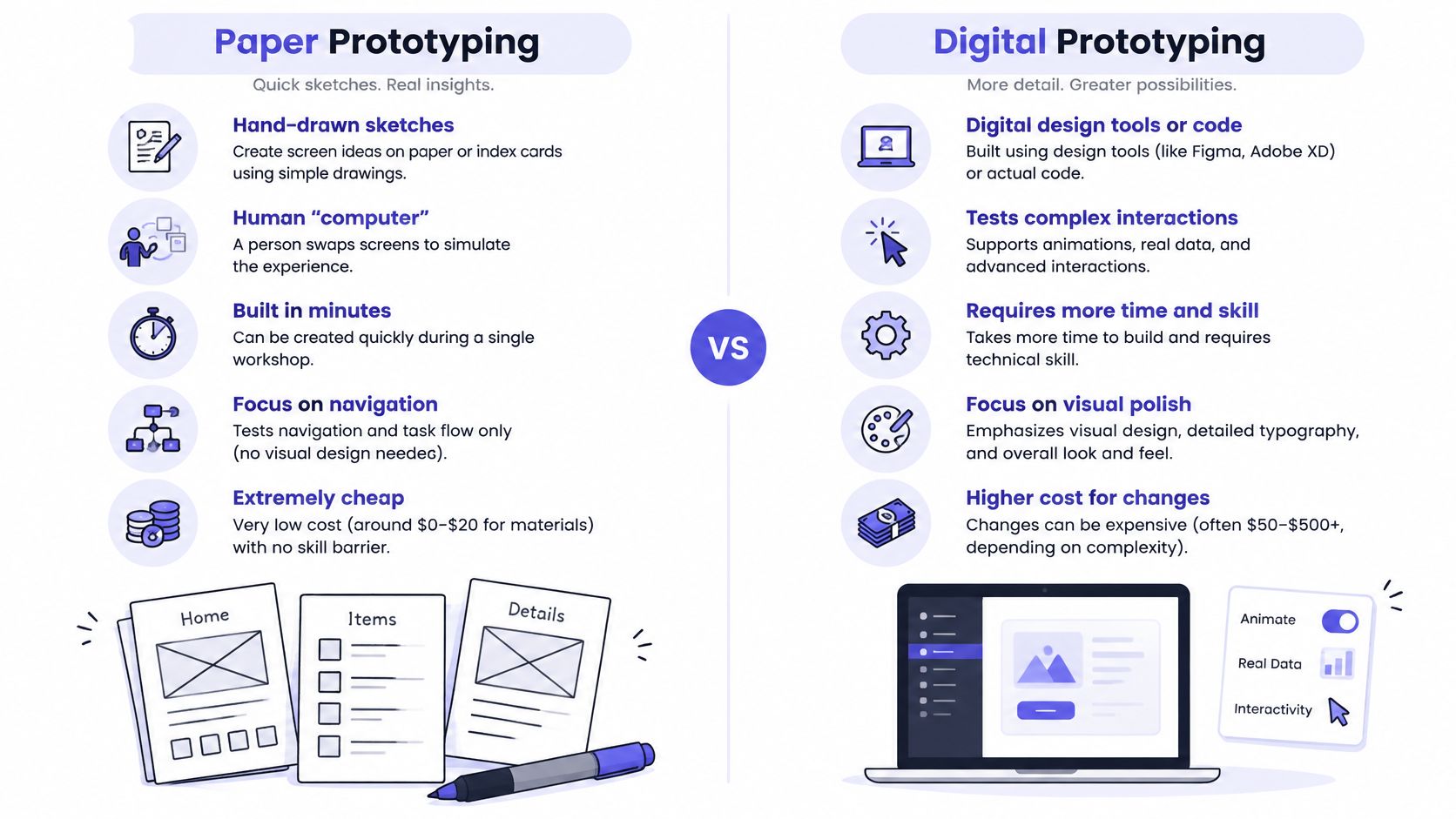
Used at the start, paper keeps the cost of changing direction close to zero. It's also the fastest entry point into rapid prototyping for product teams because the first version exists in minutes, not days. What won't it tell you? Anything about timing, real interaction feel, or how the design holds up under realistic data.
2. Low-Fidelity Digital Wireframe
A low-fidelity wireframe moves the sketch into a tool like Figma, Balsamiq, or Sketch while deliberately withholding color, imagery, and detailed typography. Structure stays. Decoration waits. That restraint forces a useful conversation about what a screen contains, what it prioritizes, and what it should leave out entirely.
This is the workhorse artifact for product reviews. A PM team mapping a dashboard can argue about information hierarchy before design system work begins. A B2B onboarding team can settle which steps belong on one screen and which need separation, without a stakeholder derailing the session over a shade of blue.
What Makes a Wireframe Useful
Write the user's goal at the top of each frame. Reviewers then judge the layout against purpose, not taste. Use your existing component library in grayscale where you can, because it signals what is buildable. Put open questions directly on the frame, beside the element they concern, rather than burying them in a separate document nobody opens during the review.
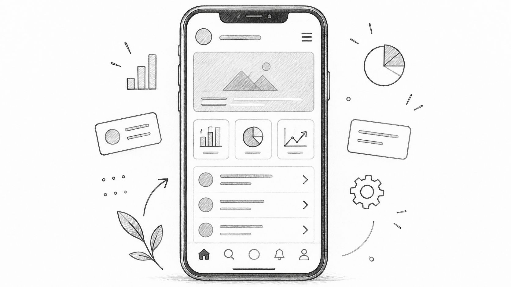
Why does grayscale discipline matter so much? Fidelity isn't one dial. The ScienceDirect abstract on prototype fidelity distinguishes dimensions including functionality degree, interaction similarity, feature breadth, and aesthetic refinement. A wireframe deliberately keeps aesthetic refinement low while you test breadth and structure.
If you're new to the format, start with understanding wireframes and keep every frame answerable to one question. Does this screen help the user decide, act, or recover? Wireframes won't validate emotional response or real task flow. They settle priority. For many stalled reviews, priority is the actual blocker.
3. Clickable Mid-Fidelity Prototype
Static wireframes can't tell you whether someone can get through a flow. A clickable mid-fidelity prototype connects wireframe level screens with basic transitions, so a reviewer moves through the path with a mouse or touch. Visual styling stays restrained, usually a simplified palette and standard controls. Attention stays on behavior.
Say a fintech team runs usability sessions on a transfer flow before committing to visual design. Participants choose an account, enter an amount, hit a confirmation they didn't expect, and try to back out. A setup wizard works the same way. You learn where the path breaks while changing it still takes minutes.
Test Behavior, Not Opinions
- Script three to five tasks: define clear success criteria before anyone sits down
- Include an error path: failure states drive most real confusion
- Track hesitation: pauses reveal uncertainty that success rates hide
Think about scope while you build. The Cambridge paper on strategic prototyping in Stanford's ME310 course distinguishes horizontal prototypes covering many features at low resolution from vertical prototypes exploring deep functionality in a few areas. Most clickable prototypes work best horizontal, wide enough to test navigation, shallow enough to rebuild quickly.
If you're comparing builders for this stage, the top AI prototyping tools roundup is a useful scan of current options. Keep expectations honest, though. A clickable prototype shows whether people find the path. It won't prove the path performs, feels polished, or survives real data and permissions.
4. High-Fidelity Interactive Prototype
A high-fidelity interactive prototype mirrors the final product in typography, spacing, color, and micro-interactions. Teams build it with real components, often pulled directly from the design system, so it looks and feels like production software. That's its strength and its trap. People react to it as if it were already shipped.
Reach for this when the open questions concern emotional response, brand perception, or fine grained interaction. A consumer app team might test whether a new onboarding animation builds confidence or just adds friction. A design team might put two visual directions in front of executives before a launch decision, when the choice is about presentation.
A polished prototype narrows feedback toward appearance. Build one only when appearance is the question.
That narrowing has evidence behind it. The Cambridge study on toy prototype fidelity and children's feedback found that form fidelity can bias feedback, while lower fidelity models elicited more types of feedback. Adults in stakeholder reviews behave similarly. Polish invites comments on polish.
Conditions Before You Invest
Confirm the information architecture in cheaper rounds first. Pull components from the live design system so the prototype matches what engineers will ship. Use realistic data lengths, because polished screens with tidy fake names hide truncation, overflow, and empty state problems until development finds them.
Used late, high fidelity earns its cost. Used early, it manufactures confidence. How much of your current prototype is there to answer a question, and how much is there to make the room comfortable?
5. Coded Functional Prototype
Some questions can't be answered by any design tool. A coded functional prototype, built in HTML, CSS, and JavaScript or a framework like React, handles real logic, data binding, validation, and state. It behaves. That makes it the right call when the uncertainty lives in behavior rather than layout.
A data product team prototyping a filter system needs live query performance, not a designer's guess at result counts. An engineering led team might build a coded spike to test a complex permissions model before design commits to screens the model can't support. When you need realistic source material for that work, you can scrape rendered HTML through an API rather than hand building every test page.
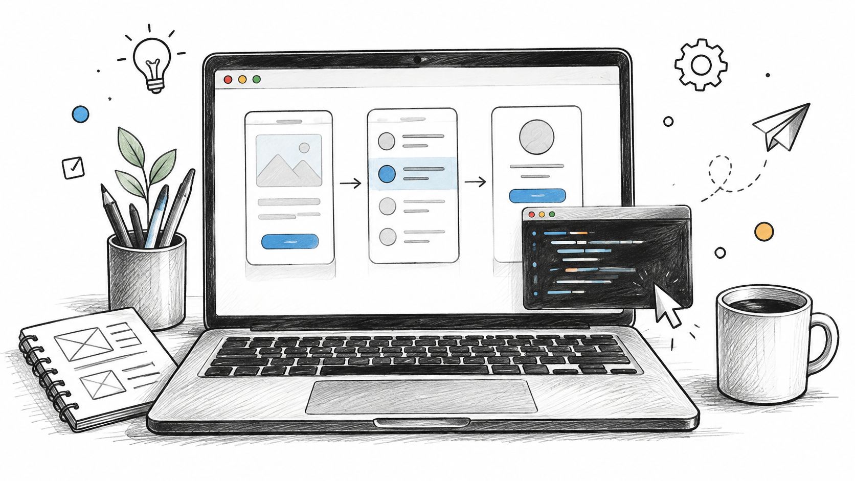
Accessibility is where coded prototypes become essential. Yale's UX guidance on prototypes frames the gap clearly in its documentation context: a visual mockup can't validly test keyboard order, focus visibility, screen-reader labels, zoom, or voice control. If the question involves those failure modes, the prototype must implement the behavior in semantic markup that assistive technology can interpret.
Keep the Spike Honest
- Limit the build: prototype the single behavior you need validated
- Name what's excluded: agree upfront what it won't include
- Document assumptions: keep decisions beside the design rationale
Coded prototypes demand the most engineering time on this list, and stakeholders love mistaking them for release candidates. Protect the exit. Decide before you start whether the code gets thrown away, and align that with your developer handoff best practices so nobody inherits a spike by accident.
6. Wizard of Oz Prototype
A Wizard of Oz prototype presents an interface that appears to work while a hidden human performs the back end tasks in real time. The name comes from the 1939 film, and John Gould and Clayton Lewis described the method for usability research in their 1985 paper in Communications of the ACM. The user believes they're testing a system. They're testing your idea of one.
Early conversational assistant research ran this way, with researchers answering queries manually behind the curtain. Product teams still do it. An automated report generator can be tested by having analysts produce each report by hand while users judge whether the output is worth having at all.
In short, the method separates the question of desirability from the question of engineering cost.
Running the Illusion Responsibly
- Write an operator script: define response rules and escalation paths before testing
- Log every response: compare human output later against what the system should produce
- Debrief participants: disclose the setup after each session when appropriate
This kind of prototype sits within a broader lifecycle choice. The Springer chapter on software startup prototyping describes throwaway prototypes built quickly to explore requirements and then discarded, alongside evolutionary ones refined into the delivered system, and its study of 20 software startups found teams created between 2 and 7 prototypes before launch. Wizard of Oz work is throwaway by design.
What it won't tell you is whether the actual system can match a clever human operator. It tells you whether anyone wants the capability. That answer should come before you fund the capability.
7. Concierge Prototype (Manual Service MVP)
A concierge prototype drops the curtain. Customers know a person is doing the work that software might later automate, and they value the service anyway, or they don't. That transparency is the point. You're learning what people need by delivering it manually, step by messy step.
The classic case is Zappos founder Nick Swinmurn, who tested demand by photographing shoes at local stores and buying them at retail when orders came in, before building a real catalog operation. SaaS teams run quieter versions. An analyst hand produces weekly analytics summaries for a handful of customers, watches which sections get forwarded internally, and only then argues for automating the reporting feature.
Practical rule: automate the steps customers already value, in the order they value them.
What to Track While It's Manual
Set a clear exit criterion before you start, such as a threshold of repeat users who'd notice if the service stopped. Record which manual steps customers ask for by name, because those define the core product. Record also which steps they ignore. Manual delivery exposes effort that users never see and never would've paid for, and that list saves real engineering budget.
Be transparent about the manual nature of the service to protect trust. Customers forgive a human in the loop. They don't forgive discovering one they weren't told about. The concierge approach won't tell you anything about interface usability, since there may be no interface yet. It tells you whether the outcome is worth productizing. For high touch, poorly understood workflows, is there a more honest first test?
8. Storyboard Prototype (Narrative and Experience Prototype)
Screens fail to show time. A storyboard prototype uses a sequence of illustrated frames to show how a person moves through an experience across moments, channels, and devices. Designers borrowed the technique from film and animation, where storyboards have long let directors plan scenes before expensive filming begins. Each frame is cheap. The sequence is the insight.
A product team storyboarding a trial to paid journey can lay email prompts, in-app messages, and sales calls on one timeline and see the collisions. Three nudges in two days suddenly look like harassment. A QA team can storyboard account recovery across devices and spot the handoff where a code expires mid journey, long before a test script would catch it.
Building a Storyboard That Holds Up
- Ground each frame: base it on observed behavior, not assumed behavior
- One persona, one goal: keep the narrative focused enough to judge
- Mine it for tests: every frame implies a failure point worth a test case
Storyboards pair naturally with journey mapping explained, since both force the team to look past individual screens. Where a journey map documents the current state, a storyboard proposes a future one and makes its emotional arc visible. Where does anticipation build? Where does frustration land, and who owns that moment organizationally?
What storyboards won't do is validate interaction detail. Nobody taps a storyboard. They validate sequence, context, and consequence. When your open question concerns the whole journey rather than a single screen, that is exactly the evidence you need.
The 8 Prototyping Types Compared
| Prototyping Type | Fidelity Level | Cost to Build | Best For | Typical Tools |
|---|---|---|---|---|
| Paper Prototyping | Low | Very low | Testing navigation and task flow early | Paper, index cards, sticky notes |
| Low-Fidelity Digital Wireframe | Low | Low | Aligning on screen structure and content hierarchy | Figma, Balsamiq, Sketch |
| Clickable Mid-Fidelity Prototype | Medium | Low to moderate | Testing task flows and navigation | Figma or other design tools with prototyping features |
| High-Fidelity Interactive Prototype | High | High | Evaluating visual design, brand, and detailed interactions | Figma, Framer, Adobe XD |
| Coded Functional Prototype | High functional fidelity | Highest; requires engineering time | Testing complex logic, data, performance, and technical constraints | HTML, CSS, JavaScript, React |
| Wizard of Oz Prototype | Low to medium; depends on interface | Low to moderate; requires a human operator | Testing demand for automated or intelligent features before building them | Interface mockup, operator scripts, human operator |
| Concierge Prototype | Low; service delivered manually | Low initial build cost; ongoing manual effort | Learning customer needs and willingness to pay | Manual workflows, direct customer communication |
| Storyboard Prototype | Low | Low | Exploring end-to-end journeys and experiences across touchpoints | Illustrated frames, sketches, presentation tools |
Match the Prototype to the Question
Step back and look at the incentives. Polish is visible in a review meeting, and learning usually isn't. A beautiful prototype photographs well in a stakeholder update, so teams overspend on fidelity because it signals progress. Meanwhile the cheap artifact that would've killed a bad idea early looks unimpressive, even when it carries better evidence.
This is what I mean by matching the prototype to the question. Fidelity has separate dimensions, and only the dimension under test needs to be realistic. Paper can settle sequence. A wireframe can settle priority. A clickable flow can settle findability, a coded spike can settle behavior and accessibility, and a person behind the curtain can settle desirability before the system exists. Everything beyond the dimension you're testing is decoration you're paying for twice, once to build and once to unbuild when the answer changes.
A friend at a Series C company told me their team now writes the decision the prototype must inform at the top of the file, before anyone draws a screen. Sessions got shorter. Rework dropped, because reviewers finally knew what they were judging. Steal that habit. It's cheap and it changes the conversation.
Here's your grounded move for this week. Pick one open design question on your roadmap. Write down the decision it feeds, then choose the cheapest prototype type that could prove your current answer wrong. Run it before your next sprint planning, and bring the evidence, not the artifact, to the review.
When the question requires high fidelity, that stage doesn't have to consume an entire sprint anymore. Figr generates AI high-fidelity prototypes grounded in your real product and design system, and as Mohit, Associate Director of Product at GreyOrange, puts it, "With Figr, I can sit down with the context I already have and get to a working prototype in a day." Teams can export the results into Figma as editable starting points, so prototype work flows straight into design review instead of starting over.
The ladder was never about climbing to the top. It's about standing on the right rung for the uncertainty in front of you. Choose deliberately, learn cheaply, and let each prototype earn the next one.
If your next open question needs high fidelity, Figr can generate prototypes grounded in your live product, design system, and written context, then export them to Figma as editable starting points for review. Bring one real product question, run the cheapest test that answers it, and use Figr to compress the polished stage when polish is finally the point.