
FIGR / UI TEMPLATE
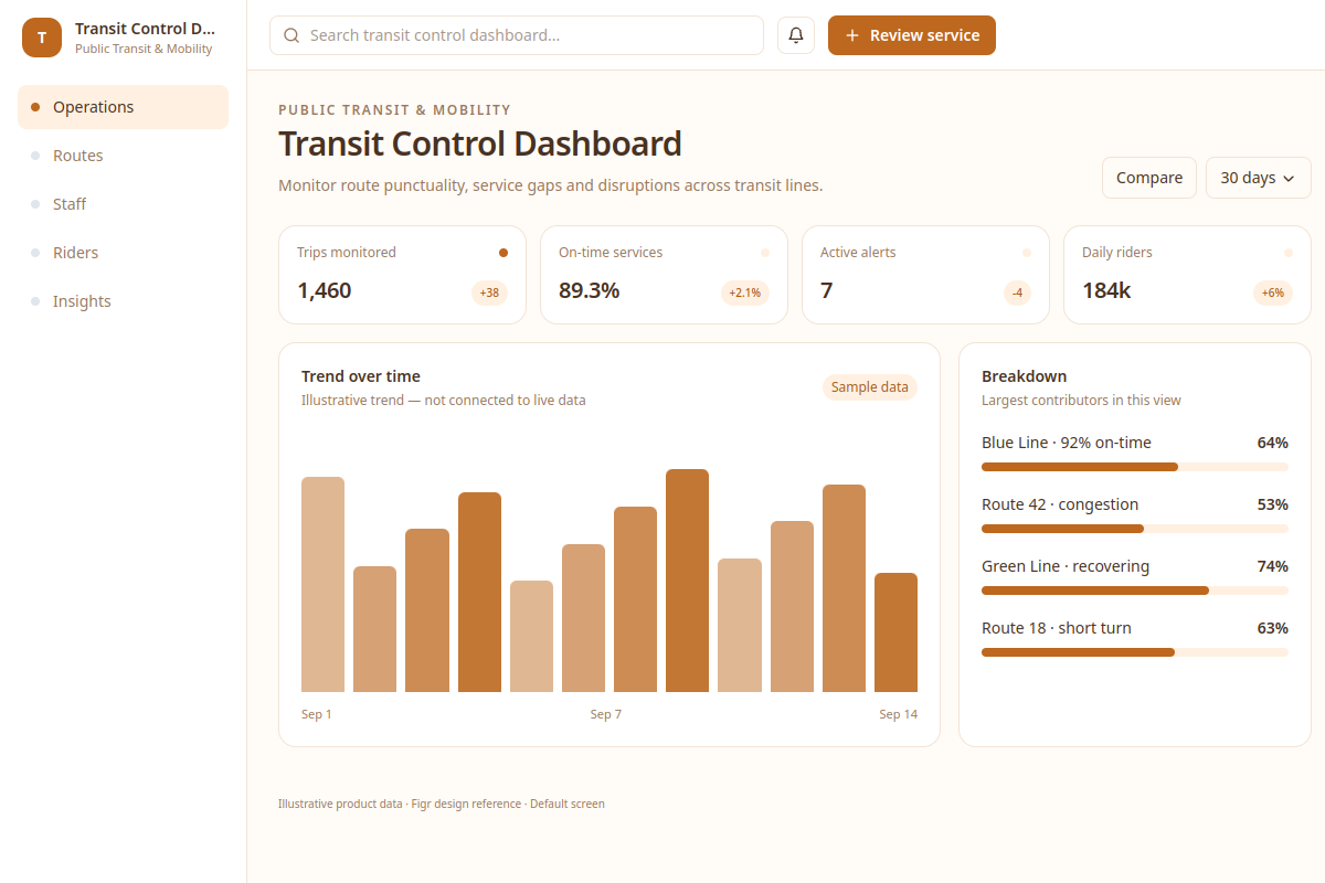
Monitor route punctuality, service gaps and disruptions across transit lines.
Explore this analytics as a reference for Public Transit & Mobility software. Review a real workflow and its UX states, then adapt the design to your product. All sample records are fictional.
BUILD ON THIS
Explore this screen, then bring in your own product and design system to shape the next version.
Analytics
Review service
analytics product workflow
Default, selected, filtered, empty, warning, error and success
Independent product UI reference; no 1mg design system
Monitor route punctuality, service gaps and disruptions across transit lines.
Core sections: Operations, Routes, Staff, Riders, Insights. Key action: Review service. Example records: Blue Line · 92% on-time; Route 42 · congestion.
Default, selected, filtered, empty, warning, error and success. Where relevant, cover restricted access, stale data, save failures and conflicting changes.
Operations → Transit Control Dashboard → Review service
analytics, status labels, filtering, record details
Show metric definitions, time ranges and data freshness. Separate missing data from genuine zero values.
Check how the review service task works with example cases like Blue Line · 92% on-time. Include clear recovery actions when a record is missing or a change fails.
Adapt the Transit Control Dashboard workflow to my existing product and design system. Keep our current screens, components, roles and business rules. Review missing states and edge cases before generating editable screens.
KEEP EXPLORING
Browse other product UI examples, compare patterns, and pick the direction that suits your product.