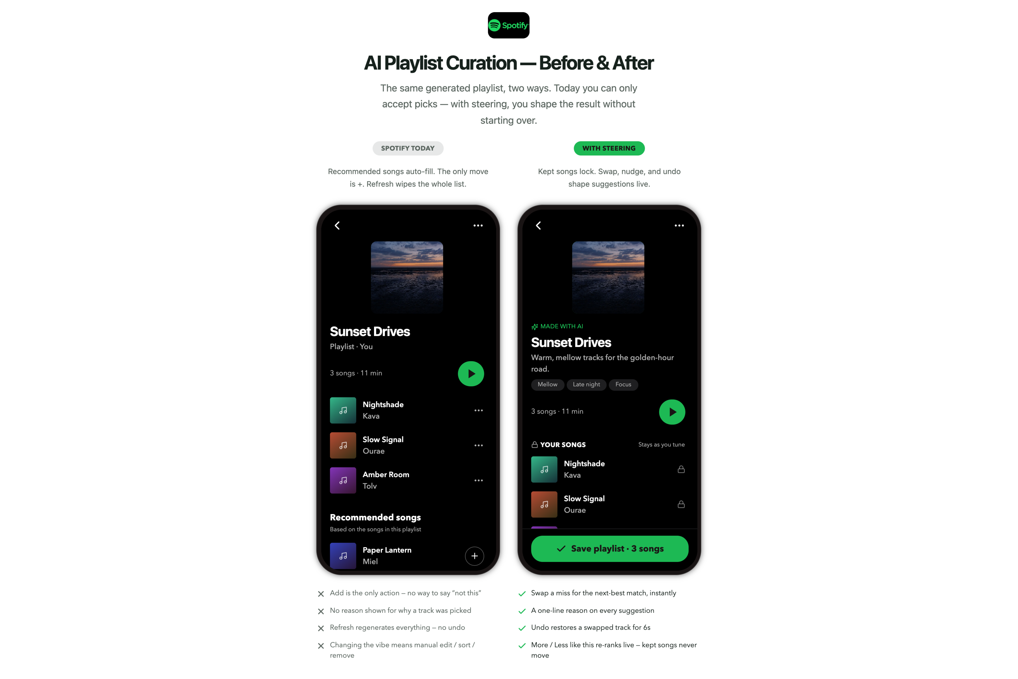
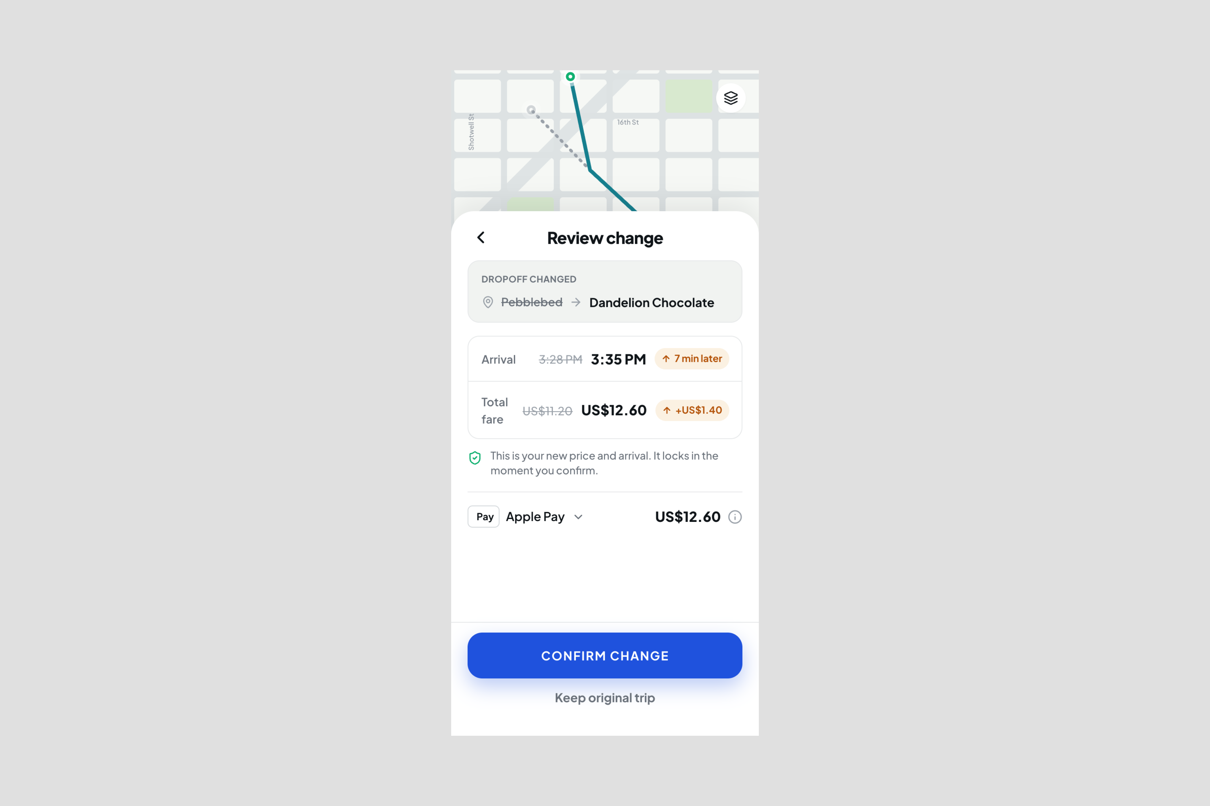
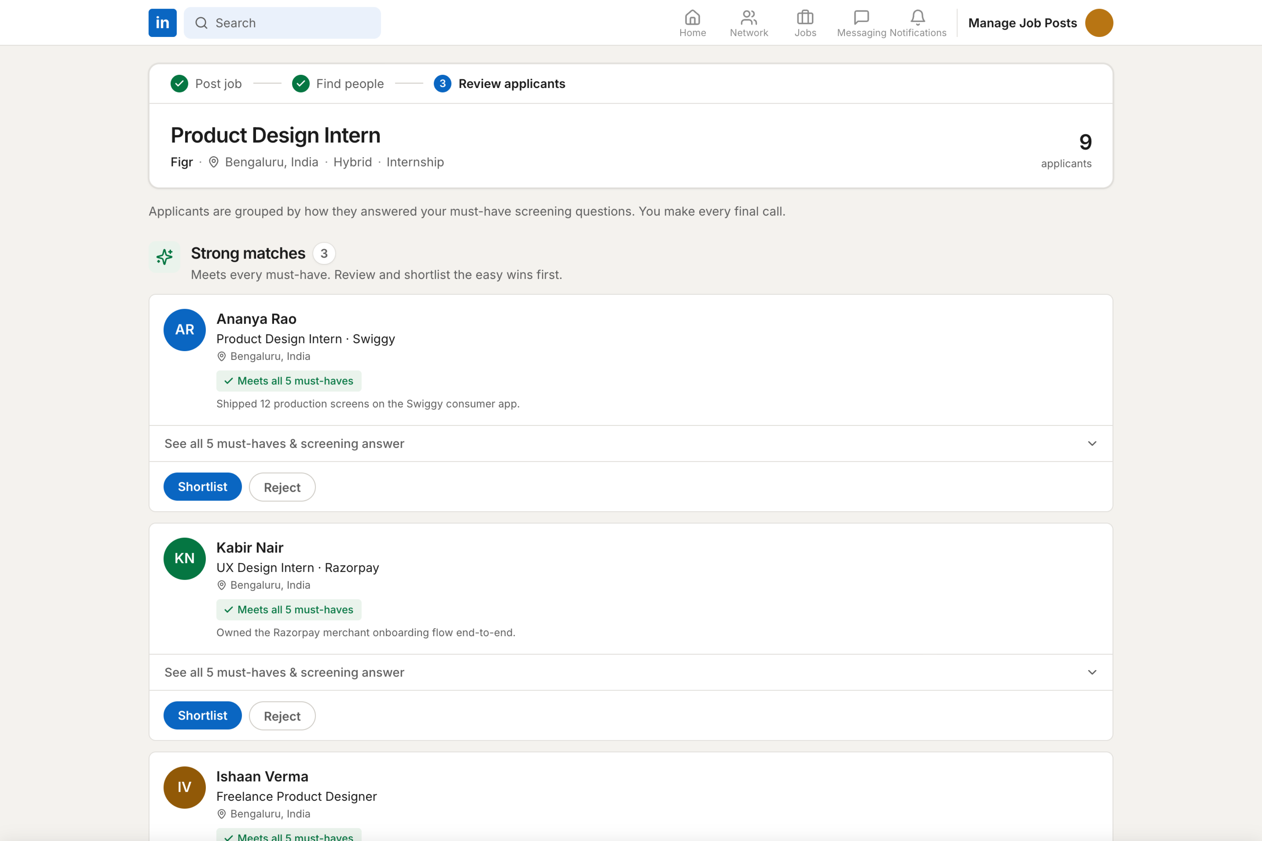
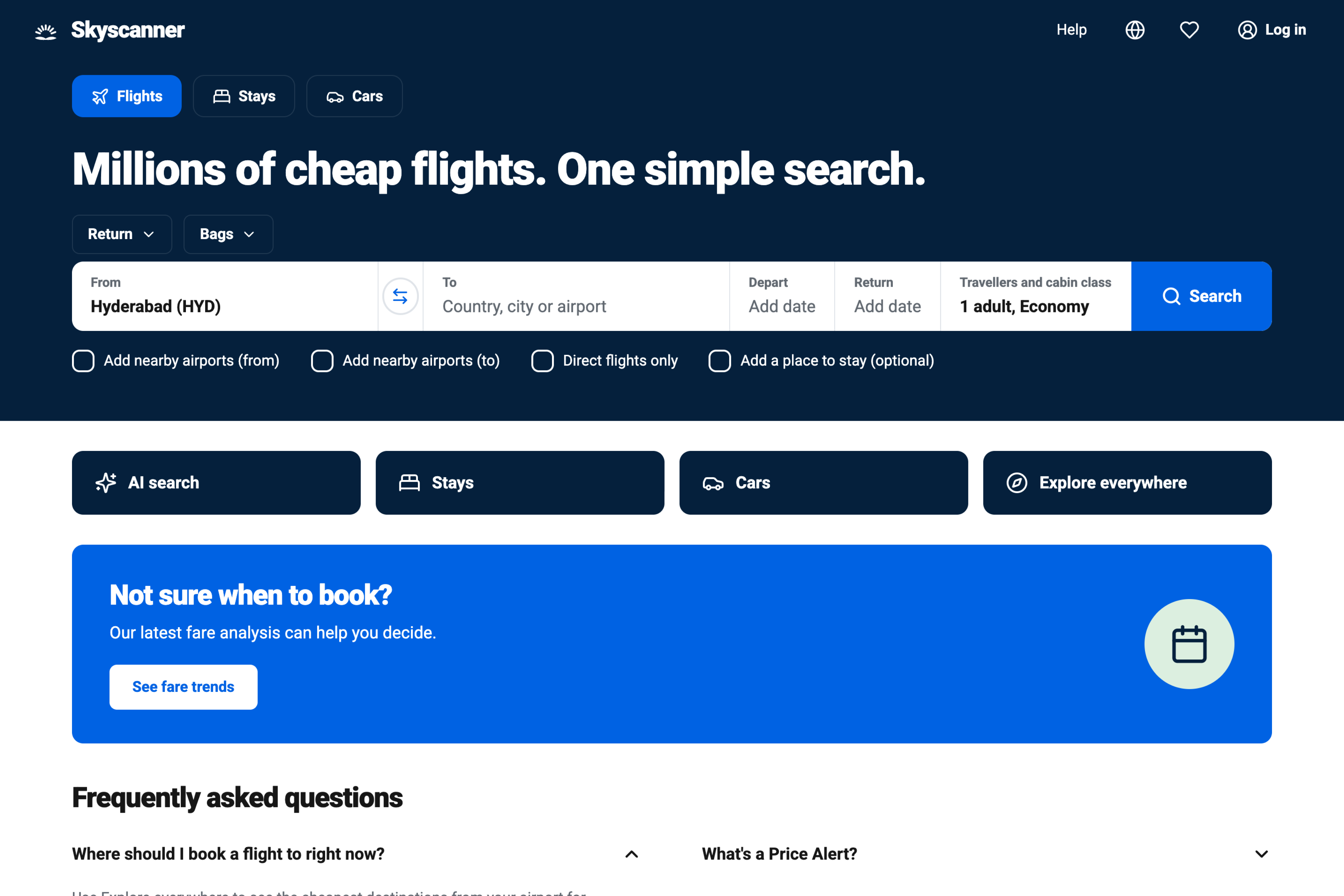
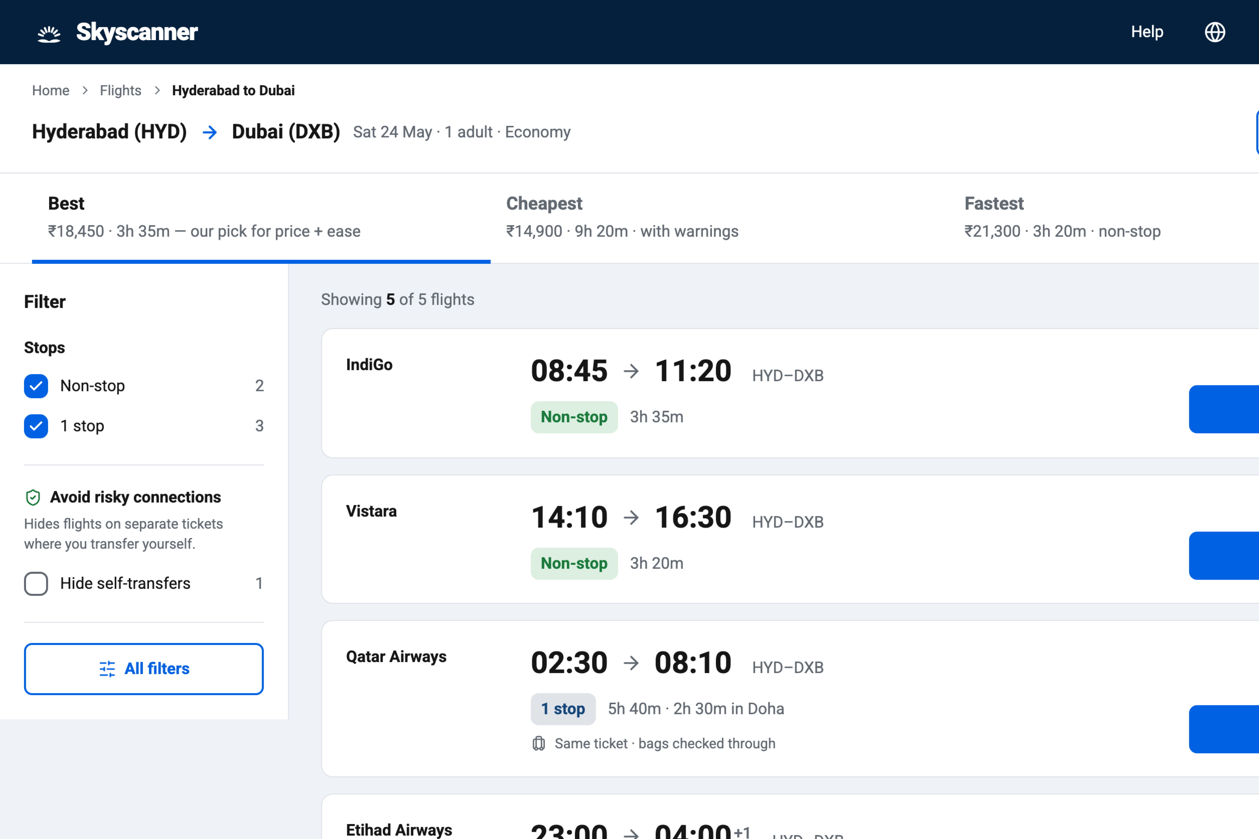
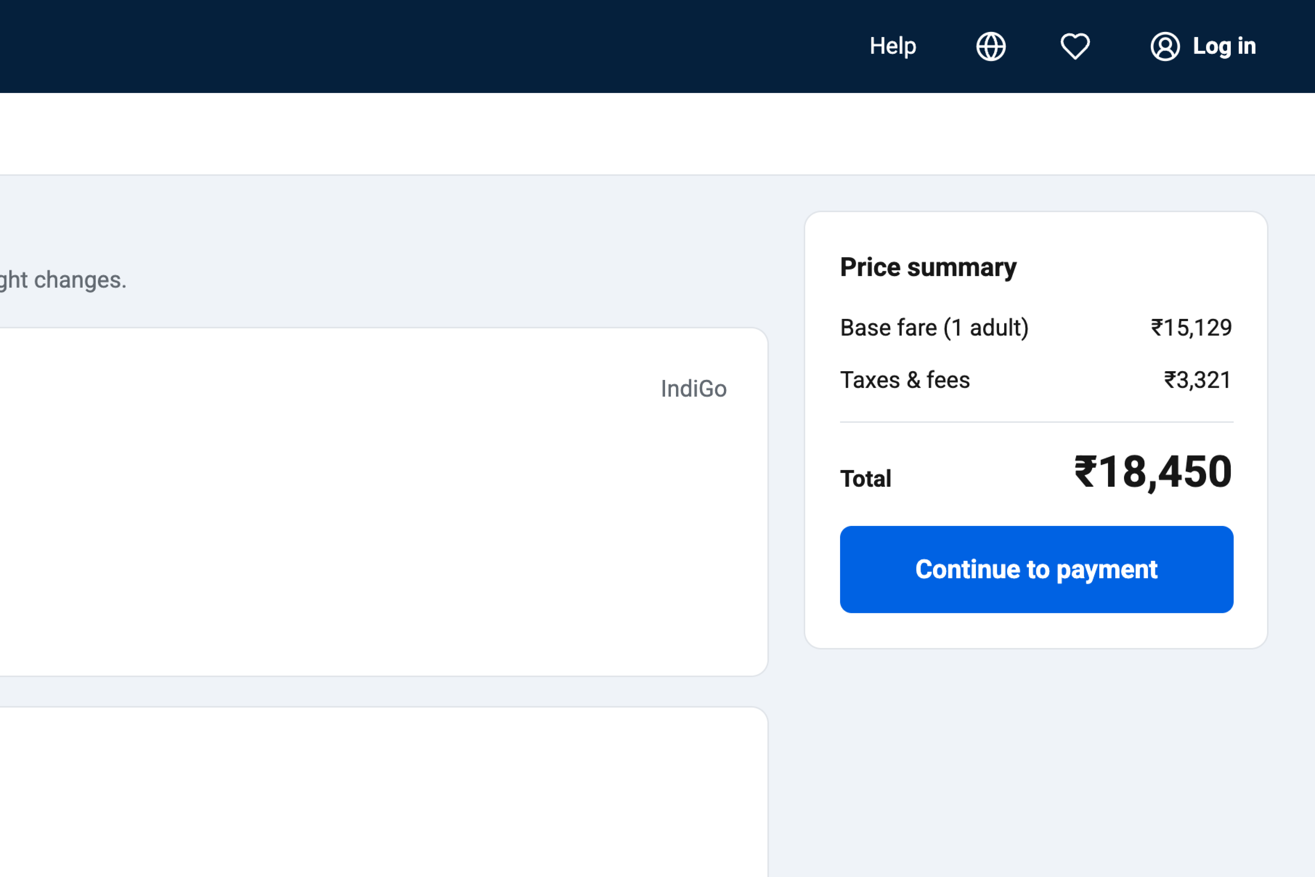
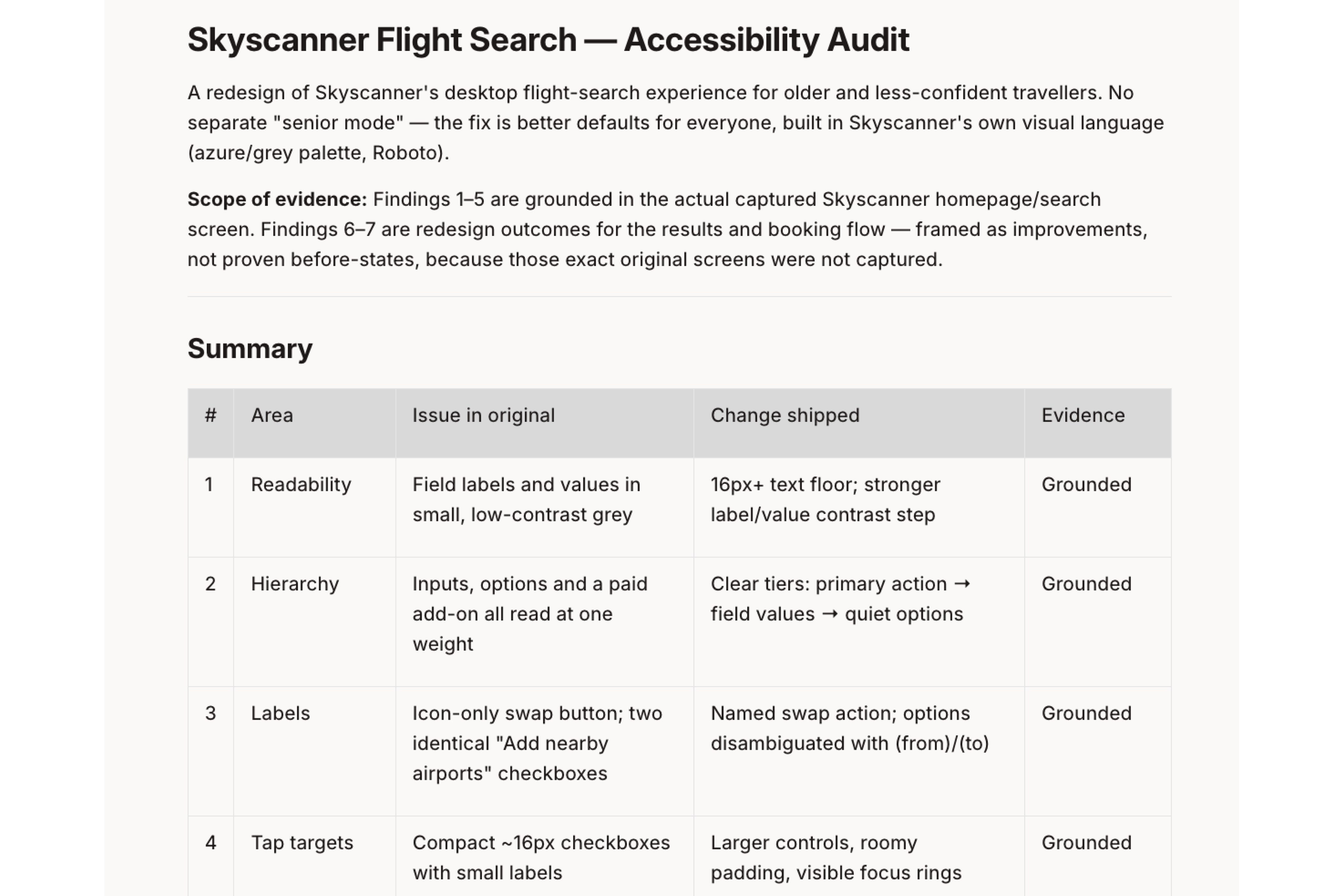
Small tap targets, thin contrast, and a connection detail that is easy to miss. Audited Skyscanner's flight search for older and less confident travellers, then rebuilt search, filters, itinerary, and review in the existing visual language. No separate senior mode.



Add your product knowledge to Context Pod and give Figr the context it needs to help your team reason, design, and align faster.