
Meta description: Wizard user interface design guide for PMs and UX teams. Learn when to use a wizard ui pattern, how to improve completion, reduce errors, and design accessible multi-step flows users finish.
Slug: /wizard-user-interface
A setup flow usually expires unnoticed.
A user starts with good intent. They click “Get started,” answer two questions, hit an unclear validation error on step three, wonder how many screens remain, and then leave the tab open just long enough to forget why they opened it in the first place. The team calls it drop-off. Finance calls it wasted acquisition spend. Support calls it another avoidable ticket.
Last week I watched a PM sit behind the glass during a usability session and stop taking notes halfway through. The user had gone from curious to defensive in under five minutes. Every next step felt like paperwork. That’s the moment it becomes clear they don’t have a form problem. They have a sequencing problem.
The wizard user interface exists for exactly this kind of mess. Used well, it turns a dense task into a guided path. Used poorly, it just slices the same confusion into smaller screens.
The Anatomy of a Failed Setup
The failure usually starts before a single field is filled.
A product team takes a complex onboarding flow, stuffs every requirement into one long experience, and assumes progress equals commitment. But users don’t experience it that way. They experience uncertainty first. What am I being asked to do? How long will this take? If I leave now, will I lose my work?

That’s why the pattern has lasted. Microsoft pioneered the wizard user interface in 1991 with Microsoft Publisher, introducing Page Wizards to guide non-designers through document creation, and by 2001 wizards appeared in over 80% of major software installations, cutting user errors by up to 50% in multi-step processes according to the historical summary in Wikipedia’s entry on wizard software). The enduring insight wasn’t visual chrome. It was guided reduction.
What failure looks like in practice
The broken setup has a familiar shape:
- Too much at once: Users face dense screens with decisions that should have been staged.
- No orientation: They don’t know where they are, how far they’ve come, or what remains.
- Late error discovery: The form waits until the end to reveal problems that could’ve been caught earlier.
- Fragile state: A refresh, timeout, or role mismatch wipes effort and trust.
Teams often notice the symptom before the cause. They see abandonment, retries, and support volume. Then they patch the copy, add helper text, or redesign the button styles. Sometimes that helps. Often it doesn’t, because the structure is still wrong.
A failed setup doesn’t feel hard because users lack skill. It feels hard because the product refuses to guide.
The best teams treat the setup flow as a product in miniature. It has entry friction, cognitive load, branch logic, and recovery paths. If you’ve ever seen users bounce between “Back,” browser refresh, and support chat, you already know how expensive bad orchestration becomes.
A good starting point is to audit your failure moments through the lens of error state design patterns. Many “wizard failures” are really state and feedback failures wearing a layout costume.
When to Summon a Wizard and When to Banish It
A team launches a new setup flow to reduce drop-off. Support tickets rise instead. Users who only needed to connect one tool now face five steps, a progress bar, and a review screen. The pattern was not the problem. The mismatch was.
The wizard ui pattern earns its place when the work has real dependency and real consequence. It belongs in flows like account setup, billing configuration, compliance intake, identity verification, permissions mapping, and integration setup, where one answer changes what should happen next. In those cases, a guided sequence improves completion because it narrows the decision space and catches mistakes before they spread downstream into failed activations, broken configs, or manual support cleanup.
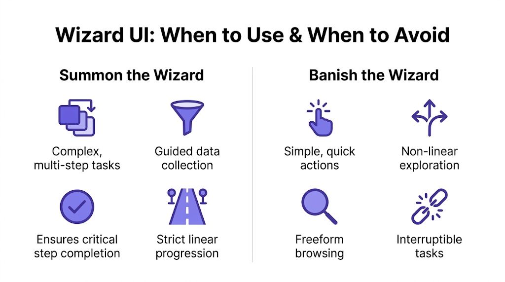
Summon the wizard
Use a wizard when users are doing something unfamiliar, when the order matters, or when an error is expensive to fix later. Good examples include tax onboarding, SSO configuration, marketplace seller verification, or any flow with branching rules based on role, plan, region, or account state.
In product reviews, I ask a blunt question: if users complete this out of order, what breaks? If the answer is data quality, compliance status, payment readiness, access control, or implementation time, the wizard is usually justified. If the answer is “nothing serious,” the team is often wrapping a simple task in unnecessary ceremony.
A well-chosen wizard also lowers engineering waste in the long run. It gives the team a clear place to enforce validation, manage prerequisites, and instrument fallout step by step. That is far cheaper than cleaning up bad records later or asking support to diagnose half-finished setups by hand.
Banish the wizard
Skip the wizard for tasks that are short, reversible, or naturally non-linear.
Preference toggles, profile edits, plan comparison, dashboard customization, and any task that benefits from scanning options on one surface usually work better without step gating. A wizard hides context, slows experts down, and increases build cost because the team now owns progress state, branching rules, save-and-resume behavior, and more QA paths than the task deserves.
The practical filter is simple:
- Use a wizard if: later choices depend on earlier ones, users need focused guidance, or step-level validation prevents costly errors.
- Avoid a wizard if: users need overview, comparison, or freedom to edit in any order.
- Challenge the request if: the flow is long because internal teams stacked requirements together without deciding what the user needs to do.
Practical rule: Use a wizard for dependency and risk. Use a single surface for visibility and speed.
Economics also shapes the decision. A wizard is a product and engineering commitment, not a visual treatment. It adds state management, transition logic, analytics, autosave, edge-case handling, and branch testing. I have seen teams spend weeks polishing a multi-step flow that should have been a well-structured settings page.
That cost is exactly why modern teams should pressure-test the pattern early. AI design agents such as Figr can help map edge cases before the flow hardens into code, surface missing branches, and speed up the handoff from journey design to QA. That changes the conversation from “should we add another step?” to “does this step raise completion enough to justify the complexity we are about to build?”
For teams sharpening that judgment, revisit the basics in UX design fundamentals. Good pattern selection starts with task shape, failure cost, and the work required to ship and maintain the flow.
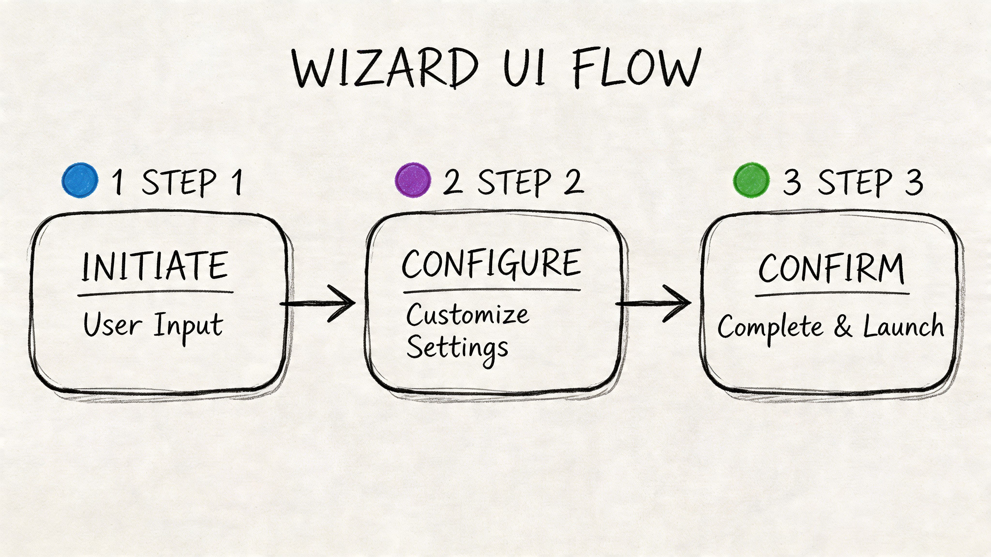
Designing for Flow and Momentum with the Wizard UI Pattern
A setup flow starts to die the moment a user asks, “How much longer is this going to take?” That question usually appears after step two, when the product has asked for effort without showing progress, preserved nothing, and grouped fields according to internal systems instead of the user’s job.
A good wizard keeps momentum by reducing uncertainty at every step. In multi step wizard design, the fundamental unit of work is not the screen. It is the decision. Each step should ask for one meaningful commitment, confirm that it was understood, and make the next action feel smaller, not heavier.
Segment by decision, not by database field
Teams often organize a wizard around backend objects because that is how the system is built. Users feel the damage immediately. One step asks for company details, the next asks for payment configuration, then a legal checkbox appears beside team invites because those items happened to sit near each other in the implementation plan.
Better flows group work by user intent. “Set up your business.” “Choose how money moves.” “Add the people who need access.” That structure lowers cognitive switching costs because each step has a clear purpose.
It also cuts engineering churn later. Decision-based segmentation exposes where a step is doing too much, where a branch should exist, and where requirements were combined for internal convenience. Teams using AI agents such as Figr can review those decision boundaries early, spot hidden dependencies, and catch edge cases before they spread into state logic, validation rules, and QA scripts.
For layout, consistency carries more weight in a wizard than on a static page. If labels, buttons, and helper text jump around from step to step, users waste attention re-orienting instead of progressing. A stronger grid system helps maintain that continuity. See designing with grids.
Progress has to feel honest
Users do not need a decorative progress bar. They need proof that the task is finite and that their effort is accumulating.
Pick a progress model that matches the shape of the work:
- Numbered steps: Best for fixed sequences with little branching.
- Milestones: Useful when one step contains several fields but leads to one clear outcome.
- Adaptive progress: Best when earlier answers remove later questions.
The rule is simple. Never show progress that later expands without explanation. If a user sees “Step 2 of 4” and the flow becomes seven steps after one answer, trust drops fast. If the path changes, the interface should explain why and update the model immediately.
For a concrete reference, study this Shopify checkout setup flow. It shows how milestones, grouped tasks, and confirmation states can keep a flow moving without making it feel long.
Preserve state like completion depends on it
It often does.
People refresh browsers, switch devices, lose permissions, get pulled into meetings, or need approval before they can continue. A wizard that forgets their work turns a temporary interruption into abandonment. Product teams often blame “drop-off in the funnel” when the underlying issue was a broken promise to save progress.
State persistence needs design and engineering ownership. Autosave where recovery matters. Keep prior answers intact when users go back. Support re-entry with clear confirmation of what is done and what still needs attention. Branching logic also has to respect saved state, or users get stuck in loops and support tickets follow.
Map those transitions before code hardens. These flowchart process examples help teams define states, branches, and recovery paths with more discipline than a screen-by-screen mockup alone.
The same principle shows up in strong multi-page form design, where preserving user effort is what keeps long flows finishable.
AI-assisted workflow design helps here too. Figr can surface re-entry gaps, missing confirmation states, and branch conflicts while the flow is still cheap to change. That matters because every overlooked edge case in a wizard becomes expensive twice. Once in implementation, and again in QA.
A quick visual breakdown helps here:
Advanced UX Details That Prevent Abandonment
Most wizard failures aren’t caused by the headline structure. They come from small moments that tell users, “this product isn’t paying attention.”
That’s the domain of step by step wizard ux. The shell can look polished and still fail if each step asks the wrong thing, validates too late, or ignores what the user already told you.
Progressive disclosure keeps the task breathable
Show only what is needed now.
If a user selects a digital product, don’t ask for shipping details. If a team is under a certain compliance mode, don’t expose enterprise-only configuration language on step one. Every irrelevant field is a tax on confidence.
The best wizard ui examples don’t merely reduce visual clutter. They reduce premature decision-making. Users stay in the task because the product keeps the conversation scoped to the decision at hand.
Good wizard design removes questions users shouldn’t have to answer yet.
This is also where adaptive defaults earn their keep. If the product already knows the user’s region, team type, or likely configuration from context, prefill intelligently. A default can feel helpful or creepy, so pair it with clear editability.
Validate early, but don’t punish
Wizard UIs reduce input mistakes because they focus users on one step at a time. Studies summarized by Andrew Coyle report 28-45% fewer input errors compared with monolithic forms, and removing extraneous navigation has been linked to a 30% higher task success rate in the discussion of form wizard design. A key takeaway isn’t “split the form.” It’s “surface consequences at the moment they can still be fixed easily.”
Inline validation works best when it answers three questions fast:
- What’s wrong: Be precise, not generic.
- Where to fix it: Keep the error next to the field or control.
- What happens next: Tell users whether they can proceed, save, or return later.
Late validation is expensive. It creates rage because it converts completed effort into rework.
Conditional logic makes the flow feel intelligent
Branching is where many wizards become humane.
A good flow changes based on role, plan, permissions, or prior answers. A bad flow drags everyone through the longest possible path. That’s not thoroughness. That’s laziness disguised as consistency.
Think about the broader system. Your setup flow is part of larger user experience flows, not an isolated artifact. If marketing promised speed, sales promised ease, and onboarding delivers bureaucratic drift, the product is breaking a promise made earlier in the journey.
Conditional logic should reflect the user’s reality, especially across larger digital customer journeys. The fewer irrelevant detours the wizard creates, the more respectful the product feels.
Accessibility and Mobile Wizard Interface Design
A wizard that works only for mouse users on desktop is not finished.
Many teams still treat accessibility as annotation work at the end. Add labels. Check contrast. Ship. That misses the main failure mode in wizard interface design. The problem is transition. The interface changes state, context moves, and assistive tech loses the thread.
A recent analysis cited by Telerik notes that wizards can fail 40% more often on screen readers when dynamic step changes aren’t announced, and a cited Google Mobile UX study found 65% of users abandon mobile wizards because of conflicts with the native browser back button, in Telerik’s discussion of wizard accessibility. Those are not niche problems. They are structural ones.
Screen readers need explicit step changes
When a new step loads, announce it. Move focus to the new heading. Make error summaries reachable. Ensure the active step is conveyed programmatically, not only through color or position.
If your wizard updates content without a full page load, developers should treat that transition as a meaningful event. Users need to hear that step two has started, what changed, and where focus now lives.
A useful parallel shows up outside forms. Media teams have learned that comprehension improves when context is explicitly surfaced. If your team needs a refresher on that broader accessibility mindset, understanding what closed captioning is and why it matters is a helpful example of designing for access instead of assuming it.
Mobile back behavior must be designed, not hoped for
The basic gist is this: an inaccessible wizard is a broken wizard.
On mobile, users expect the native back action to behave consistently. If back exits the entire flow, drops unsaved state, or jumps to a browser history page instead of the prior step, your wizard feels unstable. Touch targets, sticky footers, keyboard overlap, and step labels all become part of the completion problem.
Use a mobile-first pass before release:
- Back navigation: Map browser back to the previous logical step where possible.
- Focus handling: Keep the primary action visible when the keyboard opens.
- Step labels: Shorten milestone text so it remains legible on narrow screens.
- Recovery states: Make returning to an interrupted step obvious.
If your team wants tooling help before handoff, tools that check product UI for accessibility using AI can catch issues earlier than manual audits alone.
Measuring Success and Accelerating Design with AI
You can’t improve a wizard by arguing about it in a meeting.
You improve it by seeing where users stall, where they retry, and where the flow asks for effort it hasn’t earned. Completion rate matters, but it’s too blunt on its own. The better lens is step-by-step friction.
Measure the flow, not just the finish line
Track the setup like a chain of commitments.
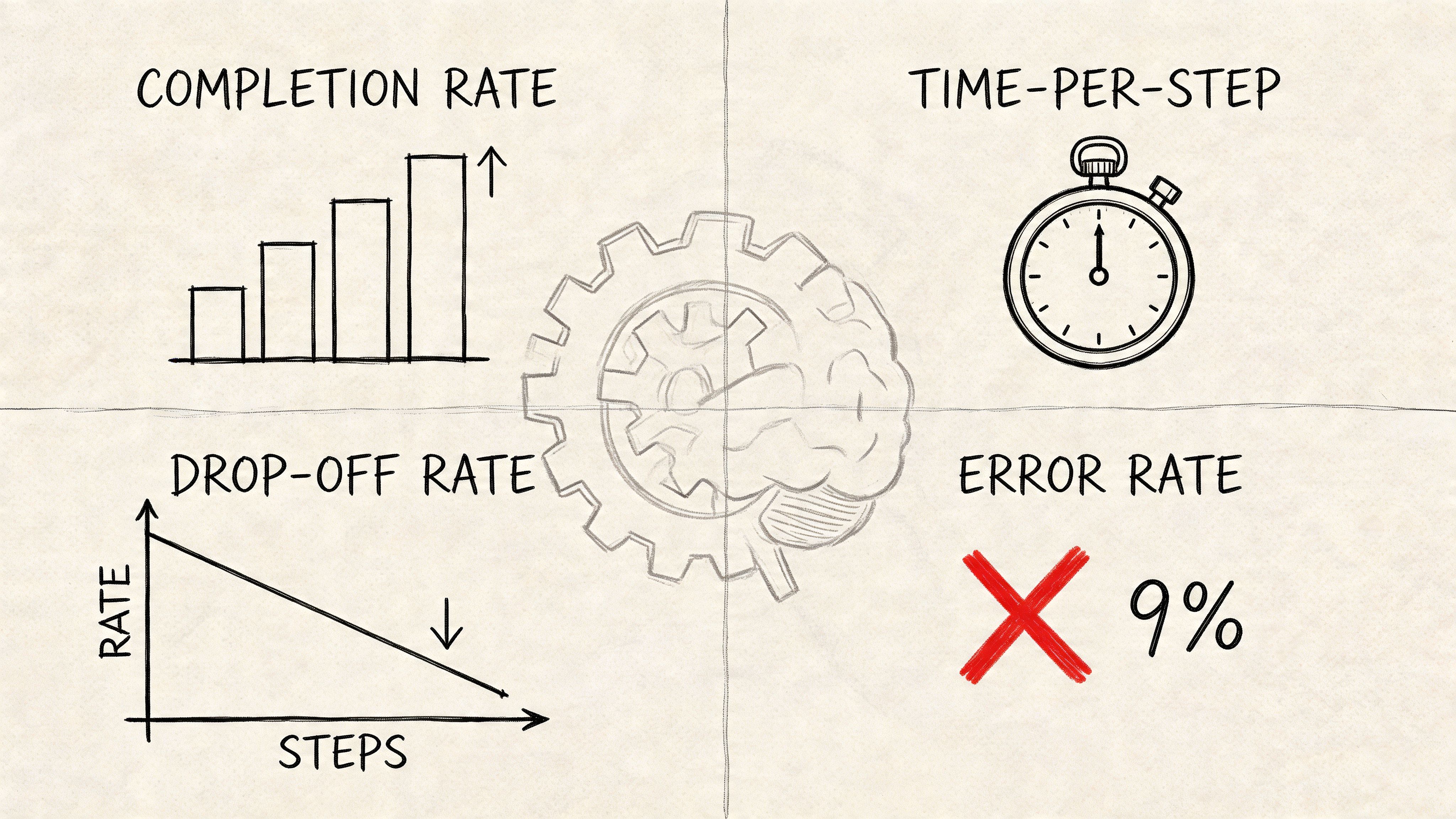
Look for patterns such as repeated backtracking on one step, high error density in one field group, or long pauses before a permissions decision. Those signals tell you whether the problem is wording, sequence, missing reassurance, or a branch that shouldn’t exist.
A friend at a Series C company told me their team spent weeks debating whether users “understood the flow,” only to discover the underlying problem was one role-selection step that changed downstream requirements without warning. The setup wasn’t too long. It was too surprising.
Useful metrics usually include:
- Completion rate by entry segment: New users, invited users, admins, contributors.
- Drop-off by step: The exact point where intent turns into exit.
- Time per step: Good for spotting confusion, not speed fetishism.
- Error concentration: Which steps trigger retries and correction loops.
This is the same mindset behind growth design to enhance UX. Growth isn’t only acquisition. It’s removing avoidable friction from the paths that matter.
AI changes the cost of being thorough
The expensive part of wizard design isn’t drawing the happy path. It’s discovering the paths you forgot.
That’s why teams increasingly use AI systems to map branches, recoveries, and role-based variants before code starts. The shift is operational. Design can test assumptions earlier. Product can reason about dependencies sooner. QA can inherit clearer edge cases instead of reverse-engineering them after implementation.
For example, this Shopify checkout canvas shows the kind of structured flow artifact teams need when discussing branching and progression, not just polished screens. Pair that with analytics and you move from opinion to diagnosis.
If you’re building a measurement stack around these flows, product analytics tools that integrate AI for better insights can help teams connect funnel behavior to design decisions with less manual synthesis.
Your Actionable Wizard Design Checklist
A good wizard is easier to recognize in review than in theory.
Use this checklist before you ship, and again after the first round of user sessions. Most failed flows reveal themselves quickly when you ask sharper questions.
- Check task fit: Is the task complex, unfamiliar, or dependency-heavy enough to justify a wizard user interface?
- Check the step model: Does each step represent a user decision or job, not an internal data bucket?
- Check orientation: Can users always tell where they are, what’s next, and whether the path changed?
- Check validation timing: Are errors caught at the earliest useful moment, with clear recovery guidance?
- Check branch logic: Do users skip irrelevant questions based on role, plan, permissions, or prior input?
- Check state resilience: Can users go back, refresh, or return later without losing trust or progress?
- Check focus: Have you removed side links, distractions, and conflicting calls to action inside the flow?
- Check accessibility: Are step changes announced, focus managed, and controls usable on screen readers and mobile?
- Check instrumentation: Do you know where users drop, hesitate, retry, and ask for help?
Audit one existing setup flow against this list before your next planning session. You’ll find issues faster than you will in another design critique.
For the complete framework on this topic, see our guide to user interface design.
The next move is simple. Pick one onboarding or configuration flow in your product and mark every moment where the user has to stop and think, “wait, why am I doing this?” That’s where the redesign starts.
Figr helps product teams design wizard flows with more confidence by mapping states commonly overlooked, including skipped steps, back navigation, lost connections, and permission changes. It prototypes those paths using patterns learned from 200k+ real UX patterns, then turns them into artifacts design, product, and QA can readily use. If you’re trying to make complex setup flows easier to ship and harder to break, explore Figr.
