Creating an intuitive design that feels effortless to use is no small feat. Even with polished visuals and a user-friendly interface, guiding users through their journey on a website or app can be challenging.
To create a truly seamless experience, users should feel that every click, swipe, and scroll flows naturally, leading them exactly where they need to go—without any second thoughts. However, users often need subtle cues to help them make decisions, find information, or confidently take the next step without hesitation.
This is where priming enters as a powerful technique. Rooted in psychology, priming uses subtle, subconscious cues to shape users’ responses, helping them interpret content in ways that align with their goals and make navigation feel instinctive.
In this blog, we’ll explore what priming is and how it works in UX design. You’ll learn about different types of priming techniques and discover actionable ways to apply these techniques ethically to improve user engagement.

Designed by Freepik
What is Priming in UX Design?
Priming is a psychological concept that describes how exposure to one thing can subtly influence how we respond to something else afterward.
In UX design, priming guides users' subconscious decisions, helping them interpret elements on the screen in natural ways that lead to desired actions.
When you introduce specific cues—like colors, images, words, or icons—you activate associations in users’ minds, shaping how they interact with your design.
For example, seeing a shopping cart icon primes users to think about adding items, even without explicit instructions. Priming works subtly, so users don’t feel like they’re being “told” what to do; instead, they’re guided intuitively.
Why Priming is Essential for UX Designers
Priming is especially useful for creating a smooth user journey. Here are some key benefits:
- Increased engagement: Priming helps guide users toward actions that align with their goals, increasing their likelihood to interact with features naturally.
- Reduced cognitive load: Priming uses familiar patterns, so users don’t need to think hard about what each element means. This makes the design feel easier to use.
- Enhanced satisfaction: When navigation feels intuitive, users are more satisfied and likely to have a positive experience.
Now that we’ve covered what priming is and how it influences user behavior, let’s dive into the different types of priming techniques in UX design. Each type has a unique role in guiding users and enhancing their experience.
Types of Priming Relevant to UX Design
Priming in UX design can take various forms, each one activating different subconscious responses in users. By understanding these types of priming, designers can create interfaces that feel intuitive and easy to navigate.
Let’s explore the key types of priming that are particularly relevant to UX design and how they help users interact with your product naturally.
1. Perceptual Priming
Perceptual priming is based on the visual aspects of a stimulus, such as shapes, colors, and icons, which users recognize without conscious thought. This type of priming can enhance the user experience by creating familiarity and encouraging quicker responses.
- Visual elements: Common visual elements like rounded buttons, checkmarks, or arrows prime users to expect specific actions. For instance, a blue “Submit” button may trigger familiarity, encouraging users to complete a form.
- Color cues: Colors have powerful associations. For example, red is often linked to urgency or danger, while green is linked to positivity or success.
2. Conceptual Priming
Conceptual priming works by focusing on the meaning of a cue rather than how it looks. It helps people connect ideas in their minds, making it easier to understand the purpose of something based on what they already know or have experienced before.
For example, seeing the word "school" might instantly make someone think of classrooms, teachers, or homework. This happens because the brain connects the meaning of "school" with these related ideas.
- Icons and symbols: Using familiar icons, like a trash bin for deleting items, leverages conceptual priming. Users intuitively know the purpose without needing additional text.
- Text and phrases: Strategic language, like “Start your journey” for a sign-up button, can prime users to think of their experience as an adventure or personal growth, encouraging engagement.
Conceptual priming relies on these mental connections to guide understanding and recognition, making interactions more intuitive and contextually relevant.
3. Repetition Priming
Repetition priming strengthens users’ recognition and comfort with design elements by presenting them repeatedly. This type of priming can make a website or app feel more intuitive because users become familiar with the recurring elements, reducing their cognitive load over time.
- Onboarding steps: Repeating specific actions or icons during onboarding helps users recognize them later, increasing their comfort with the interface.
- Consistent layouts: Maintaining similar layouts across different screens or sections allows users to focus on content rather than figuring out navigation.
4. Affective (Emotional) Priming
Affective priming involves using cues that evoke emotions, helping users feel certain ways when interacting with an interface. Emotional responses can make users feel more connected to the design and more inclined to engage with it.
- Mood-setting colors and imagery: Warm colors and friendly images can make a design feel welcoming and approachable, while neutral tones might convey professionalism and reliability.
- Encouraging language: Words like “Welcome back!” or “You’re almost there!” add a supportive, personal touch that makes users feel valued and engaged.
Each of these priming types plays a unique role in shaping user interactions and helping users move through a product with ease. By combining perceptual, conceptual, repetition, and affective priming, designers can guide users smoothly without explicit instructions.

By setting up consistent color palettes, familiar iconography, and intuitive layouts, Figr Identity helps you create production-ready components that naturally guide users through your interface.
Whether it’s establishing mood with affective priming or maintaining cohesive visual patterns for perceptual priming, Figr Identity streamlines the entire process, enabling designers to build interfaces that feel instantly recognizable and easy to navigate.
With a clear understanding of the different types of priming, let's see how big brands like Apple, Amazon, and Instagram have mastered it.
Real-World Examples of Priming in UX Design
Seeing priming in action can help illustrate how subtle cues guide users without them realizing it. Many well-known companies use priming techniques to create engaging, intuitive experiences that enhance user satisfaction.
Let’s look at some examples where priming has been successfully implemented to improve user experience.
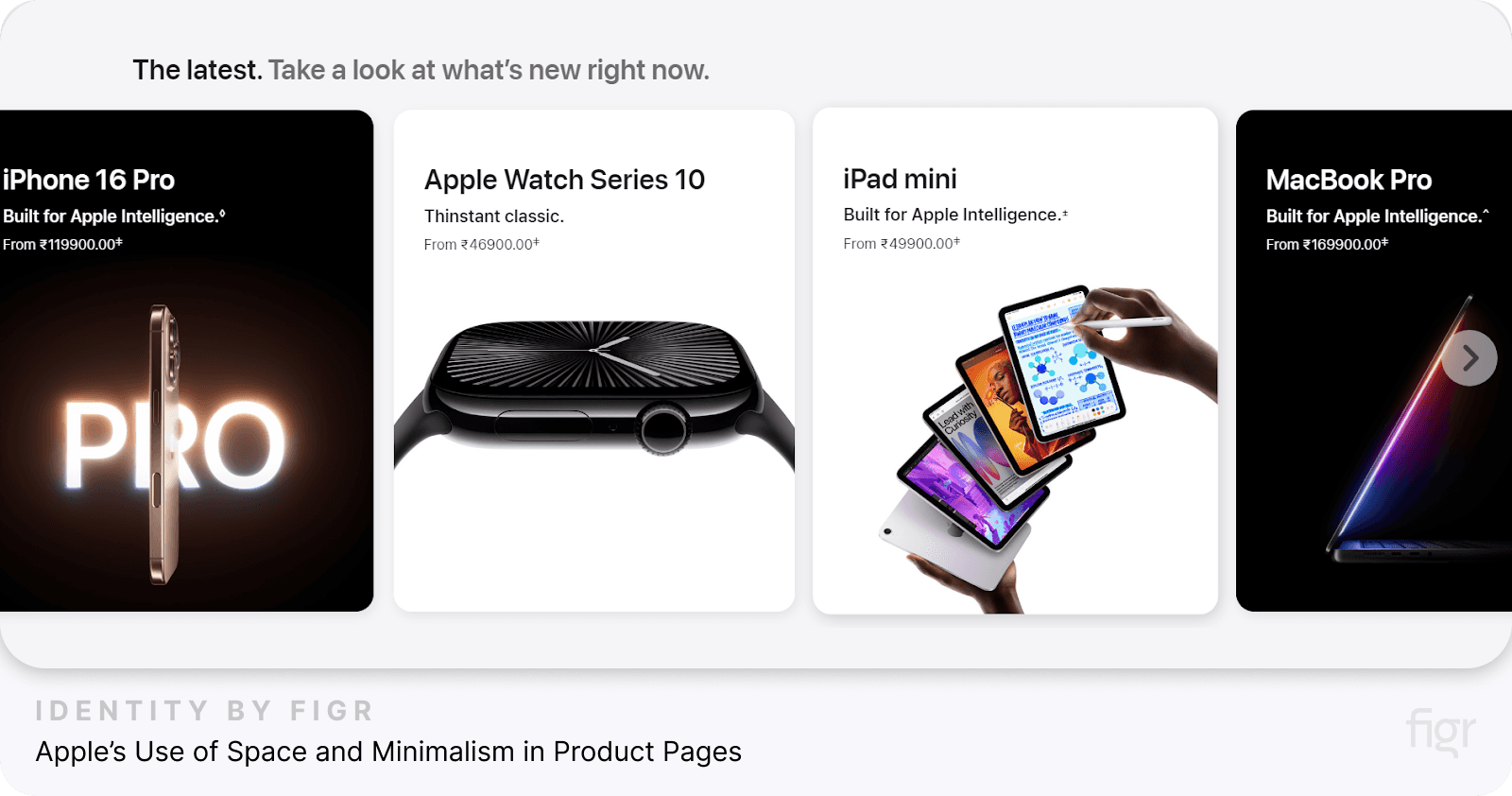
1. Apple’s Use of Space and Minimalism in Product Pages

Credit: Apple
Apple’s product pages use perceptual priming through clean, minimal layouts that direct users’ focus to the product. The ample white space around products and sparse text primes users to perceive Apple products as sleek, high-quality, and worth the premium price.
- Minimalist layout: The spacious design and minimal text around Apple products draw users’ attention to the product images, emphasizing their elegance and innovation.
- User Impact: This minimalist approach primes users to see Apple products as modern, sophisticated, and exclusive, reinforcing Apple’s brand image without explicit messaging.
2. Disneyland’s Mood-Based Website Design

Credit: Disneyland
Disneyland’s website is a masterclass in affective priming. Through vibrant visuals, cheerful colors, and joyful images, Disneyland primes users to feel excited about visiting.
- Mood setting: The site uses videos and images of families enjoying Disneyland, creating positive emotional associations.
- User Impact: This affective priming enhances the user’s sense of excitement and adventure, making them more likely to book tickets.
This makes it easy to evoke specific emotions in users, helping your designs connect on a deeper, more memorable level.
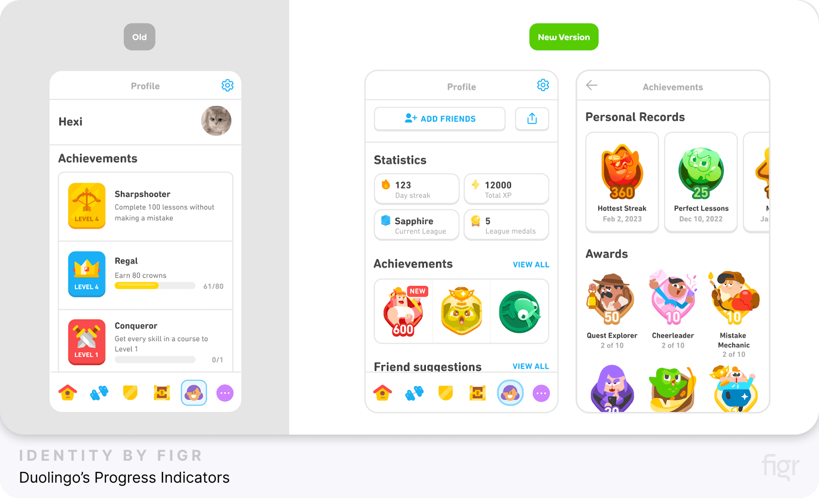
3. Duolingo’s Progress Indicators

Credit: Duolingo
Duolingo uses repetition priming effectively to keep users engaged in their learning journey. With progress indicators, Duolingo encourages users to complete daily lessons and maintain their streaks.
- Guidance: Progress indicators visually show how close users are to reaching their goals, which primes them to continue their practice.
- User Impact: Using streaks and visual cues encourages users to return frequently, enhancing user retention.
4. Amazon’s “Frequently Bought Together” Section
Amazon uses conceptual priming to encourage additional purchases. By displaying items frequently bought together, Amazon primes users to view these items as complementary, leading them to consider buying more.
- Contextual cue: The “Frequently Bought Together” section primes users to think of related items, simplifying the decision-making process.
- User Impact: This primes users to add items to their cart, increasing sales while helping users make a more complete purchase.
5. Instagram’s Stories and Reels Navigation

Credit: iDownload Blog
Instagram leverages familiarity and repetition priming to encourage user interaction with Stories and Reels.
By placing these features at the top and bottom of the app, Instagram primes users to engage with these features frequently.
- Visual repetition: Stories and Reels are always at the app's top (stories) and bottom (reels), making it easy for users to recognize and interact with them.
- User Impact: This familiarity primes users to naturally engage with Stories and Reels, boosting time spent on the platform.
These examples highlight how priming can be used effectively across different industries to guide user behavior, enhance engagement, and improve the overall user experience.
Now that we’ve seen how priming techniques work in real-world applications, we must consider the ethical implications.
In the next section, we’ll discuss the importance of ethical priming, ensuring that design choices are user-friendly and respectful, not manipulative.
Ethical Considerations of Using Priming in UX
While priming is powerful, it must be used to support users’ needs and respect their autonomy, not to manipulate or push them into actions they might later regret.
Let’s look at some ethical considerations to keep in mind when using priming in UX design.
1. Guide, Don’t Manipulate
Priming should enhance the user journey without crossing the line into manipulation. The goal is to create a smooth experience that helps users reach their goals—not to force them into actions they might not want.
- Transparent guidance: Use cues to help users make informed choices, such as subtle reminders or visual prompts, without creating unnecessary urgency or pressure.
- Avoiding “dark patterns”: Don’t use priming to create deceptive designs, like making an “opt-out” link nearly invisible. Respect users’ choices and let them easily find all available options.
2. Prioritize User Well-Being
Ethical priming respects the user’s best interests. For instance, when designing an app for financial management, consider whether a prompt encourages responsible decision-making or just drives quick transactions.
- Balance encouragement and caution: If your app involves spending or signing up for subscriptions, avoid overly enthusiastic language that might lead users to act impulsively.
- Support long-term user satisfaction: Use priming to improve the overall user experience by building trust and a sense of ease, rather than short-term engagement tactics that may lead to dissatisfaction.
3. Be Clear About Your Intentions
Users deserve to know what they’re agreeing to. If you’re using priming techniques, make sure the user understands why they’re being encouraged to take a specific action.
- Transparency: If you’re suggesting users complete a task (like filling out a profile), let them know the benefits of doing so, rather than nudging them without explanation.
- Contextual clarity: Provide context where it’s relevant. For example, if you’re encouraging an upgrade, outline the added value honestly, so users can decide with all the facts.
4. Build Trust, Don’t Exploit It
Trust is at the core of ethical design. Priming should contribute to a relationship where users feel comfortable returning to your app or website without feeling misled or pressured.
- Long-term loyalty over short-term gains: Instead of using priming to drive immediate actions, use it to reinforce positive user habits. This approach builds trust and long-term loyalty.
- Create a positive user experience: Users are more likely to engage with a product they trust. Use priming to create an experience that feels intuitive and supportive rather than manipulative.
Applying priming ethically is about using these techniques to guide users in supportive and intuitive ways.
With these ethical guidelines in mind, let’s look at some best practices for implementing priming techniques in your UX design.
Best Practices for Implementing Priming in UX Design
Using priming techniques effectively in UX design involves careful planning and an understanding of how subtle cues influence users.
By following these best practices, you can apply priming in ways that enhance user experience, encourage engagement, and build trust.
1. Test and Measure the Impact of Priming
Before rolling out priming elements across your design, it’s essential to test them on a small scale to see how users respond.
- A/B testing: Run A/B tests with different priming cues, like button colors or language variations, to identify which versions lead to the most positive user actions.
- User feedback: Collect feedback to see if users find the design intuitive or feel directed. Adjust based on their input to ensure priming feels natural and supportive.
- Measure engagement: Track metrics like click-through rates, completion rates, or time spent on specific tasks to understand if priming cues effectively guide users.
2. Use Subtle, Consistent Cues
Subtlety is key in priming—small cues often have a more natural influence on users than bold or overly direct ones. Aim for consistency in these cues to reinforce familiarity without overwhelming users.
- Keep it minimal: Simple cues, like color changes on important buttons, are often enough to guide users without them realizing it.
- Maintain consistency: Use similar colors, icons, and language across the platform. Consistency helps users learn where to find information and actions, making navigation feel effortless.
- Avoid overloading with cues: Too many priming cues can confuse users. Stick to a few key elements that direct users toward important actions.
3. Align Priming Cues with User Goals
Priming should align with what users want to achieve, not just what your design wants them to do. Think about the user journey and where they may need guidance.
- Support user objectives: Use priming to help users reach their goals, like completing tasks or navigating easily, rather than pushing them toward actions that may not benefit them.
- Guide without forcing: Ensure that users feel in control of their choices. For example, if your app encourages profile completion, let users know how it benefits them instead of making it a requirement.
4. Emphasize Ethical Priming
As we discussed, ethical priming is about respecting the user’s autonomy and boosting trust. By designing with ethics in mind, you ensure that users feel supported, not manipulated.
- Avoid dark patterns: Steer clear of priming tactics that trick users, such as hidden opt-out options or misleading prompts.
- Disclose intentions: Be transparent about the reasons behind certain cues. If you’re encouraging an upgrade or feature use, clearly communicate the benefits so users understand the value.
5. Maintain a Feedback Loop
Continuous improvement is essential in UX design. By keeping a feedback loop with users, you can refine priming elements to ensure they stay relevant and effective.
- Regular user testing: Run tests periodically to check if priming cues still serve users as intended. Adjust cues based on findings to maintain an optimal user experience.
- Update based on trends: UX design trends evolve. Stay informed about new best practices and user preferences to ensure your priming techniques are up-to-date and engaging.
Conclusion
Priming is a powerful yet subtle tool that can transform the way users experience and interact with your design. By using well-placed cues—whether through colors, familiar icons, or encouraging language—you guide users naturally, making navigation feel effortless and intuitive.
Figr Identity makes it effortlessly easy to establish a priming-friendly design system that can elevate the user experience, helping users connect with your brand on a deeper, more intuitive level.
With priming, you have the opportunity to design products that feel natural and empowering—making the user journey enjoyable, efficient, and memorable.


