Your portfolio gets opened in the least romantic moment possible. It’s late afternoon. A hiring manager is moving through a stack of tabs with the emotional range of someone clearing email after a product launch. Your work appears, gets a quick scan, then either earns another minute or disappears.
That’s the whole game.
When people search for ux portfolio examples, they usually find polished homepages, smooth transitions, and a parade of immaculate mockups. Helpful, sometimes. Misleading, often. Hiring teams aren’t hiring for gallery taste. They’re hiring for judgment under constraints.
A design lead I know at a Series C startup described it plainly during a portfolio review: the fastest way to lose attention is to show finished screens before explaining why they exist. That comment has stayed with me because it names the core problem. Many designers build exhibits. The portfolios that get designers hired make arguments.
This is what I mean: a great portfolio doesn’t say, “look what I made.” It says, “here’s the problem, here’s what changed my mind, here’s the trade-off, and here’s what happened next.”
That distinction matters because hiring is a risk decision. Teams use portfolios to lower uncertainty. In analyses referenced by the Interaction Design Foundation, 90% of hiring managers consider portfolios essential when evaluating UX candidates, and 94% of first impressions of websites are determined by design and web aesthetics, which is exactly why portfolio structure and visual trust matter so much from the first screen (Interaction Design Foundation on UX portfolio examples).
So instead of giving you another shallow roundup of pretty sites, I’m going to treat these ux portfolio examples the way a hiring manager would. What signal does each one help you study? What does it teach well? Where does it mislead? And how do you turn inspiration into a stronger ux designer portfolio of your own?
1. Bestfolios
A lot of portfolio research fails for one simple reason. You look at one standout site, admire it, then accidentally copy its surface style instead of understanding the pattern underneath.
That’s why Bestfolios is useful.

It gives you volume. Fast. You can scan how product designers and UX designers introduce themselves, label work, sequence projects, and signal seniority before anyone reads a case study. For early pattern recognition, that’s hard to beat.
What Bestfolios teaches well
Bestfolios is strongest at showing the outer grammar of a portfolio. The homepage. The thumbnail system. The “About” page posture. The balance between confidence and restraint. You start noticing repeatable moves in the best ux portfolios, especially around project naming and visual hierarchy.
What hiring managers infer from that surface is simple:
Descriptive thumbnails: Strong portfolios name the problem, not just the artifact.
Tight introductions: Senior candidates rarely bury the work under a long personal manifesto.
Consistent project framing: The site feels like one mind made it, not five unrelated experiments.
That matters because first-pass review is mostly triage. If the portfolio shell is confusing, many reviewers won’t make it to your best case study.
Practical rule: Study ten homepages in a row and ask one question, “Could I tell what this designer is good at in under half a minute?”
Where it falls short
Bestfolios can tempt you into aesthetic mimicry. You’ll see elegant layouts, but not every featured site goes deep on process, iteration, or decision-making. That means it’s excellent for homepage strategy and weaker for studying rigorous UX case study examples.
There’s also the usual curation trade-off. Personal sites change, links break, and some portfolios age out of relevance. That’s not a flaw in the gallery so much as a reminder that examples are snapshots, not blueprints.
I use Bestfolios when I want to calibrate portfolio positioning. Not writing. Not evidence. Positioning.
If you’re reworking your own ux design portfolio examples, pay close attention to how often strong portfolios make the same three moves: clear role definition, clean project index, and restrained self-description. Those choices read as confidence because they reduce effort for the reviewer.
2. UXfolio Showcase
If Bestfolios shows you the storefront, UXfolio Showcase shows you the floor plan.

The value here is structure. These portfolios tend to make the case study legible, which is exactly what many designers struggle with. You can see how people move from problem to research to design decisions to outcomes without losing the reader halfway through.
Why hiring teams respond to this format
The strongest portfolios in UXfolio’s orbit make their thinking easy to inspect. That matters because hiring teams often prefer a few deep projects over a crowded archive. UXfolio’s own portfolio roundup stresses depth over quantity, recommending three to four strong examples across different kinds of challenges, and highlights examples like Moritz and Albert for structure, transparency, and homepage presentation control (UXfolio portfolio examples roundup).
That guidance matches what many design leads already do instinctively. They compare cases side by side and look for repeatable problem-solving behavior. Not just one lucky project.
You’ll also see why this kind of scaffold helps. It nudges designers toward context, rationale, and outcomes. If you’re still learning how to articulate your process, that’s useful pressure.
The trade-off with template-shaped thinking
Template help can become template sameness.
Some portfolios in UXfolio Showcase feel over-shaped by the tool. The structure is there, but the voice is generic. The sequence is clear, but the project still reads like a cleaned-up school assignment. You can feel when a designer answered the prompts without adding interpretation.
That’s the risk.
A hiring manager doesn’t want only evidence that you know the expected sections. They want evidence that you know why each section matters. So use this showcase to study narrative mechanics, then sharpen your judgment with actual UX design principles and your own commentary.
The portfolio should feel authored, not assembled.
For pure ux portfolio inspiration, this is one of the best places to diagnose your own weak spots. If your case studies feel shapeless, compare your opening paragraphs, transitions, and decision explanations to the strongest examples here. You’ll usually find the missing piece quickly.
3. Case Study Club
There’s a reason many portfolios disappoint even when the final UI is strong. The designer never explains the path.
Case Study Club is valuable because it centers that missing path. It’s not a portfolio builder, and that’s exactly why it earns trust. It’s a curation layer for case studies that bother to explain the work.

What stands out in the strongest entries
The best examples on Case Study Club don’t confuse activity with reasoning. They don’t say, “we did interviews, then wireframes, then testing.” They explain what changed because of each step. That difference is the whole hiring signal.
I like this resource for another reason too. It exposes you to a wider mix of voices and levels of polish than platform-specific galleries do. Some are slick, some are plain, but the memorable ones share a trait: they justify decisions.
That’s especially useful if you’re building a research-heavy portfolio. For researchers, evidence of thinking matters as much as visual craft, and the strongest research portfolios emphasize method choice, ethics, and business impact. If that’s your lane, Figr’s perspective on Figr on UX research portfolios is a smart companion to what you’ll study here.
What it won’t do for you
Case Study Club won’t help much with portfolio shell design. You won’t get a strong read on homepage composition, navigation patterns, or brand system consistency. It links out to external work, so the experience can feel uneven.
Still, that unevenness is instructive.
A friend once sent me two candidate portfolios for feedback. One was visually polished but vague. The other looked plain, almost austere, but every section answered the question behind the question. Why this problem? Why this method? Why this trade-off? Guess which one felt more senior?
Portfolios feel senior when the designer removes ambiguity for the reviewer.
Use Case Study Club when your issue isn’t aesthetics, it’s explanation. If you need stronger user flow reasoning, clearer prioritization logic, or more believable outcome framing, this is one of the better places to recalibrate.
4. Behance UX UI Case Study Search
A hiring manager opens Behance after a long day, clicks three projects, and closes two within a minute. That pattern tells you how to use the platform.
Search Behance case studies with intent and you can find unusually detailed ux case study examples in the wild. Browse passively and you’ll get buried in high-polish visuals that never explain the actual work. Behance rewards selective reading.
How to read Behance like a hiring manager
The first pass is simple. Ignore the rendering quality and look for proof of judgment. Strong portfolios make the setup clear fast: what problem existed, what constraints shaped the work, what changed because of the designer’s choices.
That is the signal many mid-level portfolios miss. They show deliverables. Senior candidates show decision quality.
On Behance, that usually means looking past the hero shots and scanning for evidence of process. Did the designer include research inputs, failed directions, prioritization logic, flow decisions, prototype thinking, or outcomes tied to product goals? Do they explain trade-offs, or do they only present the final answer as if it appeared fully formed?
The best Behance case studies feel grounded in real product work. They show enough artifacts to make the reasoning believable, but they don’t dump every workshop photo and sticky note into one endless scroll.
Why Behance helps, and where it can mislead you
Behance is useful because it exposes range. You can study work from fintech, health, SaaS, ecommerce, mobility, and internal tools in one place. That makes it easier to compare how designers frame similar problems in different business contexts.
It also reveals a common hiring trap.
Some portfolios look impressive because they are edited like magazine spreads. The typography is tight, the device frames are sharp, the pacing feels cinematic. Then you finish the case study and still can’t answer basic questions about ownership, constraints, or impact. A reviewer notices that gap immediately.
I’ve seen candidates lose credibility this way. The work looked expensive. The thinking looked thin.
That’s why Behance is best used as a reference library, not a model to copy wholesale. Borrow presentation ideas, yes. Borrow the habit of stretching a light project into a long visual narrative, no.
If you need a clearer structure for presenting work from problem to outcome, start with a process frame first. Figr’s UX design process guide is useful for that because it gives you a cleaner backbone for the story before you start borrowing layout patterns from gallery sites.
Strong Behance portfolios do not just show taste. They show what the designer noticed, chose, and changed.
Use Behance to study depth, artifact selection, and industry-specific storytelling. Judge every example by the same hiring question: does this project prove the designer can make good product decisions under real constraints? If the answer is unclear, the portfolio is doing less work than it appears to be.
5. Dribbble Case Study Tag
Dribbble is the trailer, not the film.
That’s not a complaint. It’s the reason to use it correctly. The Dribbble case study tag is good for studying how designers package a project so someone wants to click. In a market crowded with similar-looking work, that skill matters.

What Dribbble does better than almost anyone
Compression.
Good Dribbble case study posts teach you how to summarize a project visually and verbally without making it feel cheap. Strong thumbnailing, quick before-and-after framing, a hook that suggests stakes, and just enough process to earn curiosity. Those are useful homepage lessons for any ux designer portfolio.
This is also where you can see how visual storytelling is changing as AI-native workflows show up in design presentation. Some designers are using interaction previews and compact summaries to communicate iteration paths more effectively, which connects to broader changes in AI for product design.
Why it rarely proves seniority on its own
Dribbble is biased toward surface craft. That means you’ll often see visually strong posts with thin product thinking underneath. If you copied that pattern into your portfolio, you’d risk looking stylish and junior at the same time.
The best use of Dribbble is upstream. Study how people frame a project teaser, create contrast in the first viewport, and build a visual rhythm that rewards scanning. Then move that learning into a portfolio where deeper reasoning lives.
A lot of candidates miss this. They think a portfolio homepage should contain all the information. It shouldn’t. It should create enough trust and relevance that the reviewer opens a case study.
A practical way to borrow from it
Look for posts that answer three questions quickly:
What was the product? The category should be obvious fast.
What changed? Improvement or transformation should be legible.
Why should I care? The business or user tension should be hinted at early.
If a post can’t do that in compact form, it probably won’t help your own portfolio much. For ux portfolio inspiration around visual hooks and project teasers, though, Dribbble is still one of the fastest pattern libraries around.
6. Awwwards Portfolios Category
A hiring manager opens your portfolio and knows within seconds whether the site is helping your work or getting in its way. Awwwards is useful because it makes that distinction obvious fast.
Awwwards portfolio sites show what high-end portfolio shells look like when interaction, layout, and brand expression are treated as part of the product.

What a hiring manager can actually learn here
Awwwards is less useful for case study depth than for reading execution quality around the work. You can inspect navigation rhythm, page pacing, transition logic, responsive behavior, and how consistently a designer carries a point of view across the whole site.
Those signals matter. Senior candidates usually show control at the system level, not just inside a polished screen. Their portfolios feel intentional from first click to final scroll. The interface supports comprehension. Motion has a job. The visual language stays coherent even when the content changes.
That is the lens to use here. Do not ask, “Is this impressive?” Ask, “Does this make the work easier to evaluate?”
The trade-off Awwwards exposes
Awwwards also creates a common failure mode. Designers see theatrical transitions, oversized intros, and unconventional navigation, then copy the form without considering the review context.
In hiring, the portfolio shell is there to frame evidence. If a recruiter or design lead has to decode your interface before they can assess your projects, the shell is failing. Strong interaction design can help a portfolio feel memorable, but clarity gets you shortlisted.
I have seen this play out repeatedly. A candidate presents solid product work inside a portfolio that behaves like an experimental microsite. The craft is real, but the judgment feels off. That is often the difference between “talented” and “ready for senior scope.”
Beautiful motion helps. Fast orientation wins.
How to use Awwwards without copying its mistakes
Study the parts that improve readability and confidence. Ignore the parts that turn the portfolio into performance art.
Good patterns to borrow include clear section transitions, disciplined type hierarchies, restrained animation cues, and interaction details that make the site feel maintained. If you want to explore effective UX design patterns, use that lens here too. Patterns are useful when they support understanding, not when they compete with it.
I’d treat Awwwards as a calibration tool. It sharpens your eye for finish, but it should also make you more skeptical. The best portfolios here signal taste and control. The weaker ones signal effort spent in the wrong place.
For mid-level and senior candidates, that distinction matters a lot. Borrow less than you admire.
7. Lapa Ninja Portfolio Category
If your homepage feels oddly weak, even though your projects are solid, Lapa Ninja’s portfolio category is the fastest way to diagnose why.
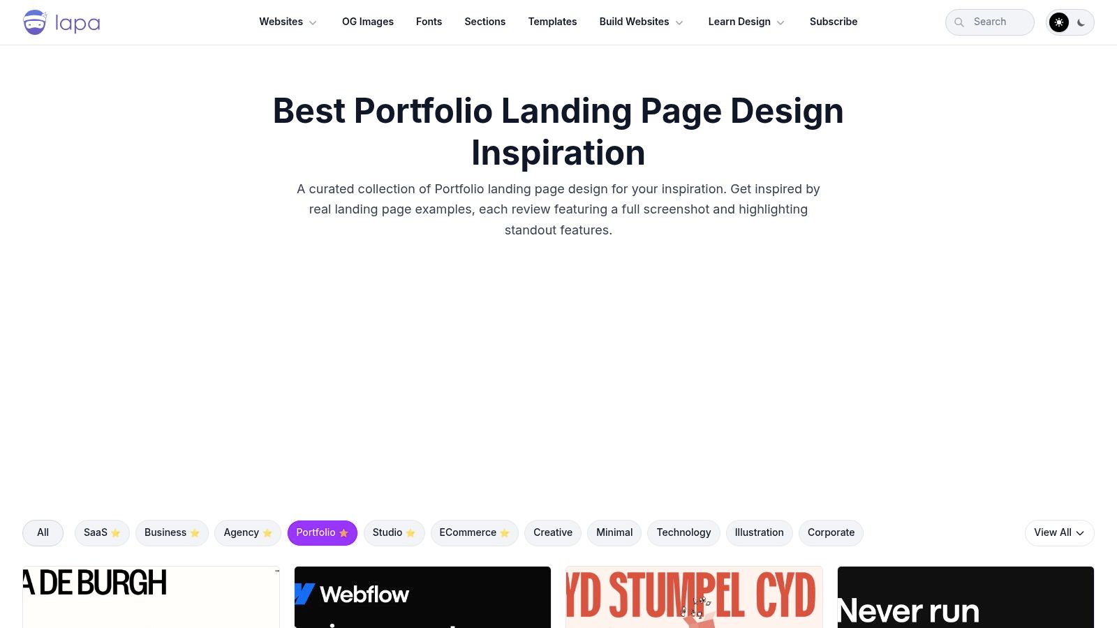
Lapa Ninja is less about deep reading and more about high-speed comparison. Full-page captures let you scroll through many portfolio entry points and build taste around information density, hero messaging, project indexing, and mobile-friendly hierarchy.
Why this one is deceptively practical
Designers often underestimate the homepage. They treat it as a holding area before the actual work starts. Hiring managers don’t. The homepage is where trust gets granted or withheld.
Lapa Ninja helps because it makes patterns visible at scale. You start seeing how strong portfolios handle headline specificity, whitespace, featured work order, and CTA restraint. You also see how weak portfolios lose the plot by trying to say everything at once.
This gets especially useful when you think of the homepage as the start of a journey, not just a pretty landing page. The projects you feature, the order you place them in, and the words you use all shape how someone moves through your work, much like digital customer journeys do in product design.
Where it can mislead you
Lapa Ninja favors page composition over case study depth. So it’s brilliant for your front door and less useful for what happens after the click. If you only study Lapa, you may build a homepage that earns admiration but leaves the reviewer stranded inside thin projects.
There’s also a subtler trap. Because screenshots are standardized, it’s easy to optimize for visual similarity instead of strategic fit. But your homepage should reflect the kind of designer you are. A research-heavy practitioner and a visual systems designer shouldn’t necessarily present the same way.
A PM I worked with once rewrote a designer’s homepage headline during a hiring sprint. The original was abstract and stylish. The new one clearly stated the designer’s focus and product context. The entire portfolio became easier to enter. No redesign, just better positioning.
If you want to sharpen your homepage instincts and then carry those lessons into stronger project framing, it helps to explore effective UX design patterns alongside these screenshot comparisons.
From example to execution
A hiring manager opens your portfolio with one question in mind. Can this designer handle ambiguity and make sound product decisions without heavy supervision?
That question changes how strong ux portfolio examples should be used. They are not swipe files for visual style. They are calibration tools. The useful move is to study each example for signals: how quickly it establishes the problem, how clearly it defines ownership, where it shows evidence, and whether the trade-offs feel like product decisions instead of presentation polish.
That is why copying structure beats copying aesthetics. A polished homepage might earn a click. A credible case study keeps a reviewer reading because it lowers hiring risk. Portfolios that stay vague usually read as execution support. Portfolios that explain constraints, judgment, and outcomes read as readiness for ownership. That difference affects level, scope, and the kinds of roles you get considered for.
Adobe’s discussion of inspiring UX portfolios points to a gap many portfolio guides still miss. Designers are often taught to present a clean success story, but reviewers also need to see the messy middle: failed directions, iteration, and the reasoning that shaped the final call (Adobe on inspiring UX portfolios). Hiring teams do not need a dramatic postmortem. They need enough process visibility to trust your judgment.
A portfolio that only shows final screens often feels incomplete.
Strong case studies make review easier. State the problem early. Clarify your role and the project context. Show the research input, product constraint, or business requirement that changed your direction. Name the hard trade-off. Close with an outcome, or with an honest reflection on what you would measure or change next if hard metrics were not available.
The artifacts matter too. Static mockups rarely prove seniority on their own. Product thinking shows up in the connective tissue around the screens. If the project is onboarding, include the flow and the drop-off risk you were addressing. If it is checkout, show error states, edge cases, and what you optimized for. If it is a redesign, make the previous experience legible enough that the improvement is obvious. For sharper references, study user flow examples, stronger user experience flows, broader thinking around UX best practices, and how emerging tools fit into the craft through AI for UX design.
Here is a practical test I use. Open a blank doc, not Figma, and write five lines only: the problem, the user tension, your role, the hardest trade-off, and what changed because of your work. If one of those lines stays fuzzy, the issue is usually not writing. The case study still lacks a clear argument.
Figr helps designers build stronger portfolio case studies with more product context. Instead of showing static mockups, use Figr to create interactive prototypes from real product contexts that demonstrate your thinking process, from PRD to user flow to final design, all connected in one canvas. You can see that in the Shopify checkout case study, the Mercury forecasting case study, or browse the wider Figr design gallery.
Your portfolio needs a stronger argument.
If you’re rebuilding your portfolio, start with one case study and make it undeniable. Figr helps you turn product context into portfolio-ready artifacts, from PRDs and flows to interactive prototypes and edge cases, so your work shows not just what you designed, but how you think.