It’s 3:07 on a Tuesday. A high-intent visitor hits your signup page, types an email, pauses on “Job Title,” and closes the tab before they ever see your product work.
That moment is what signup flow design really governs. Not screens in isolation, but the thin slice of time where curiosity either turns into momentum or dies from friction.
Signup is often treated as a UI task. It’s closer to a diagnostic discipline. You’re tracing hesitation, mistrust, unnecessary effort, and badly timed asks across a sequence that feels small in design review and expensive in production. Last week I watched a PM walk through a “simple” registration flow design that had seven separate opportunities to quit. On paper, it looked polished. In replay, it looked exhausting.
A strong signup page ux does one thing above all: it gets users to value fast enough that giving you more information feels reasonable.
Early on, it helps to align on a simple comparison of what tends to help and what tends to hurt:
| Signup choice | Usually works when | Usually fails when |
|---|---|---|
| Minimal upfront fields | You need users in the product quickly | Teams ask for sales data before product value |
| OAuth as a primary path | Audience already uses Google or similar identity providers | It’s buried as a secondary option |
| Email verification after first value | Product can safely defer identity proof | Verification blocks every first action |
| Progressive profiling | Data can be gathered in context later | Teams insist on complete CRM records at minute one |
| Intentional friction | Enterprise, compliance, lead qualification matter | Consumer-style growth depends on volume |
The Most Expensive Five Seconds in Your Product
The cost of a broken signup flow rarely shows up as one dramatic failure. It shows up as hundreds of tiny exits that nobody discusses in roadmap review.

A user lands with intent. They’re not comparing twenty tools. They clicked because something in your promise felt relevant. Then your form starts asking for context you haven’t earned yet. Company name. Team size. Phone number. Maybe a password rule they only discover after the error state fires.
That’s not a neutral interaction. It’s a tax.
Why this moment matters so much
If users stall before account creation, every downstream metric gets distorted. Activation looks weaker. Paid conversion looks weaker. Retention cohorts start smaller than they should. Teams often respond by tuning onboarding copy or lifecycle email when the leak is still sitting at the front door.
Signup friction is expensive because it blocks users before they can form any product memory.
This is also why good onboarding advice matters before users even become users. If you’re tightening the handoff from acquisition into product, this guide to customer onboarding best practices is useful because it treats early experience as one system, not separate teams defending separate screens.
The economic lens
Product teams often overestimate the importance of persuasive landing-page copy and underestimate what happens after the click. That’s backwards. The first meaningful loss usually happens in the gap between intent and completion.
If you’re already working through broader conversion rate optimization techniques, signup deserves its own diagnostic pass. Why? Because this isn’t just about getting more accounts. It’s about removing avoidable effort before a user has seen proof.
Bad signup flow design doesn’t merely lower conversion. It pushes your acquisition spend, sales effort, and onboarding work onto a smaller base of surviving users.
The Anatomy of a Leaky Signup Funnel
Most funnels don’t break in one place. They leak at every handoff.
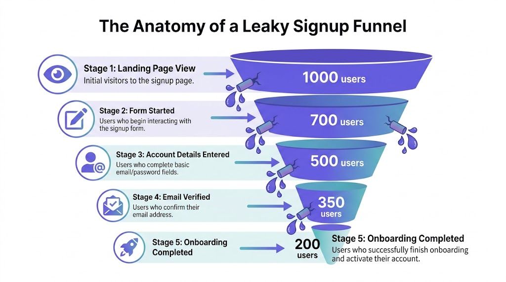
That’s why signup funnel optimization starts with a sequence, not a screen. The basic gist is this: teams spend weeks on the page before signup and very little time on the chain of states after the click.
The five leaks to inspect
CTA click to form load
If the message on the landing page promises speed and the form implies paperwork, users feel the mismatch immediately.Form start to form completion
Cognitive load hits during this phase. People abandon because the ask feels larger than expected.Details entered to verification
Email and phone verification often fail for operational reasons, not just UX reasons. Delayed emails, spam folder confusion, or context switching can end the session.Verification to first in-app step
Many products technically “convert” a signup while still leaving users directionless.First step to meaningful activation
If setup feels like administrative labor, users leave with an account you’ll count and a customer you never had.
What the data says about staged friction
A detailed analysis by Flow’s optimization team found they lifted signup completion 17.3%, from 55.31% to 64.89%, by reducing friction across information gathering, email verification, and setup stages, using funnel analytics and session recordings (CXL’s write-up).
That result matters because it reflects how real funnels break. Not only in the form, but in the spaces between screens.
Practical rule: Instrument every transition, not just the final account-created event.
When teams need a broader lens for understanding these stages, I often point them to work on digital customer journeys. Signup lives inside a larger path of expectation, commitment, and trust. If you only inspect one frame, you miss the movie.
For operators working across storefronts and product funnels, these proven ecommerce conversion rate optimization tips are also useful because they sharpen the same instinct, identify where intent decays between steps, then treat those leaks as measurable design problems.
What teams usually miss
The drop-off reason is often embarrassingly ordinary. A field label is ambiguous. Password requirements appear too late. Verification arrives after the user has switched devices. Login and signup choices compete on the same screen and create doubt.
None of that sounds strategic.
It is.
Because user registration ux is where product promise meets user effort. If that exchange feels uneven, people leave.
Fixing the First Hurdle Your Signup Form Design
Most signup forms ask for information as if they’re entitled to it. They’re not.
The sharpest lever in signup flow design is still field count. Industry benchmarks show forms with 1 to 2 fields convert at 15.2%, while forms with 7 or more fields convert at 2.1%. The same analysis notes that moving from four fields to three can boost conversion by nearly 50% (Artisan Growth Strategies).
That should change how you think about every input.
Treat each field like a cost center
If a field doesn’t provide immediate product value, remove it or delay it. Company name is often derivable later. Job title is usually irrelevant to account creation. Phone number is one of the fastest ways to trigger suspicion unless there’s an obvious verification reason.
Good signup form best practices start with subtraction, not decoration.
- Keep the first form minimal: Email and password is often enough for a first pass.
- Reveal constraints early: If passwords need special rules, show them before submission.
- Validate inline: Don’t make users finish a form just to discover a basic formatting error.
- Stay single-column on mobile: Multi-column layouts look efficient in mocks and feel annoying in thumbs.
- Use specific labels: “Work email” means something different from “Email.”
Design for recovery, not just completion
A lot of form abandonment is a recovery problem. Users hit one error, lose confidence, and quit. That’s why small details in error handling matter more than teams think.
If your validation states are vague or delayed, fix that before you rewrite your page copy. Patterns from error state design patterns can be particularly helpful, as they turn failure into guidance instead of punishment.
A signup form should feel like progress with guardrails, not a test with traps.
Look at the burden, not the beauty
I’ve reviewed polished signup page ux that still underperformed because every choice increased work. Placeholder-only labels. Hidden password requirements. A submit button that didn’t explain what happened next. A “confirm password” field added out of habit, not evidence.
The form looked clean.
The experience felt heavy.
That’s the distinction that matters in registration flow design. Not whether the form appears modern, but whether each field earns its place.
Rethinking Authentication Security vs Speed
Authentication choices reveal your product philosophy quickly. Do you value user momentum, or are you making people prove they’re worthy of trying the product?

For a lot of products, email plus password remains the default because it’s familiar. Familiar isn’t the same as efficient. It introduces typing errors, password friction, reset flows, and avoidable support burden before the user has done anything useful.
Where OAuth earns its place
Heap’s analysis found that adding one-click third-party OAuth, such as Google sign-in, boosts signup rates by an average of 8.2 percentage points because it removes most form friction (Heap).
That’s not a cosmetic gain. It changes the shape of the funnel.
If your audience already lives in Google Workspace or Microsoft ecosystems, making OAuth a secondary option is usually a mistake. People scan for the fastest trusted path. If they don’t see it, they assume the long route is mandatory.
Choosing the right auth pattern
Different products need different trade-offs:
- OAuth first: Best when speed matters and your audience is comfortable with a shared identity provider.
- Email and password: Works when account portability matters or users resist third-party auth.
- Magic links: Useful when you want to remove password creation altogether, though inbox switching can still create friction.
- SSO or enforced work email: Often right for enterprise products where identity assurance matters from the start.
A strong user registration ux makes the primary path obvious. It doesn’t put five equivalent choices on the screen and hope users sort it out.
The Cal.com booking flow is a good reference for this. It keeps the path to entry readable and doesn’t bury the obvious next move under account ceremony.
The fastest trustworthy path should be visually primary.
Security still matters, of course. But plenty of teams confuse visible friction with meaningful protection. If a control doesn’t reduce real risk, it’s often just slowing down legitimate users.
The Power of Progressive Profiling
The purpose of signup isn’t to complete your CRM. It’s to get a user to their first useful outcome.
That’s why progressive profiling changes the economics of signup flow design. Instead of collecting every detail upfront, you collect the minimum needed to create access, then ask for more data when context makes the request feel reasonable.
Ask later, ask smarter
Custify reports that SaaS companies using progressive profiling and related optimizations can reach 15% to 25% conversion, compared with an industry average of 3.2%, a 400% to 700% improvement (Custify).
The lesson isn’t “hide fields.” It’s “time the ask.”
Billing details belong at upgrade. Team information belongs when collaboration starts. Job title belongs when personalization depends on it. Users give better data when they understand why the product needs it.
This is what I mean
A complete profile collected too early is often low-quality data attached to an inactive account. A partial profile collected in sequence is often cleaner, more accurate, and tied to actual product intent.
That’s why progressive profiling pairs well with growth design to enhance UX. You’re reducing effort at the precise moment where motivation is most fragile, then using behavior and context to guide later asks.
It also connects naturally to adaptive defaults. If the system can preselect sensible choices based on role, source, or prior behavior, you reduce both form length and decision fatigue.
Turning the pattern into a workflow
Here’s a practical way to apply it:
- Create access with the minimum viable identity: Usually one or two fields.
- Move users toward the first meaningful action: Don’t interrupt with administrative questions.
- Attach data requests to feature moments: Ask when the user can see the benefit.
- Use behavior to personalize later steps: Segment by what users do, not only what they claimed at signup.
One option for diagnosing where this can work is Figr. It maps signup flows from your existing product. Feed it a screen recording of your current signup process, and it identifies friction points, maps the full flow with edge cases, and generates redesigned alternatives that match your design system. The Shopify checkout setup example is a useful reference for how complex setup can be broken into manageable stages without forcing every decision upfront.
Progressive profiling isn’t softer signup. It’s stricter prioritization.
When Friction is a Feature The Enterprise Signup
The “remove all friction” mantra breaks down fast in enterprise software.
If you sell into regulated industries, sensitive workflows, or high-consideration teams, some friction is not accidental. It’s part of qualification, compliance, and account security. Eleken notes that enterprise SaaS products with requirements such as SOC 2 or SSO often need intentional friction for compliance and lead qualification, a nuance most consumer-style advice ignores (Eleken).
When more effort is actually correct
A healthcare product may need stronger identity checks before showing any live data. A security tool may require work email validation to prevent throwaway evaluation. A collaboration product selling to large teams may need role and company details early because routing the lead matters as much as account creation.
That doesn’t mean the flow should feel bureaucratic.
It means the friction should be justified, clearly explained, and limited to what the business model needs.
Enterprise signup should never feel casual, but it also shouldn’t feel arbitrary.
The trade-off most teams avoid naming
Consumer and product-led SaaS often optimize for volume. Enterprise teams often optimize for fit. Those goals produce different signup patterns.
If your sales team needs qualified evaluators, asking for company context can be a reasonable move. If your product can safely offer self-serve access, those same fields may be self-inflicted drag. This is the zoom-out moment. Signup funnel optimization has to match your go-to-market model, your risk posture, and your activation path.
That’s also why clear user experience flows matter so much in enterprise contexts. The more conditions, permissions, and edge cases you have, the more dangerous it becomes to improvise screen by screen.
Measuring and Iterating Your Signup Flow
A redesigned flow without instrumentation is just a prettier opinion.
The teams that improve signup consistently don’t rely on one heroic redesign. They build a loop: watch behavior, isolate one friction point, change one thing, measure the result, repeat.
What to measure first
Keep the funnel simple enough that people use it:
- View to form start
- Form start to submit
- Submit to verification complete
- Verification to first meaningful in-app action
That sequence gives you somewhere to look when conversion falls, and it keeps the conversation grounded. You’re no longer arguing about whether the flow “feels cleaner.” You’re inspecting where users stop moving.
How to run better tests
Test one meaningful change at a time. Remove a field. Reorder the auth options. Clarify the CTA. Shift one question into the product. If several changes ship together, nobody learns what caused the improvement.
I also like to review concrete user flow examples before testing because they expose assumptions teams stop seeing in their own product. Sometimes the fastest way to improve a registration flow design is to notice how another product handles choice, sequencing, or recovery.
The same goes for copy. If your CTA underperforms, don’t treat it as a microcopy problem detached from the rest of the flow. It sits inside user intent, field count, and perceived effort. Work on that systemically, then use AI for better CTAs when you’re ready to refine the message against actual behavior.
Watch replays of failed signups before you spec a redesign. The pattern usually becomes obvious.
What works in practice is boring and effective. Event tracking. Session replay. Short research loops. Small A/B tests. A team that can admit the actual problem might be one unnecessary question no one wanted to challenge.
Your Next Step is Obvious
This afternoon, watch five failed signup sessions. Don’t open a workshop doc. Don’t start redesigning. Just watch where people hesitate, backtrack, or give up.
Take one page of notes. Mark the exact field, message, or transition where momentum breaks. Then pick the smallest fix with the clearest rationale and ship that first.
For the complete framework on this topic, see our guide to what is a user journey map.
If you want a practical starting point after that, use an AI design tool for product teams to map the current flow, inspect edge cases, and turn vague friction into a concrete redesign brief.
Figr is useful when your team needs to diagnose signup friction without starting from a blank canvas. It learns from your live product context, maps full flows and edge cases, connects design decisions to funnel behavior, and helps product teams generate production-ready alternatives faster.
