
It’s 4:47 PM on Thursday. Your latest feature shipped last week, and the adoption dashboard is a flat line. Not down, just… flat. The analytics tell you what happened: 10,000 visitors, 1,200 signups, 80 activated users. But they don't tell you why the other 9,920 people left. Every digital product is an architecture of choices, a series of invisible doorways. Some are wide and welcoming, others are narrow and confusing. The difference between a thriving product and a stagnant one often lies in the subtle friction points within this architecture.
Conversion isn't a switchboard you can just flip: it's a garden you cultivate. It’s about understanding this architecture and methodically widening the right doors. It’s the small, deliberate changes, backed by data, that compound over time. The basic gist is this: to improve your numbers, you must first understand the human behavior behind them. This requires moving beyond just what users are doing and digging into the why. For a comprehensive overview of strategies that build these foundational architectures, explore this guide on Website Conversion Rate Optimization.
This article provides a blueprint for doing just that. We will break down ten specific, actionable conversion rate optimization techniques tailored for product teams. Each section is a self-contained guide, detailing when to use the technique, the expected impact, and a clear test setup. These are not just tips: they are blueprints for building better pathways through your product. They are the tools for turning a flat dashboard into an upward curve.
1. A/B Testing: The Dialogue with Your Users
Most teams treat A/B testing like a science experiment, which it is, but that framing misses the point. It’s less a sterile procedure and more a conversation. You present two versions of a choice, a path, or an idea, and you listen intently to which one resonates more. It is the most direct way to ask your users what they prefer, using their actions, not their words, as the answer.
This technique is the foundation of conversion rate optimization, turning product development from a monologue into a dialogue.
When to Use This Technique
When should you start this conversation? A/B testing is ideal for optimizing a single, critical conversion point in an existing flow. Think of moments with high traffic but a noticeable drop-off: sign-up forms, pricing pages, or checkout buttons. It works best when you have a clear hypothesis, for instance, “Changing the button CTA from ‘Sign Up’ to ‘Get Started Free’ will increase clicks because it reduces perceived commitment.”
How to Implement and Operationalize It
The process is straightforward but requires rigor. First, you need a hypothesis grounded in user behavior or analytics. Why do you believe a change will improve performance? Once you have a theory, the next step is to visualize it.
For example, a product manager I know was comparing two user onboarding flows. One was linear, the other offered branching choices. Instead of just writing a PRD, she used Figr AI to capture screenshots of both concepts and instantly generate interactive prototypes. This allowed the entire team to feel the difference.
You can see a similar competitive analysis comparing the setup speed of scheduling tools like Cal.com vs Calendly. By simulating the real user flow, teams can identify friction points and generate testable hypotheses for their own products. The key is to move from abstract ideas to tangible variations quickly, test them with a segment of your audience, and let the data declare the winner. The goal is to replace assumption with statistical evidence.
2. Funnel Analysis and Drop-off Optimization
Think of your product not as a single destination, but as a series of connected rooms. Funnel analysis is the act of watching where the doors slam shut. It maps the ideal path you’ve designed, from awareness to action, and pinpoints the exact moments where users decide to leave the building entirely. This isn't just data: it's a map of user frustration and broken intent.
By visualizing this journey, product teams can stop guessing where the problems are and start surgically addressing the highest-impact friction points.
This is how you convert mild interest into committed action.
When to Use This Technique
Funnel analysis is crucial when you have a multi-step process that is essential for conversion, but you’re seeing a significant gap between the number of users who start and the number who finish. This applies to SaaS onboarding, e-commerce checkouts, or any critical workflow. If your overall conversion rate is low, a funnel analysis will tell you which step is bleeding the most users, guiding your optimization efforts for maximum ROI.
How to Implement and Operationalize It
The first step is instrumentation. You need analytics tools like Mixpanel or Amplitude to track user events at each stage of your key flows. Once you identify a major drop-off point, for example, a 40% user exit during a complex setup phase, the real work begins. The 'what' (the drop-off) must be paired with the 'why'.
A product team I know at a B2B SaaS company used analytics to find a massive drop-off in their checkout setup. Instead of just guessing, they used Figr AI to capture screenshots of the entire Shopify checkout setup flow, creating a visual map of the journey. By layering analytics data over this user flow, they could see exactly which screens were causing the most friction. This enabled them to redesign the experience and test a streamlined new setup flow, ultimately reducing user churn. This approach connects quantitative data with qualitative user experience, turning abstract numbers into an actionable redesign.
3. Landing Page Optimization: Building a Room with One Door
Imagine walking into a massive store with a hundred aisles and a thousand signs. Now imagine walking into a small boutique where a single, perfect item is displayed under a spotlight. A great landing page is that boutique. It's a purpose-built environment with a single exit, which is the exact action you want the user to take. It strips away the distractions of a full website to focus attention and intent.
This focus is why landing page optimization is one of the most powerful conversion rate optimization techniques. It aligns the promise of an ad or email with a single, clear path to value, drastically reducing friction and second-guessing.
When to Use This Technique
Landing page optimization is critical for paid acquisition campaigns, product trial sign-ups, or any initiative where traffic arrives with a specific goal in mind. If you're running Google Ads for a "project management tool," the user shouldn't land on your generic homepage. They should land on a page that screams "The Best Project Management Tool for Teams Like Yours" and offers an immediate next step. It’s perfect for isolating a single conversion metric and optimizing for it relentlessly.
How to Implement and Operationalize It
The process starts by aligning the message of your traffic source with the page's content. A product manager I know noticed their ad campaigns for different user segments (e.g., developers vs. marketers) all led to the same generic sign-up page. The conversion rate was dismal.
They decided to test segment-specific landing pages. Instead of starting from scratch, they captured their existing page into Figr AI and asked it to generate three variations, each with a different value proposition tailored to a specific persona. The tool instantly created high-fidelity, interactive prototypes that matched their Figma design system. This allowed them to A/B test headlines and CTAs that spoke directly to each audience. The results were immediate: a double-digit lift in trial sign-ups. For more ideas, you can explore how AI can suggest better CTAs based on user intent. The key is to transform a one-size-fits-all doorway into a series of personalized entrances.
4. User Experience (UX) Optimization Through Friction Analysis
Imagine your user is trying to get through a maze. Every wrong turn, dead end, or confusing signpost adds a little bit of frustration. Enough of those small frustrations, and they give up. Friction analysis is the art of mapping that maze from their perspective, identifying every source of hesitation, and systematically clearing the path. It’s about making the desired action the path of least resistance.
This technique reframes UX from a matter of aesthetics to a matter of momentum. It’s one of the most powerful conversion rate optimization techniques because it targets the silent killers of conversion: confusion, effort, and doubt.
When to Use This Technique
Friction analysis is most potent in multi-step processes where drop-off rates are high but the reason isn't obvious. Think complex onboarding sequences, checkout flows, or profile completion wizards. It is also invaluable when analytics show users are spending too much time on a page without converting. The goal is to answer: where are they getting stuck, and more importantly, why?
How to Implement and Operationalize It
The process begins with mapping the current state. You can't remove friction you can't see. Last week, I watched a team tackle their complex onboarding flow for a new SaaS product. Users were dropping off, and the data alone couldn’t explain it. Instead of guessing, they used Figr AI to capture every screen of their flow and generate a complete user flow map.
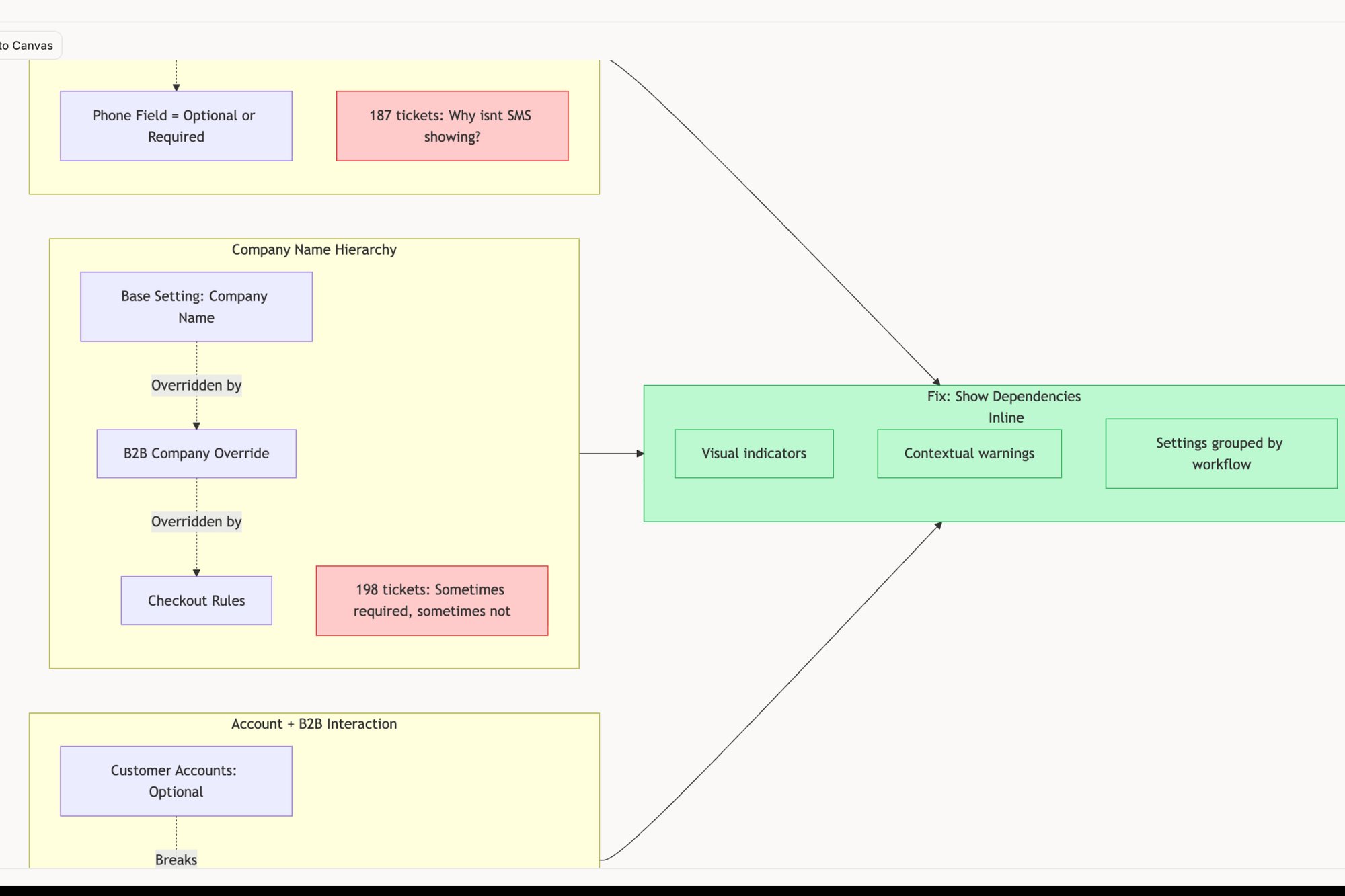
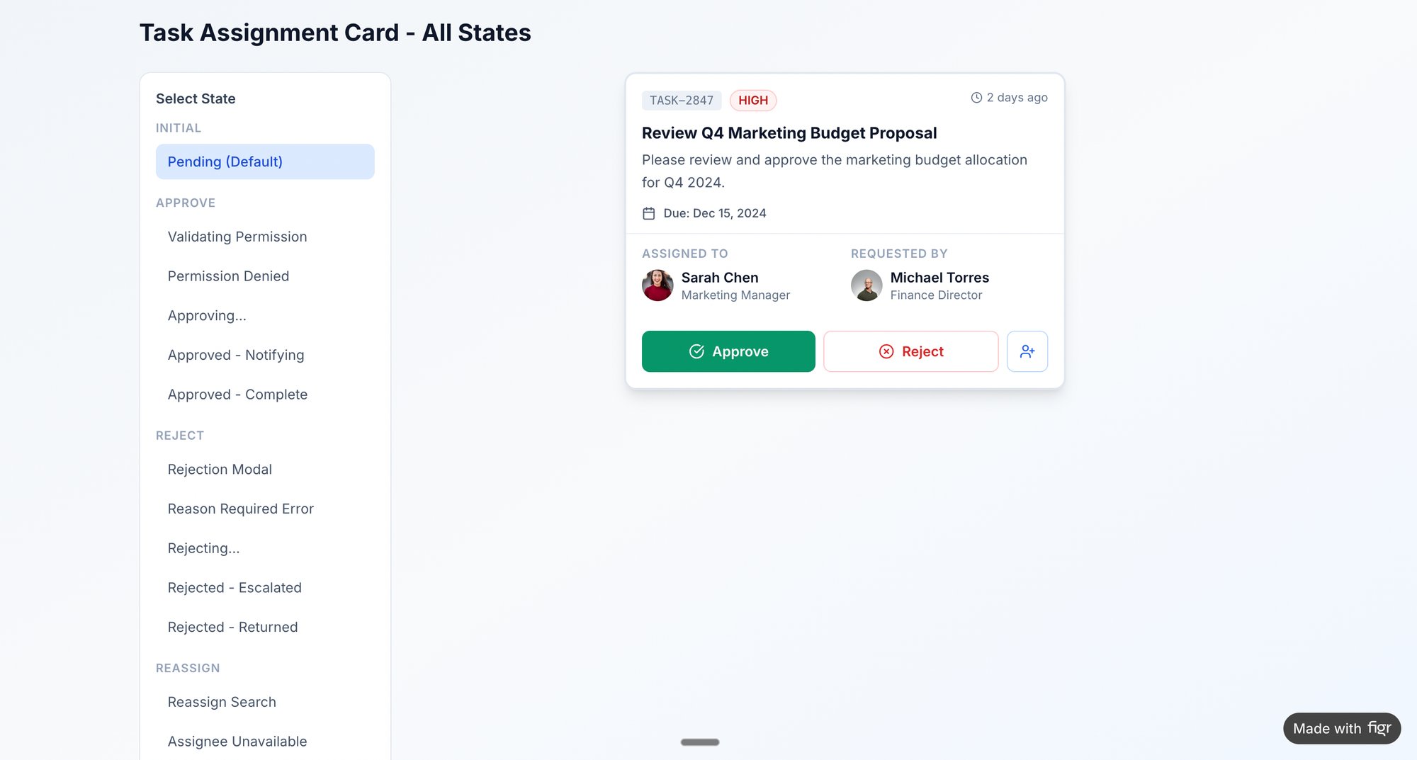
This visual map became their single source of truth. It revealed two unnecessary confirmation screens and an ambiguously labeled button that was causing hesitation. By analyzing this map, they identified three distinct points of friction. They then created a simplified prototype in Figr, removing the extra steps and clarifying the copy, which they could then test. The entire map of edge cases and user flows for a task assignment component can reveal these friction points with startling clarity. Your goal is to make the user’s journey feel less like a maze and more like a slide.
5. Personalization and Segmentation: The Custom-Fit Suit
Imagine walking into a store where every item is already tailored to your exact measurements and style. You wouldn't waste time browsing ill-fitting options; you’d move straight to what works. Personalization is the digital equivalent of this bespoke experience. It stops treating your user base as a monolith and starts addressing them as individuals with distinct contexts and needs.
This is one of the most powerful conversion rate optimization techniques because it replaces generic messaging with specific, relevant value propositions, making the path to conversion feel less like a sales funnel and more like a guided tour.
When to Use This Technique
Personalization is most effective when you have identifiable user segments exhibiting different behaviors. Are new users from a specific ad campaign dropping off during onboarding? Are power users ignoring a new feature because it’s buried? These are perfect scenarios. The technique is ideal for tailoring onboarding flows, feature discovery, or even pricing pages based on user attributes like their role, company size, acquisition source, or past behavior.
How to Implement and Operationalize It
The process begins with data, not design. Identify your most impactful segments first: returning versus new, free versus paying, or users from different industries. The goal is to form a clear hypothesis, such as "Enterprise users will convert to paid plans faster if shown an onboarding flow that highlights security features and team management."
Once you have a hypothesis, you can visualize the different paths. For instance, a product manager could map a standard user journey and then use a tool like Figr AI to quickly branch that flow into multiple personalized versions. By uploading screenshots of different UI components, you can generate interactive prototypes for each segment, like one for a solo user and another for a team admin.
For a concrete example, you could map the current Shopify checkout setup and then design a new, streamlined flow specifically for first-time merchants. This allows the team to test if a tailored experience for a key persona improves activation rates. The core idea is to move from a one-size-fits-all model to a portfolio of targeted experiences, and measure which custom fit drives the highest conversion.
6. Checkout and Payment Flow Optimization
The checkout process isn't a finish line, it’s a tightrope. Every field, every click, and every moment of hesitation is a point where a confident buyer can fall into the abyss of cart abandonment. Optimizing this flow is less about aesthetics and more about removing psychological friction. It’s the art of making the final commitment feel like an effortless, foregone conclusion.
This is where the highest-intent users live. Treating this flow with surgical precision is one of the most direct conversion rate optimization techniques for boosting revenue.
When to Use This Technique
This technique is non-negotiable for any product with a transaction: e-commerce, SaaS subscriptions, or digital marketplaces. It’s especially critical when analytics show a high cart abandonment rate or a significant drop-off between the "Add to Cart" and "Purchase Complete" events. If users are saying "yes" to your product but "no" to your payment process, this is your highest-leverage opportunity.
How to Implement and Operationalize It
The goal is to eliminate surprises and reduce cognitive load. Start by mapping your existing flow. According to research from the Baymard Institute, the average checkout contains 11.8 form fields, yet a fully optimized flow can be completed with as few as 6 to 8. Where can you cut?
A product manager I know was tasked with overhauling a checkout experience for a B2B SaaS tool. The existing flow was a single, long form that felt intimidating. Instead of guessing, she captured screenshots of the current flow and used Figr AI to quickly generate several interactive prototypes. She created one version that broke the process into three clear steps and another that offered a guest checkout option.
This allowed stakeholders to feel the difference between the cluttered original and the streamlined alternatives. For instance, you could model a redesigned Shopify checkout setup process, focusing on clarity for new merchants. By visualizing variations, like guest checkout versus mandatory account creation, or testing the placement of trust signals like security badges, you move from abstract "best practices" to tangible, testable hypotheses that directly address user anxiety and friction.
7. Onboarding Flow Optimization
The moment a user signs up is not the finish line; it’s the starting gun. Onboarding is the critical handoff from their expectation of value to their experience of it. A poor onboarding flow is like a clumsy tour guide who gets you lost in the lobby. An optimized one is a trusted advisor, leading a new user directly to their first "aha!" moment and proving the product’s worth within minutes, not days.
This technique transforms a moment of high potential churn into a powerful engine for long-term retention and user activation. It’s one of the highest leverage conversion rate optimization techniques for SaaS products.
When to Use This Technique
Onboarding optimization is crucial when analytics show a steep drop-off immediately after sign-up or when user activation rates are low. It’s perfect for complex products where the path to value isn't immediately obvious. A key indicator is user feedback like, "I signed up, but I wasn't sure what to do next." Your goal is to shorten the time it takes for a user to perform a key action that signals commitment.
How to Implement and Operationalize It
The first step is to see the entire journey from the user's perspective. You can’t optimize what you can’t see. Start by mapping every step, decision point, and potential path a new user can take. This isn’t just about the "happy path" either, you have to account for different user roles and goals.
A product team I know was struggling with low activation for their developer tool. They used Figr AI to capture screenshots of their entire onboarding sequence and generate a comprehensive user flow diagram. This visual map immediately highlighted two major friction points where users were getting stuck. From there, they could hypothesize solutions: a shorter, interactive tutorial versus the existing passive video.
By prototyping these new flows directly from the captured screens, they created testable variations in hours. The core idea is to treat onboarding not as a static manual but as a dynamic, personalized guide that adapts to the user, accelerating their journey to value. This is where you convert curiosity into commitment.
8. Social Proof and Trust Signal Optimization
Buying a product online is an act of faith. Users are standing at a digital ledge, weighing the risk of jumping against the potential reward. Social proof is the crowd below, shouting "It's safe! We did it, and it was great." Trust signals are the safety net, promising a soft landing if things go wrong. These elements aren't just decoration, they are fundamental risk-reducers.
This technique transforms a solitary decision into a communal one, using the psychology of conformity and safety to ease a user's primary anxieties: "Will this work for me?" and "What if it doesn't?"
When to Use This Technique
This is essential for any page where a user must make a commitment, whether it's signing up, starting a trial, or making a purchase. It is most potent on pricing pages, sign-up forms, and high-value landing pages. The hypothesis is usually direct: “Adding customer logos and a satisfaction guarantee near the ‘Buy Now’ button will increase conversions by reducing last-minute hesitation.” It addresses the final barrier between consideration and action.
How to Implement and Operationalize It
The core idea is to make trust visible and credible. Don't just say you're trusted, show it. This means moving beyond generic praise to specific, verifiable signals. For instance, Slack doesn't just say "big companies use us," they show the logos of Uber, Airbnb, and Salesforce. That visual proof is instant credibility.
A product manager I know was tasked with improving a checkout page conversion rate. The analytics showed high cart abandonment. Instead of guessing, she used Figr AI to capture the current checkout screen and mock up several variations. She tested different placements for security badges (SOC 2, GDPR), customer testimonials, and a prominent money-back guarantee. She then used a link to the interactive prototype showing edge case simulations to get immediate feedback from the sales team on which signals resonated most with customers they spoke to. This allowed her to build a data-informed hypothesis for her A/B test, ultimately choosing the variation that layered specific testimonials directly under the CTA, which proved to be the winner.
9. Scarcity and Urgency Tactics: Turning "Maybe Later" into "Right Now"
Your user’s attention isn't a conveyor belt; it’s a finite resource. Scarcity and urgency, when used ethically, act as a focusing lens. They take a user’s vague intention to act "someday" and crystallize it into a decision to act now by highlighting a real constraint: limited availability or a closing window of opportunity. It’s the difference between a casual browse and a decisive purchase.
This technique, rooted in Robert Cialdini’s principles of persuasion, helps overcome user inertia, one of the biggest silent conversion killers. It provides a compelling reason to stop procrastinating.
When to Use This Technique
Scarcity and urgency are most effective for time-sensitive promotions or products with genuine limitations. Think flash sales, webinar registrations with a fixed number of seats, or beta programs where you can only onboard a certain number of new users. The key is authenticity. Messages like Booking.com’s “Only 2 rooms left at this price” work because the scarcity is real and verifiable. Use this when the cost of user delay is high, both for you and for them.
How to Implement and Operationalize It
The implementation must be honest and visually clear. Don't just say an offer is limited, show it. This is where you connect the psychological trigger to the user interface. A countdown timer next to a "Buy Now" button isn't just decoration, it’s a constant, visible reminder of the deadline.
For instance, a product team could brainstorm different ways to present a limited-time offer for a new feature. Is it a banner? A modal? A subtle note below the price? Instead of debating abstracts, they could capture screenshots of their pricing page and use Figr AI to quickly generate interactive prototypes of each variation.
By testing different visual formats, such as a countdown timer versus a "spots remaining" counter, you can find what resonates. A PM I know used this to test the urgency messaging for a trial. The team visualized variations like "limited beta spots available" and "offer ends Friday" to see which one felt more compelling. The goal is to make the constraint feel both real and relevant, pushing the user over the conversion threshold without sacrificing trust.
10. Form Optimization and Micro-Interactions
A form is not a database entry point, it's a negotiation. The user has something you want (their information) and you have something they want (access, a product, a newsletter). Every field you add is a new term in that negotiation. Make it too demanding, and the user walks away. Make it effortless, and the deal is closed.
This technique transforms a necessary chore into a smooth, guided experience. It reduces the psychological friction of data entry through simplification, smart defaults, and subtle, reassuring feedback loops.
When to Use This Technique
This is a critical conversion rate optimization technique for any flow that requires user input. It's essential for sign-up pages, checkout processes, contact forms, or complex onboarding questionnaires. If you have analytics showing high drop-off rates on a page with a form, that's your signal. The hypothesis is nearly always the same: “Simplifying the form and providing better real-time feedback will increase completion rates by reducing cognitive load and user frustration.”
How to Implement and Operationalize It
In short, the process starts with subtraction. As Luke Wroblewski, a key thinker in form design, advocates, the best way to improve a form is to remove unnecessary fields. Each field is a point of friction. After culling, focus on clarity and flow. Are the labels clear? Is the sequence logical?
For instance, a team I know was tackling the notoriously complex Shopify checkout setup for merchants. They didn't just guess what was difficult, they analyzed the existing flow, identified drop-off points, and redesigned the entire experience. Using Figr AI, they mapped the current user flow and then created an interactive prototype of a new, simplified setup. This allowed stakeholders to feel the reduced friction firsthand before committing development resources.
You can apply a similar method by capturing your own form, generating variations, and testing them. Implement real-time validation to provide helpful, inline error messages. Use smart field types like date pickers and autofill to reduce typing. For multi-step forms, add a progress indicator. The goal is to make the form feel less like an interrogation and more like a helpful conversation.
Your Next Move: Start with One Step
We’ve covered a lot of ground. From the surgical precision of A/B testing a call-to-action to the systemic redesign of an entire onboarding flow, the landscape of conversion rate optimization techniques is vast. It can feel like standing at the base of a mountain range with ten different peaks to climb, each demanding its own strategy, tools, and effort.
The temptation is to try climbing them all at once.
This is a recipe for scattered effort and murky data. The true work of CRO is not about boiling the ocean. It's about heating one cup of water to a precise temperature. This is what I mean: optimization is a rhythm, not a blitz. It’s a continuous process of observation, hypothesis, and measurement. The goal isn’t to "be done" with CRO. The goal is to build a product that breathes with your users, adapting and improving with each cycle of feedback.
Turning Insight into Action
So, where do you begin? Forget the ten techniques for a moment and focus on one user problem. What is the single most frustrating, confusing, or inefficient moment in your customer's journey right now? Is it the moment they land on your homepage and can't figure out what you do? Or is it the five-step form that asks for their life story just to download a whitepaper?
That’s your starting point.
Here is a practical, three-step plan for your next move:
- Isolate the Problem: Don't just say "our checkout conversion is low." Get specific. "Users on mobile devices are dropping off at the shipping address input step." Capture this precise flow. A friend at a Series C fintech company recently did this using Figr to map their complex card freeze flow, and seeing the journey laid out visually immediately revealed two redundant steps they could eliminate. The problem became tangible.
- Form a Singular Hypothesis: Based on your observation, make one testable claim. "We believe that by adding Google Address Autofill to the shipping step, we will reduce friction and increase completion rates by 15%." This isn't a vague goal, it's a specific, falsifiable statement.
- Build and Test One Variation: Create a prototype of that one change. It doesn't have to be a massive redesign. As we saw in the Shopify checkout setup example, even simplifying the information architecture can have a profound impact. You can build a high-fidelity variation, test it with a segment of your users, and measure the result against your baseline.
This deliberate, focused approach is how you make progress. It compounds. A 5% improvement this month, a 7% lift next quarter. These small, validated wins build the momentum and the business case for larger optimization efforts. This is especially critical in specific verticals. For instance, teams looking to improve ecommerce conversion rates will find that optimizing the payment flow and adding trust signals can yield disproportionate returns.
Mastering these conversion rate optimization techniques is more than just a way to increase metrics. It is a way to build a better, more intuitive, and more valuable product. It is the practice of empathy at scale. You are not just optimizing a funnel, you are shortening the distance between a person with a problem and your product as the solution. For the statistical rigor behind each experiment, see our complete guide to A/B testing best practices.
Start with one step. One hypothesis. One experiment. Begin today.
Ready to move from theory to action? Figr is the fastest way to capture a user flow, map its friction points, and prototype a better version to test. Stop guessing and start experimenting with a clear, visual workflow built for product teams. Get started with Figr for free.