
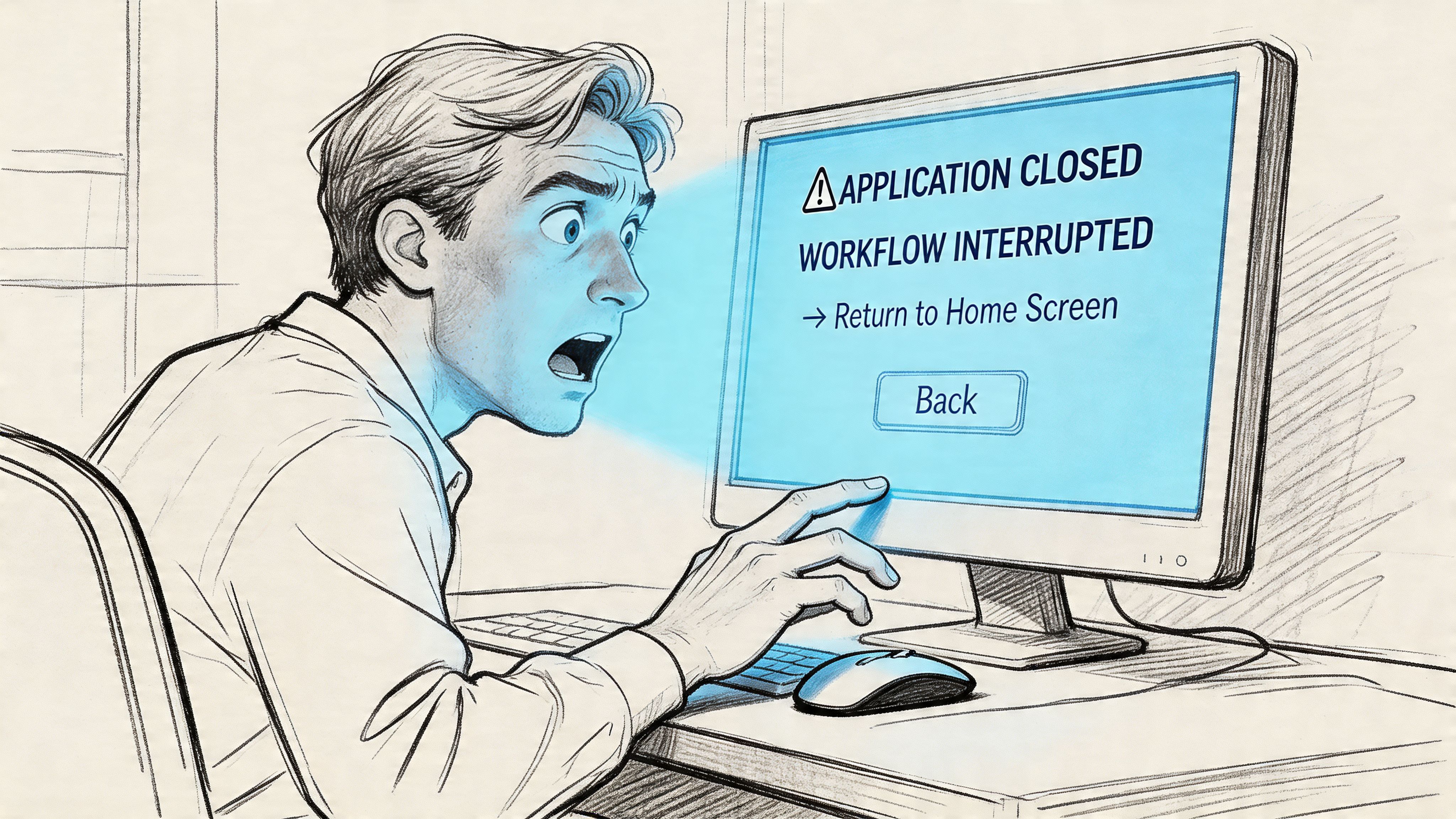
Tuesday, 10:14 a.m. A product manager is halfway through a pricing update, Slack is buzzing, a sales call starts in six minutes, and one click on a harmless-looking Back button wipes the draft. No crash. No dramatic error. Just that cold pause where the user realizes the product did something they did not mean, did not expect, and now do not trust.
That moment is the primary cost center in software.
The principle of least surprise exists to prevent exactly this kind of small betrayal. It sounds abstract, but in practice it gives teams a brutally useful lens: if the interface makes people stop and reinterpret what just happened, the product has already imposed a tax. Not just on attention, but on momentum, trust, and completion.
The best UX rarely feels impressive in the moment. It feels obvious. That is the point.
The Small Betrayal That Kills a Product
A user doesn't usually abandon a product because of one giant catastrophe. More often, they leave after a series of tiny breaks in confidence.
A Save button publishes. A Cancel button resets. A tooltip appears where a confirmation should have appeared. A link opens a new tab for no clear reason. None of these failures look dramatic in a sprint demo. All of them feel expensive in the hands of someone trying to get work done.
Trust breaks before usage drops
I've seen teams spend weeks polishing onboarding copy while leaving one destructive action mislabeled in the core workflow. Guess which one users remember.
People forgive slow learning curves when they feel the product is honest. They don't forgive interfaces that trick them, even accidentally. Once users start second-guessing labels, motion, and system responses, every future interaction gets slower.
Practical rule: If a user has to hover, hesitate, or ask "wait, what does this do?" in a core flow, trust has already slipped.
This is why the least surprise principle UX teams talk about isn't just a matter of elegance. It's a matter of preserving confidence under pressure. Software is often used in moments of urgency, not leisure. In those moments, surprises feel larger than they are.
The hidden pattern behind "annoying" products
A friend at a Series C company told me about a release that looked polished in review but drew instant complaints after launch. Nothing was technically broken. The feature behaved differently from the rest of the product. Users had learned one interaction model, then hit a screen that subtly switched the rules.
That's the pattern worth naming.
Products bleed engagement through mismatched expectations. The interface signals one thing, the system does another, and users absorb the difference as friction. They may not say "your interaction model violated my assumptions." They say the product feels clunky, confusing, or risky.
The basic gist is this: every surprising behavior acts like a withdrawal from the user's trust account. Enough withdrawals, and the product starts to feel unsafe, even if it still works.
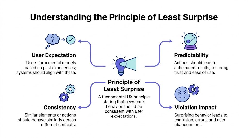
What Is the Principle of Least Surprise?
The principle of least surprise, also called the principle of least astonishment, says a system should behave the way users reasonably expect it to behave. When people click, swipe, type, or confirm an action, the response should align with their existing mental model, not force them to learn a private logic invented by the product team.
A door makes the point faster than any software example. A handle suggests pulling. A flat plate suggests pushing. When the signal and the action match, the door disappears and the person just moves through it. When they don't, the object becomes a puzzle.
Old principle, current problem
This idea is older than most design teams realize. The principle was first formally documented in print in 1972 as the "Law of Least Astonishment" in systems programming literature, and its original formulation argued that "every construct in the system should behave exactly as its syntax suggests" while following accepted conventions wherever possible, as documented in the history of the principle of least astonishment.
That longevity matters.
This isn't a trendy UX slogan. It's one of the foundational UX design principles in computing because human beings have always relied on expectation to use systems effectively. Interfaces changed from terminals to touchscreens, but the underlying human need did not.
Surprise is not the same as inconsistency
This is what I mean. Teams often hear this principle and translate it into "make everything consistent." That's too shallow.
Rigid sameness can create confusion when context changes. A Delete action in a text editor may remove text and support undo. A Delete action in file storage may trigger a very different level of consequence. Matching user expectation matters more than making every component behave identically in every context.
A few useful distinctions help:
- Convention beats novelty: If users already know a pattern from other products, you need a strong reason to replace it.
- Context beats dogma: Similar controls can require different safeguards depending on risk.
- Signals matter as much as behavior: Labels, placement, color, and motion all tell users what to expect before they act.
The best interfaces don't ask users to admire the designer's originality. They let users proceed without stopping to decode intent.
When teams get this right, people don't notice. They move faster.
The Cognitive Cost of Surprise
Surprise is expensive because the brain is always predicting.
Users don't approach an interface as blank slates. They arrive with a working theory formed by every app, website, and device they've used before. That theory helps them move quickly. They see a button shape, a left-arrow, a kebab menu, a swipe gesture, and they forecast the likely result before they act.
When the interface violates that forecast, the user has to stop and rebuild their internal model. That is the cost.
The cognitive tax users pay
The principle of least astonishment is rooted in cognitive science. Human beings construct mental models from prior experience, and research in information theory has treated "surprise" as something measurable through Bayesian frameworks that compare prior and posterior expectations, as explained in this guide to the cognitive foundations of the principle.
For product teams, the practical implication is simpler than the math. Surprise increases cognitive load.
Instead of completing the task, the user must answer a new set of questions:
- What just happened
- Did I cause damage
- Can I reverse it
- Are the other controls also unreliable
That shift is brutal because it replaces progress with diagnosis.
Friction shows up as emotion first
User expectation design transcends mere interaction mechanics. Friction doesn't arrive wearing a label. It arrives as irritation, caution, and low-grade anxiety.
A user who no longer trusts the interface becomes slower and more defensive. They read more carefully. They click less confidently. They avoid advanced features. They postpone action. That emotional residue is one reason predictability sits so close to emotional design in product UI. Interfaces don't just process inputs. They shape the user's felt sense of safety.
If your product makes people feel careful instead of capable, it is probably violating expectations somewhere important.
Teams often miss this because analytics catch exits, not hesitation. Session replays and strong user research methods are what expose the pauses, re-reads, and cursor loops that reveal surprise in the wild.
Why this matters beyond one screen
There is also an economic pattern here. Every unexpected interaction makes users spend effort learning your exception instead of using your product to achieve their goal. Multiply that across onboarding, setup, collaboration, and billing, and you don't just have a UX issue. You have a scaling problem.
A company can ship around a few rough edges when users are highly motivated. It cannot build durable adoption on accumulated confusion. UX predictability lowers the mental overhead required to get value, and lower overhead is one of the few advantages users feel immediately.
The Hallmarks of Intuitive Interface Design
Great products often look simple because they borrow from familiar behavior instead of inventing new grammar. That's what intuitive interface design really is. Not magic. Not minimalism. Familiar cues, correctly applied.
Think about keyboard shortcuts. Copy, paste, cut, save. People carry those expectations across tools without needing a tutorial. The pattern works because the product respects prior learning rather than demanding fresh interpretation on every screen.

Familiarity is a feature
One reason Gmail has remained learnable despite growing complexity is that new capabilities are usually framed as additive, not destabilizing. In this Gmail AI draft example, the assistance sits inside a context users already understand: drafting, editing, refining. It doesn't ask users to abandon the compose mental model. It extends it.
That's a subtle discipline.
Strong user expectation design usually shares a few traits:
- Clear affordances: Controls look interactive when they are interactive, and passive when they are not.
- Stable consequences: Primary actions produce results people can infer before clicking.
- Recoverable paths: Risky moves are buffered with confirmation, undo, or obvious escape routes.
- Consistent hierarchy: Users can tell where to look first, second, and third without hunting.
Teams that want a broader lens on this usually benefit from revisiting classic design heuristics and the golden rules of interface design. Both are useful not as doctrine, but as reminders that familiarity compounds.
Invisible UX usually has visible structure
A product feels intuitive when users don't have to inspect every element equally. Good hierarchy narrows attention. It says, in effect, "this matters now, that matters later."
That's why ux predictability is tightly connected to layout, spacing, and sequencing. If the eye lands in the wrong place first, the hand often follows. Better visual hierarchy reduces interpretation work before any interaction begins.
For teams thinking beyond interaction mechanics, this external piece on principles of design for better conversions is useful because it frames design choices through user comprehension and response, not just aesthetics.
Here is a simple product truth I come back to: users experience the interface in motion, not as a static mockup. Predictability comes from the full chain of cue, action, response, and recovery.
What works in practice
Patterns become intuitive when they respect what people already know from adjacent products and adjacent moments. Pull to refresh worked because it fit the physical metaphor of content moving under the finger. Inline validation works because it answers a question at the moment the question appears. Autosave works when the system makes status legible and doesn't subtly alter meaning.
What doesn't work is novelty for its own sake. Hidden gestures, overloaded icons, unlabeled states, and interactions that change meaning between screens all create preventable friction.
The most effective interface pattern is often the one that feels slightly boring in design review and completely effortless in use.
That's not a compromise. That's maturity.
When Interfaces Cause Whiplash The Anti-Patterns
Last week I watched a PM demo a feature where a toggle had three states. Not on, off, but on, off, and auto. The hesitation in the room was immediate. Nobody said the model was wrong exactly. They just stopped trusting that the control meant what it looked like it meant.
That kind of hesitation is the smell of broken expectation.
Ambiguity disguised as cleverness
Some anti-patterns keep showing up because teams optimize for compactness, novelty, or internal logic instead of user interpretation. A label makes sense in the spec. A state machine makes sense to engineering. But the interface asks the user to infer too much from too little.
This X.com soft mute example shows the problem well. The action lives in an ambiguous middle ground. It isn't fully visible in consequence, isn't universally understood in naming, and can leave users unsure what changed. That is exactly how interfaces create whiplash: the system knows what happened, the user only thinks they do.

The cost of violating expectation
In UX design for SaaS products, the Principle of Least Surprise prioritizes user expectations over rigid consistency, and usability benchmarks summarized by Dovetail note that friction in complex interfaces is associated with 40-60% task abandonment, while violating the principle can lead to a 25-35% drop in task completion, with users backtracking or exiting screens 2-3x more frequently when actions defy intuition.
Those numbers matter, but the lesson isn't "be conservative." It's "don't make users decode your product while trying to use it."
A few anti-patterns tend to cause the most damage:
- Controls that lie: Buttons or toggles that imply one outcome and trigger another.
- Navigation that shape-shifts: Menus that move, rename, or collapse differently across similar screens.
- Text that hides interactivity: Links styled like body copy, or plain text that unexpectedly acts like a control.
- Errors that blame without guiding: Messages that tell users something failed but don't explain recovery.
If your flows break here, they rarely fail gracefully. They fracture user experience flows, corrupt otherwise strong user flow examples, and usually show up later as support complaints, workarounds, or abandonment.
Recovery is part of predictability
Teams often treat recovery patterns as secondary polish. They're not. Good error state design patterns are one of the clearest signals that a team understands the principle of least surprise. If something goes wrong, the path forward should feel just as legible as the primary path did.
A surprising interface can survive one mistake. It rarely survives a mistake plus a confusing recovery path.
Users don't need perfection. They need to know the system is understandable even when things go sideways.
How to Enforce Predictability in Your Workflow
Teams often agree with the principle of least surprise in theory. The trouble starts in execution, where deadlines reward shipping and local decisions gradually add up to a confusing whole.
The fix is operational. Predictability has to be designed, tested, and governed like any other product quality standard.
Start with expectation mapping
Before debating polish, map what users are likely to expect in each critical flow. Look at competitor patterns, platform conventions, and your own legacy behavior. If your billing page, settings screen, or creation flow departs from those norms, make that a conscious choice, not an accidental one.
I usually ask teams three questions:
- What does the label imply?
- What would a first-time user predict happens next?
- If our behavior differs, is the benefit obvious enough to justify the cost?
This sounds simple because it is. Yet many painful surprises survive because nobody asked those questions out loud.
Test for interpretation, not just success
Usability sessions often focus on whether users can eventually finish the task. That bar is too low. A person can complete a flow and still experience unnecessary confusion.
Better tests probe expectation before action. Ask users what they think a button will do. Ask what they expect after they submit. Ask where they would go to reverse a decision. The mismatch between prediction and reality is where the best product insight lives.
Watch for: hesitation, rereading, cursor hovering, repeated backtracking, and the phrase "I guess."
Those are often stronger signals than verbal feedback. Users will try to be polite. Their behavior won't.
Build design systems that govern behavior
A mature design system doesn't just standardize color and spacing. It standardizes meaning.
That includes when to use a modal instead of inline expansion, how destructive actions are signaled, where confirmations appear, what loading states promise, and which components support undo. Teams that want to scale consistency should treat interaction rules as part of the same operating layer as tokens and components. A practical starting point is a shared design systems guide.
If your team needs a durable way to document those decisions, it also helps to create standard operating procedures around recurring UX choices so product, design, QA, and engineering don't reinvent interaction logic in each sprint.
Measure surprise where it actually happens
One of the biggest gaps in product work is measurement. Teams still lack concrete metrics tying surprise to churn, support volume, or lost revenue, and the Centercode discussion of the principle makes the case that mapping specific UI pattern violations to funnel abandonment would turn this from philosophy into a measurable optimization lever.
Until that measurement is perfect, teams can still instrument useful proxies:
- Drop-offs after non-standard interactions: If a novel control is followed by exits, compare it against more familiar patterns elsewhere in the product.
- Support themes by screen: When users ask "where did this go" or "what happened after I clicked," that is expectation debt.
- Replay review on high-value flows: Watch onboarding, checkout, setup, permissioning, and collaboration moments with special care.
- Revision churn in design and QA: Repeated fixes to labels, states, and interaction logic often point to predictability issues upstream.
This is also where thinking in journeys helps. Surprise rarely exists on one screen alone. It accumulates across handoffs, states, and edge cases inside broader digital customer journeys.
A working playbook for product teams
If I had to turn all of this into one operating rhythm, it would look like this:
- Audit one core flow monthly: Pick a task users do under pressure and inspect every signal, action, and recovery path.
- Keep a surprise log: Track moments where testers predicted the wrong outcome, even if they eventually recovered.
- Review novelty as debt: Any custom interaction should have a written reason it needs to exist.
- Treat undo as strategic: Reversible systems feel safer, which makes the interface feel more predictable.
- Align PM, design, and QA on expected behavior: Surprises often enter when teams agree on output but not on user interpretation.
Predictability is not anti-innovation. It is disciplined innovation. The team still solves hard problems, but it does so without making users pay the interpretive cost.
Conclusion Design for Trust Not for Applause
The best UX rarely announces itself. It lets the user finish the job, keep their train of thought, and move on with confidence. That is why the principle of least surprise matters so much. It is not a call for blandness. It is a standard for trust.
Every unexpected behavior makes the user do extra work. Sometimes that work is cognitive. Sometimes emotional. Sometimes operational, when they need to recover from an action they never meant to trigger. Over time, those moments shape whether the product feels dependable or draining.
The sharpest teams I know don't ask whether an interaction is clever. They ask whether it is legible under pressure.
Before your next sprint planning, pick one core flow and watch five new users attempt it. Don't guide them. Don't rescue them early. Just observe the pauses, the second guesses, the small frowns, the moments where a label or action creates uncertainty. That is your roadmap.
For the complete framework on this topic, see our guide to UX design process steps.
Build for trust first. Applause usually follows later, if it matters at all.
Figr helps teams operationalize the principle of least surprise by grounding design work in familiar patterns instead of blank-canvas guesswork. It draws from 200k+ real-world UX patterns when generating prototypes, so interactions reflect what users already recognize from similar products. The result is output that feels familiar on first contact, which is often the difference between a product people admire and a product people can effectively use.
