The PM needs a stakeholder demo tomorrow. Engineering wants a decision tonight. Design already has three open branches, two half-finished concepts, and a Slack thread full of “quick thoughts” that are no longer quick. This is the moment when a wireframe in Sketch stops being a design exercise and becomes a stress test for the whole product process.
I’ve seen this pattern for years. The slowdown rarely comes from lack of ideas. It comes from what I call workflow friction, the tiny manual steps that pile up until momentum disappears. Naming layers. Rebuilding the same card. Adjusting spacing by eye. Duplicating screens for a variant that should have taken minutes.
Sketch is still a capable tool. For many teams, it remains a familiar wireframe sketch tool with a clean canvas and a strong symbol model. But familiarity can hide cost. If you’re creating a sketch app wireframe under real delivery pressure, speed depends less on drawing skill and more on whether your setup resists rework.
The Unseen Friction in Design
A lot of product teams think the problem is wireframing itself. It usually isn’t.
The problem is that manual wireframing asks you to solve too many small operational problems while you’re still trying to think. You’re deciding structure, flow, hierarchy, copy placeholders, state changes, and component reuse, all while managing the file. That context switching burns time.
Where the drag actually lives
In practice, friction shows up in a few repeatable places:
Setup drag: wrong artboard size, loose alignment, no component baseline
Assembly drag: repeated drawing of common UI patterns instead of reusing symbols
Revision drag: every feedback round creates one more layer of manual edits
Handoff drag: someone else opens the file and can’t tell what changed, what matters, or what’s final
This is why a simple flow can feel slow.
One PM I worked with didn’t need a polished prototype. She needed a believable path through a broken onboarding sequence before an executive review. What blocked her wasn’t ideation. It was file prep, component hunting, and version confusion. That’s a design problem, but it’s also an operations problem.
Practical rule: If the team spends more time arranging boxes than debating user risk, the workflow is upside down.
That same pattern shows up beyond design. Teams wrestling with document-heavy processes run into similar bottlenecks, which is why work on AI document processing feels relevant here. The underlying issue is the same, manual structuring work steals time from judgment.
The economic cost is usually hidden until someone calculates it. Figr’s piece on rework has a number most teams just never calculate it gets at the significant pain: rework isn’t just annoying, it changes team velocity.
What still works
Sketch still works well when the job is clear. A fast wireframe in sketch is possible if you set constraints early, use a lean symbol library, and stay disciplined about fidelity. That’s the part many tutorials skip. They show where buttons are. They don’t show where time goes.
This is what I mean: the best Sketch workflow is less about drawing faster and more about removing choices that don’t matter yet.
The Blueprint Before the Build Your Sketch Setup
A Sketch file can get slow before any real design work starts.
Open a blank canvas on a rushed product team, and the first 20 minutes often disappear into file setup, artboards, grids, naming, and deciding which patterns deserve reuse. None of that is wasted work. It is necessary work. But it is still friction, and Sketch makes you pay that cost upfront.
Start with the decision, then set the frame
The setup should match the question the team needs answered. If the debate is about a broken mobile signup, start with the mobile breakpoint and build only the screens that test that flow. If the risk sits in a desktop dashboard, use a desktop frame and keep the scope there.
Sketch’s guide to how to create a wireframe recommends starting with realistic screen sizes such as 1920x1080 for desktop and 375x667 for mobile. That advice still holds because wireframes go sideways fast when the frame is vague and spacing decisions drift.
For a desktop flow, I usually set up only the moments that can change the product decision. Entry point. Core task. Error or edge case. Completion state. Sketch supports that workflow fine, but it does not remove the manual sorting work. A newer AI tool can often generate those first passes from a prompt or existing spec in minutes. In Sketch, you still need to structure the file yourself.
A setup that holds up under revision usually includes:
One primary breakpoint: desktop first or mobile first
A visible grid: enough to keep spacing and hierarchy consistent
Layout rules: columns, margins, and gutters that reflect product constraints
Clear page names: active flows, experiments, and archived options
A grid does more than tidy the screen. It cuts down small, avoidable choices that slow every revision.
Build the smallest system that can survive edits
Early wireframing in Sketch gets painful when designers either under-prepare or overbuild. Under-prepare, and every new screen becomes a fresh drawing exercise. Overbuild, and half the session disappears into component management before anyone has tested the idea.
The better middle ground is a small sketch wireframe template with parts you know will recur. Header. Navigation block. Text area. Form field. Button. Card. Image placeholder. That is usually enough to pressure-test a concept without turning setup into a side project.
Sketch’s guidance on wireframe creation suggests that reusable Symbols and shared patterns can improve speed and consistency across screens. That matches real practice. Repeated UI blocks are where manual wireframing either starts to pay off or starts to drag.
A messy setup rarely fails in one obvious moment. It shows up as slower edits, inconsistent screens, and avoidable debate in review.
If your team already works with components, tokens, or naming conventions, keep the Sketch file close to that logic from the start. A practical design systems guide for scaling shared UI patterns helps here, especially when a quick wireframe is likely to get inherited by another designer or pushed forward by engineering.
What to avoid
Three setup mistakes create revision debt fast:
Designing for multiple breakpoints in your head. Put the alternate state in the file if responsive behavior is part of the question.
Styling too early. Grayscale keeps attention on flow, hierarchy, and missing states.
Treating every screen as custom. Reuse should reflect product logic, not convenience.
That is the setup job in Sketch. It is less about drawing the first screen and more about reducing the manual effort waiting behind the fifth revision.
The Power of Repetition Mastering Symbols and Components
A few years ago, I watched a junior designer update the same card pattern across multiple screens by hand. Same border. Same padding. Same placeholder image. Same label row. He spent his energy editing copies instead of improving the flow.
That’s the trap.
Build a lean sketch wireframe kit
A good sketch wireframe kit is not a giant library. It’s a minimal set of parts that cover most product conversations.
Start with four symbols:
Button: one primary shape with flexible label length
Input field: label, field, helper text
Card: title, meta line, placeholder media block
Avatar or icon shell: for lists, comments, accounts, or menus
Then make them stretch without breaking. Use overrides for labels and simple state changes. If a component can’t adapt to three common use cases, it’s not saving you time yet.
Wireframing with Sketch starts to feel mature. Not because the file looks organized, but because edits stop rippling manually through every screen.
As noted in Linowski’s post on visible change history on sketches, iterative sketching practices such as marking originals in black and revisions in red can reduce miscommunication in UX handoffs by 50%. The same source also notes that by 2020, Sketch was used by 70% of Mac-based design teams, and that low-fidelity “Crazy Eights” sprints can yield 30% more validated ideas.
That history matters because it explains Sketch’s culture. It was built for iteration, not ceremony.
Do the work once
When I build symbols for wireframes, I name them by role, not appearance. “List / row / default” is better than “gray card.” Functional naming survives revisions better.
A few habits pay off immediately:
Keep symbols grayscale: it prevents visual polish from outrunning product clarity
Use one placeholder style for images: every media block doesn’t need a fresh treatment
Create variant screens by duplication, then swap overrides: faster than rebuilding from scratch
If you want a useful mental model, borrow from systems thinking rather than art. Figr’s article on atomic design methodology explained is a strong companion for this stage because it pushes you toward reusable patterns instead of isolated screens.
Here’s a practical demo format that still holds up:
What usually breaks
Teams often don’t fail because they lack symbols. They fail because they create too many too early, or they let local edits override the system. Once that happens, the “system” becomes a museum of exceptions.
Keep the kit small until the product proves it needs more.
That restraint is what makes user flow examples easier to explore later, because the file can absorb change instead of resisting it. When you’re comparing alternate paths, fewer moving parts means faster judgment.
You can see that connection in Figr’s library of user flow examples, especially if your wireframes need to represent multiple states instead of a single happy path.
From Low-Fi Sketch to High-Fi Clickthrough
Why start with gray boxes when everyone knows the final product won’t look like that?
Because fidelity is a cost decision.
The point of early wireframes isn’t beauty. It’s risk removal. The earlier you expose a broken flow, weak hierarchy, or missing state, the cheaper the correction. That logic predates digital tools. According to Cloudesign’s history of wireframes in UI and UX, wireframing grew out of the skeletal blueprints used by architects in the 1970s and 1980s, and this structure-first approach can reduce design iteration time by up to 60%. The same source notes that Sketch amassed over 1 million users by 2018, helping teams align stakeholders 40% faster than static methods.
Low fidelity is for decisions about shape
In low fidelity, stay abstract. Use blocks, labels, and rough hierarchy. Don’t answer color questions. Don’t finalize copy. Don’t argue about icon style.
This stage is for questions like:
What’s the first action?
What information does the user need before choosing?
Where can this flow fail?
Which screen exists only because the system is confusing?
A wireframe in sketch at this level should feel disposable. If it feels precious, it’s probably too detailed.
Medium fidelity is for logic
Medium fidelity is where Sketch becomes most useful. Add real labels. Tighten spacing. Show content hierarchy clearly. Introduce components that suggest interaction without pretending the design is finished.
This is often the right level for reviewing user experience flows with PMs, engineers, and researchers. People can now critique the path, not just the idea.
For teams working through messy pathing, I often recommend pairing screens with explicit journey notes. Figr’s pieces on user experience flows and digital customer journeys are especially relevant here because they force you to think beyond single screens and into behavior over time.
High fidelity is for confidence, not discovery
A lot of teams move to high fidelity too early because polished screens calm stakeholders. But polished screens also make weak concepts harder to challenge.
Use high fidelity when the structure is stable and the remaining questions are about visual emphasis, trust, or realism. If you need a deeper breakdown of that transition, Figr’s article on high fidelity wireframes is a good companion.
Low fidelity invites critique. High fidelity often invites approval.
That distinction matters.
Turn the file into a clickthrough
Sketch’s prototyping features are enough for many product reviews. Link the critical path. Add the obvious states. Include one failure condition. You don’t need to simulate the entire product to validate whether a flow makes sense.
I also like to keep one branch deliberately rough, even after a cleaner concept emerges. It gives the team permission to keep questioning the underlying model.
If you’re designing for phones first, it’s worth comparing this workflow with a dedicated mobile app wireframe approach, because mobile constraints expose weak hierarchy much faster than desktop layouts do.
The Speed Limit of a Manual Wireframe Sketch Tool
A disciplined Sketch workflow can be fast.
It still has a ceiling.
The minute your team needs multiple variants, edge cases, or a fresh concept built from an existing product surface, manual assembly starts to show its cost. You’re no longer solving one screen. You’re solving a branching system with dependencies, states, and historical decisions buried in previous files.
Efficiently manual is still manual
This is what I mean: dragging rectangles faster is not the same as deciding faster.
Every manual wireframe sketch tool has a hidden tax. Someone has to translate intent into shapes. Someone has to find or rebuild the right component. Someone has to preserve system consistency while moving quickly. Sketch can support that work, but it doesn’t remove it.
This is why newer AI-assisted workflows matter. They shift the starting point from blank canvas to interpreted context.
If you’ve been following how engineering changed, the parallel is obvious. The same reason product teams now pay attention to coding with AI applies here. Once the system can handle repetitive translation work, humans spend more time on trade-offs.
What the machine layer changes
In sketch recognition systems, the technical pipeline usually follows a pattern: collect sketch data, preprocess the images, run recognition through a CNN, then assemble recognized elements into interface structures. The research paper hosted by Texas A&M, A Sketch-Based Interface for GUI Design, describes this kind of approach and notes that CNN-based recognition can achieve over 95% accuracy on symbol identification. In production, it can deliver 85-90% first-pass conversion for medium-fidelity wireframes and reduce manual tweaks by 70%.
That’s the useful part of the story. Not the acronym. The labor shift.
Instead of rebuilding known patterns, the system recognizes them. Instead of manually drawing every common layout, the software can infer structure from a sketch, screenshot, or prompt.
Where manual Sketch starts losing
Manual Sketch becomes noticeably slower when:
The product already exists: you’re recreating known patterns instead of exploring unknown ones
The flow is complex: permissions, edge cases, admin states, error handling
The team needs many options quickly: experiments, executive alternatives, QA paths
The design system is mature: hand-assembling from fixed components becomes repetitive overhead
That’s where AI wireframing earns attention. Figr’s overview of an AI wireframe generator is useful if you want to see how that workflow differs from conventional drag-and-drop tools.
A good manual workflow still matters. But once your team’s real bottleneck is translation work, not thinking, the faster path is often to stop drawing first and start interpreting first.
Collaboration Handoff and the Cross-Tool Reality
A wireframe isn’t done when the designer understands it.
It’s done when the PM, engineer, researcher, and reviewer can all act on it without needing a live walkthrough. That’s where many Sketch files become fragile. They make sense to the author and nobody else.
Handoff is where structure gets tested
In a healthy file, layers are named by role, screens are grouped by flow, and states are explicit. Comments should answer open questions, not explain what a button is. If a stakeholder has to ask which screen is current, the file isn’t ready.
For enterprise products, accessibility and responsiveness also need to show up before visual design. The challenge is bigger than many tutorials admit. Sketch App Sources notes that scalable workflows often miss responsive breakpoint simulation and grayscale accessibility checks, even though 25% of UX reviews can fail on accessibility, and that tools enforcing tokens, checks, and QA mapping can cut revisions by 50% in enterprise contexts, as discussed in this piece on low fidelity wireframes in Sketch.
That’s not a niche concern. It changes whether a handoff survives contact with reality.
If accessibility only appears in high fidelity, the team has already delayed an important product decision.
Sketch rarely lives alone now
A lot of teams still start in Sketch and finish elsewhere. Figma may handle shared libraries. Product management platforms may hold requirements. Engineering may rely on a separate inspection workflow. So your handoff process needs to respect that cross-tool reality.
A practical approach looks like this:
Keep source wireframes clean: remove dead explorations before export
Preserve component logic: don’t flatten everything unless you must
Mark responsive intent clearly: one breakpoint per frame isn’t enough if behavior changes
Attach flow notes to screens: especially for approvals, permissions, and failure states
This becomes even more important when you’re connecting wireframe and prototype tools with broader product systems, where the file is one artifact among many.
If the goal is smoother delivery, Figr’s guide on how to automate designer to developer handoff with cloud platforms version control and project management integrations is worth a read. Not because automation replaces judgment, but because it removes avoidable translation work.
What works in practice
The best handoffs share three traits:
They show intent, not just layout
They include the ugly states, not only the happy path
They survive without the original author in the room
That’s the benchmark. Not whether the file looks tidy, but whether the product team can move.
Your Next Move From Drawing to Deciding
The goal was never to become excellent at drawing gray boxes.
The goal is to get to a validated idea before the team burns time building the wrong thing. A strong wireframe in sketch workflow still helps. It gives you structure, speed, and a reliable way to reason through flows. A decent sketch wireframe template can remove a lot of noise.
But the manual labor never fully disappears.
Mastering Sketch is useful. Questioning whether Sketch should be your starting point every time is more useful. That is the shift. Move from “how do I make this wireframe” to “how do I reduce time to decision.”
Time your next feature. Start when the page is blank. Stop when the wireframe is clear enough for feedback. If that number feels uncomfortable, don’t just look for a better sketch app wireframe process. Look at the process itself.
For the complete framework on this topic, see our guide to what is a wireframe.
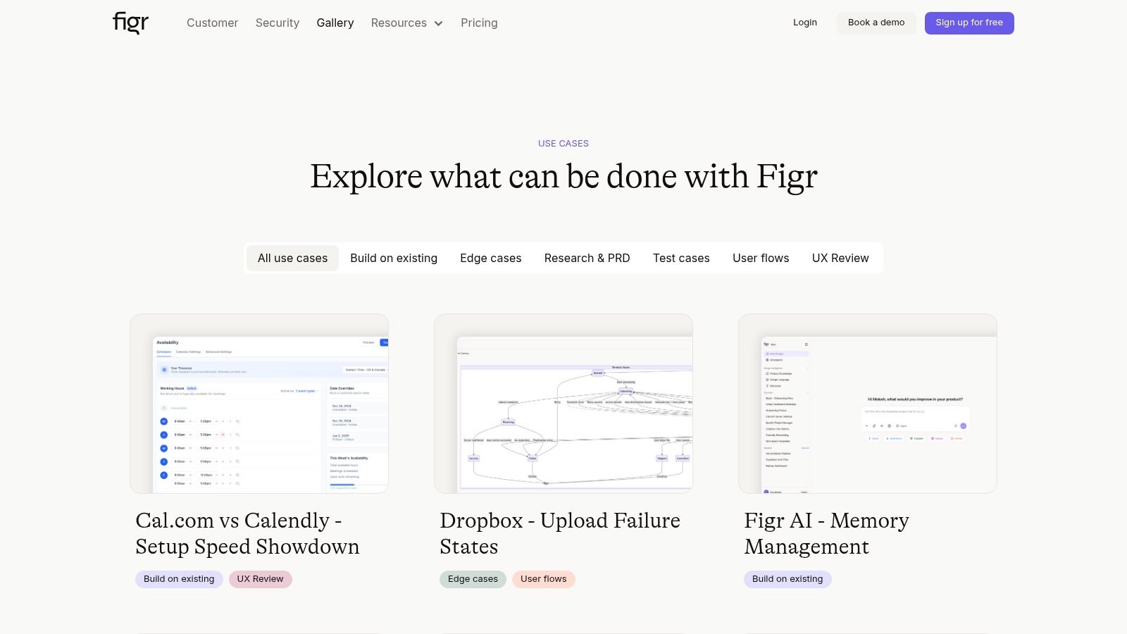
If Sketch wireframing feels slower than the product pace around you, Figr offers a faster path. Describe a screen or feed it a screenshot, and Figr generates wireframes that match your product design system in seconds. No drag-and-drop, no component hunting. You can also browse the Figr gallery to see how teams use it to move from idea to validated flow much faster.