A high-fidelity wireframe is the detailed, visual blueprint of a digital product. Think of it as the full dress rehearsal before opening night: it includes the final copy, branding, typography, and layout.
Unlike rough sketches, a hi-fi wireframe closely mimics the look and feel of the finished app or website. This happens long before anyone writes a single line of code, making it an indispensable tool for getting final design approval and ensuring everyone is on the same page.
From Hazy Vision to Tangible Blueprint
It’s 4:47 PM on a Thursday. Your VP needs something visual to anchor tomorrow's board discussion. You have a PRD, a list of bullet points, and about 16 hours. Oh, and zero designer availability. This is the moment an abstract idea must become something real enough to see.
A high-fidelity wireframe is the bridge between a strategy document and a user's screen.
Its job isn't to look pretty. Its job is to make an idea tangible enough for the entire team to debate, test, and truly understand. For the first time, everyone from engineering to the C-suite can see the same picture, closing the dangerous gap between different interpretations of a requirements doc.
The First True Test of Viability
A detailed wireframe is the first real stress test for an idea. It forces you to answer the tough questions early. Where does that button actually go? What happens when a user types the wrong password? What content is essential for this screen to make sense?
This process builds alignment and momentum long before a single line of code is written. It transforms a document that people read into a destination that people can see and react to.
A friend at a Series C startup told me about a project that got green-lit based on a killer PRD. Three weeks into development, the team realized their interpretations of the core user flow were completely different. The rework cost them a full month. This is the catastrophic misunderstanding high-fidelity wireframes prevent.
They become the shared language for the whole team. To turn that initial concept into a solid plan, it helps to use a comprehensive prototype guide for idea validation.
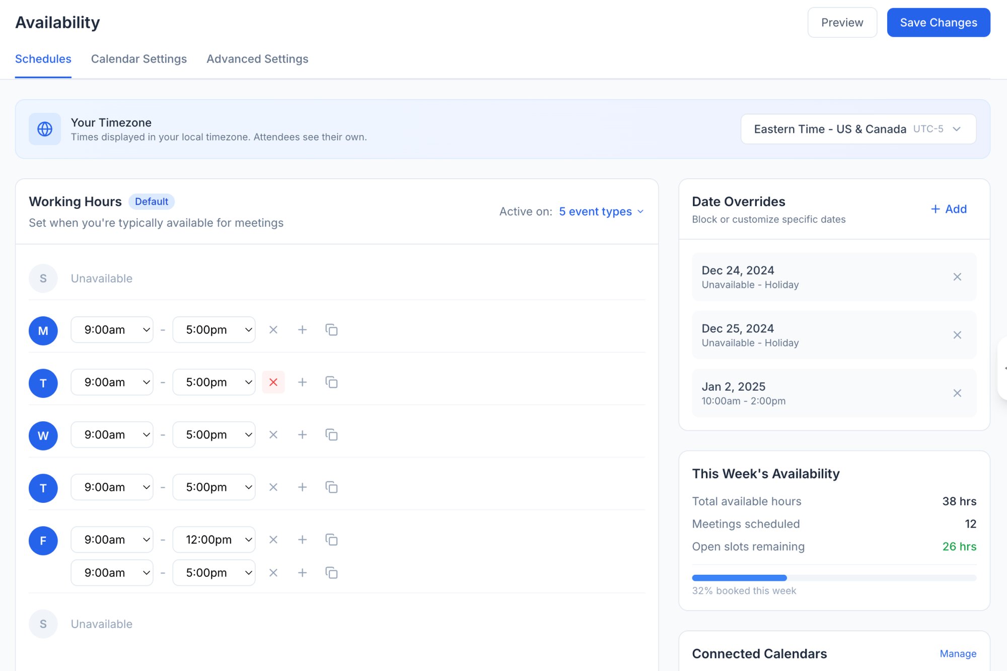
The basic gist is this: a detailed wireframe serves as a destination. It's a tangible preview of the future that grounds every conversation in reality. It’s less a document and more a demonstration, shifting the conversation from "what if" to "what about this." For instance, this redesigned scheduling page gives stakeholders a concrete artifact they can grasp immediately, something a list of features never could.

The Blueprint and The Scale Model
Does a wireframe do the same job as a prototype? The terms are tossed around interchangeably, a casual swap that breeds confusion and misaligned expectations. A stakeholder asks for a prototype but just needs to approve a layout. A designer builds a static wireframe when the team really needs to test a user flow.
This confusion costs time. It costs money.
Let’s clear this up with an analogy. A high-fidelity wireframe is the architect’s blueprint for a house. A prototype is the interactive scale model you can walk through.
The blueprint is static and incredibly detailed. It is all about specification. It shows the precise dimensions of every room, the location of every electrical outlet, and the exact materials for the countertops. Its job is to ensure the plan is sound, complete, and buildable. Can you build a house from it? Yes. Can you feel what it’s like to live there? Not really.
The scale model, on the other hand, is all about the experience. It is interactive. You can open miniature doors, walk from the kitchen to the living room, and get a sense of the flow. Its purpose is to test the lived reality of the design. Does this hallway feel too narrow? Is the path to the backyard intuitive? You cannot build from the model, but you can validate the experience.
This is what I mean: wireframes define the structure, while prototypes simulate the interaction.
Purpose Dictates The Artifact
The core difference is not just semantics; it's about the question you are trying to answer. Are you asking, "Is this plan correct and complete?" or are you asking, "How does this feel to a user?"
High-fidelity wireframes are for alignment and documentation. They are the single source of truth for what gets built.
They answer questions like:
- Have we accounted for all necessary UI elements?
- Is the visual hierarchy clear and logical?
- Does this layout adhere to our brand guidelines and design system?
Prototypes, in contrast, are for validation and testing. They are simulations designed to elicit feedback on usability and flow.
They answer questions like:
- Can users successfully complete a specific task?
- Where do users get stuck or confused in the flow?
- Does the interaction feel natural and intuitive?
Last week I watched a PM present a set of high-fidelity wireframes for a new onboarding flow. An executive immediately asked, "Can I click through it?" The PM’s goal was to get sign-off on the content and layout of each screen: a classic blueprint review. The executive wanted to feel the experience: a scale model walkthrough. The meeting stalled because they were talking about two different things.
Choosing The Right Tool For The Job
Clarity on this distinction helps teams request the right artifact at the right time. Demanding a fully interactive prototype when all you need is layout approval is like building a physical scale model just to check room dimensions. It is wasteful. Similarly, presenting static wireframes for a usability test misses the entire point.
High-fidelity wireframes share many similarities with website mockup examples, serving as detailed visual representations of your design before any code is written. These static visuals are perfect for design reviews and developer handoffs. For instance, a clear visual of a redesigned Shopify checkout setup flow is a blueprint. An interactive version that lets you add items to a cart and click "purchase" is a scale model.
The grounded takeaway is this: before you start any design work, ask one simple question. Are we trying to finalize the plan, or are we trying to test the experience? Your answer determines whether you need the blueprint or the scale model. Getting this right saves everyone from building the wrong thing.
Why Gray Boxes Conceal Million-Dollar Risks
Low-fidelity wireframes feel fast. They are the quick sketch on a whiteboard, the rapid alignment in a kickoff meeting. But speed at the start often creates drag later. Relying on simple gray boxes for too long is like navigating a minefield with a vague map.
I once watched a fintech team ship a file upload feature based on a simple lo-fi sketch. Engineering gave a two-week estimate.
It took six.
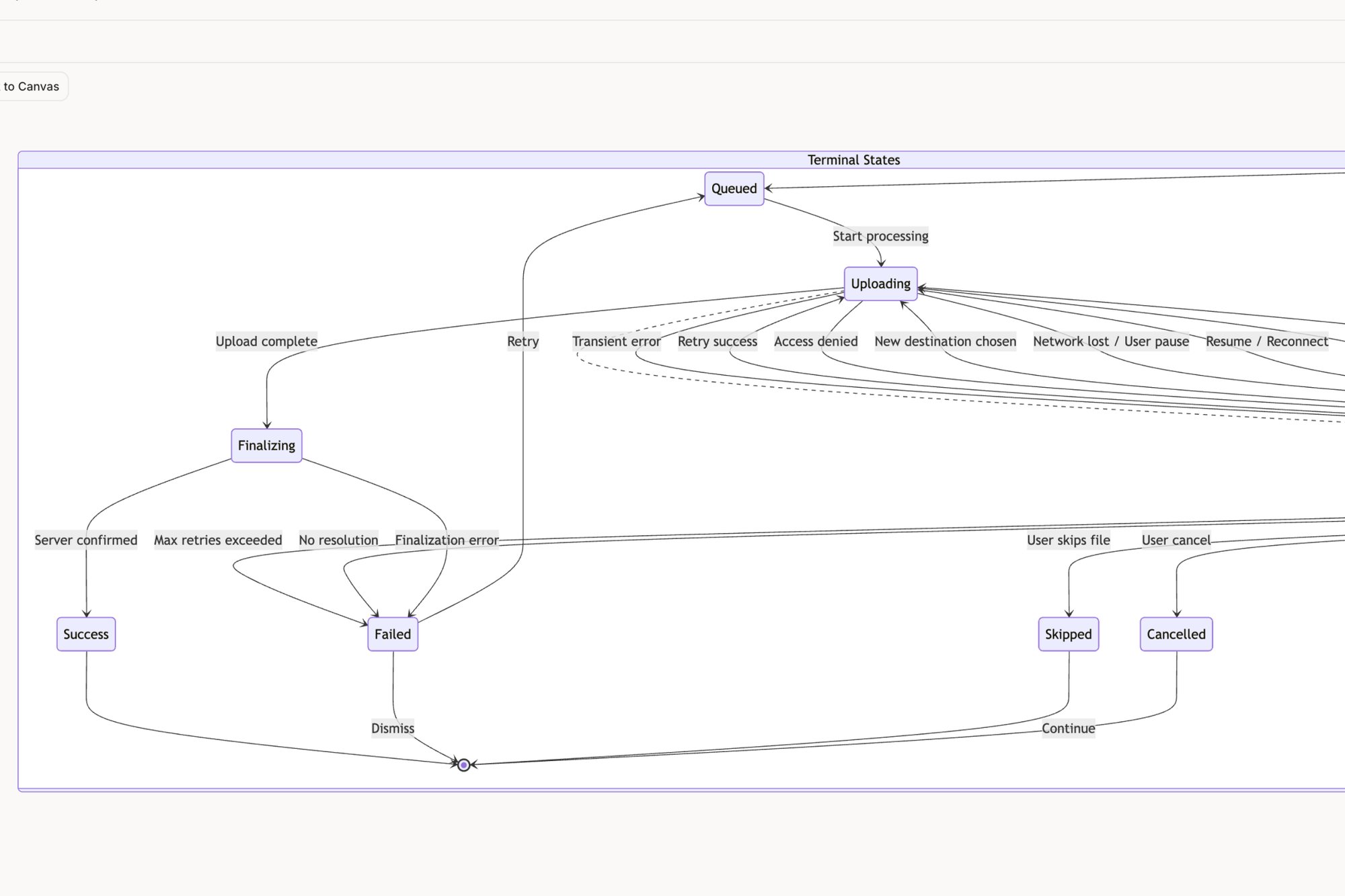
Why the huge gap? The single box labeled "Upload File" concealed 11 hidden states. You had the uploading state, the processing state, the success state, and all the unhappy paths: network error, file-too-large error, wrong file type, and more. Each state needed design decisions, copy, and PM input, completely derailing the timeline.
This is the zoom-out moment. The economic reality is that conversations are cheaper than code. High-fidelity wireframes force these critical conversations to happen early, when the cost of change is measured in minutes of design time, not weeks of engineering rework.
From Ambiguity to Actionable Detail
A high-fidelity wireframe is the canvas for mapping the entire user experience, not just the perfect "happy path." It pushes teams beyond the basics and into the messy but critical edge cases that define a user's actual journey.
For instance, a low-fi box for "user invite" seems simple. A high-fi version forces you to answer real questions:
- What happens if the invited user already has an account?
- What does the screen look like if the invitation link has expired?
- How does the system handle an invalid email address?
Answering these questions prevents late-game scrambles. It transforms a vague idea into a buildable specification. Tools like Figr AI can analyze a product and automatically map out potential edge cases, turning hidden risks, like those in a Dropbox upload flow, into a visible checklist for the team. This proactive discovery is crucial; it's worth learning more about the common edge cases PMs miss and their staggering costs.

Securing Buy-In and De-Risking Development
Beyond surfacing technical requirements, high-fidelity wireframes are essential for securing genuine stakeholder buy-in. An executive cannot get excited about a gray box, but they can rally behind a realistic depiction of the final product.
This realism is not just for show. It is a powerful tool for validation. Presenting a tangible vision makes it easier for stakeholders to spot misalignments and provide meaningful feedback before significant resources are committed.
This is where the financial impact becomes clear. According to Nielsen Norman Group, fixing an error after development costs 100 times as much as it would to fix it before any code is written. A high-fidelity wireframe is the cheapest place to find and fix these errors. For any product leader who cannot afford delays, a realistic interface demo is often what it takes to get investors to truly believe in the vision. Read more on how wireframes benefit your product to understand the complete picture.
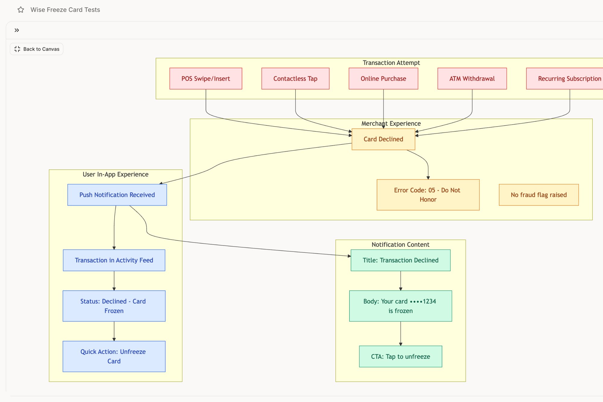
A high-fidelity wireframe for a feature like a Wise card freeze flow does not just show the button; it visualizes the confirmation message, the updated card status, and the options to unfreeze. Seeing this level of detail gives the entire team, from legal to marketing, the confidence to move forward.
The grounded takeaway is that high-fidelity wireframes are not a cosmetic step. They are a risk mitigation strategy. They front-load the difficult conversations, expose hidden complexity, and build the organizational alignment needed to ship great products on time. They replace assumptions with clarity.
A Modern Workflow From Context to Creation
The old way of making high-fidelity wireframes? It started with a blank canvas and an ocean of possibility. It was a manual, often painful process of translating abstract requirements into a visual form, pixel by pixel. This was not just slow; it was completely disconnected from the product's living reality.
A modern workflow does not start with a blank page. It starts with grounding.
The idea is that you build from what already exists. The first move is to capture your live application, creating an instant baseline that respects the current user experience. Why start from zero when your product already has a pulse, a design system, and established user patterns?
From Grounding to Generation
Once you are grounded in reality, the next step is nailing the "job to be done" for the new feature or fix. What is the one thing a user must accomplish? This is not about listing features; it is about clarifying intent. A sharp job story acts as the creative constraint that focuses the entire effort.
This is where everything changes. Instead of a designer manually pushing pixels, an AI agent can take this context: the existing screens, the design system, the job story: and generate initial high-fidelity screens. These are not generic templates. They are intelligent first drafts that already speak your product's visual language. This strategic approach turns a purely creative process into a repeatable system.
Consider this high-level user flow for a scheduling tool. Capturing the existing product and then defining a clear goal, like "set up availability for user research calls," gives an AI the specific context needed to generate a relevant, high-fidelity draft.
Context-Aware Creation in Practice
Let’s make this real. When redesigning a complex process like the Shopify checkout setup flow, starting with the current flow and analytics data is non-negotiable. The AI can analyze the existing information architecture, spot the drop-off points, and then generate a new flow that directly targets those specific friction points. The output is a high-fidelity wireframe born from evidence, not just intuition.
Or take creating a new runway forecasting feature for a fintech app like Mercury. That requires deep context. By feeding an AI agent the existing UI, competitor research, and a PRD, it can generate a new forecasting UI that feels like a natural extension of the product. The result is a set of high-fidelity wireframes that are already consistent, informed, and closer to production-ready from the very first draft. You can see a detailed guide on how this works to get from PRD to prototype in just two hours, a timeline that used to be unthinkable.
This method is not just about moving faster. It's a system for making smarter decisions by ensuring every design choice is anchored to real product context and user data. It closes the gap between idea and execution.
Now for the zoom-out moment. The economic incentive for this shift is huge. A Harvard Business Review article on design thinking found that organizations mastering this type of integrated approach see massive returns. The article notes that "for most companies, design remains a late-stage 'gussying up'" instead of a core strategic function. That traditional mindset is where inefficiency lives.
A modern workflow fundamentally changes the starting line. By beginning with context, you de-risk the entire design process, improve the quality of the output, and drastically cut the time it takes to get from a problem to a viable, high-fidelity solution.
The grounded takeaway is this: capture your product first. Ground every subsequent action in that reality. This single shift in your workflow will save you from countless hours of rework and ensure your high-fidelity wireframes are not just beautiful, but intelligent.
How to Present Wireframes and Get Decisions
A brilliant high-fidelity wireframe is useless if it is presented poorly. You can have the most elegant solution to a user’s problem, but if you cannot get a decision, it is just a collection of pixels. The artifact itself has no power; its power comes from the conversation it starts and the action it drives.
Too many teams treat the presentation as a defense of the design. They walk through screens, justify choices, and field questions. This is a losing strategy. The goal is not to be right; it's to create clarity and build momentum.
Time isn't a conveyor belt; it's a switchboard. You have to connect your idea to the right circuit for each person in the room.
The Two Languages of Influence
Your stakeholders live in different worlds. They care about different metrics, face different pressures, and therefore need different stories. A one-size-fits-all presentation will fail to connect with everyone. You need to become bilingual.
Last week, I watched a product manager get a feature prioritized by doing this perfectly. He showed the VP of Sales a single high-fidelity wireframe that directly addressed the top customer complaint from the previous quarter. The story was not about UI components; it was about closing deals. The VP saw a solution to his team's biggest objection, and the feature was fast-tracked.
To get decisions, you need to master two dialects:
- For Engineers: The Language of Feasibility. Their primary concern is building it correctly. Your presentation should focus on clarity and logic. Walk them through states, data requirements, and component interactions. Showing the different states for an interactive task component gives them the concrete specification they need to estimate accurately and build confidently.
- For Executives: The Language of Impact. Their world revolves around vision and business outcomes. They need the story of the user problem and a clear line connecting your design to revenue, retention, or market position. Frame the wireframe as evidence that you understand the customer and have a credible plan to solve their problem.
Anticipating what each stakeholder cares about is half the battle. When you walk into a review, you should already have a good idea of the questions you will face from each department.
The Presentation Playbook
A successful presentation is not improvised. It is a structured narrative designed to guide your audience from problem to proposed solution, ending with a clear "ask." You are the guide, and the wireframe is the map.
What does a successful narrative look like?
- Frame the Problem First: Never start with the solution. Begin by grounding everyone in the user pain or business opportunity. Use data, a quote from a user interview, or a customer support ticket. Make the problem feel urgent and real.
- Tell the User's Story: Walk through the high-fidelity wireframes as if you are the user. Narrate their journey. "Sarah logs in on Monday morning, frustrated because she can't find..." This transforms abstract screens into a relatable human experience.
- Connect to the "Why": For each key screen or interaction, tie it back to the initial problem. Explain why a particular layout or button placement solves a specific point of friction. This shows your design choices are strategic, not arbitrary.
- End with a Clear Ask: The final step is the most critical. What decision do you need? Is it a "yes" to begin development? Approval for the budget? The green light to start usability testing? State it clearly.
The purpose of a presentation is not to share drafts; it's to force a decision. A meeting that ends without a clear next step is a failure. You need a process focused on getting decisions, not drafts.
The grounded takeaway is to reframe your role. You are not just a designer or a product manager presenting work. You are a translator and a storyteller. Your job is not done when the design is finished; it is done when the decision is made. Frame your high-fidelity wireframes in the language of your audience to drive action.
The Final Mile: From Handoff to Partnership
The handoff to engineering is where your design either comes to life or gets lost in translation. This is the final mile, and it is full of potential wrong turns. Tossing a beautiful high-fidelity wireframe over the wall is a recipe for delay. The real goal is not delivery, but partnership.
It is about giving engineers a package that answers their questions before they even have to ask.
This means you need to go way beyond the visuals. A solid handoff pairs the final design with crystal-clear documentation that leaves absolutely no room for interpretation. Think of it as a complete kit for building.
The Anatomy of a Bulletproof Handoff
So, what is actually in this kit? It is much more than just a link to a Figma file. It is the single source of truth that respects an engineer's need for absolute precision.
- Linked User Stories: Every single wireframe needs to be tied directly to a specific user story. This gives the "why" behind the "what."
- Complete Interaction States: You have to specify every state for interactive components: hover, focused, disabled, and loading. What seems obvious to you is an assumption an engineer has to make.
- Clear Copy and Specs: Provide the final, approved copy. Do not forget to note crucial accessibility considerations like tab order and ARIA labels.
- Documented Edge Cases: Proactively map out what happens when things go wrong. You can see how we did this for a Wise card freeze flow by simulating every possible failure point.

This level of detail is not overkill; it is a strategic investment. In fact, prototyping with hi-fi wireframes can slash overall project costs by 20-30% because you catch issues before a single line of code is written. The wireframing software market is even projected to hit $15 billion by 2032, largely because AI is starting to automate this kind of detailed work. You can find more data about this approach on dogtownmedia.com. To get even deeper into the nuts and bolts, check out our guide on the developer handoff playbook.
The handoff is not a moment in time; it's the beginning of a conversation. The quality of that conversation is determined by the quality of the artifacts you bring to the table.
Here is the most practical takeaway: schedule your handoff meeting not as a presentation, but as a collaborative working session with your lead engineer.
Walk through the flows together. Click through the interactive elements. Actively ask, "What are we missing?" and "What technical constraints do you see here?" This one step transforms the handoff from a simple transaction into a genuine partnership, making sure the vision you designed is the product that actually gets built.
Frequently Asked Questions
It’s only natural to have questions when a process asks for more detail upfront. Let's tackle a few common ones I hear about high-fidelity wireframes.
How Much Detail Is Too Much?
This is a great, and very common, question. You have crossed the line from wireframe to prototype the moment you start building functionality that requires code, like complex animations or live API calls.
Think of your high-fidelity wireframe as a visual specification, not a working product.
The focus should be squarely on elements that tell the developer exactly what to build for the final user experience. This means final copy, brand colors, precise spacing, and all the different UI states a user might see (like error messages or success banners). If it affects what an engineer needs to build visually, it belongs in the wireframe. If it is a slick micro-interaction that only comes to life with code, you have gone a step too far. For the full spectrum of fidelity levels and when to use each, see what is a wireframe.
What Are the Best Tools for Creating Them?
The tool landscape is always shifting. While Figma is still the undisputed champ for manual, from-scratch creation, a new class of AI-native tools is changing the game entirely.
The real difference is the starting point. Traditional tools hand you a blank canvas and say, "Go." Modern tools like Figr work differently by starting with your live product as context. It uses AI to generate high-fidelity wireframes that are already consistent with your existing design system. This is not just a small speed bump; it shrinks a process that takes hours down to just a few minutes.
How Do I Justify the Extra Time to My Manager?
Simple. Frame it as a risk-reduction strategy, not just another design exercise. You need to speak the language of economics. Explain that an hour spent getting a user flow right in a wireframe today prevents a week of engineering rework next month.
The conversation should be: "Can we afford to spend an extra day aligning on this design now, or do we want to risk a two-week delay and wasted engineering cycles later?"
When you can show them a tangible asset like a high-fidelity UI for a new feature, the value becomes instantly obvious. High-fidelity wireframes are not an expense; they are an investment in clarity and, ultimately, speed.
Ready to turn product thinking into production-ready artifacts without the manual effort? Figr is an AI design agent that learns your product to generate user flows, edge cases, and high-fidelity wireframes that are already on-brand. Design confidently and ship faster. Explore Figr and accelerate your workflow. For a primer on the spectrum from low to high fidelity, see our complete guide on what is a wireframe.


