
Meta description: Good GUI design turns screens into clear, trustworthy workflows. Learn 12 practical GUI design principles, examples, and a PM-ready checklist for shipping intuitive interfaces.
It’s Tuesday morning. A churn alert lands in Slack. New users are signing up, reaching the project setup screen, hesitating, then disappearing.
The button exists. The labels are technically correct. The flow passed review. Yet the screen is failing beneath the surface.
That’s the moment most product managers stop talking about “nice UI” and start talking about good GUI design. Not as decoration, but as product viability. An interface is where your roadmap meets a user’s patience. If that meeting goes badly, the feature might as well not exist.
I watched a PM at a SaaS company go through this exact arc not long ago. The team had spent weeks refining onboarding copy, instrumenting events, and tightening permissions logic. But the core problem was smaller and more brutal: the primary action looked secondary, the empty state explained too much, and the screen asked for commitment before trust had been earned.
That’s how bad interfaces fail. Imperceptibly, expensively, and often in places that looked fine in design review.
The Cost of a Confusing Click
A confusing click rarely looks dramatic in isolation. It’s a gray button where a stronger visual cue was needed. It’s a field label that makes sense to the internal team but not to the person seeing it cold. It’s a modal that interrupts momentum right when a user is ready to proceed.
Each one feels minor.
Together, they become churn.
When the interface breaks the promise
The harsh truth is that users don’t experience your product as a backlog of features. They experience it as a sequence of decisions. Can I trust this? Do I know what to do next? If I click this, will I get what I expect?
When the answer is fuzzy, people leave.
That’s why good GUI design is less about polish and more about keeping promises. A clean screen that obscures the next action is still a bad screen. A dense workflow that makes priorities obvious can still be good interface design. The distinction matters.
One useful way to think about it is this: every click creates a small moment of negotiation between product and user. If you want a sharp lens on those moments, Making Every Click Count: Micro-Interactions That Drive User Satisfaction is worth reading. Tiny cues often carry disproportionate weight.
Practical rule: If a user must stop and interpret the interface, the interface is already underperforming.
What PMs usually miss
PMs are trained to spot missing capability. They’re often slower to spot missing clarity.
That’s understandable. Functionality is easier to debate in planning. Clarity shows up later, in support tickets, abandoned trials, and replay sessions where users hover over the right element and still don’t act. The fix is rarely another feature. It’s usually a change in hierarchy, wording, defaults, spacing, or feedback.
Many teams benefit from studying good interface design as an operating discipline, not just a design craft. The strongest product teams treat interaction friction like any other production issue. They identify it, prioritize it, and remove it before it compounds.
A confusing click doesn’t just hurt one task. It teaches the user that future clicks may also be risky.
Once that lesson lands, recovery gets harder.
The Unseen Language of Good GUI Design
Every interface is having a conversation, whether your team intended one or not. The question is simple: does it sound clear, respectful, and efficient, or does it sound vague, demanding, and slow?
That’s the hidden job of graphical user interface design. It gives users a way to understand the system before they fully trust it. The copy helps, yes. The feature set matters, yes. But the interface is where judgment happens fastest.
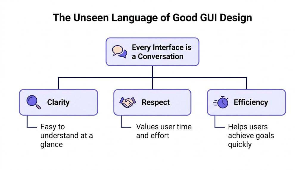
Clarity, respect, efficiency
Good GUI design has a grammar. I’d name its three highest-order qualities like this:
- Clarity: users can tell what matters, what happened, and what to do next
- Respect: the interface doesn’t waste attention, hide costs, or force avoidable effort
- Efficiency: the shortest path to task completion is also the most obvious path
These qualities sit underneath familiar gui design principles like usability, consistency, feedback, hierarchy, and accessibility. When those principles are strong, the interface feels understandable without needing explanation. When they’re weak, users feel the burden immediately.
A solid refresher on this layer of thinking lives in UX design fundamentals.
Why the economics are not soft
Teams still treat interface work like optional refinement. The data says otherwise. Intentional UX design, which is tightly linked to good GUI principles, can raise conversion rates by as much as 400%, every $1 invested in UX yields a $100 return, and 94% of first impressions of a brand’s website come from design, according to Adobe’s summary of UX research.
Those numbers explain something PMs feel every quarter but don’t always name. Interface quality changes business outcomes because it changes decision quality at scale. Every unclear state, every weak affordance, every inconsistent pattern adds drag. Every clear action path removes it.
Good interfaces are engineered empathy. They reduce the amount of interpretation a user has to do before getting value.
There’s also a trust layer here. Design is often the first proxy users have for credibility. Before they know your roadmap, they know your screens. Before they believe your positioning, they react to your layout, rhythm, and control.
What this means in practice
The basic gist is this: a product can be powerful and still feel unusable if the interface asks users to think about the wrong things.
So the job isn’t to make screens look modern. It’s to make intent legible.
That changes review conversations. Instead of asking, “Does this look clean?” ask:
- Can a first-time user identify the primary action fast
- Does the system show the result of each action clearly
- Are we asking for effort before we’ve delivered value
- Would this still make sense under time pressure
Those are not aesthetic questions. They’re product questions. And they sit at the core of good gui design.
The Five Pillars of Intuitive Interfaces
If you’ve ever looked at a screen and felt that it was “off” without knowing why, it was probably breaking one of five pillars. These are the foundations I keep returning to when reviewing a new flow, auditing a mature product, or deciding whether a redesign is solving the right problem.
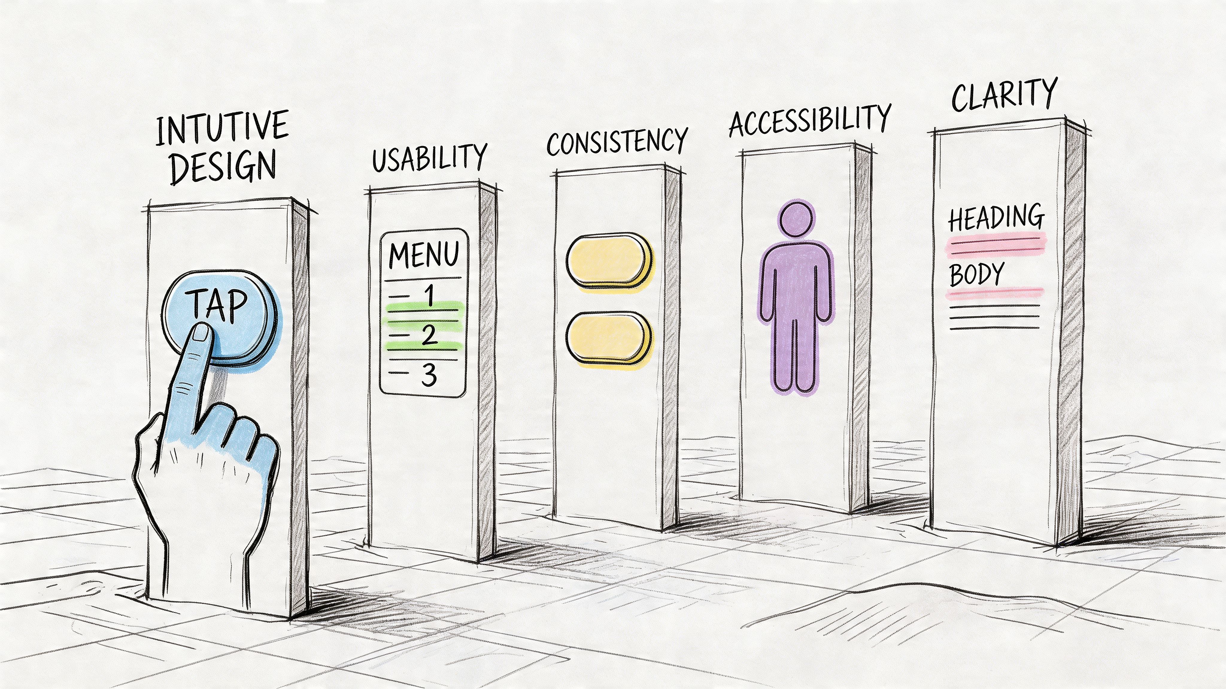
Usability
Usability starts with a blunt question: how much effort does this interface demand from a normal person trying to finish a real task?
That’s different from asking whether the feature is technically available. A flow can be complete and still be exhausting. A form can be valid and still punish people for entering information in ordinary ways.
One of the most common misses is rigid input handling. Many teams build validation but skip forgiveness. Yet a common GUI mistake is failing to support error-resistant patterns such as fuzzy date matching or offering both a dropdown and free-text field, an approach noted in Learn UI’s discussion of forgiving formats.
What works:
- Flexible input handling: accept likely user formats when the intent is obvious
- Recovery paths: help people correct mistakes without restarting
- Progressive effort: ask for only the information needed at that moment
What doesn’t:
- Brittle forms: exact formats with vague errors
- Premature complexity: too many fields before value is visible
- Dead ends: validation messages that explain what’s wrong but not how to fix it
A usable screen reduces the penalty for being human.
Consistency
Consistency is where many interfaces either gain trust or slowly leak it. Similar things should look similar, behave similarly, and appear in similar places. That sounds obvious, but teams break it constantly under delivery pressure.
The trade-off is real. Local optimization often improves one screen while making the product harder to learn overall. I usually favor system consistency over one-off cleverness, especially in SaaS products where users repeat workflows.
A few practical consistency checks:
- Component behavior: does a tertiary action stay tertiary everywhere
- Terminology: are “workspace,” “project,” and “account” being used precisely
- Interaction patterns: does saving, editing, filtering, and confirming feel stable across the app
If your settings page behaves differently from your onboarding flow, users have to relearn the product. That relearning cost is rarely visible in sprint planning, but users feel it immediately.
Feedback
People need confirmation that the system heard them. Without feedback, even correct interactions feel broken.
Feedback includes the obvious cases, such as loading states and success messages. But it also includes subtler moments: button state changes, inline updates, previews, disabled states with explanation, optimistic UI when appropriate, and undo patterns when mistakes are reversible.
Watch for this: If a user can perform an action and then wonder whether anything happened, feedback is missing.
What works versus what fails often comes down to timing. Instant visual acknowledgement lowers anxiety. Delayed, ambiguous system response creates double-clicking, repeated submissions, and support noise.
Good feedback also protects trust when something goes wrong. Error messages should explain the problem in plain language and point toward the next move. “Something went wrong” is technically true and operationally useless.
Visual hierarchy
Hierarchy answers a question users never state out loud: where should my eyes go first?
Without hierarchy, every element competes for attention. That’s when interfaces start to feel loud, even if they’re visually minimal. Good hierarchy uses placement, size, spacing, contrast, and grouping to make priorities obvious.
If your team needs a stronger structural foundation here, study designing with grids. A grid doesn’t make a screen good by itself, but it creates the alignment discipline that hierarchy depends on.
The quickest review questions are simple:
- Does the primary action carry the most visual weight
- Can users scan the page and understand sections before reading in detail
- Are related items grouped tightly enough to read as one unit
- Is secondary information visually quieter than primary information
For a deeper framing of this discipline, I often recommend principles of design for better conversions. Conversion conversations are often really hierarchy conversations in disguise.
You can also sharpen this practice through visual hierarchy techniques, especially if your product has dense dashboards or multi-step flows.
Accessibility
Accessibility is where good intentions often collapse under visual fashion.
One of the most neglected areas in modern GUI work is keyboard navigation. Designers and engineers still use positive tabindex values that disrupt natural tab order, or remove focus outlines for aesthetics, creating real barriers for keyboard users. That pattern is called out clearly in Netguru’s review of web accessibility mistakes.
Accessibility isn’t a separate layer added at the end; it’s a test of whether your interface logic is coherent.
Look for these failure modes:
- Broken tab order: focus jumps unpredictably across the page
- Invisible focus states: users can move between elements, but can’t see where they are
- Mouse-only assumptions: interactions that become difficult or impossible without a pointer
What works is less glamorous and more disciplined. Keep natural DOM order aligned with visual order. Preserve visible focus indicators. Use clear labels. Make interactive states obvious. Test complete flows with a keyboard, not just isolated components.
A product that looks elegant and excludes users under keyboard navigation is not good interface design. It’s a partial design masquerading as a complete one.
The pillars work together
These pillars are useful on their own, but their true power comes from seeing how they reinforce each other. Usability without consistency feels ad hoc. Consistency without hierarchy feels flat. Feedback without accessibility still excludes people. Hierarchy without usability becomes cosmetic.
The strongest gui best practices aren’t isolated tricks. They’re connected judgments. That’s why experienced teams review interfaces as systems, not screens.
Good Interface Design in the Wild
Principles become easier to trust when you can see them working on a real surface. That’s why I like reviewing actual interfaces with teams instead of debating abstractions in a vacuum.
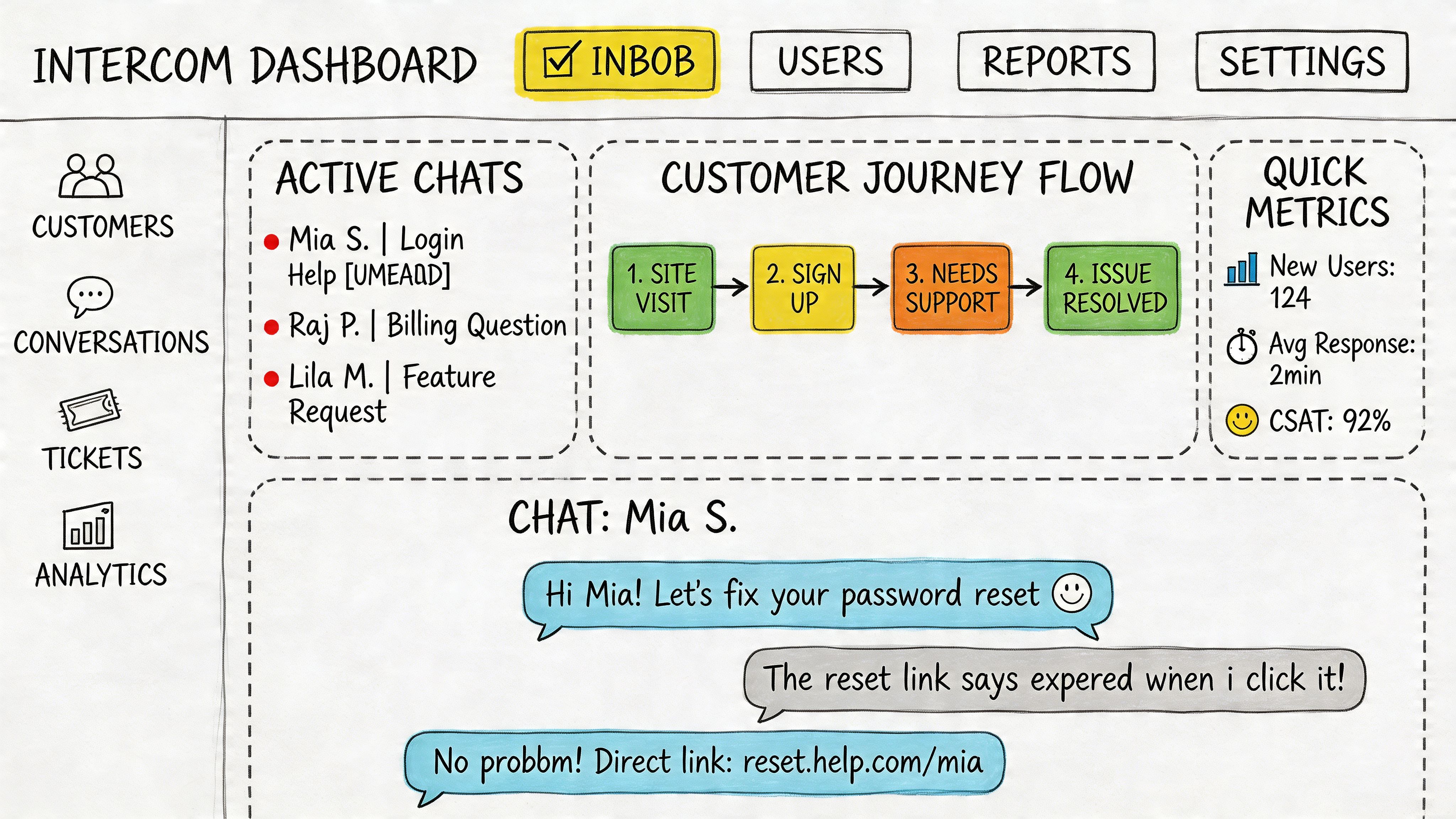
A dashboard that knows its job
Take this Intercom dashboard example. It works because the screen understands its operational role. The most urgent information is surfaced first. The layout separates monitoring from action. Components repeat predictably enough that a support lead can scan, decide, and move.
This is what I mean when I say gui design examples should be evaluated by task clarity, not just visual taste.
The screen earns trust in a few ways:
- Primary information is prominent: urgency reads before detail
- Repeated patterns reduce learning cost: cards, labels, and states behave consistently
- Density is controlled: the screen carries a lot of information without feeling formless
If you build or review operational products often, the logic overlaps with strong dashboard design rules.
The anti-pattern most teams ship at least once
Now contrast that with a common settings page anti-pattern: a long wall of toggles, weak section grouping, vague labels, and no explanation of consequence. Technically complete. Functionally hostile.
The user has to answer too many questions at once. Which toggles matter now? Which are risky? Which belong together? What changed after I clicked? The interface pushes interpretation work onto the user.
That’s where “minimal” design often goes wrong. It removes visual structure but leaves cognitive mess.
A useful reference point for comparing stronger and weaker screens is this collection of UX design examples and analysis. Side-by-side reading trains the eye quickly.
Another pattern worth studying is search. The Perplexity search example shows how restraint can help. Minimal surfaces work when the interaction model is obvious and the next step is unambiguous. Sparse isn’t the goal. legible is.
One recurring place where products still stumble is forms. As noted earlier in Learn UI’s writing, a common mistake is ignoring forgiving formats and forcing rigid input styles where users would benefit from flexible entry patterns. Search bars, date fields, and filters are especially vulnerable.
Here’s a short visual breakdown that helps teams spot these differences in live products:
The takeaway is simple. Good GUI design isn’t just recognizable in polished consumer apps. You can see it in any interface that makes the right thing feel obvious.
A PMs Checklist for Evaluating GUI Quality
Most design reviews drift toward taste unless someone sharpens the conversation. PMs need a way to inspect interface quality without pretending to be the designer in the room.
A practical audit starts with questions, not opinions. If you need a broader review framework, this UX audit checklist is a helpful companion. For day-to-day product work, I use a tighter screen-level pass.
Ask these questions in review
- Primary action: does the main action have the clearest visual weight on the screen
- First scan: can a new user tell what this page is for within a few seconds
- Consistency: do similar controls and states behave the same way as the rest of the product
- Feedback: after each action, does the system clearly show what happened
- Error recovery: if someone enters the wrong thing, is there an easy path forward
- Keyboard path: can the complete flow be used with a keyboard, including visible focus
- Content priority: is secondary information quieter than decision-critical information
- Risk clarity: if an action is destructive or irreversible, is that obvious before the click
What good reviews sound like
Weak review language sounds like this: “I’m not sure I like this layout.”
Useful review language sounds like this:
“The screen has two competing primaries, so users won’t know which action we value more.”
Or this:
“The validation catches the error, but recovery is still expensive because the field doesn’t accept common input patterns.”
That shift matters. It turns feedback from subjective preference into product reasoning.
A simple working habit
Pick one critical screen, then run two passes.
First pass, review it as a first-time user. Second pass, review it as a repeat user under time pressure. Those are different experiences, and strong interfaces serve both. New users need orientation. Expert users need speed.
If a screen fails either test, don’t jump straight to redesign. Name the broken principle first. Usually the answer sits inside one of the five pillars.
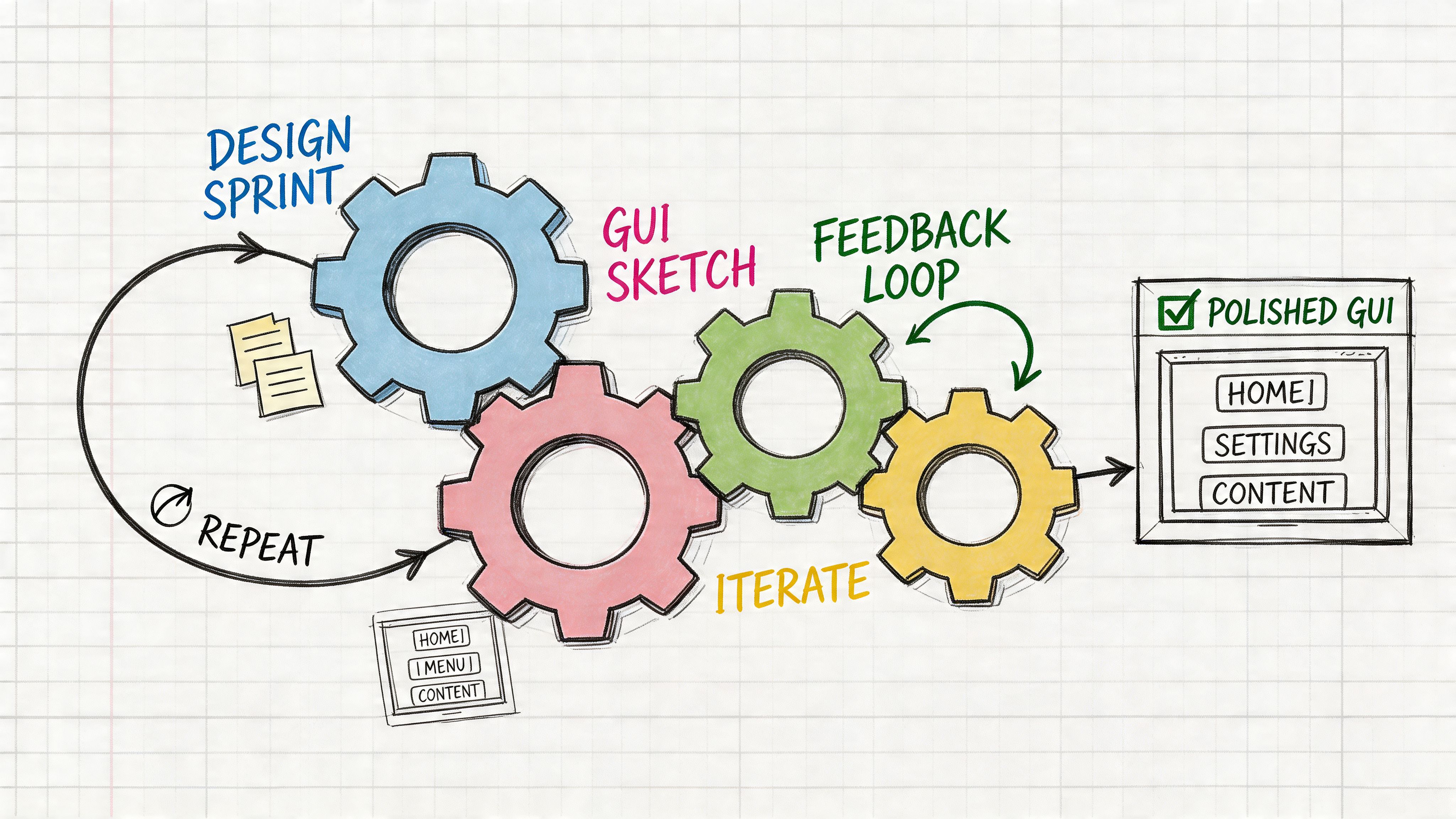
How to Build Good GUI Design into Your Team's DNA
Knowing the principles is the easy part. Shipping them repeatedly is the harder one.
Teams don’t get to good GUI design through taste alone. They get there through process, shared language, and decision hygiene. When interface quality depends on a single strong designer catching issues at the last minute, the system is fragile. Once delivery pressure rises, quality slips.
Move GUI decisions earlier
The strongest product teams discuss interface consequences before high-fidelity design. They don’t wait for mockups to ask what the primary action is, what the edge cases are, or whether the flow works without a mouse.
That operating model matters because companies that integrate user research throughout the product development lifecycle see 30% to 70% better business metrics, 88% of consumers are unlikely to return after a bad experience, and 70% of enterprise CEOs view UX as a competitive differentiator, according to Eleken’s roundup of UX statistics.
Those numbers point to an operational truth. Interface quality is not a finishing pass. It is part of product strategy.
Create a shared language across functions
A friend at a Series C company told me their most impactful discovery was boring on paper and profound in practice. They started naming flows, states, and failure modes the same way across PM, design, engineering, and QA.
That sounds small. It isn’t.
When teams share flow language, product debates improve fast. You stop arguing vaguely about “the setup page” and start talking concretely about entry conditions, transitions, and friction points. Resources like user flow examples, user experience flows, and digital customer journeys are useful because they make this shared model easier to build.
A few habits make a real difference:
- Define the primary user task in the PRD: not just the feature, the intended path
- List edge cases before design starts: especially empty, loading, error, and permission states
- Review keyboard behavior in QA: not as a bonus, as part of done
- Document component decisions: names, use cases, and behavior rules
Operationalize patterns instead of rediscovering them
Tools offer assistance, if they reinforce discipline instead of adding noise. Figr applies GUI design principles automatically. It references 200k+ real-world screens when generating interfaces, ensuring proper spacing, hierarchy, contrast, and component usage. The output follows good GUI design because Figr already knows what works.
Used well, that kind of system changes the workflow. Teams can start from product context instead of a blank canvas, explore variations with clearer rationale, and carry design decisions into prototypes, QA cases, and handoff with fewer gaps. The point isn’t automation for its own sake. The point is reducing preventable inconsistency.
Turn principles into rituals
Here’s the pattern I’ve seen hold up:
- In planning: identify the core task, success state, and likely failure points
- In design review: evaluate against hierarchy, consistency, feedback, usability, and accessibility
- In prototype review: walk the complete flow, including edge cases
- In QA: test keyboard navigation, copy clarity, and state transitions
- After launch: review session recordings and support themes, then feed changes back into the system
That’s how good interface design becomes repeatable. Not by asking people to “care more,” but by making quality inspectable at every stage.
Design That Respects the User
The most useful definition of good GUI design is the simplest one. It respects the user.
It respects their time by making the next step obvious. It respects their attention by emphasizing what matters and muting what doesn’t. It respects their effort by forgiving mistakes, confirming actions, and staying consistent from screen to screen.
That respect has economic weight, but it also has a human one. People can feel when a product is making them work too hard. They can also feel when a tool seems to think alongside them. The best interfaces don’t show off. They remove friction so thoroughly that the user barely notices the design at all.
If your team wants a sharper benchmark, revisit the five pillars on one live screen this week. Don’t start with your prettiest page. Start with the screen where users hesitate, drop, ask for help, or make errors. Audit it impartially. Find the one place where the interface is asking for interpretation instead of providing guidance.
That’s usually where the next win is.
For the complete framework on this topic, see our guide to user interface design.
Pick one flow. Run the checklist. Fix one thing that reduces cognitive load. Then test again.
That’s how better products are built.
If your team wants help turning product context into production-ready interface artifacts, Figr is built for that workflow. It captures your live app, works with existing design systems and tokens, generates flows, edge cases, prototypes, and QA-ready outputs, and helps teams close the gap between product intent and shipped UX.
