
It’s 4:47 PM on Thursday. Your VP just asked for something visual to anchor tomorrow's board discussion. You have a PRD. You have bullet points. You have 16 hours and no designer availability.
This moment is where good interface design stops being a debate about aesthetics and starts becoming a tool for clarity. It’s not about making things pretty. It’s about making things understood under pressure.
An interface is a conversation. Get it right, and you drive revenue. Get it wrong, and the consequences ripple through your metrics, your support queues, and your team’s morale.
The Moment an Interface Fails
It’s 3:14 PM on a Friday. An analytics alert fires. Checkout abandonments are up 40% since the last release.
The button is there. The fields are correct. But somewhere between the shopping cart and the confirmation screen, your users are vanishing. This isn't a bug in the code. It is a critical disconnect in the conversation.
This is the moment the abstract concept of good interface design becomes painfully concrete. It stops being a task for the design team and becomes an urgent problem for the entire business. An interface isn't a static picture: it's the fundamental architecture of your user's experience.
When it fails, it fails loudly in your metrics.
Shifting from Aesthetics to Architecture
For too long, interface design has been treated as a surface layer, a coat of paint applied at the end. This view is not just outdated, it’s costly. A friend at a B2B SaaS company told me they spent an entire quarter chasing down a customer satisfaction dip. The culprit wasn't a missing feature. It was a confusing navigation pattern introduced three months prior.
The basic gist is this: Every single element a user interacts with is part of a system. Good design ensures that system is coherent, intuitive, and resilient. It anticipates needs and handles errors gracefully.
This guide reframes the discussion around interface design. We’ll move away from subjective visual debates and toward a strategic function focused on measurable outcomes.
The goal is to give you the mental models to see your product not as a collection of screens, but as a series of conversations. You'll learn to evaluate those conversations for clarity, efficiency, and trust. Understanding this architecture is crucial, especially when you consider all the different states a user might encounter. You might be interested in learning about the common edge cases that can completely derail a user's journey.
Before we move on, consider this: what’s the most fragile conversation happening in your product right now?
The Unseen Architecture of Predictable Interfaces
It’s 10:22 AM on a Tuesday. You’re watching a user test recording. The participant is trying to save a configuration profile and clicks a button labeled “Done.” Nothing happens. Confused, they scan the page, find a small, gray “Apply Changes” link tucked away in the footer, and click that. A success message finally appears.
The user got the job done. But the interface failed them.
It felt like asking for directions and being handed a compass, a map, and a cryptic riddle. Why do some products feel like a conversation with a helpful guide, while others feel like an interrogation?
The difference is an invisible architecture built on a few core principles.
The Four Pillars of Predictable Design
Good interface design isn't about a single perfect button. It's a system, like a city's road network. Effortless navigation is not an accident: it’s the result of clear, consistent rules that users internalize without even thinking about it.
This is what I mean:
- Clarity: Every element communicates its purpose without ambiguity. A button that looks like a button and an icon that means what it depicts are the clear street signs of your interface.
- Consistency: Similar elements behave in similar ways. A “Save” button shouldn’t be blue and on the right on one page, then green and on the left on another. This is the traffic light system of your UI: predictable and universal.
- Feedback: The interface acknowledges user actions. A loading spinner, a color change on click, a confirmation message, these are the audible crosswalk signals that tell a user their input was received and something is happening.
- Forgiveness: Users can easily undo actions and recover from errors. An “undo” button or a clear confirmation prompt before a destructive action makes exploration feel safe, not scary.
These pillars have formal counterparts in academic research. Nielsen's usability heuristics and Shneiderman's eight golden rules provide the diagnostic frameworks for evaluating each pillar.
Just last week, I watched a PM at a startup get frustrated because users weren't adopting a new feature. The problem? A small inconsistency. The button to activate it was styled differently from every other primary action in the app. Users literally didn't see it because it broke the established pattern. This is how small design debts create real friction.
Building a library of these rules is a critical practice. You can learn more by reading about how to craft a consistent app design system to enforce these principles.
The Immediate Economics of a Good Interface
These principles are not just abstract ideals; they are a conversion powerhouse. When an interface is predictable, users move faster and with more confidence. This directly impacts revenue in ways product leaders cannot afford to ignore.
Users form a judgment on an interface in under 50 milliseconds, and a staggering 94% of them cite design as the primary reason they trust or reject a website.
Optimized interfaces can boost conversion rates by up to 200-400% through simple changes like faster load times and intuitive navigation. Every moment a user spends deciphering your interface is a moment they could be churning. The economic argument for good design is undeniable.
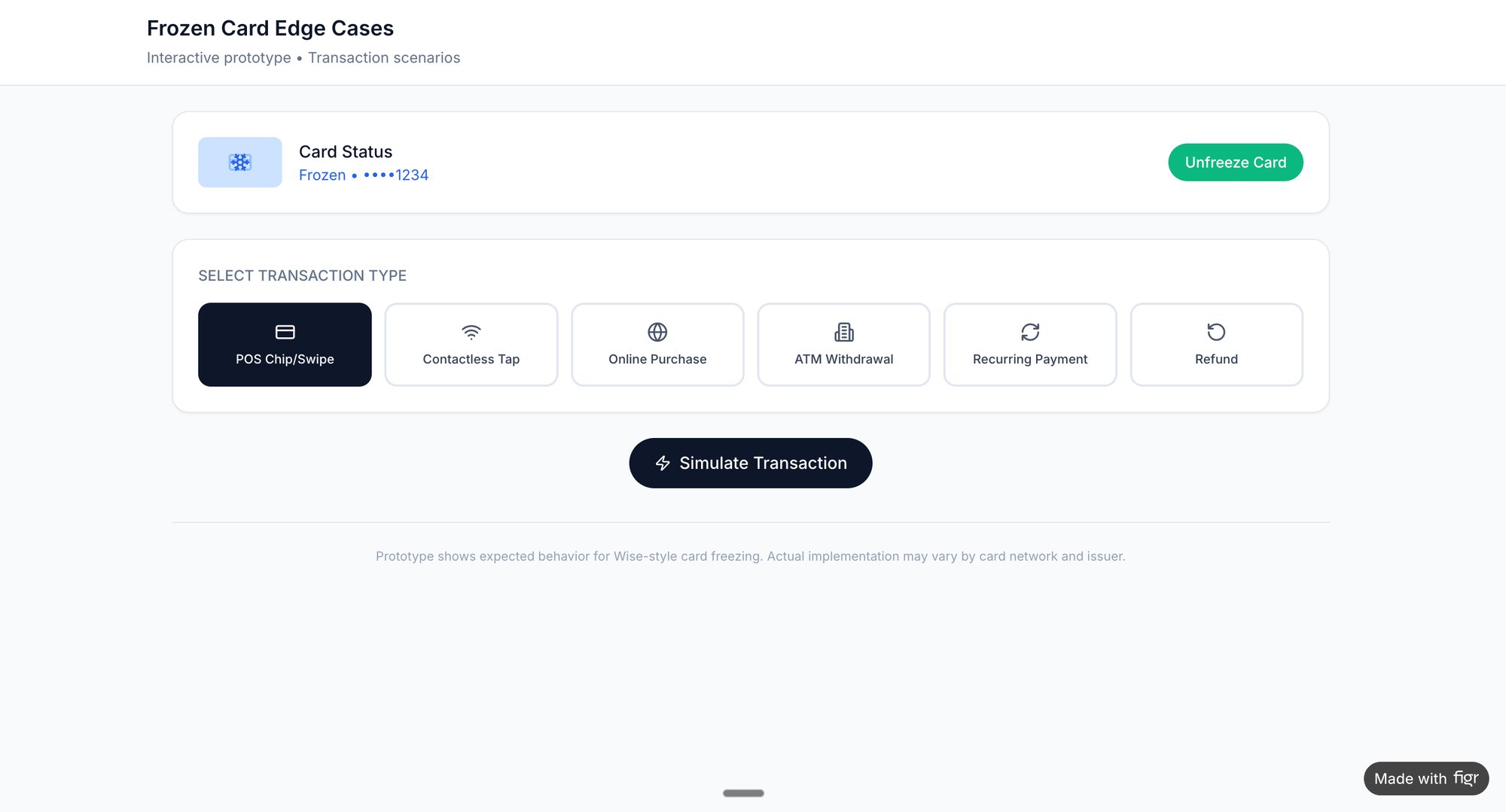
A great starting point for assessing your own product is to observe these principles in action. For example, you can map out a simple task like a user trying to freeze their bank card, a task that requires absolute clarity and feedback. Or consider something seemingly simple, like a task assignment component, and observe how it handles its various states.
The takeaway is this: evaluate your interface not on how it looks, but on how predictable it feels. Pick one core user flow. Does it have clear signs, consistent rules, and helpful feedback? If not, you’ve found your starting point.
Designing for Reality Beyond the Happy Path
A feature is not defined by its ideal state. It’s defined by how it handles chaos.
Most product roadmaps are built on a foundation of optimism, a straight line from A to B we call the "happy path." This is the journey a user takes when everything goes perfectly. But reality is rarely a straight line. It's a frantic scribble of network drops, invalid inputs, and unexpected user choices.
Good interface design lives in that scribble.
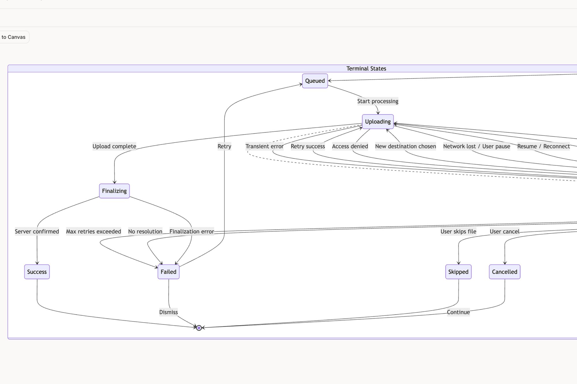
A fintech PM I know thought a simple file upload feature was a two-week job. It ended up taking six. Why? The happy path was a single, clean screen. But reality surfaced eleven hidden states: network drops mid-upload, oversized files, permission errors, and duplicate filenames. The two-week estimate assumed a perfect world, the six-week reality was the cost of confronting the messy one.
From Happy Path to Reality Map
The basic gist is this: good interface design anticipates these failures and provides clear, calm guidance. It doesn't just flash a generic "Error" message and abandon the user. It explains what happened, why it happened, and what to do next.
This transforms a moment of friction into a moment of trust. The process, visualized below, moves from establishing simple clarity to providing consistent feedback for every possible state.
This flow shows that after establishing clarity and consistency, providing feedback is the crucial step that handles real-world interaction.
Mapping these failure states and edge cases is a core design activity, not an engineering afterthought. It’s the architectural work that separates a resilient product from a brittle one. A brittle interface shatters under the slightest pressure, leaving users confused and frustrated. A resilient one bends, adapts, and guides them back to safety.
If you're curious, exploring a map that details the many failure states for a Dropbox file upload feature makes this concept much more concrete. It reveals the hidden complexity behind even the most common interactions.
The Human Side of System Failures
Last quarter, I was observing a usability session for a project management tool. A user tried to assign a task to a team member who had just been deactivated in the system. The interface just spun for ten seconds and then did nothing. No error message. No explanation.
Designing for these failure states requires a process grounded in empathy. The human-centered design process provides the methodology for uncovering these scenarios before they reach production.
The user, assuming they’d made a mistake, tried again.
And again.
That small oversight, a failure to design for a predictable edge case, created five minutes of genuine frustration and undermined their confidence in the entire platform. How many users experience this silent failure and simply give up?
Designing for reality means creating inclusive and accessible experiences for everyone, considering different user needs and environmental constraints. For instance, thoughtful features like Dark Mode And Accessibility Enhancing User Experience With React Native are vital for a truly good interface, as they cater to users in various lighting conditions and with different visual abilities.
According to a report by the Standish Group, only 29% of software projects are successfully completed on time and on budget. A primary cause of scope creep and delays is the late discovery of unhandled states and edge cases.
This is not just about user frustration; it’s about development cost. Every edge case discovered by engineering after the design is "final" is exponentially more expensive to fix. It triggers a cascade of questions, meetings, and rework that derails sprints and blows up timelines.
The happy path is a myth. It’s a useful starting point, but it's not the product you will actually ship. The real product is the sum of all its states, successful or otherwise.
So, here's your next step: challenge this myth on your own team. Take one of your "simple" user flows. Get your PM, a designer, and an engineer in a room and ask a powerful question: “What are all the ways this could break?”
The answers will reveal the true scope of your work and the real definition of good interface design.
How to Measure What Makes an Interface Good
It’s 2:30 PM on a Wednesday. You’re locked in a debate with a stakeholder about a design change. You say it feels more intuitive. They say the current version feels fine. Now you're at a stalemate, armed with nothing but feelings.
How do you break the tie?
You don’t win design arguments with feelings. You win them with numbers. Good interface design isn't an aesthetic preference; it’s a measurable outcome. It’s the difference between a user finishing a task in seven seconds versus forty-seven.
The great myth of design is that its value is subjective. The reality? A good interface is like a well-engineered bridge: it either carries the traffic efficiently, or it collapses under the load. Your job is to measure the traffic, not just admire the architecture.
From Vague Feelings to Hard Metrics
To do this, we have to stop saying "easy to use" and start talking in quantitative metrics. These numbers become the common language that translates design impact into business value, a language everyone in the organization understands.
This is what I mean:
- Task Success Rate (TSR): This one’s the most brutally simple. Did the user accomplish their goal? A user trying to set their availability for a meeting either succeeds or fails. A high TSR is the absolute baseline for a functional interface.
- Time on Task: How long did it take the user to succeed? If one design lets someone schedule a meeting in 20 seconds and another takes 90 seconds, the faster one is objectively better. Time is a finite resource. Efficient design respects that.
- System Usability Scale (SUS): This is a standardized, ten-question survey that spits out a single score from 0 to 100. It’s a quick, reliable gut-check on a user's overall perception of usability. A score above 68 is considered above average. Anything less, and you’ve got work to do.
These metrics turn abstract feelings into cold, hard data. You can learn more about turning these numbers into real insights by exploring how to build a product management dashboard that includes design metrics.
A Tale of Two Schedulers
Let’s make this real. Imagine your team is evaluating two different scheduling tools. A junior PM on my team did exactly this, comparing the user flow for setting up meeting availability in Cal.com versus Calendly.
Instead of having a vague discussion, she mapped the entire flow for both apps, click by click. She counted every screen, every decision the user had to make, and the total number of interactions. You can see the whole analysis on the Figr canvas here.
She found that one flow required seven clicks and three distinct cognitive loads (like choosing a time zone), while the competitor's required only four clicks and one primary decision.
This was not an opinion. It was an objective measurement of friction. The data gave her a clear, defensible reason to advocate for changing our own product's scheduling interface. This is how good design moves from a "nice to have" to a strategic imperative backed by evidence.
This approach gives you a clear path forward. Go pick one critical, high-traffic task in your product. Don't ask if users "like" it. Measure it. Time it. Count the clicks.
The numbers will tell you a story that no opinion ever could.
The Unmistakable Economics of Intuitive Design
It’s 11:00 AM on Monday, and you’re in the quarterly business review. The finance lead’s slide is a gut punch: customer churn is up 7%. Then the support lead follows, reporting a 15% spike in tickets tied to the new feature.
Every head in the room turns to the product team. What’s going on?
Let’s pull back from the pixels and prototypes for a second and talk about why any of this really matters. Good interface design is not a creative luxury; it's a powerful economic engine. In a world where a better alternative is always just one click away, a confusing interface is a leaky bucket for your revenue. Every moment a user spends feeling lost is a moment they could be churning.
The Market Signal for Good Design
This is not some industry secret. Companies are not suddenly pouring money into aesthetics just to make things look pretty. They're responding to a loud and clear market signal: intuitive design directly drives adoption, retention, and profit. The numbers don't lie.
The global UI/UX market is projected to explode from USD 2.20 billion in 2025 to a staggering USD 11.66 billion by 2031. That's a compound annual growth rate of 32.05%. This is not just growth; it's a global scramble to build more intuitive products as businesses fight to keep their competitive edge. You can see more details about this rapidly expanding market on mordorintelligence.com.
You can see this shift playing out everywhere:
- In healthcare, patient experience scores, which are heavily swayed by the usability of digital portals, are now directly tied to a hospital's reimbursements.
- In e-commerce, platforms live or die by the slickness of their conversion funnels. Every unnecessary click is a potential lost sale.
- In SaaS, a clunky onboarding flow is the single greatest predictor of a customer who will cancel before their first renewal.
I was talking to a VP of Product last year at a Series D company that was bleeding users. Their analytics showed that customers who actually finished the initial setup flow were 80% more likely to stick around after six months. The problem? Less than half of their new users were making it through. Their entire growth model was being throttled by a few poorly designed screens.
From Cost Center to Revenue Driver
In short, the bottom line is this: a good interface reduces the cognitive tax on your users. It makes it easier for them to find value, which, in turn, makes it easier for them to give you their money. It slashes support costs because fewer people get stuck. It boosts conversion because the path to purchase is frictionless.
A study by Forrester Research found that, on average, every dollar invested in UX brings $100 in return. That’s an ROI of 9,900%.
This is why conversations about design have moved from the studio to the boardroom. A well-designed interface is not just another feature; it's a competitive moat. It's the silent, hardworking engine that powers your entire business. You can read our guide on conversion rate optimization techniques to see how these principles translate into direct financial gains.
So, the next time your team is debating a design decision, frame it as an economic one. It’s not about which button is prettier. It's about which button makes the company more money.
Your Next Step: An Actionable Design Workflow
Theory is great, but action is what gets products built. We’ve covered the principles, the metrics, and even the economics of good interface design. Now, let’s tie it all together with a repeatable process that turns abstract ideas into concrete improvements.
This is not about suddenly learning to "think like a designer." It's about implementing a system. The workflow itself is a simple, powerful loop: capture, analyze, and iterate.
Capture Your Product’s Reality
First things first: you need to see your product as it actually is, not how you remember it from the design files. Start by capturing the live context of a critical user flow. Forget the idealized mockups. You need the real thing, with all its quirks, inconsistencies, and friction points.
This captured flow is your foundation. It grounds every decision you make from here on out in reality, not assumptions.
Analyze a High-Friction Flow
With the current state recorded, it's time for some surgical analysis. Don't try to boil the ocean. Pick one high-traffic, low-converting journey, like a merchant setting up their checkout for the first time or a new user getting through onboarding.
A friend at an e-commerce platform did exactly this. His team mapped their entire Shopify checkout setup flow and immediately spotted three totally unnecessary steps and two confusingly labeled fields. What tipped them off? Analytics showed those were the exact points where most users dropped off. That kind of clarity only comes from a focused analysis of the real journey.
Iterate with High-Fidelity Prototypes
Now you translate insight into action. Based on your analysis, spin up a high-fidelity prototype of an improved flow. This is not a rough wireframe; it’s a tangible, clickable artifact that looks and feels just like your real product. It lets you test your hypothesis fast, without writing a single line of code.
This transforms design from a debate over opinions into a systematic search for what actually works. For a little inspiration, check out this redesigned Shopify checkout setup flow that came out of this exact kind of focused work.
The job market itself tells a compelling story. Demand for these kinds of interface skills is growing fast, especially as AI reshapes how we work. Web design job postings grew 9% annually as of 2025, while 56% of companies now use AI in their design and development processes.
But many teams are stuck with generic AI tools. Skilled talent is still hard to find, but context-aware AI agents can bridge the gap for product managers and QA folks by auto-generating flows and tests that are actually grounded in your app's reality. You can find more insights on the state of UX over at nngroup.com.
So here’s your immediate next step.
Pick one user flow in your product that keeps you up at night. Capture it. Map it out. Question every single screen, every button, every bit of text. That is where the real work of good interface design begins.
Frequently Asked Questions
A few questions always pop up when teams start to get serious about interface design, and that's a good thing. It’s a sign the organization is shifting from seeing design as just a coat of paint to seeing it as a strategic advantage.
What Is the Difference Between UI and UX Design?
Think about it like going to a restaurant.
The User Experience (UX) is everything. It’s how you heard about the place, how easy it was to book a table, the greeting at the door, the lighting, the music, the service, the food itself, and even how you settled the bill. It's the whole journey.
The User Interface (UI) is the menu. It's a critical part of that journey, and if the menu is confusing, unreadable, or just poorly designed, the whole experience suffers. Good UI is a vital piece of a great UX, focusing on the specific screens, pages, and visual elements you actually touch and see.
How Can I Advocate for Better Design with a Limited Budget?
Forget the grand redesign. Instead, focus on high-impact, low-effort fixes and let the data make your case.
Use your analytics to find the single most painful point in your user's journey. Where's the biggest drop-off rate? What one screen generates the most support tickets? Pinpoint that spot. Then, propose a small, targeted A/B test to fix just that one thing.
A small win that actually moves a key metric is infinitely more powerful than a grand vision that never gets funded. Frame the investment by quantifying the cost of the bad design, how much are those support tickets or lost conversions actually costing you? For more on navigating these trade-offs, you'll find a list of common frequently asked questions about platform development helpful.
Can AI Tools Replace Human Designers for Interface Design?
No, but they've become incredible partners in the process.
AI agents are fantastic at speeding up the most tedious parts of design work. Think mapping out existing user flows, generating a dozen variations of a screen based on proven patterns, or flagging obscure edge cases you'd never catch on your own. For instance, an AI can instantly explore all the possible states of a scheduling page redesign without anyone needing to draw a single box.
This frees up human designers and product managers to do what they do best: the strategic work. They can focus on understanding the real user problem, exercising nuanced judgment, and making the creative leaps that lead to truly great products. The future is not AI replacing designers; it's AI-augmented teams building better products, much faster. Good interface design is built on established principles. For the complete framework covering heuristics, golden rules, and more, see UX design principles.
Ready to stop debating and start building? With Figr, you can turn product thinking into production-ready artifacts in minutes. Capture your live app, map user flows, uncover edge cases, and generate high-fidelity prototypes that are grounded in your actual product context. Design confidently and ship faster with Figr.