
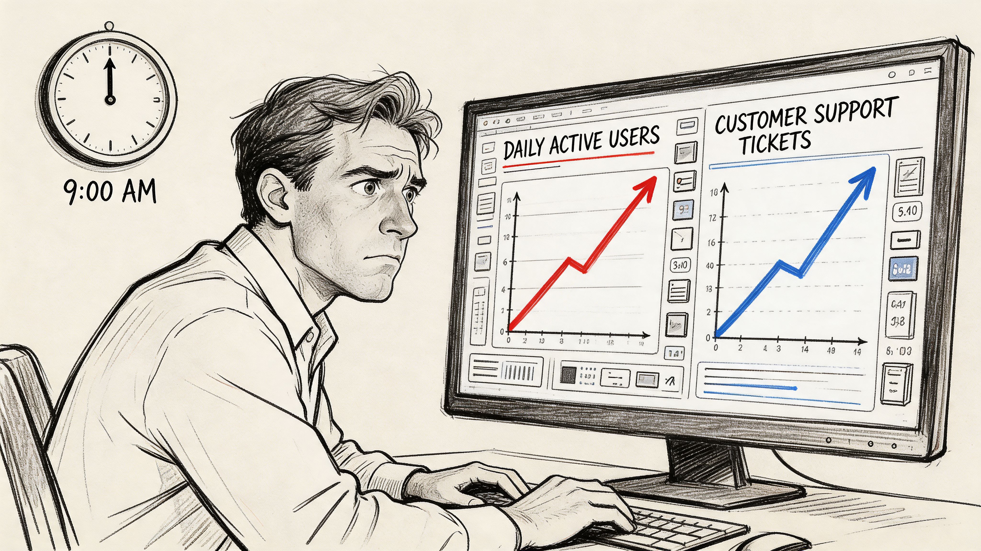
Last Monday, a PM shared a dashboard with leadership at 9:07 a.m. Daily usage looked healthy. Support tickets on the same feature were climbing. A funnel step showed long dwell time, which sounded encouraging until someone asked the obvious question: are users engaged, or are they stuck?
That’s the trap with ux metrics.
The problem often isn't about measurement. It's about translation. Teams can describe what happened, but they can't connect the signal to a design decision, an experiment, or a product change. So the dashboard grows. The clarity doesn't.
I’ve seen this pattern in startups, enterprise SaaS, and teams with expensive analytics stacks. The same thing happens every time. Someone reports metrics. Someone else asks for context. The meeting ends with a follow-up doc, not a decision.
The basic gist is this: ux metrics only matter when they change what the team does next. Everything else is reporting theater.
The Dashboard That Tells You Nothing
Monday morning dashboards often create a false sense of control. You can point to movement, but you can't explain meaning. A chart goes up, a chart goes down, and everyone projects their own story onto the same screen.
I watched a product lead go through this recently. Activation looked steady. Session depth looked strong. Yet customer-facing teams were escalating confusion around a newly shipped workflow. Nobody in the room was wrong. They were just looking at different kinds of evidence and treating all of it as equally diagnostic.
That’s where teams get lost.
Metrics without a model create noise
A metric is not insight. It is a signal. If you don't know what kind of signal you're looking at, you'll overreact to healthy friction and miss harmful friction.
Time on page is the classic example. More time can mean interest. It can also mean hesitation. More clicks can mean exploration. It can also mean users are hunting for the one path that functions. If your dashboard doesn't separate those possibilities, you're not measuring experience. You're measuring ambiguity.
This is why PMs should care about dashboard design as much as dashboard content. The layout teaches interpretation. The groupings suggest causality. Even the sequence of charts influences what gets discussed first. That's why Figr's guide to dashboard design is worth reading alongside your analytics setup.
Practical rule: If a metric can support two opposite stories, it can't stand alone.
The hidden cost of mixed signals
Conflicting charts slow teams down in subtle ways. Designers defend choices they can't yet validate. Researchers get asked to explain analytics they didn't instrument. Engineers ship fixes aimed at symptoms, not causes.
The damage isn't just confusion. It's delay.
A useful dashboard should answer three questions in order:
- What changed: Identify the user behavior or sentiment that moved.
- Where it changed: Pin it to a step, flow, cohort, or task.
- What the team should inspect next: Point to replay, interview, test, or redesign.
That last part is what most dashboards miss. They report performance, but they don't direct action. Once you see that, a lot of “data-driven” product work starts to look like storytelling under pressure.
The Two Families of UX Metrics That Matter
There are over 70 distinct UX metrics identified across the field, organized into action metrics and attitude metrics, according to MeasuringU’s taxonomy of UX metrics. That sounds useful until you're the person who has to pick four and defend them in a quarterly review.
The escape route is simpler than it looks.
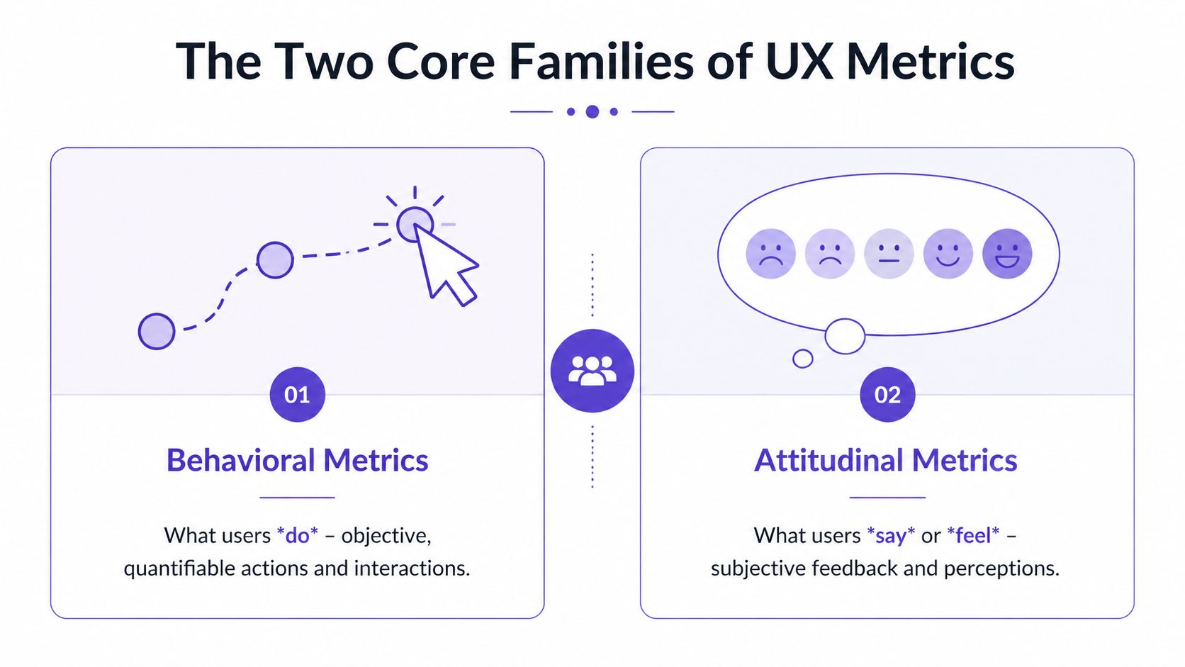
Behavioral metrics show what users do
Think of behavioral metrics as observation. You watch someone move through a maze. You don't ask how they felt yet. You watch where they stop, where they reverse, and whether they ever reach the exit.
These are your ux performance metrics. Task completion. Error patterns. Time on task. Drop-offs between steps. Path deviations. They answer the operational question every PM eventually faces: can users get through the experience you designed?
This is what I mean by diagnostic evidence. Behavioral data is often the fastest way to locate friction because it captures failure in motion, not in retrospect.
One reason this matters so much is that real-world redesigns show especially wide movement in effectiveness metrics. MeasuringU notes that metrics like task success rate saw improvement ranges from -9% to 271% across case studies in their report. That variance tells you something important. Behavior is where hidden design debt often surfaces first.
Attitudinal metrics show what users say and feel
Now switch the lens. The maze is over. You ask the user what felt confusing, easy, frustrating, or unexpectedly smooth.
That gives you the second family, ux design metrics tied to perception. Satisfaction, ease, confidence, usefulness, and overall usability all belong here. These don't replace behavior. They explain it. A user may complete a task and still hate the experience. Another may fail but describe the product as promising and worth another try. Those are different product risks.
If you want richer inputs on this side, start with how to collect customer feedback and pair it with approaches for automating customer interviews. Organizations often under-collect attitudinal signals, assuming analytics already tells the full story. It doesn't.
Watching users and listening to users are not competing methods. They answer different questions.
Why both families belong in the same system
A team that uses only behavioral metrics can become coldly efficient and still miss trust, confidence, or perceived complexity. A team that uses only attitudinal metrics can become empathetic and still ship flows people can't complete.
So when people ask for ux metrics examples, I usually push them to pair one from each family. Measure whether users completed the task. Then ask how hard it felt. That pairing turns isolated data into an interpretable pattern.
For teams trying to get sharper at seeing what your users truly need, that distinction is the first mental model worth keeping.
How to Choose Your Core UX Performance Metrics
Teams often collect too many ux kpis because they start with available data instead of product intent. The better sequence is the opposite. Start with the outcome that matters, then choose the smallest set of signals that would tell you whether the experience is helping or hurting it.
The framework I keep returning to is HEART. Happiness, Engagement, Adoption, Retention, and Task Success. It’s useful because it forces a product team to connect user experience to business behavior without collapsing everything into one score.
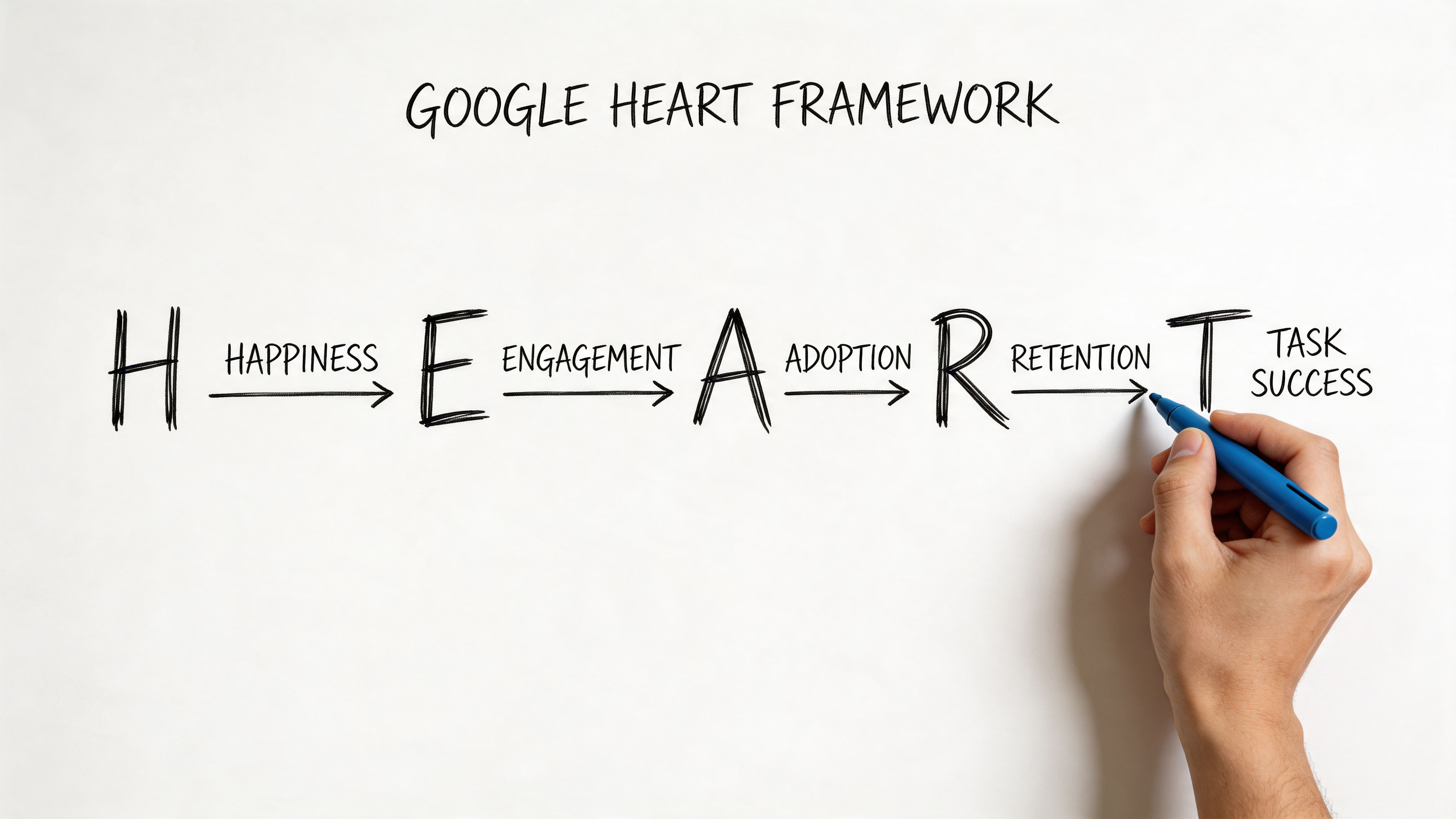
Happiness is where perceived usability becomes visible
For SaaS products with complex workflows, Happiness isn't about delight in the abstract. It often means, “Can I use this without feeling like I need a workaround?”
The System Usability Scale, SUS, gives you a standardized way to track that. It scores perceived usability from 0 to 100, with an industry average of 68, and scores above 80 indicating excellent usability, as described in this UX metrics overview on SUS. The same source notes that scores below 68 signal higher cognitive load, and that a 12-point improvement in SUS can correlate with 15% faster task efficiency in mandatory-use enterprise tools.
That’s more valuable than it first appears. A low SUS score isn't just a sentiment problem. It's often a clue that your workflow logic, labels, or edge cases are forcing users to think too hard.
Task Success is usually the sharpest instrument
If you only keep one category from HEART, keep Task Success. It's the category least likely to flatter you. Users either got through the job or they didn't.
A practical pair here is Task Success Rate and Time on Task. According to UserTesting’s breakdown of UX metrics, a strong Task Success Rate benchmark is above 90%. The same source says low task success can lead to 2x higher error rates and 35% churn, while a 10% uplift in TSR can cut enterprise labor costs by 15% through fewer iterations.
That gives PMs a much better answer to “how to measure ux” than broad engagement charts do.
Use the pair like this:
- Task Success Rate: Ask whether users completed the intended task.
- Time on Task: Check how much effort completion required.
- Compare novice and experienced users: If experts succeed and newcomers stall, you have a learnability problem, not a capability problem.
The other HEART dimensions matter when tied to one journey
Engagement, Adoption, and Retention can become vague fast. Keep them anchored to a specific product behavior.
For example, if you manage onboarding for a B2B SaaS tool, your version of HEART might look like this:
- Happiness: SUS after first-use session
- Engagement: repeat use of the onboarding checklist
- Adoption: first use of a high-value feature
- Retention: return to the workflow in a later session
- Task Success: completion of account setup without assistance
That structure helps teams align design review with delivery review. If you're also responsible for tracking product velocity for PMs, this matters because UX metrics and execution metrics shouldn't live in separate universes.
A related skill is understanding team performance, especially when you're trying to distinguish a design problem from an operational bottleneck.
Later, when the qualitative evidence starts piling up, tools that support AI tools for usability test reports can help compress raw sessions into patterns your team can act on.
A quick walkthrough helps if you're aligning a team around HEART in practice.
Why Most Teams Get UX Metrics Wrong
A friend at a Series C company told me about a launch review where the team celebrated higher time on site. A week later they learned users were wandering because they couldn't find the new checkout path. The metric moved. The experience got worse.
That’s not a measurement failure. That’s a framing failure.
Vanity metrics survive because they look executive-ready
Vanity metrics usually share one trait. They travel well in slides. They are easy to summarize, trend nicely over time, and sound directionally positive. But they don't tell a product team what to inspect or fix.
Time on site is one. Raw page views can be another. Even aggregate engagement can mislead when the user journey is breaking underneath it.
When teams lean on those numbers, they treat metrics like a report card. Green means “we’re fine.” Red means “someone should investigate.” But product work doesn't improve through abstract grades. It improves through diagnosis.
The most dangerous metric is the one that sounds good before anyone asks why it changed.
The economics only work if action follows measurement
The business case for UX metrics becomes clear. Forrester research, cited in DesignRush’s summary of UX statistics, found that every $1 invested in UX can return $100, or a potential 9,900% ROI. The same source notes that companies using top design practices grow twice as fast as their industry benchmark.
Those numbers get quoted in budget conversations, but they're often misused. They don't mean “spend on UX and good things happen.” They mean the return comes when research, design, and product decisions compound into fewer dead ends for users.
If measurement stops at reporting, the ROI logic breaks.
Three habits that quietly derail UX work
I see three patterns again and again:
- Chasing vanity metrics: Teams optimize for movement, not meaning.
- Analysis paralysis: Teams collect every possible signal and still can't decide.
- No bridge to design action: Research findings live in one tool, analytics in another, prototypes somewhere else.
That last one is especially expensive. It creates handoff lag. If you're trying to tighten the loop between evidence and release quality, it helps to compare top visual UI testing tools alongside your broader stack. A lot of UX failures don't begin in strategy. They appear when the intended fix gets distorted in implementation.
This is also why product leaders should connect UX metrics to broader effective agile metrics. Otherwise, the team measures friction in one meeting and ships unrelated work in the next.
From Insight to Action A Modern Workflow
The strongest teams don't admire metrics for long. They convert them into design hypotheses quickly, while the context is still fresh.
That workflow usually starts with one broken journey, not a full analytics overhaul.
Start with a single flow, not the whole product
Suppose your onboarding setup task is underperforming. Don't begin by asking whether the product has a UX problem. Ask where the task breaks.
Look at the behavioral layer first. UserTesting’s guidance says Task Success Rate should be above 90%, and a lower rate can drive 2x higher error rates and 35% churn. The same source says a 10% improvement in TSR can cut enterprise labor costs by 15% through fewer iterations, which is why this metric is such a useful operating lever for SaaS teams.
Then map that drop to the experience itself. Which step causes hesitation? Which field introduces rework? Which branch traps users in loops?
At that point, your metric has become a design prompt.
Turn the signal into a redesign brief
At this stage, most organizations still improvise. They know the journey is weak, but they rewrite the brief from scratch and lose the evidence that made the issue obvious in the first place.
A better loop looks like this:
- Isolate the failure: Pinpoint the task, step, or cohort where success drops.
- Add context: Bring in session notes, support themes, edge cases, and constraints.
- Generate a better flow: Use the evidence to redesign the journey, not just polish screens.
- Test the revision against the same metric: See whether the fix changed the behavior.
One option here is Figr. When task completion drops or error rates spike, teams can feed that data into Figr alongside product context. It then generates redesigned flows aimed at the friction the metrics exposed. That’s especially useful when you're working across existing systems and don't want generic templates. You can see that kind of output in the Intercom analytics dashboard example and the Skyscanner accessibility review.
Field note: A metric becomes strategic the moment it changes the prototype, not the slide deck.
This is also where adjacent artifacts become more useful. Better user flow examples make redesign options easier to compare. Cleaner user experience flows reduce ambiguity before handoff. Clearer digital customer journeys help teams understand whether a local UX issue is really part of a broader path problem.
Once a variation ships, continuous checks matter too. Teams that need a tighter post-release loop should look at Figr's AI monitoring tools so they can catch regressions before the next quarterly review explains them too late.
Conclusion Stop Measuring and Start Moving
The teams that get UX right aren't the ones with the biggest dashboards. They're the ones that can look at a weak signal, name the user problem behind it, and change the product while the evidence is still actionable.
That’s the core job of ux metrics.
Behavioral metrics show whether users can get through the work. Attitudinal metrics show how the experience lands. Frameworks like HEART help you choose a small set of meaningful ux kpis. But none of that matters if the numbers end their life in a review deck.
Pick one journey this week.
Not five. One.
Define the task. Measure whether users can complete it. Add one attitudinal check so you know how hard it felt. Then ask the only question that matters: what change should this data force us to make?
In short, if your metrics don't create motion, they aren't helping you manage UX. They're just helping you narrate it.
For the complete framework on this topic, see our guide to user research methods.
If you want to shorten the path from UX signal to shipped fix, Figr gives product teams a way to turn drop-offs, friction points, and product context into redesigned flows, prototypes, and artifacts that are grounded in the product you already have.
