It’s 4:47 PM on Thursday. Your VP just asked for something visual to anchor tomorrow's board discussion on the new checkout process. You have a PRD. You have bullet points. You have a jumble of screens and 16 hours until the meeting.
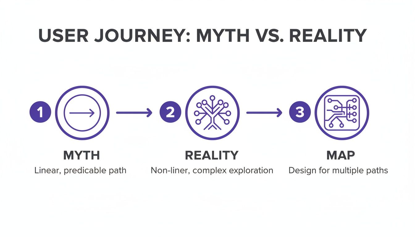
The temptation is to draw a straight line.
User lands, adds to cart, enters payment, confirms. It's clean, simple, and utterly wrong. We love to imagine user paths as orderly queues, but they're more like crowded marketplaces: full of detours, second thoughts, and abandoned carts. Nobody moves in a perfectly straight line.
A UX user flow is the map of that marketplace. It's a diagram showing every step, decision, and interaction from the moment a user starts a task to the moment they finish it. It's the blueprint for an intuitive experience.
The Myth of the Straight Line Journey
The single most common mistake in product design is assuming a user's journey is linear. It never is. The path isn't a conveyor belt; it's a switchboard, with countless potential connections.
Your Product Is a Transit System
A better analogy for UX user flows is a transit map for your entire product. A simple bus route shows one way to get from Point A to Point B. But a full transit map shows everything: the express trains, the local lines, all the interchanges, and even the emergency exits. It reveals the whole system, not just one idealized "happy path."
Your product isn't a single road; it's a network.
- Entry Points: Where are users getting on? Are they coming from a social media ad, a direct link, or organic search? Each starting point has a different user mindset.
- Decision Nodes: These are the interchanges. Does a user sign up with Google or email? Do they apply a discount code or proceed without one?
- Alternative Routes: What happens if a credit card is declined? Or when they need to reset their password mid-purchase? These aren't edge cases; they are scheduled stops on someone's journey.
- Destinations: The goal isn't just a "Purchase Confirmed" screen. It’s the feeling of a successful interaction that makes them want to come back.
Thinking of a user flow as a system map forces you to anticipate complexity. It becomes a strategic tool for stress-testing the journey before a single line of code gets written. A friend at a SaaS company recently told me their engineering rework dropped by 30% after they started mapping both successful and failed paths. Why? Because they stopped designing for a single rider and started managing the entire transit system.
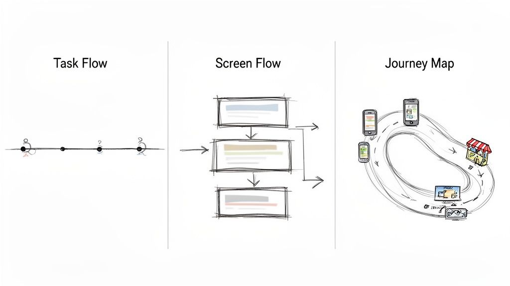
How User Flows Differ From Other UX Artifacts
It’s easy to get user flows mixed up with other design documents. They all tell a piece of the story, but they focus on different things.
While they all work together, a user flow is uniquely focused on the "how"—how a user actually gets from A to B within your interface.
The basic gist is this: a user flow isn't just a design artifact; it's a strategic narrative. According to Jakob Nielsen of the Nielsen Norman Group, a journey map visualizes the holistic process a person goes through to achieve a goal. While distinct, you can learn more about this broader perspective in our guide on what a user journey map is and how it provides crucial context for your flows.
It’s the difference between giving someone a single route and handing them a map of the entire city. Which one do you think builds more confidence in your product?
How to Map the Path From Intent to Action
The journey from a user’s first thought to their final click is not a straight line. It's a conversation. Each screen asks a question, and every tap is an answer. What happens when that conversation breaks down?
This is where UX user flows come in. Mapping this dialogue is the core skill. It’s less about drawing boxes and arrows and more about choreographing a successful interaction. A great flow feels intuitive because it starts with the user's problem, not a feature you want to build. You're mapping the job they need to get done.
We like to think the user's journey is simple, but the reality is much more complex.
This image nails it. We hope for a direct path, but the truth involves branches, choices, and detours. That reality is exactly what a good user flow is meant to navigate.
The Anatomy of a User Flow
To build this map, you have to know the basic grammar. These are the building blocks for that user-product conversation.
- Entry Points: Where does the dialogue begin? A link in a marketing email? A Google search result? Each starting point comes with its own context.
- Steps/Actions: These are the back-and-forth turns. They’re the specific things a user does, like "Enter email" or "Upload a photo."
- Decision Nodes: This is where the path splits. The user has to make a choice. Should they log in with Google or create a new account?
- Exit Points: How does the conversation end? A success screen ("Order Confirmed!"), an error ("Payment Failed"), or the user just giving up. A complete flow accounts for all possible endings.
Last week I watched a PM present a new sign-up flow. It looked perfect. Then the lead engineer asked, "What happens if the social login fails?" The PM went silent. The flow only showed the sunny day scenario, ignoring three or four error and recovery screens.
That’s the exact moment a two-week project quietly becomes a six-week fire drill.
A Process for Creating Your Map
Creating a user flow isn't a freeform art session. It’s a structured process that takes you from an abstract goal to a concrete, visual plan.
- Define the Goals (User and Business): First, get clear on what the user is trying to do. Reset a password? Buy a subscription? Then, connect that to the business goal. The user must win for the business to win.
- Outline the Major Steps: Before touching any software, write out the sequence of actions in plain text. This is a simple form of task analysis. It forces you to focus on logic without getting distracted by visuals.
- Identify Entry and Exit Points: Figure out all the ways a user might start this flow. Once you have the starting points, define what success and failure look like.
- Visualize the Flow and Its Branches: Now open your tool and translate the outline into a diagram. Start with the "happy path." Then, go back to every decision point and map out the alternatives, especially error states.
- Refine and Get Feedback: A user flow is a hypothesis. Show it to your engineers, other designers, and stakeholders to see if they can break its logic. Their questions will expose the weak spots you missed.
In a 2017 paper on interaction design, researchers from Carnegie Mellon University defined a flow as a "structured representation of the user's path." The key word is structured. A clear process helps you spot the gaps that cause rework later.
By mapping this conversation, including all potential wrong turns, you stop designing screens and start designing successful outcomes. This makes the user flow one of your most valuable strategic tools.
Choosing the Right Type of User Flow
Not all maps are drawn to the same scale. To get across town, you need a street map. To plan a cross-country road trip, you need a national atlas. Using the wrong one is a recipe for getting lost. The same is true for UX user flows.
Choosing the right type of flow diagram depends entirely on the question you need to answer. Are you focused on a single interaction, a sequence of screens, or the entire customer experience? Each requires a different level of zoom.
Last month, I watched a product manager try to explain a complex data export feature to his engineering team. He kept jumping between high-level goals and tiny UI details. You could see the confusion growing. He needed a detailed screen flow, but he was trying to describe it with the language of a high-level journey map.
The result? A meeting that went in circles.
This is what I mean: the type of user flow you create is as important as the flow itself. Matching the diagram to the audience and the problem is the first step toward clarity.
Task Flows: The Microscope
A Task Flow is your most focused view. It illustrates the steps a user takes to complete one specific, discrete task. It often doesn't even reference specific screens, focusing instead on the sequence of actions.
Think of it as the "reset password" flow. The task is simple, linear, and has a clear start and end.
- When to Use It: Perfect for sprint planning meetings, aligning on the logic of a single feature, or explaining a simple interaction.
- Key Characteristic: High-level and abstract. It prioritizes logic over specific screen designs.
- Example: Mapping the steps to apply a coupon code in a checkout process.
Task flows are your best tool for getting quick alignment on a single job-to-be-done.
Screen Flows: The Street View
A Screen Flow visualizes the literal path a user takes through your product on a screen-by-screen basis. It connects wireframes or mockups to show the complete visual journey for a specific task.
This is the most common type of flow used during active design and development.
It’s less about abstract actions and all about the tangible interface. It shows the actual screens and the decisions made on them. If you’re preparing for a design review or developer handoff, this is the map you need. You can find several powerful user flow examples that highlight just how critical this level of detail is.
Journey Maps: The Satellite View
A Journey Map is your widest possible view. It’s less a user flow and more a strategic document that maps the user's entire experience with your brand over time. It includes their emotions, pain points, and thoughts, both inside and outside your product.
This isn’t about clicks and screens. It's about the holistic narrative.
This perspective is crucial now that user paths are rarely confined to one device. An AppsFlyer report notes that many user flows begin on mobile (60.3% market share) and follow a distinctive ‘M-shaped’ pattern, often moving from mobile to a connected TV, then back to mobile. This proves users expect a coherent experience, no matter the device. You can explore the full findings on cross-platform user behavior.
In short, start by identifying your audience and your goal. A quick chat with an engineer needs a simple task flow. A quarterly strategy review demands the broad context of a journey map. Picking the right map ensures everyone is navigating the same territory.
Why Most User Flows Fail Before They Start
It’s Monday morning, kickoff for a new feature. The team feels aligned. The roadmap looks clear. Six weeks later, the feature is late, over budget, and QA keeps finding bugs.
What went wrong?
The failure didn’t start during the sprint. It started before a single line of code was written, with a user flow diagram that looked perfect but only told half the story. A poorly planned UX user flow isn't just a design problem; it's a financial one. It’s the quiet source of engineering rework, blown deadlines, and rising customer support tickets.
The Tyranny of the Happy Path
The single biggest mistake is designing only for the "happy path." This is the perfect, best-case journey where the user does everything right, their payment clears on the first try, and no error ever pops up. It’s clean, simple, and dangerously incomplete.
Last quarter, a PM at a fintech company shipped a file upload feature. Engineering estimated two weeks. It took six. Why? The PM specified one screen. Engineering discovered 11 additional states during development. Each state required design decisions. Each decision required PM input. The two-week estimate assumed one screen. The six-week reality was 12 screens plus four rounds of 'what should happen when' conversations.
The so-called "edge cases" weren't edge cases at all. They were the reality for a huge chunk of their users.
Designing a user flow without its failures is like drawing a map that only shows highways. It’s great until you need an off-ramp, a local street, or have to deal with a detour. When you only map the perfect journey, you’re not saving time. You're just pushing the discovery of complexity downstream to the most expensive part of the process: development.
The Economics of a Thoughtful User Flow
So why does this matter at scale? Because companies are pouring massive sums into user experience, and it's not just to make things look pretty. Bad experiences cost money. Good ones make it. The incentives are that simple.
The global User Experience market is projected to hit $30.24 billion by 2031, with sectors like e-commerce driving a huge piece of that growth. This isn't happening in a vacuum. It’s a signal that organizations get the direct line connecting thoughtful design to happy customers and a healthy bottom line. You can read more about the growing UX market to see how this investment is playing out.
Creating a user flow without data is a gamble. But a flow that anticipates friction is an investment. It accepts that human behavior is messy and that building a resilient product means planning for that mess from the very start.
Here's the takeaway: stop thinking of error states and alternate paths as "edge cases."
They are the user flow.
Try this. Pull up your product's most critical flow. Find the three most common failure points from your analytics or support tickets. Now, map the recovery path for each one. That small exercise will transform a simple diagram into a real tool for building a tougher, more user-centric product.
Accelerating Your Process with Modern Tools
Creating a user flow from scratch feels like drawing a city map from memory. You nail the main roads, the big, obvious paths everyone takes. But what about the one-way streets and the back alleys? The process is slow, tedious, and you're almost guaranteed to miss something.
What if you didn't have to start from a blank canvas?
What if you could ground your design decisions in the living reality of your product from the very first click?
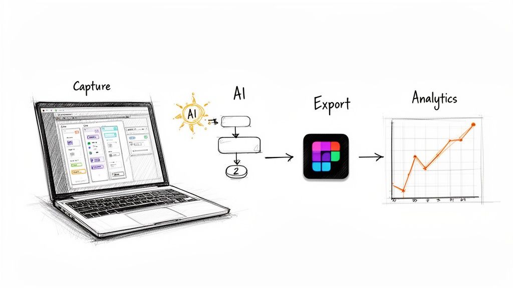
This is where the entire workflow changes. Instead of guessing how people move through your product, you can actually capture it. Modern tools can act like a cartographer, instantly tracing every path in your live application.
It’s the difference between theorizing about your product and seeing it.
From Manual Guesswork to Automated Insight
Imagine your product is a complex building. The old way of creating UX user flows was to walk through it room by room with a notepad, sketching the layout. It's time-consuming and prone to human error. You might forget a closet.
AI-powered tools are like having a LIDAR scanner.
In one pass, they capture every wall, doorway, and staircase, generating a comprehensive map that includes hidden edge cases you didn't even know existed. This automated capture becomes the foundation for everything that follows.
From this model, you can:
- Generate Complete User Flows: Instantly visualize entire journeys, from onboarding to checkout, without dragging a single box.
- Uncover Hidden States: Automatically identify forgotten error messages, empty states, and loading screens that were missed in original designs.
- Export Directly to Figma: Move from reality capture to your design canvas in seconds, with flows that perfectly mirror your product's existing structure.
This shift moves your role from manual drafter to strategic editor. Your time is no longer spent drawing diagrams but on analyzing the map and deciding how to make it better.
Connecting the Map to Real-Time Traffic
A map is useful, but a map with live traffic data is a command center. The next evolution is connecting these visual diagrams to your analytics. When your flow diagram knows where users are actually dropping off, it transforms from a static document into a dynamic diagnostic tool.
I watched a product leader at a Series B company struggle with this. They had a beautiful user flow for their trial sign-up, but their conversion rate was abysmal. The diagram showed a perfect, happy path, while their analytics revealed a massive drop-off after the second step.
The problem? The map didn't reflect reality.
With modern tools, you can overlay analytics directly onto your user flow. This pinpoints the exact funnels where users get lost, showing you the bottlenecks that are costing you customers. You can then create new, data-backed flows designed to fix the real problems. To explore this topic further, check out our guide on the best AI tools for product design workflows.
This is especially critical in the mobile space. Mobile apps now account for nearly 90% of mobile internet time and boast a 157% higher conversion rate than mobile web. But the stakes are high: 88% of consumers will abandon a site or app after a poor experience. Given that mobile drives over half of all web traffic, optimizing these flows isn't just a good idea, it's a requirement. Discover more insights about UX trends and statistics on UserGuiding.com.
The grounded takeaway is to start with reality. Use a tool to capture your most important existing flow. Connect it to your data. Find the one spot where the most users are getting stuck, and focus all your design energy there.
Putting Your First User Flow Into Action
All this theory is great, but it’s useless without action. Forget the generic advice to "start making user flows." Let's ground this with a single, achievable task.
Pick one critical journey.
Seriously, just one. This isn’t about boiling the ocean. It’s about finding one high-traffic path in your product where a small improvement can deliver a big result. Think about your core onboarding sequence or your checkout process. These are the arteries of your product; a small clog causes major problems.
Now, use a tool to capture that journey exactly as it exists today. Don't draw it from memory: that’s a recipe for assumptions. Record the real thing, click by click. Then, spend thirty minutes just looking at the map it generates.
Where are the detours? The dead ends? Where does the conversation with the user feel broken? As you dig in, make sure your ideas align with established SaaS conversion optimization best practices to ensure you’re not just changing things, but actually improving them.
Here’s the grounded takeaway: identify one single point of friction. Just one. Find a frustrating step you can realistically propose fixing in the next sprint. This gives you a small, high-impact win and transforms the abstract concept of UX user flows into a concrete improvement you can champion immediately.
A Few Common Questions About User Flows
Even with a clear map, some questions always pop up at the start of a journey. Let's clear the path forward by tackling a few of the most common ones.
How Detailed Should a User Flow Be?
The honest answer? It depends entirely on who you're making it for and what decision they need to make.
Are you trying to get your team aligned on a single feature for the next sprint? A simple task flow showing the core steps is probably perfect. But if you're getting ready for developer handoff, you'll need a much more detailed screen flow that maps every possible interaction, dead end, and error state.
The key is to match the flow’s fidelity to the problem you're solving right now.
A flow that’s too simple misses critical edge cases, which always leads to engineering rework later. A flow that’s too complex for a high-level strategy meeting will just drown your audience in details they don't need. Always start by asking, "Who needs to see this, and what do they need to decide?"
What’s the Difference Between a User Journey and a User Flow?
Think of it like this: a user journey map is the atlas of an entire country, while a user flow is a detailed street map of a single neighborhood.
A UX user flow is tactical. It zooms in on a specific task inside your product. It details the steps, clicks, and screens a user navigates to hit a single goal, like uploading a profile picture. It's all about the how within the app.
A user journey map is strategic. It captures a person's entire experience with your brand over time, often across multiple channels, from seeing a social media ad to finally using the app itself. It includes their emotions, motivations, and pain points along the whole ride. It’s about the why and how it feels across all touchpoints.
Can You Create a User Flow Without User Research?
Could you? Yes. Should you? Absolutely not.
Building a user flow without research is like drawing a map based on a story you overheard once. It’s just an exercise in guesswork. You end up designing for an idealized, perfect user who doesn't actually exist, which leads you straight into the "happy path" fallacy.
Real user research, even something as simple as reviewing support tickets or looking at your product analytics, grounds your flow in reality. It shows you where people are actually struggling, not where you think they are. As Jakob Nielsen of the Nielsen Norman Group has been telling us for decades, understanding the user is the bedrock of usability. Without that foundation, your flow is just a diagram of your own biases.
The most expensive user flow you can create is the one based on guessing. It guarantees you'll build solutions for problems that don't exist while ignoring the ones that are costing you customers.
What Are the Most Common Mistakes to Avoid?
Besides designing only for the happy path, two other mistakes frequently sink user flows:
- Creating flows in a silo. A flow designed without input from engineering is a fantasy. A flow created without stakeholder buy-in is a document destined to be ignored. Collaboration isn't optional; it's essential.
- Forgetting the exit points. Every good flow has to account for success, failure, and abandonment. What happens when a user gives up or an error occurs? Do they hit a dead-end screen, or do you give them a clear path back to safety? A truly resilient product plans for every exit.
Remember, the goal isn't to create a perfect diagram. The goal is to build a shared understanding that leads to a better product.
Ready to stop drawing maps from memory and start capturing reality? Figr learns your live product with a single click, generating complete user flows, uncovering hidden edge cases, and exporting directly to Figma. Turn product thinking into production-ready artifacts and ship your next feature with confidence. Get started with Figr.